There are several colors and lack of layering and texture. In fact, even if it is a slag picture, as long as you are good at using some design skills, you can make it burst into texture. The following five cases will be introduced to teach you how to use
Author: Wang Mengqi Authorized to reprint from: I am Design Wet
Many students will often be confused by the processing of pictures, and feel that they have got a relatively ordinary picture with no texture and dull colors. The final artwork is too simple, and the effect of simple integration of information on the overall picture is not great from the perspective of visual effect.

So when I usually look at the design, I start to lament, how can the pictures they get are so good, my life...

Indeed, usually we can't get such good pictures at all, not all Party A are so rich, have professional models, professional photography, professional marketing team. But the question is, does Party A have rich people ask you to do it? How cheap you are. Don't have points in mind?

In this tutorial, we use five schemes to tell you step by step how much influence different image processing has on the overall picture. So when it comes to a picture, there are quite a lot of parts that need to be taken into account.
Image processing, composition, grouping and arrangement of text, color selection, graphic embellishment, we try our best to pay attention to these aspects.
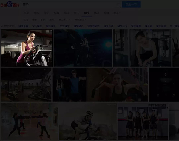
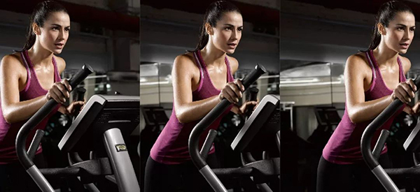
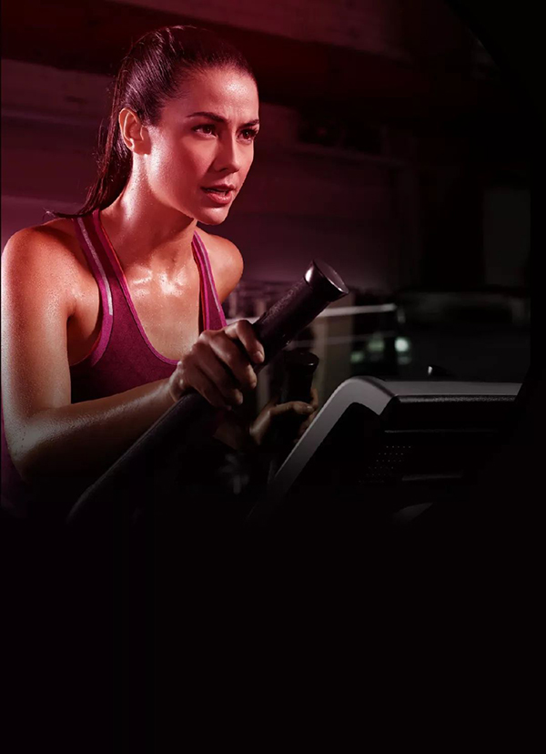
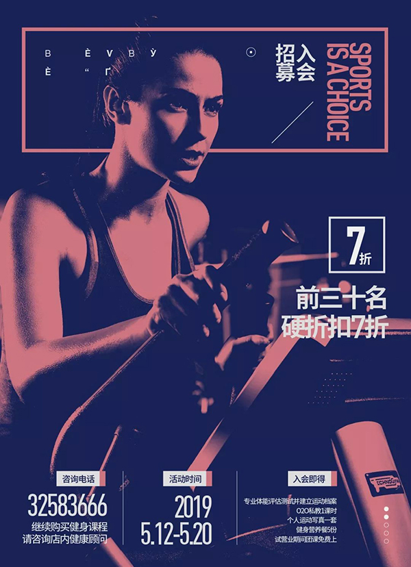
First of all, let's take a look. The picture we got this time, in order to pretend that the quality of the picture is average, I did just randomly search for a picture on Baidu. And it is the first picture displayed, without picks. There are few people as sincere as me, pay attention to cherish.
Let's take a look at the copywriting again. This time I will deal with the copywriting briefly. What is simple treatment? It is to choose the font, match Chinese and English well, re-select the correct word, adjust the kerning, adjust the line spacing, group information, clear the hierarchy, widen the kerning, and simple formal processing. You see, it is as simple as that.

The handling of copywriting does not need to be particularly complicated. You have to pay attention to that we want to convey information to the audience anyway. Don’t fall into self-indulgence. When organizing information, don’t think which one is important and which one is secondary. Look at it from the perspective of the audience.
If you want to go to the gym, what are the important information you pay attention to, which ones are not important, and how is the hierarchical order divided? Think about it.
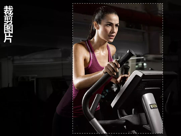
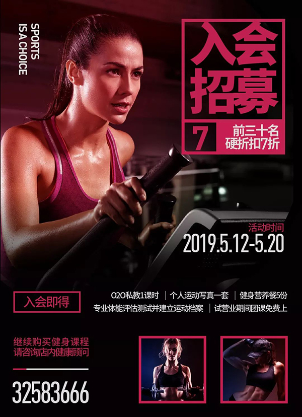
The picture we got is like this, so you have to observe it. This is a picture with the main characters. The characters are in a scene. Is the scene important? Important, she is in a state of exercising in the gym. But we don't need to keep all of this scene, just extract a part. So in this step, we need to crop the picture to make the main focus of the picture. Let the first sight stay on the character.
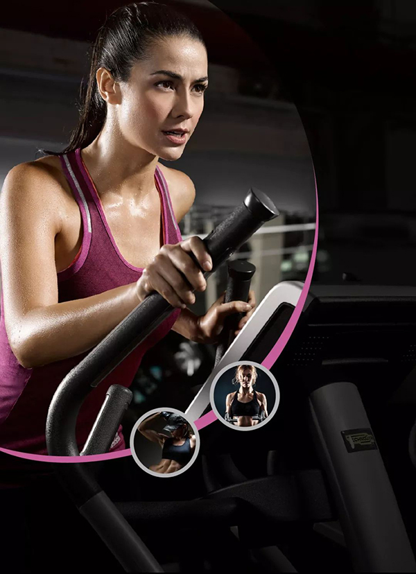
Then I used a simple graphic to refocus the character, and for the rest I gave an 80% black transparency overlay. Then add a small regular decorative graphic, with two small graphic embellishments.
Then the text is arranged in order.

This is a very conventional direction.
To sum up, there are mainly two methods we used in this case.
01. Image cropping
02. The contrast between light and dark highlights the main picture again.

Then we have determined the cropping of the picture, let's briefly demonstrate the second form of expression.
Let’s take a look at this case. Use simple colors to superimpose pictures to process the tone and texture of the pictures. It doesn’t require you to do more complex color correction operations, it’s very simple.
As you can see in the picture below, first of all, I made a focus gradient of the characters for the picture, still following the idea of the first plan, and I gave a black to transparent gradient for the rest of the picture, so that the copywriting will be clearer.
Because the composition method has almost changed from a left-right composition to a semi-enclosed composition, I have slightly adjusted the copywriting.
Compared with the first solution, is the texture of the picture in this case slightly improved?
Summarize the methods we mainly use in this case.
01. Image cropping
02. Gradient overlay picture (I use "soft light" here)
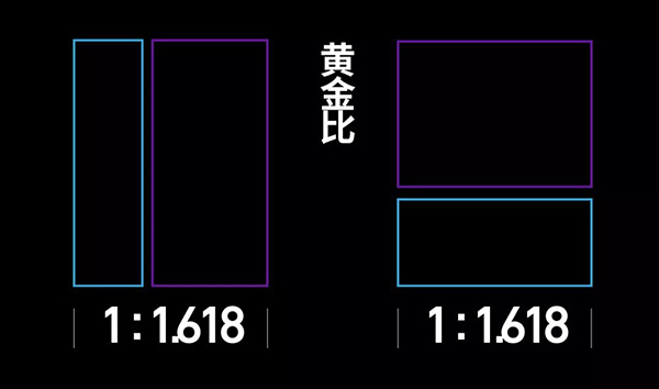
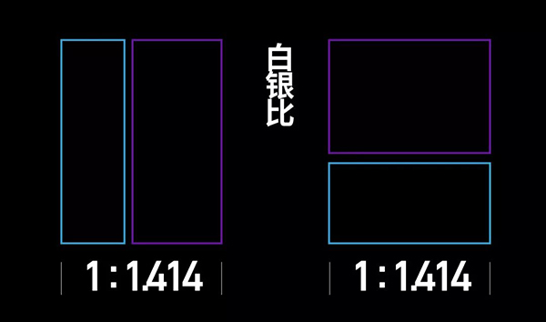
In the third case, let’s combine Case 1 and Case 2, and then we can make a breakthrough in color. I also carried out a simple sense of form on the parts of the two small pictures, so that the overall contrast effect is better and more obvious. texture.
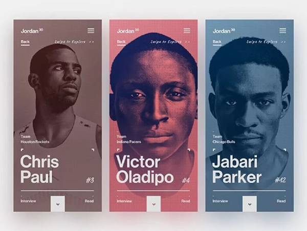
Some students have doubts. Is there any basis for this comparison between left and right? That's right, it's the silver-to-silver ratio.
Both the golden ratio and the silver ratio are commonly used ratio methods. In fact, we often see the silver ratio in Japanese posters.
But don't use it blindly, you can add it if it is suitable, and don't force it if you can't add it.
Far away, let's take a look at the final effect of this case.
Summarize the methods we mainly use in this case.
01. Image cropping
02. Gradient Overlay Image
03. The contrast between light and dark highlights the main picture again
04. The picture is divided into two parts to make the silver ratio
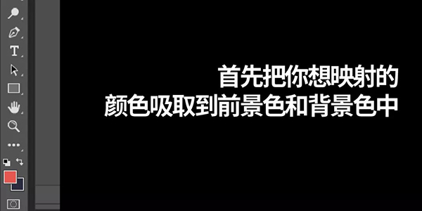
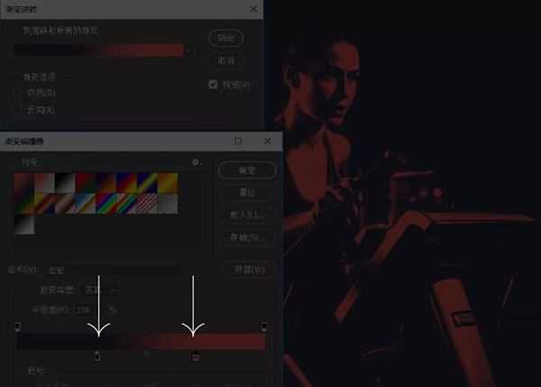
In the fourth case, we mainly talk about a very important color correction function - gradient mapping
This function is done in ps, which is also a relatively simple and practical method.
Then Image—Adjustment—Gradient Mapping. After finding this function, start to adjust the details to the effect you want. I mainly want to make the light and dark contrast of the characters bigger.
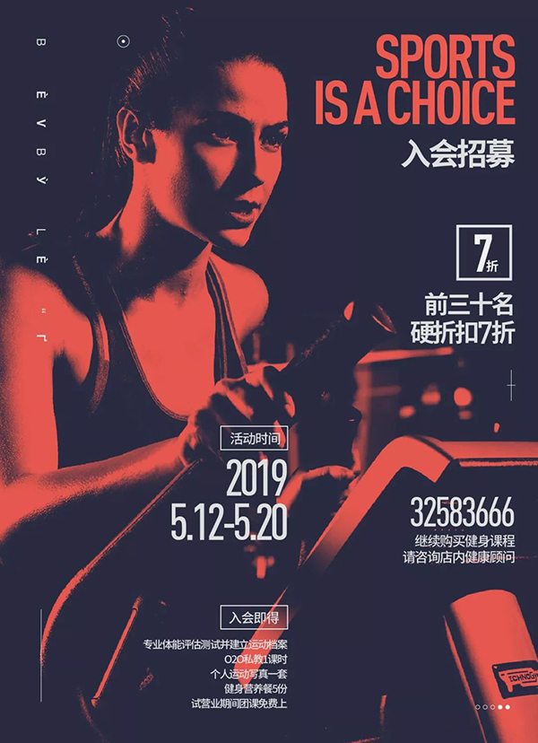
The final effect after adding copy.
Summarize the methods we mainly use in this case.
01. Image cropping
02. Gradient map
The fifth case is actually to deepen everyone’s understanding of the function of gradient mapping. I changed the color and layout method to reinterpret the direction of the fourth case. You will find that the composition method I mainly used in the above cases is basically It is still a left-right composition, and the characters are always on the left. This is because the eyes of the characters are best able to cover the copy, and the audience will read the copy along the direction of the eyes of the characters, which is also a small detail.
Then in this case, I used a simple line to make an interspersed relationship between the characters, Some students will ask, your English that you can’t understand What is it? If you don’t understand it, that’s right. If you can understand it, it’s important information. If you don’t understand it, then it’s just a simple decorative embellishment. Don’t you know?
Summarize the methods we mainly use in this case.
01. Image cropping
02. Gradient map
03. The interspersed relationship between lines and characters
Alright, let's stop here this time, see you next time.
Articles are uploaded by users and are for non-commercial browsing only. Posted by: Lomu, please indicate the source: https://www.daogebangong.com/en/articles/detail/Slag%20pictures%20can%20also%20burst%20in%20texture%20five%20cases%20will%20teach%20you.html


 支付宝扫一扫
评论列表(196条)
测试