To achieve a tall effect, you can use CSS and SVG to achieve text gradients, strokes and drop shadow effects. The following are some simple sample codes: 1. Text gradient effect: Use the gradient property of CSS to add a gradient effect to the text. Here'
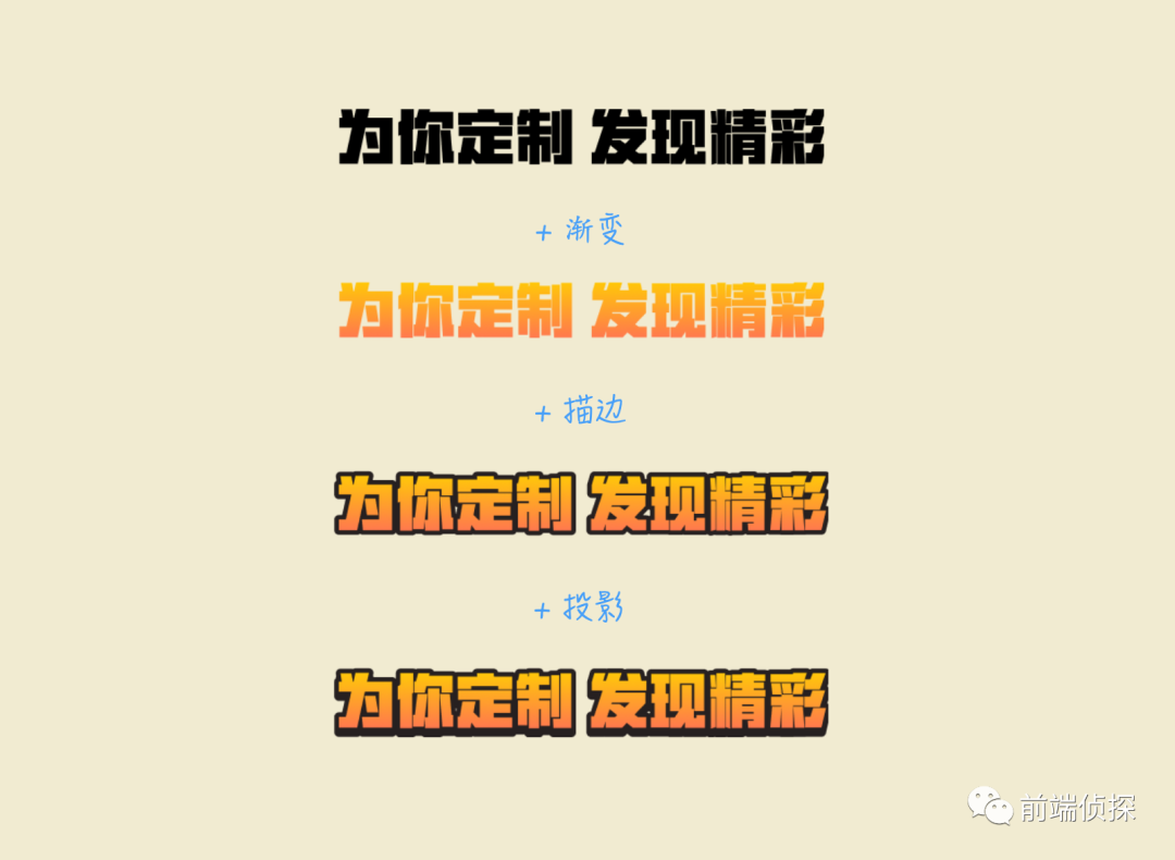
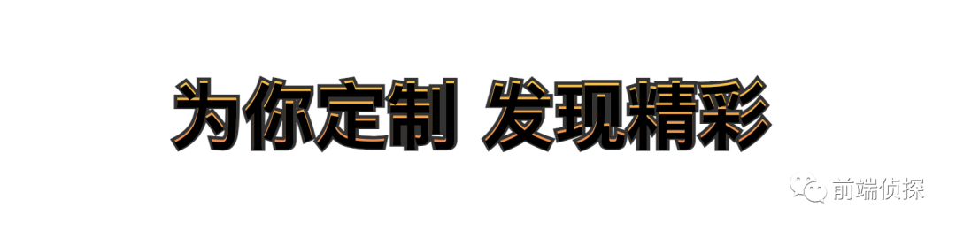
In some web activity pages, you can often see specially processed title text, such as thisimage-20210918103841918
Ignore special fonts for the time being, and you can find out through the layer style of the design draft that there are 3 special text effects, namely Gradients, strokes, drop shadows
image-20210918105003942
As a pursuit front end, of course it will not be used directly Pictures~ Here are two ways to implement CSS and SVG respectively, let’s take a look together
Reminder: There are many details in the article, if you are not interested, you can directly skip to the bottom to view the online demo
1. CSS text gradient
First look at CSS accomplish.
There is no direct property in CSS to set the text gradient, usually the text can only be a solid color. However, the background color can be displayed in the text area by clipping the background background-clip, which looks like the text has a gradient
<pclass='text' > Customized for you to discover wonderful </p>
But this has no effect, the text is still the default color
image-20210918113056809
The reason is actually very simple, because it is a cropped background, the last display is actually the background color, and the colored text is covered It is above the background, so here you need to set the text color to transparent, which can be achieved with color and -webkit-text-fill-color.
.text{
 background-image: linear -gradient(#FFCF02, #FF7352);
 background-clip: text;
 -webkit-background-clip: text;< br> -webkit-text-fill-color: transparent; /*requires text to be transparent*/
}
< p data-tool='mdnice editor' > In this way, you can see the text gradient effectimage-20210918113558250
2. SVG text gradient
Take another look at text gradients in SVG.
SVG naturally supports text gradients, and text can be regarded as ordinary vector paths. The structure is as follows
<svg>
 << span >text> Customized for you to discover wonderful </text>
</ svg>
Just fill it directly with fill, but you need Note that the filling here is a little troublesome. Gradients cannot be like CSS, and you must use a special gradient tag <linearGradient>. If you are interested, you can check linearGradient - SVG | MDN (mozilla.org )[1], need to be defined in <defs></defs>
<linearGradient>< The <stop> tag in /code> is used to define the color gradient of the gradient, offset and stop-color respectively define the gradient node and Color, and then fill the gradient with the fill attribute (specify the id)
.text{
 fill: url span>(#gradient);
}
The effect is as follows (it is not a problem with image loading)
image-20210918150224988
There are two problems in this way
The text is not centered horizontally and vertically
The gradient direction is horizontal to the right
First look at the first question. The adaptive processing of text in SVG is still very weak. For example, in CSS, automatic line wrapping is common. In SVG, you can only manually wrap lines at specified positions. Two attributes text-anchor and dominant-baseline are needed for centering here, which are text anchor alignment and text baseline alignment respectively, which are horizontal and vertical in simple terms. alignment
At the same time <text> also need to set x, y position, The percentage here can be compared to the background position percentage in CSS
<textclass='text' x='50%'y='50%'> Customized for you Discover wonderful </text>
This way centered
image-20210918151535204
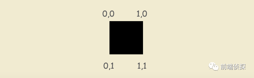
Regarding the gradient direction, SVG uses x1, y1, x2, y2 are determined by two sets of coordinates. Given a rectangle, the upper left corner is [0, 0], and the lower right corner is [1, 1], so that any angle can be expressed
image-20210918151901299
For example, if you need a vertical downward direction, you can set it in <linearGradient>x1='0' y1='0' x2='0' y2='1', as follows
<svg> << span >defs> <linearGradientid='gradient'x1='0'y1='0'x2='0 'y2='1'> <stopoffset ='0%'stop-color='#FFCF02'/> <stopoffset='100%'stop-color='#FF7352'< /span>/> </linearGradient> </defs > <textclass='text'> Customized for you Discover wonderful</text> </svg>
The effect is as follows
image-20210918152238267
3. CSS text stroke
There is an attribute -webkit-text-stroke specially used for text stroke in CSS, which can control the width and color of the stroke, such as
.text{
 -webkit-text-stroke: < span >2px #333;
}
The effect is as follows
image-20210918154946939
There is indeed a stroke, but the text seems to be thinner Circle, if you think it is not obvious, you can set it a little bigger
image-20210918155647207
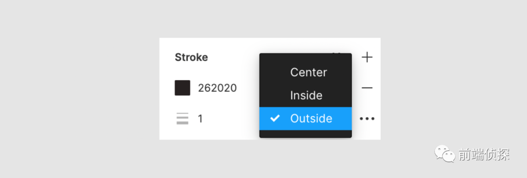
As can be seen from here, -webkit- text-stroke is actually a centered stroke, and it is covered on the text, and the stroke method cannot be changed. In fact, many design tools can choose the stroke method, such as figma
image-20210918160301899
So, how to achieve the outer stroke effect?
is also possible! Use two layers of text, one layer of text stroke, and one layer of text gradient. In order to save labels, you can use pseudo-elements to generate
<pclass='text' data-title='Customized for you to find wonderful'>Customized for you to discover wonderful</p >
::before set the gradient, at the top, the original text This setting stroke is located at the bottom, pay attention to remove the -webkit-text-stroke of ::before
Change different strokes There will be no text "thinning"
image-20210919123457209
Fourth, SVG text description Edge
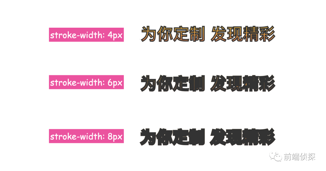
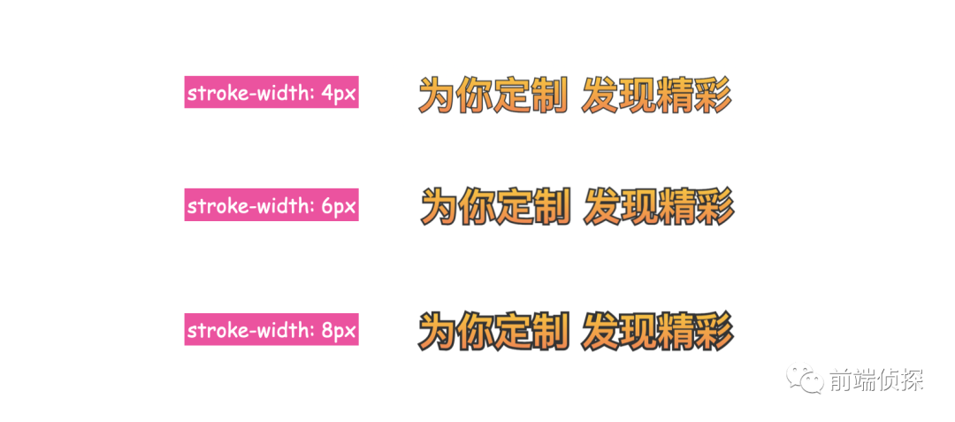
SVG can also achieve stroke effect, which is similar to CSS. It should be said that CSS is based on SVG, through stroke and stroke-width to control the stroke color and size, such as
The performance is the same as CSS, both are centered strokes, and also Can not change.
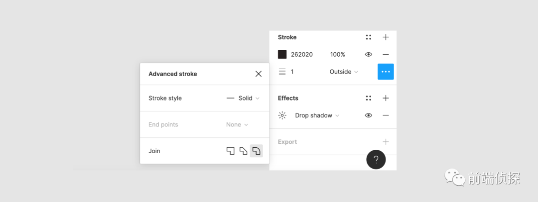
The difference is that SVG control is more flexible. The default is to fill first, then stroke, so it looks like the stroke is on top of the fill , However, we can change this rule, set the stroke first, then fill, then the filled color will cover the stroke. To change this rule in SVG, you can set it through paint-order[2]. About this property, you can visit this article by Zhang Xinxu: CSS paint-order wishes everyone a happy New Year[3]
The reason is actually related to the text gradient, which is actually the background The text is transparent, so adding a shadow to the text will result in the shadow covering the background. In addition to using text-shadow, you can also use the drop-shadow filter to achieve
here dx, dy, stdDeviation, flood-color and drop-shadow(dx,dy,stdDeviation,flood-color) are one-to-one correspondence, so I won’t explain more, and then Apply filters to text
.text{
 /*other*/
 filter:url(#shadow);
}
like this Can also implement text projection
image-20210919132653973
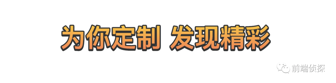
In fact, there is no need to be so troublesome in SVG. The reason why the above text-shadow cannot It is used because the text gradient implemented by CSS is the background, which is a fake text gradient, but in SVG it is a real gradient filling, so yes, you can directly use text-shadow in CSS here To achieve, SVG and CSS now have many attributes and styles that are interoperable, as follows
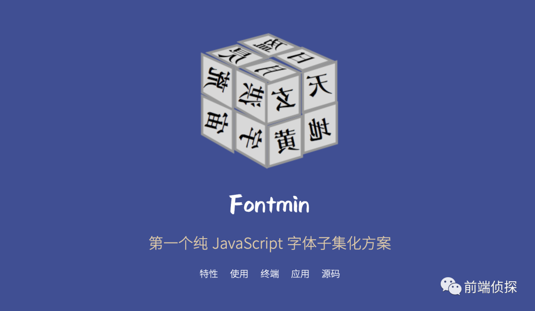
Usually, some special fonts will be used for the title of the activity. It may reach tens of MB or hundreds of MB. In fact, we only need to use the fonts that appear. If the special fonts that appear in the text are extracted separately, the entire font file will be greatly reduced. This process is called font subsetting.
So what to do?
Here is a recommended tool Fontmin - font subsetting scheme[6], about the principle of font subsetting, you can Refer to this article: Performance Optimization Magician: Chinese Font Practice - Nuggets[7]
image-20210922192856814
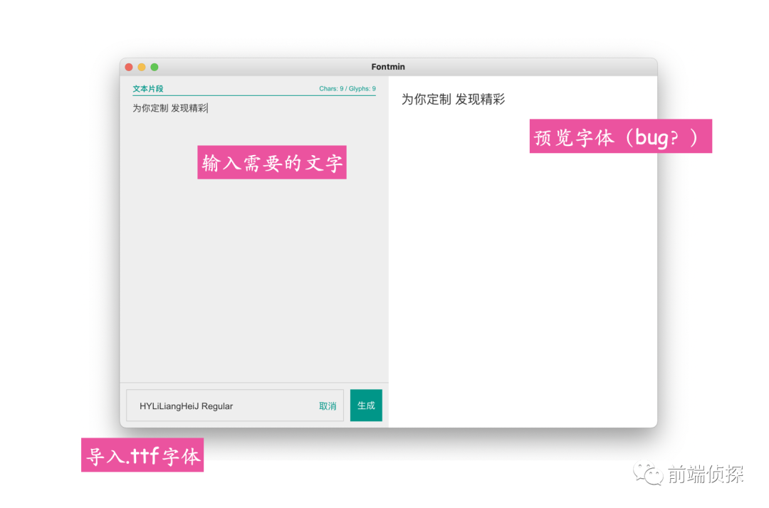
After downloading the client, import the font file . ttf, and then enter the required text, as follows
image-20210922193402350
Click Generate to get the following files
image-20210922193601713
The first one starts with -embed is the CSS suffix, which contains the converted base64 file, which can be imported directly
CSS implementation can access text-css (codepen .io)[8]
SVG implementation can access text-svg (codepen.io)[9]
VIII. Summary and explanation
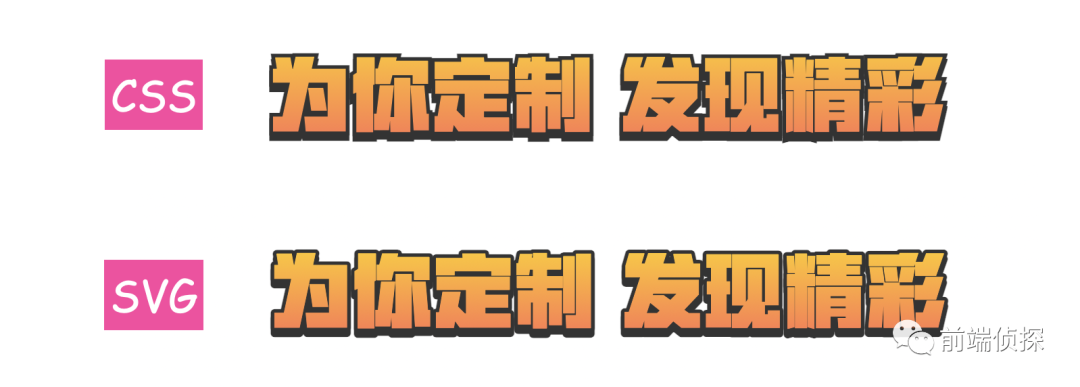
The above introduces two different CSS and SVG From the effect point of view, it is obvious that SVG is better, such as smoother strokes and no need for multi-layer nesting, but CSS also has advantages, such as gradients and shadows are simpler, to sum up
The essence of CSS text gradient is background clipping, you need to set the text color to transparent
SVG text naturally supports gradient filling, you need to use the linearGradient tag
SVG text centering is a little troublesome, you need to use text-anchor and dominant-baseline
CSS and SVG strokes are both centered strokes and cannot be changed
CSS outer strokes can be achieved by superimposing multi-layer structures
SVG can draw the fill on top of the stroke through paint-order
CSS text shadows will be visible when the text is transparent Through it, you can use drop-shadow to simulate projection
feDropShadow in SVG is similar to drop-shadow in CSS
SVG can directly use text-shadow in CSS to realize text projection
fontmin
CSS and SVG have their own advantages and influence each other. Many CSS styles can also be used in SVG, and many SVG attributes have also been introduced into CSS. In normal development, the advantages of the two can be fully combined. Finally, if you feel good and helpful to you, please like, bookmark, forward ❤❤❤
iCSS is not limited to CSS. If you are also interested in various novel and interesting front-end (CSS) knowledge, welcome to pay attention. At the same time, if you have any questions, or want to join the group to participate in the discussion of large front-end technology, watch and answer questions, grow and progress together, you canscan the code to join the group:
Because the WeChat official account has revised the rules, if you do not star or click to read, you may not receive the push of my official account article, please share thisto the public , after reading the article, rememberlikeor< span >Looking, thank you!
Articles are uploaded by users and are for non-commercial browsing only. Posted by: Lomu, please indicate the source: https://www.daogebangong.com/en/articles/detail/Simple%20to%20achieve%20highend%20effect%20%20CSS%20and%20SVG%20to%20achieve%20text%20gradient%20stroke%20drop%20shadow.html


 支付宝扫一扫
评论列表(196条)
测试