When people write a document, most of the attention How to clearly express the content to be expressed, few people pay attention to fonts deliberately.

But really, you have at leasttwo An absolute reason to care about fonts.
On the one hand, for the beauty of the document and legibility purposes. Each document has its own mood, mood, and visual style, which are communicated to people through what they read and see. Although there are no written standards and norms to follow from this perspective, choosing the right font is definitely an indispensable factor for an excellent text reading experience.
On the other hand, due to the Standardization and normalization purposes. From government documents to industry documents, to corporate documents, there are usually written standards and norms to follow. If you submit a document of this type that does not meet the format requirements, especially if the font is not selected correctly, it is likely to be disqualified even if the content is correct.
It can be seen that the role of fonts cannot be underestimated.
Unity of fonts in PowerPoint documents
When you write a PowerPoint document, it is likely that you need to find some other related documents that have been calibrated for professional content from the company's document library. Copy paragraphs of text or slides and paste them into the document you're writing.
At this time, because these documents you use as material Comply with different standard dimensions, so the content you copied is prone to font inconsistencies.

Taking the above presentation as an example, you would It is necessary to unify the font of the entire document. To this end, you can use the "Replace Font" function provided by PowerPoint to complete the font replacement very conveniently.

If your document contains many different fonts , you need to perform replace fonts multiple times. Once the font substitution is done, the normalized characteristics of the document can be seen at a glance.

Word document font uniformity
If you plan to always use a certain font in future document writing, do you want to set it as the default font of Office? ?
Take a Word document as an example, you want to use "font ” dialog box to change the default font. First, select a commonly used font, and then click the "Set Default" button in the lower left corner of the dialog box to set the currently selected font as the default font of Word.
This means that whenever you When creating a new document, this font will be used for writing by default.
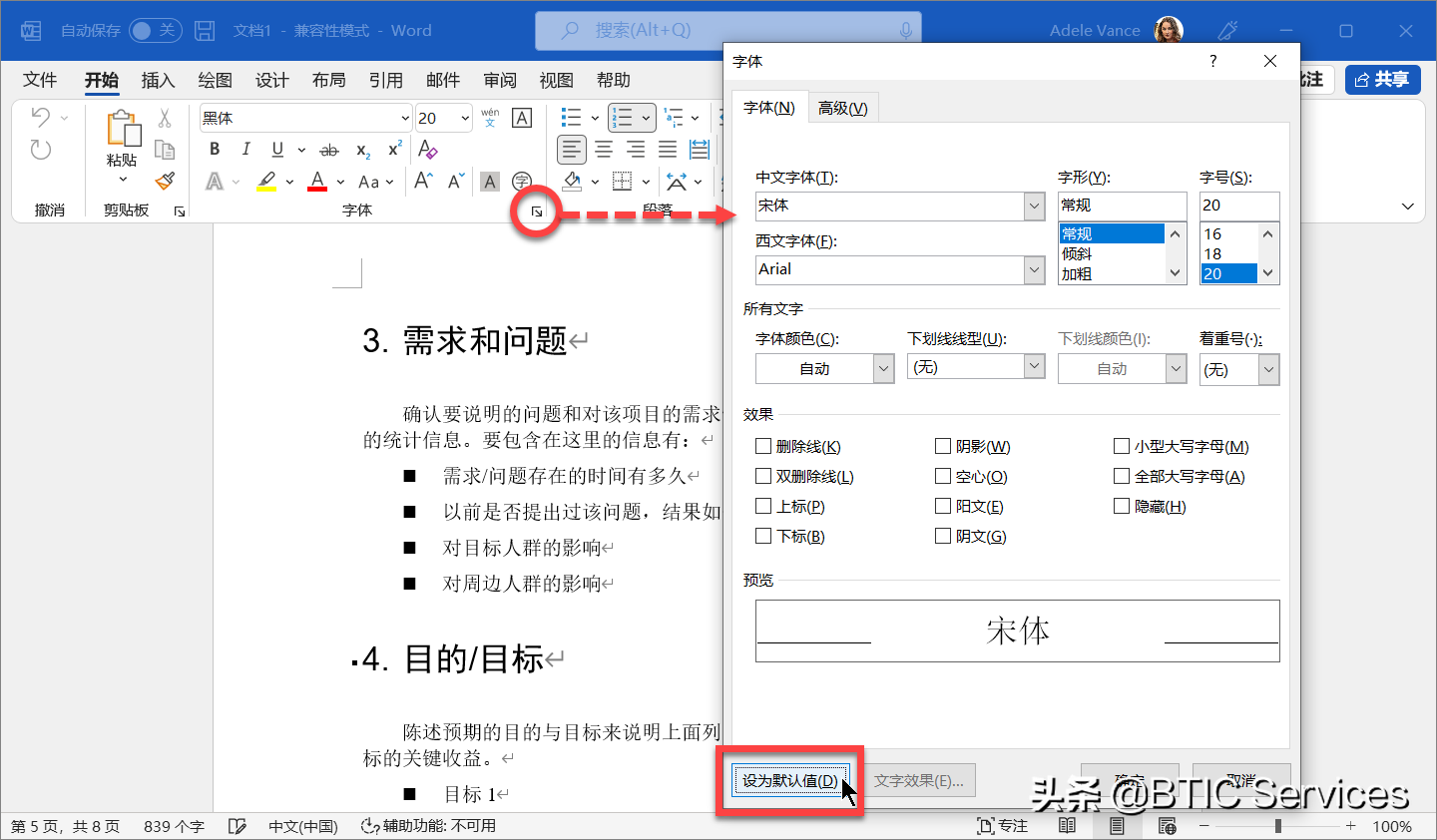
In fact, Word, Excel, PowerPoint and Outlook both support this setting. Their setting ideas are generally similar, only slightly different in specific methods.
Of course, each type of document usually has its own inherent Format requirements, especially the requirements on font selection. If you are assigned to write a new document with the full set of formatting in an existing document, the easiest way is to extract all the styles in that document into your own document.
First, open the Style pane, click the Manage Styles button, and click the Import/Export button at the bottom of the Manage Styles dialog box.
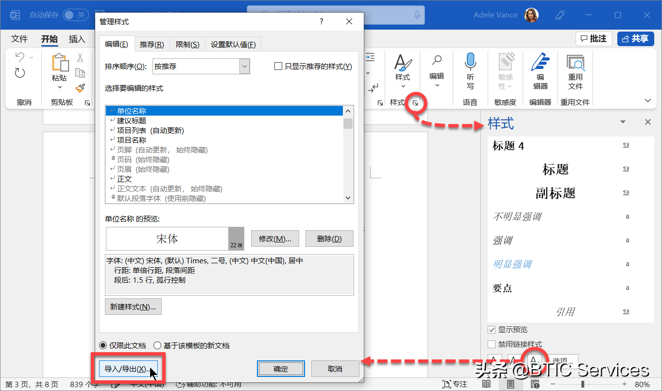
Next, in the Manager< /strong>" dialog box, the left area represents the current document, and the right area represents the style source document, you only need to open the document containing the desired style in the right area, and copy the style to the left side area, the style extraction can be completed.
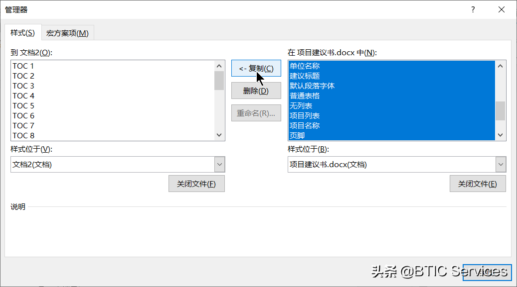
This way, you can focus on the content itself , and the formatting and font settings are already included in the style you just imported, so you don't have to struggle to get consistent document formatting.
Let the font follow the document
In order to pursue the beauty of text, you may use some special fonts in Word or PowerPoint documents. When these files are delivered to someone else, chances are they won't have the fonts installed on their computer.
At this time, the text with a special font is applied in the file By default, the content will be displayed with the default font set by the current user.
In order to allow the text content in your file to be in It is still displayed on other people's computers, and you can embed special fonts into files, so that special fonts can accompany your files like a shadow.
Taking PowerPoint presentations as an example, you can place them in the " Options" dialog to force the current document to embed special fonts.
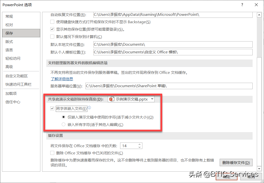
Of course, you can also use "only Choose between embedding characters used in the presentation" and "Embed all characters."
If you deliver the purpose of the documentThe former is ideal if you are only looking at, and the latter is ideal if you are delivering the document for editing Ideal choice.
How to choose the most suitable font
We all want to make the text content in the article "beautiful" by choosing the appropriate font, but, in following the established industry or enterprise Under the premise of document specification, there are still some important homework to be done on how to choose the ideal font.
First of all, is the font you choose enough< strong>Legibility and Legibility.
Legibility refers to the Any text can be easily recognized by readers.

And legibility refers to reading large The difficulty level of a piece of text, that is to say, when you read a piece of text, how much attention do you need to pay attention to, and whether it is difficult to read.

Secondly, whether the font you choose can make the text content Create a visual layering.
In an article,usually contains Several levels of headings and body text. If all these texts use the same font (or even the same font size), then it will be difficult for you to quickly grasp the main point of the article, and your attention will be distracted;
Conversely, if headings at all levels use If you have the right font (and font size and style), then your eyes will automatically be drawn to the content that occupies the first visual level (the most prominent), and you can quickly grasp the article main structure.
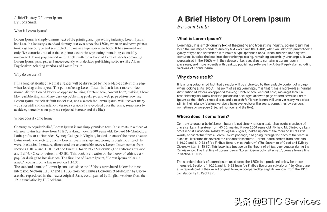
Finally, does the font you choose convey a certain Mood and personality.
No matter which font you choose, the font you choose evokes an emotional response from the reader (this is known as font psychology). In order to effectively convey the message you want to convey to your readers, you need to choose a font that matches the nature of the topic of your article.
How the text will appear on the page (or screen) affects how readers interact with it, read it, and understand it. If you care about what readers think of the articles you write, you need to pay more attention to the choice of fonts.

Discover new fonts in Office
Microsoft is also constantly adding new fonts to meet people's diverse needs for fonts. For example, the default fonts of Microsoft products are also evolving with the times.
To set a new direction for the default font selection , Microsoft recently introduced 5 original custom fonts, now, let's take a look at these brand new fonts.
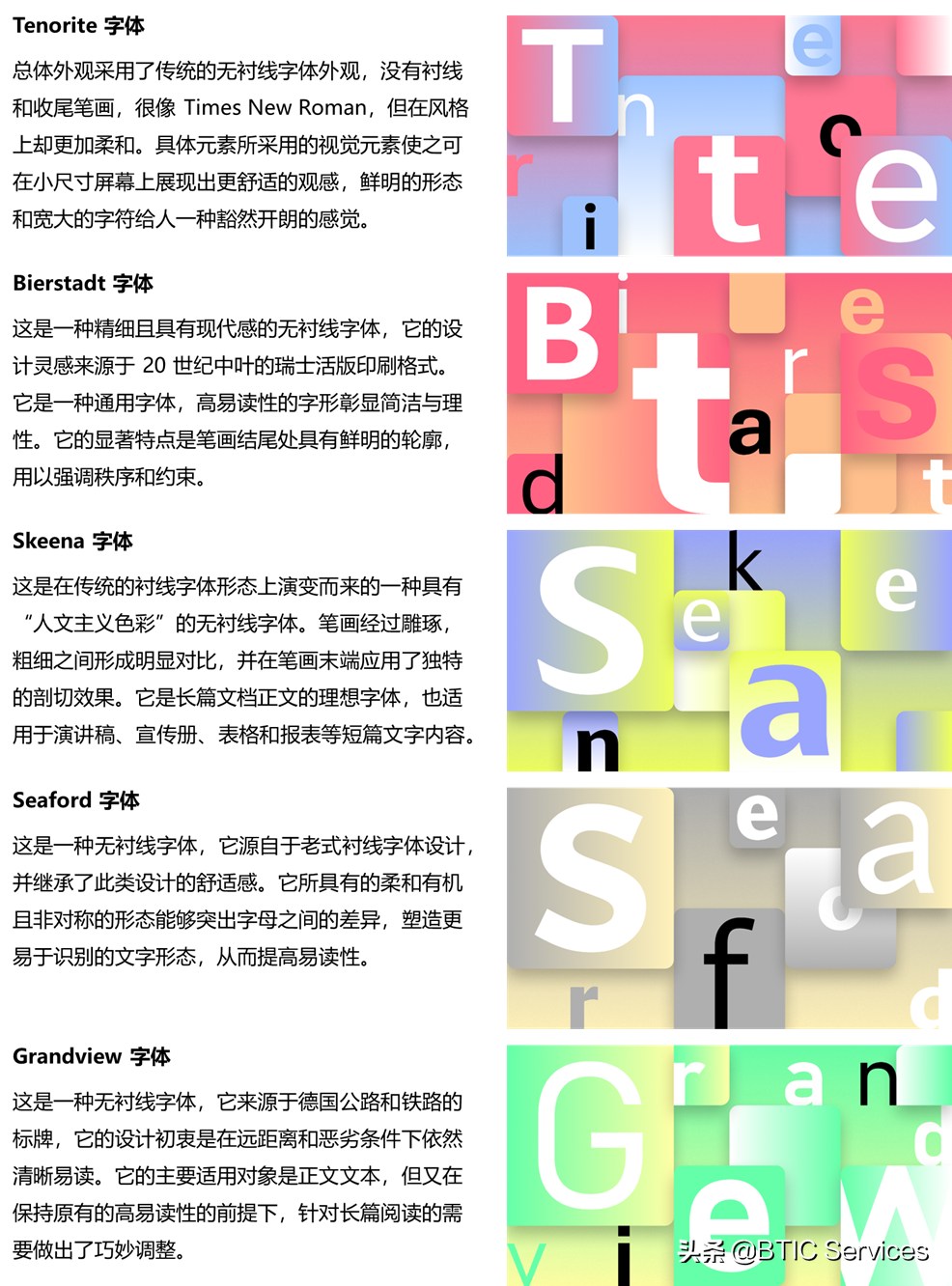
It is worth mentioning that when you are in the Office application When you open the "Fonts" option in the program, you will find that some fonts are marked with the "Cloud Download" icon. What's happening here?
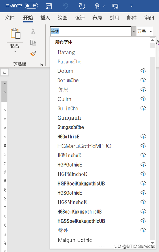
These fonts are hosted in the cloud by Microsoft Office Fonts, which appear in the latest versions of Office applications. The reason why they are called cloud fonts is that they are not downloaded and installed to the local computer by default, only when you need to use them, they will be downloaded and installed.
This means, you use cloud fonts to create The document will also be presented as it is on other people's computers, without the need to embed cloud fonts as special fonts into the document, which provides a wide range of font availability guarantees for the fidelity of shared documents.
Text is not only a carrier of information transmission, but also a A special graphic symbol, which plays a role in the transmission of visual experience in the process of information transmission through the visible form of fonts.
Therefore, choosing the right font is a good way to write The first step of an article, and efficiently applying it to your written content is also an indispensable skill in knowledge creation.
If you have any ideas after reading, come to the comment area to communicate together. Originality is not easy, don’t forget to like it!
This article was originally published by BTIC Services.
Articles are uploaded by users and are for non-commercial browsing only. Posted by: Lomu, please indicate the source: https://www.daogebangong.com/en/articles/detail/Seeing%20characters%20like%20people%20notes%20on%20document%20font%20standardization.html

 支付宝扫一扫
评论列表(196条)
测试