Editor: Green Onion Author: Wang Mengqi I am a designer
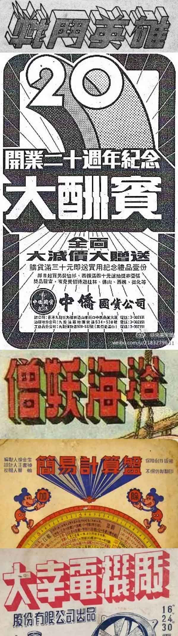
Some time ago, I intensively read a lot of cases about the artistic characters of the Republic of China. The more I read, the more I felt guilty. I found that although we have already started to design such artistic fonts with computers, with the assistance of many tools, the alignment and cutting effect is very good. It looks like a very advanced tool. However, compared with 70 or 80 years ago, the font design industry does not seem to have particularly developed.
For example, three-dimensional characters, in fact, most designers can't draw them now, and they can't even use computers to make them. However, we have seen many such cases in the Republic of China, and there are even many three-dimensional effect characters at present, which basically refer to a continuation and improvement of that period.
Seeing this, many students may have fallen into self-doubting meditation.

Even the many, many fonts on our current computers are inspired by some artistic characters in the Republic of China period, but there are still many cases that have not been "utilized", so in this issue we use five cases to demonstrate how to To learn from the reference, and then complete your own work.
There are many cases of artistic characters. First of all, if you have more font design needs, my suggestion is to organize them into a relatively large material library, which of course requires a collection process.
Some people raised their hands to ask, won't you give it? do not give.
Let's look at the first case. The first step is of course to find the reference direction you want.
The character of this glyph is very strong.
The first is horizontal thickness and vertical thinness, which is a ratio of thickness that we hardly see.
The second is the change of abandonment.
The third is the special handling of points.
The fourth is the rounded corners of the mouth.

Then after determining the thickness change and stroke characteristics, we need to use these strokes in the topic we are going to do.

Although the features of the characters are many and fancy, it is still very important to handle the details well.

I tried to make the strokes of several parts as uniform as possible. Let's take a look at the details.
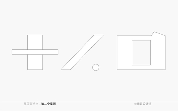
Let's look at the second case, first find the reference direction.
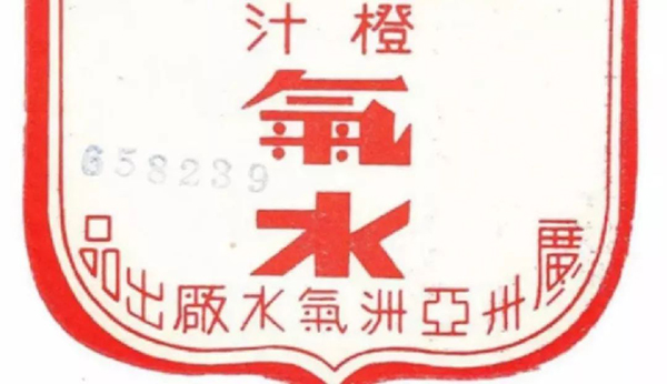
The characteristic of this glyph is also very good. Although when we look closely, we will feel that the processing of its basic strokes is not so completely unified, but it is the category of artistic characters after all, and the overall characteristics can be unified.
Let's extract the strokes and pick out the parts that you think stand out.
After we pick out the features, we will find that some features are not enough, so we need to create again in this glyph, not limited to reference.
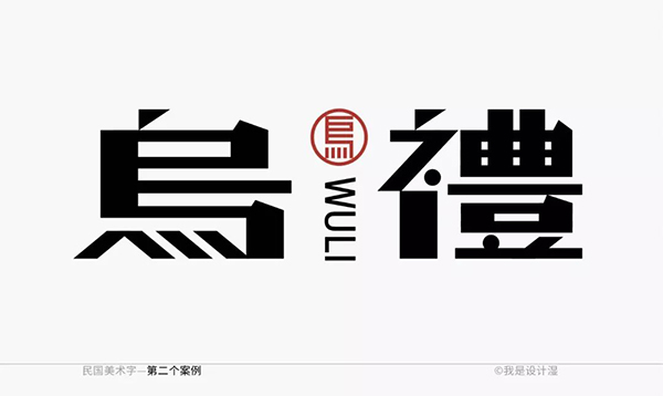
Check details such as alignment or even distribution of strokes with standard drafting.

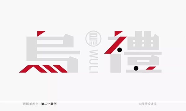
Look at the specific details, mainly from several characteristics.
In the third case, I found quite a lot of reference directions in this group. You may often see this type of glyphs, but you may not have used them.

Undoubtedly, the feature of this character is mainly derived from the change of the crisp point, and even the features of other parts can be ignored.
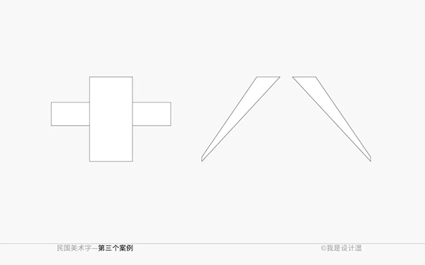
It should be noted that the feature of scribbling and swiping not only comes from the transition of thickness, but also its overall thickness is less than half of that of the vertical pen.
Of course, in order to improve the features, I still added some features by myself, and the layout rhythm of the overall presentation is more flexible.

The meaning of the reference line here is mainly to remind that the word spacing should adapt to the blank area, rather than being completely equal.
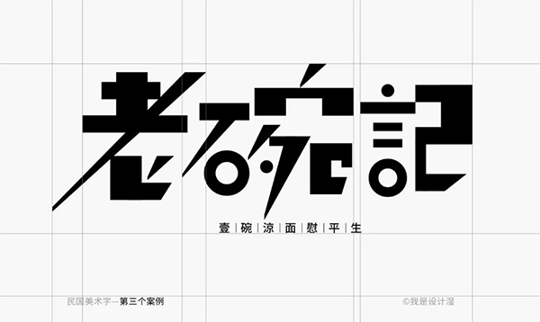
Take a look at the specific details.

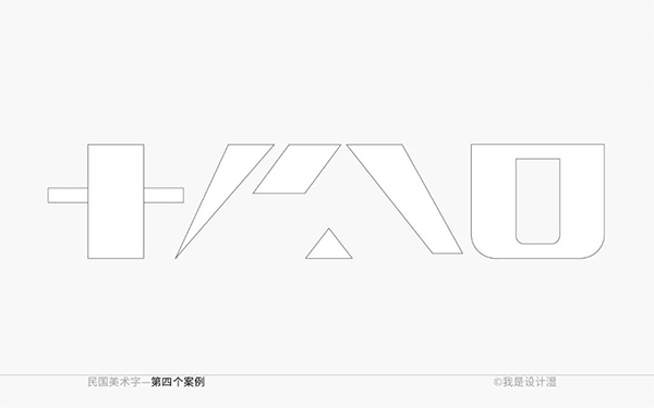
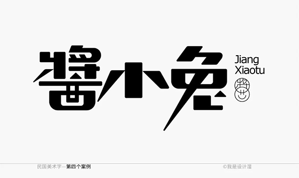
In the fourth case, the characteristics of this group of words mainly come from the use of triangles. The degree of difficulty is relatively good, and it is not applicable to all questions, and more details need to be considered.
Then my title is "Little Rabbit with Sauce", so I definitely can't make it so tough. Even if I add a triangle, I plan to give it a certain rounded corner, or make the whole more rounded.
Take a look at the final effect.
In the last part, I added rounded corners. In order to adapt to the feeling of this topic, it should not be as sharp as before.
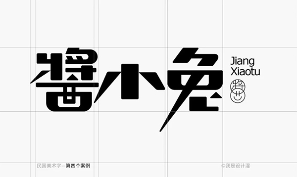
Take a look at the specific details.

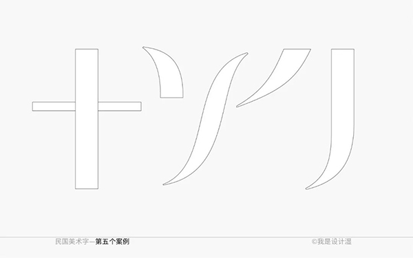
In the fifth case, I found a feeling with a little curve. After all, the previous demonstration was tough, so I changed the taste.
See reference.
Let's summarize the basic strokes first, especially for some relatively complex characters, the basic strokes mean that the foundation is unified, and there will be no particularly large mistakes.
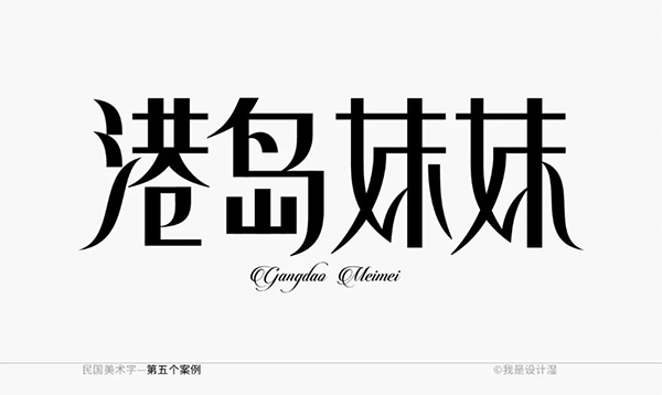
Take a look at the final effect. I matched it with an English with a very strong sense of curve, which fits the title on the one hand and Chinese on the other.
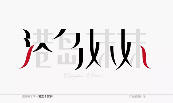
Specification details, once again, even if this reference line is not for showing to customers most of the time, try to draw it as much as possible. Many irregular details may not be noticed before the reference line is drawn, and it is often easy to ignore.

The following are the specific details.
So this is the end of our content for this issue. I hope that you who have exhausted your inspiration will reopen your mind and learn to use references to start your own new creations.
Articles are uploaded by users and are for non-commercial browsing only. Posted by: Lomu, please indicate the source: https://www.daogebangong.com/en/articles/detail/Running%20out%20of%20inspiration%20Teach%20you%20to%20reuse%20the%20art%20characters%20of%20the%20Republic%20of%20China.html
 支付宝扫一扫
评论列表(196条)
测试