Editor: chopped green onion
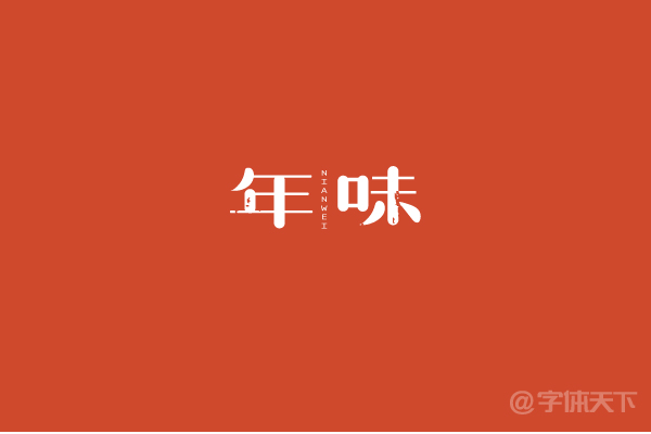
It is said that Song typeface is the most difficult to make. How to do this kind of Song typeface that does not follow the convention. After going out these days, the taste of the new year is gradually getting stronger. The green onion uses Song typeface as the medium, and the taste of the year is the theme. Share some ideas with everyone.
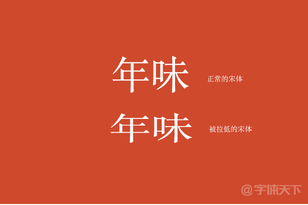
Step 1. Enter a basic Arial or other favorite Arial as a reference, and place the bottom of the layer to lock. What I want to do here is a font with a relatively low weight, so I deliberately lowered the Arial.
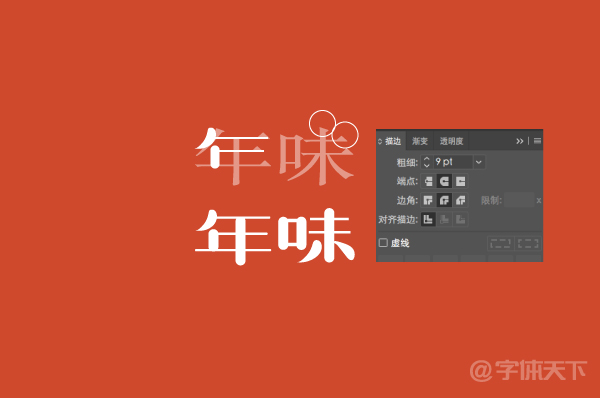
Step 2. Use the pen tool to outline the basic strokes of the font. Here we need to make some changes in the strokes. Round and thick. All horizontal strokes use pen strokes set to 2 pixels in thickness, and the endpoints are changed to dots, and the trouser legs are deleted, leaving only a horizontal line, so that the font looks more concise.
The strokes of all vertical strokes are set to 9 pixels, and the values here are relative. The same strokes are copied directly, and the parts of different lengths are obtained by adjusting the nodes. It also removes the small trouser legs of the basic Song typeface, and only keeps a long straight line.
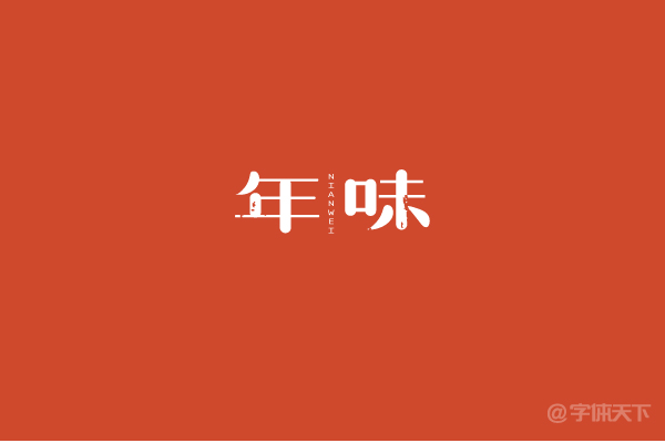
What is a small trouser leg? The green onion has been marked in the picture. It is the so-called serif in English fonts, a triangle decoration.
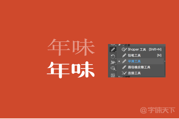
Step 3. The word "taste" is also drawn in the same way. The big change is the left and right strokes below. Here you can use a pen to hook or a pencil. At the beginning, the drawing is not so round. It's much easier to use the smooth tool in Pencil.
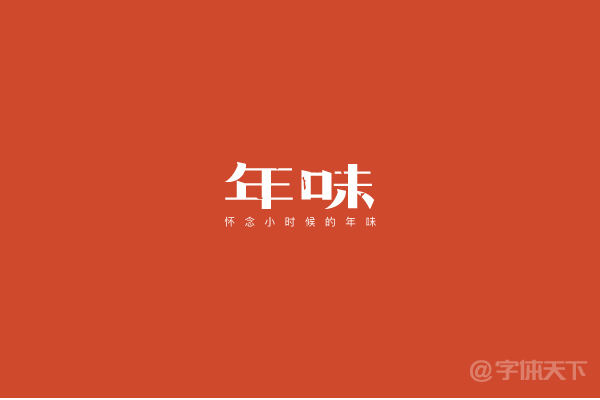
Step 4. After the appearance of the font is ready, the same routine, add an English to do the typesetting, and finally find a mottled material to paste on the font, just a little bit here, more On the contrary, it is more chaotic first.
Step 5. To do this, the green onion wants to extend it a bit, change the shape of the font, and make the font a little harder. The method is actually very simple. First, stroke all the horizontal and vertical lines Change the endpoints to right angles, and then sketch the glimpse of the character "Nian", and the left and right of the character "Wei". As shown in the picture:
Articles are uploaded by users and are for non-commercial browsing only. Posted by: Lomu, please indicate the source: https://www.daogebangong.com/en/articles/detail/Retro%20Song%20typeface%20design%20%20taste%20of%20the%20year.html
 支付宝扫一扫
评论列表(196条)
测试