Ou, Yan, Liu, Zhao four-body structure and brushwork
Regular script also has a variety of calligraphy styles, such as "Cuan Longyan" and "Cuan Baozi" with unique style of writing, square and strong like "Shi Ping Gong", and elegant and elegant like "Zheng Wen Gong Monument". , there are also beautiful and elegant ones like "Longzang Temple Stele", and there are also vigorous and vigorous ones like "Zhang Menglong Stele". However, among the various regular script styles, there seems to be a sequence in terms of the learning process. The basis for this sequential division is that those calligraphy-style works are more suitable for practicing basic skills and laying the foundation; those inscriptions are more suitable for reference and creation, and have more artistic appeal. This is indeed a distinction to be made. Therefore, it is not unreasonable to use the Ou, Yan, Liu, and Zhao calligraphy styles formed in history as a model for writing regular script and practicing basic skills. The Tang Dynasty was the heyday of regular script, known for its strict laws and regulations, and there is a saying that "Tang upholds the law". Ou, Yan, and Liu are all famous calligraphers in the Tang Dynasty, and they are the representative calligraphers of Tang Kai. Although their styles of regular script are different and have their own characteristics, they are all out of the rules and strict in law. They are suitable for beginners to learn basic skills. Study the method, practice the structure and brushwork. Zhao Mengfu was a master in the Yuan Dynasty. His calligraphy learned from the Jin and Tang Dynasties. The structure is compact and peaceful, and the style is beautiful, which is very popular among people. Therefore, beginners of calligraphy can choose to learn first. Now we will introduce their regular script features and how to write them.
(1) Ouyang Xun
Ouyang Xun (557-641 A.D.) was a famous regular script writer in the early Tang Dynasty. "Old Tang Book" said: "Xun first learned Wang Xizhi's book, and then gradually changed his style. A role model." He also taught calligraphy in the Imperial Academy and served as the crown prince Shugeng, so he is called Ouyang Shugeng, a bachelor of Hongwenguan, and was granted the male title of Bohai County. Ou Shu is thin and tough, with strict laws and strong writing skills. He has the reputation of "a diamond with angry eyes, a powerful man with fists". But there are also people who criticize and say: "It hurts the elegance", this is because the body is tight, the bones are strong, and it lacks a natural and elegant atmosphere.
His regular script includes "Huangfu's Birthday Stele", "Huadu Temple Stele", "Jiucheng Palace Liquan Inscription", "Yu Gonggong Wen Yanbo Stele" and so on.
1. European word structure
Ou Shu's body is vertical and long, and the stippling arrangement is strict. A little improper writing will either lose the echo between the stippling and painting, or destroy the overall square balance, and even affect the stability of the center of gravity. Such as "Gong", "Kang", and "Xia" (Figure 48). The cover of European characters is often tight on the left and right on the right, but it is just right; if it is slightly extended when writing, it will destroy the tightness of the structure. The word "Kang" has a left-right structure. In order to change the flatness and rigidity, the Ou word changes the radian of the throwing hook and slant it down; but when it is written too much, the structure will fall apart. The word "下" is a little lower, and it is close to the right angle of the horizontal and vertical lines; if it is moved downward, the structure will be scattered and the center of gravity will not be stable.

The structural up-down and left-right ratios are improperly placed, which also destroys the structure of the European characters. Such as "zheng (zheng)", "zhu", "drink (drink)" and other characters (Figure 49). The side of the mountain of the character "zheng" is short, and the main body of the character "strength" is long, so it has to be on top. If the writing is flat, the characters will be scattered and lifeless. The character "Zhu" next to "Wang" and the character "Zhu" can both be written in a rectangular shape, with five horizontal strokes plus left and right left and right strokes. The arrangement is both scattered and basically consistent. If the size of the two characters is very different, and the distance between the left and the right is widened, it will cause structural errors, lack of connection with each other, and become two characters. The character "drink" has a left-right symmetrical structure, but the strokes of the character "owe" intersect with oblique lines. In order to make the writing changeable and uneven, Ouyang Xun wrote the first stroke and the character "人" in a regular triangle, leaving its center empty. If the word "ow" is written upwards, the whole structure will not be stable.
The upper and lower structures are composed of upper and lower parts, such as "Su", "Rail", and "Cloud (cloud)" (Figure 50). The word "日" above the word "Su" accounts for one-third, and the vertical painting of the character "Tu" is directly in the middle of the character "日" on the top, which is the center line of the character. Left left and bottom long, to stabilize the center of gravity, appear thin and straight. When writing, if the proportion of the two parts is not appropriate, and the upper and lower "days" are written as large, the center of gravity will not be very stable, top-heavy, and lose the "dangerous" characteristics of Ou Shu. The upper half of the character "沟" accounts for two-thirds, and the upper part is dense on the left and sparse on the right, so the vertical stroke of the lower "土" character is on the right, and the upper part of the character "You" is written with a vertical oblique stroke to the right, leaving the center to make the vertical stroke of the earth character. The pen is inserted to form a tight structure with left and right balance and up and down connection. The character "cloud" intentionally raises the second short vertical stroke to the same height as the first short horizontal stroke, shortening the space of the treasure cover, forming up-and-down symmetry, and writing the four points of the word "rain" and the two horizontal strokes of the word "cloud" vertically The central palace is formed tightly, and the upper and lower sides echo each other symmetrically.

There are two basic forms of writing the three dots of water in the European character, such as the radical of the word "池" and "流 (jian)". One is like the character "池", the three points are thick and compact, the thickness and length are basically the same, the upper two points are down, and the third point is up, forming a triangular shape. The other is like the word "Jian", written with three dots of water, one and three dots form two triangles up and down to echo the situation anyway, and there is a downward short stroke in the middle, connecting the upper and lower dots. However, the shape and posture of the three dots of water in the European character vary from character to character. For example, the shape, position, and posture of the three dots of water in the Chinese character "Man" are determined by the avoidance relationship, which is slightly different from the character "Jian". . (Figure 51)

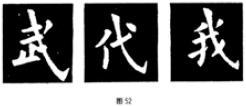
The wording of the European word "Ge" is very characteristic. Since the Ou character is a vertically long rectangular shape, he often writes the characters with the character "Ge" in a regular triangle structure, such as "Wu", "Dai", "Wo", etc., starting with the vertical and oblique strokes of the character "Ge". It is the starting point of the upper corner of the triangle. The horizontal drawing is short, the upper part is tightened, and the lower part is released, so the lower part of the vertical pen extends beyond the dotted line of the regular triangle. If you don't grasp this feature, you won't be able to write the "Ge" method of European characters well. (Figure 52)
So, what aspects should we pay attention to when writing the European word structure?
One is to pay attention to the structure of the European characters. Generally speaking, the European style structure is vertical, but it also depends on the natural posture of the font, such as "zhi", "ren", and "shen" (Figure 53), all because the characters themselves are naturally horizontal, For example, in the handling of the throwing hook of the word "Shen", the lower part is written short and obliquely, so that the vertical pen of the throwing hook is slanted inward, and then the pen tip is changed to extend outward and then change the pen tip to hook out. When hooked out, there is no emphasis on setbacks like other book styles. Therefore, when writing, we must first observe the style characteristics of European characters.

The second is to pay attention to the surrounding space of each stroke, that is, the length, oblique curvature, horizontal and vertical strokes and the position of each stroke in the whole character. Each stroke is only one of many strokes, and it must be related to other strokes, so we must pay attention to it when writing.
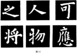
The third is to pay attention to the main pen in each word. For any character with more than two strokes, one stroke is always the main stroke. The main stroke is an important stroke in a character, which plays a major role in the structure, just like the beams in the structure of a house. Its length, inclination, and thickness are all determined according to other strokes; conversely, it also affects the shape of other strokes. Length, Slope and Thickness. Such as "zhi", the main stroke is the next horizontal long stroke, the long stroke of the word "person" is the stroke, and the vertical stroke of the word "ke" is the stroke. Complex characters often have two main characters. For example, in the word "wu", the vertical pen next to "ox" is the main pen, and the half-frame of the word "wu" is the main pen. For example, in the character "江(江)", the vertical drawing of "爿" is the main stroke, and the horizontal stroke of "寽" is the main stroke. In the word "ying (ying)", the pen of the character "Guang" is the main pen, and the horizontal hook of the character "Xin" is the main pen. If you write the main pen well, you can grasp the main strokes and air in the frame of the characters. (Figure 54)
2. European calligraphy
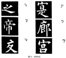
(1) How to write points. There are many ways to dot the European characters, and the dots are determined according to the natural structure of the characters.
The central point of the prefix, such as "Zhi", "寔", "Emperor", "Long", "Jiao", "Gong". (Figure 55)
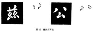
Zeng Tou Dian is called by borrowing the first two dots of Zeng, such as "Gai", "Jian", "Zi" and "Gong" (Figure 56). Because the natural structure of each character is different, the styles of the above two points are also different, and the writing methods are also different.

Beside three points of water, such as "chi", "Han (Han)", "flow" and other characters. (Figure 57)

For the writing of the next four points, each point has a different posture, basically the left and right points should echo. (Figure 58)

(2) Horizontal writing. The horizontal strokes of the main pen, such as the horizontal strokes of "ke", "yes" and other characters (Fig. 59), after entering the pen against the front, go down and pause for a while, then go to the right. , Willow word setbacks are light.

For non-main pen horizontal strokes, use the center to enter smoothly, with thin and hard strokes, or close the strokes from thinner to thicker from the left. For example, the short horizontal painting of "墨", the first short horizontal painting of "孤", the horizontal painting of "Fu" and so on. (Figure 60)

The third type of horizontal painting is a turning pen that turns into a vertical pen when the pen is closed. This kind of horizontal drawing has thin lines, while the turning pen and vertical drawing are thick, such as "Ze (Ze)", "Hundred" and other characters. (Figure 61)

(3) Vertical writing. The vertical lines of European characters are thicker than the horizontal lines, and the horizontal lines are lighter and the vertical lines are heavier. There are the following situations:
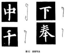
The first way of writing the central vertical painting. The reverse stroke goes up and to the right, and then the stroke goes down, and when the brush is retracted, it pauses and lifts to the right, forming a so-called drooping shape, such as the vertical painting of the characters "middle" and "down"; the other is to pause and return to the front when retracting the stroke , into a vertical needle shape, such as the characters "Qian" and "Feng".
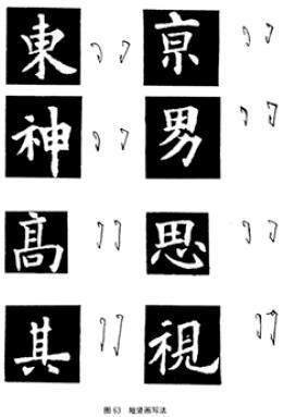
The second type of short vertical painting with a folding pen with horizontal strokes can also be divided into two types: one is short vertical strokes, the left side is short and straight, and the bottom is harvested in the shape of a vertical needle, and the top is thin (Figure 62)
The bottom is thick or the top is thick and the bottom is thin, and the short right is drawn as a right-handed pen, such as "Dong (East)", "Jing", "God", and "Nan". The other is the middle vertical painting, or the writing method similar to the short vertical painting, or the writing method similar to the central vertical painting, such as "gao", "si", which is similar to the short vertical painting; Center vertical painting. (Figure 63)
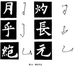
(4) How to write the hook. Ou Shu's hooks are short and sharp, and some of them only express their meaning; the right hook is turned into an upturned shape, and the thrown hook is turned into a pressed shape according to the situation. These are the characteristics of Oushu. Such as "month", "zhuo", "hu", "long (long)", "jue (jue)", "yuan" and other characters, the posture of the hook is different. (Figure 64)
(5) Left-handed and left-handed writing. Due to the different positions of the characters, there are differences in weight, thickness, length, and length. Such as "Yong", "I", "Spring", "Xia" and other words. (Figure 65)

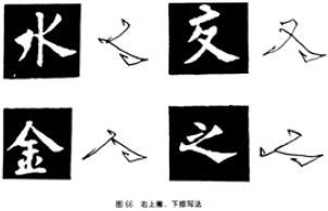
(6) The writing method of right upper left and right lower right. It also has different forms because of different positions in the word. Such as "water", "pay", "gold", "zhi" and so on. (Figure 66)
Memorize the structure and brushwork characteristics of European-style stippling, and write it repeatedly, and then write the full text of "Jiucheng Palace" in sections.
(2) Yan Zhenqing
Yan Zhenqing (709-785 A.D.) was a calligrapher in the mid-Tang Dynasty. He was appointed as Minister of the Ministry of Officials and Grand Master of the Prince. He was honest and honest all his life, and was repeatedly demoted. He first raised the flag of righteousness in the opposition to the "Anshi Rebellion", which had a wide influence. Later, he was sent by the imperial court to appease the rebel general Li Xilie, who was unyielding and was hanged in Longxing Temple, Hebei. He is a very creative and famous calligrapher. He changed the "two kings"'s flattering Reuben calligraphy style and created a style that reflects the majesty and majesty of the prosperous Tang Dynasty. It is light horizontally and heavy vertically, with silkworm head and swallow tail, full of the characteristics of the times. There are more than 60 pieces of his works survived, and more than 20 pieces of regular script works. The main ones are "Duobao Pagoda Stele", "Dongfang Shuo Painting Praise Stele", "Xianyushi's Lidui Story", "Ode to Zhongxing", "Baguanzhai", "Magu Fairy Altar", "Yan Qinli Stele", "Yan Family Temple Monument, etc.
"Duobao Pagoda Stele" is the earliest surviving inscription of the Yan family. It can be seen that influenced by the style of the Sui stele, the brushwork is vigorous and rich, with square brushes as the main part and round brushes as well. There is a method, and strive to be even and square. It is suitable for those who are new to Yanshu to practice structural brushwork.
1. Color structure
Yan Shu generally said that the knot tends to be horizontal, which is the opposite of the European word. Especially in Yan Zhenqing's later works, the posture has a sense of outward expansion, showing its grace. Even though the characters in "Duobao Pagoda Stele" are naturally formed vertically, they are written in a square manner as much as possible, and there is also a sense of tension in the horizontal direction, although generally speaking they are square. Judging from the part of "Duobao Pagoda Stele" (Fig. 67), it has the following characteristics: first, the structure is square and horizontal; The echo is very decent; the third is that the setbacks are clear and meticulous; the fourth is that the rules and layout are dense, and the distance between lines and characters is not much different.
The font of this post shows that several parts are tightly combined, such as left and right, up and down, relying on, interspersing, and echoing each other, and each has its own place.
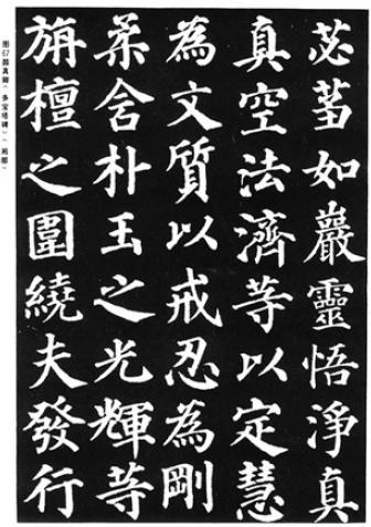
The radicals and the main body are closely tied. Such as "Cheng", "浍(浍)", "猎", "龙(龙)" and other characters (Figure 68). The ending strokes of the strokes, short horizontal strokes, and right strokes next to the character "He" of "Cheng" are all close to the "Cheng" character, while the starting strokes on the left side stretch to the left space, and the horizontal strokes at the end of the character "Cheng" are close to the "Cheng" character. Go deep into the lower space of "He". Relying on and extending each other makes the two parts form a tight structure. The three dots of the character "浍" and the two dots above the water are close to the left-handed upper part of the herringbone, and the two horizontal strokes of the "Dragon" are close to the right, forming a close structure of left and right. If it is not written properly, the structure will fall apart. In the left and right knots of this post, you can find this kind of connection point through careful observation. Pay special attention to this interlude when writing.

The three-body structure of the left, middle and right also pays great attention to avoiding, interspersing, and tightly knitting. Such as "tree (tree)", "sign (sign)" and other characters (Figure 69). The last short horizontal stroke in the middle part of the character "tree" is inserted into the lower part of the character "wood" on the left, and the pen and lower hook of the horizontal stroke of the character "inch" echo each other with the middle character "mouth" and the horizontal stroke below, so that the three parts are closely linked together. In order to avoid the left side of the "Wen" character, the "Shan" character in the middle of the "Zheng" character is written obliquely, with the left side next to the two people, and the right side gives way to the "Wen" character, which is written upwards and interspersed in the middle.

The upper and lower combination structure is also very tight. For example, "meng (dream)", "tong", "shuo (早)", and "luo" (Figure 70), it is to form a tight whole through different methods. The word "Meng" and the character "Si" are written very closely together, and the slant point of the character "Xi" is at the center of gravity. Although the slant is very long, the center of gravity is stable and the structure is rigorous. The character "Li" of the character "Tong" is drawn vertically, which strengthens the close connection with the character "Li" above. The word "早" inserts the word "ear" into the side of the double character "cong" and the middle of the brush, turning the two parts into a whole. The three parts of the cursive initials of "Luo", three dots of water, and "each" are avoided and interspersed to form a compact body.

The structure of the brush for Yan character "Zou" is very distinctive. There are two points on it. The character "Le" is small, and the brush is long and heavy. Such as "lian (lotus)", "you (you)", "dao", "sui" and other words. (Figure 71)

The "Ge" method of Yan characters is not as distinctive as that of Ou characters. The structure is relatively ordinary, and the basic writing methods are the same, but the length and slope are different. Its structure is also triangular. Such as "feeling", "style", "mie (mie)", "I" and other words (Figure 72). But some (such as the characters of the three-body juxtaposition structure) do not present a triangular structure, such as the word "knowledge (knowledge)" and so on. The structure of the word "Ge" in the European character also forms a triangle in the whole character, but the upper angle is sharper, so it is vertically long. In the Gefa of Yanzi "Duobao Pagoda Stele", the bottom line of the triangle has a large angle, which is closer to an equilateral triangle.

When writing Yanzi "Duobao Pagoda Stele", what should we pay attention to in terms of structure?
First, we should pay attention to the characteristic that the font structure of "Duobao Pagoda Stele" is square and tends to be horizontal. When writing, have a general concept of the overall character, observe the stippling arrangement of the characters, and see which points and strokes are arranged to have such a sense of squareness. That is to grasp the structural characteristics of the characters in this post as a whole. Such as "Beijing", "West", "Water", "Su" and other words. The first horizontal stroke of the "Jing" character and the two points of the lower part of the "Xiao" character are drawn with lines to form a rectangle. The first drawing of the word "West" draws two points of the closing brush and the bottom of the word "Four" draws two points of the starting brush to form a flat square. The left and right left and right strokes of the word "water" extend up and down to the height of the vertical strokes, forming a square. The starting point of the vertical pen of the treasure cover of the word "Su" and the starting point of the hook draw a line downwards to the side of the person to close the pen, and the right vertical pen of the word "Hundred" is also rectangular. (Figure 73)

Second, pay attention to the position of the stippling in the overall character. The length and straightness of each point of painting must be determined according to the surrounding strokes, just like the parts of a machine, if they do not meet the proportion specifications, they will not fit in, and will be out of balance in the whole character.
Third, pay attention to the writing characteristics of each stippling. Brushwork and structure are inseparable. For example, the posture of stippling will affect the structure of characters. Such as "hand", "flat" and other words. The horizontal strokes of the word "hand" are light on the left and heavy on the right, long on the left and short on the right. The balance is only supported by the heavy pause of the third stroke on the right, otherwise it will fall to one side. The second horizontal stroke of the character "Ping" is the main stroke, which is long on the left and short on the right, and the balance is achieved by the frustrating strokes. (Figure 74)
2. Color and calligraphy
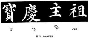
(1) How to write points. The dots of Yan characters "Duobao Pagoda Stele" are not as varied as those of Ou characters. However, due to the different positions of the dots in the characters and the different natural structures, the writing method also changes. The center point of the prefix. For characters with long knots, the center point of the beginning of the characters is close to the horizontal stroke, and the posture may be left or right, such as "Bao" (Bao)", "Qing (Qing)" and other characters; the thickness depends on the number of strokes in the font Depending on the situation, the strokes at the center of a character with many strokes are lighter and thinner, while the strokes of a character with fewer strokes are thicker and heavier. In a font with a flat structure, the center point is separated from the horizontal stroke, and the position is higher. Such as "zhu", "zu" and other characters. (Figure 75)

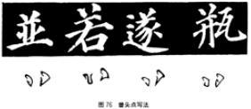
Zeng nodded. The Zengtou dots in this post are generally left-handed and right-handed, forming a pitching trend, or left-handed and right-handed, but the thickness of the stippling is also different from character to character. Such as "and (and)", "ruo", "sui", "bottle" and other characters, using various forms of writing. (Figure 76)
Third, pay attention to the writing characteristics of each stippling. Brushwork and structure are inseparable. For example, the posture of stippling will affect the structure of characters. Such as "hand", "flat" and other words. The horizontal strokes of the word "hand" are light on the left and heavy on the right, long on the left and short on the right. The balance is only supported by the heavy pause of the third stroke on the right, otherwise it will fall to one side. The second horizontal stroke of the character "Ping" is the main stroke, which is long on the left and short on the right, and the balance is achieved by the frustrating strokes. (Figure 74)
2. Color and calligraphy
(1) How to write points. The dots of Yan characters "Duobao Pagoda Stele" are not as varied as those of Ou characters. However, due to the different positions of the dots in the characters and the different natural structures, the writing method also changes. The center point of the prefix. For characters with long knots, the center point of the beginning of the characters is close to the horizontal stroke, and the posture may be left or right, such as "Bao" (Bao)", "Qing (Qing)" and other characters; the thickness depends on the number of strokes in the font Depending on the situation, the strokes at the center of a character with many strokes are lighter and thinner, while the strokes of a character with fewer strokes are thicker and heavier. In a font with a flat structure, the center point is separated from the horizontal stroke, and the position is higher. Such as "zhu", "zu" and other characters. (Figure 75)
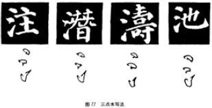
Three o'clock water. There are no more changes in the brushwork of the three dots beside the water in "Duobao Pagoda Stele". In terms of posture, the upper two dots are in a downward position, the second dot is forward with a thread, and the third dot is raised upward. It's just that the position of the font is different, and the weight is also different. Such as "note", "potential (potential)", "Tao (Tao)", "pool" and other words. (Figure 77)
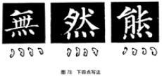
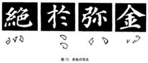
Next four o'clock. It is a deformation of the word "heart". The lower four points of "Duobao Pagoda Stele", each character has a change of posture, the general trend between the four points is a centripetal posture, the lower part of the left and right two points is outward, and there is a relationship between the four points and the back. Such as "no (none)", "ran", "bear" and other words. (Fig. 78) From the writing methods of the above various points, we can basically grasp the writing method of the points in "Duobao Pagoda Stele". Although the dots have different shapes in various positions, the writing is generally the same. Such as "jue (jue)", "yu", "mi", "gold" and other words. (Figure 79)
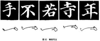
(2) Horizontal writing. The horizontal strokes of "Duobao Pagoda Stele" are generally relatively thin, with low left and high right strokes, the main stroke of horizontal strokes ends heavily, and the starting strokes are either against the front or along the front, slightly heavier at the beginning, and thinner in the middle. For example, even the horizontal strokes of the vertical pens are relatively slender.
The horizontal strokes of the main pen, such as the long horizontal stroke of "Hand", the horizontal stroke of "No", the second horizontal stroke of "Ruo", the third horizontal stroke of "Temple", and the long horizontal stroke of "Nian", etc. There are some differences, but basically they can be divided into two categories: one is to start the pen smoothly, and the end of the pen is heavy; Other horizontal and short brush methods are also roughly the same. (Figure 80)
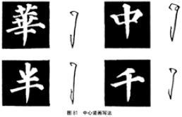
(3) The writing method of vertical painting. Generally speaking, vertical paintings are thicker and heavier than horizontal paintings. The central vertical paintings are in the shape of vertical needles, the side vertical paintings are in the shape of hanging, and the turning points are square folds. There are two types of vertical painting with a hook: one is to start the pen backwards and suddenly set back, descend vertically or slightly inwardly, pause to the left when closing the pen, and then lift it up suddenly to pick the hook. The second is in an arc shape. When starting the pen, it goes backwards to the left, pauses for a while, and then arcs down to the right. The pause when closing the pen has the meaning of picking out. All kinds of vertical paintings show strong brushwork, with a sense of penetrating three-thirds.
Vertical painting in the center, such as "Hua (Hua)", "Zhong", "Half", "Thousand" and other characters. (Figure 81)
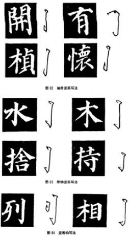
The vertical paintings on the side have a hanging shape, such as "kai (kai)", "you", "zhen (zhen)", "huai (huai)" and other words. (Figure 82)
Vertical paintings with hooks, such as "water", "wood", "she (she)", "hold" and other characters. (Figure 83)
(4) How to write the hook. The hooks of "Duobao Pagoda Stele" are all in the shape of a strong and long triangle, with a pointed edge, and the brush is clean and neat. Some only have a hook meaning, like a pen hanging down, or slightly sharp. The right hook starts the pen and pauses heavily, like a nail, and the tip of the pen is thin.
Vertical hooks, such as "column", "phase" and other words. (Figure 84)
Throw hook strokes, such as "Ye", "Zhao" and other characters. (Figure 85)

(5) Left upper and lower strokes. The upper left and lower left sides of "Duobao Pagoda Stele" are vigorous and thin, with softness in rigidity, just like flying arrows. Such as "water", "such as". The pen starts to falter, and the pen gradually becomes thinner and sharper. Only when the writing speed is a little faster, can the front be exposed. If the pen is stuck, you will not be able to write momentum. (Figure 86)

(6) Left-up and right-down strokes. Generally speaking, the left side is lighter and the right side is heavier when the pen is written in "Duobao Pagoda Stele". Therefore, the upper right pen is thicker and shorter, and the lower right pen is the pressing pen, which is the thickest and thickest stroke in the character. You must be very careful when you run the pen, and you must run it slowly. Most of the brush strokes are on the front, some have obvious pauses before the strike, and some are in the shape of dots but not on the front. Such as "Yong", "Xiang", "Zhi", "Huai (Huai)" and other words.
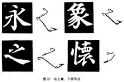
Before writing the full text, it is best to practice the stipple writing of the "Duobao Pagoda Stele" font, master the characteristics of the structure and strokes, and then enter the full text part of the temporary writing. (Figure 87)
(3) Liu Gongquan
Liu Gongquan (778-865 A.D.), with the character Chengxuan, was a famous calligrapher in the late Tang Dynasty, specializing in regular script. His calligraphy first learned from calligraphers in the early Tang Dynasty, and then from Yan Zhenqing. His regular script not only inherited the flattering attitude of the early Tang schools, but also absorbed Yan Zhenqing's majestic style, forming a characteristic "willow style", which is also called "Yan Jin Liu Gu" together with Yan Zhenqing. His regular script is strong and firm, with a tight structure, gathered in the center and stretched out on all sides. There are many inscriptions left by Liu Gongquan, among which "Mysterious Pagoda Stele" and "Shence Army Stele" are the most famous, which are good models for learning Liu style.
1. Willow structure
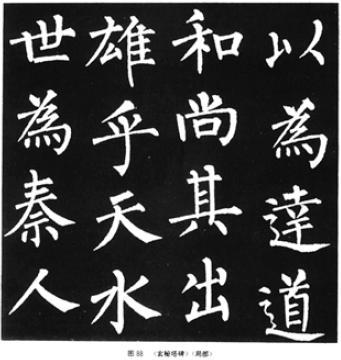
The structure of Liu characters, on the one hand, slightly changes the face and body to completely square body posture, and adopts the charm and interest of sideways and charming poses since the "two kings". The structure shows that the left side is tight and the right side is relaxed, and the right shoulder is slightly raised. high. On the other hand, it basically maintains the squareness of the structure, looks at people head-on, and absorbs the majestic momentum of the face and body. The arrangement of stippling in the central part of the knot is strict, highlighting the stretching of the strokes on the four sides. For example, when the strokes of horizontal and vertical strokes, strokes, and strokes are started and closed, the length is intentionally exceeded from time to time, and there are strokes that stretch left and short, or stretch right and short. . The thickness of the lines is relatively consistent, and there is no phenomenon of horizontal lightness and vertical heavyness of great disparity in thickness, which is to express the straight and vigorous characteristics of Liu Shu. The brush used for the lines is mainly a square brush with sharp edges, with a slightly rounded brushwork at the turning point. (Figure 88)
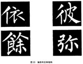
The structure of the radicals and the main part changed more. There are some characters that emphasize the radical but light the main body, such as "yi", "bi", "yu (yu)", and "mi" (Fig. 89), which intentionally emphasize the position and power of the radical.
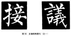
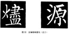
The radical and the main body are either high on the left and low on the right, or high on the right and low on the left, showing structural changes, such as "Jie", "Yi (Yi)", "Jin (Jin)", "Yuan" and so on. (Figure 90)
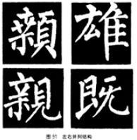
The characters with the juxtaposed structure of the left and right parts are closely related, and form a rigorously structured whole through the interspersed and echoed strokes. Such as "", "Xiong", "Qin (pro)", "Ji" and other words. (Figure 91)

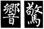
Characters composed of upper and lower structures are generally vertical, rectangular, echoing up and down, and closely related, such as "Huang", "Zhi", "Xing (ring)", "Jing (surprise)" and other characters. (Figure 92)
However, some Liu characters are not tight in structure, or too empty and scattered, such as the character "fu"; or too flat, such as the character "chao"; some are out of balance, such as the character "wai". When writing, be selective. (Figure 93)
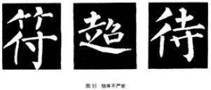
Generally speaking, when writing Liuzi "Mysterious Pagoda Stele", in terms of mastering the structure, you should pay attention to:
First, the font structure of "Mysterious Pagoda Stele" can be divided into three types. One is a vertical rectangular structure; the second is a horizontal flat square structure; the third is some special structures that are small and flat. When you are writing, you should have a big concept of the structure, and pay attention to the vertical and horizontal ratios. The horizontal and oblique, length and vertical of the stippling all change in this large ratio.
Second, when you are writing, you should pay attention to the characteristics of the willow character structure, which is tight in the middle and stretched on all sides, and you must see which strokes in the character exceed the proportional length, slope, and width of the whole character. This is what the willow character emphasizes. place.
Third, pay attention to some characters in the stele that are not coordinated with the structure and stippling. You don't need to copy them, or you don't have to copy them completely, and you can make some adjustments. For example, in the word "Explanation (Explanation)", the word "door" is too large, and the word "single" is too small. Another example is the character "Kuo", the whole character is tilted to the left, and the radical "扌" and the character "tongue" are also pulled apart. It is caused by vertical painting on the left and slanting to the right. (Figure 94)
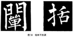
2. Willow strokes
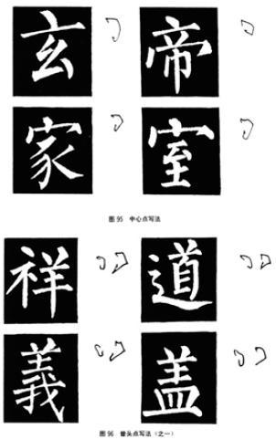
(1) How to write points. There are not many changes in the center point of Liu characters, which are similar. It can be divided into two categories: one is the oblique point, that is, the reverse stroke is inclined to the left, and the oblique to the right is paused, or the front is exposed, or the front is not exposed. Such as the characters "Xuan" and "Emperor"; the second is the vertical point. Because of the long structure of the characters, the vertical point is in the middle of the horizontal painting, that is, the stroke of the pen is reversed upward and then moved to the middle of the horizontal painting, and then retracted. Such as "home", "room" and other words. (Figure 95)
The two points at the beginning of Zeng are written in a left-handed and right-handed way, such as "Xiang", "Tao", "Yi (righteousness)", and "Gai"; Point homeopathic writing. (Figure 96)
Three o'clock writing next to water. There is no great change in the three dots of the willow character. The upper two dots are bent down, and the third dot is lifted up. ", "Sand", "Note" and other words. (Figure 97)
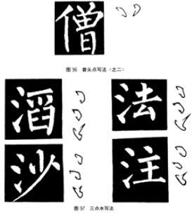

The next four points of writing. Generally, it corresponds to around four o'clock, the right side is larger, and the left side is smaller, and the fonts of all types are basically the same. Such as "no (none)", "obvious (shown)", "ran", "for (for)" and other words. (Figure 98)
(2) Horizontal writing. The horizontal strokes of the main stroke of the willow character are roughly the same, using reverse strokes, squatting down to form a square stroke, when moving to the right, the tip of the stroke is slightly raised, and the middle is slightly thinner, and then pressed down slightly before the right stroke is closed, and gradually increased to the stroke. When writing, first go up and then down to form a silkworm head-shaped square pen. Such as "square", "big", "Qi", "no (none)" and other words. (Figure 99)
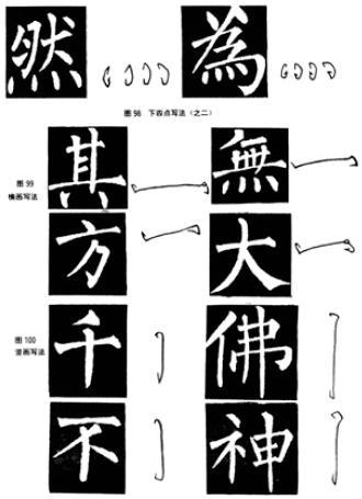
(3) Vertical writing. The vertical strokes of willow characters are mainly square strokes, with both ends bent to the left, and the closing strokes are also divided into two types: drooping and hanging needles. Such as "thousand", "Buddha", "no", "God" and other words. (Figure 100)
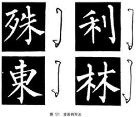
(4) How to write the hook. The writing style of the vertical hook. The hook of the willow character is very characteristic. When drawing vertically, squat down to close the pen and pick it with the tip of the pen to the left, like a thorn on a tree. Such as "special", "li", "dong (east)", "forest" and other words. (Figure 101)
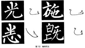
The spelling of hook throwing. The throwing hook of willow characters is similar to the horizontal writing of the vertical painting hook. When turning from vertical painting to horizontal painting through an arc to closing the pen, squat up the belly of the pen and pick it up into a pointed shape. Such as "Guang", "Shi", "Xi ()", "Ji" and other words. (Figure 102)
(5) Left upper and lower strokes. The pen is left up and the pen is reversed, squatting down and picking out quickly, as if riding a horse and whipping a whip. The willow characters are written upwards to the left, and the pen is straight and straight, with a square pen and no sharp edge. The left-hand pen is shaped like ivory, long and swift, powerful and elegant. Such as "water", "home", "teaching", "for (for)" and other words. (Figure 103)
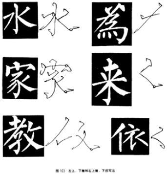
(6) Left-up and right-down strokes. The upright stroke of Liu character is like a bird turning over and leaping forward, but there are heavy and light pauses at the beginning of the pen. The willow-shaped brush is generally very heavy. After the stroke is reversed, the stroke is gradually pressed down, and it pauses before the brush is drawn out. . Or become a short stroke that does not leave the stroke, such as the word "Yi", the stroke becomes a tendency to retract to the left. (Figure 103)
(4) Zhao Mengfu
Zhao Mengfu (AD 1254-1322), courtesy name Ziang, nicknamed Songxue Taoist, was born in Huzhou (now Wuxing, Zhejiang Province). He was a famous calligrapher in Yuan Dynasty. . In history, there are few calligraphers like him who are good at all kinds of styles, especially Xingkai script, which is more profound and has its own unique style of calligraphy. He first learned the calligraphy of Siling, Emperor Gaozong of the Song Dynasty, and later pursued the calligraphy of various schools in the Jin and Tang Dynasties, and wrote the works of Wang Xizhi and Wang Xianzhi hundreds of times. His pen is round and smooth, full of posture, exquisite structure arrangement, elegant and elegant style, and he is very popular with later generations. He is considered "five hundred years, ten thousand miles vertically and horizontally, and he is unmatched." (Jiao Hongyu) Some people also say that he is "beautiful and delicate, and lacks the spirit of integrity." ("Calligraphy Elegant Words") But this kind of comment is not fair, mainly referring to the fact that he joined the Yuan Dynasty as an official descendant of the Song royal family. of.
"Danba Stele" is one of the masterpieces of Zhao Kaishu. It was written in the third year of Yuan Yanyou (1316 A.D.). And it is an ink book, you can clearly see his pen. The "Danba Stele" published by Cultural Relics Publishing House was cut and photocopied from the ink book collected by the Palace Museum. There are many works that he has survived, such as "Miaofa Lianhuajing" (small regular script), "Xuanmiao Temple Rebuilt Three Gates" (regular script), "Huzhou Miaoyan Temple", "Tao Te Ching" (small regular script) and so on.
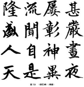
1. Zhao character structure
Judging from the structure characteristics of "Danba Stele", Zhao Shu can see that the whole body is in a horizontal position, the structure is flat, and the side is positioned, the right shoulder is raised, the left shoulder is low, the strokes are heavy, the structure is tight, and the arrangement of stippling is compact. Especially the upper part of the characters is tight, and the lower part of the strokes is stretched. (Fig. 104) The running pen has the running script style, the closing of the pen is not heavy, and the closing of the pen is fast, and some of them are drawn together.
(1) The parts of the radical and the main body are interspersed and closely echoed, giving a strong sense of the whole. Some even adopt shifting to avoid it. For example, the character "Zhe" originally has an up-and-down structure. In order to avoid more strokes in the upper part of the "Zhe" character and fewer strokes in the lower part of the "口" character, it was changed to a left-right structure, and the pick hand was extended to In the radical, the character "口" shifts to the right. Some move the left side upwards, such as the word "wow", and the word "mouth" to make the two parts close. Some strokes of the radicals are emphasized, and some strokes are reduced, such as the character "Lv", and the radical "彳" emphasizes the upper two strokes, turning the vertical strokes into vertical dots. Some deliberately distance the radicals, such as the three dots next to the word "Fa". (Figure 105)

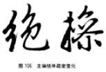
The main structure of Zhao’s radical adopts the running script style, and the relationship between the two parts may be sparse or close. For example, the character “Jue” is separated from the two parts for the momentum of running brushwork and stippling; the two parts of the character “Cao” are drawn very closely. This kind of combination of running script in regular script is only in Zhao Shu, so his regular script looks natural, straightforward and beautiful. (Figure 106)
For characters with a double-body structure juxtaposed on the left and right, the dots and paintings are interspersed with each other and avoided very closely, showing a rigorous structure, such as "number (number)", "cheek (頬)", "what", "jing (jing)" and so on. Among them, the character "Jing (Jing)" is a main and partial structure, but the main part is simplified to form a parallel structure after the strokes are simplified. (Figure 107)

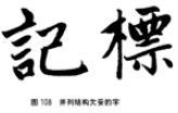
However, the stippling arrangement of some juxtaposed characters on this stele is not perfect, such as "ji (ji)", "mark (mark)" and other characters, the stippling arrangement is not strict. The relationship between the left and right sides, such as "yan" avoiding to the left, the arrangement of the second horizontal stroke and throwing hook of the character "ji" on the right is not appropriate; There should be a choice when writing. (Figure 108)
The three-body structure of Zhao characters is also very close, such as "言(言)", "招", "议(讗)", "Hui" and other characters. (Figure 109)

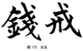
(2) The method of Zhao character "Ge" slightly shows two arcs, forming a triangle. The starting pen is the upper end of the dotted line of the triangle, such as "qian (qian)", "jie" and other characters. (Figure 110)
(3) The upper and lower structure of Zhao characters, generally speaking, the upper part is tightened, and the lower part is stretched, such as "burn", "xi", "dong (east)", "si" and other characters. (Figure 111)

However, the upper and lower structure sometimes also shows the situation of tight at the bottom and loose at the top, such as "suo", "bao (bao)", "ru", "zhen ()" and other characters. (Figure 112)

In short, the structure of Zhao style stippling is closely arranged, or the upper part, or the lower part, or the central part is tightened, while the main strokes are stretched, and the posture is sideways and horizontal. Many stipples change with this structure. Because his regular script has elements of running script, the structural stippling is also random. In addition to the main strokes, many combinations of horizontal, vertical, left and right strokes have associated strokes.
2. Zhao Zi's brushwork
(1) How to write points. Zhao Zi's point strokes are random in the scriptures.
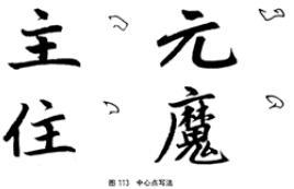
center point. The pen strikes backwards and drops paper to the left, then squats to the right and then picks to the left, sometimes it goes out, or it doesn't. Such as "master", "yuan", "living", "magic" and other words. (Figure 113)
Zeng nodded. Zhao Zizeng's writing method basically adopts a left-handed and right-handed writing method, echo
Articles are uploaded by users and are for non-commercial browsing only. Posted by: Lomu, please indicate the source: https://www.daogebangong.com/en/articles/detail/Regular%20script%20study%20guide%20serial%20Ou%20Yan%20Liu%20Zhao%20four%20body%20structure%20and%20brushwork.html
 支付宝扫一扫


评论列表(196条)
测试