Previously written articles, for the convenience of reading and collection,
A remake of the WeChat official account has been specially edited in an easy-to-read format.
Friendly reminder 1:
Please click the link of the original text to download the font!
Friendly reminder 2:
For general practice use only, commercial use also requires the purchase of copyright.

There are more than 1000 fonts in the collection, but there is no egg use
—This statement may be true.
At the beginning of the year, I always promised to share an English font for novice students. It took more than half a year to finish it today. Although I majored in English in university, my English level is really average. When I was working in 4a, most of my bosses and colleagues were foreigners, so I communicated more in English. I also developed the habit of using English fonts for design.
The more fonts, the better. Some new students blindly installed thousands of fonts, but it was useless. On the contrary, it makes it very troublesome to use photoshop to select fonts. Up to now, I have reduced to more than one hundred fonts on my computer. If you are a patient with choice difficulties. Or you are not sure which font is appropriate. You might as well use the ten classic English fonts I recommend first.
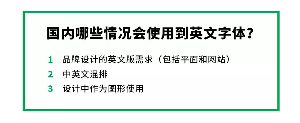
Mixed Chinese and English are often used in e-commerce. I have never accepted the method of Chinese and English mixed arrangement, but since the design of e-commerce has developed to this stage, it is reasonable to exist. But I think the role of English in e-commerce typesetting should be embellishment, using English fonts as graphics. English fonts should have the same effect as pentagons or other graphics. Don't let English words assume the role of expressing information.
This article does not introduce history, it is pure dry goods. Simple manual typesetting demo.
The English font is a very large system, and the content covered in this article is just a drop in the ocean. Interested students can search the history of each font on Baidu. Not much to say here.
(This article is not a strict academic article, it is just for sharing, mistakes are inevitable, please bear with me.)
If you are interested in English fonts, please refer to "Western Fonts" by Akira Kobayashi

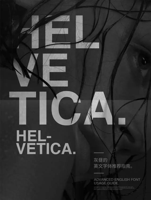
Use the most prolific font and at the same time one of the most classic. If you really don't know what English font to use, then it is right to use Helvetica. In almost any ranking of English fonts, Helvetica ranks first.
Helvetica (including Helvetica Neue) is also Apple's former royal font. There is also a special documentary "Legendary Font Helvetica" to tell about this font. Interested friends can find it.
There is an improved version of Helvetica called Helvetica Neue, with 51 fonts of different thicknesses to choose from. There is a classification system similar to that of Dalanzhou Ramen. Contains capillary, thin, three thin, two fine, leek leaves, small wide, wide, large wide...
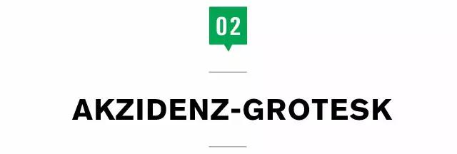
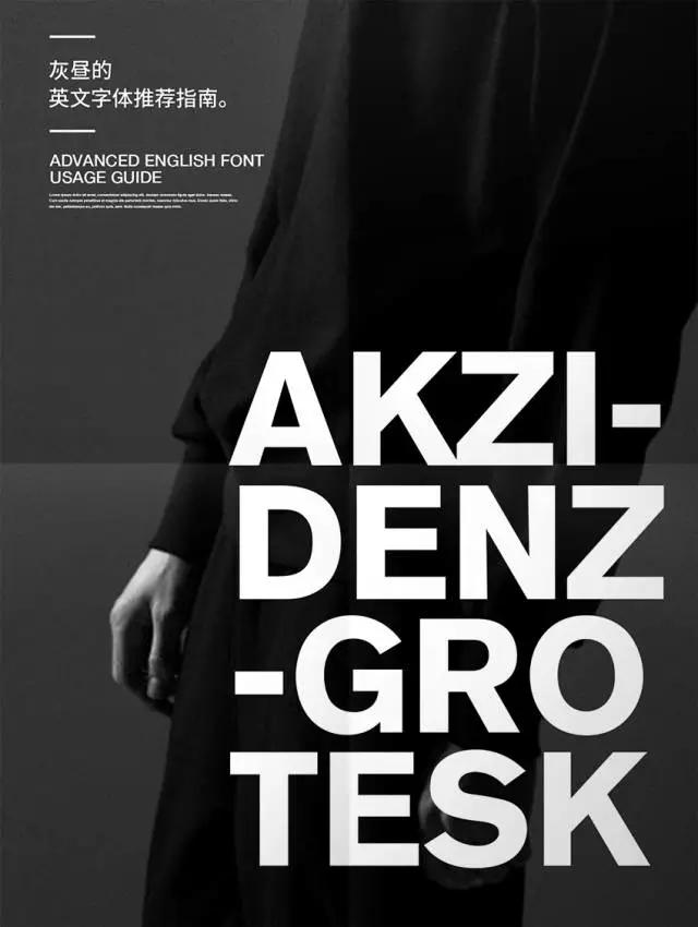
Akzidenz-Grotesk is also a very classic font. It appeared earlier than Helvetica and had an important influence on fonts such as Helvetica and Univers. The Akzidenz-Grotesk font is more stingy with strokes than Helvetica. Compared with the current font, using the Akzidenz-Grotesk font will have a more classic flavor.
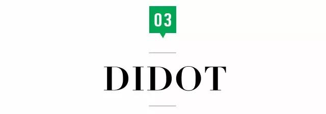
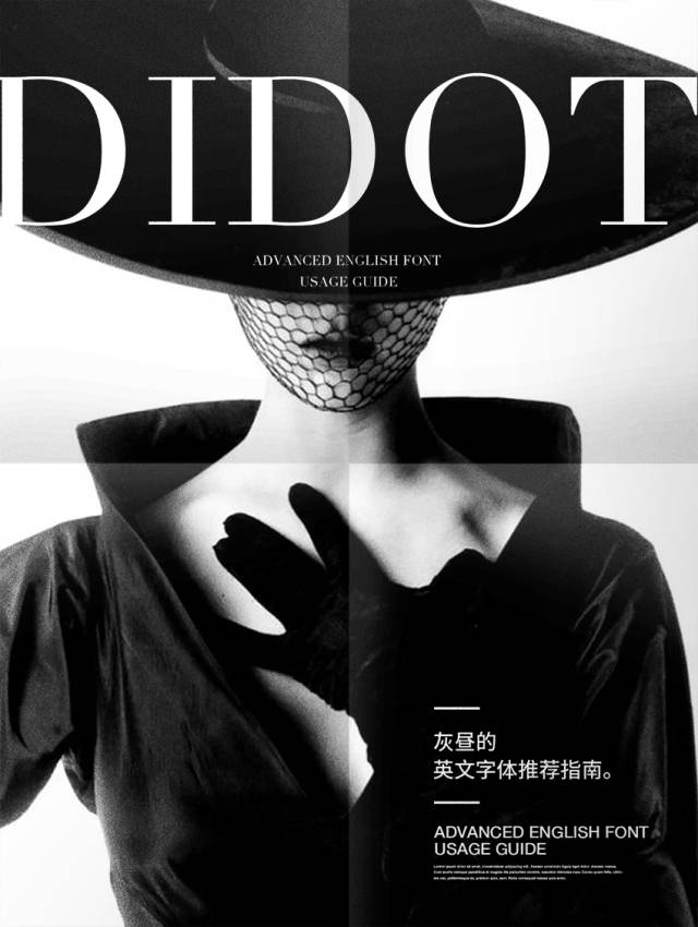
Didot font should not really say much. Represents the trendiest and trendiest fonts. Flat web pages are suitable for everything. Although it is a poorly used font, it is still ugly.

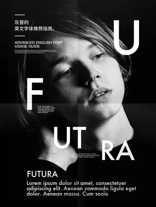
Futura was once all the rage as the official typeface of Volkswagen and IKEA. Both fonts are variations on Futura. But both have since abandoned the font. One of the reasons may be that Futura is too sharp and lacks affinity. It may also be due to the design of the font. The bold Futura takes up more length, which makes it difficult to typeset multiple letters.
Personally, I prefer a sharp and stern font like Futura, which will be more effective when paired with some suitable images.

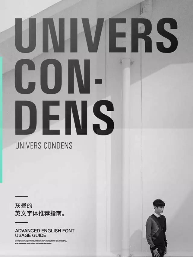
Univers was designed by typography guru Adrian Frutiger. As can be seen from the name, another famous font Frutiger is his work. The Univers font has precise fonts and even strokes, and has a more rational outline than Helvetica. Both big and small characters have better fonts, especially Univers Condensed is more modern and design. Therefore, Univers is more "niche" than Helvetica.

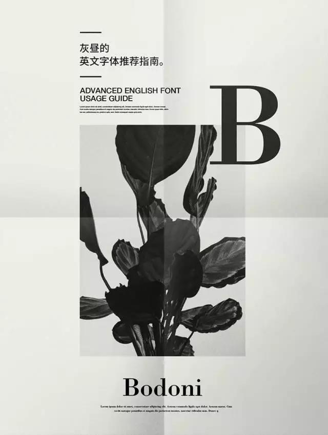
Another well-known serif typeface is Bodoni, which was born later than Didot. These two fonts are often compared together. Bodoni's strokes are bolder while retaining the elegant glyphs. Ease of use is much higher than Didot.
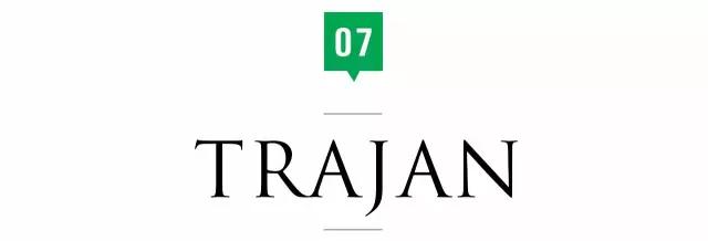
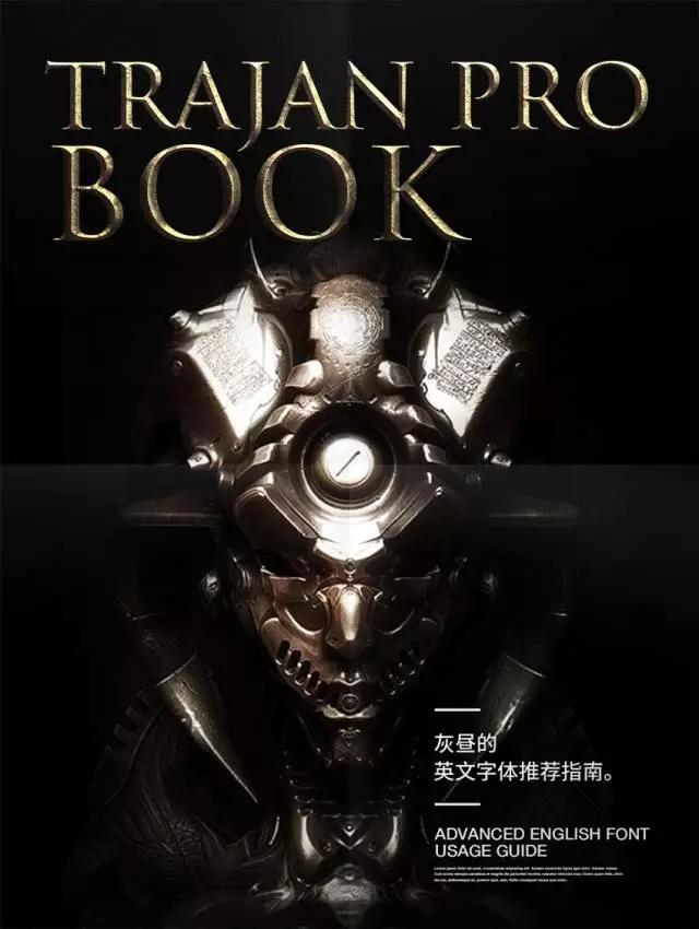
Trajan Pro font is also a very popular serif font. This font is improved on the basis of the font of the ancient Roman stele, so it has a strong ancient style. It is especially suitable for industries related to movies and games. The ancient Roman fonts at that time did not have lowercase, so the lowercase of this font is actually a miniaturization of the uppercase font.

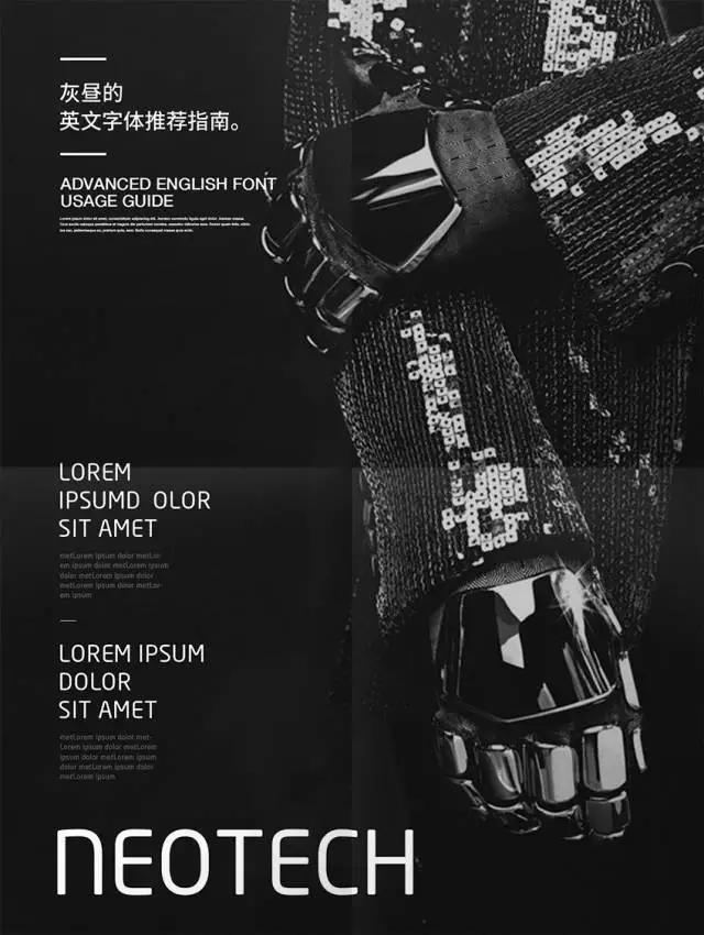
Neo Sans was once all the rage as Intel's queen font. Compared with the previous fonts, Neo Sans, a font that was produced in 2004, is considered a "younger generation", but it also has a modern and beautiful curvature. Perhaps because of the cooperation with Intel, this font has a strong sense of technology. Neo Tech is a variation of Neo Sans, with certain letters more minimal and modern.
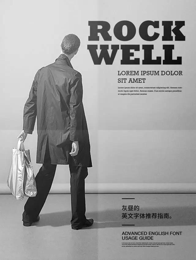
Rockwell is a thick serif font, which belongs to a type of serif font, and its characteristic is that the serifs are quite thick. This type of font is much less than other types, and the typewriter font Courier that comes with the system also belongs to this type. Rockwell's bold word is strong and powerful, which is very suitable for title typography.

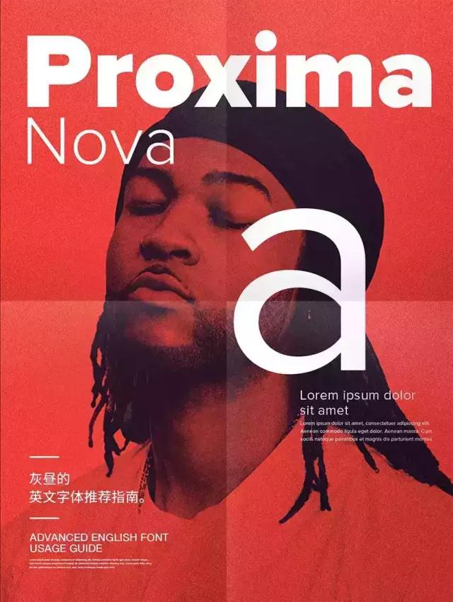
I first noticed this font font because of its special name, and I have to try it every time I choose a font. Proxima has something special and unique, modern but not cold. Especially its representative lowercase "a" is very flavorful. Proxima nova is also one of my favorite fonts.
This article font Baidu network disk download address:
Link: http://pan.baidu.com/s/1jI8jtEe Password: usbx
friendly reminder:
If the network disk fails, please click the original text link to my website, there is a Baidu network disk address at the bottom of the page!
Or go directly to Zcool to download.
----
Author: Hui Zhou, the copyright belongs to the original author
Reprint: The Stolen World (ID: Lost3001)
Follow the official WeChat account of excellent web design: youshege; let's learn design with millions of designers
Articles are uploaded by users and are for non-commercial browsing only. Posted by: Lomu, please indicate the source: https://www.daogebangong.com/en/articles/detail/Recommended%20basic%20English%20fonts%20commonly%20used%20by%20the%20Grey%20Day%20master%20%20Part%201.html
 支付宝扫一扫
评论列表(196条)
测试