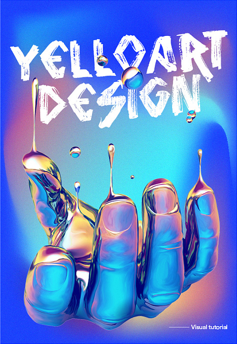
Author: Martin_K, Zcool homepage: http://chuqi.zcool.com.cn/
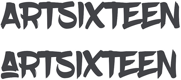
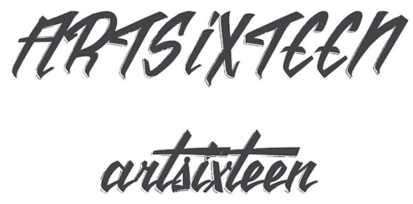
1. DHF Dexsar Brush
Features: Neat writing, with its own tilt
Application: e-commerce design, graphic design, advertising design
Recommended index: 5 stars
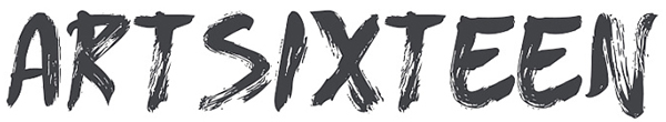
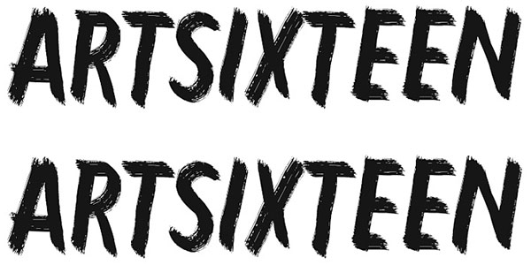
It can be seen from the name that this font is a brush-type handwriting. There are relatively many such fonts in English. It highlights the free and easy Chinese brush characters in the form of handwriting, but most of them are more beautiful and Practical fonts are not easy to download. This is because the copyright awareness in foreign countries is better than that in mainland China. Usually, such English fonts cost money to buy. As a designer, you must collect those more classic fonts. ;This font is relatively free and easy, giving people a natural and casual feeling, but because the uppercase and lowercase letters of this font are almost the same, the writing form tends to be the same as brushed out with a brush However, the coherence and rhythm in Chinese calligraphy are extremely rare; but the visual effect it presents is still very good. In font design, especially in handwritten font design, the flying white effect of its strokes and the rough edges on the edges are often used. Extract it to form a very personalized handwriting in Chinese; the basic fonts are as follows:
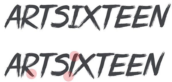
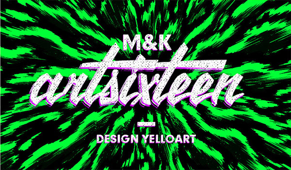
From the basic font, it can be seen that this font is relatively regular among handwritten English fonts, and the overall writing is relatively regular, with relatively few changes in horizontal and vertical strokes. The pen is relatively light, and at the same time, it has the effect of deinking and whitening, which is also a unique effect that the brush can achieve. In terms of writing, it is more in line with the writing method of calligraphy fonts. Although there is no strong rhythm of brush movement, it has no effect at all. The font has a sense of design and very individual characteristics. The uppercase and lowercase letters are basically consistent in writing, but there will be changes in a few individual letters. There are differences in words such as "R" and "I". Overall, there is not much impact. When used as a headline in the design, each letter can be disrupted and rearranged in a random order, which can make the picture more visually impactful, but it is not suitable for text, and the strokes The characteristics of Chinese characters can be well extracted as an inspiration reference for Chinese design.
From the two cases, it can be seen that the visual effect of this font in practical application is still good. The word spacing used as a headline is relatively tight but it does not affect the recognition. Adding any modification itself also has a strong impact. In addition, it should be noted that the font has a feeling of leaning to the right from the perspective of human vision, especially when there are many letters, it will be more prominent. Need to pay attention to adjust the optical illusion of tilting.
Second, Wicked queen
Features: Strong and powerful, free and easy personality
Application: e-commerce design, graphic design, advertising design
Recommended index: 5 stars
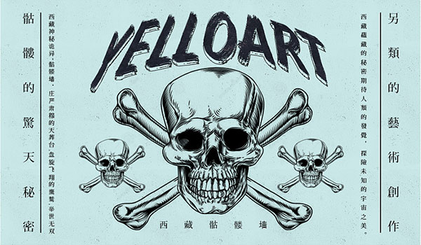
The name of the font translates to "Evil Queen", which belongs to the same dark family as Gothic, but relatively speaking, this font is presented in the style of handwriting calligraphy, and there is no distinction between upper and lower case. There is only one regular character Re-usable, as an English font, it is also a good choice to express a dark Roman style in the design. This font has distinctive features, more splashed ink and whitening effects, smooth and natural handwriting, and thicker strokes with a feeling of flowing water , used as a headline can show a strong visual impact. It is not only full of personality but also neatly written. It has a strong advantage in recognition. For font designers, a strong The splashed ink and whitening effect can be extracted and applied in Chinese font design. Even students who do not know font design can use this font to enhance the visual impact of their works, whether it is in e-commerce design or graphic design. In the design, as the highlight of personality, it is essential to highlight the visual impact.
From the basic font, it can be seen that the recognition is emphasized while ensuring the personality. The strokes are thick and powerful, but without losing the gentle temperament. The ink effect is more serious, according to the writing order of the letters, the pen is light or heavy, the deinking effect is natural and coherent, but it guarantees the overall outline of the letters well, there is no exaggerated stroke extension, but it has a wild Qixi Festival, this problem Relatively speaking, it is relatively neat but without losing its personality. In addition, the letters are rounded when writing. No matter whether it is the starting pen or the ending pen, there are as few sharp corners as possible, especially at the turning point of the letters. The line transition is smooth and natural. , There will be a little deinking splash on the edge of some specific letters, such as "S", "I" and "N", these are all letters written in one stroke, and there is more deinking, which is just right with other adjacent letters It can form a sharp contrast of strength and weakness, so that it can exert its own unique characteristics in the application: the case is as follows:
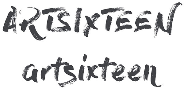
Third, vtks animal 2
Features: strong personality, texture effect
Applications: e-commerce design, entertainment posters, optical transformation design
Recommendation index: 5 stars
vtks animal font is a handwritten English font with great personality and chalk effect. It is commonly used in the design of personalized posters. The letters are thick and powerful, the structure is tough, and the characteristics are distinctive. The splashed ink and white are similar to the previous font, but the graininess is stronger , used as a headline in the design can not only add vitality to the design, but also enhance the visual impact of the picture. The uppercase and lowercase letters of this font are basically the same visually, except that there are differences in the center of gravity of the letters. Slight fluctuations can be directly ignored in terms of application, and its own material sense will also be loved by designers as a font effect in design, and as a font for font designers The design style of , even the Chinese design is often given the feeling of this kind of effect. It can be seen that this font is worth collecting and researching. The basic fonts are as follows;
From the basic font, it can be seen that the characteristics of this font are obviously more individual. Although its writing style is biased towards a cohesive feeling, it does not have the coherence like flowing clouds and flowing water. Try to avoid gentle and mellow temperament , the style of the strokes is clear horizontally and vertically, and the overall writing method is thin and vertical, which makes the font more upright and powerful. It is worth noting that all closed letters of this font are all processed into triangular geometric figures, such as the letter "R". "S" exaggerates the extension of the ending pen, while the letter "E" treats the angle of the vertical pen, and has transitional changes in thickness and some extra small corners. The distance between letters is compact and well-defined The rhythm makes the font full of personality, and the other is the effect of deinking. This font pays attention to the deinking of the middle part of the letters, while the starting pen and ending pen are more solid, and only some letters are deinking like lines around them. , if it is used as a small letter in the application, it is easy to cause the texture characteristics of the font itself to be ignored. The actual case is as follows:
It can be seen from the case that this type of font has a strong visual effect in practical applications, but it is not suitable for adding font effects. Even if it is added, it is only a simple color level. In the design style, especially in the current popular design style, especially the gradient color with high saturation and high brightness can also be used directly, which can further add visual impact to the picture, especially in the picture of entertainment programs and music , it is very suitable to use this type of font as a personalized font, and at the same time, the strokes of this type of font can be separated and used directly in Chinese font design.
Fourth, Brushscript Bt
Features: smooth continuous strokes, individual waves
Application; e-commerce design, entertainment poster, advertisement design
Recommended index: five stars
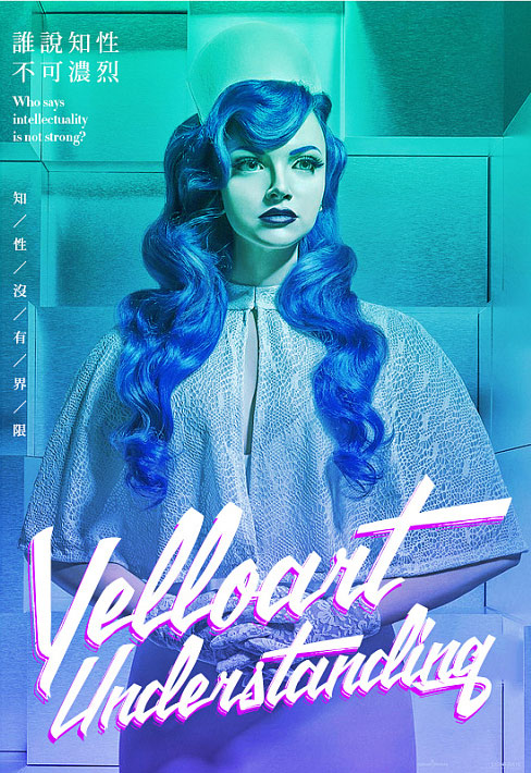
This font is a handwritten font with a wavy effect. It is full of personality and distinctive features. The letter line writing has a wavy arc and the effect of text overlapping. In particular, the recognition of uppercase letters is not suitable for use in the design. It is more suitable for the combination of uppercase and lowercase letters. In the design, it can improve the visual impact of the picture and add some unique personality to the picture. , the overall writing method is biased towards continuous strokes, the uppercase letters are designed to highlight individuality, and strive to be written in one stroke, while the lowercase letters are designed according to the normal writing continuous strokes, which better shows the characteristics of handwritten fonts. In the application, the font is more It is suitable for the combination of upper and lower case. In addition, the wavy strokes and exaggerated features can be extracted and used in font design, or directly used as font strokes for secondary transformation. It is a good choice. The basic fonts are as follows:
The font has a compact structure and a natural transition between stroke thickness, especially the starting stroke is thicker, while the ending stroke is thinner and has the effect of radians and sharp corners, which is very good. Roundness and sharpness are effectively integrated together, and there are letters such as "T", "E", "I" and "M" that break the conventional form, highlighting individuality and artistry. The downward small corner protrudes, and the bottom of the vertical pen has a rounded protrusion. In addition, the writing thickness transitions naturally, and the starting horizontal pen and ending horizontal pen will have a feeling of big waves. The strong personality highlights the random characteristics of handwritten fonts. However, letters like "i" and "T" with only one stroke or horizontal and vertical forms can be personalized and unique. Visually, lowercase letters are slightly thicker than uppercase letters, and the recognition is higher. The pen shape is more characteristic. I personally like the lowercase form of this font, and it can not only be used as a subtitle in the design, but also can be used as a personalized English signature.
This font can carry the addition of font effects very well in the application. At the same time, when the upper and lower case are used together, the size of the individual letters needs to be adjusted to form a creative combination to make the whole more harmonious and beautiful. It has visual impact, and the smooth continuous strokes can add some vitality to the picture and highlight the personality. In addition, it can also be used as decorative text, and it also has a very good effect when used in conjunction with Chinese.
Five, BoldBrush
Features: round and full, thick and powerful
Application; graphic design, poster design, advertising design
Recommended index: five stars
As can be seen from the name, this font is a thick brush font with a full font structure, thick and powerful. It is a handwritten font suitable for titles. Compared with the above fonts, this font is more It is more neat and tidy. Although the effect of splashed ink and whitening is basically gone, and some of the free and easy handwriting itself is missing, it has more plump and round features. In today's design style, it is more flat and flat. It is used for gorgeous The colorful screen can express its unique characteristics very well. In addition, the difference between the upper and lower case of the font is not too big. You can directly select the upper case mode when applying it. For the font designer, it is thick and plump Round features can be a good source of inspiration, the basic fonts are as follows:
As can be seen from the basic font, the writing form of this font is to use strokes according to the way of handwriting. It is written in one stroke, the thickness of the lines is natural, the pen is thick and the pen is light, and there is some stroke effect at the end of the stroke. The font structure is relatively full, so that the distance between the letters is small, especially the top of the letter. There is even an overlapping effect, while there is more white space at the bottom, forming a sharp contrast effect between the top and bottom, so that the font has a good sense of rhythm while maintaining the recognition of the letters, which is the biggest feature of this font. In addition The strokes of the letters are treated with rounded corners at the beginning and end of the strokes, and the oblique strokes also have transitional arcs, such as the treatment of letters "A", "R" and "X". For the "T" letters composed of horizontal and vertical, vertical The intersection of the pen and the horizontal pen will have a protruding treatment, which also adds a little personality to the font. It not only has a strong personality in the application, but also the full letters can carry a good carrying effect. The case is as follows:
It can be seen from the case that this font also has a strong personality in application and has a strong visual impact. It will look a bit like Japanese when used in the state of small letters Feeling, but the impact on the picture should not be too great. What needs to be paid attention to is the degree of recognition in the case of multiple letters, regardless of whether it is used as a decorative text or the main title, it can render the picture very well and Substitution effect.
6. The Citizens italic
Features: strong decoration, full of personality
Application: e-commerce design, poster design, advertising design
Recommended index: four stars
Translated into Chinese is: citizen italic. In the process of writing in English, people tend to write in an inclined way. Handwriting is natural and easy to connect strokes. This font is a very good way to use italic to develop it into a font. It is casual and natural , full of personality and guarantees the recognition of the font, the overall structure is slender and inclined, the strokes are strong, and the lowercase letters are coherent and full of handwriting. In the application, the advantages of handwritten fonts can be well utilized to add personality to the screen. To improve the visual effect, for this type of font, the upper and lower case are usually used together, which can be used for creative arrangement. In addition, the font has its own overlapping effect, which has become a unique feature of the font.
From the basic font, it can be seen that the font has a very strong personality and has a strong decorative effect. There are extensions of small feet at the end as decorations, and the corners are sharp and rigid, with uppercase The transition of the murals of the letters is relatively small, and it is only slightly shrunk at the corners to connect the decorative feet. Even in the relatively neat writing structure, it also strives to show the randomness of the handwriting. The top of the starting pen is slightly thicker and there will be from The transition from circle to pointed arc is processed, and the starting stroke of the horizontal pen will also have a personalized turning and extension. The overall slender and inclined makes the distance between letters more compact, which adds a lot of freedom to the font. The lowercase letters are relatively It is more casual, according to the way of handwriting to restore the feeling of continuous strokes as much as possible. The treatment of the starting part is different from that of capital letters, but continues the rigid turning and removes the transition of the arc. In order to keep the height of the letters continuous strokes Letters such as "R" and "S" will cause difficulties in recognition, while the horizontal strokes of the letter "T" are independently exaggerated, making the lowercase letters unique. The most prominent thing is the overlapping effect of the font, similar to The deinking effect of writing with a brush makes the font feel like it has its own special effects superimposed on two layers, but it is actually just a visual illusion. The turning point and personality characteristics of the entire font are somewhat similar to the feeling of Gothic. You can use it in the application Very good expression of personality characteristics, examples are as follows:
In actual application, a certain letter can be enlarged or reduced independently according to the specific layout situation, and even the strokes of a certain letter can be redesigned according to the rhythm of the font to achieve a satisfactory effect, whether it is Whether adding effects or not, the unique characteristics of the font can be well utilized in the design, and the visual effect of the design work can be enhanced.
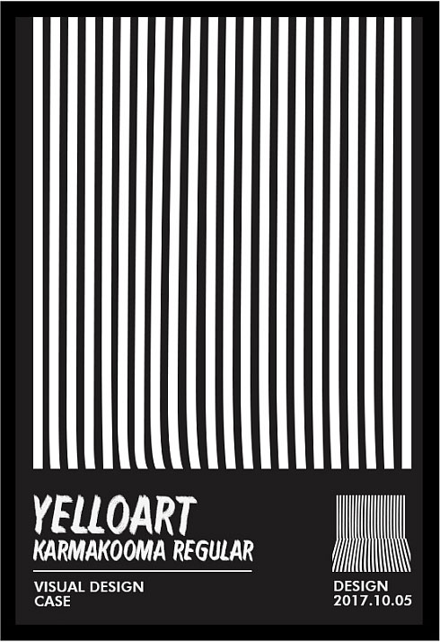
Seven, karmakooma
Features: thick and slender, neat personality
Application: e-commerce design, graphic design, advertising design
Recommended index: four stars
This font is a very classic English font. It is neatly written, highly recognizable, and has a charcoal feel. The letters are thick and individual. There is no extra decoration, but the individuality of the letter strokes is brought into full play. Maximization is more suitable for large titles in design, and it is also an English font commonly used by designers. This font has only one regular pattern. The entire font is developed completely according to the display effect of uppercase letters, and the lowercase letters are only slightly. It has been changed a bit. It is usually used to express personality, trend and creativity in the design, which can improve the visual effect of the picture very well. This font is also one of the fonts that I have kept for a long time. Let’s look at the basic characters first. type:
From the basic font, it can be seen that the beginning and end of the font have a strong deinking and burr effect, and the middle of the letters also has a little whitening and uneven length of burrs With a little whitening, it gives people a feeling of charcoal burning, and writing with this effect is more common in Chinese brushes. This font is neatly written, with a slender structure, and each stroke is sonorous and powerful. The ink is uniform and runs through all the letters, and the spacing is tight. The letters are slightly inclined, avoiding the rigid feeling of horizontal and vertical, and blending the short, thick and slender feeling together well. Even though it looks slender, it also has a thick feeling. It is worth noting That is, the two ends of the horizontal pen and the end of the vertical pen are treated with parallel slopes, which adds a little vitality to its neat structure. In practical applications, it can be used simply, and the characteristics of the font itself can also add a lot of visuals to the picture. The effect, the actual case is as follows:
It can be seen from actual cases that this font has a strong personality and visual effect in the application, but because the font itself is italic, it will appear untidy in the conventional arrangement, and it is When applying, it is necessary to adjust or design the combination and arrangement of fonts according to the characteristics of the screen, so that the unique characteristics of the font can be better utilized, and its strong recognition can also be well received when used as a small mosquito. show.
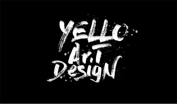
Eight, Dry Brush
Features: full of personality, strong artistry
Application: web design, graphic design, ui design
Recommended index: four stars
This font is a very personalized handwritten font written with a dry brush. It has a strong artistic effect and shows the characteristics of Chinese calligraphy in English. Compared with the other fonts above, it is overall Exaggerated and casual, natural and free writing, more individuality, and more splashed ink and whitening effects, forming a unique characteristic temperament of this font. It can be used as a headline in the design to add strong artistry and personality to the picture , and as a personalized handwritten English, this typeface is not common in design, but it is very popular among designers because of its unique personality and style. Especially in Chinese font design, it is often used by designers, and this font is my favorite private font. The basic fonts are as follows:
From the basic font, it can be seen that the strokes of this font are also written one stroke at a time. The treatment from heavy to light or vice versa makes the font have a very sharp contrast, and the vertical also has thick and light writing, and has extended exaggeration, such as letters "R" and "N", etc., even if the two In the case of a vertical pen, it is also a writing with different changes. The uppercase is well-proportioned and relatively more rhythmic than the lowercase. The lowercase is more conventional in writing, but it also has exaggerated extensions and individual strokes. The overall visual effect is also weaker than that of uppercase letters. Although the font has strong artistry and personality as a whole, it does not affect the recognition of the font at all. It will be better when using uppercase or a combination of uppercase and lowercase. The actual case is as follows:
It can be seen from actual cases that this font can show strong artistry and personality in the application, and it can enhance the visual impact of the picture when using the headline, and at the same time, it can also use personalized layout Maximize the characteristics of the font itself, even if only the font is used, it can well support the visual effect of the entire screen.
Summary: The application of handwritten fonts in design is more and more sought after by designers, and they appear in various designs more diversely, but the cost for the creation of handwritten fonts is very high. High, the handwritten fonts shared in this article are all personal collections. In the design, I don’t necessarily have to use ready-made fonts for my use. I can also extract individual letters and use them in the design of Chinese fonts to continuously enrich my own. It is the prerequisite for a designer to develop a good creativity in the work. I would like to share my personal opinions with you. If there is anything wrong, you can leave a message to discuss~!
Articles are uploaded by users and are for non-commercial browsing only. Posted by: Lomu, please indicate the source: https://www.daogebangong.com/en/articles/detail/Recommended%20English%20handwriting%20fonts%20commonly%20used%20in%20design.html
 支付宝扫一扫
评论列表(196条)
测试