The following article comes from Yihai Shibei Design, author Deng Haibei

Design experience sharing, practical modification of cases, and recommendation of excellent works are designed to help novice designers grow quickly, and look forward to making progress together with you.

In the previous issue, through the analysis of the four major types of fonts in "Teaching You to Get Rid of Font Selection Difficulty", "Hei Ti", "Song Ti", "Round Type" and "Calligraphy Type", it explained the style characteristics of various types of fonts and their Usage effects in various design cases>We can determine the font type according to the "target audience", "project tone", "industry attributes", etc., so that the font and layout style fit. This issue will explain the basic skills of font matching through the three principles of font matching:limiting the number of fonts, establishing visual hierarchy, and unifying style and temperament.
It is not easy to change too many fonts in a layout. Regardless of the amount of information, two or three fonts are enough to meet the needs of the screen. Even if the font remains the same, changing the size, thickness, color or decoration of the font can achieve the purpose of distinguishing between primary and secondary and guiding readers to read. The fewer font types, the easier it is to control the layout of the text information on the screen.
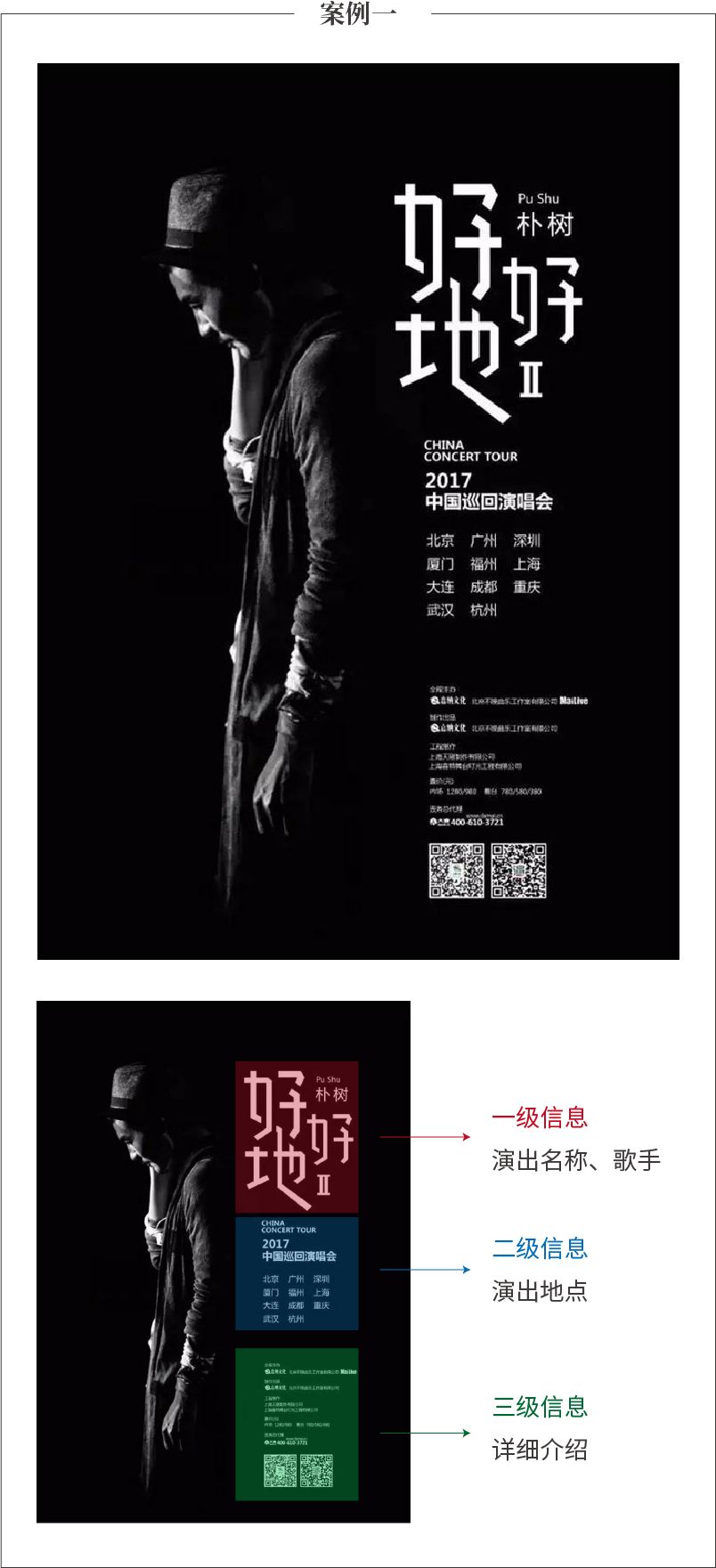
has a lot of information, but only uses one typeface. Through font size, thickness contrast, and clever layout, it creates a good visual hierarchy.

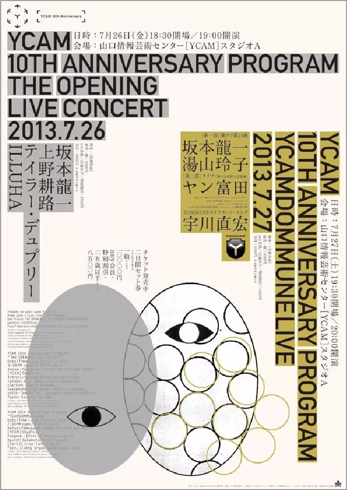
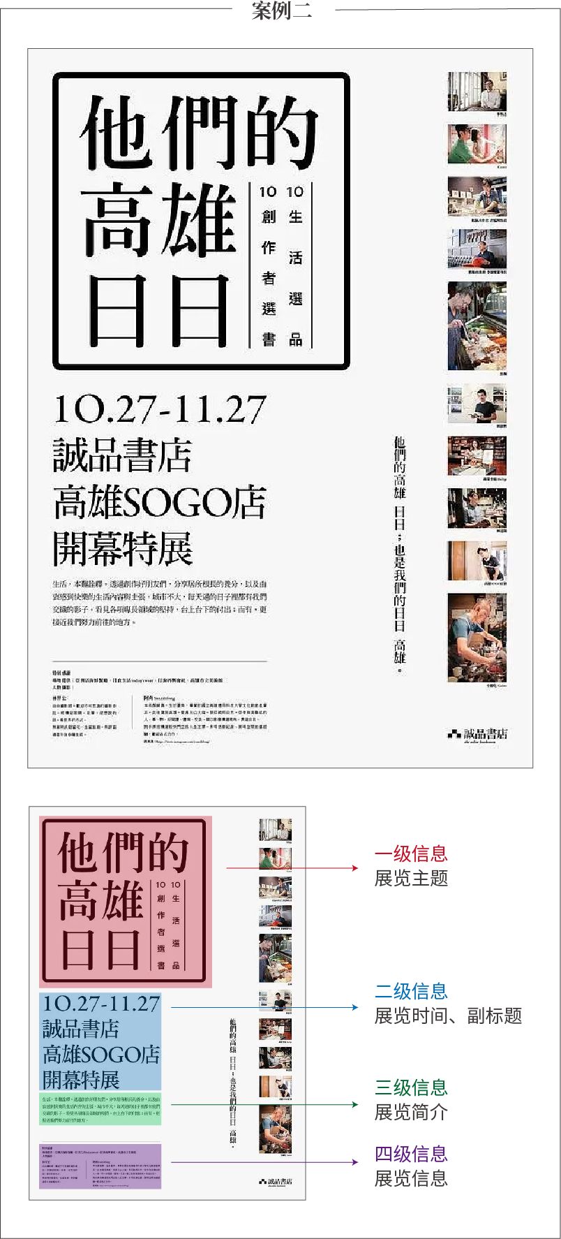
Only two sets of fonts are used for the entire layout:English information uses bold sans-serif fonts, which are enlarged and emphasized>Japanese information uses thinner serif fonts, and the information level can be obtained It is easy to distinguish.
Some projects need to present a lively and lively atmosphere, or require very decorative designs, and complex fonts must be used. Please keep the overall effect coordinated to avoid conflicts and confusion.
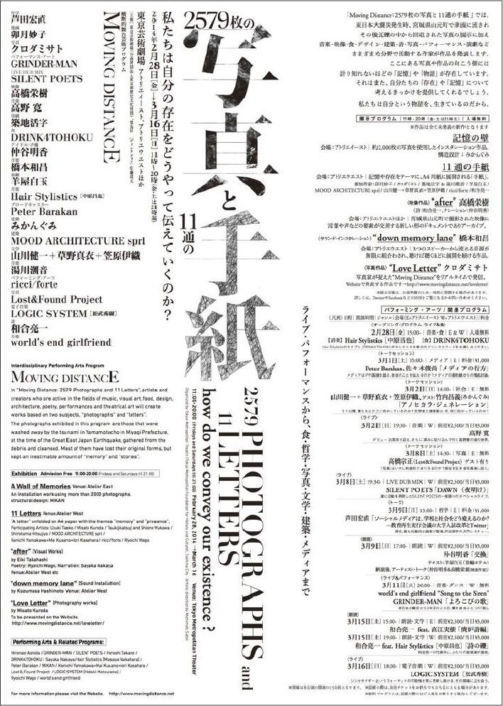
In order to create a lively and rich picture, this poster uses a lot of fonts, which has a rich sense of form and strong visual impact. However, for most designers who do not have strong control over the layout, it is often difficult to achieve both richness and coordination, so limiting the number of fonts is a good way to achieve a coordinated and unified screen.
Why font matching? One is for aesthetics, and the other is to establish a visual hierarchy. In a layout, there are different levels of information content, which need to be distinguished according to the primary and secondary, such as title, subtitle, and text. Each information level will also have key information and non-key information.
When matching fonts, it is necessary to use font size, thickness, color, etc. to match the display, helping readers avoid visual confusion, and at the same time bringing a sense of layering to the layout.


Although only one font is used in these two cases, the primary and secondary levels can be clearly divided. Generally speaking, you can choose thicker and larger fonts for the main information, and use thinner and smaller fonts for secondary information to form a contrast, create a visual process, guide the audience to read the information, and make the level of the layout richer.
One of the basic principles of coordinating fonts is to choose fonts with similar temperament. Different modeling features form fonts with various style characteristics, and the emotions they convey are also different. Some fonts have a solemn temperament, some exude a classic atmosphere, some give people a sense of modern fashion, some fonts focus on information transmission, and some focus on spiritual symbols.
Using fonts in the same font family is the easiest and safest way to match them. The so-called font family refers to the font family. There are multiple sub-fonts under one font, such as Siyuan Heiti and Siyuan Songti.

Using fonts from the same font family conforms to the principle of "limiting the number of fonts">The principle of "forming a visual hierarchy" needs to be followed when arranging, and the size, thickness, and color of fonts need to be used when matching fonts And other ways to bring a sense of hierarchy to the layout.

When matching different fonts, pay attention to the inclusiveness between them, which must be different and harmonious.
The mix and match of HeiTi and SongTi is a very common way of matching. When the emotional SongTi meets the rational HeiTi, it can form a very good contrast effect. What needs to be paid attention to here is the grasp of scale. Appropriate contrast can bring a rich visual impression to the layout, but excessive contrast will also produce a sense of mess.
As shown in the cosmetic advertisement in the picture below, choose the combination of thinner Song typeface and thinner black typeface. The fonts are similar and form a subtle contrast, and both of them have elegant and delicate temperament, which complement each other in the design of cosmetics with feminine characteristics. .
When matching different fonts, generally choose a thicker and decorative font for the main information, so as to quickly attract the attention of the audience>For the explanatory text, it is suitable to choose a font with clear structure and simple strokes to facilitate reading . As shown in the figure below, "Huakang Poster Style" is used as the main title, which is eye-catching and lively, and can attract audiences to watch. It has good readability and is also unified with the title style.

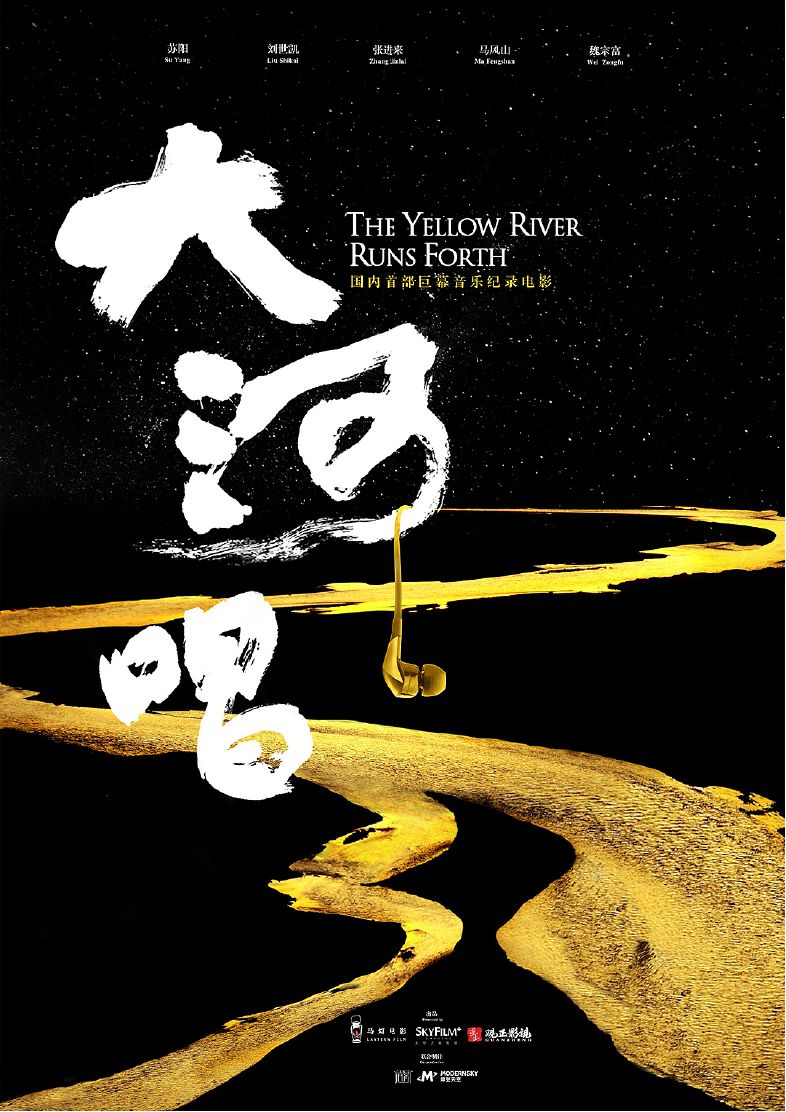
Calligraphic characters have great visual tension, and the strokes are varied and very visually impactful. It is very suitable as a display title, but it is not suitable for small-sized explanatory text, and the stroke details will become extra complicated due to the reduction in size. In order to solve this problem, we usually match it with Song typeface, which also has a strong sense of culture and history and a strong humanistic atmosphere.

Calligraphic fonts are paired with boldface. The tough boldface and soft handwriting can produce a strong contrast effect. It is very suitable for the text combination of the title and is often used in modern pictures.
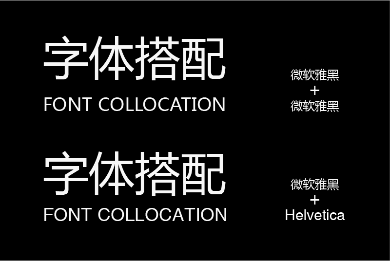
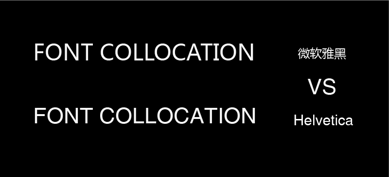
When using Chinese and English combined typesetting, try not to use Chinese fonts in English, because the English part of some Chinese fonts is not designed perfectly, so try to use classic English fonts, the effect will be much better.
The upper part is the Chinese and English combination of "Microsoft Yahei", and the lower part replaces the English with the classic English font "Helvetica". You can see that the lower part is more refined and beautiful.
Now compare English alone, pay attention to the letters "F", "C", "L", "I", etc., you will obviously see that the English design of "Microsoft Yahei" is relatively rough, and "Helvetica" is more obvious exquisite.
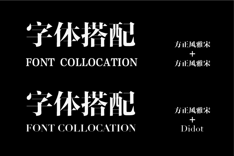
The Chinese and English combination of "Founder Feng Ya Song" is shown above. You can see that the Chinese and English styles are quite different.>The English is replaced by the classic English fashion font "Didot", which is obviously more unified in style and also It is more suitable for matching.
Case Study
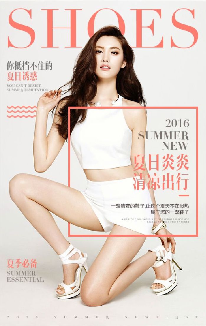
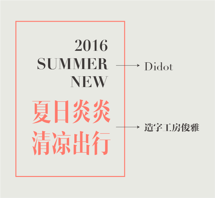
In this case, I choose "Zhizi Gongfang Junya" in Chinese, and I don't choose the Western characters that come with the font, but choose the more classic and fashionable English font "Didot", which can create a fashionable atmosphere.
In the collocation of Chinese and English, it is usually chosen to arrange the English serif fonts and Song typefaces correspondingly, and arrange the English sans serif fonts and Chinese boldface characters correspondingly. This kind of matching method is the simplest and safest This method can better form a unity of style.
However, each type of font also has subtle temperament differences. For example, in Song typeface, there are also classical fonts with a strong sense of writing and modern fonts with great geometric characteristics.
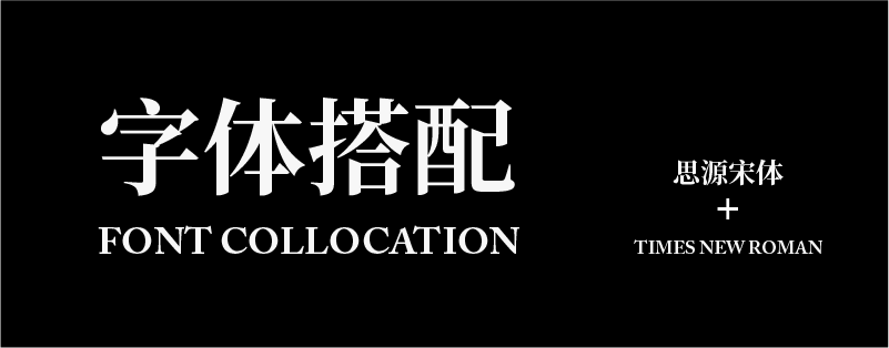
Prefers "Siyuan Song Typeface" for printing and screen display, and it will be more unified with the calm and restrained English font "TimesNewRoman". In terms of details, the lining between the two is closer, and the transition and contrast of thickness are also similar.


So when designing, whether it is a combination of Chinese and Chinese or Chinese and English, careful analysis and continuous practice are required to achieve a harmonious and unified, clear and beautiful effect.
Summary
Three principles should be followed in font matching:
1. Limit the number of fonts. Regardless of the amount of information, two or three font choices are sufficient to meet the needs of the screen>
2. Establish a visual hierarchy. When matching fonts, it is necessary to use font size, thickness, color, etc. to match the display, helping readers avoid visual confusion, and at the same time bringing a sense of layering to the layout>
3. The unity of style and temperament. When matching different fonts, pay attention to the inclusiveness between them, which requires both distinction and harmony.
When using a combination of Chinese and English for typesetting, try not to use the fonts that come with Chinese in English, and follow the above three principles when matching Chinese and English.
Yihai Shibei Design (ID: YHSBds)
Deng Haibei
Articles are uploaded by users and are for non-commercial browsing only. Posted by: Lomu, please indicate the source: https://www.daogebangong.com/en/articles/detail/Quickly%20master%20font%20collocation%20ideas.html
 支付宝扫一扫
评论列表(196条)
测试