
Let me restore the specific appearance of a city in my mind, and most of the memories I can pull out stay on the taste and visual levels.
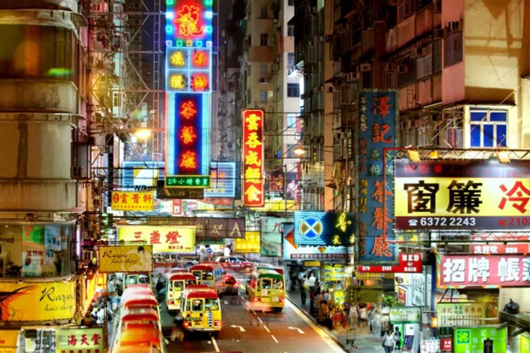
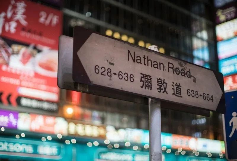
Talking about my impression of Hong Kong, the taste should be the takeaway from the tea restaurant I ordered yesterday - pineapple oil and milk tea, and the visual sense is probably the colorful neon signs under the night.

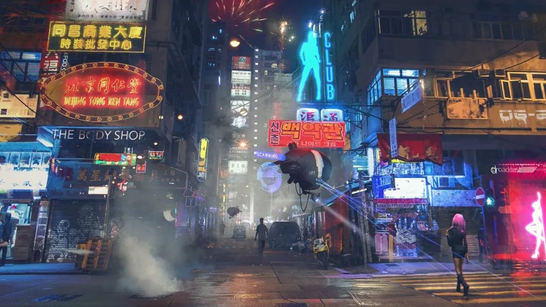
Hanging above the bustling city, the luxury and money fans are dubbed "pure cyberpunk flavor" and appear in various film and television and game works, such as "Ghost in the Shell", "Shadowrun" and so on.
I don’t know when I started, but I have already equated these colorful and light-filled signboards with the authentic appearance of Hong Kong.
Compared to peeking at the changes of Hong Kong’s commercial culture through the neon signboards saying "XX Gold Shop" and "X Ji Restaurant", I am more fascinated by the fonts hidden behind the words.
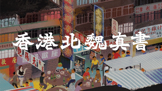
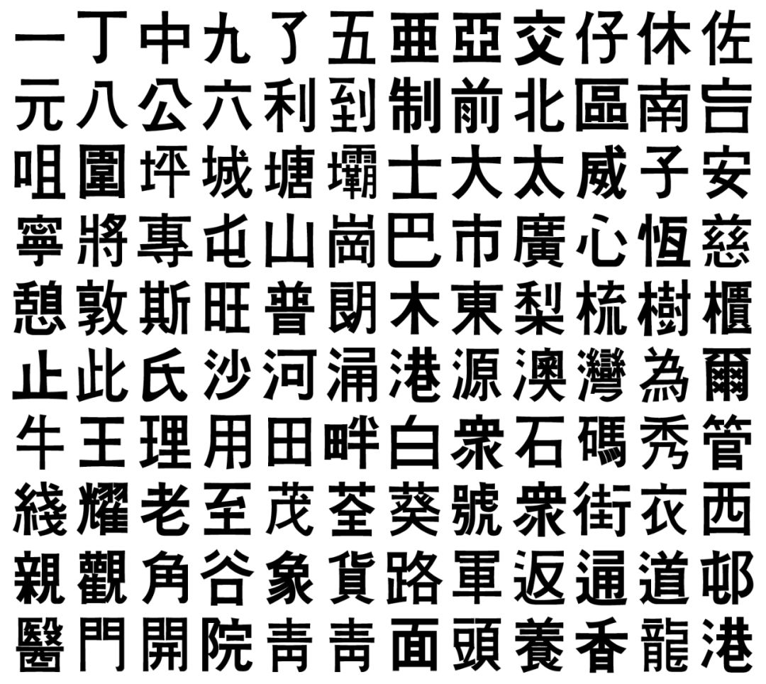
Most of the characters on street signs in Hong Kong are "Northern Wei Kaishu". It is said that this tradition originated during World War II, and it is difficult to examine the accuracy of this statement.
The only thing that is clear is that it has a clear start and end and is suitable for long-distance recognition and reading, which makes it stand the precipitation of time and the test of the market. It has spanned decades and is still popular today.
In the 1950s, Au Jiangong, a calligrapher who was good at Northern Wei style, began to write signboards for shops and gave classes to teach apprentices. It was he who initially drove the popularity of Northern Wei style in Hong Kong.
At that time, there was even a saying that "Ou Jiangong helped you write the signboard, so the store would not close down."
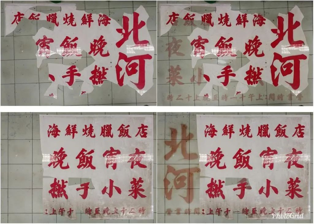
In the 1980s and 1990s, more signboards were created by Li Han. At first, Li Han set up a stall in Mong Kok to write. During this period, he met Li Wei, a signboard guy.
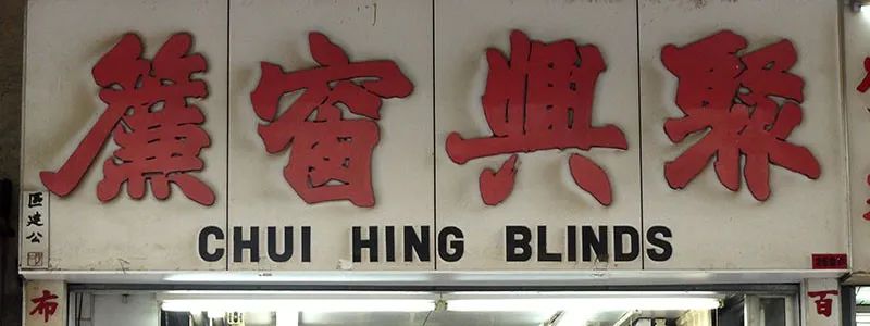
Li Han's regular script can also see the strength of the Northern Wei regular script, but it is not so prominent, and the mean makes it have a wider use. When you go to Kowloon today, you can still see their works from the past.

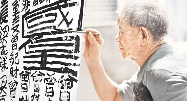
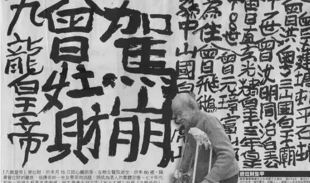
Now that we are talking about street fonts in Hong Kong, we have to mention that wild street calligrapher—Zeng Zaocai, He called himself the "Emperor of Nine Dragons",this claim was not just out of mouth and unfounded.
Born inGaoyao County, Guangdong ProvinceWhen sorting out the relics of his ancestors, he found thatbecoming< /span>Before the British colony, part of the land of Kowloon City was granted as the fiefdom of his ancestors.
After Hong Kong was colonized by the British, the Tsang family lost the ownership of these lands, so Tsang Zao Choi wrote on the street to tell everyone that this is the territory of the Tsang family.
Tsang Tsao Choi has been graffitiing on the streets for more than 50 years. He has left his handwriting in various districts of Hong Kong and Kowloon. The graffiti is written by himself with a brush As well as the past deeds of the family, and the declaration of "sovereignty".
Each word has no aesthetic feeling when disassembled separately, but when stacked together, it creates a majestic momentum, which is also unique.
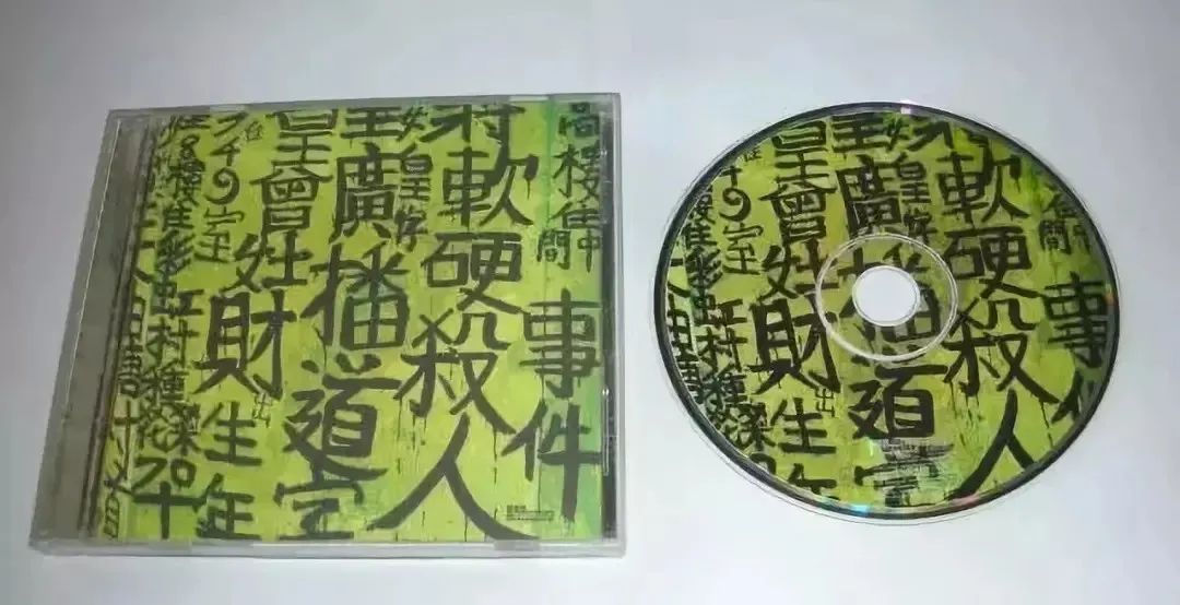
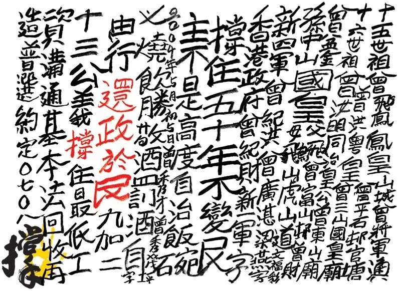
His work was exhibited at the Venice Biennale and was also awarded Sotheby's auction has even become a source of inspiration for some practitioners in film and music circles.
The poster of the movie "The Queen of Nine Dragons" uses the graffiti works of Tsang Zao Choi, and the album "Broadcast Road Fans>

"It is definitely a collective memory of Hong Kong people, and it also inspires us to rethink what art is." Liang Wendao Zeng This is the evaluation of Zeng Zaocai's calligraphy works.
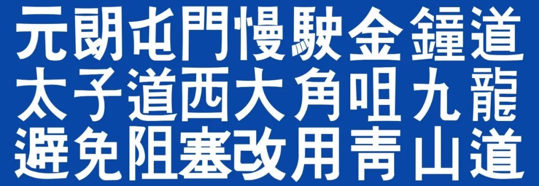
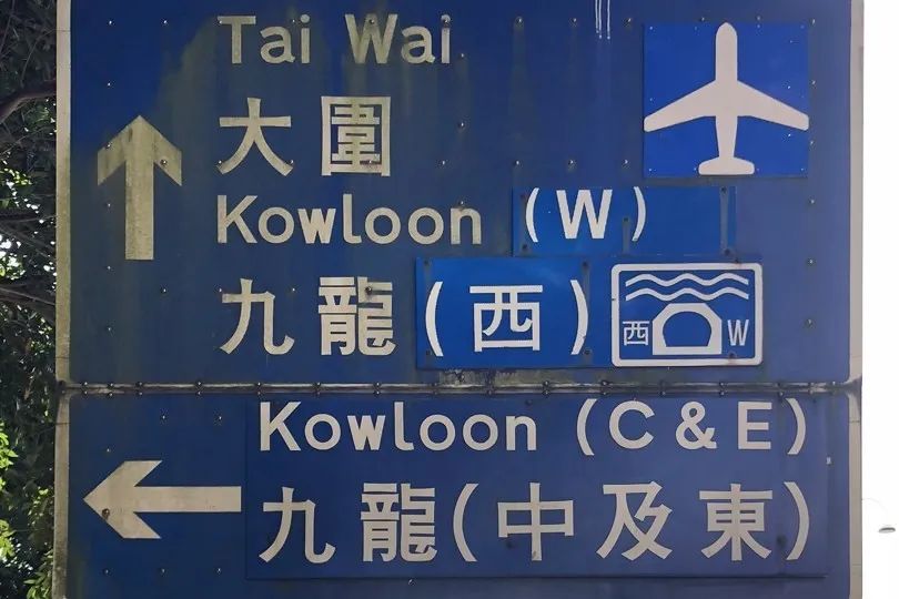
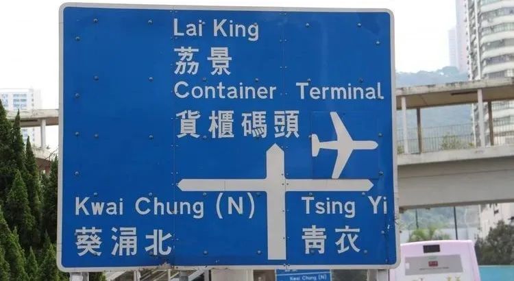
In addition to the signature font and Tsang's calligraphy, there is another sharp and unique font on some old road signs in Hong Kong - the prison font, all from the old prison handwriting of the prisoner.
Since the 1970s, the Hong Kong government has handed over street signs and traffic signs to correctional institutions. In addition to road signs, prisoners in prisons sometimes have to Craft urban infrastructure such as trash cans, metal fences, and concrete barricades.
At that time, there was no standard and unified font template, and the prisoners could only use the manuscripts from the past as production materials. written on street signs.
So you can see that the characters on these street signs are not perfect, sometimes they are slightly slanted, and sometimes they are of different thicknesses, all of which are traces of hand-made.
Compared with the current mechanical and rigid computer fonts, the ends of the strokes of many characters in prison fonts will show a trumpet shape, and the ends are wider than the middle, which is also due to manual cutting.
But it is precisely these unavoidable errors that make the prison typeface so distinctive, giving the blue-and-white characters their vividness.
In addition to the shape of the characters, the sense of the times of these street signs can also be read from the writing of the variant characters retained on some existing street signs, such as the "流" and "洞" on the street signs below "Qing" is not a typo, but a common way of writing in the past.
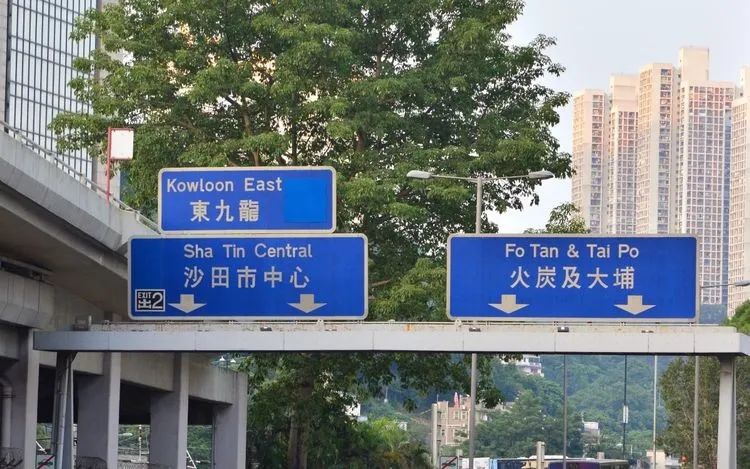
Since 1997, although the prisoners in the correctional institution still make city road signs, the fonts have been changed to "full true thick black" computer fonts, and many handmade prison road signs have been replaced with new ones. street sign.
The road network of the new town has been carefully planned before, so there is no need to replace too many street signs. Therefore, it is easier to find traces of old street signs in Shatian, Dapu and other places than in other places.
Even so, the government also abandoned the use of variant characters, and used the method of "sticking plasters" to cover the variant characters on the old road signs with regular characters, and those completely preserved street signs became less and less.
The monotony of street fonts also makes Hong Kong a city that is becoming more and more boring.

In 1992, Li Han suddenly decided to retire and return to his hometown. He was afraid that his friend’s words would not be enough to sustain his business.
Unexpectedly, this farewell turned out to be a farewell. Not long after, Li Han passed away due to illness; the old-fashioned handwritten signboard industry also gradually declined, and like road signs, they were forced to step into the digital age.
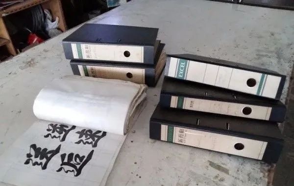
A few years ago, Li Wei's son, Li Jianming, did not want to waste all his hard work, so he launched the "Uncle Li Street Calligraphy Restoration Project". After more than a year, he converted these precious materials into computers The font is 7,800 characters.
In 2007,"Kowloon Emperor" died of a heart attack. Most of the calligraphy he left in the city earlier had been erased by the cleaning staff. After the death of Zeng Zaocai, Hong Kong The government stated that it will not remove the graffiti left over from now on, and will consider how to preserve it properly.
The "Road Research Society" association organized by a group of young people in Hong Kong is also working hard to preserve the prison fonts on road signs. They search for existing road signs through Google Street View, and then go to the scene to take photos and archive them.
They collected the only surviving street signs, recorded more than 400 prison-style Chinese characters by outlining the fonts on the street sign photos, and then reorganized the radicals to imitate the style, and completed the digitization of about 3,000 characters Work.
The society is busy changing, and the ever-changing state of development not only reduces the function of the city to record the real history, but also brings various problems such as amnesia and identity to the urban community.
The process of modernization will inevitably push everything in the city to homogeneity, but fortunately, some people are desperately trying to recover from the ruins of the old era those sporadic things that should have been forgotten. marks our memories.
Planning|Modern Sky ZERO Editorial Department
Producer | Wu San Wu Wu Wu Wang Shuo
Edit|Sail
You can also look at these

With music bonus time, "Modern Calendar 2020" is on sale!

People are doing it, Google Street View is watching
This article was originally created by Modern Sky ZERO, please contact the background for reprint
Articles are uploaded by users and are for non-commercial browsing only. Posted by: Lomu, please indicate the source: https://www.daogebangong.com/en/articles/detail/Prison%20Font%20on%20Hong%20Kong%20street%20signs.html
 支付宝扫一扫
评论列表(196条)
测试