The following article comes from LOGO Research Institute, author LOGO Research Institute

[Official account that designers are concerned about]?
Backstage reply "Design Talk"
Rizhan Jun will push a design story for you
365 days, 365 classic sentences, only updated once a day

Spring Festival is coming
Many international brands have begun to localize their brands in China
Speaking of Chinese branding
We have the impression that seemsfailures abound
Some brands distort Chinese culture
Seriously directly suspected of insulting China
Chopsticks of DG Promo

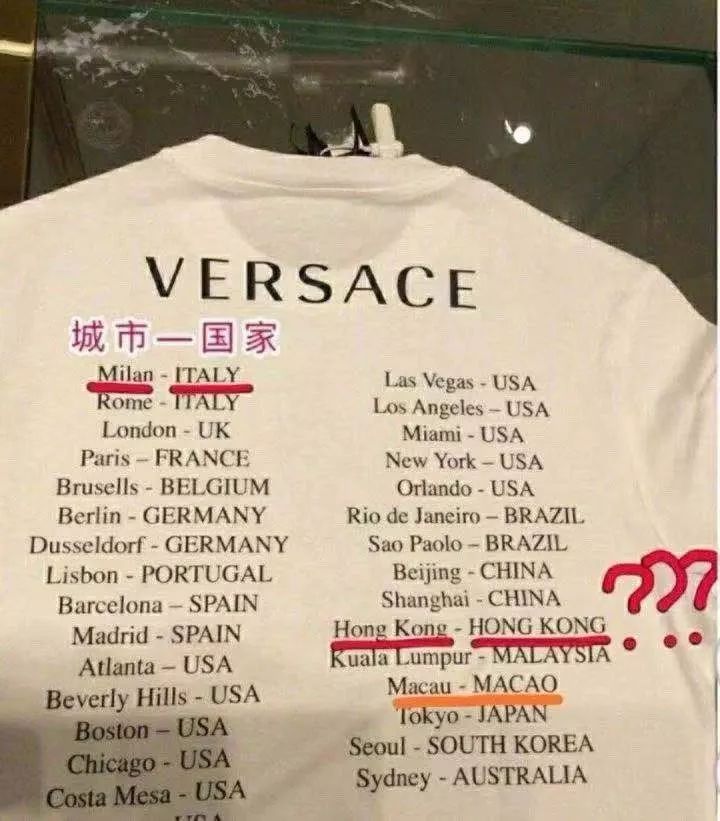
Versace T-shirt
Burberry New Year Ghost Film

blah blah blah
The Chinese market has great potential
But even international big names want to make money
It doesn't work without a brain
Compared
The recent Chineseization of the well-known Italian brand Prada
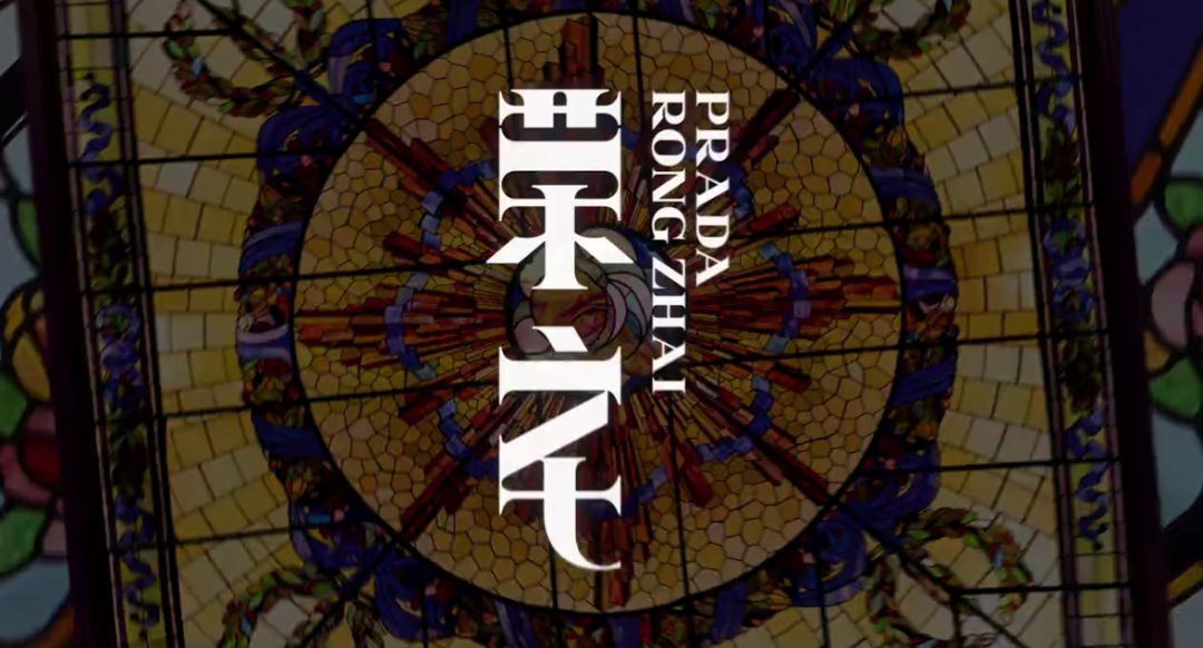
Designed a simple word "home"
But it has been well received by many domestic netizens
Also set the right example for the industry
Let's take a look at the word "home"


Image: @Regarez
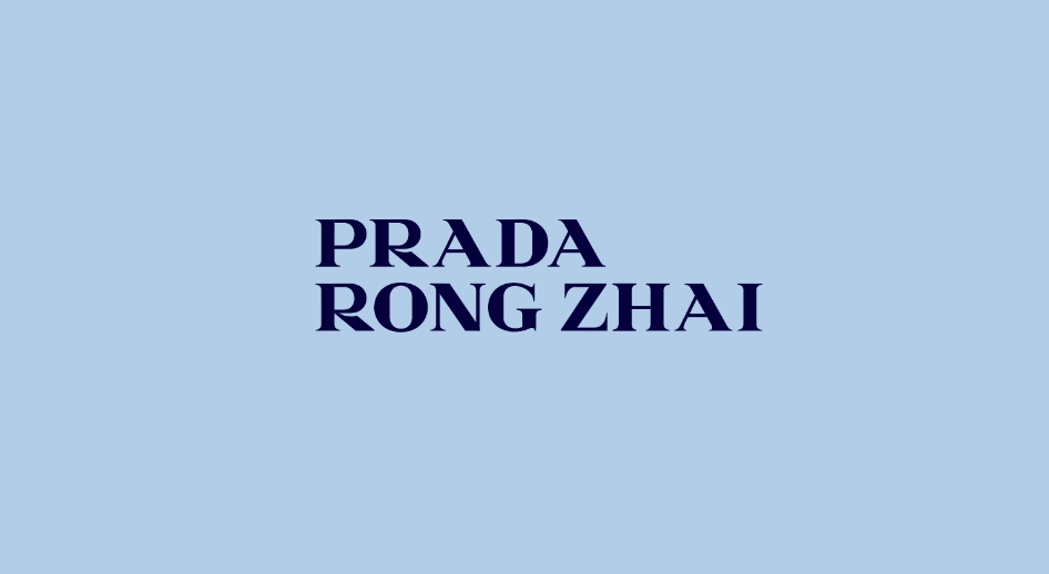
Prada's brand logo is a serif font
There is strong room for design variation
The well-known design firm 2x4 disassembled the serif font
Reconstitute Chinese characters with Prada's unique temperament
Combination of Chinese and Western ideas is ingenious
This design technique has been successful before
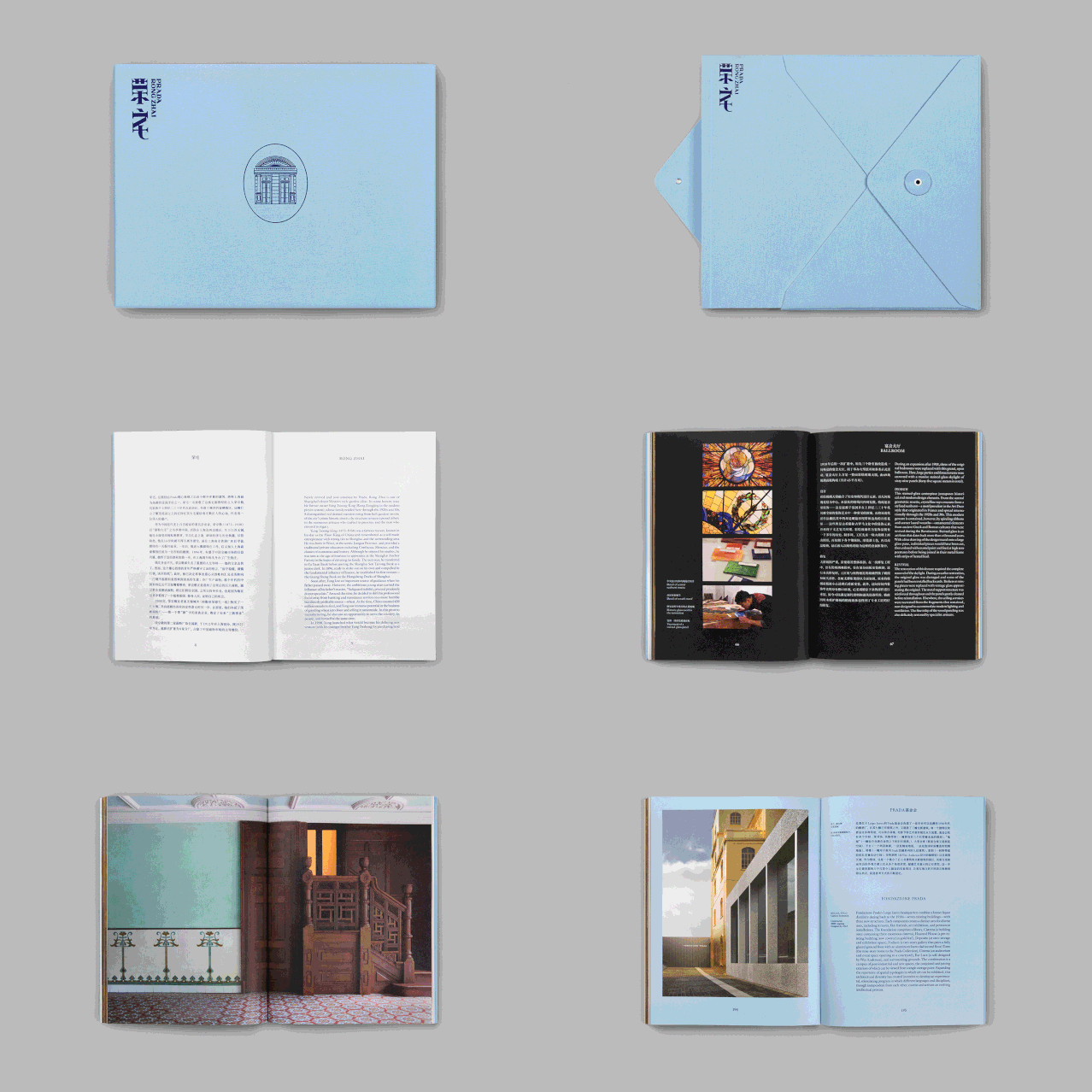
Prada renovated Shanghai Rongzhai for 6 years
Rong Zhai, a century-old house located on North Shanxi Road, Shanghai, Rong Zhai
One of the most elegant garden houses in Shanghai
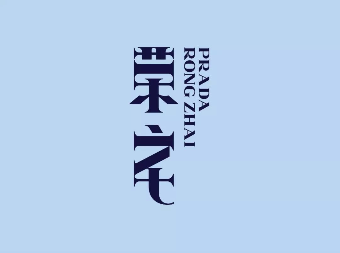
The LOGO of Rongzhai is created by
From the change of PradaLOGO
Break up and reassemble the letters "PRADARONGZHAI"
Vary stroke length and position
Reconstitute the Chinese font "Rong Zhai"
It can be seen that this is a very careful design



Some other brands directly use Chinese fonts
The author doesn't even pursue Chinese meaning
Take incomprehension as a fashion trend
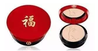
Armani powder uses a couplet-like blessing character
Auntie must like it very much~

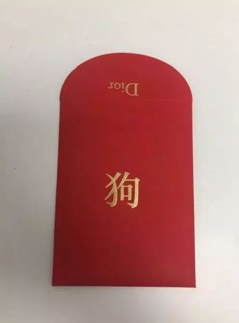
Dior's Year of the Dog red envelope
Do you accept it?

Although the design of Prada has no obvious Chinese elements
The color is also not using "Chinese red"
This LOGO still makes Chinese people feel
Prada brand strives for cultural integration
Received a lot of praise from netizens

What do you think of the logo?
Prada's 2019 men's clothing advertising campaign last year
Also invited Cai Xukun, the top traffic in domestic fresh meat
Acquired a very high degree of attention


Although many people commented that
Cai Xukun lowered the height of Prada
But from the data
Prada’s official Weibo video has more than 20 million views
110 million exposures on related topics
The most important thing is that sales have also increased
But Prada is not achieved overnight
The previous New Year commercials were also full of weirdness
In the dim light
Looks like there is an unknown transaction
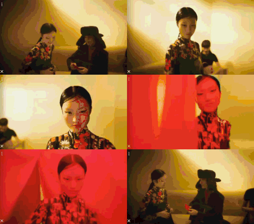
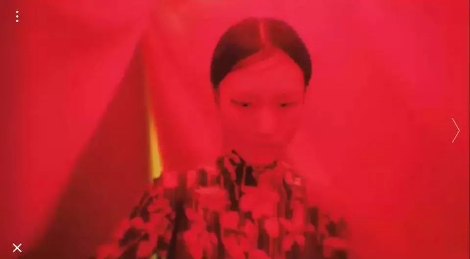


Happy New Year and all the best
I can't feel the festive atmosphere at all

Luxury brands have repeatedly misunderstood Chinese culture
This is a lack of insight into the Chinese market
It is also caused by ignorance of Chinese culture
The localization of the Prada brand in China has made significant progress
I hope international big names can learn more about Chinese culture
Make meaningful products, creative design with foundation
I'm bloated
Actually talking about luxury accessories
Can't afford it..


-END-
Rizhan Jun private WeChat
rizhanjun2060
Did you make it
Taking up a conversation with Rizhan Jun
More interesting than watching movies
Japanese design ✎ Stop for details
If you like our articles, just forward them to your circle of friends
Articles are uploaded by users and are for non-commercial browsing only. Posted by: Lomu, please indicate the source: https://www.daogebangong.com/en/articles/detail/Pradas%20font%20LOGO%20was%20praised%20by%20netizens%20Its%20really%20hard%20work.html

 支付宝扫一扫
评论列表(196条)
测试