
Text/Suo Xiaohong Qiao Jinglu
As a tool of visual communication, font has the function of conveying emotion and can give people a feeling of beauty. Excellent font design can make people never forget, and can achieve the purpose of visual aesthetics, so as to obtain a good psychological response. 
From the perspective of graphic design, text is a visual graphic symbol for disseminating information. The graphic characteristics of text have the same origin as calligraphy and painting since ancient times. Therefore, the pictographic and symbolic nature of Chinese characters has the characteristics of graphics. 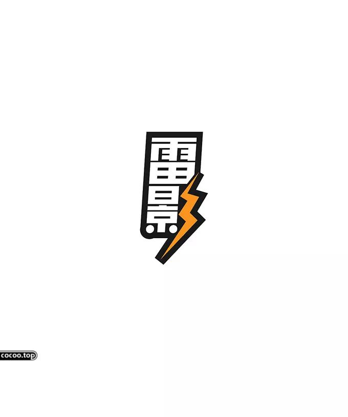
Font Design Considerations
①The position of the text should meet the overall requirements. There should be no visual conflicts between the text in the picture, and overall factors must be taken into consideration. Otherwise, it is easy to cause confusion in the visual order on the screen. This is a very delicate problem. It is possible that a difference of one pixel will change the taste of your entire work. 
②When designing the text in the plane, it is necessary to take into account various realistic factors faced by the work and its different requirements for the text. In general, creativity should be highlighted to enhance visual appeal.
③ Designers should combine the elements in text design with local culture to achieve more and better communication with the audience. 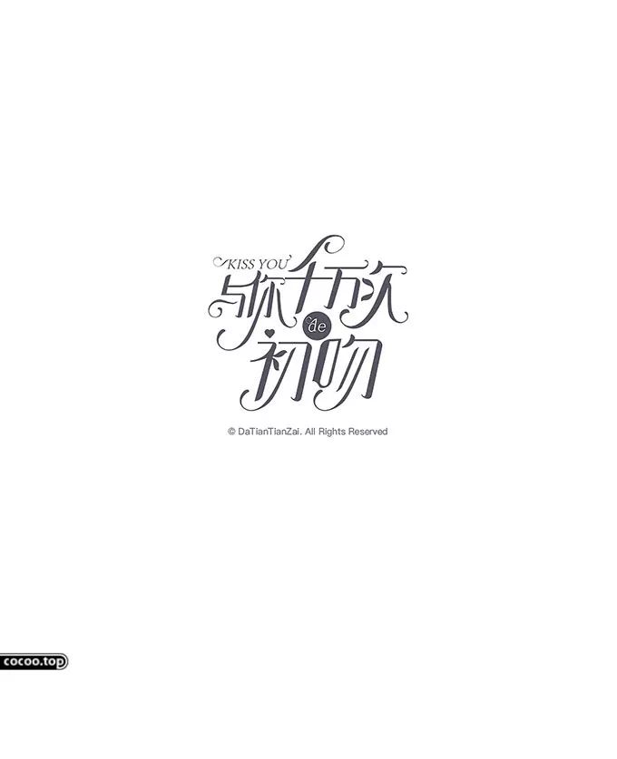
④It is necessary to choose different fonts according to different contexts and needs in the design. In addition, the horizontal, horizontal, horizontal, folded, hooked, etc. of characters can reflect the charm of the image. Graphic designers should be able to find the best matching point of fonts in design creativity in order to achieve unique charm. 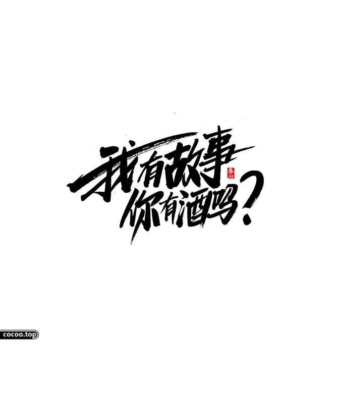
⑤ Avoid text becoming a decorative element and losing its original meaning. In graphic design, it is necessary to be able to exert its existence value and form a perfect whole. The design of the text must not be separated from the design of the advertisement. If the original intention of the text is ignored for the sake of so-called beauty, it will only be superfluous. 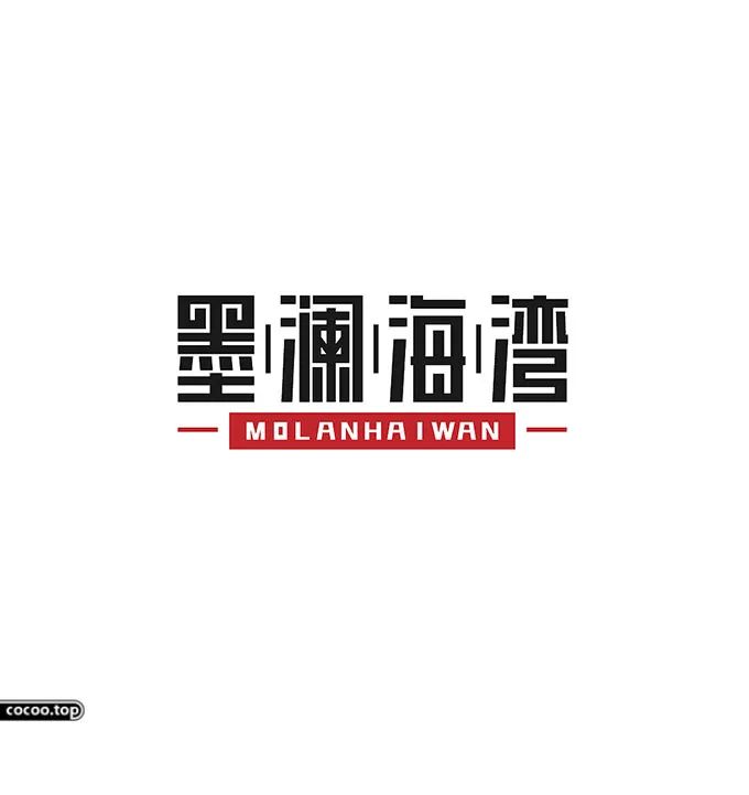
⑥In graphic design, text should avoid unnecessary clutter and design for simple design. The main function of text is to convey various information to the public and give people a clear visual impression, so text design Improving readability is one of the key aspects of creativity. Recommended reading:The shape of the font is beautiful! Tangible, sound, meaningful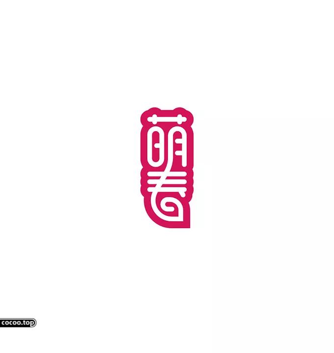
⑦Treat text as a basic element of design, because text is a part of graphic design, do not simply regard text as something other than creativity, and consider the entire content when designing The effect, but also consider the different manifestations of words and so on.
⑧Create unique fonts to highlight the personality of the text design, which is conducive to the expression of design intentions. When designing, it should be pondered over and over again, so that its external form can arouse people's sense of pleasure, so as to create characters full of personality. 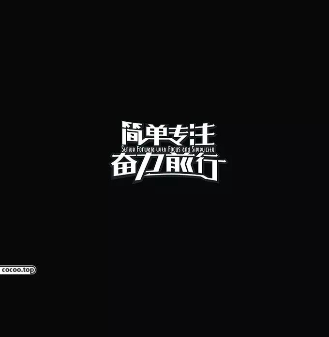
Typography Tips
As a modern graphic designer, we must not only have professional knowledge and professionalism, but also have profound knowledge and broad vision, and have a deep understanding of traditional culture, so that we can better apply fonts Go for modern graphic design and add glamor to your graphic design work. 
Font
refers to the graphical processing of the glyphs of Chinese characters according to the actual meaning of Chinese characters and the needs of graphic design, in order to obtain better visual communication effects. On the basis of ensuring the original font structure, proper reorganization and spatial arrangement of a certain stroke or a certain radical of a Chinese character is carried out to strengthen the information transmission ability and interest of Chinese characters, so as to further clarify the meaning to be expressed by the graphic work. Specifically, glyph methods can be divided into the following two types: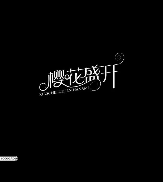
①Stroke isomorphism method: refers to two related characters in graphic design using the same strokes or radicals at the same time, so as to achieve a design effect of "I am in you, and you are in me". Designers often connect the same strokes or the same radicals in the picture with the same stroke, thus forming a wonderful and interesting combination. 
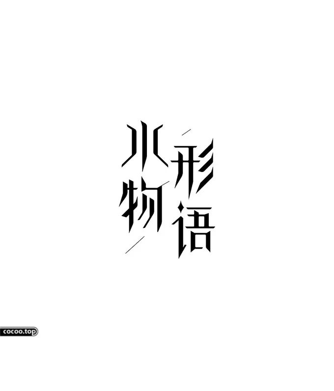
②Incomplete method: As the name suggests, incomplete means that the strokes and structures of Chinese characters are incomplete, but this is intentional by graphic designers and will not affect the ideographic function of Chinese characters. In modern graphic design, in order to improve the design interest of the work and expand the imagination space of the work, the designer will deliberately incomplete the design of the Chinese characters in the plane, or simplify the strokes, or disassemble the local small structure, Thus creating a unique flavor. Attract a larger audience to read. 
pictogram
The Chinese characters are processed graphically according to the actual meaning to achieve the perfect combination of "shape" and "meaning". The connotation contained in the works, so as to achieve the purpose of communication of "clear image" and "expression quickly". Specifically, pictographic methods include the following two types: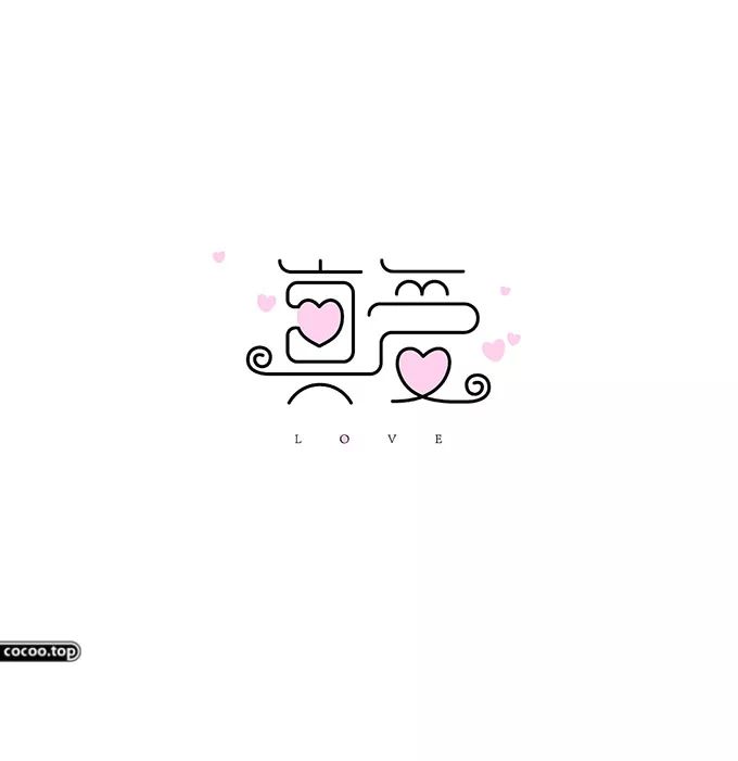
① Graphic association method: In modern graphic design, graphic association method is the most common composition method. The so-called graphic association method is to change the pictographic parts of Chinese characters, so as to make the audience associate, so as to achieve the creative purpose of "both form and spirit". In the process of graphic design, the designer uses the association method to graphically process parts of Chinese characters, and deliberately exaggerates the characteristics of some parts, so that the audience can understand the deep meaning in it at a glance, and deepen the audience's understanding of the graphic work. impression. 
②Replacement method: As the name suggests, the replacement method is to replace a certain part of a Chinese character, usually replacing an abstract image with a concrete image, so that the pictographic characteristics of Chinese characters can be fully utilized and "clear at a glance" the boundaries of dissemination. Designers should determine the strokes or parts of the Chinese characters to be replaced according to the needs of the overall graphic design, and then choose appropriate images or patterns that fit the theme according to the structure of the Chinese characters to be replaced, so as to strengthen the Chinese characters and graphic works. Recognizable and unique. 
Geometry
Use oblique lines, straight lines or any other directional and powerful lines to form Chinese characters, and then give them appropriate colors as decorations. The Chinese characters designed by this modeling method are "like and not like" "Between" is very interesting and artistic. At the same time, it can also bring people a solemn, upright, tough, powerful, rational and calm visual experience, which is conducive to the expression and communication of the theme of graphic works. 
①Color block method: The so-called color block method refers to arranging and combining some brightly colored geometric color blocks according to certain character creation rules and aesthetic principles to form a geometric square shape. Innovative forms of styling. In modern graphic design, this kind of Chinese characters constructed by the color block method not only has bright colors and a strong sense of order, but also has obvious geometric shapes and edges and corners, which is very in line with the aesthetic standards of modern design. 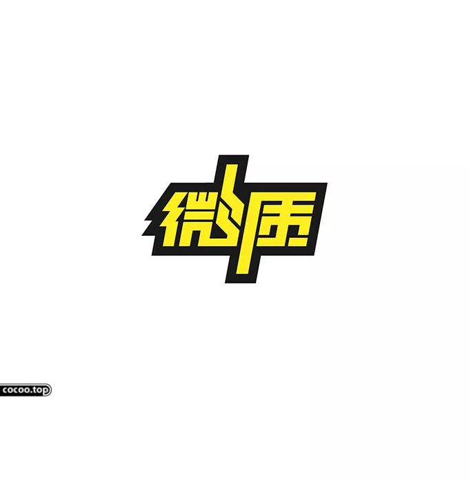
②Symmetry method: Symmetry method emphasizes that there is a sense of balance and symmetry in the direction of up and down or in the direction of left and right in two-dimensional works. This feeling will bring a high sense of order and technology to the audience. A more commonly used method of expression in design. Recommended reading: The "bone, blood, and flesh" of font design! 
Articles are uploaded by users and are for non-commercial browsing only. Posted by: Lomu, please indicate the source: https://www.daogebangong.com/en/articles/detail/Practice%20every%20word%20font%20design%20stuff.html
 支付宝扫一扫
评论列表(196条)
测试