
The first two issues explained the style characteristics of various fonts and their use effects in various design cases; we can determine fonts according to "target audience", "project tone", "industry attributes" and other methods during design Type, so that the font and layout style match; after the font is determined, use the principles of "limiting the number of fonts", "establishing a visual hierarchy", and "unifying the style and temperament" to carry out font matching. This issue will use cases to carry out practical demonstrations to help you deepen your understanding.
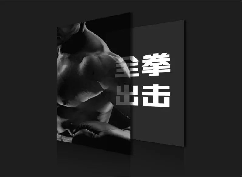
The first case is a promotional poster about a fitness club,
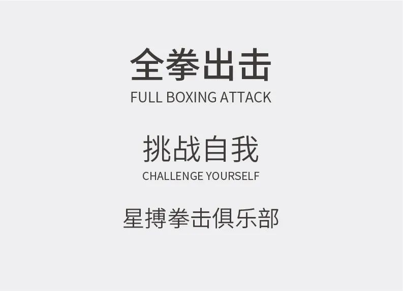
The following is the text information:
Case Study
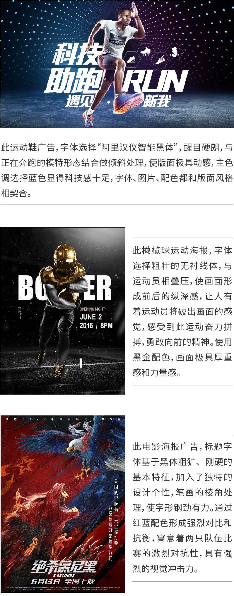
Before designing, you can find excellent poster design works about sports for reference, and understand how their fonts are selected and matched through analysis, and you can also refer to picture selection, color matching, space composition, etc.
Font selection and matching
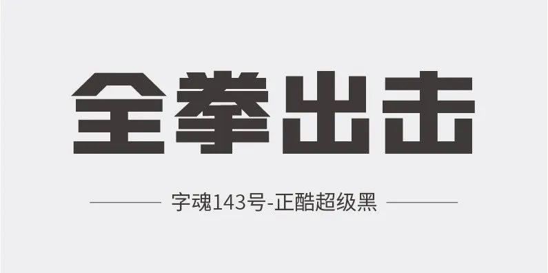
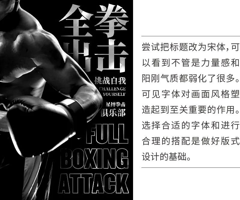
Boxing is a masculine and masculine sport, so the main title should give priority to rough, tough, and powerful black body. This case demonstrates that the main title is "Character Soul-Zhengku Super Black". This font has thick strokes and sharp edges and corners.

Choose "Champion" for the English font. The thick strokes, tight spacing and narrow internal space of this font make it look thick and eye-catching, conveying a strong sense of power. This font is used in many sports events.
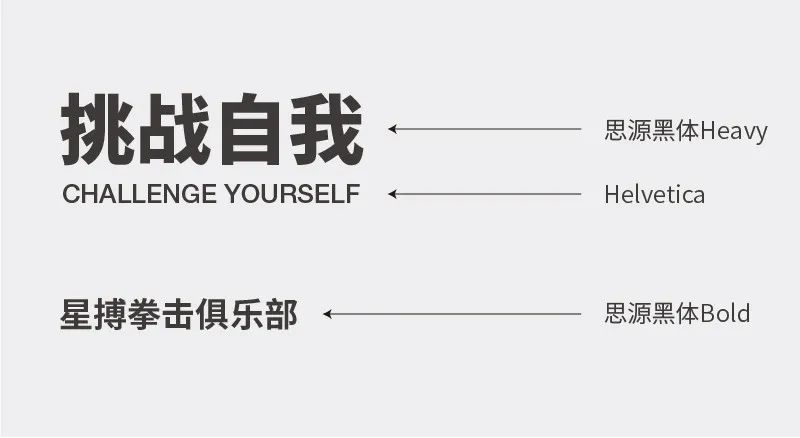
For the second-level title and club name, use "Siyuan Blackbody", and choose the thicker "Heavy" and "Bold" fonts in the font family respectively. English is matched with the "Helvetica" font with a similar style.
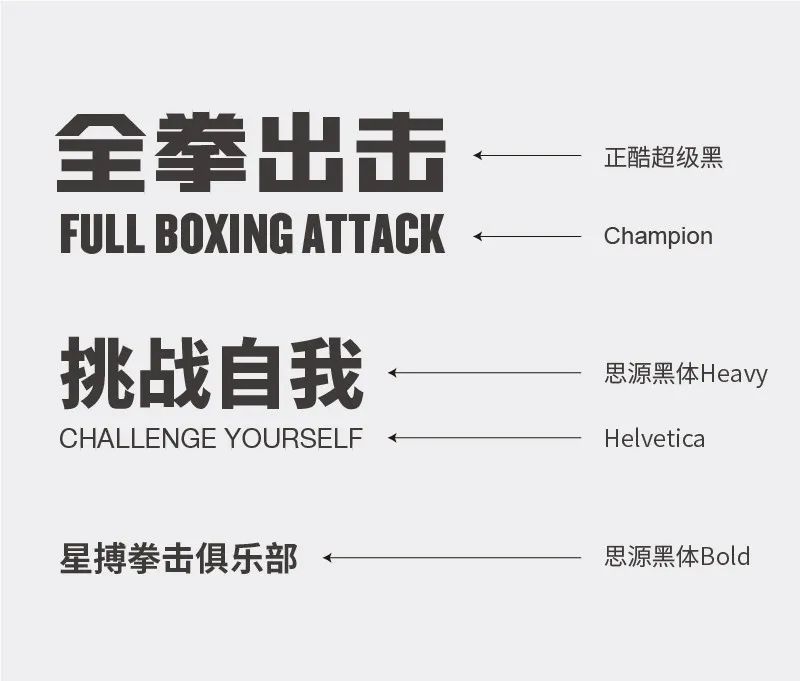
In this way, through the size and thickness of the font, it is distinguished by primary and secondary,
The visual hierarchy is established.
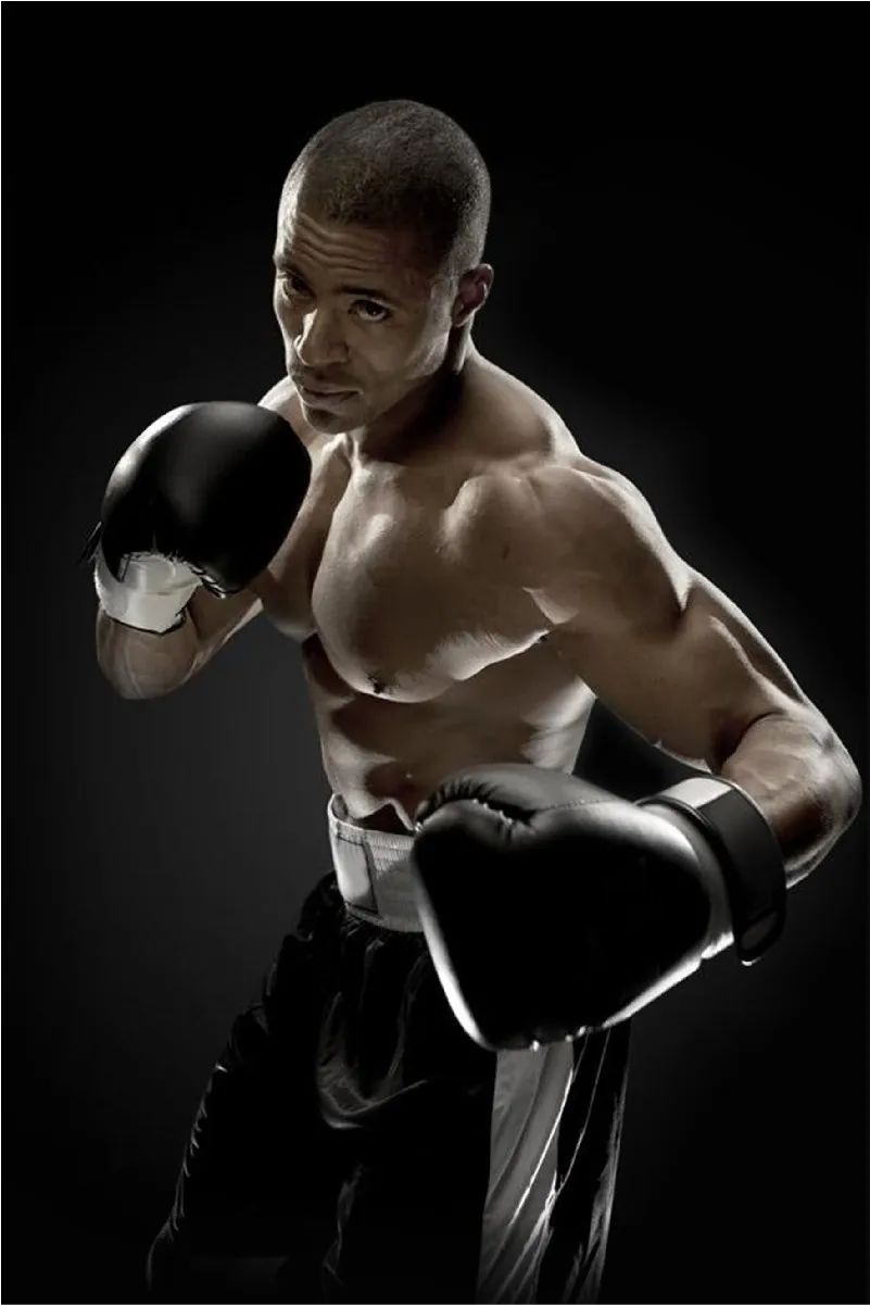
Image selection and processing
Next, look for a picture, search for the keyword "boxing" through the material website, and choose a picture of a boxer with a better visual effect. As shown in the picture below, the inclined composition creates a sense of instability in the picture, and the movements of the boxers can well reflect the confrontation and strength of boxing.
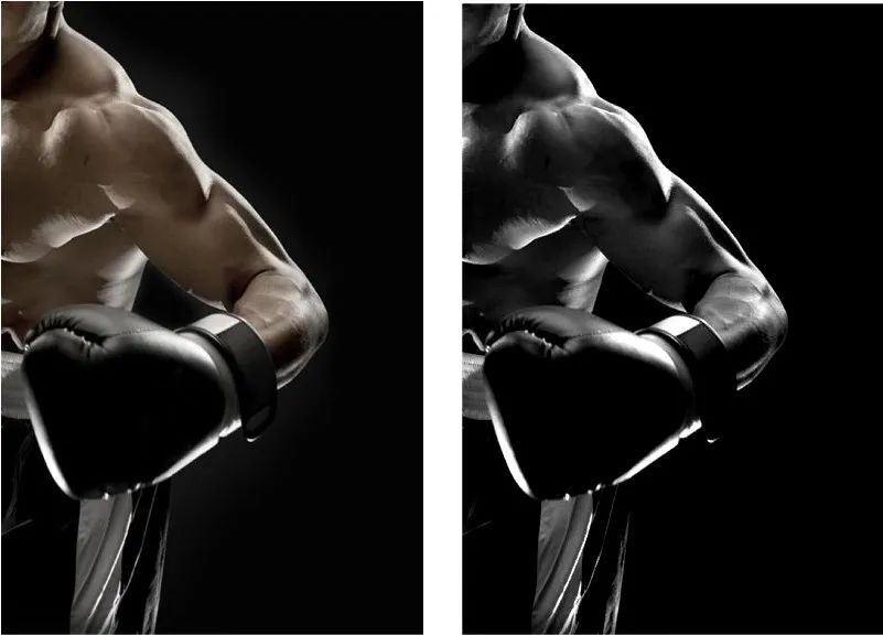
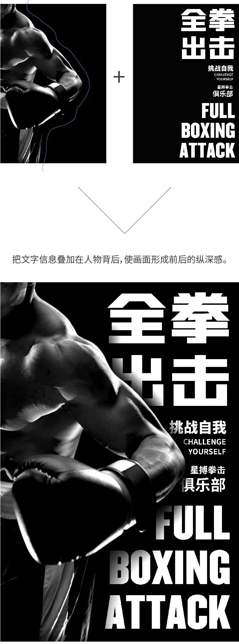
Move the picture to the left of the screen, occupying the full proportion of the screen, leaving a space on the right for text information typesetting, forming a left and right composition. Adjust the photo to black and white and enhance the contrast to make the picture more imposing and texture better.
Text information arrangement
According to the previously selected font,
arranges the text in the remaining space according to the outline of the picture.
In-depth description
Now the white characters are rather abrupt in the picture. In order to make the picture more integrated, the processing method is to add texture to it. The method is to use the clipping mask function of PS, put the character picture above the text layer, and use the shortcut key: Ctrl+Alt+G, so that the character image can be placed into the text.
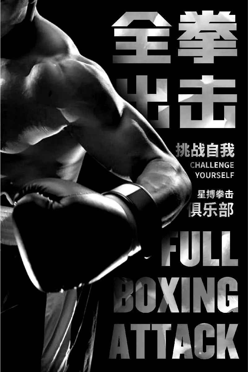
Next, adjust the brightness of the people picture,
makes the text effect and layout style more unified.
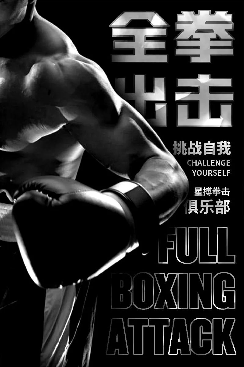
Observing the screen, I found that the English information of the main title is too eye-catching, so the English stroke processing is weakened. The stroke effect is also added to the main title Chinese, which can not only emphasize, but also enhance the texture and layering. The design is completed:
Try other options
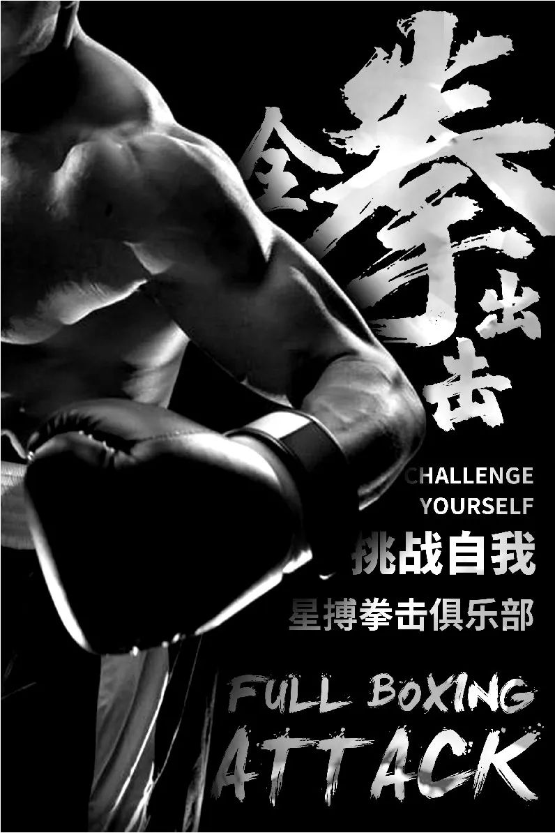
Try to change the title to calligraphy fonts, you can see the dynamic and majestic calligraphy fonts, which have strong visual tension, and can also fit with the layout style. It can be seen that the selection and collocation of fonts are not static. Designers need to accumulate experience through continuous design practice, deepen their understanding of different fonts, and make flexible choices and collocations.

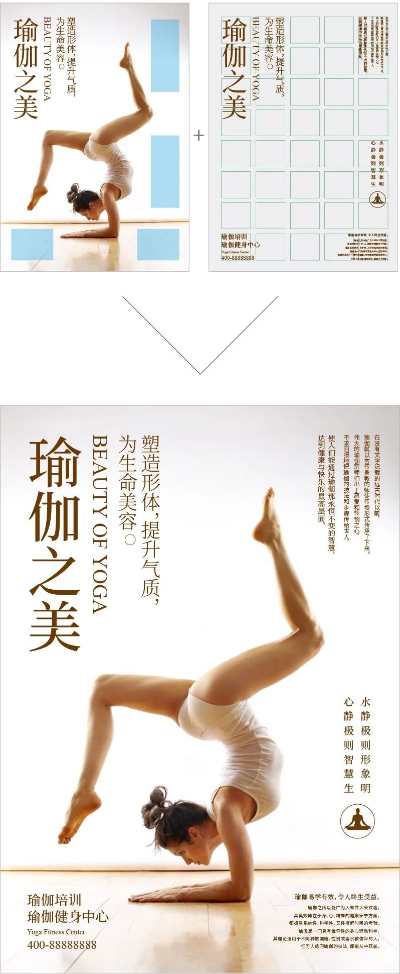
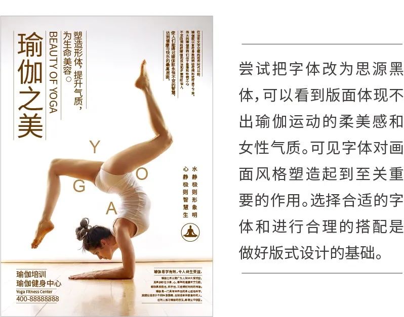
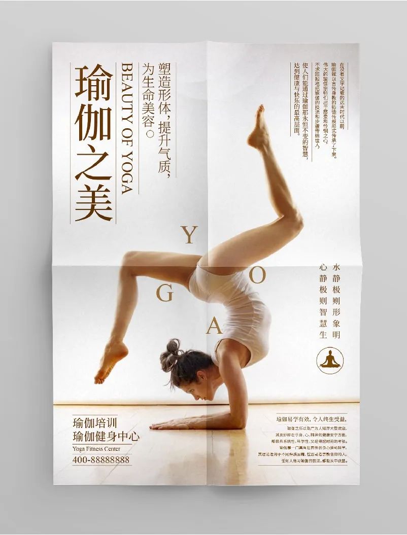
The second case is a promotional poster about yoga training,
The following is the text information:
Case Study
Look for excellent poster design works about yoga for reference, analyze the commonly used font selection and matching, and also refer to picture selection, color matching, space composition, etc.
Font selection and matching
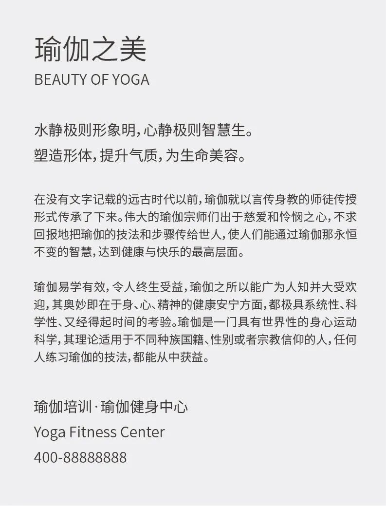
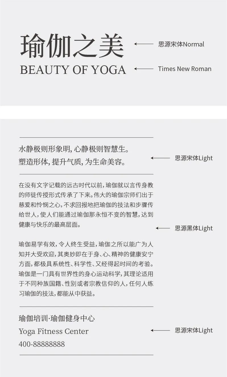
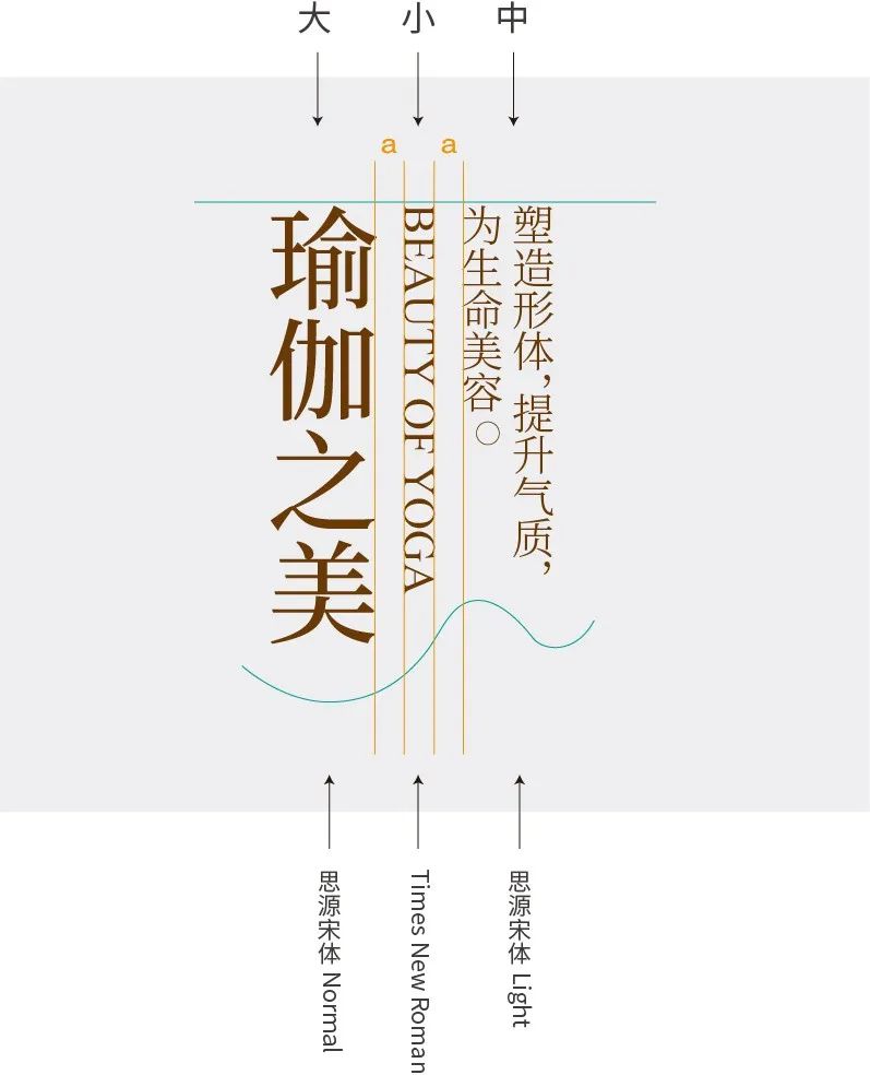
Yoga is a feminine and feminine movement, so the main title should give priority to the elegant, classic, dignified and beautiful Arial. The main title of this case chooses "Siyuan Songti" with clear edges and corners and rigorous structure. In the font family, "Normal" with thin strokes is selected, and "TimesNewRoman" is selected for English. The stroke decoration and style characteristics are relatively unified. For other information, select "Siyuan Song Typeface Light" and "Siyuan Heiti Light" to reflect the relationship between primary and secondary levels through font size.
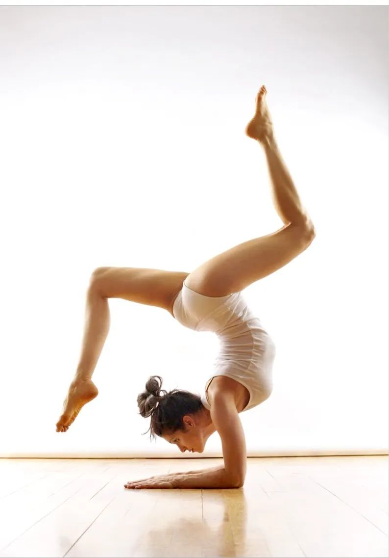
Image Selection
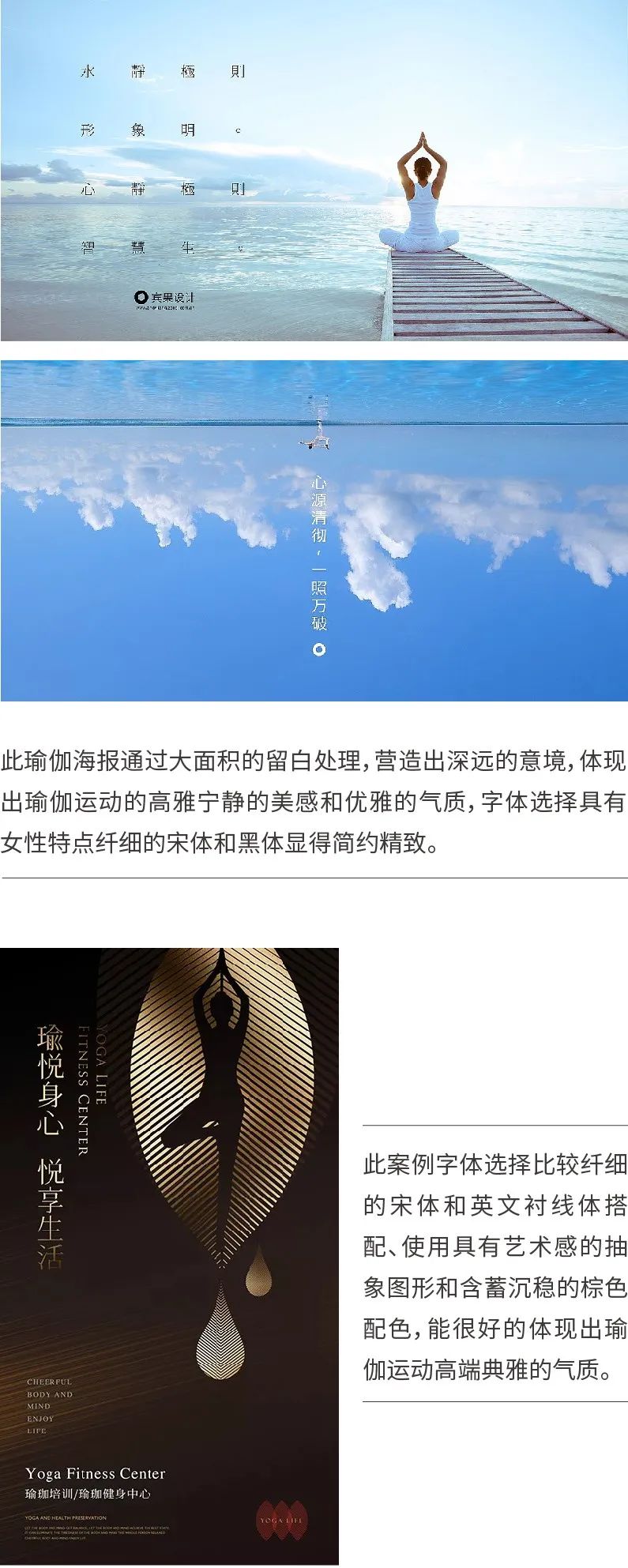
Next, look for a picture, search for the keyword "yoga" through the material website, and choose a picture of yoga exercise with better visual effects. As shown in the picture below, graceful body movements can well reflect the elegance and softness of yoga.
Main Title Description
Delineate the main title, through the size and thickness of the font, distinguish between primary and secondary, establish three visual levels, and use the same brown color as the picture.
Also pay attention to the arrangement of information under the same level, the spacing is generally equal, and the length of the text should pay attention to the rhythm of "length" arrangement.
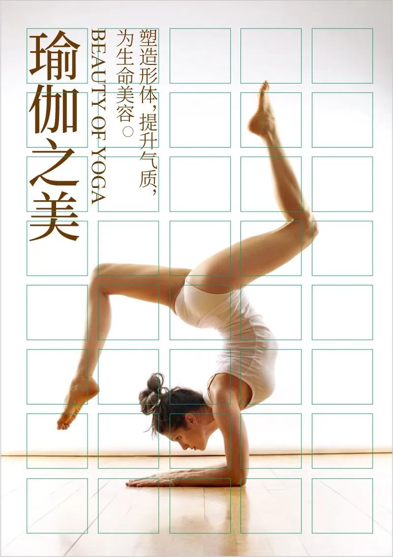
Use a grid to determine the typesetting method and proportional relationship. Here we use a 5X8 grid. Place the title on the upper left of the screen to occupy 2 grid widths, and the right space occupies 3 grid widths, forming a 2:3 close to gold split ratio.
Space Division
Divide the space according to the model's body movements, arrange other information in the blank space, and use the grid to assist in alignment.
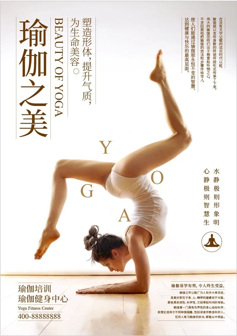
The lines are added at the end to make the information division clearer and more aesthetic. Arrange yoga English "YOGA" around the body of the model to make the picture more flexible.

Summary
In this issue, through the practical demonstrations of boxing and yoga poster design, we will explain how to determine the font type according to the layout style and choose a reasonable font for matching, helping you deepen your understanding of the selection and matching skills of HeiTi and SongTi. The next issue will focus on the selection and matching skills of round and calligraphy fonts, see you in the next issue!
If you don't know enough about fonts, you can check out previous font recommendation articles. Follow the WeChat public account: Yihai Shibei Design (ID: YHSBds) , reply "Font Practice" in the background of the official account to get practice materials and design source files.
Review

Teach you to get rid of font selection difficulties

Quickly grasp the idea of font collocation
Chinese font recommendation
The Beauty of Chinese Characters (Part 1)—Font Recommendation Series 1
The Beauty of Chinese Characters (Chinese) - Song Ti Hei Ti Recommendation
The Beauty of Chinese Characters (Part 2)—Recommended Calligraphy Fonts
Eye-catching weapon! Title font recommendation (on)
beautiful! Title font recommendation (below)
Recommended English fonts and digital fonts
Design essential! English font recommendation (Part 1)
Plenty of personality! English font recommendation (below)
Super practical price font recommendation!
Free commercial font recommendation
Zhanku font family
Siyuan font family
Pangmen Zhengdao font family
Hu Xiaobo font family
Free commercial fonts for designers (collection)


Articles are uploaded by users and are for non-commercial browsing only. Posted by: Lomu, please indicate the source: https://www.daogebangong.com/en/articles/detail/Practical%20demonstration%20of%20font%20selection%20and%20collocation%20Part%201.html
 支付宝扫一扫
评论列表(196条)
测试