Have you ever encountered such a situation:
Spent well It took a few days to make a company introduction PPT, and I showed it to the leader with confidence, but I was disliked that your PPT was not concise enough, and the advanced layout could not show the company's image;
Job competition, I have worked hard for many days to write all my achievements and contributions on the PPT, but I still can’t get the approval of the leader, but others only made a few pages of PPT but they succeeded in the competition;
Company year-end summary Compared with other people's PPT, the PPT that I racked my brains always looks so inferior...

Spread in the workplace According to such a passage, those who work are not as good as those who write PPTs, those who write PPTs are not as good as those who speak PPTs, and those who speak PPTs are not as good as those who listen to PPTs. If you want to become a leader who sits in the front row and listens to PPT, you must first learn to make high-quality PPT.
Today we will ComeLearn how to make your PPT typesetting high-level, so that your PPT looks great every time Can amaze four.
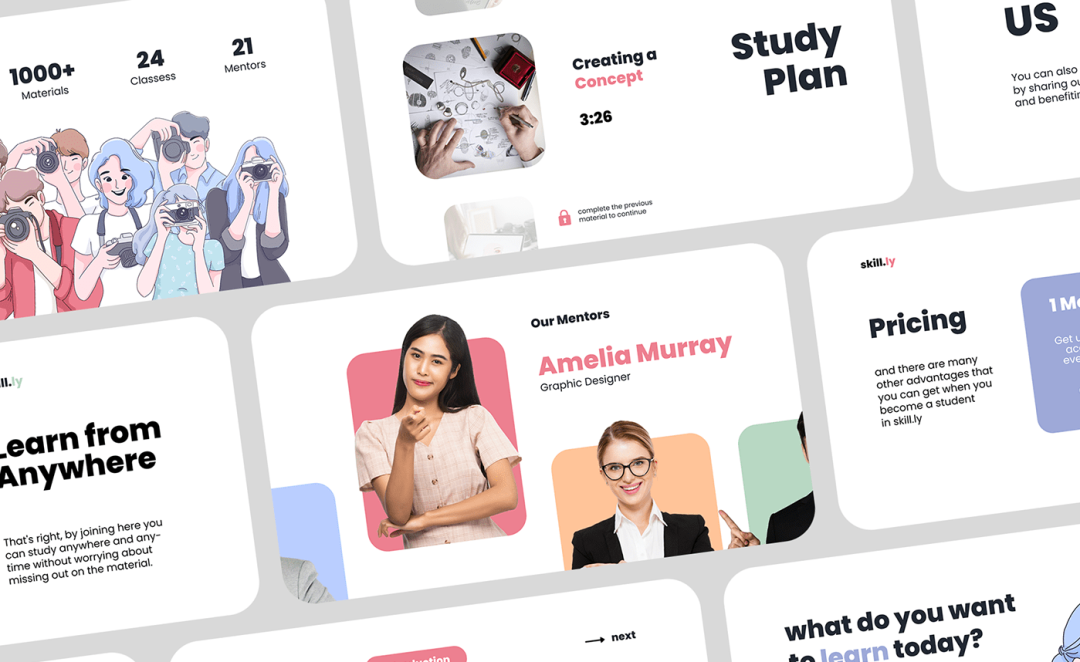
Learning content Before that, let's feel what kind of PPT will give you a sense of visual design?

Advanced design doesn't have to be complicated.
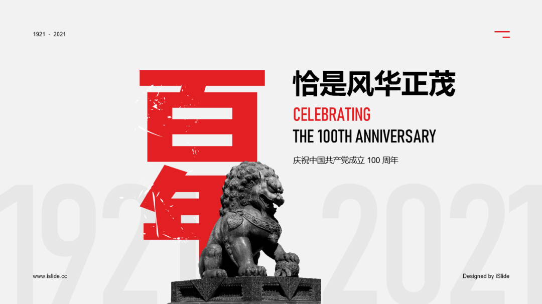
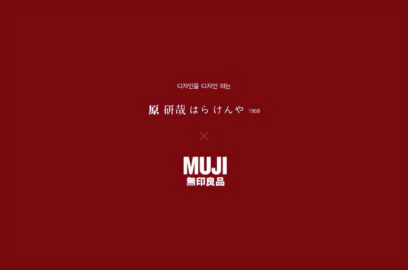
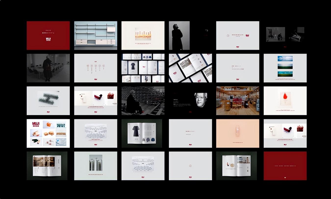
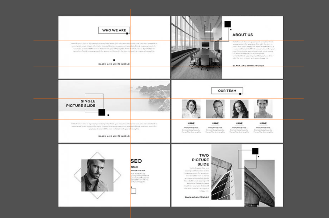
As a Japanese top The PPT of MUJI, a retail company, has always been a model of "reducing complexity to simplicity".
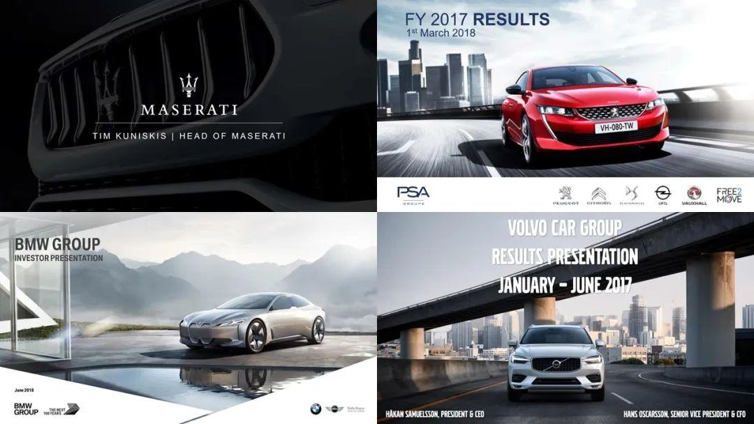
There are various The presentation PPTs of major manufacturers are also full of "apple flavor".
...
But for non Designers always feel that these PPTs are out of reach. So today, we have sorted out the design routine of six characters: "color" "character" " "Picture", "Stay", "Simple" and "Align", to help you quickly realize the high-level sense of PPT design and layout.

"Color"——do subtraction on color
Those designs that look "professional" will pay attention to harmonious color matching, and "Primary and secondary" in color application.
Designed Color is not just to differentiate and emphasize, but also to map the company's VI and content theme. Designers often use people's cognitive impressions of color to convey emotion and positioning. So do you know why so many energy industries like to use blue-green as the main color of enterprises?
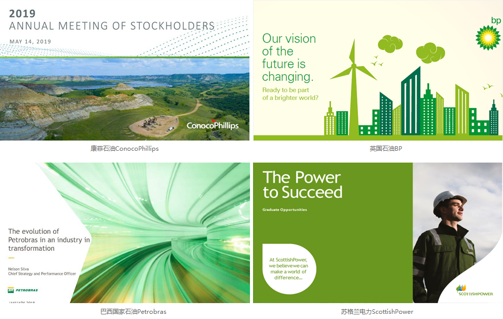
Part of the world's top 500 energy industries
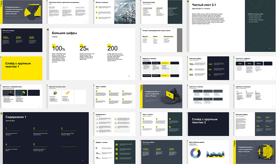
General sense of luxury All PPT color schemes will revolve around a main tone, giving people a bright color impression. Companies/enterprises will choose the VI logo color as the main color to establish the color recognition of the brand. Main color + no color (black, white and gray) is the usual combination of designers:
BY Sanjay Motiani
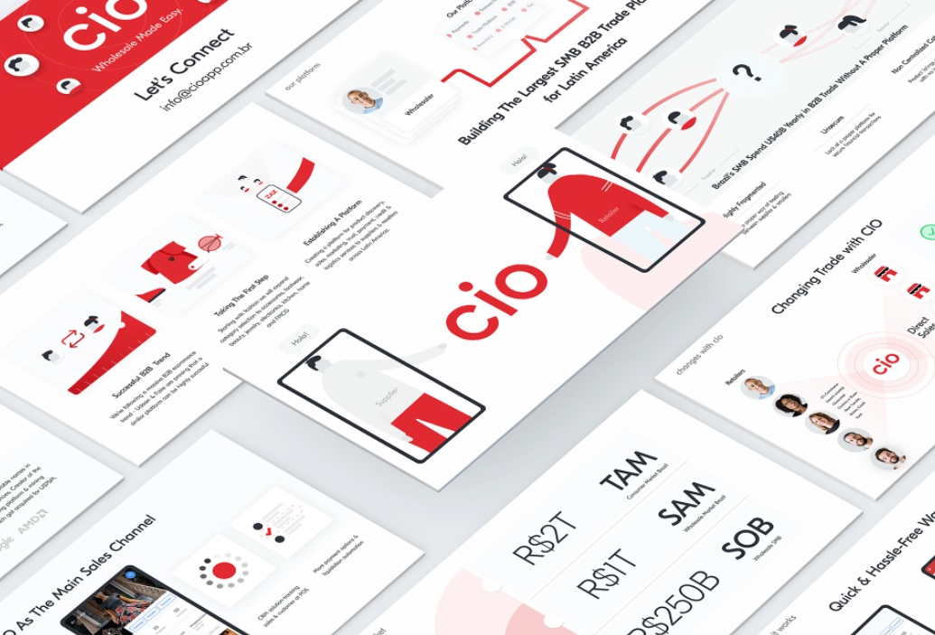
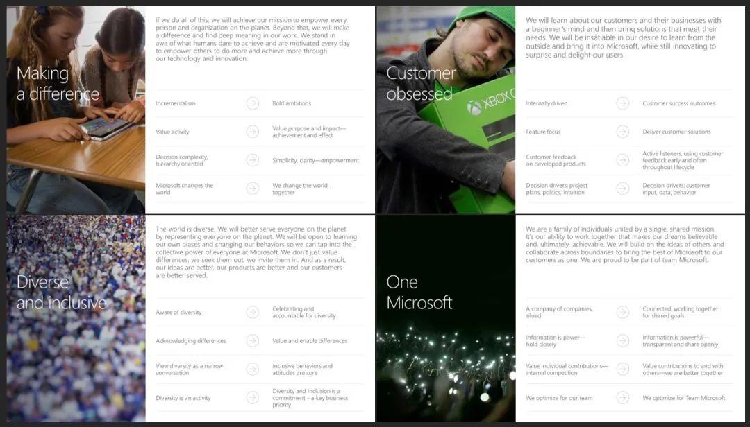
can also use The main color of the picture or graphic is used as the color tone of the whole picture, such as the PPT cover design of some well-known companies:
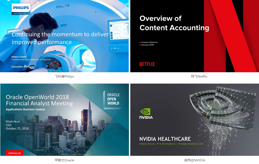
The world's top 500 PPT templates
Of course, if If you want to learn color matching, the quickest way is to start with imitation.
Find some great As a reference, use the color picker in the PPT to pick up the color on the case, and then apply it to your own PPT, and keep the color consistency between the front and back pages. Here are some common color matching methods:
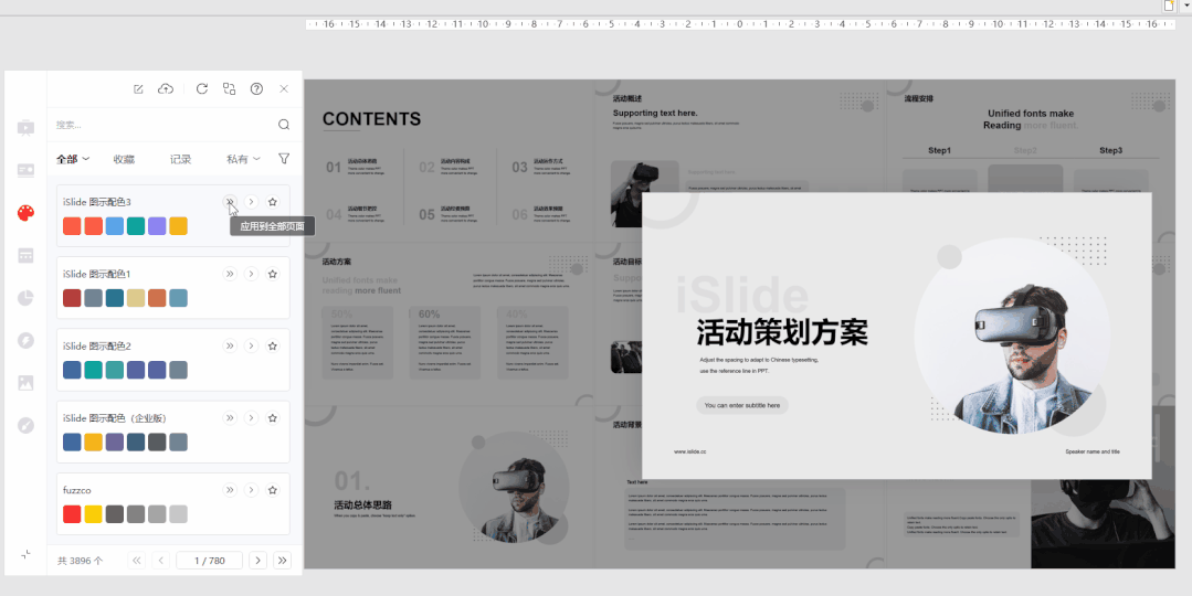
iSlide plugin color library (www.islide.cc)
Open iSlide plugin [Color Library] in Here are the theme colors of various companies matched by designers, The most convenient point is that you can click directly "Apply to the entire PPT " or "Apply to the currently selected page". Using the "theme color" concept in PPT, you can freely replace PPT like "skin" The overall color scheme in .
design by islide
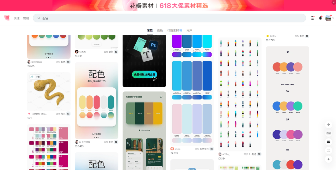
huaban.com
In petal net Directly search for color matching, and there will be many advanced color matching references. We can directly capture the picture and paste it in the PPT, and use the color picker to pick up the color on the picture.
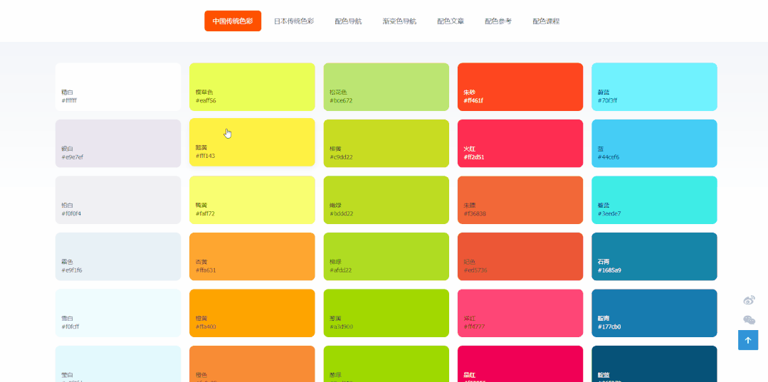
Color Navigation Network (color.uisdc.com)
Similar online color matching There are many websites in the website, which have collected many excellent color schemes, such as Chinese traditional colors, Japanese traditional colors, color matching navigation, gradient color schemes, etc., and the color values can be copied and pasted directly, which is very convenient.

"Word"——distinguishing standard and special
Graphic designers usually use the different "temperament" of fonts to choose suitable fonts as components of the screen.
But the PPT is different The most important thing is that continuous reading is required, which means that we don't want to play with "personality" on paragraphs of fonts, and prefer to be more regular; but if it is a road show, a presentation scene, or some cover design, personalized fonts It can also highlight the theme and have a high-level design in typography.
For example like this A set of comparisons:
Designers usually Different typesetting methods will be matched according to different fonts.
But be careful : When using some special fonts that do not come with the system, such a situation may occur. Obviously, it is normal to open it on your computer, but you can send it to others to open it and find that the fonts have all changed. This is because< strong>The font you use is not installed on the other party's computer, the document font loss occurred.
So general PPT Some of the designer’s works will come with font files. Only after installation can the fonts be displayed normally, showing the original design effect. Of course, you can also use the following simpler methods in PPT:
- Embed text into the PPT file [File - Options - Save - Embed fonts into the file] But this will increase the memory of the file.
- Use the iSlide plug-in to export the entire PPT as a full-image PPT [iSlide——Export——Save as a full image PPT] But the content cannot be edited after this operation, and if you make content animation All will be invalid, so you need to choose to use according to the situation.
- Select special fonts to convert to shapes. Use the "Font Vectorization" in iSlide [Design Tool] to convert text box text into vector graphics. (Suitable special fonts are only used as titles, and are not used when modifying.)

design by islide
Except select matches In addition to the font of the style theme, useAppropriate white space typesetting and random matching between font levels< /span>, can also make your PPT typesetting advanced without using pictures!
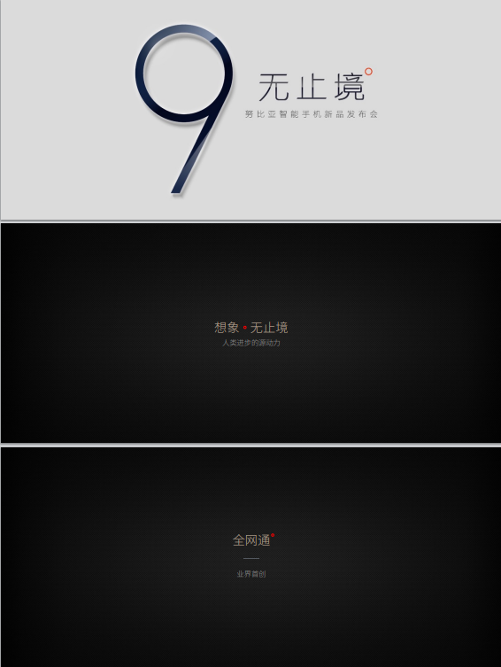
Nubia mobile phone launch conference PPT

Vancl new product launch PPT

"Picture" - a picture is worth a thousand words
For PPT application scenarios that require roadshow presentations, the text presented on the page is often less, But if such a simple text is placed directly on the PPT, it will look ordinary, if Adding a suitable picture will immediately improve the overall style by N levels.


General roadshow or conference-level PPTs will use large pictures on the cover to show their own theme or highlight humanities and products.
So these look good Where can I find high-end and atmospheric pictures?
Here for everyone Recommend a few high-definition free commercial picture material websites commonly used by great designers:
- pixabay
- hippopx
- unsplash
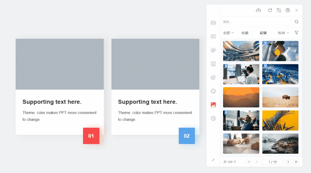
Of course, you can also use iSlide [Picture Library], directly click to download or select any graphic in the PPT, then the selected picture can be inserted into the graphic, and the proportion will not be deformed. (iSlide members also support uploading and building their own picture library)

“Stay”——Gap and space
In traditional Chinese ink painting, blank space is a relatively advanced artistic technique, which can leave a kind of charm to the painting. The blank space in the design reflects a sense of quality. Blank space can give people imagination, leaving more room for imagination, highlighting the artistic conception and allowing the page to "breathe" freely!
Sanjay Motiani

Hammer conference PPT

"Simplified"——Remove redundant, present important points
Imagine if a page of PPT is densely packed with text and pictures, what would you be when you see such a page of PPT Feel?
Generally for text For more PPTs, we can follow the following four simple principles for optimization and modification:
- Find the key——Remove non-key information, Remove content that interferes with the display of key information.
- Increase the font size——Refining key points For the subtitle, the font size should be increased appropriately for the content of the title.
- Fill color——Give key text Set the color or fill background color.
- Leave enough space——Give text Keep a certain distance between paragraphs to give the page a sense of hierarchy.
Simple page It can often give people a more high-end and atmospheric feeling, and at the same time, the simple page often pays more attention to the layering of copywriting in design and layout, making it more fluent to read!

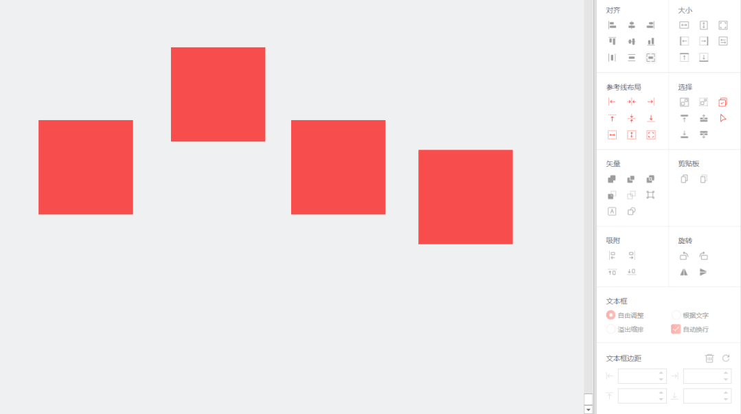
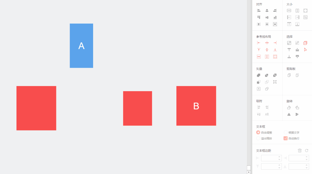
"Alignment"——various typesetting alignment
Professional design looks simple on the surface, but the underlying principle of simple design is often some complicated design standards! The seemingly random typography is often repeatedly modified and aligned by the designer.
We cannot make the Keep all text content the same length, but create some consistent sized lines, wireframes, or graphics via , you can make the seemingly messy content tidy.
For example, in " "Equal height" or "equal width" tables are filled with data of different lengths.

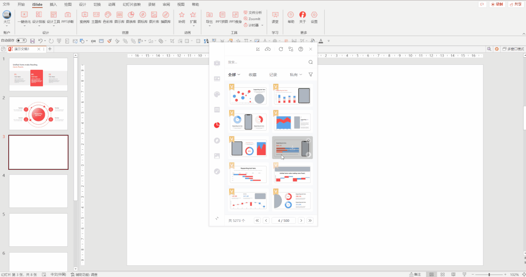
can be passed through iSlide [Illustration Library] Download some sample templates made by designers, and pay attention to the alignment details between content and content.
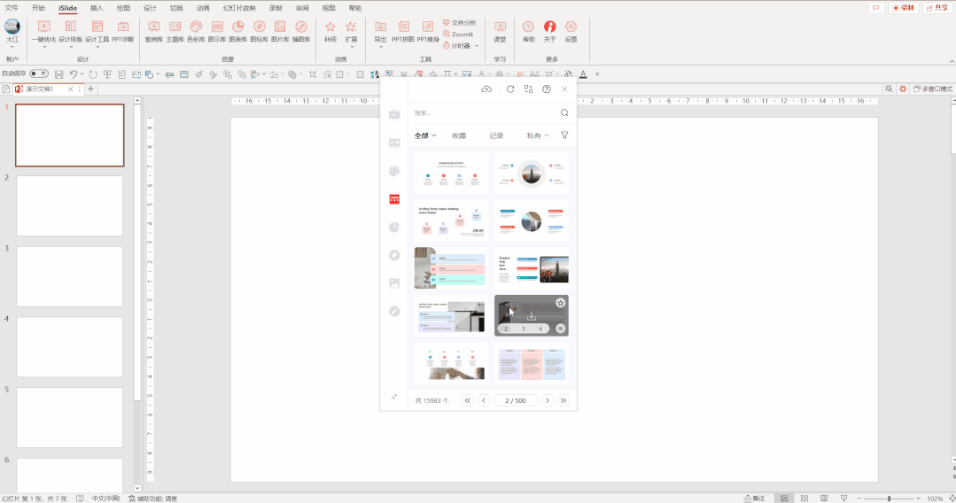
You can also try Take a look at the content in [Chart Library]. Remember to select those empty "picture placeholders" and use iSlide [picture library] to fill in the picture content~
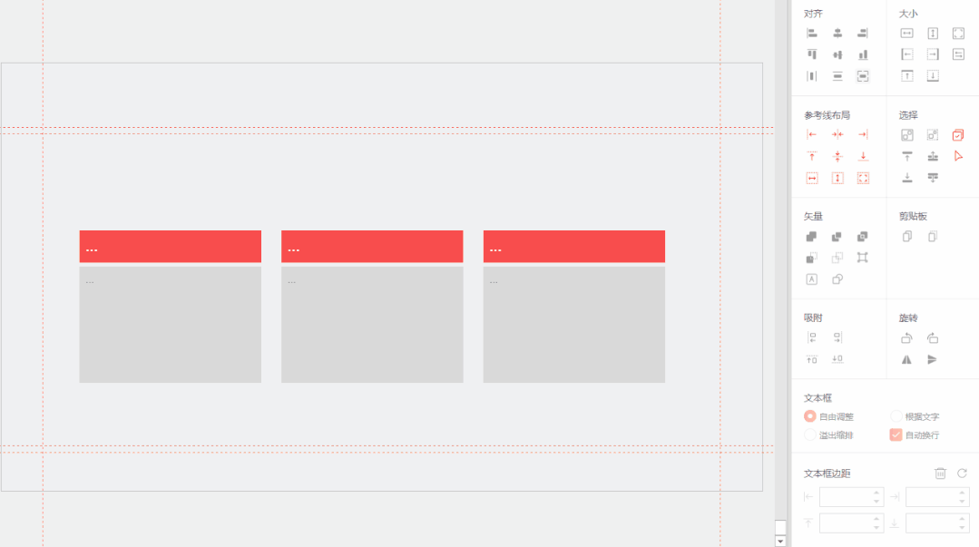
for page content typesetting alignment. You can use the various auxiliary alignment and typesetting functions in the sidebar of iSlide [Design Tools] (specially for obsessive-compulsive disorder) to quickly achieve various standardized alignment and typesetting.

So those look Behind the professional and advanced design, there are certain rules and "routines".
Six-character principle : "Color" "Character" "Picture" "Stay" "Simple" "Qi":
Color: Do subtraction on color.
Words: Distinguish between standard and special.
Picture: A picture is worth a thousand words.
Stay: gap and blank space.
Jane: Remove the redundant and present the key points.
Qi: All kinds of typography alignment.
You remember Have you tried it together and start making changes on the PPT!
Articles are uploaded by users and are for non-commercial browsing only. Posted by: Lomu, please indicate the source: https://www.daogebangong.com/en/articles/detail/Practical%20application%20Master%20the%20six%20characters%20and%20make%20a%20highlevel%20PPT%20typesetting.html
 支付宝扫一扫
评论列表(196条)
测试