Sorry, I don't quite understand what you need me to do. Can you describe your request more specifically?
Editor's recommendation:
Очень>
The following article comes from Chengmaju, author Chengmaju
ChengmajuCode all day, probably can become beautiful
by Chengmaju
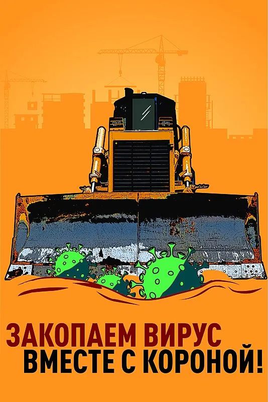
The title picture is the construction site of the " shelter hospital" under construction in Moscow two weeks ago. Several "anti-epidemic posters" are particularly eye-catching . The news photo once attracted netizens to watch, and was regarded as a symbol of "Qitusu" restarting in the design industry for a while.
*Qitusu: A term used in Station B, which means that the atmosphere suddenly became Soviet
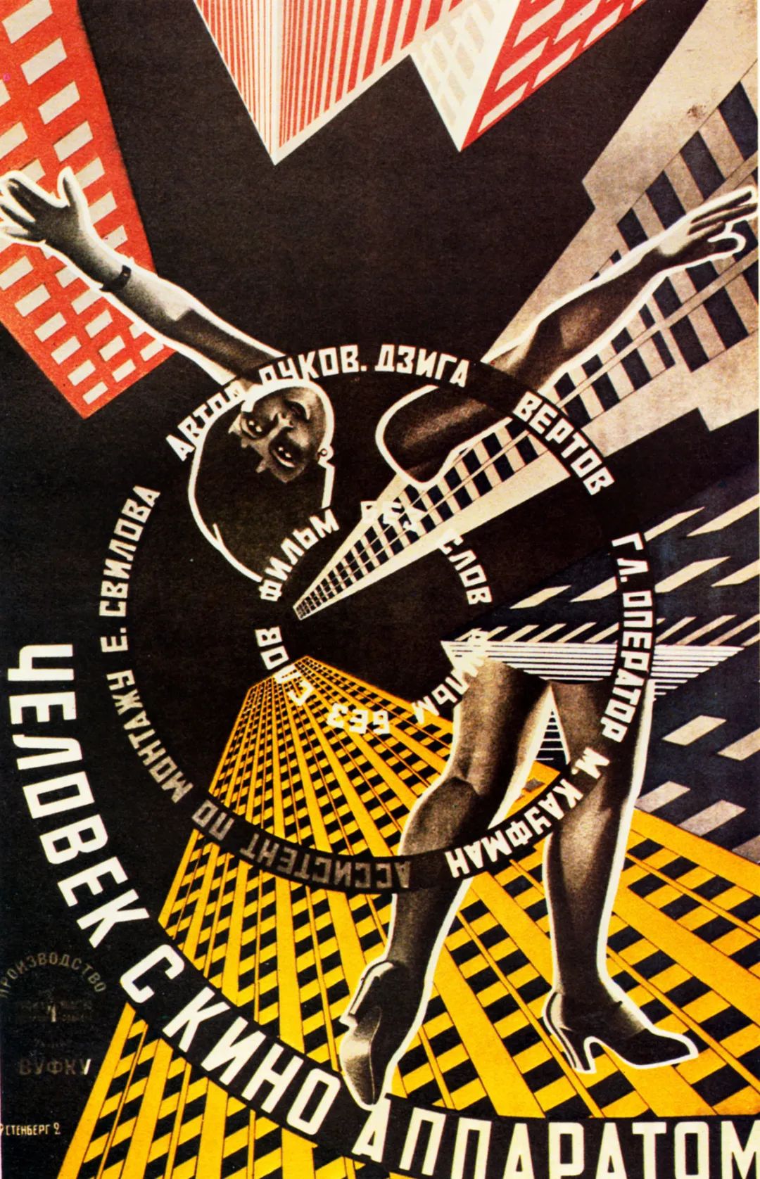
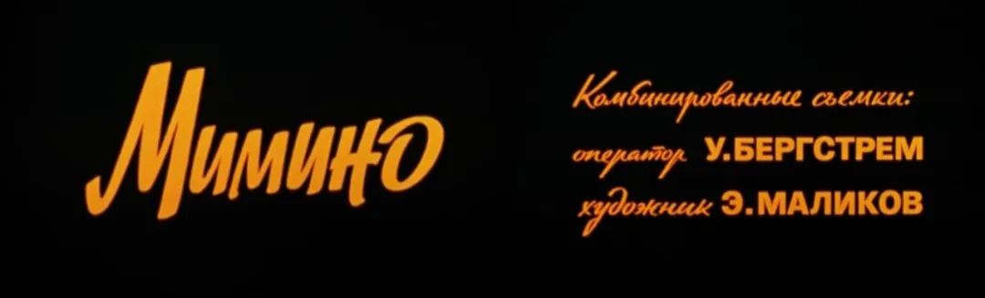
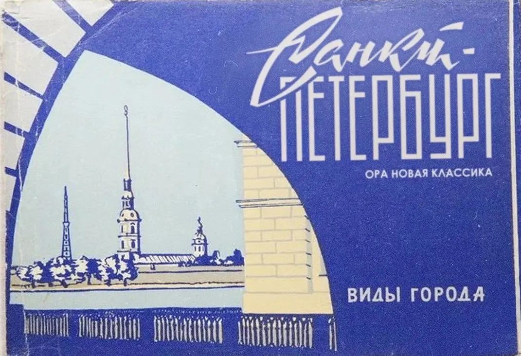
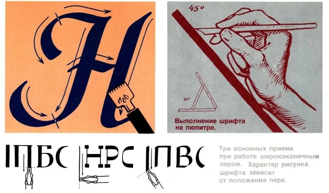
 My face is full of question marks, because in my impression This is what a Soviet poster should look like. ВладимириГеоргий Стенберги«Генерал»(1926). Why do I say that these anti-epidemic postershave nothing How about "Su"? The reason is very simple, the problem lies in the extreme The main image of the characters is beautiful, the font design is dull and mediocre, and the typesetting is lifeless. Whether it is posters, beer advertisements or leaflets scattered in the streets and alleys, Words are always the most important carrier to convey information. Designers and art workers have long discovered that an excellent font design brings people not only the information itself, but also the emotional components that the information conveys, whether strong or joyful or generous or melancholy. So let’s start today, what kind of font can make you Can you feel the strong "smell of the last century" at a glance? In September last year, the Russia-Soviet Design Aesthetics Interest Group Русский Дизайн shared several common Soviet art font designs on the Yandex photo blog (zen.yandex.ru):< section>For example, this kind of "classic model", the most well-known appeared in 1977Soviet tragicomedy movie "Мимино" Title subtitle design. Conceptual drawing of Русский Дизайн1977 Soviet tragicomedy film "Мимино" opening subtitlesThere is also this kind of "poster Body", the tool is special metal pen tip, usually three kinds of techniques are used to draw. A packaging carton with the landscape and words of St. Petersburg painted on the coverVK group Советский Дизайн uploaded a set of artistic font drawing skills diagrams, the lower left is three glyphs drawn according to the direction of the pen
< section>
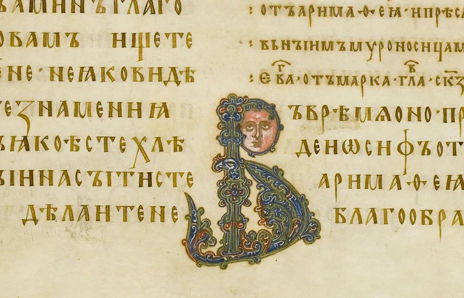
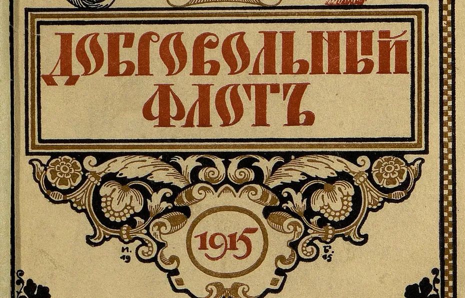
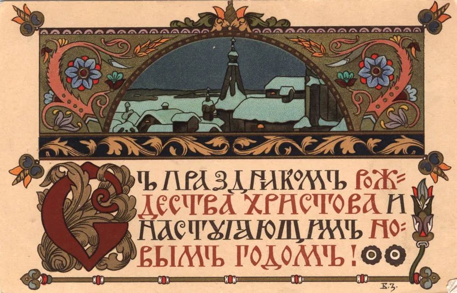
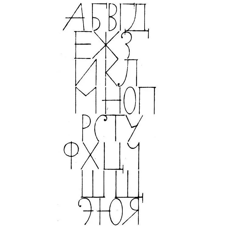
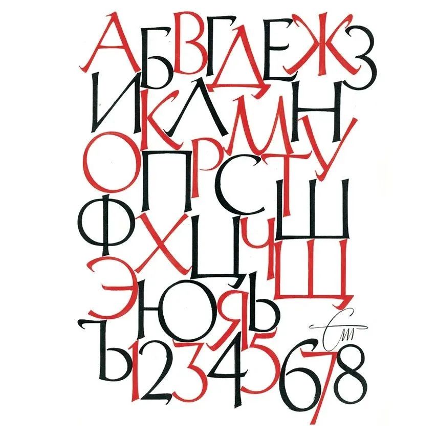
There is also a "rounded body" that is commonly used in wine, candy, and chocolate packaging Common "continuous strokes" in store neon signs and book covers Cursive". And when you enter sovietlettering in the search bar of pinterest, the world's largest photo social networking site, believe me, you will find a new world. An independent designer from St. Petersburg, Михаил Левченко, began to teach himself font design in 2011. Tomsk, his city, does not have fonts from Moscow and Petersburg. High-quality resources such as design schools, after establishing the Советский Леттеринг (Soviet Lettering) group on the Internet, in recent years have been committed to collecting various Soviet font logos from posters, posters, packaging, etc. On his own blog, М.Левченко summarizedSoviet font design from forming characteristics to further Several key opportunities for development. Before the October Revolution, most of the Cyrillic letters we saw in history books, periodicals and letters were Such. I. Остромирово Евангелие(РНБ.F.п. I.5) —древнейшаядатированнаявосточнославянскаярукопис (1056–1057) .Написана на пергамене уставом.II. Обложка книги «Добровольный флот.Петербург».Петроград,1915(фрам ент).III. Б.В. Зворык ин.Открытка «С праздникомРождестваХристова и наступающимНовымгодом»,между 1904 и 1916.
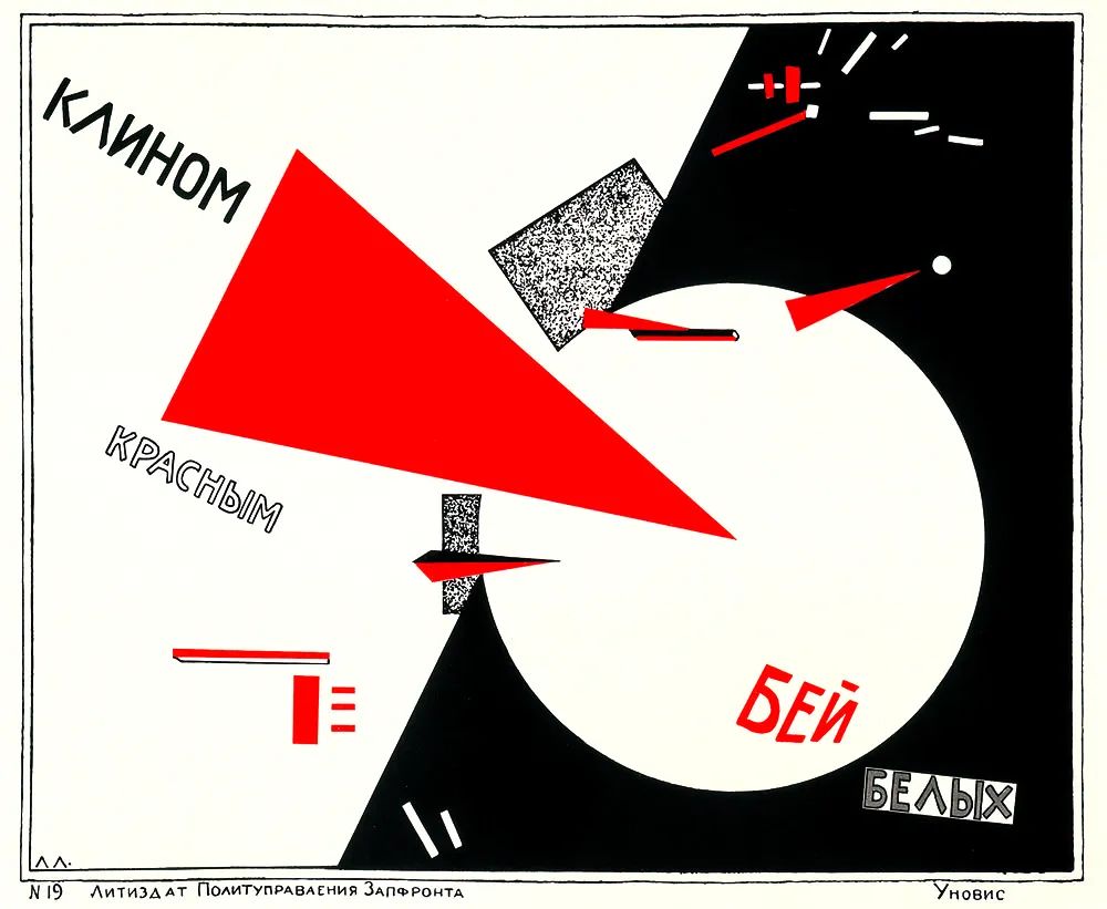
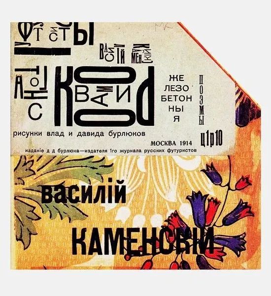
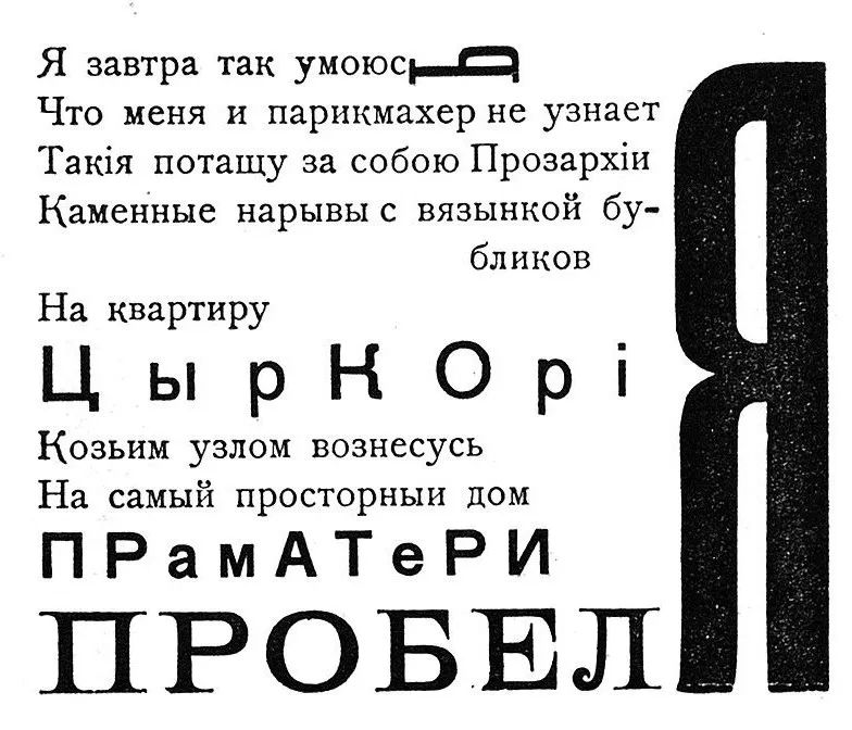
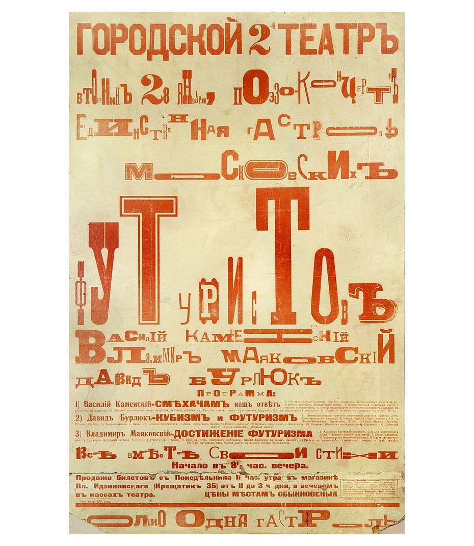
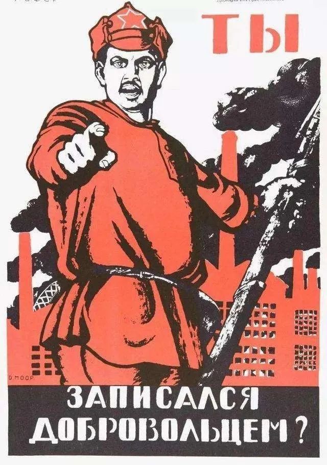
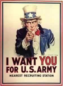
From the end of the 19th century to In the 1920s and 1930s, the penetration and development of the avant-garde in the field of Russian culture and art promoted the diversified regeneration of Cyrillic letters in the field of art and design to a certain extent. The avant-garde (avantgarde) originally referred to the politically radical artist groups in France and Russia in the middle of the 19th century, and was later used to refer to artists with innovative practical spirit in various periods. It is to break the traditional art system. The avant-garde is an open and dynamic concept in nature, so it shows different development trends in different eras. RochinKe (А.М.Роченко) and others as pioneer art Not onlythe first to realize the artistic potential of montage, but also to remove span>Adds elements that distract attention, making succinct collage the most vivid and accurate non-verbal communication The way. RochinCoadvertising poster in 1925In "Books" (Книги), used Lissitzky (Эль Лисицкий)'s < /span>"Attacking White with a Red Wedge" (Клином красным бейбелых), if Lissitzky's letters are still To fulfill the basic obligation of information transmission, then in the structural design of RochinKe, although the letters themselves in this period were not polished and showed a sense of design, each The vocabulary of each unit sectionhas been integrated into the texture of the structural expression. Theyconvey the theme with the strongest posture, and also undertake the dynamic role of balancing and adjusting the picture. 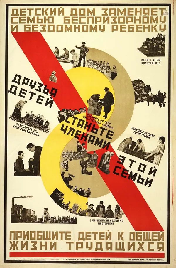 Lissitzky Attacking White with a Red WedgeFrom the Abramtsevo group to the art world, from primitive Avant-garde in Russia Ushered in the most exuberantperiod of vitality. Advertisers, designer groups, and artist unions are good atintegrating avant-garde spirit into poster design, flat straight lines and simple geometric compositions, The screen presents a dynamic layout. Неизвестныйхудожник, «Приобщайтедетейкобщейжизнитрудящихся»(1925)“Futurism< span>" can be called the "runaway horse" in the field of Russian literature and art in the 1920s and 1930s. This early 20th century< /span>Born inItalyItalyAfter taking root in Russia, there was a burst of “< /span>Abandon the old and create the new ” experimental whirlwind. After the futurists represented by Mayakovsky uttered"a slap in the face to the public", the design world quickly took the baton, span>Pursue innovation in fonts and typographyInnovation, content and style take second place"< span>Form is greater than content” was regarded as the standard of innovation and avant-garde for a while. I. Василий Каменский. Тангос коровами. Железобетонныепоэмы.М.:ИзданиеД. Д.Бурлюка,1914.II. ИгорьТерентьев.Стихотворениеиз сборника« Софии ГеоргиевнеМельниковой< /span>:Фантастическийкабачок»(Тифлис:41˚,1919).Фрагментнабора.III. Киевская афишавыступленияфутуристов. 1914.Из частнойколлекции.As for the painted The bust of Moscow Mayor Sobyanin in front of his finger and "Строители! Счетидетнаминуты!" Epidemic prevention posters, are they imitating the "You, have you signed up for the volunteer army?" created during the Soviet-Russian Civil War in 1920, or imitating the circle of "fans" during World War I Countless American "Uncle Sam", maybe the author himself is not clear. But obviously, apart from keeping Sobyanin in the same posture as the characters in the two masterpieces, the author made a complete mess of 「Mediocre」 in the overall combination of font and composition .
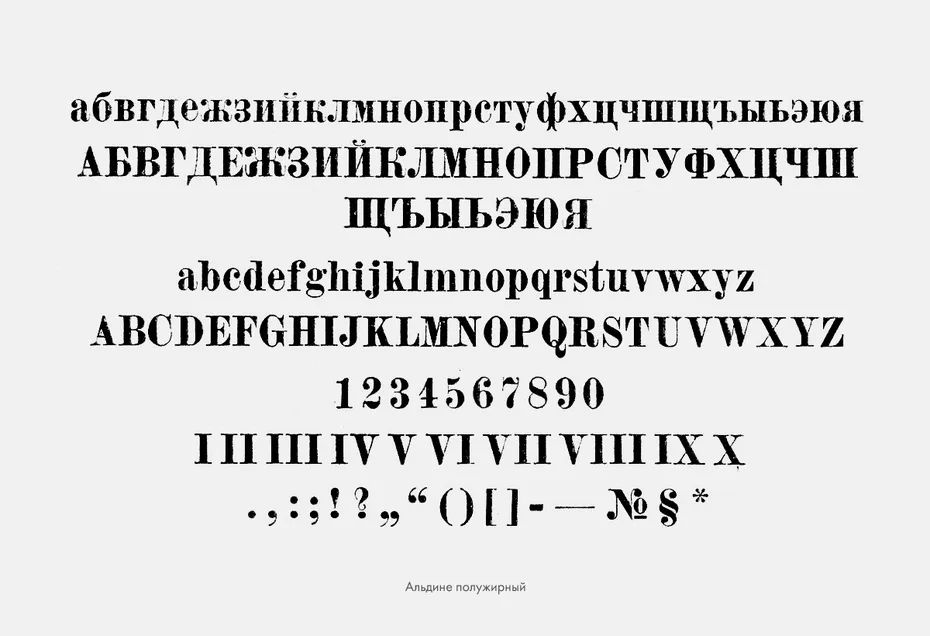
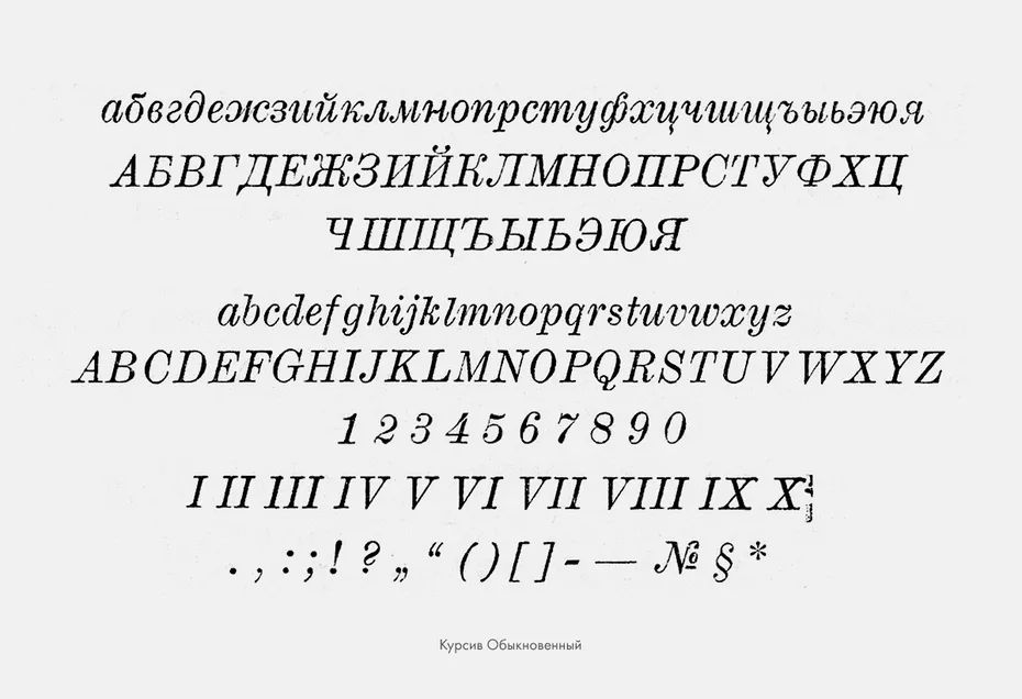
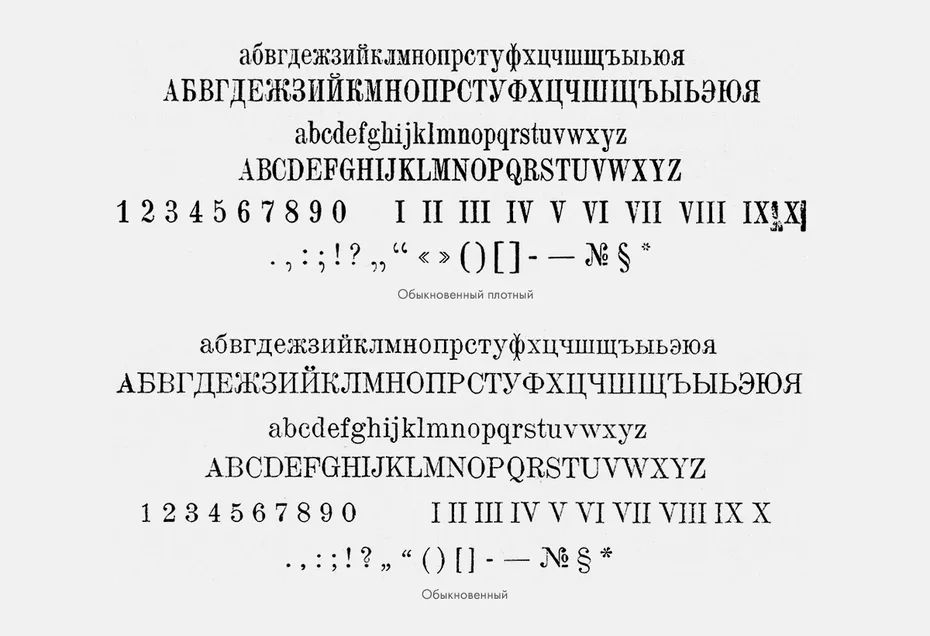
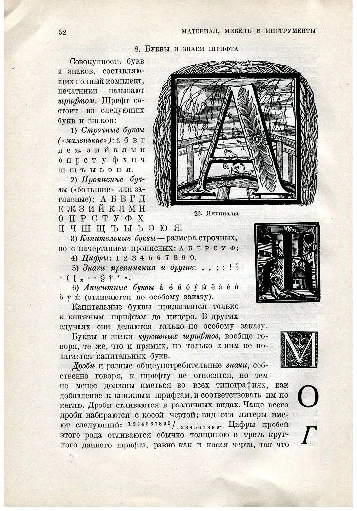
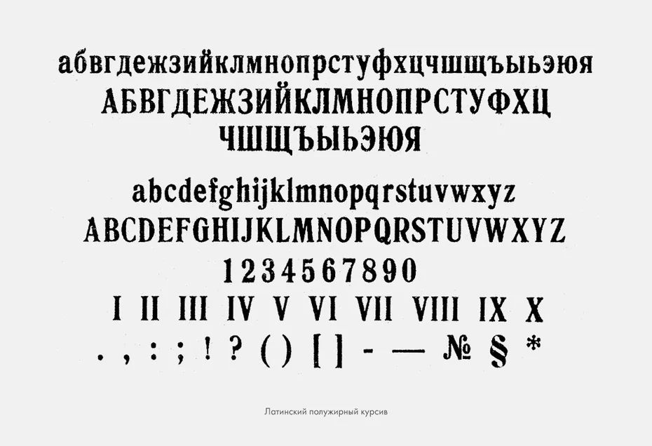
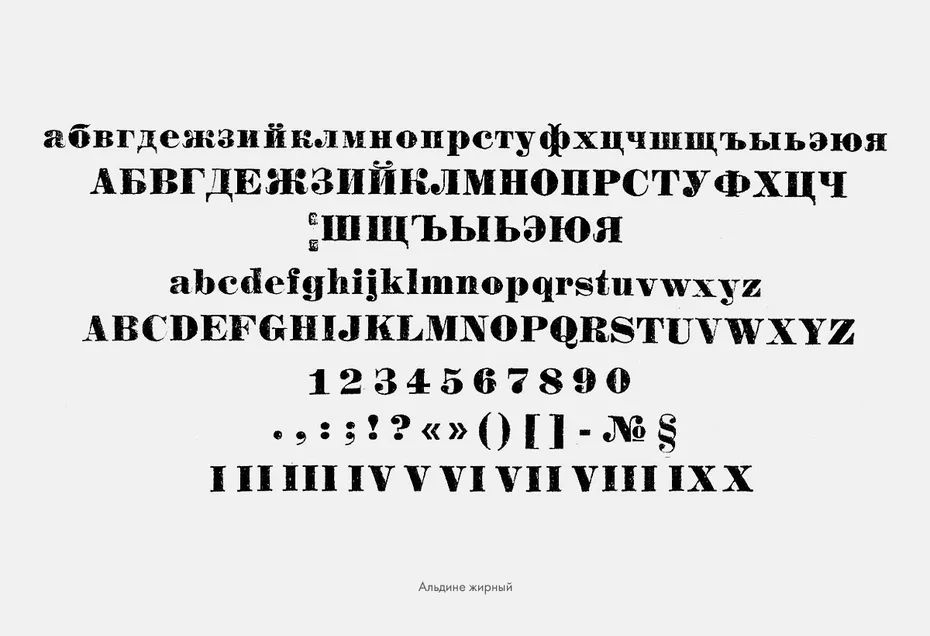 The first industrial crisis encountered by Soviet type designers occurred in 1930. At that time, a document issued by the All-Soviet Standardization Committee (Всесоюзный комитет постандартизации) greatly influenced the direction of Soviet design history. 1925 yearsestablishedafter the committee That is to start drastic standardization of the established rules of all walks of life. In 1927, three standard font catalogs were promulgated successively. According to Г.И.Лурье, in the absence of new fontsapproved, most of the more than 1,500 fonts at that time were adopted As a result, "the cover of national publications is surprisingly consistent". In February 1930, the committee adopted"Regulations for Type 1337" , this two-page document has still attracted considerable controversy to this day. In a tweet on the font design website Шрифт (https://typejournal.ru/) titled "A History of a Standard", the author digs deeply into "1337 Number" incident. Logo of font design website Шрифт (website switchable Russian/English)“ No. 1337” initially covered all handwritten fonts, but in the preliminary investigation of national fonts, the committee’s expert group included all fonts including trademarks and signs Fonts, even foreign fonts, are all included. Participated in“No. 1337”The first set of Soviet newspapers and periodicals was published Specification experts include artists and designers who specialize in book design and typography, veteran technicians with the most experience in printing houses, and even ophthalmologists who are responsible for testing the printing speed of various fonts with the most advanced instruments. “No. 1337” finally included 31 sets of fonts, divided into 7 major classes, they are numbered serially but retain their old names. For example, the "commonly used fonts" series (обыкновенный) cast by the Леман Foundry is mostly used in the printing of books and publications, and the No. 3 font has become the first choice for textbook fonts. "Common font" No. 3, dedicated to textbooks1899Designed by German designer Peter Schnorr "Latin font" (Lateinisch), which was introduced into the Cyrillic alphabet in 1901. In the following decades, this Latin font was once the most used font in Russia, so that“70% of the books in the country are printed in Latin” (В. А. Маркус,1949>
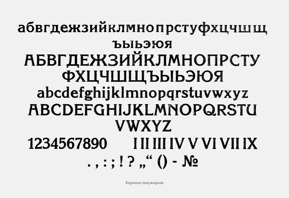
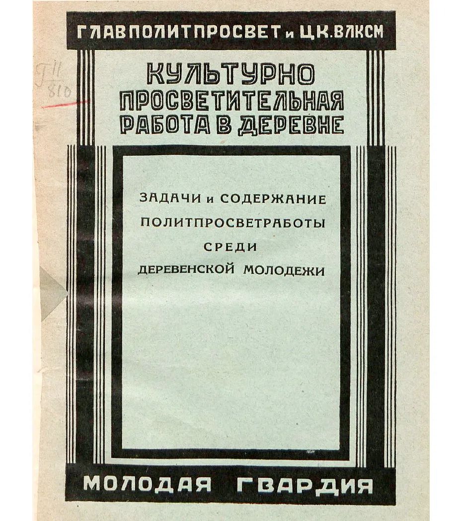 Textbooks printed in "Latin font" For example, the following font "Korinna" is mostly aimed at readers with low education level due to its consistent thickness of strokes and round body width, but it is difficult for ordinary readers to use this font to accurately and beautifully write А, Б , Ж, З, К, Р, С and other Cyrillic letters, so the scope of use of this font is very limited in the later period.
 Photosforeveryone
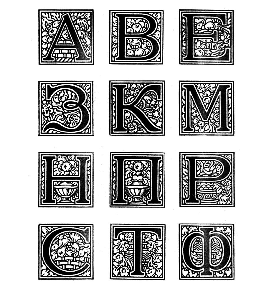
 “No. 1337 "The only font style of the first letter of the article included, it is said that was designed by А.Н.Лео, but in fact, this design with flower patterns as background decoration has already appeared in the Latin alphabet design.
 Photosforeveryone
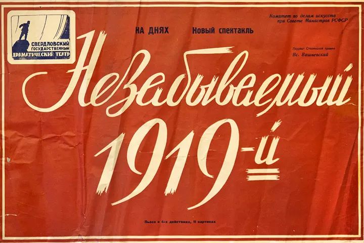
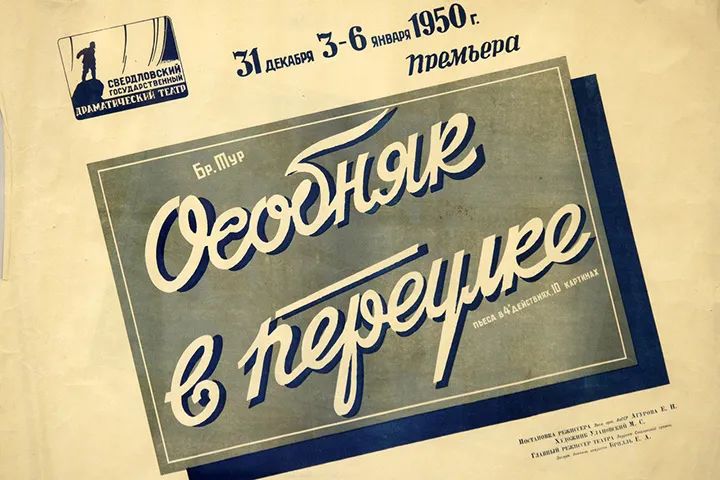
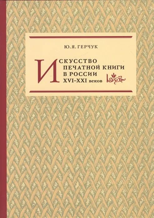
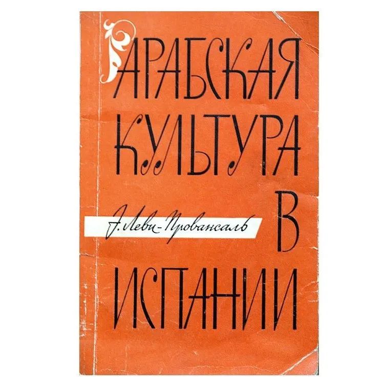
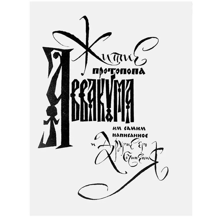
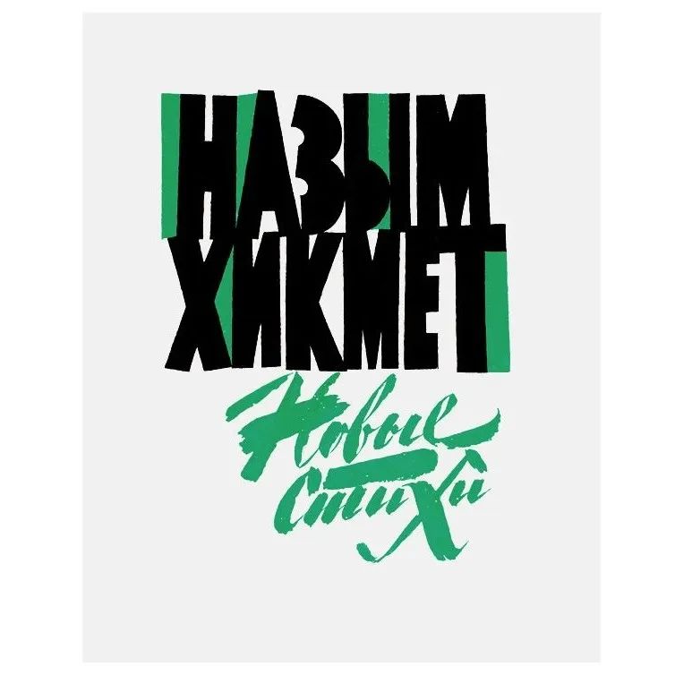
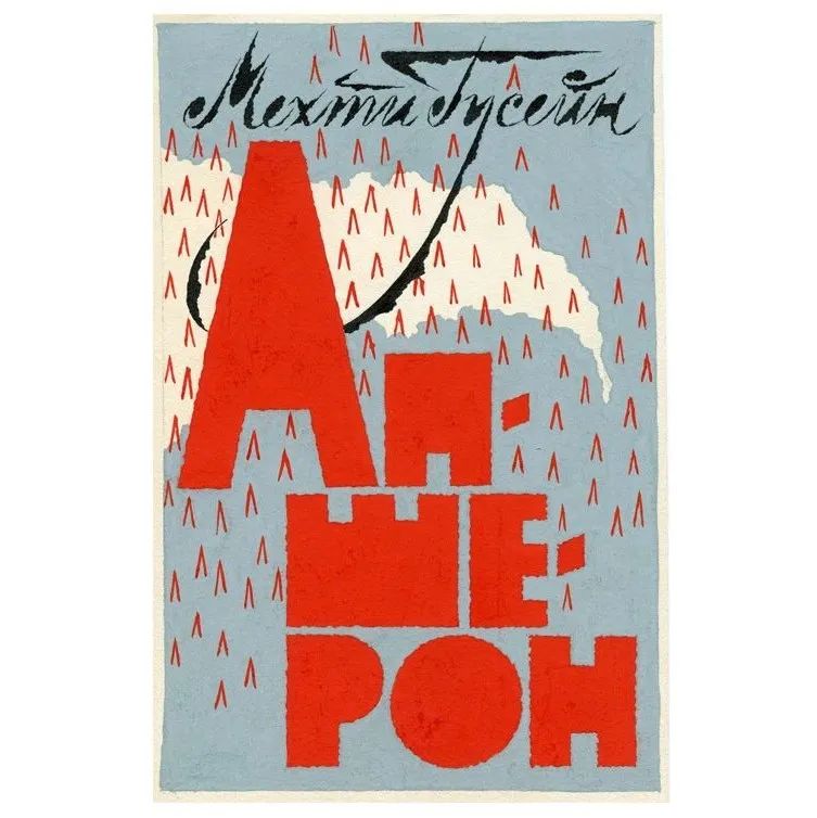
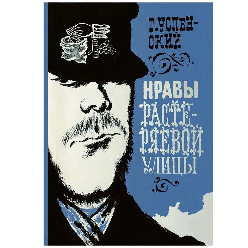
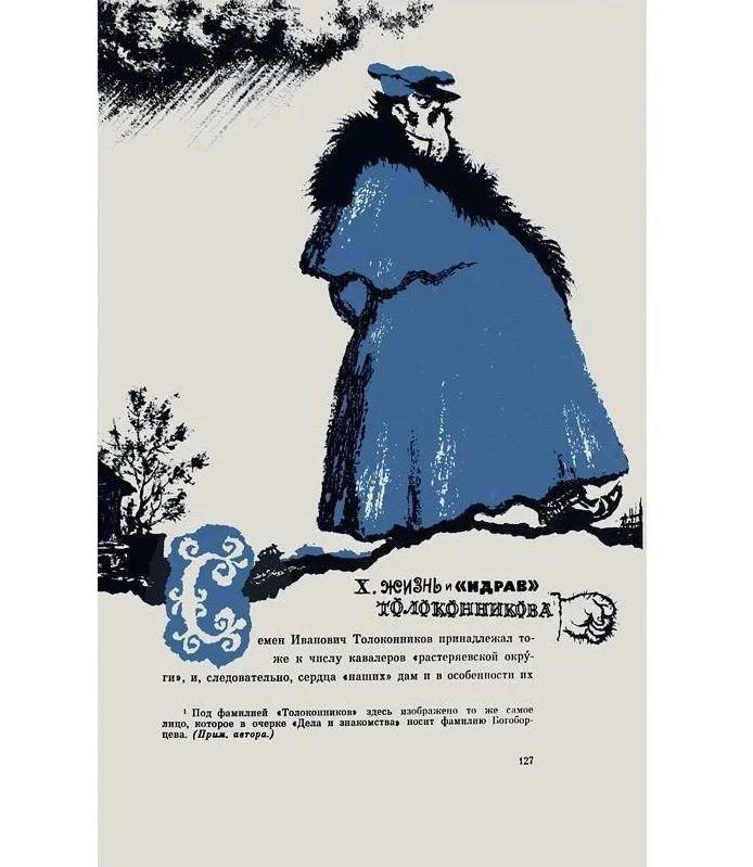
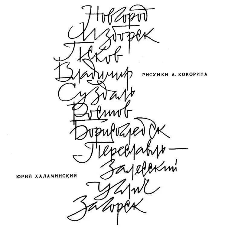
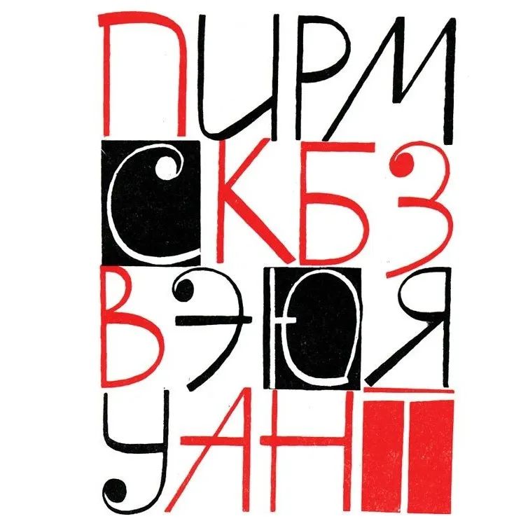
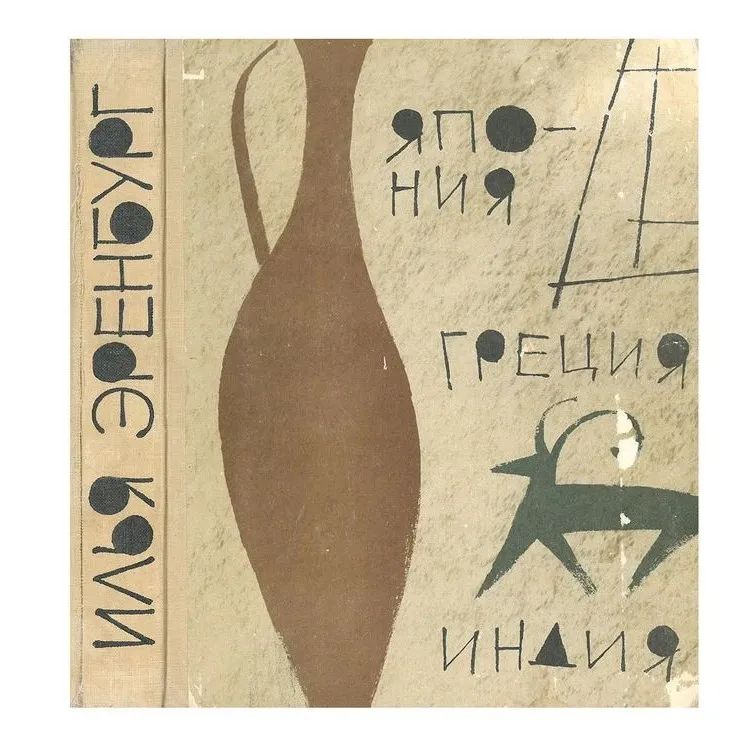
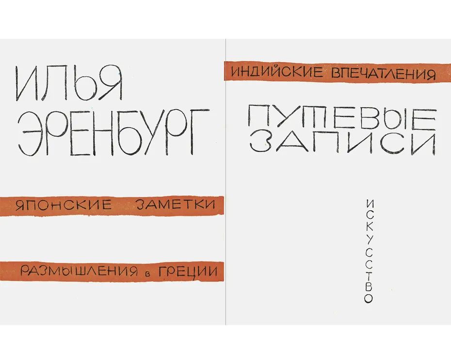
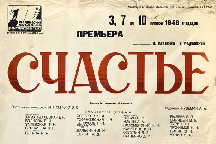 Left: Cyrillic Right:Latin Russian writer Л.М.Леонов was in 1955 “Soviet Culture Newspaper”Recalling 1930, wrote: 「Someone once told me one thing: At that time in Leningrad, there was a private printing house that kept hundreds of different types of font engravings. There was also a committee set up to review all the font blocks... and there were over 200 usable blocks. But one day someone came from the printing house and said,... just one typeface is enough. Then all used The steel molds that cast the letters are destroyed ". 「No. 1337」 Font standardizationIn fact, it does not exert absolute binding force, PublishedPublications and advertising posters are not uniform, art design Thinking has notstagnated, and people's imaginationis far from exhausted. What they were waiting for was the thaw and flourishing of the 1950s-1960s. Several posters of the Sverdrov State Theater in the 1940s and 1950sThe second innovation in the history of Soviet font design appeared in the 1950s and 1960s< span>. At this time, several years have passed since Churchill delivered the Iron Curtain speech in 1946. The socialist camp represented by the Soviet Union was classified as the opposite of Western countries. Soviet designers Our way of understanding Western design culture is further blocked. People start to reflect. Book Designer Н. И. Пискарёв in "On Standardized Art Criticism"Zhong appeals:“Every era, every new way of life and technological development requires its own font”. However, the invention of new typefaces has not been easy, and designers have had to turn to old times for inspiration. According to March 22, 1955 SovietSoviet Ministry of Culture 311-к>A team of experts was quickly formed to carry out the first inspection of Leningrad A font mold sealed by a font printing factory was inspected. A new trend in Cyrillic alphabet design. Typeface restrictions like those of the 1930s have never been repeated, although there were public calls in the late 1960s for “a general reform of the printing press, limiting the The type of font used, and uniform selection of printed fonts according to actual needs”, but fortunately, this inexplicable opinion was not received in the end Any attention goes down the drain. And just take a look at the Russian art critic Ю.Я.Герчук in "Russian Books 16-21 Century The thawfrozen timeperiodRussian periodicals described in Printing History >Design overview, you can understand that this is an era of how a hundred flowers bloom. * I highly recommend this book. I visited it in Фаланстер, and it is probably still available in several online bookstores in Russia. Ю.Герчук. Искусство печатнойкниги в России XVI—XXI веков.—СПб.:Коло,2014. < span>Young designers in this period prefer hand-painted fonts,strongly decorative, andgood atlengthhorizontal Vertical text cross-composition, fontsShaping and overall layout of the screen to break the traditional concept of symmetry, well-proportioned as the main . I. ЭваристЛеви-Провансаль.Арабскаякультурав Испании.Обложка. 1967. II. ЖитиепротопопаАвакума.Титульныйлист(праваячасть).Художник СоломонТелингатер.196 0.< /span>III. НазымХикмет.Новыестихи.Обложка.Художник СоломонТелингатер. 1961. IV. Эскиз СоломонаТелингатера к обложкекниги МехтиГусейна«Апшерон».1962.V. VI. ГлебУспенский.НравыРастер яевойулицы.Суперобложка.Художник СоломонТелингатер. 1963Борис Маркевич, Сергей Пожарский were all leaders in the field of font design at that time. I. Юрий Васильев.Фрагменттитульноголиста. 1971.II. Титульный алфавит.Художник Сергей Пожарста ий. 1960.< /section>III. БорисМаркевич.Рисованныйшрифт. 1961.IV. Эскизшрифта«АкцидентнаягарнитураТелингатера».Рисова ннаякомпозиция. 1958. V. VI. ИльяЭренбург.Путевыезаписи:Япония,Греция,Индия.Обложкаи корешок.Художник ЛевЗбарский. 1960.Unfreeze The free creative atmosphere of the period allowed publishers to pick and choose styles they were interested in. Even neoclassical designs strived to set various subtle changes between fonts in the specification. Photosforeveryone
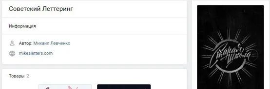 Left: Оригиналтитула. ВадимЛазурский. 1955.Right : Евгений Ганнушкин.Левая полосатитульногоразворота. 1972. Designers who advocate the style of Soviet fonts call the 21st century For a best of times. Young people who are obsessed with retro trends and cultural revival have established large and small network communication platforms: Советскийлеттеринг, Советскийдизайн, Советскаякаллиграфия, whose members design typefaces for everything from household appliances to cookie boxes, car brands to books. When did this fad start? The founders of these groups are not clear, they only remember that in 2013 they accidentally saw the new signboard of the clothing brand Запорожец using quite 「Su」 tasteless font style, and their behavior to create an online communication platform is not a whim.
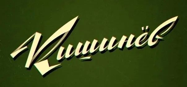
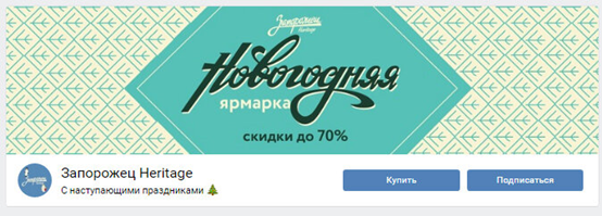
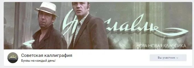
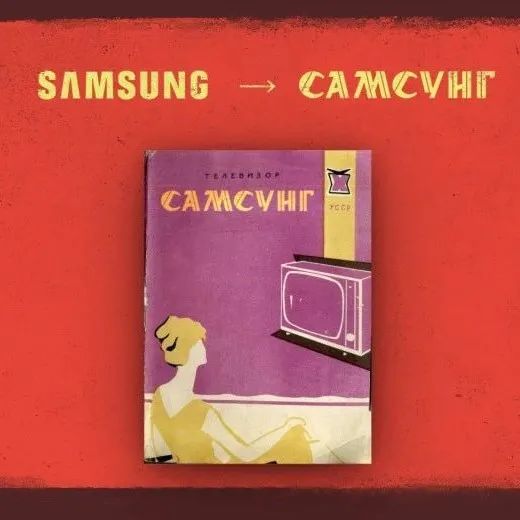
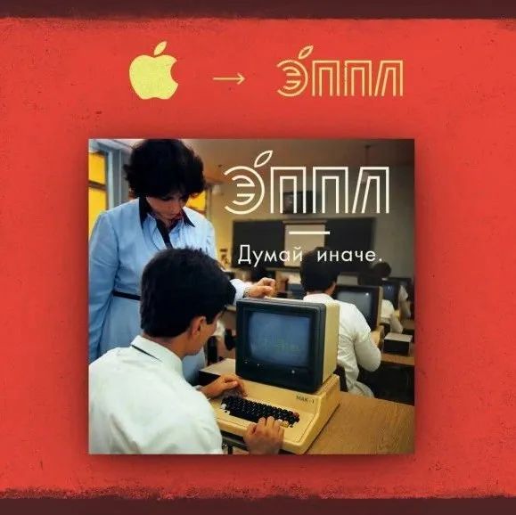
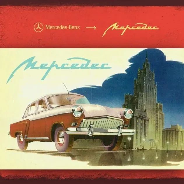
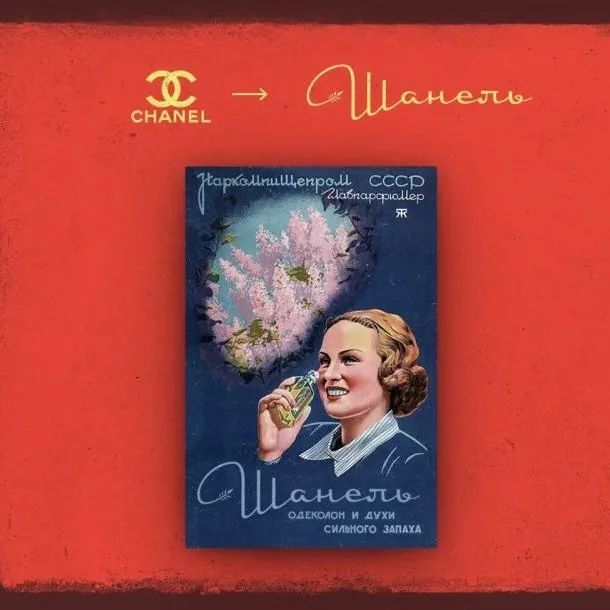
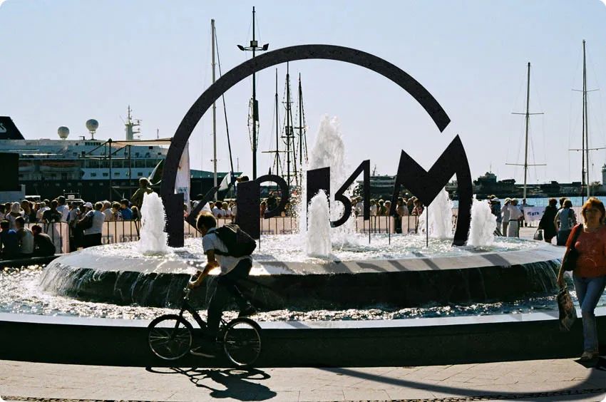
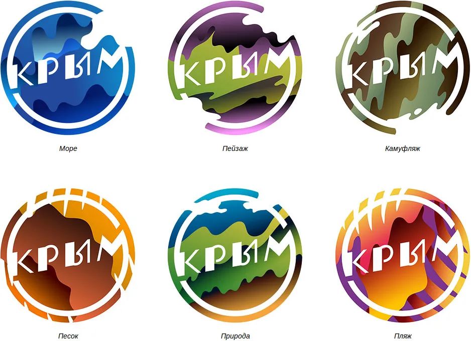
 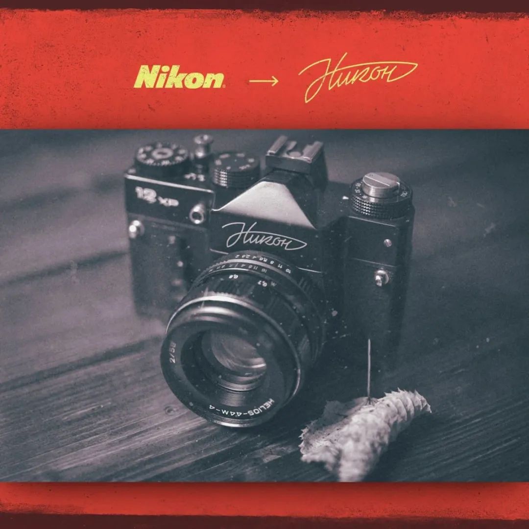 The Soviet font design team on VK is uploading Soviet font signs taken from various places every day< /span>Nowadays, a blueprint of М.Левченко is worth more than $350, recently, he is Imaginary Soviet typography for global famous brands like Apple, Nikon, Chanel, McDonalds, etc. The work of the independent designer АзатРоманов is clearly a tribute to Soviet design in the 60s, for him it was The peak of Russian design history is also the peak of world design history. Studio Лебедев designed for Crimea City logo, it seems that this is one of the few Лебедев works that did not cause polarized controversy. *About Лебедев, there are some inks in "The Mystery of Moscow City Logo", click on the title to read
< section>
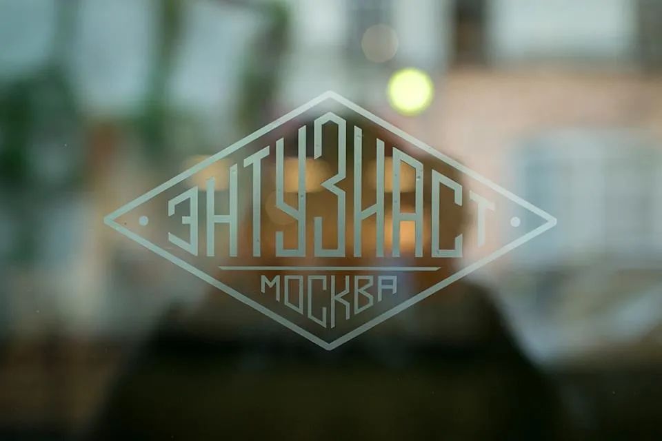
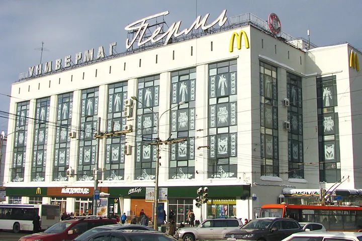
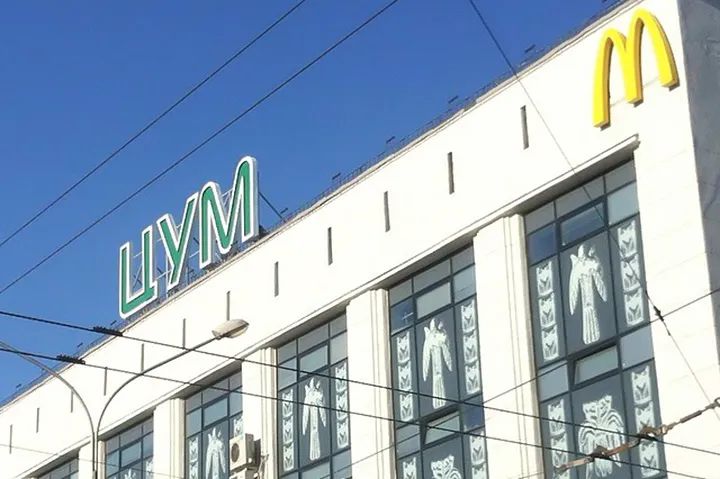
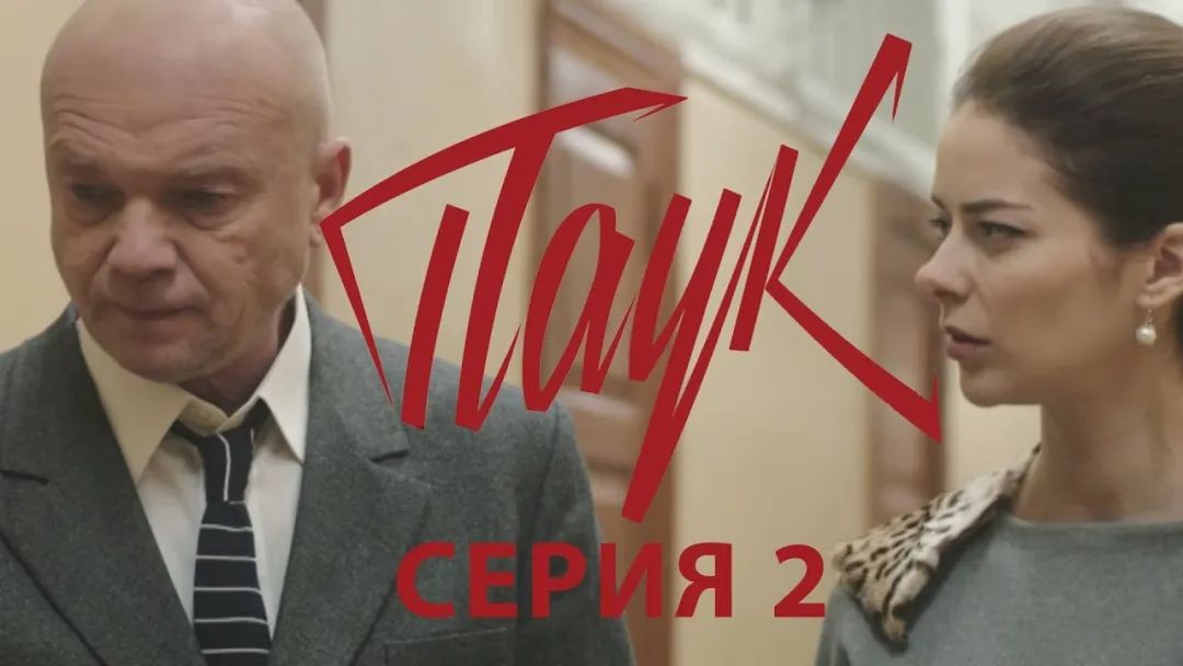 Themes of "Ocean", "Landscape", "Camouflage", "Desert", "Nature" and "Beach" The title design of the TV drama broadcast on Russian TV in prime time is also quite “Su”. The famous Энтузиаст motorcycle cafe signboard on the streets of Moscow. In a department store in Perm, the city name Пермь on the roof was replaced with ЦУМ, which can be seen everywhere, which made countless locals Residents regret.
 Photosforeveryone
 But these nostalgics can still feel relieved that when they walk in Al Along Bart Street and the Neva River, walking on the avenues of Minsk and Kiev, you can still see the neon signs of the Soviet Union 50 years ago standing up against the wind. As long as there is still a trace of memory, literature, art, architecture and their ideas, these creations of human civilization and their derivatives, It will always be lingering in the historical vortex, and will always maintain a kind of vitality that climbs upwards.
 Chengtian code words
Probably can become beautiful
— Past Content—
Paper translation|Proof of concept for parametric reproduction of historical document fonts
Call for Papers|1st Anniversary of 3typezine, invite you to continue the font story
Is there something wrong with using Variety in the game?
One of the Three Words Flying to the Southeast|Kuala Lumpur Chinese Character Stir-fry
TypeScrolls #01 Metrics in Chinese character design (1)
TypeScrolls #02 Metrics in Chinese character design (2)
TypeScrolls #03 Metrics in Chinese character design (3)
TypeWalks #03 From the street to the end of the alley, the thousands of characters in the city
Articles are uploaded by users and are for non-commercial browsing only. Posted by: Lomu, please indicate the source: https://www.daogebangong.com/en/articles/detail/Poster%20font%20Qitusu.html


 支付宝扫一扫
评论列表(196条)
测试