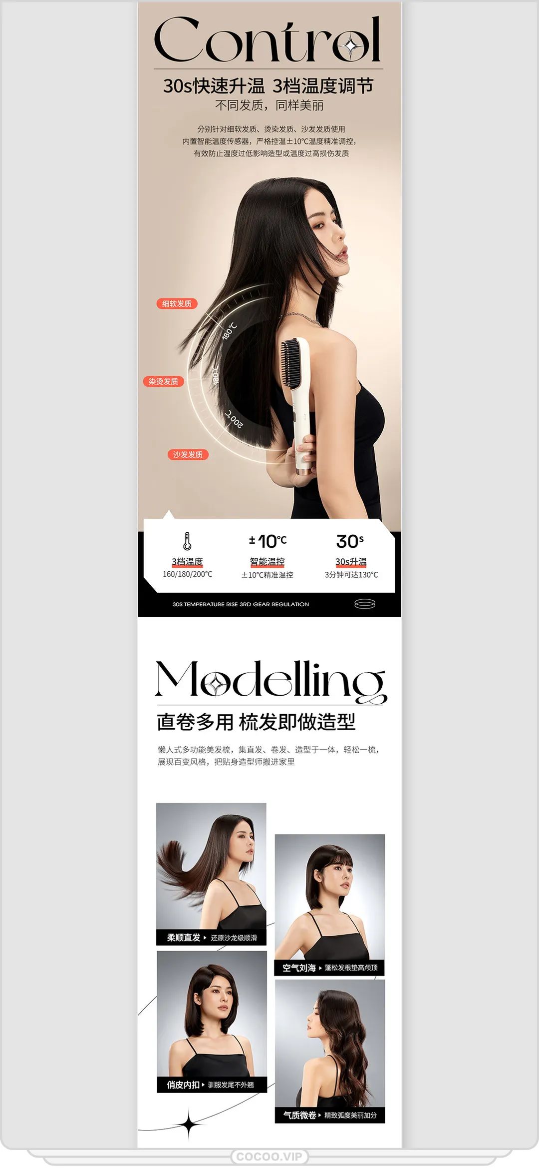
The main factors in how text is laid out are kerning and leading. The variable of line spacing has no significant effect on the reading rate, but the variable of kerning has a very significant effect on the reading rate. The basic patterns of text layout design include:

The most common form of text layout design is a line, which arranges a single dotted text Lines are the most suitable form for reading. In design, there are two common line types: straight line and curved line. Straight line also includes horizontal line, vertical line, oblique line and broken line. The drawn dotted line form can be arranged in a single line type, or can be arranged comprehensively by multiple line types.
In font layout, text is often arranged from dots to lines, and then Arranging lines into planes is the so-called "grouping" of characters. This is often due to the actual needs of the layout space and compositional form. The text arranged in a plane has better integrity and shape, and is easy to read. The text arranged in a plane is mostly considered as an auxiliary factor of the picture, and can form a complementary relationship with other subjective factors to form the characteristics and personality of the picture.

This is the most neat form of layout, which is to arrange the text of the layout into planes, The ends of the face are neat. The basic shape of Chinese fonts is square, whether it is vertical or horizontal, it is easier to arrange. However, English words are often composed of many letters. When arranging, it is inevitable that there will be a space for a few letters at the end of a line. Sometimes a word can only be arranged in half. to move the incomplete word to the next line.
Align the beginning of each line of text, and end the line break in an appropriate place. In this way, there will be a jagged shape after the row, which is the arrangement of the head and the tail. This method of arrangement is common in English. When Chinese is arranged in this way, a whole sentence or a paragraph is usually used as a division unit. For example, short sentences of poems use this kind of arrangement.
Align the end of each line of text, and end the line break at the appropriate place. In this way, there will be uneven shapes at the head of the line, which is the arrangement of the tail and the head. This method is often used in visual design to create a unique style. Usually a whole sentence or a paragraph is used as a division unit, and short sentences of poetry can also be arranged in this way. Compared with the way that the head and the tail are not aligned, the arrangement method with the tail and the head can highlight the avant-garde, fashionable and unique personality.
This is a symmetrical form. If the length of each line of text is different, make it deliberately aligned in the middle, arrange in a symmetrical form, and naturally produce concave and convex white spaces at the beginning and end. This arrangement can make the layout feel elegant. A compact center, relaxed surrounding space, and changes in the hierarchy.
This is a free and lively way of arrangement. When the text encounters graphics during design and arrangement, it is arranged along the outline of the graphics, so that the graphics and text are embedded with each other to form a whole that complements and blends with each other. In this way of arrangement, attention should be paid to the completeness of the meaning of the copywriting sentence and the neatness of the outline. If it is arranged along the shape of the irregular figure, and the shape of the copywriting arranged on the surface is not neat, it will bring certain difficulties to reading. .
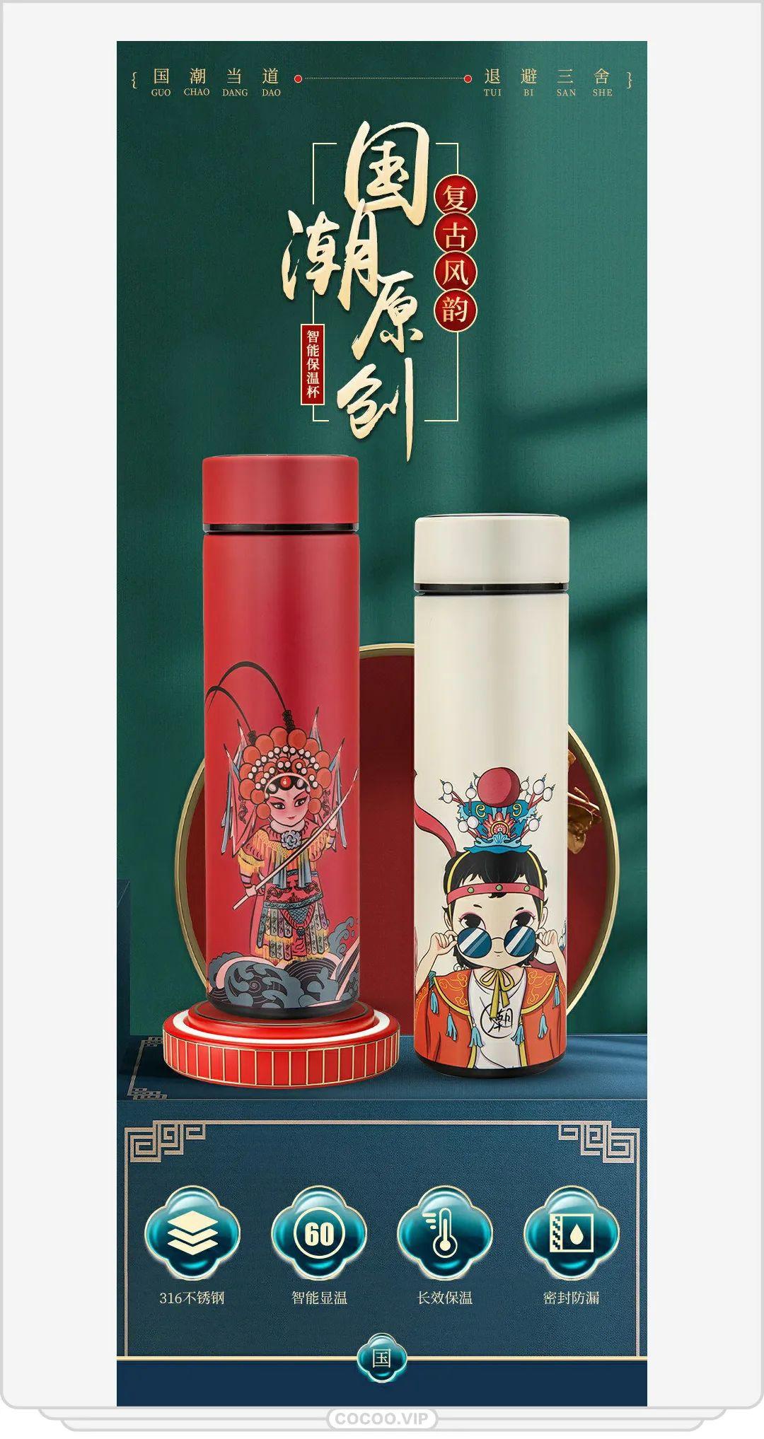
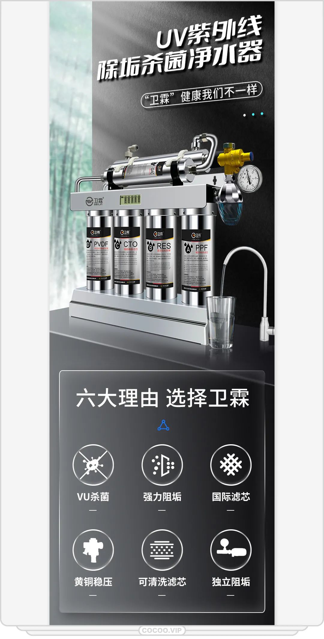
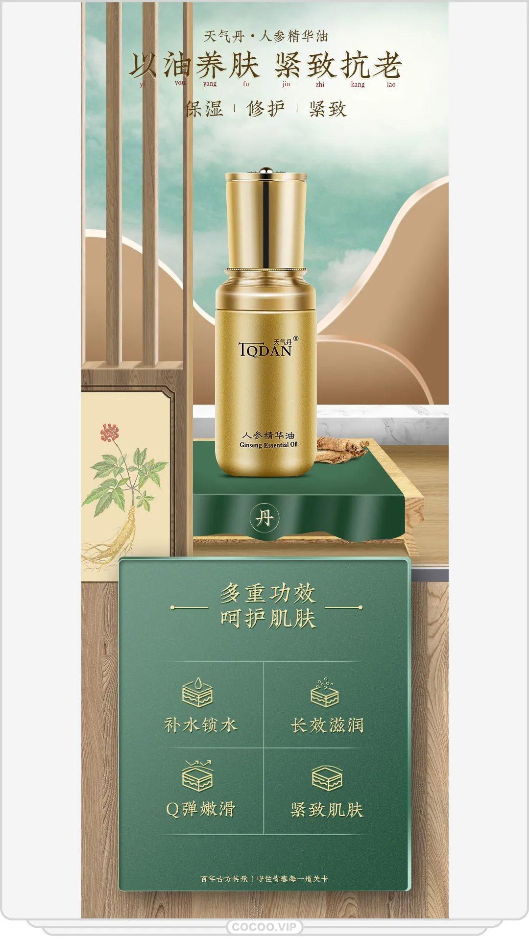
In the layout and design of posters, newspapers, magazines, and online advertisements, the amount of copy There is a big difference in the size of the text, and a large amount of copywriting is often encountered. Although horizontal reading is most in line with human physiological characteristics, the text in each line should not be too much. In order to facilitate the reading of the audience, a reasonable and effective layout method must be adopted. . One-stage, two-stage, three-stage, and four-stage arrangements are often used. The one-stage layout is concise and clear, which is suitable for shorter copywriting; the two-paragraph layout is symmetrical and generous, suitable for longer copywriting; the three-paragraph and four-paragraph layouts are more lively and more suitable for the tastes of young people.
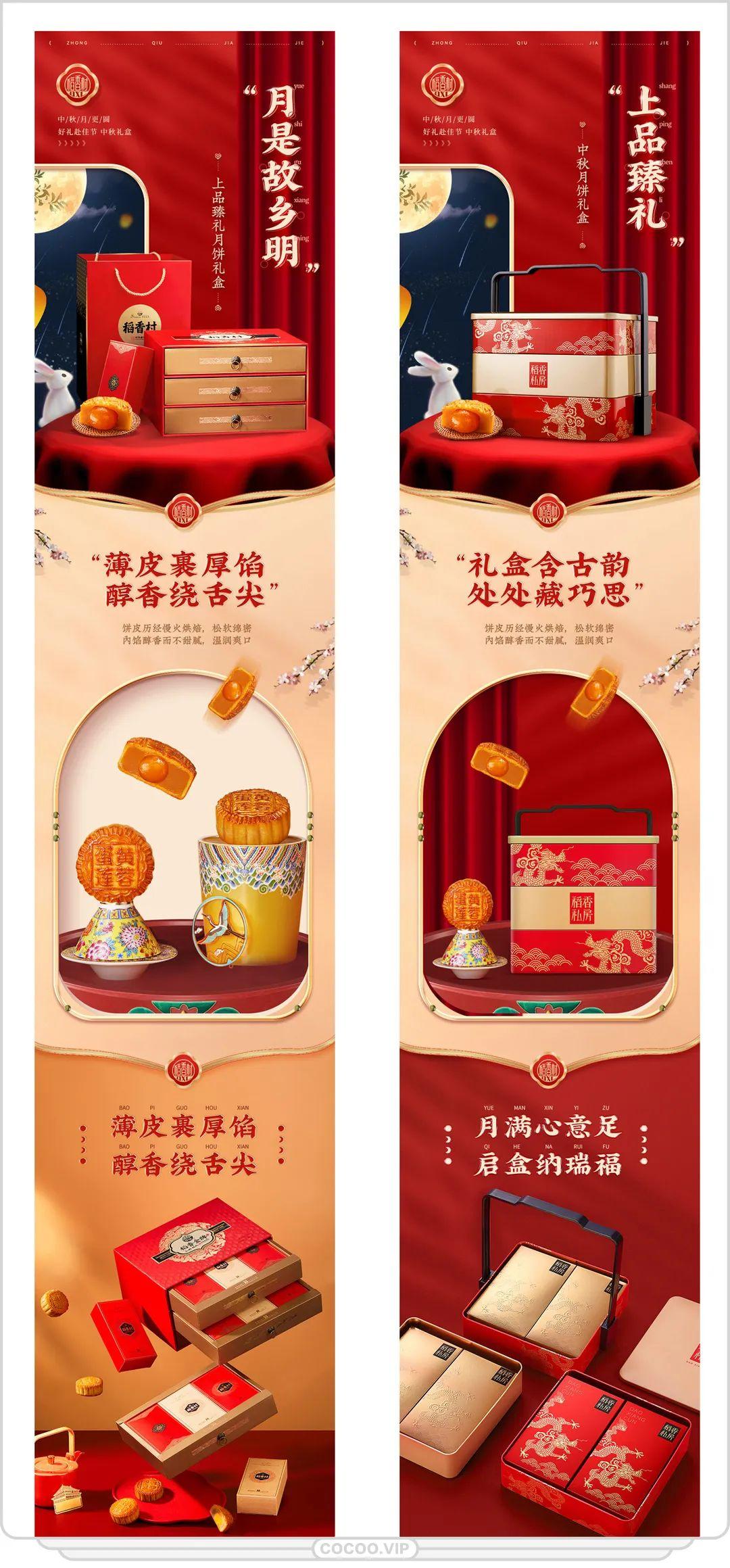
This is a method of using dislocation to distinguish or emphasize different content characteristics of copywriting. Make important content stand out by changing the shape, size and position of fonts. The specific method is to lift, sink, enlarge, flatten, elongate the individual text that needs to be emphasized.
① Arrange the text into graphics. Arrange text into lines, surfaces with sculptural features or become part of illustrations. The font itself is also an element of graphics on the screen of the advertisement. Arranging the fonts into graphics is to use a variety of layout techniques to arrange the text into a visual image with rhythmic changes and morphological characteristics, based on visibility and characteristics. Mainly, taking into account the readability, the information conveyed through the visual image.
② Separate and overlap the text. To arrange them separately is to break the usual word spacing and line spacing, and arrange the text into a unique visual form according to the needs of design communication. Arranging them separately will increase the distance between the characters. The spacing between fonts usually exceeds the width of the font itself, and some are even longer. Doing so will appear more relaxed, free and rhythmic in visual psychology. On the contrary, it is an overlapping arrangement, in which parts of the text overlap each other, and are stacked together front and back, creating a sense of three-dimensionality and compactness.
③ Variation design in text design. Change the direction, font, color, position, etc. of the font in the sentence or paragraph to play a role of emphasis. In addition, the auxiliary methods in text layout mainly include:
①Separate the text with lines (different line separation, standard shape, distinguishing levels).
②Use lines to create space (blank space, thick and thin lines to distinguish layers, scattered rhythm) .
③Using lines to emphasize (drawing lines, ticking boxes, separating).
④Visual design of symbols (to improve the modeling effect).
⑤ Symbols emphasize design (geometric shapes, natural shapes, etc.).
The visual performance of fonts includes font collocation, use of font families, and deformation of characters design etc. If you want to use fonts together to make the picture beautiful and easy to read, you need to pay attention to the following principles:
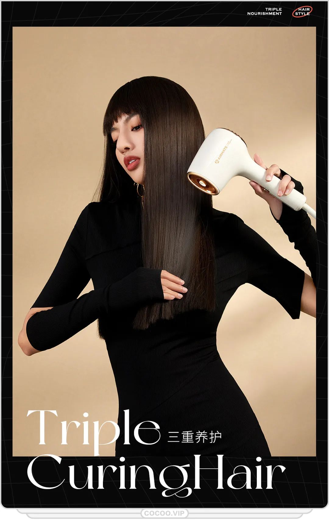
①Big title, small content. That is to use the difference in font size to express the different importance of the title and the content. This is a common method of matching fonts. The font size of the headline should be more than three times the size of the text in order to highlight its leading position; the font size of the subhead must be less than half of the headline so as not to weaken the power of the headline; the size of the subhead can be the same as the text or slightly smaller Bigger, but not smaller than the text. In Chinese typesetting, the inner text font is usually 10.5pt (No. 5 Song typeface).
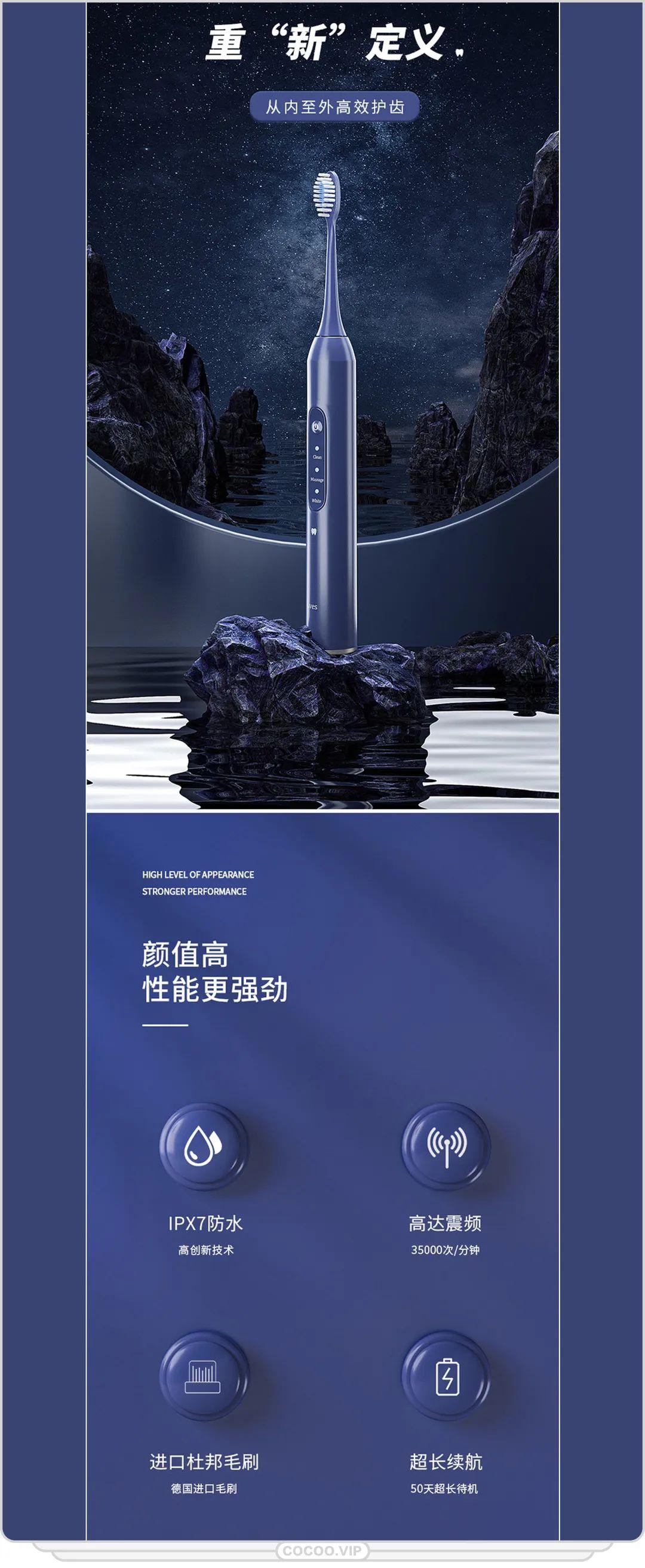
②Bold title, fine text. The title should be thick, which can attract readers' attention as quickly as possible and make a deep impression on it.
③Less fonts and fonts. The fonts used in the same group should be no more than three, and different fonts are used to separate the title and subtitle, but the fonts of the content and the title can be the same or different. The use of fonts should pay more attention to the overall sense.
④The font matches the content. Those who focus on rational persuasion should use calmer and rational square fonts, such as black body and round body; those who appeal to sensibility may wish to use fonts with a sense of change.
In short, the fonts and fonts should not be too many, but the changes must be reasonable to be obvious Mark key points and separate content to properly express the appeal content of digital art design. If there are too many types of fonts and glyphs, it will appear messy and reduce the design effect.
Layout design video tutorial! Find out the subject and level
Articles are uploaded by users and are for non-commercial browsing only. Posted by: Lomu, please indicate the source: https://www.daogebangong.com/en/articles/detail/Play%20with%20characters%20Dont%20let%20the%20text%20be%20too%20boring%20Master%20the%20font%20arrangement%20mode.html
 支付宝扫一扫
评论列表(196条)
测试