
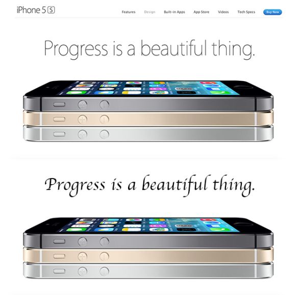
When we get the packaging of a product or log in to a website, will you notice the specific font design or usage belonging to this product intentionally or unintentionally, which will affect your most intuitive feeling about this product. Sophisticated, elegant, sci-fi, classic or rough and ugly?
For example, when I put the Apple website >
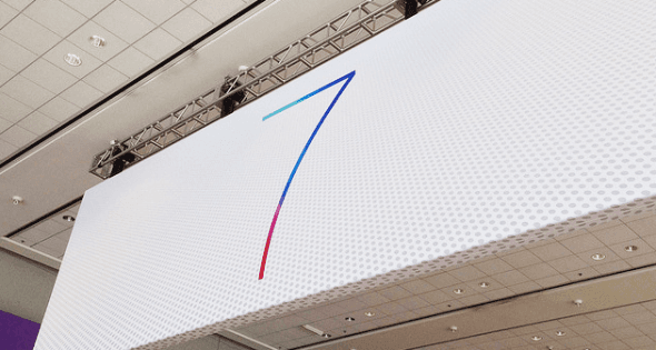
A. Modern
Modern style fonts are mostly sans-serif fonts, which lack decorative elements except for the strokes of their own characters, and their style is relatively simple.
WWDC>
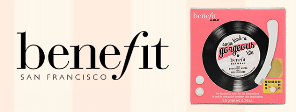
B. Retro
Cosmetics brand>
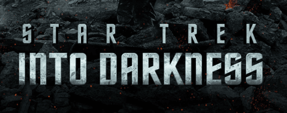
C. Science Fiction
The typeface on the poster of the movie Star Trek belongs to this type. In fact, we often see this type of font on some science fiction movie posters or websites. Sci-fi style fonts are generally tough and sharp, and usually have corners with direct transitions.

Legendary figure as the prototype of Iron Man, Elon>

D. Dream
Disney's fonts belong to this style. The strokes of different thicknesses and letters of different sizes have a very strong sense of rhythm and rhythm. The curves drawn by the letters are like dancing ribbons and traces left by magic wands. People are full of imagination.

E. Female
Feminine fonts can often be seen in cosmetics brands. They are usually slender, beautiful, with smooth lines, and the font has details such as thickness and thickness. It appears rhythmic or is combined with decorative elements and fonts. Because serif fonts are naturally decorated with serifs, many feminine fonts will choose serif fonts and modify them based on this, such as >
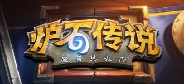
F. Fun
Interesting text can be creatively combined with certain elements in the product, such as the font design of Hearthstone, which cleverly combines the magical "vortex" with the "mouth" in the lower part of the stone, Although the characters in Hearthstone are consistent in style, the folded corners of each character do not deliberately keep the size or angle consistent. This irregular approach also adds to the fun of the font and makes users feel This game is sure to be playable.
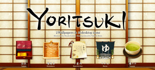
G. Culture
Yoritsuki>
Conclusion: In terms of font style, it is far more than what is listed above, and in many cases, a font can be equally applicable to many different styles. However, how to use a suitable font to accurately convey the product temperament to users is what designers should consider.
(Internet source - Tencent ISUX)

Reply with any number from "0 to 412", see past content
Webmaster WeChat ID: push-think
Click "Read the original text" below to view "10 Interesting English Fonts and Applications"
↓↓↓
Articles are uploaded by users and are for non-commercial browsing only. Posted by: Lomu, please indicate the source: https://www.daogebangong.com/en/articles/detail/PlaneOn%20how%20font%20design%20can%20change%20product%20temperament.html

 支付宝扫一扫
评论列表(196条)
测试