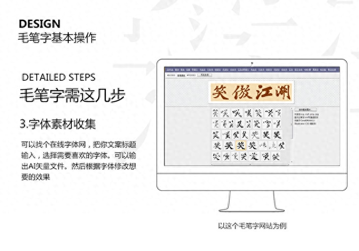
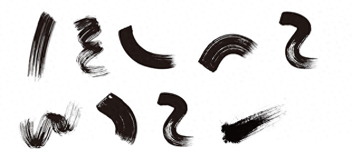
Although there are some ready-made brush fonts on the Internet, they are small in number and have limitations in practical applications, and the requirements for handwriting are too high. At this time, we can use a lazy method and simply synthesize them using brush calligraphy materials.
I finally have time to share my design experience. Today I bring you a tutorial on how to quickly create a handsome calligraphy. Some big names in design. Design experts may find such tutorials simple. But for novices or design enthusiasts, this is a very confusing thing. See the handsome calligraphy titles on posters and TV. Everyone will wonder how such a font is designed, is it an original font or has it been designed and processed? Every design is a process from novice to expert. I am also a novice in design, but for novices, juniors, and design enthusiasts at this stage, there will be a lot of why, such questions, and that kind of questions. I asked some big names, and the big names thought it was too simple. No explanation will be given. So whether it's design skills or some software operations. Maybe there are various reasons why? Although I am not a big design guru. I am not a great design expert, but I only use my many years of design experience to share with you. I hope it can help designers who have some questions. study together. Make progress together. Improve together. Closer to home, this time we used "Swordsman" as the copywriting and extended the design of a calligraphy calligraphy.

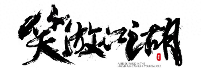
Final rendering
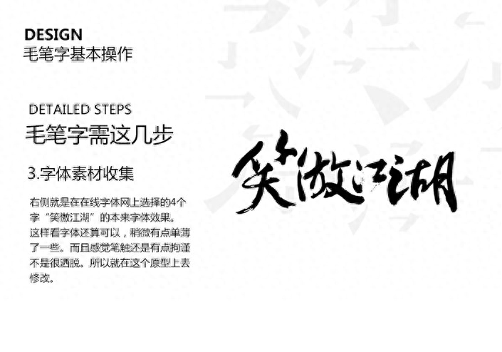
Some handsome calligraphy is indeed handwritten directly. But if you don’t have good calligraphy skills, you will need to design calligraphy.

You may have seen this/seen this/also seen this/ (the three fonts are from online screenshots)
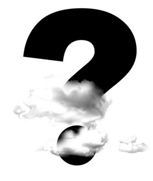
Then there will suddenly be a question mark
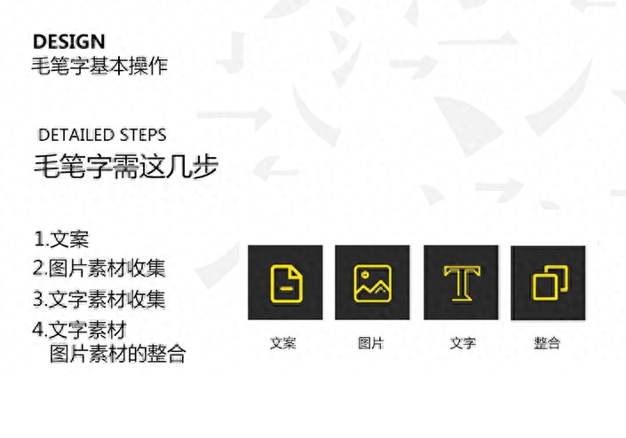
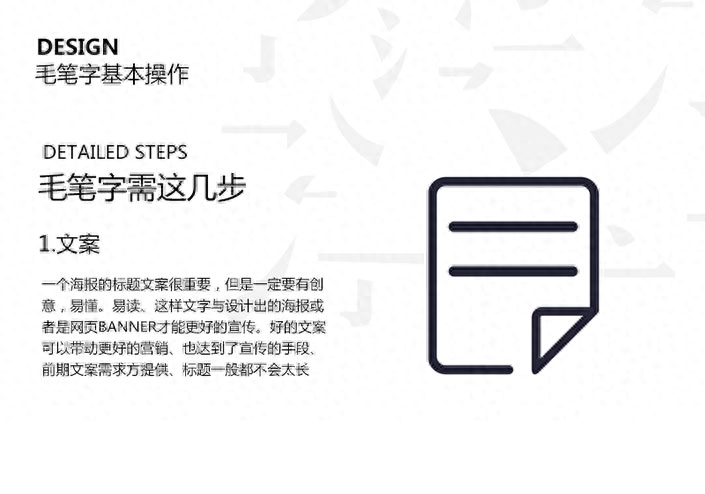
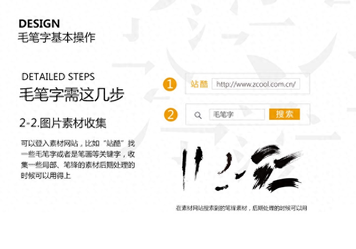
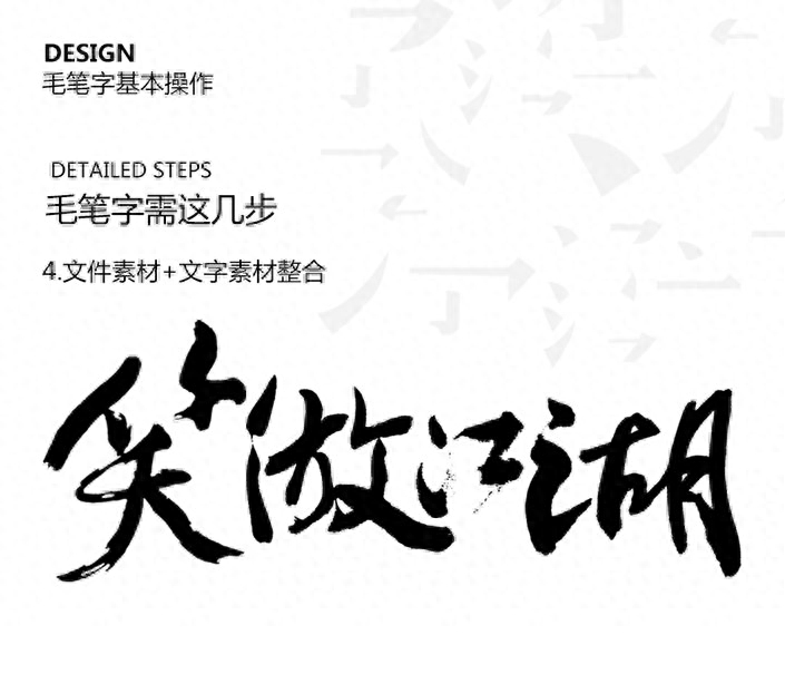
Production steps and detailed explanation

The collected text materials should be arranged in a somewhat dynamic format. Generally, the four characters will be typed at the same time (large and small text size) (bottom and top, context word position) in such a way of typesetting, which will give people a balanced and medium tone. The appearance of change. Some are big, some are small, some are high, some are low. A visual change and subtlety give people a visual impact. At the same time, it can also be placed randomly according to the text. No matter how beautiful it is, how to place it. At the same time, observe how the text structure will be smoother and more impactful, making the font more free and easy.
Under normal circumstances, the tail of the font will be modified to let the tail swing out, making the strokes more handsome and freer. At this time, the collected brush strokes should appear and integrate better with the text.
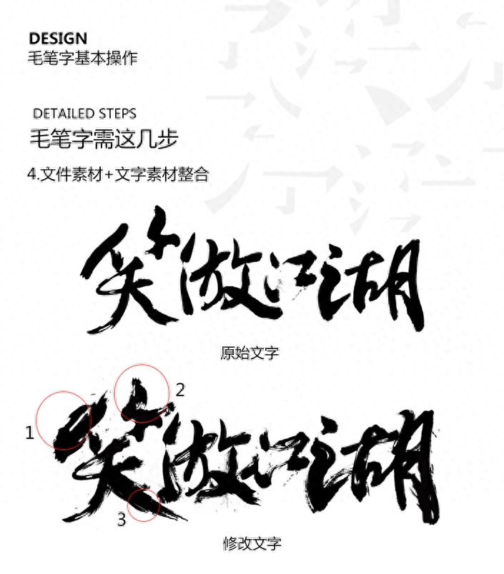
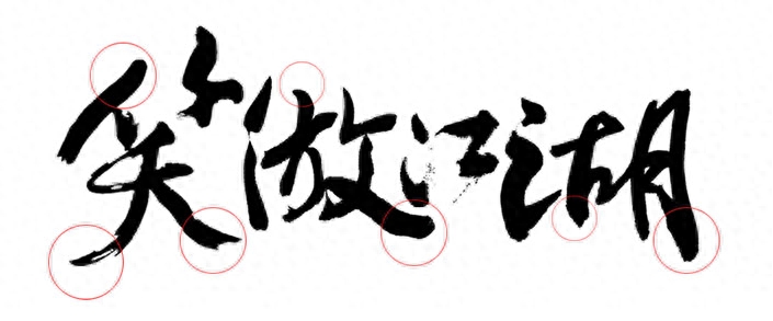
After the splicing of materials and text materials, the above effect is achieved. According to the previous ideas, I can achieve the desired effect that I am satisfied with. It’s not hard to see the details. The smile (1) part has been bolded and the corners of the pen have a little more edge effect. Because if they were all black, it would feel blocked and there would be no white space for air circulation, so I pressed the white part on the black part and crossed it out. a feeling of. Laughter (2) The same principle applies. There is a sense of disconnection. It is a bit like a brush that runs out of ink when writing. It expresses the form and at the same time leaves a blank space to make people feel less dull. Laughter (3) Take this as an example. The last stroke of the calligraphy must be handled in a free and easy manner. A little more atmospheric. Therefore, it is necessary to show the feeling of continuous strokes in a smooth manner. The remaining three characters are deduced in sequence. You can also modify and place them according to your own design feelings. There are no special rules. As long as it looks good. Just be free and easy and not formal. There is a bit of continuous strokes around the text, which feels a bit old-fashioned. At the same time, don’t be overly expressive when processing. Overly expressive will not produce better renderings.
Be sure to do some subtraction while adding. Only with reality and virtuality can the three-dimensionality of words or objects be reflected. So keep the pace. Don't blindly add effects. Based on the material and my own aesthetic text, I almost finished it. After I finished it, I felt that something was missing. Indeed, most high-end and awesome people will add something to the main title. For example, add some English and stamps. This will further improve the visual quality of the text effect. Then you might as well add it and see what the effect is.
The overall effect came out immediately. At this time, I felt that I was a lot taller. My English level was limited. In order to be tall, it was really difficult for me to speak a little English.
I temporarily found an English paragraph on the online translation to indicate the placeholder. Don’t look at the English meaning and look at the overall rendering hahaha
I think this typesetting is much more comfortable, but it’s still not enough to create a more powerful effect for the text. Then we need to add some atmospheric background to the text. After searching for materials on the Internet, it finally becomes like this


Articles are uploaded by users and are for non-commercial browsing only. Posted by: Lomu, please indicate the source: https://www.daogebangong.com/en/articles/detail/Photoshop-shui-mo-zi-li-yong-su-cai-she-ji-mao-bi-zi-jiao-cheng.html
 支付宝扫一扫
评论列表(196条)
测试