1. Font design traceabilityA pixel is the smallest unit that can be displayed on a computer screen, that is, it refers to a smallest unit in an image represented by a sequence of numbers. The word pixel is a combination of Picture (image) and Element (element), and Chinese words are also pieced together in this way. In fact, forms like pixels have a very long history. The mosaic art in ancient Greece and Rome, and the cross-stitch art originated in Tang and Song Dynasties in my country are very similar to the pixel form, but there is no concept of pixel at that time. Pixel format has a wide range of applications. Through clever combination and arrangement, creative pixel-style images and text can be constructed. Pixel style has become a nostalgic and fashionable unique artistic style and visual Form deeply affects our life. Pixel font means that the stroke thickness of the font can be adjusted to one pixel, which looks similar to a font composed of small squares. It can still be viewed normally at small sizes without distorted fonts. Pixel font is a special type of font in the computer font library, with a distinct personality. The design and development of pixel fonts are generally influenced by the following art forms or factors: First, in the history of font design, there have been pixel or pixel-like fonts. For example, the embroidered characters (Picture 1-3) in the late Qing Dynasty and the Republic of China, and the calculation paper or graph paper art characters (Picture 4-5) in the 1970s and 1980s >, these fonts may provide more direct inspiration for the design and development of Chinese pixel fonts. Second, it may be influenced by the early bit-matrix fonts. Bit-matrix fonts are also called map fonts. Because of bitmaps, bit-matrix fonts are difficult to scale, and specific bit-matrix fonts can only Clearly displayed in the corresponding font size, otherwise the text will only be forcibly enlarged and the font will be damaged, resulting in mosaic jagged edges. And the design of the Chinese pixelpixel fonts should imitate and utilize the disadvantages ofdot matrix fonts. Third, it is probably influenced by the pixel font of foreign letters. The appearance of the body is much earlier. Fourth, it is based on the influence of computer technology itself. Previous computers only had low-resolution displays, so the appearance of pixel-like fonts is a result of technology and Due to equipment, this should be the most objective factor affecting Chinesepixel font design. 
Figure 1 Cross-stitch characters in late Qing Dynasty. (PictureConfucius old book network)
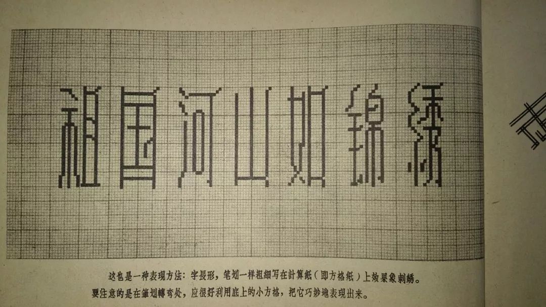
Figure 2 The cross-stitch text on the 12th edition of the Republic of China "Xinxin Art Cross Pattern" "Don't forget the national humiliation"
Figure 3 Spring Dawn on Su CausewayTen Scenes of West Lake Embroidered in the Republic of China. (picture Confucius old book network)
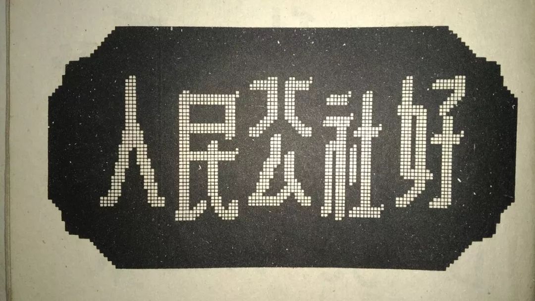
Figure 4 Artistic calligraphy written on computing paper in the last century (picture "New Works of Artistic Characters" by Geng Qiu in 1958 )
Figure 5 Artistic characters written on computing paper in the last century (picture "New Slogan Artistic Characters" by Xu Fengyu in 1959 )
Currently, there are many Chinese pixel-style fonts in the computer font library, such as Founder pixel series produced in 2009 (Figure 6), Founder foundationImagePixel and so ondeveloped in 2010 span> (Figure 7). Although these fonts are alllike building blocks piled up, butfonts is still very visually impactful, unique and full of strong decorative meaning. Founder FoundationLikeThe body is designed and developed by Founder font and designer Guang Yu in cooperation, a set of logic A font that is relatively rigorous and aesthetically pleasing. The advent of of this font was influenced by two important factors in addition to the above-mentioned factors: one is the influence of FounderLikePrime BodySeriesInspired, this can be seen from the stroke characteristics of the two. Founder pixel series is a typeface designed based on the basic glyphs of HeiTi and SongTi composed of square pixels, and Founder BasicLike< /span>The strokes of the body are alsocomposed of square pixels, butFounder's foundationLike The glyph structure of plain body has more prominent innovative individual characteristics, and is not based on the adaptation of existing fonts. Another factor was the German Joachim Müller-Lance's "mini-pillbodiesinspired (Fig. 8) , this font was won the 2002 Morisawa International Typeface Contest by Mitsuo Katsui Award. By comparing the fonts in Figures 7 and 8, it is not difficult to find that the two are very similar in terms of font structure and stroke characteristics. This can also be seen from the order of design completion timeFounder FoundationLikeThe body borrows from the "mini pill体” font features and word-building principles. 
Figure 6Founder Pixel Body Series
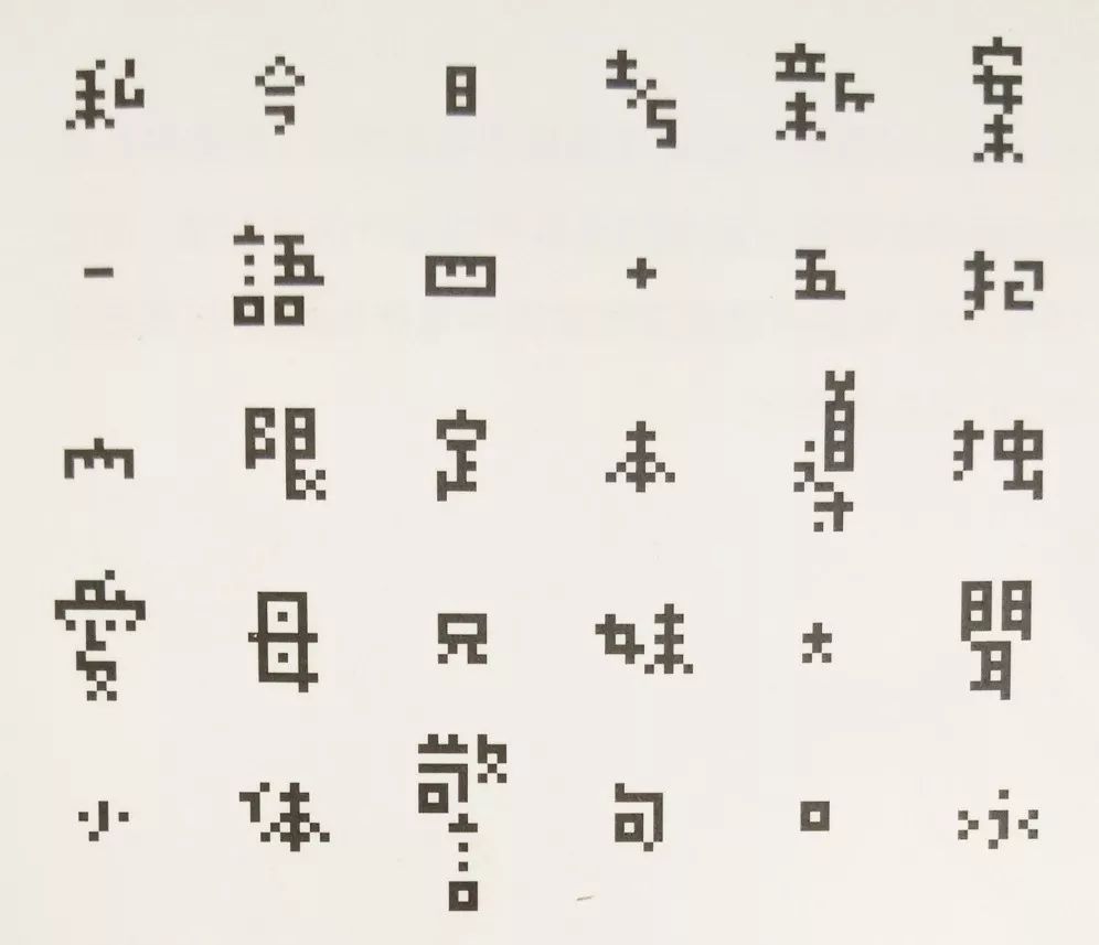
Figure 7Founder basic pixel typeface
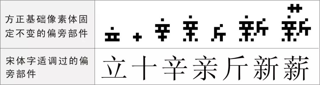
Figure 8 Mini-pill designed by Joachim Müller-Lancebody (partial typeface)
Second, font characteristics analysisFounder BasicsLikePixel AlthoughInspired by FounderPixel, especially direct It draws on the style and characteristics of "mini pill body". But it also has its own characteristics and innovations. Moreover, these characteristic innovations should be said to be subversive and breakthrough attempts made to the design and development of computer Chinese character fonts. Its innovative attempts are mainly reflected in the stroke shape, glyph structure, alignment, size ratio and white-white spacing of the font. Founder foundationThe stroke form of the element body is not as certain as the Founder pixel body The strokes of a traditional font are designed and adapted for reference, but has its own unique processing method (Figure 7). First of all, strokes are formed with the fewest pixel squares. Small strokes such as dots, short strokes, etc. are generally represented by one or two small pixel squares, long strokes, long curved strokes are represented by three pixel small squares, and only the strokes are kept. The most basic identifiability of form, and strive for the individuality of strokes. Secondly, the strokes are designed in a new way without curves and oblique lines. In case of curved or oblique strokes, small pixel squares are diagonally connected to form steps to express the curved and oblique strokes. The strokes in the entire set of fonts only exist in the latitude and longitude structure of horizontal and vertical lines, which is obviously caused by computer technology and pixel characteristics. Simple blocks are regularly arranged, stacked, and extended repeatedly, resulting in rich layers, high order, and infinite sense of rhythm, which brings strong visual impact and psychological shock. It makes this font look unconventional in the computer font library, with a distinct sense of the times. Founder foundationLikePrime font structureBreakthrough The inherent structural norms of Chinese characters have made an original experimental treatment of the structural norms of Chinese character components. The font structure draws on the word-forming method of phonetic letters, that is, the radical parts of Chinese characters are not adjusted in size like letters, and are directly mechanically combined to form characters, the same radicals Components are also treated in the same size form in the entire font set (Figure 9). Unlike the radical parts of other traditional fonts, the same radical parts have been adjusted in size, length, width and position in different characters. As a result, in the Founder baselikeelement, the fixed radical parts are mechanically piled up to form a jagged The shape of Qi is completely different from the inherent shape of Chinese characters. It has made great changes to the standard of Chinese characters, and the shape looks abrupt and peculiar. This may be the Founder foundationLikePrint body design and developers intendNot demanding visual balance and font structure Steady, but for the sake of the visual personality of the character structure and opening. In the computer context, the revision of glyph norms should first establish the aesthetic value of the font library with reading as the first mission, and then control the lack of glyph norms by controlling the differencethreshold of glyph variation, so as to achieve Glyph innovation within limits. Founder FoundationLikeThe element body is the font innovation within the difference threshold of font variation. In fact, the attempt to change the inherent structure and structure of text is not limited to the basic pixel volume of Founder. According to records, from 1834 to 1835, in order to reduce the number of fonts, Grande carved and casted the form and sound of Chinese characters separately, and put them together in time. For characters that cannot be separated, single-character fonts are still made. Although this method was discarded due to the complicated typesetting and uneven and unattractive characters, he did discover the characteristics of the phonetic characters of Chinese characters. Later, Chinese people also designed according to the phonetic characters. It can be said that Grande is a modern Chinese character. Pioneers of typographic design. This spelling method of the French Grande is called "Chinese stacked characters" or "stacked movable type" (Figure 10), "stacked movable type"is A relatively unique phenomenon in the history of Chinese font design, in order toreduce the number of cast fonts without breaking the inherent norms ofChinese font structure, resulting in a departure from the original and aesthetic feeling of Chinese characters . The spelling method of Founder's basic pixel body is very similar to this method of stacked spelling. Both of the word-building and spelling methods are more mechanized, but the fonts formed by the two are different. The spelled characters are not neat and unattractive, but the Founder basic pixel body is a complete, beautiful and lively font, which is an innovative breakthrough based on the Chinese font library font design specification. 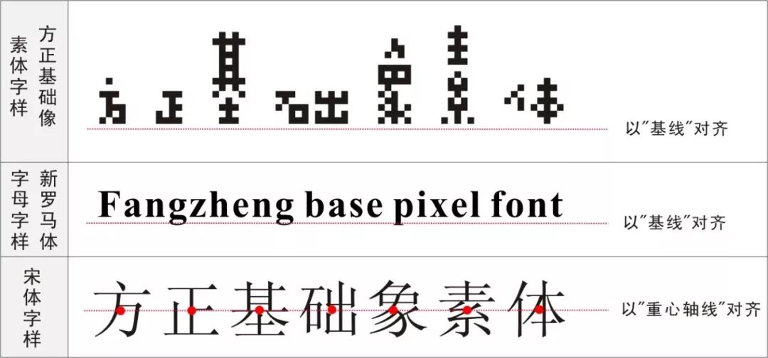
Figure 9Comparison between the basic pixel body of the Founder and the radical parts of Song typeface
The "center of gravity" of a character is the balance point of the weight formed by the strokes after the strokes of the character are combined according to certain rules, from all sides of the character The force to this equilibrium point is equal, so the word can have stability. "Center of gravity" is an extremely important technical specification for the design of Chinese character fonts. In the arrangement and alignment of traditional Chinese character fonts, whether it is horizontal or vertical, the center of gravity of the characters is connected to a vertical or horizontal line as the standard. The line is called "central axis", which is in the middle of a line of characters, which is an inherent standard of Chinese character layout. Founder foundationLikeThe body is forced by the characteristics of the fontuneven, Instead of adopting the Chinese character's inherent "gravity axis"alignment, it draws on the phonetic alphabet to "baseline" AlignedArrangement method, the baseline is at the bottom when horizontally arranged, and the baseline is on the left when vertically arranged. An innovative attempt has been made to the alignment of Chinese characters (Figure 10 ). This practice of referring to the alignment norms of phonetic letters did not cause visual discomfort to the font layout, and the sense of fluency and stability still exists. These innovations instead increase the vividness of the font and make reading enjoyable. 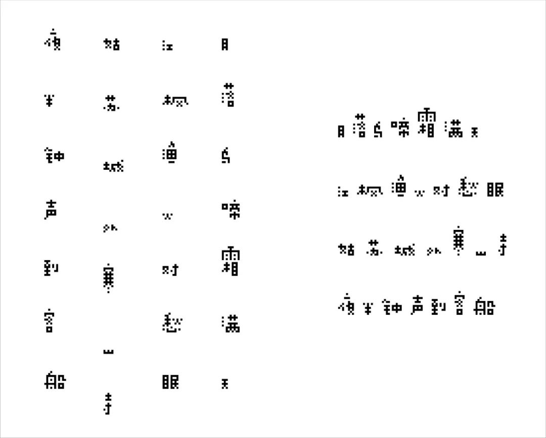
Figure10Founder basic pixel body and other font alignment comparison
Founder's foundationLike The body is actually based on the same size squares with different numbers A font composed of cells. Although it retains the basic characteristics of square Chinese characters in appearance, it boldly exaggerates the size ratio between characters. Characters with more strokes are several times or even ten times the size of characters with fewer strokes. Unlike regular Chinese fonts, each character in a set of fonts actually occupies the same square space. This is obviously the reason why Founder's foundationlike element body is mechanically composed of fixed radical parts, resulting in different widths and heights of characters (Figure 11). This is relatively rare in computer fonts, and it is a tentative change to the design specifications of Chinese fonts. However, these changes did not make the font lose its sense of unity and integrity, but enhanced the sense of rhythm, form and interest in reading. Cloth white is a calligraphy term. Refers to the method of arranging the blank relationship between the stippling frame of characters and the character spacing and line spacing. The blank space outside the stippling of the characters is also a part of the characters, and the combination of reality and reality constitutes a complete character. Mr. Zong Baihua, a famous esthetician, once pointed out when studying the aesthetics of Chinese calligraphy: the blank space should be counted in the shape of a character, the blank space should be properly distributed, and have the same artistic value as the strokes. Although what is mentioned here is the whiteness of calligraphy, it is also suitable for the whiteness of any font, of course, including the basic pixel body of Founder. Due to the special influence of the font structure and size ratio of the Founder basic pixel body, its space white art is more varied, which is more lively and rich than the white art of conventional fonts. From the perspective of character spacing and line spacing, it is much wider than the normal character spacing and line spacing of ordinary fonts, otherwise the text layout will be messy. It is precisely because of the wide enough character spacing and line spacing that the artistic effect of unevenness and coordination can be produced between words and lines, and between lines. Loose and transparent word spacing and line spacing are also more conducive to quick reading (Figure 11). However, from an economic point of view, the overly sparse font, word spacing, and line spacing are a bit wasteful, so it is determined that this font is not suitable for text. Figure11Founder basic pixel font vertical (left) and horizontal (right) white spacing standard style
3. Design value contributionFounder Basic Pixel is not a very perfect font from the perspective of popularity and universality, because it does not have conventional fonts such as Song, Kai, imitation Song, and Hei Ti Such clear and smooth legibility. Most of them appear as title words, which are not suitable for body text. They are suitable for advertising, packaging, newspapers, magazines and other artistic design fields, reflecting a strong sense of art, technology and modernity feel. However, the more important design value and contribution of Founder's basic pixel design and developers are not limited to this. It lies in the experimental exploration of Chinese font design specifications for computer fonts, and the innovative changes to the inherent stroke shape, glyph structure, alignment, size ratio, and white-white spacing of Chinese characters. He has made a breakthrough contribution to enriching the means, methods and performance of computerized Chinese character font design. Design is all about innovation. The purpose of creating new forms is to break the old pattern. Seeking newness, difference and development are the demands of today's people, and font design is no exception. The designers of Founder Basic Pixel have explored new font design concepts and designs through breakthroughs in the inherent strokes, structure, alignment, proportion, and white layout of Chinese characters methodology. Founder basic pixel body, as a kind of pixel style font, has a distinct personality and exudes both strong Nostalgic, but also trending towards the modern atmosphere. It composes fonts concisely with simple small squares of pixels, and enhances the uniqueness of fonts through innovative processing of stroke shape, glyph structure, alignment, size ratio, and white-to-white spacing personality and differences. However, text design should not only create a difference in visual form, but it should not be so different that people cannot recognize it. Pursuing the difference in visual form is the goal, and maintaining basic recognizability is the bottom line. Founder's basic pixel body creates a significant visual difference, which not only makes the font show distinctive features, but also maintains the basic recognition of the font. It is a very distinctive form of Chinese character font design. From the designer's point of view, it is easy to decorate and deform text, but it is more difficult to retain the "essence of text" while decorating and changing the appearance of text. Although Founder Basic Pixel has made a major breakthrough in the design norms and concepts of Chinese character fonts, it has even subverted it. But while decorating and changing the appearance of Chinese characters, it still retains the essence of Chinese characters, which naturally coordinates the essence of Chinese characters with the modern aesthetic taste of computer technology. It not only accepts the Chinese characters themselves, but also leads the design of Chinese fonts to modernization and diversification, enriches the visual language and design methods of Chinese fonts, and brings new ideas and inspirations to the design and development of computer Chinese fonts.
About the author:
Li Ke, male, director of Brand Communication Institute of Shandong University, professor, doctoral supervisor.
Yang Xinzhong, male, Nanchang University School of Art and Design, master supervisor, associate professor, doctoral candidate in communication at Shandong University, mainly engaged in visual communication design research.
*This article is the research result of Nanchang University's teaching reform project "Cross-direction Cooperative Research on Graduation Design of Art Design Discipline" (Project No.: NCUJGLX-17-74).
References:
[2]Love to play. Great "Mosaic":Pixel complex in the high-definition era[OL].(2015-08-24).http://play.163.com/special/news/features050.html< /span>
[3]Huang Benliang. The lack and correction of Chinese character font specifications in computer fonts>< span>[4]Liu Zhao. Research on the development, design and application of printed Chinese characters[D]. Beijing: Central Academy of Fine Arts, 2015: 62-63.[51]Wang Jingyan. Aligning the Center of Gravity—The Modernization of Chinese Character Design[J]. Decoration, 2015 (12): 80.< span>[6] Zong Baihua. Aesthetic Thoughts in Chinese Calligraphy [J]. Philosophical Research, 1962 (01): 67. [7]Li Hongming. Thinking and Skills of Chinese Character Creativity in Visual Communication Design [J]. Art Hundreds, 2011 (7): 127 [8]Zhu Lina. Graphic design of "horse" to success[J]. Journal of Central China Normal University (Humanities and Social Sciences Edition), 2014 (3): 146.[9] Ji Le. Under the unique aesthetic context The plastic art of ethnic minority characters [J]. Meiyuan, 2013 (1): 88. 支付宝扫一扫
评论列表(196条)
测试