Font is one of the most important communication elements in visual design. The visual characteristics and quality of font itself affect the quality of information transmission. English font has its own very complete system. If you want to be proficient, you need to learn from font The history and formation, cultural attributes are carefully studied, limited to the length of the article, here I only write some more application-oriented content from my personal feelings>
English fonts classification
English text is roughly divided into three categories, serif, sans-serif and other fonts. Other fonts include Gothic, cursive and decorative fonts. These fonts are relatively seldom used in our work, so we focus on serif and sans serif.
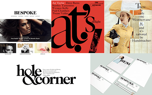
The serif font has a long history, and it was used for inscriptions in ancient Rome. It is suitable for expressing tradition, elegance, nobility, and a sense of distance.
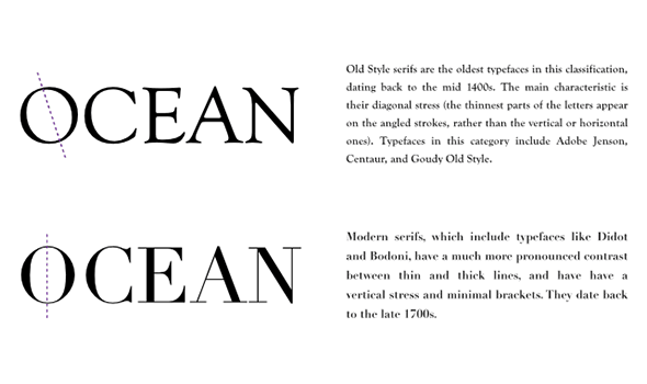
Serif fonts can be divided into two categories: serif fonts similar to handwriting are called "old fonts", and the pen tip will leave writing traces at a fixed inclination angle, and the thinner part of the O letter is connected by a slash. Old style does not mean obsolete. The text of traditional books is usually typeset in old style, which is suitable for long text reading.
The serif font with neat proportions and no traces of handwriting is called "modern font". The lines connecting the thinner parts of the O letter are vertical. It embodies a bright modern sense and gives people a cold and strict impression. This kind of serif font is less readable after shrinking, and it is generally used on titles.
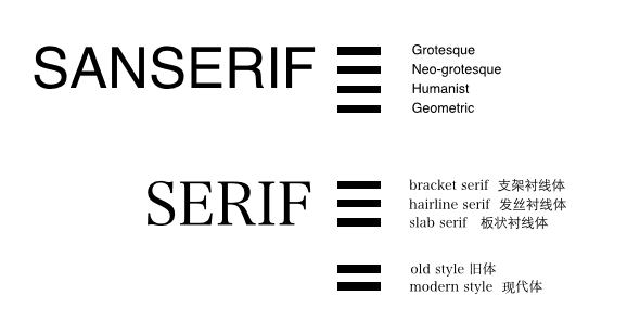
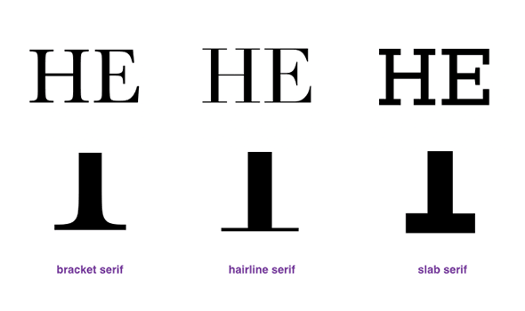
There is another classification method for serifs, which can be divided into three categories according to the changes of serifs: serifs with specific curves are "stent serifs", those with thin straight lines at the junction are "hairline serifs", thick Thick quadrangular "slab serif".
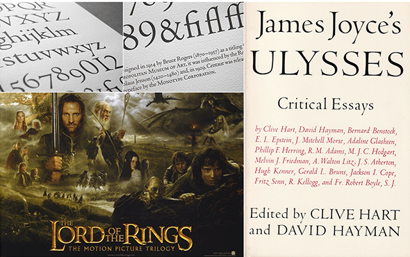
The bracket serif font is the most common typeface in the old font, and it is relatively friendly and traditional in the serif font. The more common fonts are Times>
Hairline serif font is a common font in modern fonts, which has a distinct modern feel and is not suitable for fonts with small point sizes. The more common fonts are Didot and Bodoni.
The plate-shaped serif is more powerful, and it is the text used on billboards from the 19th century to the beginning of the 20th century. It is mostly used for titles and has a nostalgic atmosphere.
Sans-serif is more friendly and modern than serif. From the category can be roughly divided into four categories: Grotesque, >
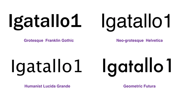
Grotesque is the earliest sans-serif, so it retains some features of the serif, such as the lowercase letter g is written differently, and there is a thick serif under the number 1.
Neo-grotesque includes many commonly used fonts, Helvetica, Arial, Univers, without emotion, calm and concise.
Humanist has a sense of calligraphy, giving people a warm and elegant atmosphere, a bit of femininity, and very good recognition. It is commonly used in the body of the website.
Geometric fonts are close to geometric shapes. For example, the letter O is very like a perfect circle, and the letter a is a semicircle with a tail. It is not easy to read, so it is not suitable for text, but this type of font has a very strong sense of design. In some occasions that need to highlight the sense of design, it is good to use a large point size font.
Personally, I feel that the usage rate of humanist and Geometric is getting higher and higher in terms of trends, especially that Humanist on the web is slowly encroaching on the territory of Neo-grotesque.
Classic font recommendation
When we are not sure what font to use, we might as well first determine what type of font is the most suitable, serif or sans serif, humanistic or geometric, and then think about whether some classic fonts can be used. Some are recommended below Classic typeface.
Epic orthodox, it's perfect for expressing age. Pay attention to the use of ligatures and old-fashioned numbers when typesetting.

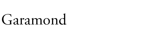
Retro tradition, no strong personality, very easy to read, because it is too popular, many big companies have made Garamond reprints, Apple Computer has the system word Garamond and Adobe> produced by Adobe>
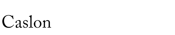
The words used in the American Declaration of Independence are the most popular fonts in the era of movable type. Many companies have also done Caslon replicas, and they are now widely used.
The representative font of the transitional Roman font (old font to modern font), very classic, giving people a classical and noble feeling.

Modern serif body, hairline serif. It is characterized by strong stroke thickness contrast and horizontal serifs, stylish, modern and graceful.

Similar to Didot, it is suitable for large font performance, and it is tougher than Didot.

This font is a sans-serif font that appeared very early, so it has an ancient style, the strokes are bold and powerful, and it has a masculine feel, which is suitable for strong performance. For web fonts consider Oswald.

Futura means the future in Latin. It is modern and has geometric features. It feels like a popular mainstream font. It can be used especially when you want to highlight the sense of fashion and design. The production process was influenced by the Bauhaus movement. It is the trademark word of LV, and it is also the font of choice for many magazines.

The representative font of the British style has a classic skeleton, but it also has a strong sense of technology and the future. The shape of the font is geometric, but it is a humanist font, which is softer than futura.

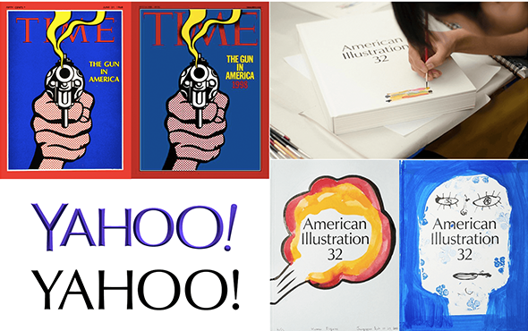
It has a classical atmosphere, the strokes are thicker at both ends and thinner in the middle, and the temperament is elegant. Time Magazine’s font change, and Yahoo’s 2013 use of Optima as a design benchmark for a new logo are testament to the typeface’s popularity.

Grotesque font, more concise than Helvetica. The font family is very comprehensive, so it is very convenient to use together.

The Humanist font, which has been popular for a long time, is more eye-catching with the widespread use of Apple, with soft and simple strokes.
The font is simple and modern, although it also has geometric features, it does not lose its human touch. Avenir means the future in French, and it is a challenge to Futura, which has the same meaning of the future. Enlarging the x-height and elongating the descending part makes the text easier to read. The font family is also very complete.

Finally, I would like to mention Helvetica. During internal sharing, many designers asked why it was not listed here as a recommended font. On the one hand, it is because Helvetica has been widely used as a classic font in modern fonts, and there is no lack of attention. . On the other hand, Helvetica is a Neo-grotesque font with a rigorous structure and no emotional orientation. It provides a strong sense of security. It seems that it can be used no matter how you use it. This is an advantage and a disadvantage. When the design object has a relatively clear temperament, it will be a better choice to find a font with the same temperament.
Text suitable for long text
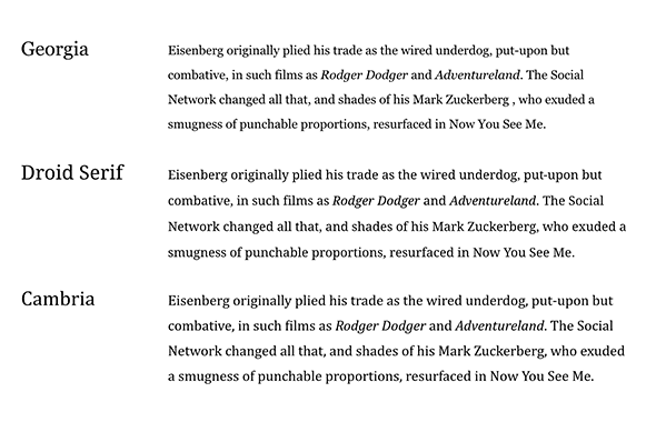
The text suitable for long text reading in the sans serif font is generally Humanist, and the text suitable for long text reading in the serif font is generally the bracket serif font. Here are a few fonts that I personally think are more suitable for long texts.
Sans-serif: Lucida>
Serif: Georgia,>
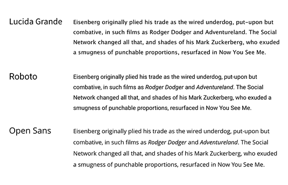
There are many fonts suitable for typesetting long texts, such as Lucida in sans serifs>
How should fonts be matched
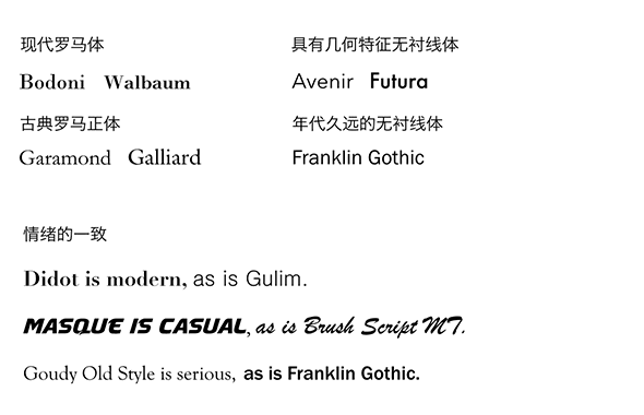
The overall principle of font matching is consistency and contrast. Consistency refers to choosing fonts that align with tonality and mood. For example, modern Roman fonts are paired with geometric sans-serif fonts, and classical Roman fonts are paired with older sans-serif fonts. The emotional expression of fonts needs to be unified, and serious fonts are not suitable for matching casual fonts.
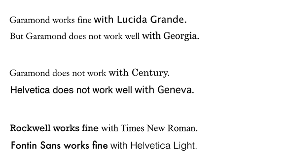
Contrast means that there must be obvious differences between fonts, and they cannot feel very similar, and the differences cannot be separated.
Contrast can also be achieved in many ways. The combination of different fonts listed above is one. Different weights and different styles are fine. If you use weight to emphasize contrast, it is best not to choose adjacent grades, use an alternate grade The typeface collocation.
The easiest way to match is to use the same font to create contrast. Another safe way is to choose a font family that contains contrasting fonts, such as ITC>
It is more difficult to be proficient in English fonts, because of the cultural gap and the influence of the environment, what is written here is just a few superficial, welcome to correct and communicate.
Original address: Tencent isux
【UTS contribution: 2650232288@qq.com】
Articles are uploaded by users and are for non-commercial browsing only. Posted by: Lomu, please indicate the source: https://www.daogebangong.com/en/articles/detail/Penguin%20Haowen%20how%20to%20use%20goodlooking%20English%20fonts.html
 支付宝扫一扫
评论列表(196条)
测试