This is the number 124 time push | including 116 picture + 1 video + 8303 word | 21 minutes
Don't show off technology flow technology Feelings to feelings
There are no routines, everything affects influential people
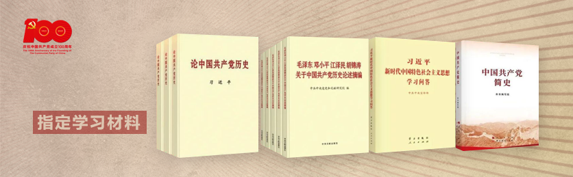
The colors of the party flag are indeed red and yellow, as well as the national flag, military flag, regiment flag, and team flag... These are also the colors of our nation, the color that flows in the blood and the color of the eyes.
However, if you see too many so-called PPT templates in this color, will you feel tired?
Often people will come to me and ask for it——"Hey, whoever, send me some templates, the party's mouth, be beautiful, be grand~< span >" I usually smile slightly, and then give him the so-called templates in front of him, but I think it should be able to meet the needs.
I won't tell them that high order never uses templates...
This may be the obstacle brought about by cognition, and it is also the ultimate reason why most people thinkthat's the case anyway.
Actually, party and government PPTs have been misunderstood or even misunderstood, and it has become a closed loop or even a stereotype in our work and life. , theme class meetings, various lectures, sharing meetings, report meetings, and other occasions, unconsciously and passively, accepting... the eyes are hot, and I get used to it, get used to it, and naturally It's only natural, then? Then there is no more, and it becomes an inertial concept cognition, and the pattern seems to be consolidated.
The general understanding is often, the party’s PPT, do you need it? No matter how well done it is, how can it be as high-end as project declaration, base review, academic dog counterattack, and doctoral defense?
What is the value?
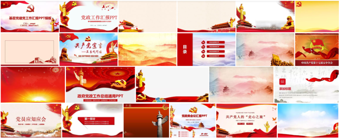
So, from a broader perspective, the party’s PPT really needs this—anyway, you can find it on the Internet, there are many, find one with the party emblem (many of the party emblems are wrong used), get some pigeons, red ribbons, rich peonies, looming distant mountains, the Great Wall, and Huabiao (in fact, Huabiao cannot be used indiscriminately~ ), anyway, is it the color, red and yellow, or red and white, golden...
Is it really all right? (Ah~ what can we do if we don’t do this? )
)
Could it be that all these things really don't make sense? ?
It's not that we don't know such a LOW, but, aren't all people like this? What other flowers can you make?
If you can look down and read it, I believe it can alleviate the general pain points of party mouth PPT production. I dare not say it is a textbook-style sharing, but it must be a nanny-level guide ,Wash your eyes to make a more sincere PPT.
Thanks to a very respected lecturer brother of the Municipal Party Committee Propaganda Group for his content, so let me use this PPT of the party’s mouth to make a relatively rare and detailed review...
(This time will not release the final effect as before, but as long as you read it patiently, I think you have read it seriously and thought about it yourself Do some hands-on practice, this article will definitely not disappoint you, haha~)
1
Get it, what should I do
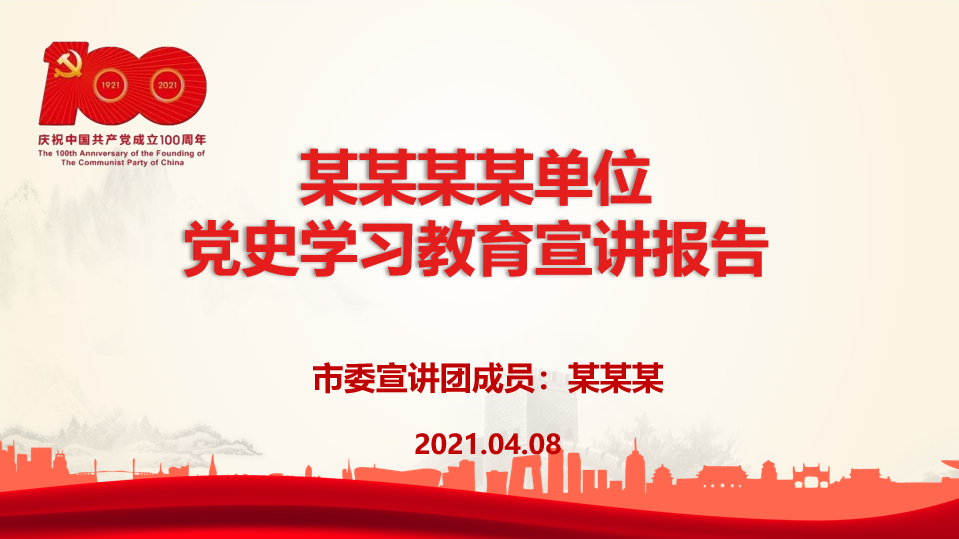
With this red and white (light yellow) manuscript in hand, you must think, wow, another template style...then? Then shouldn't it be changed?
Noisy~
You should think about it first-
Q: If there is a problem with this PPT, where is the problem?
A: Shouldn’t PPTs like history-telling be more textured? Add the towers of the Great Wall in the background, the dark lines of the distant mountains, the silhouettes of various landmark buildings, and a red silk across it, is it complete? ? Isn’t it still impossible to get rid of the stereotype? Moreover, in terms of color configuration, the contrast between blue and red must be able to play an emphatic role? Especially with such a high-profile color contrast, will there be suspicion of krypton goldtitanium alloy hot eyes?
2
How to change the tone
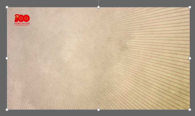
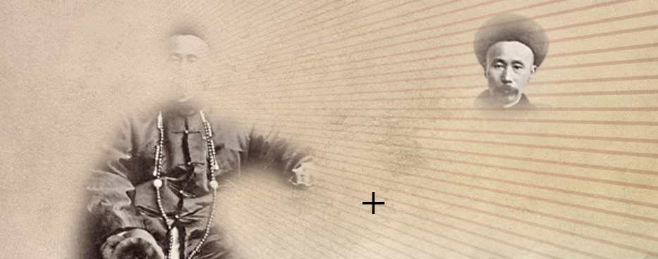
If there is no texture, then give it a texture. If the color is too spicy, lower the tonality, and use a softer color scheme to help adjust the style of the entire PPT.
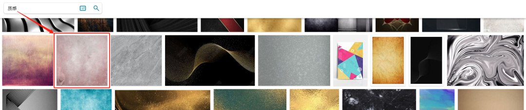
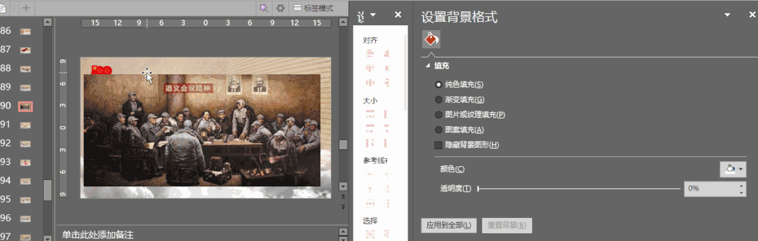
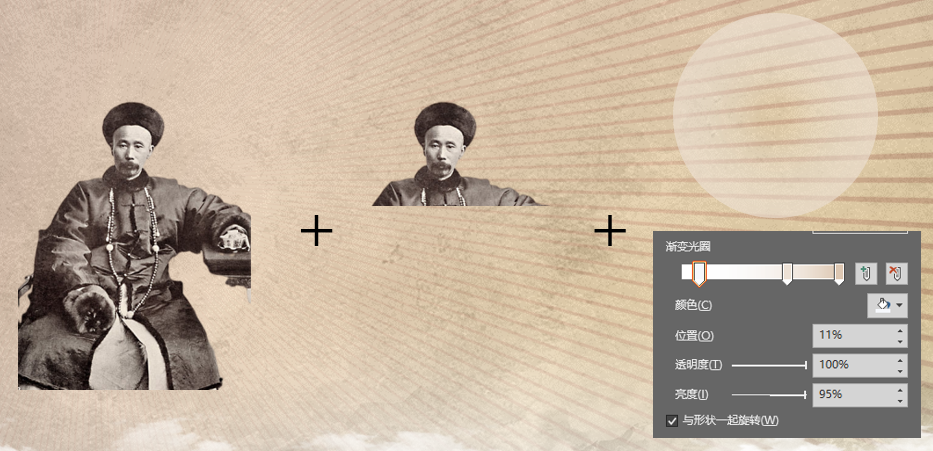
Bing, I found such a picture, as shown in the red box above. by the way, generally looking for pictures with a higher quality, I like to go to Bing, use the international version, sometimes in English, the search results will make you more happy.
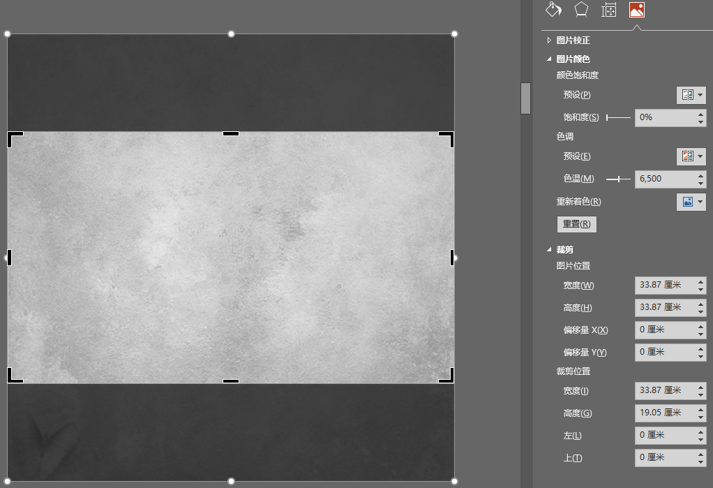
Take the segment in the picture and crop it (to avoid the pattern below the picture), and then adjust the saturation to "0".
Is this operation for dry hair? In short, it is to improve the texture~~ Later, after adjusting the transparency of the frame, the bridging degree will be higher (details later, not to repeat), as for the saturation, it is to better match the color tuning.
However, you will definitely say that this picture is gray, how can it help to adjust the color?
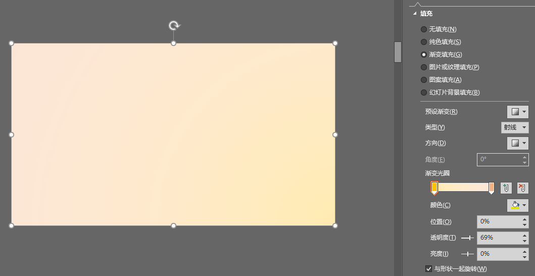
Define the light, fleshy color between red and yellow, and use this to overlay the previous layer with a gradient filled picture frame, isn't it all right? This is the "softer color matching aid" I gave before - you can use the color picker , easily configured successfully in the above image.

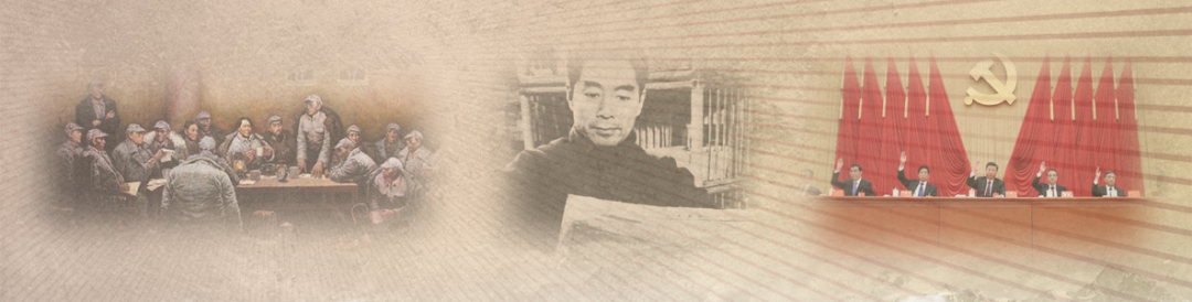
Stacking up is this effect.
Is it over? Of course not—
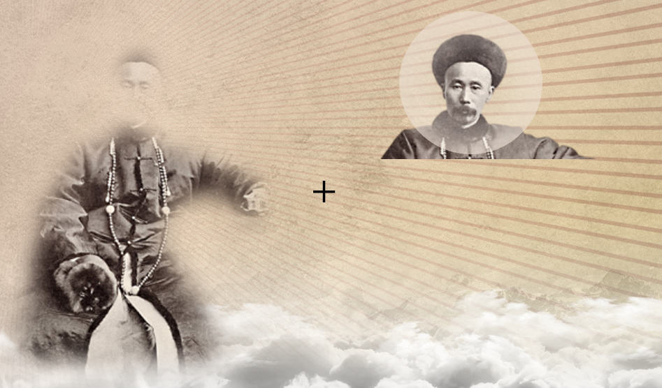
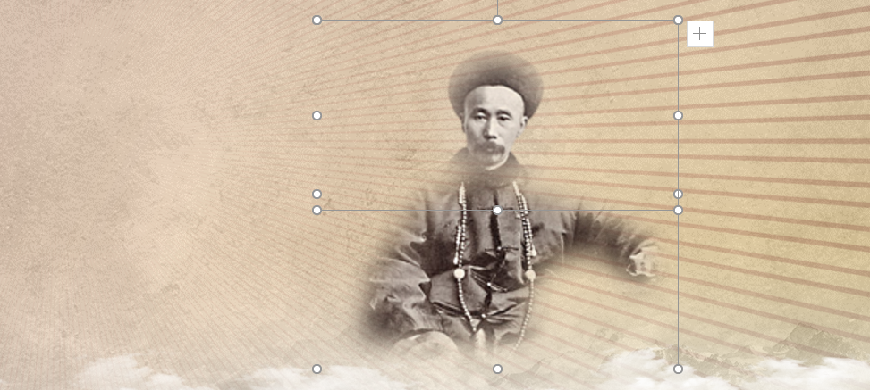
You have to add LOGO (this material will be given later in the "Celebration of the 100th Anniversary of the Founding of the Communist Party of China Moving logo" vector material pack)
Analyzing this LOGO, we will find that the radiation in the LOGO is actually quite attractive, so would it be more appropriate for us to overlay one on the background? It is also very simple to do——
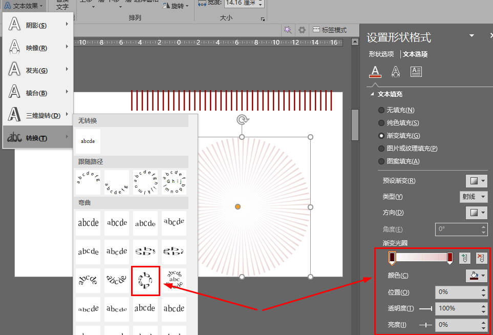
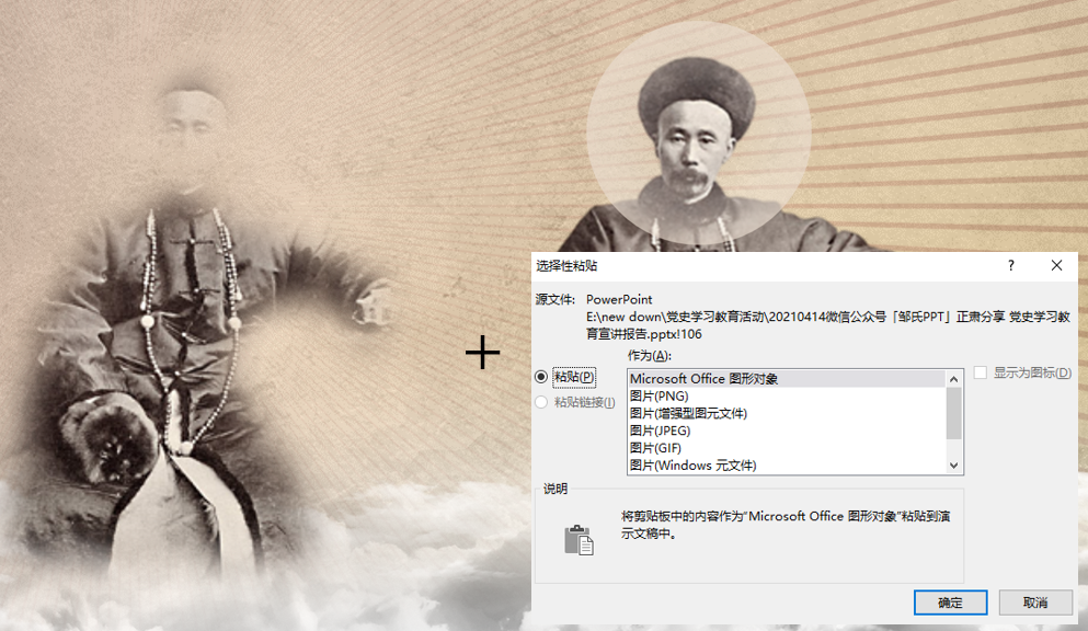
Create a new text box, enter a line of "||||||", select it, and select "Irregular circle< in "Conversion" in "Text Effect" /span>", the text is filled with "gradient aperture-ray-from the center", then cut the whole, selectively paste it as a PNG transparent image, stretch it appropriately, cut the excess part, and stack it, it becomes the sample paper below, The power of visual guidance is gushing out.
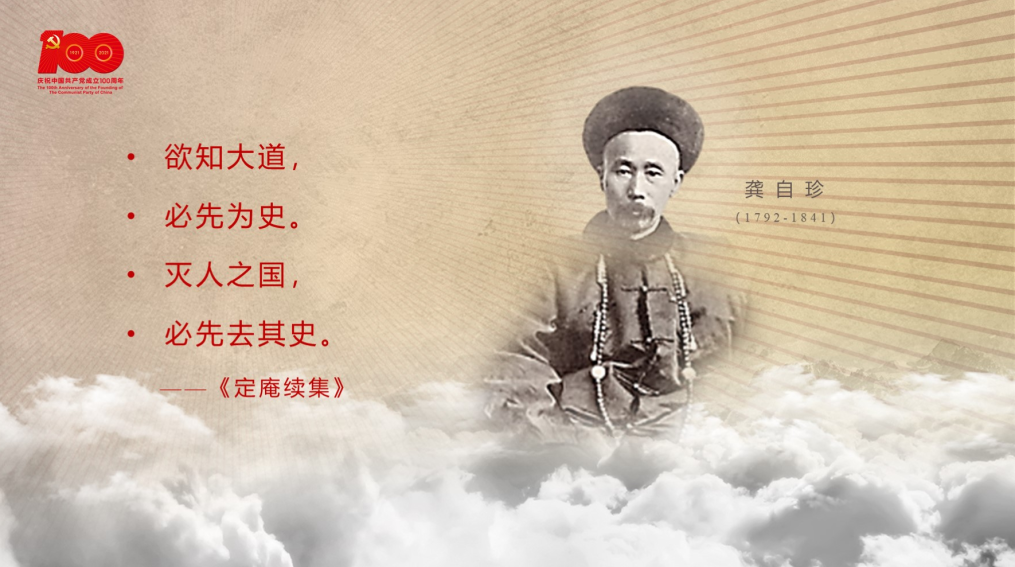
In order to present the feeling of the vast history, we went to our old friend "Looking for Elements" (51yuansu.com51yuansu.com) Go up and get a transparent PNG image of the sea of clouds for free, and then stack it——
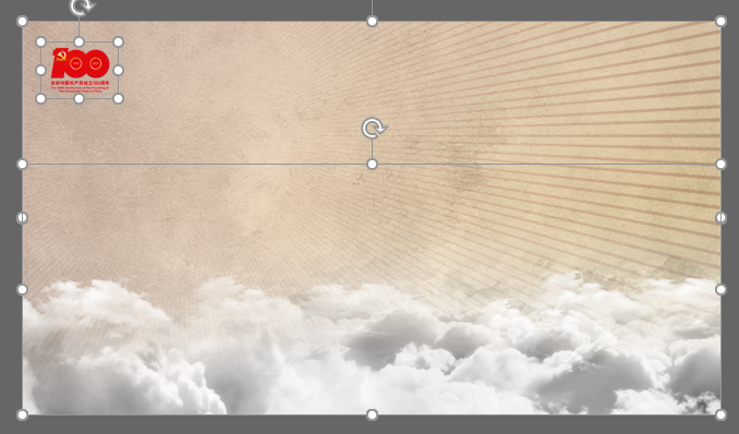
Comparison, dear, look at the texture, is it not spicy at all? Is this compelling style more advanced?
3
How to get the word
According to general principles, Microsoft Yahei font is selected, the main text is 26 points, and the highlighted part is bold (Microsoft Yahei is currently the only regular font weight and The WIN system with both bold and heavy characters has its own Chinese fonts, so if most of the users in the PPT usage scenario are users of the WIN system, then you can get a more consistent experience, and there is no problem that it cannot be displayed after calling.< /span>), the annotation font should not be smaller than 18 points.
Western letters and numbers also use the "Times New Roman" that comes with the WIN system. It is also an English font with regular weight and bold weight. It is aimed at non-DW WIN system platforms. ClearType's characteristic anti-aliasing optimization under hardware acceleration, the effect is very obvious.
See that faint number "2" superimposed on the back of the text box? In fact, this "Impact" font that comes with the same WIN system is often used for emphasis, and the above decoration function, you only need to adjust the transparency of the font fill and border, and the It can achieve the above effect, very chic and fresh, isn’t it?
Even, punctuation marks can also be used for decoration, which is already a common practice, and can play a good role in emphasizing and catching the eye.
The dark background uses white as the routine and yellow as the emphasis, which can strengthen the "first-sight cognition".
In the case of a flowery background, adding a layer of background color (mask) with relatively low transparency to the text box is actually a good effect. At least, it can avoid the need to bulge your eyes to see clearly Embarrassed.
Conversely, for emphasis, adding a dark color with low transparency to the text box of light-colored text can achieve the purpose you need to achieve, whitening and bolding the keywords highlight more clearly.
When the background is not so flowery, the text box can also be filled with a gradient, so that the flowing and elegant feeling can be squeezed out naturally and smoothly. In addition, a layer of dark color can be given to the text The effect of outer glow + shadow of the same color makes it appear more lively. Note that I did not use black, but a dark color of the same color (near ocher color), so that it looks more diffuse (here Ask Aite about the master of light and shadow in the PPT world—Teacher Ermu @张二木).
Special fonts are generally best not to appear in PPTs regulated by Dangkou. If they must appear, it must be an emphasis on a greater perspective. Moreover, please be careful to avoid copyright risks. The special font I chose in this case, the word "Xueshi" is a free open-source font - the heaviest font in Siyuan Song typeface, and the word "Lixing" is my own handwriting, so that there is no risk of copyright , plus the size, the perfect up and down arrangement, has the appeal of the picture been significantly enhanced?
4
How to deal with pictures
Graphs are the most difficult to do well, but they are also the most brilliant. When it comes to image processing, I think many people first think of PS, but in fact, the 2019 version of PowerPoint, image processing It's already very powerful.
Let’s take a look at some pictures in the original PPT——
1. Style confusion
2. The original quality of the picture is poor and the pixels are low
3. Serious deformation
4. Use for use, no match
5. No regulation
6. Reproduction missing, simple and direct application
Seeing these pictures, my first reaction was that my head was getting bigger, but then I thought about it, isn't this just the "blue ocean" that I want to upgrade, optimize and beautify?
Stylistic confusion - what to do?
We can clearly see that after the modification, the density has been well tuned, and the subtitle content of the title has been removed, which has reduced the heavy burden and crampedness of the head. In addition, because before we When adjusting the template, I made a very soft and extremely gentle tonality improvement, which made the overall breath of the page very strong and blessed, and the forceful style was also effectively improved. I set the word spacing of the text The weight is 3 pounds, which is neither exaggerated, but also can relieve the visual oppression caused by a large pile of dense black characters. The most important point is to use pictures. The above screenshots are static. Let me show you The dynamic one actually used is the following——

Which one do you think is more lively? Which one is more impressive to your point and your statement with the admiration for the picture? If you want to do this, it depends on your usual accumulation and the amount of pictures you read. It is no exaggeration to say that I have seen similar good pictures in the learning power country, and they must be saved and then quickly. (Extended reading, click to reach:To commemorate breaking thousands and breaking hundreds, PPT pays tribute to my "learning power" )
This kind of immersive page reading can make the viewer completely immersed in the content. Whether it is a lecture or a report, it will definitely not make people feel boring.
Then you may be wondering, similar to the presentation of the above animation on the page, how to adjust the diffusion effect around the picture, and how to adjust the transparency? This is actually very simple, you insert a rectangle, and then in "Shape Options-Fill", select "Picture or Texture Fill", then insert gif into it, and then adjust the rectangle with the animated background Transparency, and the "soft edge" setting in "Effect", it will show this feeling of blending with the background. Now you finally know why you must find a strip Let’s use textured pictures as the background, because it will be tolerant to include some pictures with poor picture quality, coupled with the motion characteristics of the dynamic picture itself, it can perfectly erase the unclear and blurred impression , and let people have the illusion that the background should look like that, and it is not the fault of the picture, so they will not subconsciously demand the quality of the picture.
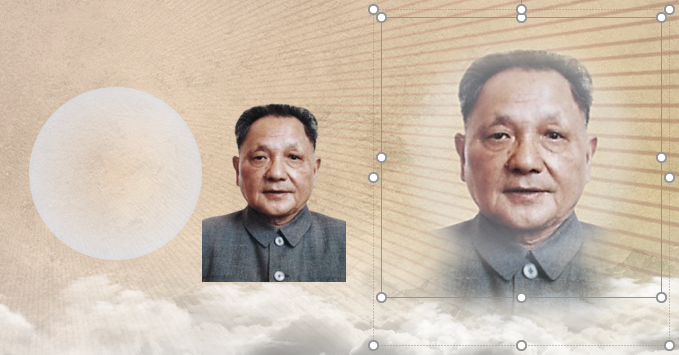
The original quality of the picture is poor and the pixels are low - how to break it?
As mentioned earlier, blurry and low-quality pictures give people a sense of uneasiness, and they will distract the viewers when you convey them. The sincerity of the producer raises reasonable doubts and doubts about the attitude of the production, which affects the overall perception and even the quality of this PPT. This has become the usual way for us to judge the quality of a PPT. potential standard.
Which one is better, the top one or the bottom one? I believe it is easy for you to give the answer. You must need a higher-precision front-layer image to divert attention to make up for the slightly blurred background layer, thereby eliminating the discomfort that may be caused to the look and feel.
Through the adjustment of "soft edge", the picture can be easily processed to blend with most of the background, and it is also added to the soft generalization and tone adjustment we have done before, so now we know , Why did you choose such a fleshy color? That is because most of the pictures, including oil paintings, historical photos, and even real photos, are of low quality, but they can be used in this way to form a silky smooth texture. The reduction of transparency can make the texture of the background stand out naturally, and with the effect of softening the edges, it can form a seamless image from images to no images. Excessive, low-resolution paintings and historical photos can be easily adjusted through the built-in "image correction" in PowerPoint to form a natural contrast between light and dark in the picture, and it can also present a sense of matching very smoothly. For realistic photos, let’s put it this way, in the mainstream of the graphic paradigm of the party’s lipstick and yellow two-color system, this kind of fleshy color between red and yellow can also well highlight the picture and should be able to achieve visual impact. The three pictures below are all processed by PowerPoint’s native tools——
There is also a way to use low-resolution images. Based on the above method, after blurring the image, overlay a layer on the bottom to expand the diffusion surface, which is especially suitable for small areas. Reproduction of low-resolution images. Let’s take a look at the picture with serious deformation mentioned earlier——
Of course, when I was dealing with it, I was looking for another picture. From the perspective of the layout, I should choose a picture with a slightly more positive angle, which is more suitable. ——
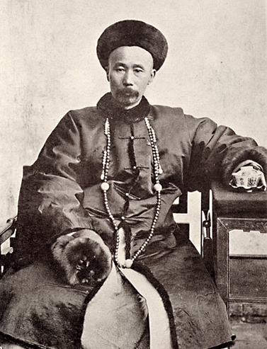
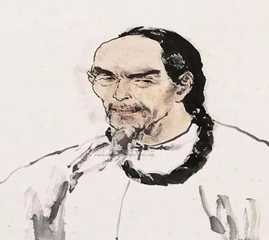
Obviously, for modern figures, we must pay attention when selecting pictures, and try to have real (or close to real) photos, which are better than those that have been processed by art, or works of art (sketches, watercolors) , oil painting), from the perspective of reliability and validity considerations, they are much better.
AI online smart cutout, recommend the following one——
 http://matting.deeplor.com/
Free, the generated image quality PowerPoint and general screencast presentations are accurate enough and usable.
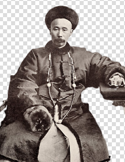
Generation in seconds, faster and easier than PS
Then reprocessing, the result is this effect——
You will say, this is not the use of PS, making a noise~~ not at all, this case has not used PS at all, and everything is completed in PowerPoint using the built-in tools. This picture Reproduction processing, the specific method is——
The same processing method can be applied to portrait processing such as headshots, and the effect is also very good. By adding and deleting the edges, it can achieve the highlight of a certain part in a silky way. .
Having mastered such a technique, you can burst into inspiration at any time, and smoothly handle pictures with relatively low quality, especially those with close edges, such as the following one——
The red flag and the characters close to the edge, the area reserved for connection is too small, the effect of softening the edge is like this——
Then, how can we achieve the effect in the picture below without opening the external picture editing tool?
In fact, it is very simple. Cut off a small part of the edge of the picture, flip it horizontally and stretch it, then combine it with the original picture, cut it and paste it into a new picture, and you can see it clearly. ? The part where the softened edge is hidden and becomes excessive is actually the part that you added later. Since it is co-existing with the original image, after softening, no reprocessing traces can be seen. Moreover, compared to PS A class of large-scale processing software, is it much faster?
Reproduction missing, simple and direct application - how to change?
You can often see such a form, but it is actually a rather careless way of presentation. Alternatively, leave a white border that looks out of place with the surrounding background.
Actually, in PowerPoint, it is very easy to make appropriate reproduction processing, and the resulting effect is like this——
Again, I have never used PS~
So, using only PowerPoint, how is this done?
Look for the book cover, Amazon outside, Dangdang inside~
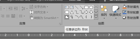
Use the "free polygon: shape" in the drawing tool that comes with PowerPoint
Outline and close along the book cover just cut
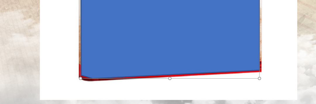
Note that the control points should be within the outer edge range, so as not to leave white edges after processing. In addition, the control points can still be trimmed after closing. The method is to right-click on the generated shape, and then click "Edit Vertex" can be adjusted by dragging and dropping.
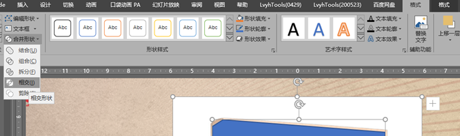
Select the picture, then press and hold the shift key to select the shape you just generated, and then go to the "Format" in the drawing tool (note that it is not the "format" of the picture tool , otherwise you will not be able to find it) Find "CombineCombined Shapes", click the "Intersecting Shapes" in it, and the image below will be generated——< br>

As for adding shadows and lighting, it is very simple. The previous method of using shape keying is the so-called " Boolean operation".
Don't talk about regulation - how to find it?
There are no rules, no squares, especially the serious party PPT, to a large extent, it is necessary to follow certain regulations and maintain enough paradigms in order to fully achieve the purpose of "sight-seeing". Do it yourself PPT is LOW~LOW, how can you expect to use PPT to attract viewers and achieve the information you want to convey?
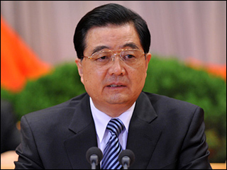
From a broader perspective, leaders of the party and the country should be respected and loved. This shows that our nation has sufficient confidence in itself. Otherwise, how can we talk about the "four consciousnesses" Woolen cloth? But unfortunately, when dealing with related pictures in PowerPoint, we tend to rely too much on pictures that can be found at hand, but we don’t pay attention to the path combing in this aspect at all. When reflected in the production, the following situations often appear——
Oversaturated ↑
Bloated ↑
Low pixel↑
 Looking bad↑
As above, there are two dimensional sorting paths——
The first pathis to find a standard photo that has been announced by the official, and then follow the aforementioned method to online AI smart keying——
And make some corrections and adjustments to the picture, such as head size, body interception height, color saturation, such as clarity, brightness contrast, etc., so that the final effect looks more consistent and uniform.
According to the method mentioned above, add the gradient shape to reproduce the picture.
Comparing the two phases, which one is better and which one is worse, the cloud and mud will make a judgment.
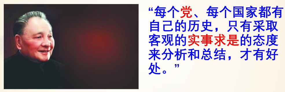
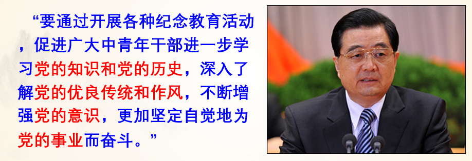
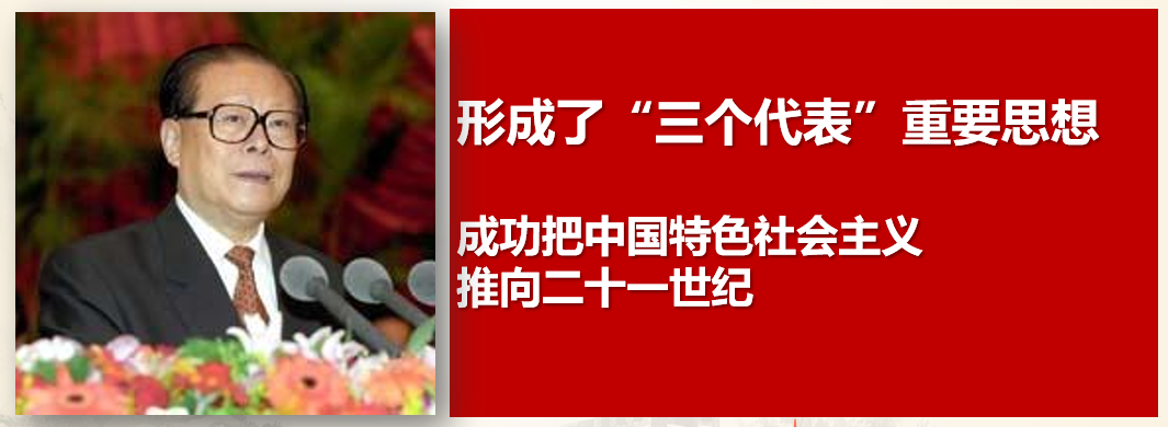
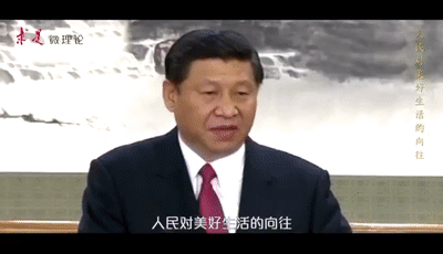
The second path is very particular about your accumulation, one is the accumulation of vision, the other is the accumulation of experience, and the other is the accumulation of information. As long as the image of a public figure must have a bright moment, it is not difficult to find a more suitable picture if you have to grasp it accurately and carefully.
Look, with the copywriting, the pictures I found are either written by the characters, or more of the characters are speaking, which can match the tone and content of the page; in addition, pay attention to the color The characteristics of each historical era, the first two generations of characters before the end of the last century, the tone is older, and it looks more in line with the original style. All the characters are not bloated, and their expressions are not exaggerated. They are very natural and solemn, and they will not divert the attention of the viewer because of a little bit of strangeness.
So, sometimes, the atmosphere may be as simple as that, although, I always think that all Party A are professionals from the Meteorological Bureau..."Well, ah, that Who~ I don’t have any particularly complicated requirements, it’s just this PPT, it must be grand, ah, grand”...
We often hear requests to "Read the original text, learn the original text and understand the principle". I think, in the production of PPT, we must learn to "use the original picture"
Actually, the original picture is really not hard to find, even if you can’t find the characters in the original picture, the scene of the venue is still okay~ It’s very easy to use the “soft edge” mentioned above to process it. Easy to use and works great.
In addition, People's Daily Online, Guangming Net, Xinhua Net, Xueqiang Guo, Party Construction Net...these are all treasure troves, as long as youhave the heart, As long as youpay attention, as long as you carefully, you will be able to find a matching picture.
Look, most of the animations below are from the aforementioned websites, and you can even see the accompanying pictures in such tweets in many official media’s self-media, save them, just Become your own material library, and then build an outline, so that when you make it, you can clearly present the matching part in your PPT, or, directly intercept some videos on the website, many film and television works include some official media Documentaries, such as "Awesome, My Country", "We Walk on the Great Road", "The Road to Revival", "Steel from Hundreds of Steel: 100 Years of the Communist Party of China"...I think it is simply inexhaustible Precious resource~

With the help of the high-end output of the official media platform, is this paradigm more vivid and attractive than the usual PPTs we see? (Did you save it by the way? )
)
After blending with the background of the page, it should have the above effect. The key point is that, except for the lack of sound, the controllability and stability are much better than the video. The red page in the second half, in fact, is the effect of the superposition of two moving picture frames, and the effect is more integrated. Why do you have to use a frame plus a background to present the moving picture? When talking about the operation above, it has actually been described. In addition to the "soft edge" of ordinary pictures, adding it to the frame can increase the transparency adjustment function, at least in PowerPoint 2019 version. , I haven't found any other alternatives, this set of combination punches down, and your PPT's blockbuster feeling will explode instantly! One thing to note is that the animation is well presented in PPT, but its color values cannot be adjusted, including saturation, sharpening, color temperature, contrast, brightness, and even cropping...you can adjust, but after the adjustment , you will find that the animated picture will not move
So, you may ask, many of these animations are from videos, how can they be output as animations?
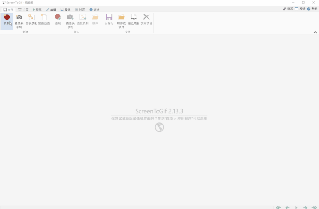
Here is a very considerate and free green and useful weapon of Amway, which is——
Although the icon is flat and simple enough, its function is too powerful!
Green and non-toxic, completely free, and it is actually an open source tool
The size is super small, the commonly used version is only about 2M
No need to install, you can even use it on a USB flash drive
If English is not good, don't worry, the little one can choose more than 20 languages
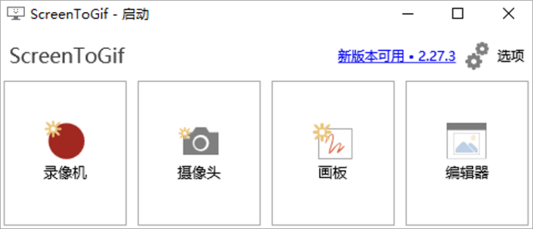
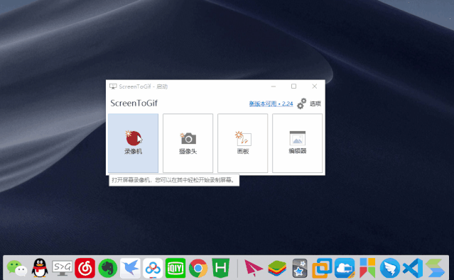
The starting page is very simple, but the function is really powerful.
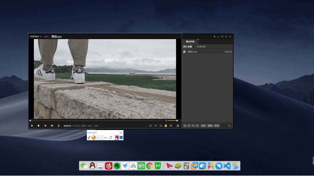
Common operations to record the screen and automatically convert it into a gif. First, click the video recorder (that is the red dot) to open the screen recording window. You can also set parameters, including the frame rate of the screen recording, whether the mouse is displayed, whether the magnifying glass is activated, etc. Settings can be easily customized.
Then, select the recording window according to your needs.
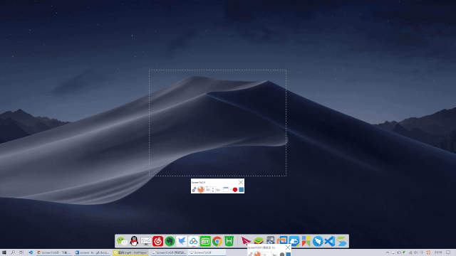
Click Start or use the keyboard shortcut F7, the effect is as follows——
Use the drawing board to create, ScreenToGif will automatically record your operations in the drawing board, you can make some simple gifs, first open, choose your favorite brush to create, such as this
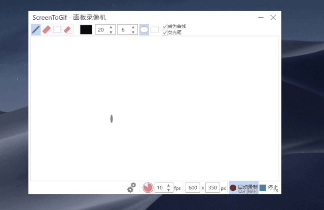
Then you can directly save and export~
It also has powerful editing functions, use the editor to edit existing materials or newly recorded materials, such as adding subtitles and watermarks, adding and deleting frames, converting video to gif, compression, etc. ..
All information is clearly presented to you.
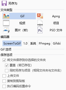
The editing tool is so powerful that you can even compress a gif of more than 10MB in half through multiple debugging. In this way, the 10MB limit of the WeChat official account is no longer a problem.
Even the saved file types are extremely powerful, and the encoder allows you to explore more optimized saving scheme settings many times.
screen to gif Here is the address of the portable version of Lanzoux,https://www.lanzoux.com/iXLbwhffosj

Zou Comb

Words are not as good as tables, tables are not as good as pictures, and pictures are not as good as moving. This seems to have become the standard in the demonstration production industry. The teacher has gone farther and wider on the 3D branch tasks of PowerPoint, and Chen Kui, a teacher of Ruipu, has pushed the PowerPoint presentation business to the height of 2.0, including more complex C4D, AE integration, full-screen Brothers Wu Chao and Ah Wen are still searching for the ultimate significance of artifacts for the PPT business...
But where is our original intention? Content is still king, and technology is just a piece of phosphorescence floating on the surface and the periphery. It is true that the flow of techniques will definitely be the biggest force to promote the development of the industry, but "Everything moves forward Never forget the path you have traveled; no matter how far you go, no matter how glorious the future is, you must not forget the past you have traveled, and you must not forget why you started.”
So, you may understand that it is definitely different from making a PPT casually with full of sincerity.
Dangkou’s PPT, see here, you should know what to pay attention to and how to do it?
Okay, release all the generated videos, everyone enjoy
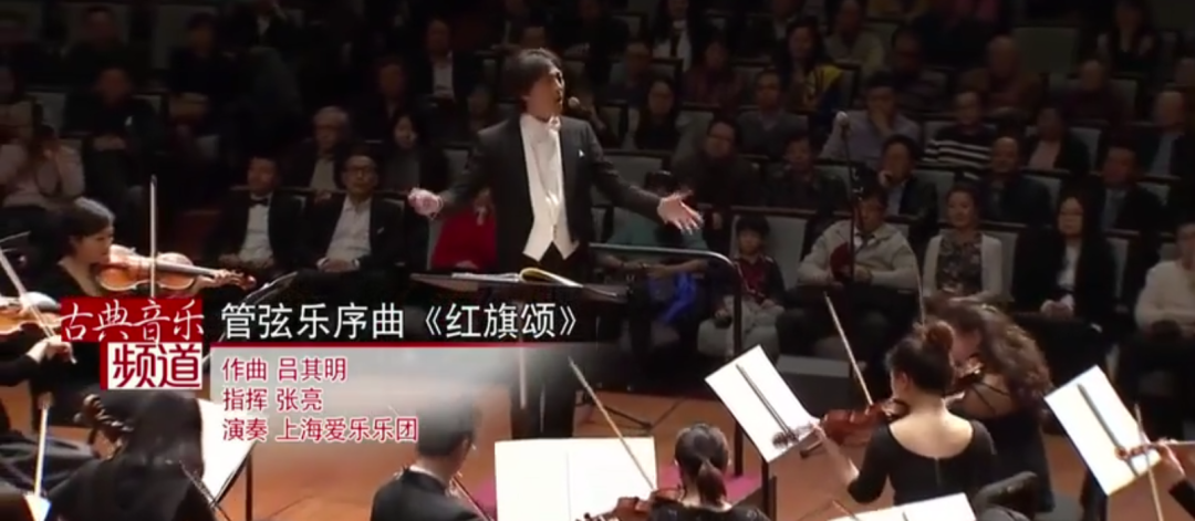
The sound source of the above video comes from the Shanghai Philharmonic Orchestra's orchestral overture "Ode to the Red Flag". You must be familiar with this familiar melody Pai right?  A special thanks
I hope that it will be helpful and inspiring to you.
end
Benefits

PPT reply "dangshi" in the background of the official account to get it without routine.
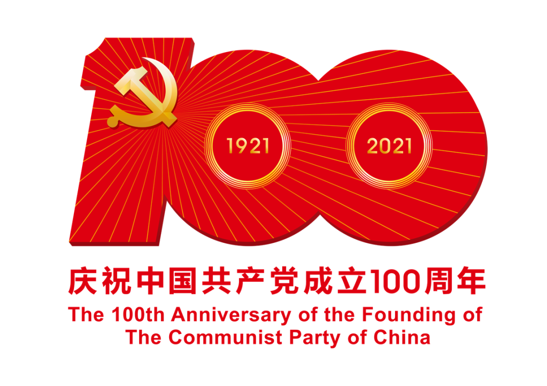
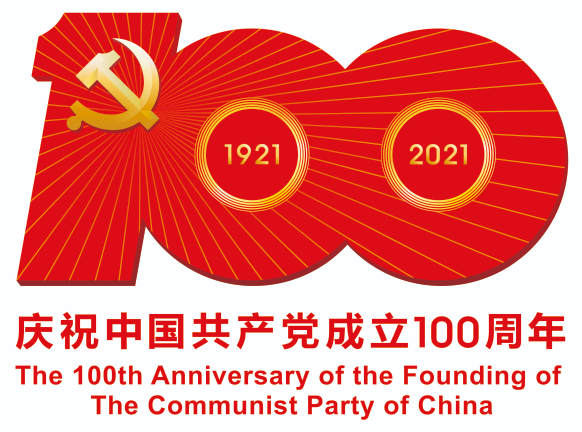 The Propaganda Department of the Central Committee of the Communist Party of China released the logo for the celebration of the 100th anniversary of the founding of the Communist Party of China
Download the vector and transparent image compression package from the website of China Civilization Network, the address is below——
http://www.wenming.cn/specials/100/jj_52318/202104/t20210402_6002427.shtml
Sincerely, no appreciation
Please, please Leave a messageTransfer Group Post Friends Circle Point Looking OK
Articles are uploaded by users and are for non-commercial browsing only. Posted by: Lomu, please indicate the source: https://www.daogebangong.com/en/articles/detail/Party%20mouth%20PPT%20there%20are%20so%20many%20particulars.html
 支付宝扫一扫
评论列表(196条)
测试