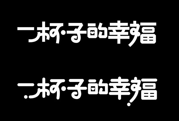
Today we talk in detail about the design rules of interesting fonts. What is an interesting font? To put it bluntly, it is cartoon style, children style and other interesting fonts. Such as the following sets of cases:
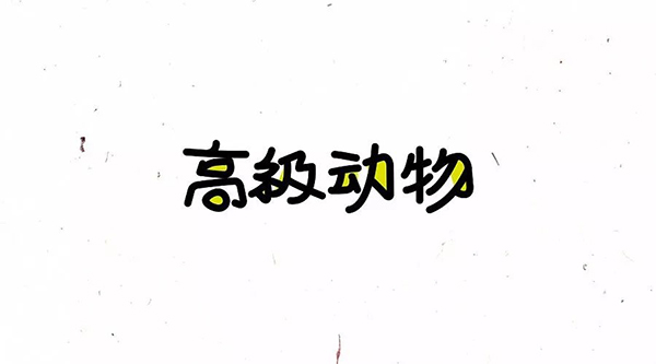
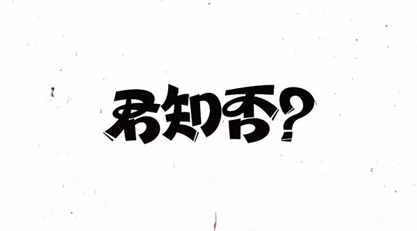
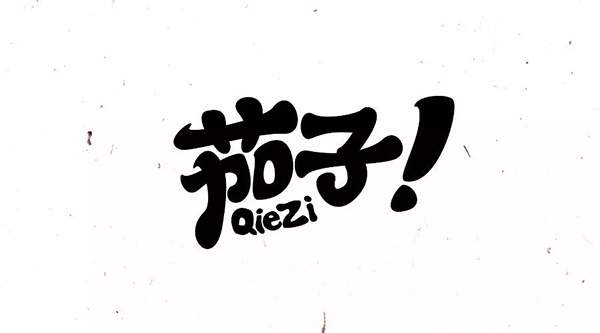
Interesting fonts are different from standard fonts. They are only suitable for titles and individual LOGO standard characters. Generally, they are not suitable for body fonts, because they are difficult to read when they are arranged in large quantities. So how to design interesting fonts? There are three macroscopic methods, namely
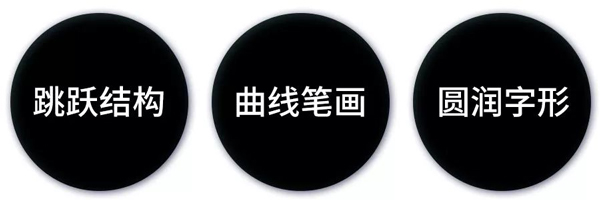
1. Jump structure
The jumping structure is actually a rhythmic relationship. The normal fonts are all square characters, and there is no sense of rhythm when they are arranged together. Making the glyphs interesting can make the characters big and small, high and low when arranged, so as to form a sense of rhythm, as follows:
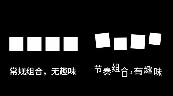
A regular blackface is spiced up with a tempo change.
Actually, many of the glyphs in our computer font library are cartoony and interesting, and their structures are jumping. Here are a few chestnuts:
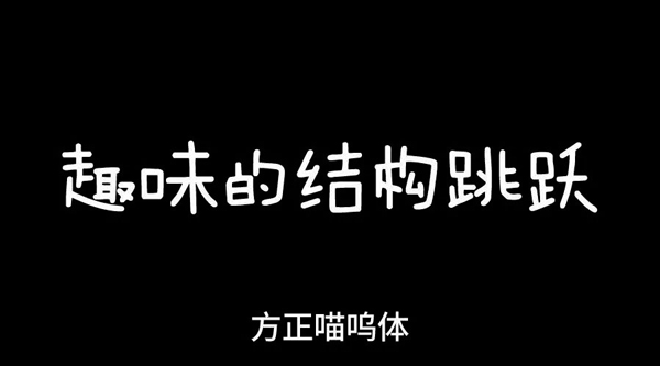
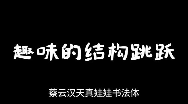
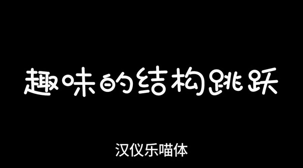
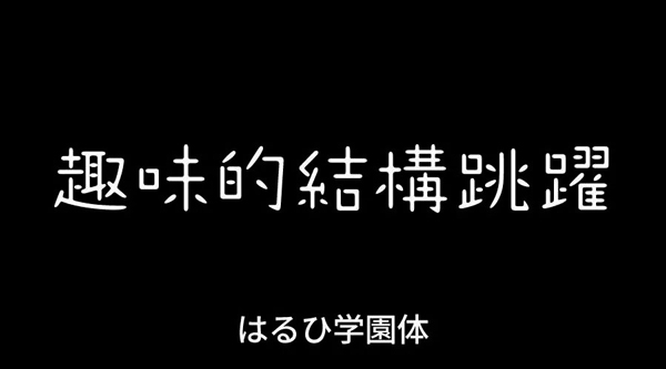
The structure of interesting fonts is jumping in arrangement. In addition, compared to the horizontal, flat and vertical strokes of ordinary fonts, the fun-shaped fonts are more individual, and will not completely follow the stroke rules of horizontal, flat and vertical.
Then let's take a look at the excellent works of the jumping structure
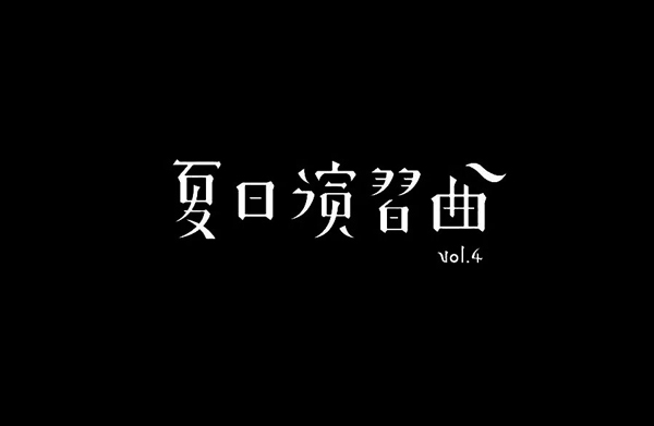
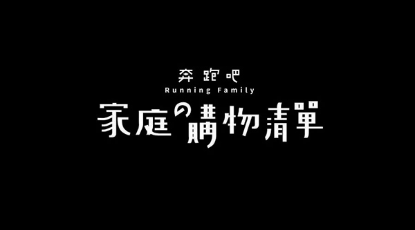
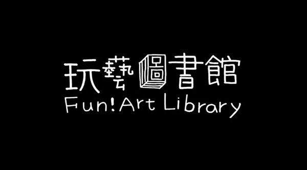
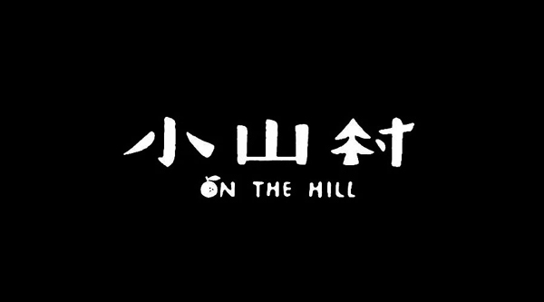
2. Curved strokes
Curved strokes use curves to express the font structure. Curves have more changes than straight lines, and are visually richer, making them more interesting and cartoony.
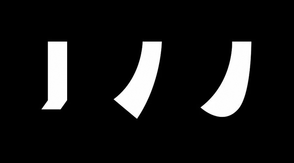
For the same stroke, the two curves on the right are more interesting than the one on the left. Let’s take a look at the excellent works with curves.
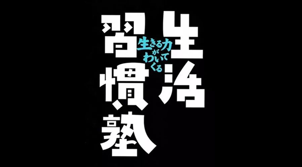
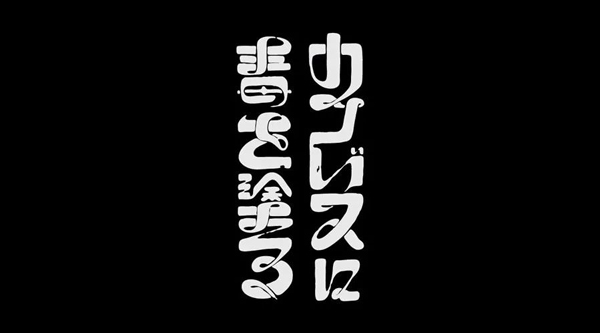
It is worth mentioning that many different methods are often used in a group of characters, such as the combination of curved strokes and jumping structures, or the combination of rounded fonts. Therefore, the method is more flexible, depending on the temperament of the project.
3. Round font
Round fonts are easy to understand, that is, whether the ends of the strokes are round or not. Generally speaking, round fonts are more interesting and cartoony.
For the same set of glyphs, those with rounded strokes at the bottom are more interesting and attractive than those with square endings, and at the same time have a stronger sense of cartooniness.
Let's take a look at the excellent works of round fonts
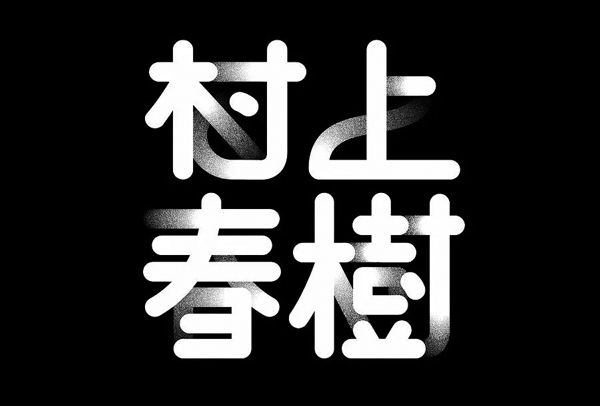
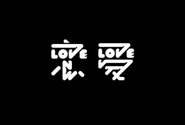
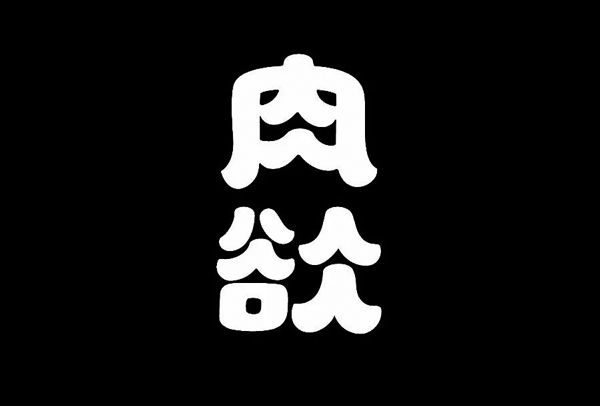
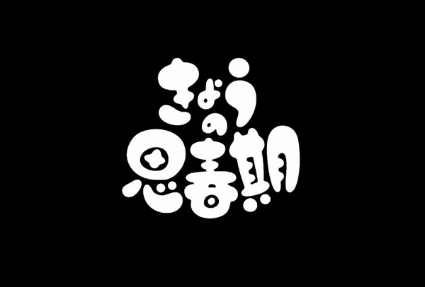
Case presentation
The next part is the case presentation. Let’s take the three characters Niu Bobo as an example. First of all, we need to use the pen path to outline the structure of the three characters. Note that we can substitute "Jump Structure" and "Curved Stroke" when ticking, as follows:
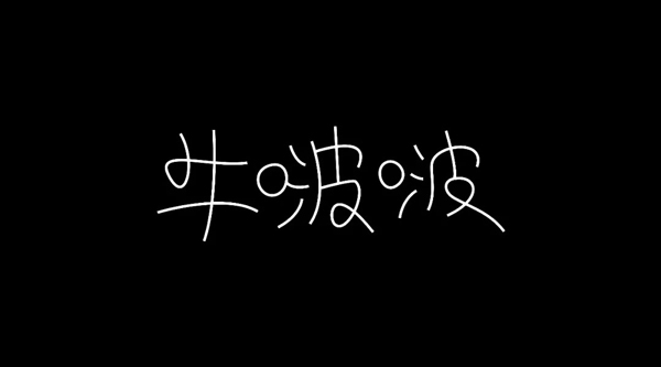
In order to make the characters more rhythmic, I changed the two "Bo" in different forms, which will make this group of characters more interesting and varied. Then we thicken the stroke to an appropriate size, as follows:
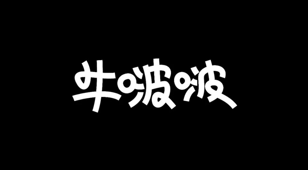
In fact, the feeling of this group of characters has come out now, but relatively speaking, the curve is not smooth enough, and the thickness of the strokes is the same and lacks variability. Then on this basis, we use the width tool or directly adjust after turning the curve to make the strokes vary in thickness and have more tension, as follows
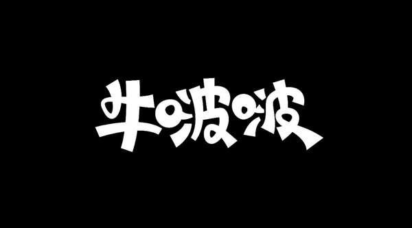
After this step, we used both "Jump Structure" and "Curve Stroke", but overall it lacked some atmosphere. Because "Niu Bobo" means milk, it should give people the feeling of being round, smooth and soft, so on this basis, we can substitute the "round font" into it to make the strokes rounder, as follows
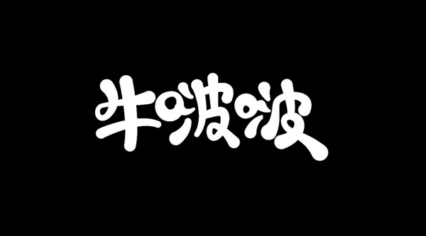
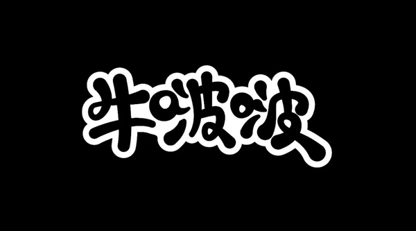
In addition, you can also add a stroke effect to the font, which is more flavorful.
Articles are uploaded by users and are for non-commercial browsing only. Posted by: Lomu, please indicate the source: https://www.daogebangong.com/en/articles/detail/Party%20A%20Can%20you%20help%20me%20design%20a%20font%20that%20is%20fun%20for%20children.html

 支付宝扫一扫
评论列表(196条)
测试