【Page Question】Analysis of Rapid Rewriting of Print Commercial Advertisement (9)
Recently, there have been a lot of discussions among fans of Yewen about revisions. Seeing everyone's thinking and enthusiasm for design, the logistics team of Yewen is really full of enthusiasm~~~Grandpa Mao said: Art
On the issue, we should "let a hundred flowers bloom." So, let the high-quality complaints come more violently!
As the number of manuscripts increases, the theme of revisions will naturally change with the manuscripts. Do you have any ideas and coups for the existing revisions, or what type of revisions you expect?
If you wait, you can leave a message on the page asking official account!
Hurry up and take a look at today's revision!
Contribution from 【Page Question Fan】

【introduction】
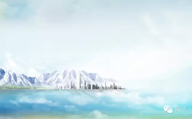
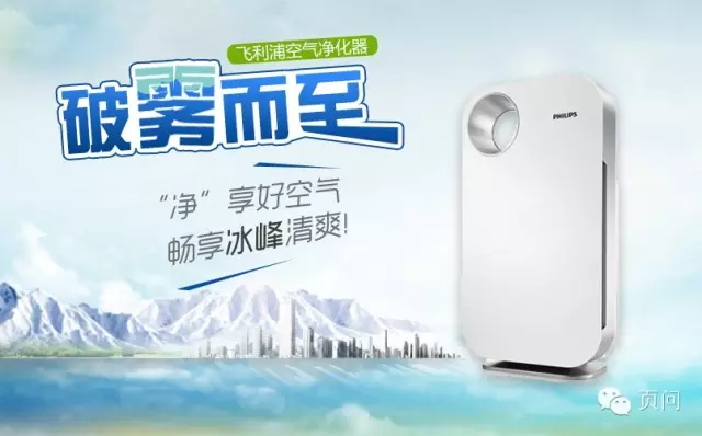
The contribution in this issue is an air purifier banner, which mainly expresses that the product can allow users to breathe deeply and healthily, as refreshing as if they are on an ice peak.
[How to analyze works? 】
When analyzing things, we should pay attention to being well-founded and well-thought-out, so that the evaluation obtained from this can be convincing. The evaluation dimensions of the two-dimensional visual works on the page are as follows:
It starts from the four most critical angles of work design, strives to analyze the work comprehensively and truly, and finds a breakthrough for improvement:
(1) Artistic level: color, image and graphics, text, layout
(2) Creativity and attractiveness: visual impact, freshness
(3) Theme expression: highlight the key points and clearly define the primary and secondary
(4) Comprehensive effect: brand image consistency
【Page Question · Work Analysis】
For this work, the analysis of four aspects is as follows:
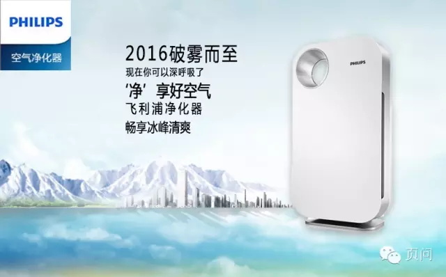
(1) Artistic level: 1 point (rework is fine)
(2) Creativity and attractiveness: 2 points (hard work)
(3) Topic expression: 2 points (incomprehensible)
(4) Comprehensive effect: 2 points (hard work)
According to the evaluation statistics on the page, the score of this work is: 7 points (total score: 40 points)
Overall analysis: the overall design of the banner is dazzling.
The idea of drawing is not clear, and the theme is confused and vague.
[Artistic level]: The material synthesis is too immature, and it looks like it is from a novice. The water and the background are mixed together, and the blue gradient color blocks appearing for no reason, the whole
The overall visual effect is greatly reduced.
[Creativity and Attraction]: I want to use the coolness of the glacier to attract attention, but the selection of materials and synthesis skills really need to be improved, so the overall picture feels too good
Due to the expansion, the products are annihilated in the glacier, and the primary and secondary are reversed.
[Theme expression]: Are you selling water purifiers or air purifiers? ! The handling of the product in the original manuscript is a failure, and the product of the air purifier is not included
Feel expressed.
[Comprehensive effect]: There is a problem with the drawing logic, and the text layout is chaotic, which makes the theme that the entire banner wants to express unclear. Here is the breakthrough point for the revision.
On-page optimization begins!
[Page question and draft revision in progress]
Step 1: Improve the big picture (less is more)
First hide all layers and design the background separately.
① The background echoes the theme, using the sky and icebergs as materials, because the main air purifier products can be combined with the city, using the elements of urban agglomerations
The material means to purify the air in our living environment.
② After the material is found, it is synthesized. When synthesizing the picture, it is necessary to predict the composition and leave room for the product picture.
The second step: title design (using fonts to heighten the atmosphere)
(1) Organize all the text, change it into a unified font and align it to the left to facilitate subsequent typesetting.
(2) Start designing the title, the title of the banner is "Breaking Through the Fog".
Visual beauty is the foundation, and the way of information transmission can truly reflect the designer's ability and level!
Banner uses the background to give people a pure and natural visual enjoyment, while the title plays the finishing touch in information transmission, focusing on the instant moving effect
As a result, some image exaggeration techniques are used to arouse consumers' desire to buy. The calm and gentle atmosphere collides with the powerful and shocking title, and there is tension and relaxation.
The screen allows consumers to quickly learn the content of the advertisement.
The page asks the following image design for the Title of this banner:
① First choose a suitable font for the text as the title, and select "Founder Variety Simplified".
The most basic requirement of title font: clear and clear.
② Next, select "Fog" and "Zhi" for design, make the word "Fog" feel broken, and "Zhi" bring out the sense of speed of arrival.
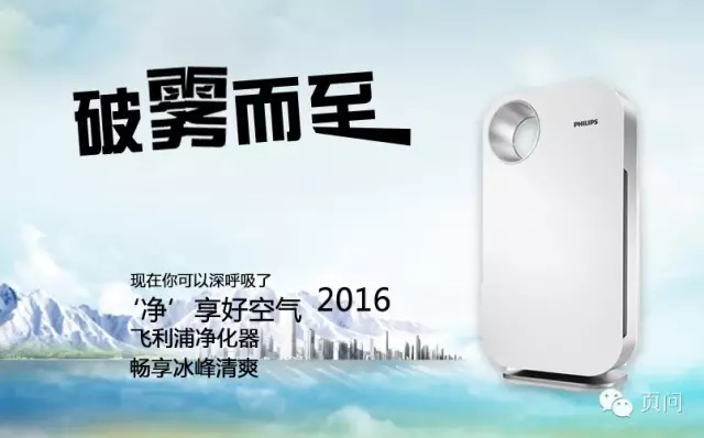
③Choose an appropriate color for the font. We use the theme color of the background as the color of the font, a sky blue gradient. Then do it for the fog word alone
It has a foggy feeling and makes the font more vivid.
It should be noted that on the basis of endowing text with emotion, attention should be paid to issues such as font recognition and application environment.
④Enhance the effect of the title, add background color and stroke.
⑤ Typesetting of subtitles.
How to break the silence of fonts—slanting can be straightened, and the text must be horizontal and vertical to look the best? No No No! In some designs, a slanted text
Typography can not only break the dullness of the default font, but also assist the composition of the entire picture. This trick has been tried and tested!
[Font Encyclopedia: Thick and favorable black body can also bring a sense of elegance, suitable for electrical appliances and light industrial products; round head black body with curves, suitable for women and children
Children's commodity application; the dignified and honest Old Song typeface is used for traditional product logos, which is stable and full of historical charm; the elegant and beautiful New Song typeface is suitable for matching clothing,
Cosmetics, and italics add wind and movement to the picture. (quote from the web)]

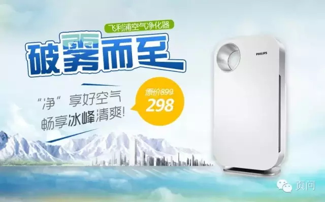
⑥ Let the price increase the click-through rate, use the discount to enhance the carnival atmosphere, and shock your little heart!
Step 3: Fine-tune the atmosphere (the feeling of purifying the air)

Here we continue to heighten the atmosphere, and add the material (fluttering leaves) that can best express the fresh air into the picture to achieve the ultimate goal. The overall picture is awesome!
[Comparison before and after modification]
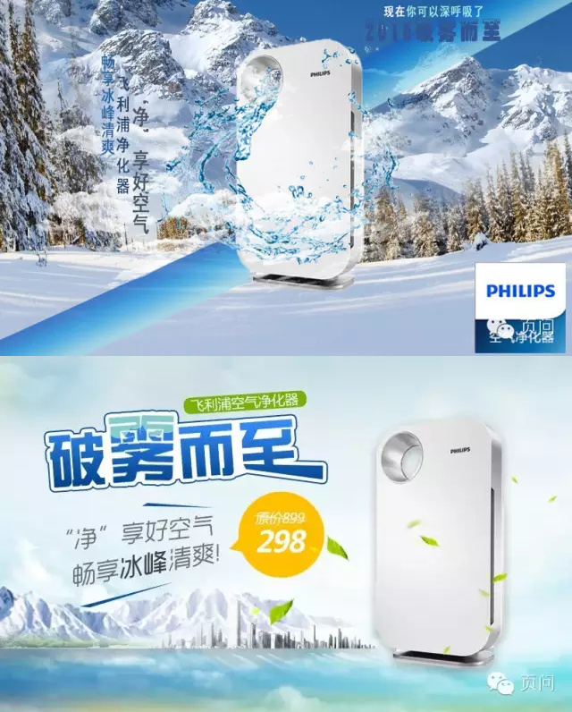
The same product, the same icy theme, but it has completely different effects. After the modification, the theme is clear and clear, and the overall grade has been improved by several levels! ~
In fact, these characteristics of the title can be easily referred to around us: the cover of magazines, the cover of genuine games, the integrity, logic and guidance of the title design are very good, I suggest you read more and think about it. If a designer walks on the street, everything he sees can be combined with the composition in his mind, and he will think and apply more. When faced with endless designs in the future, he will have a more appropriate understanding of product appeals and consideration of the audience's psychology. Naturally, it can better meet the needs of both advertisers and consumers!
The article is original from [page question], please indicate the source for reprinting
Revised for this issue
Ask fans what they think
You can "write a message" below
Welcome to complain
Articles are uploaded by users and are for non-commercial browsing only. Posted by: Lomu, please indicate the source: https://www.daogebangong.com/en/articles/detail/Page%20question%20revision%20The%20title%20is%20louder%20it%20is%20better%20to%20have%20a%20beautiful%20font%20banner%20tutorial.html
 支付宝扫一扫
评论列表(196条)
测试