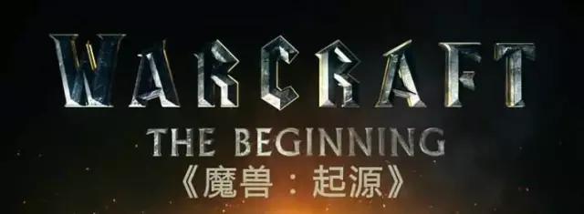
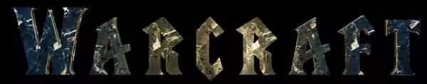
Blizzard fans can't miss it~
Today share a PS stone carving text tutorial from Zhihu Liu Yuanhang! In fact, it is not difficult to copy the cool three-dimensional stone lettering effect in the poster of the Warcraft movie. Today Zhihu student Liu Yuanhang will guide you to do it from scratch, and it can be done easily in 8 steps. The source files have been packaged, let's learn!
Source file packaging Baidu cloud download: http://pan.baidu.com
tutorial
Source: Zhihu author Liu Yuanhang
Original address: https://www.zhihu.com/question/41972289/answer/94974565
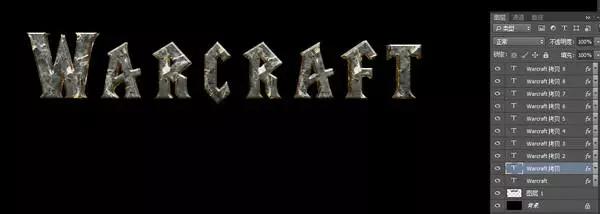
1. Create a file with a black background. The first step is of course typing. I haven’t found the exact same font in the movie. Find a similar one. This font: LifeCraft, which seems to be used in the original World of Warcraft.

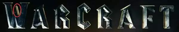
2. Take a look at the three-dimensional part of the original image, the highlight light source is on the upper right, and the lower left is a little orange reflection.

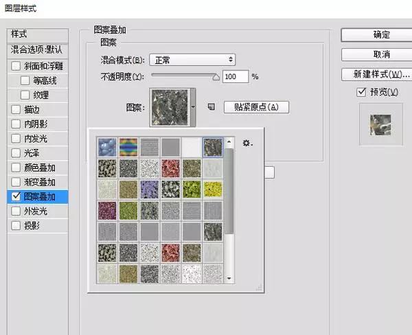
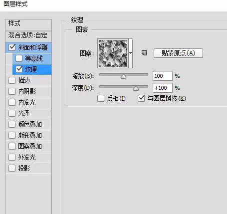
So after we superimpose a "texture" casually, (this is the rock texture that comes with PS, it looks okay, you can also use other metal textures) first let him make such a bevel relief, light yellow filter Colored highlights, dark orange shadows.

3. Then copy and zoom in, press and hold the shortcut keys Ctrl+alt+T, zoom in by one pixel proportionally, then double-click to confirm, and a zoomed-in layer will be copied directly.
4. Next, you can use the shortcut key of Ctrl+Shift+Alt+T to repeat the deformation operation just now. Press a few times to see that it is almost the thickness you want. I pressed 9 layers here. , look at the effect
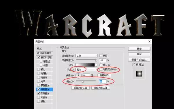
5. On the top layer, let’s modify its oblique embossing method, observe the original image, the front part is blue-gray, the highlight is on the lower left, and the overall font is the middle letter R, which is brighter, so wait for us Also do a Gradient Overlay.

Ok, let’s look at the gradient overlay here. We use a radial black-and-white gradient, pay attention to the option of layer alignment, adjust the zoom to achieve the gradient effect we want, and then change the blending mode above to overlay.
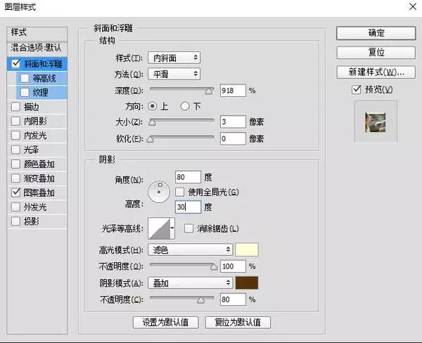
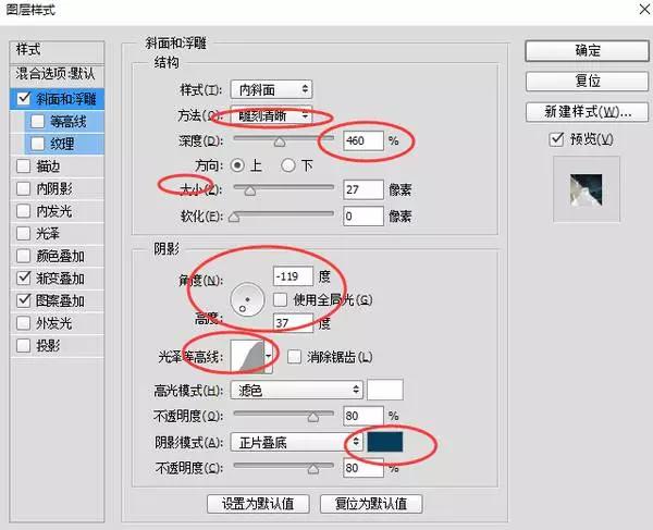
Then there is the bevel embossing, choose clear engraving, pay attention to the depth, size, and light angle, choose an overly soft curve, and modify the shadow part to a dark gray-blue multiply. These parameters are for reference only, mainly depends on the feeling you want to tune.
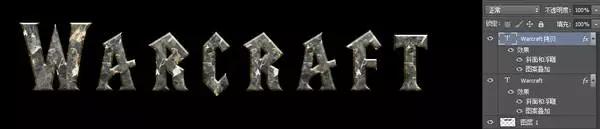
Well, the effect is like this:

6. Don’t worry, it’s still early. There is a small chamfer on the edge of the original image. Let’s copy the top layer to make this small chamfer fill and change it to 0. Gradient overlay and pattern overlay are all Remove, as long as a relief effect.

To do a one-pixel, light source-reversed embossing effect:


7. Let's copy this layer "Copy 10" to another layer, add a little texture on the surface of the text, add a variegated texture to the texture of the suspended bevel relief, make it a little bumpy, and then reduce the overall opacity .
8. In the original picture, there is a dividing line suspected to be layered in the three-dimensional part. The front W is a shadow, and the letter T behind it seems to be a bright light.
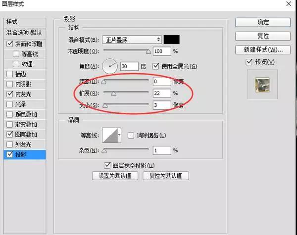
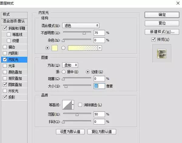
Let's pick one of the several layers just now, for example, "copy 5" and give it a projection and inner glow to have this effect, which also looks a little bit layered.
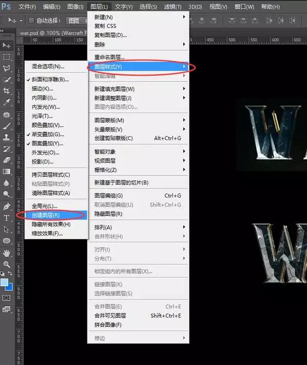
8. In fact, this step is almost done, but the details are still not in place, especially the light and shadow changes are not delicate enough through this method, it is difficult to express simply using the layer mode, come on, come back Go to the layer "Copy 9" with more parameters just now to carry out meticulous work, and select Layer-Layer Style-Create Layer on the menu.
Disassemble the effects we just made into individual layers, and separate them in the form of layer clipping masks.

Now we can paint with the brush according to each layer, and fill this layer with gradient.

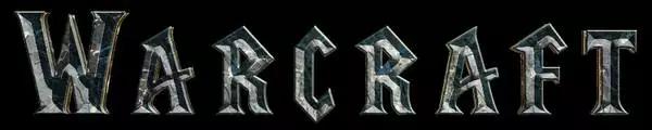
Highlights and Shadows We can use masks to adjust the intensity of highlights and shadows in those areas. Okay, the final effect, let's see it's almost the same

What, no effect? It would be cool to put it in a poster.

Articles are uploaded by users and are for non-commercial browsing only. Posted by: Lomu, please indicate the source: https://www.daogebangong.com/en/articles/detail/PS%20to%20make%20atmospheric%20Warcraft%20movie%20poster%20LOGO%20stone%20font.html
 支付宝扫一扫
评论列表(196条)
测试