
Recently,I found a very easy-to-use method for making PPT forms. It takes less time and produces better results.
What is the method? Don’t be too pretentious, just 8 words, the method is simple enough:

Take a practical case to see,For example, on this page, this is the default table style in PPT:
How to optimize? What you have to do is reduce the lines and only keep the horizontal lines:
Next,At the bottom of the table, add a rounded rectangle color block, and you're done. Is it simple enough?
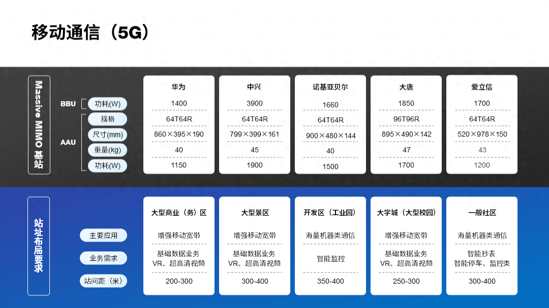
For For pages with more numbers, this method is also universal. For example, a page like this:
What to do? Remove all vertical lines and keep only horizontal lines:
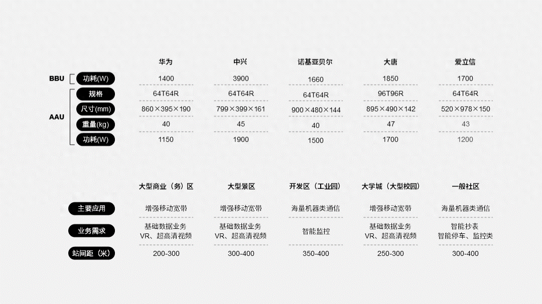
In order to visually organize the information, add unified rounded rectangular color blocks, and create a sense of high-end, right?
It is also common for PPT table pages of product introductions, such as this page:
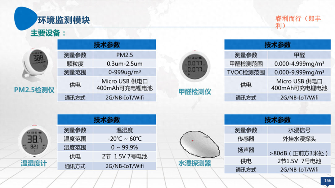
We still use the same method,First remove all effects of the original table, leaving only the horizontal lines:
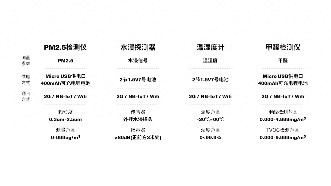
The purpose of adding color blocks is to organize and distinguish the information in each group. Is it simple enough?
Of course, if you want to use the default table style, you can, However, it is very important to remove lines as much as possible.
For example, on a page like this, how should we deal with the two tables on the page?
Remove the lines and keep only the color blocks separated by one line:
The table processed in this way looks clean and comfortable:
Of course , this method is also applicable to pure text tables.
For example, a page like this should be considered a very common form:
What to do? Only keep horizontal lines,If the text information on the page is larger than 2 lines, then let all the text, Align everything to the left and it will look neater:
Next, for visual distinction, you can add two color blocks of different colors. Is that enough?
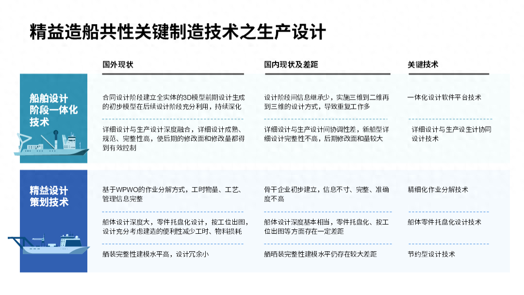
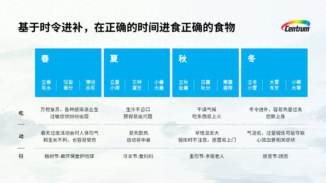
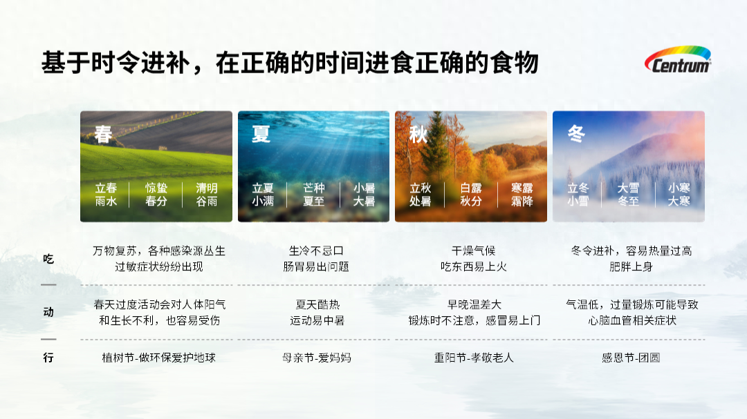
Let’s look at a more complex table case:
For this page, we should first remove the information from the table and all the complex effects, leaving only the horizontal lines:
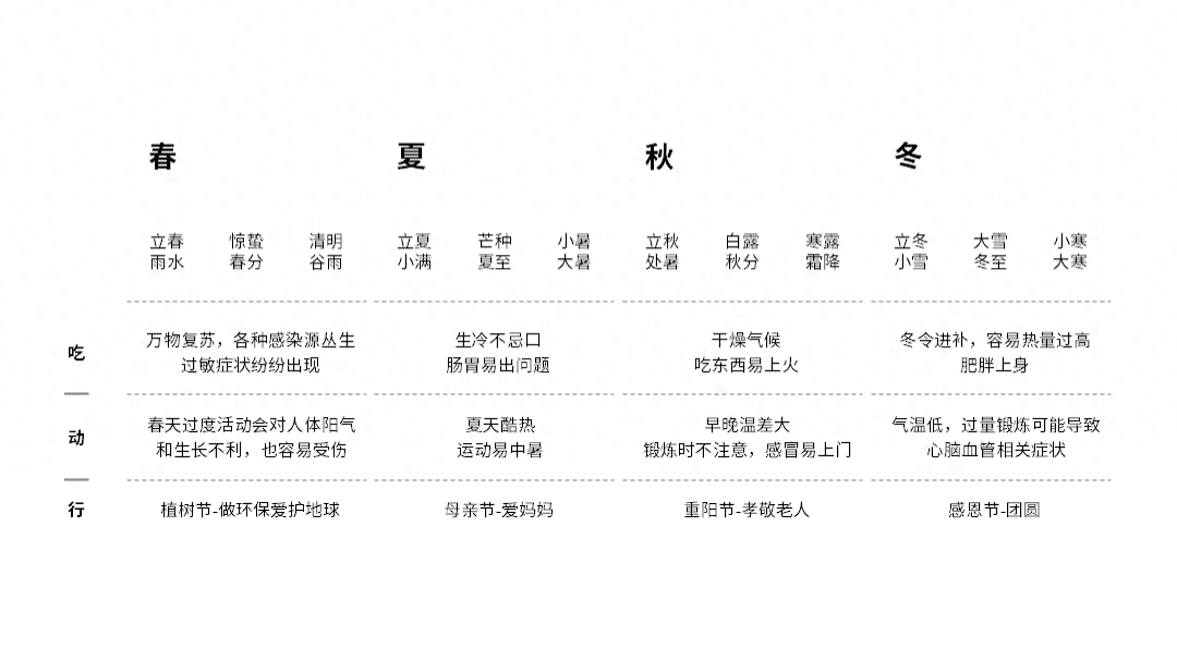
For the four seasons above, you can add a color block to differentiate:
If you want to be more creative,You can also add corresponding pictures to distinguish them,It is also possible:
How about it? Is the method I summarized for you simple and effective? Have you learned it?
If you are going to work in the workplace in the future, you must be able to handle it Work-type PPT , recommended to you PPT learning membership in the circle of friends. After activation, get 9 full-stage learning courses for free,From scratch to a PPT master.
and Join once and it will be valid for a long time. Interested friends can click:
Learn PPT and read heresy
No matter how small a skill is, it deserves to be taken seriously
Articles are uploaded by users and are for non-commercial browsing only. Posted by: Lomu, please indicate the source: https://www.daogebangong.com/en/articles/detail/PPT-zi-dai-de-biao-ge-mu-ban-shui-yong-shui-chou-8-ge-zi-zhi-jie-bian-gao-ji.html
 支付宝扫一扫
评论列表(196条)
测试