
Hello, everyone, I am Brother Li!
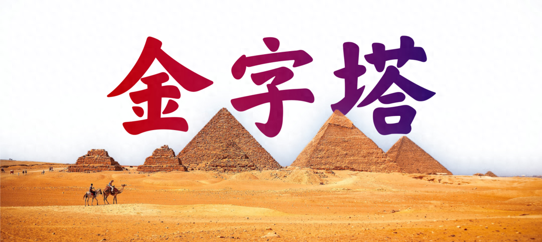
When making PPT, you often encounter various charts.One of them is the pyramid chart, or It's called a pyramid diagram.
Used to express such a structural relationship of multi-layer progression.
But the pyramid diagrams made by many people seem to be quite ugly.
So, how to make a good-looking pyramid icon. I think there are three main aspects.
Respectively, select the structure diagram, the color matching should be coordinated, and the layout should be neat.

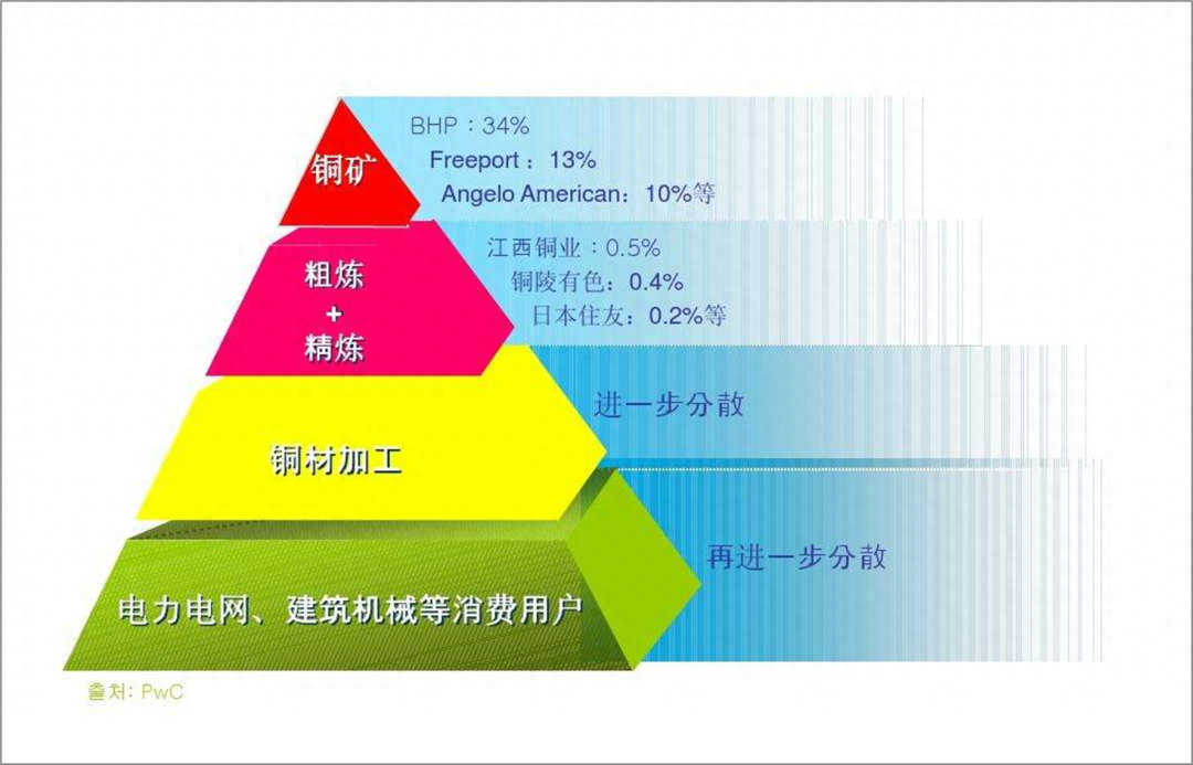
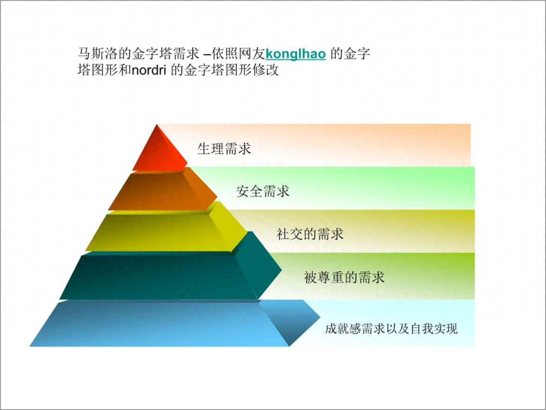
First of all, let’s look at the structural diagram. There are several types of pyramids, there are two-dimensional ones and three-dimensional ones< /strong>, there are also inverted pyramid structures and so on.

Our SmartArt icon comes with some two-dimensional pyramid structure diagrams. We Open to see.
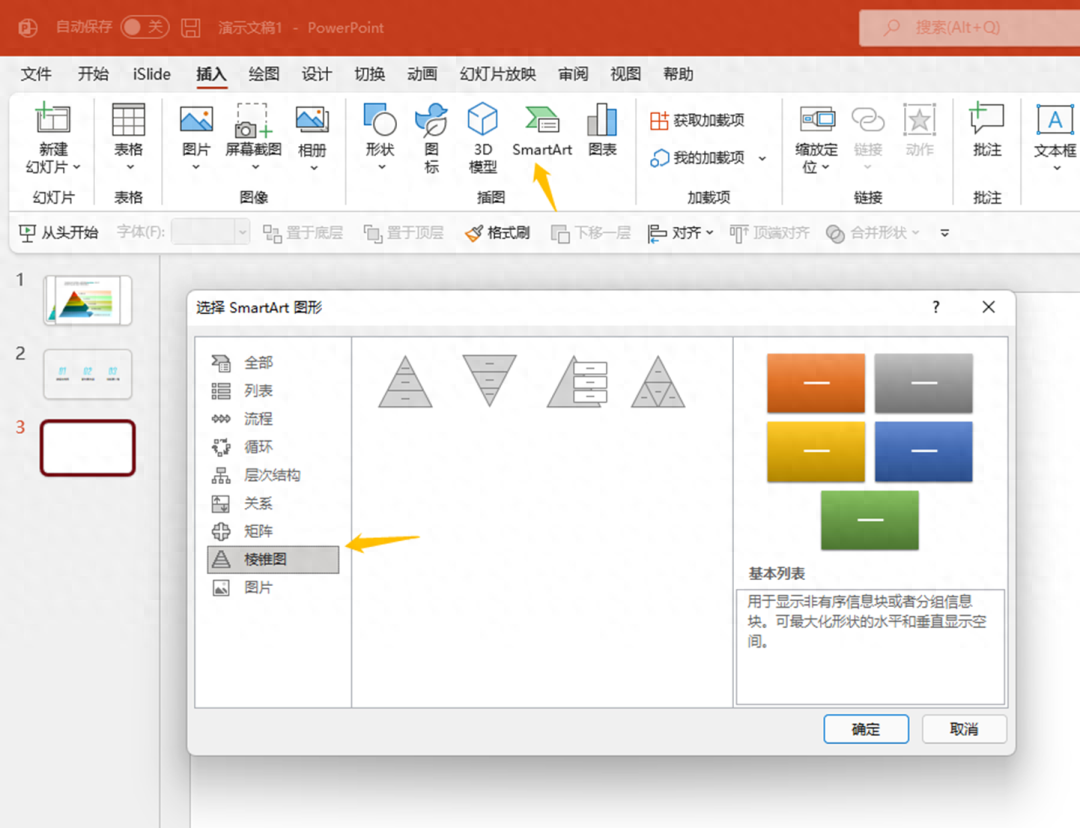
But the directly inserted SmarArt is not easy to use, so you need to learn to modify it.
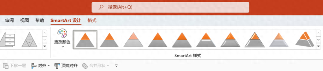
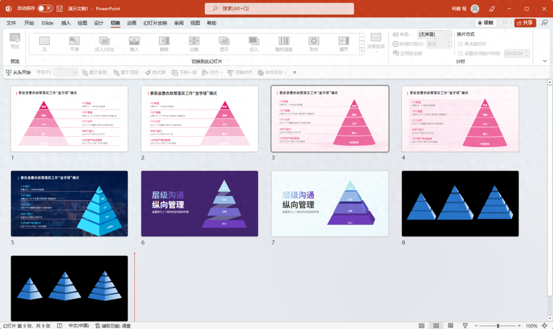
What we insert directly is usually three layers, and then open the smartart design menu, which can Adjust the number of layers, change colors.
I would like to mention here that the default Smart Art style should not be used. Whoever uses it will be ugly.
After adding levels, you can transform them. We select this pyramid diagram andungroup it twice to turn the graphic into a shape.

Don't make it colorful. Many people don't match it well and it often looks ugly. This is the level of expression, and we can just use different shades of one color.

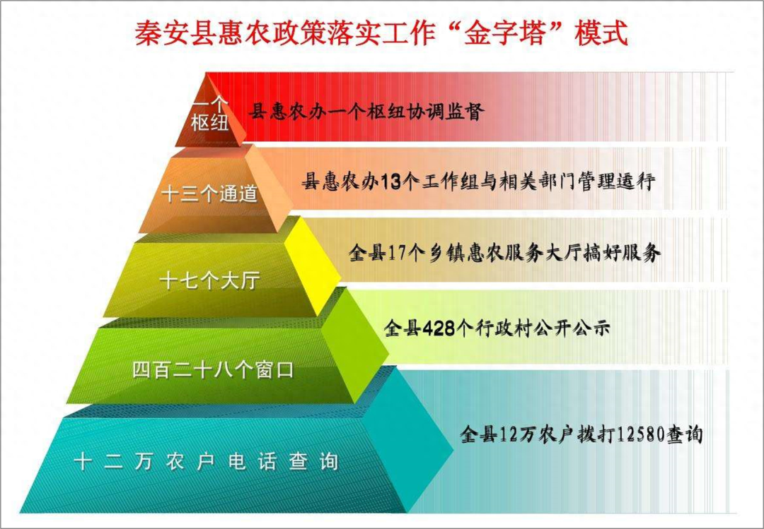
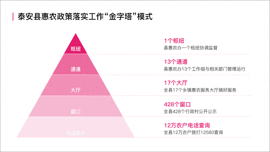
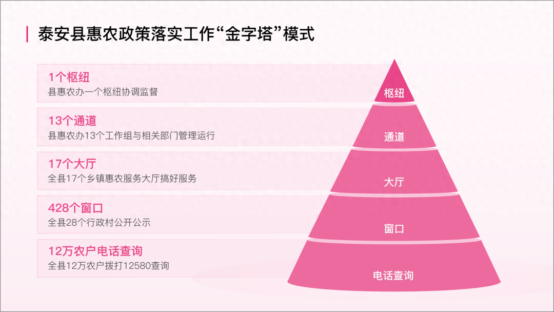
The next step is text layout. Let’s use this case as an example. This is a pyramid diagram found on Baidu.
We can be simpler, don't make it so complicated, and use two-dimensional first.
Some people here may format the text in this way to keep the distance from the pyramid consistent. Because the pyramid is narrow at the top and wide at the bottom, this type of layout will cause the PPT to be unstable and the right side is a bit empty.
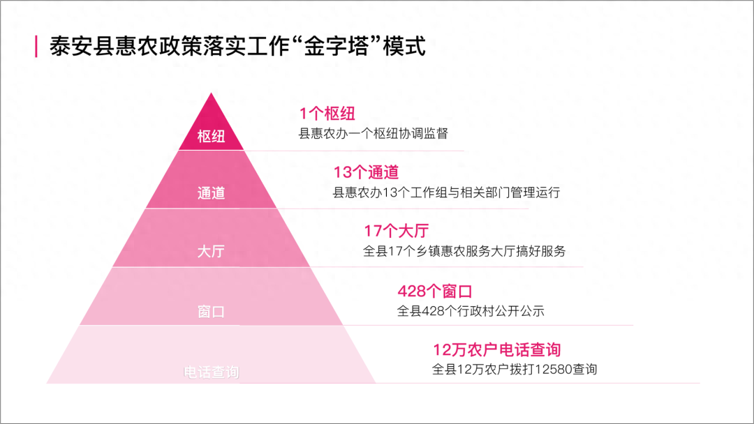
This does not look good and is not stable.It is best to keep the text aligned consistently. It’s more coordinated like this.
Or this way, change the position of the pyramid.
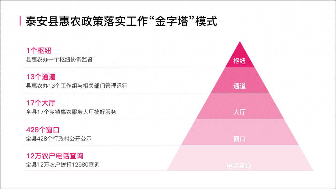
Isn’t it quite refreshing and looks very comfortable, right?
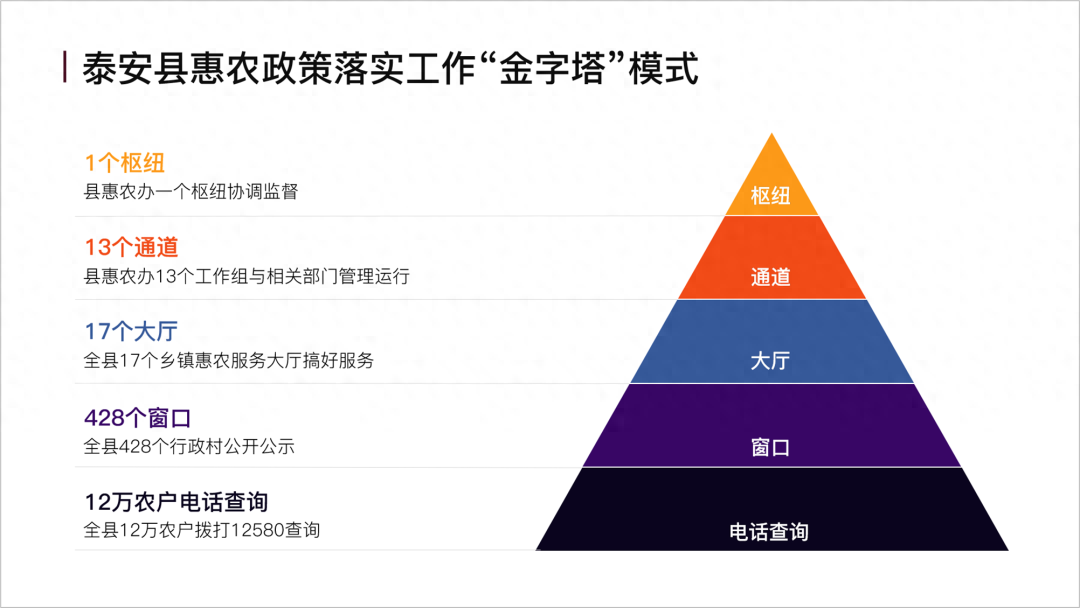
Of course, we can also change the color. If you don’t know how to match colors, you can use a color matching website. We recommend the color hunt website.
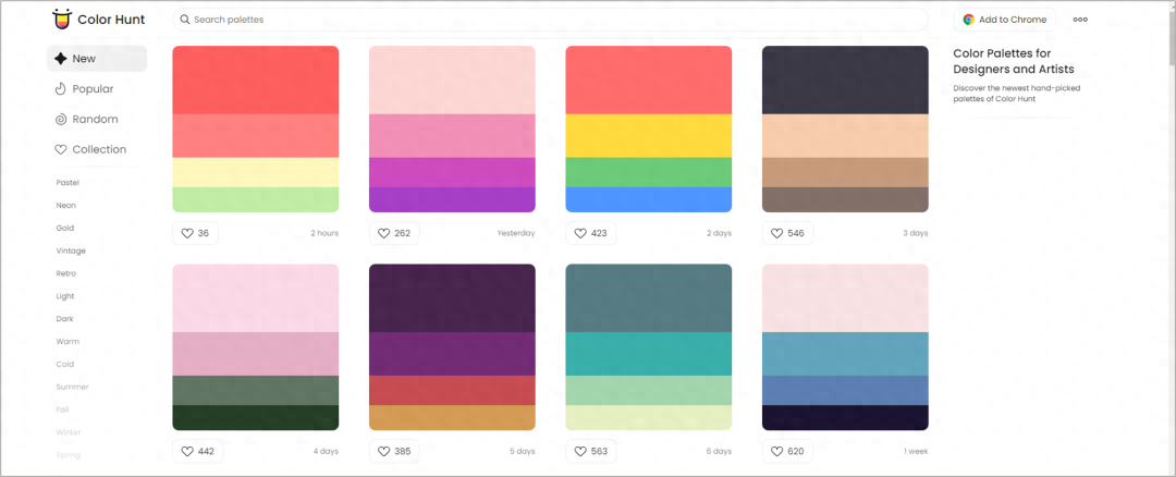
Just pick up the color and apply it directly.
Next, I will let myself go and continue to iterate and surpass myself on a basic basis. First, let’s do a three-dimensional one.
How to make this three-dimensional icon? Just use shapes to splice it together.
For details, you can take a look at the following case.

But the directly inserted Smar is not easy to use, so you need to learn to modify it.
Of course,in addition to this conical structure, there are also pyramid structures.

There is also the following structure, which is also a pyramid chart.


The above is the main content of today, I hope you like it.
I have also prepared some benefits for you, which are some pyramid graphics.
The old rules are followed for the collection method, see the picture below:

Articles are uploaded by users and are for non-commercial browsing only. Posted by: Lomu, please indicate the source: https://www.daogebangong.com/en/articles/detail/PPT-zhong-de-jin-zi-ta-tu-ju-ran-zhe-me-hao-kan.html
 支付宝扫一扫
评论列表(196条)
测试