Recently, many friends asked me: How to layout PPT pages?
PPT masters can create good pages because they have mastered design thinking, and the little skills are just scratching the surface. Regarding operations, it is easy to learn, but the thinking method is an internalization process.
Today, let’s talk about several design principles in PPT:
1. Intimacy principle
Simply put, it is to make the highly relevant elements on the page closer together, like this:
It is obvious that the logical relationship between the text information, such processing, makes the page easier to understand.
2. Sense of stability
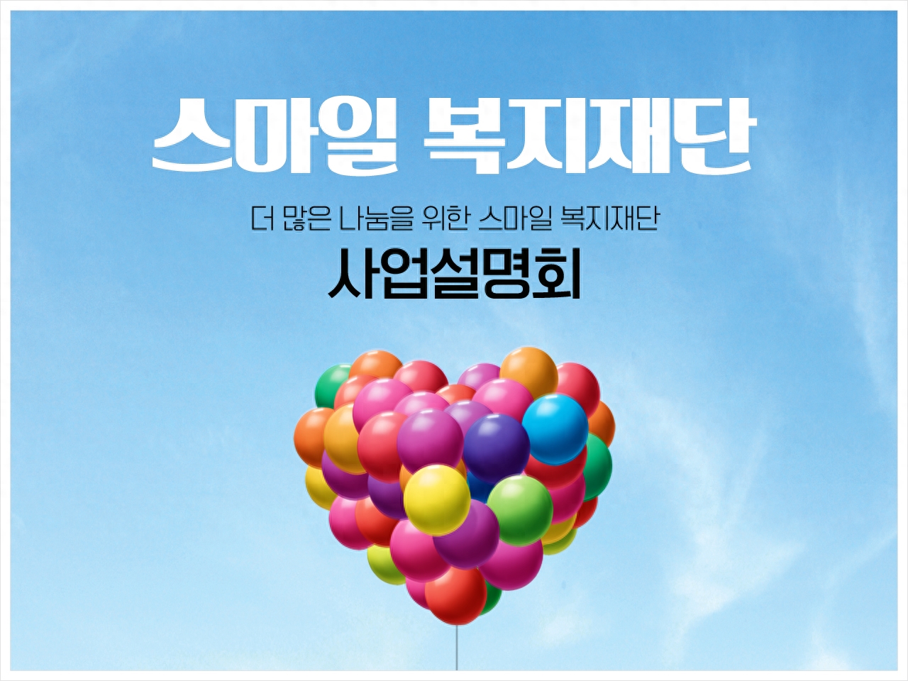
In page layout, try to balance the page information. Therefore, the most classic layout method is top-bottom layout or left-right layout.
Left and right layout

Top and bottom layout
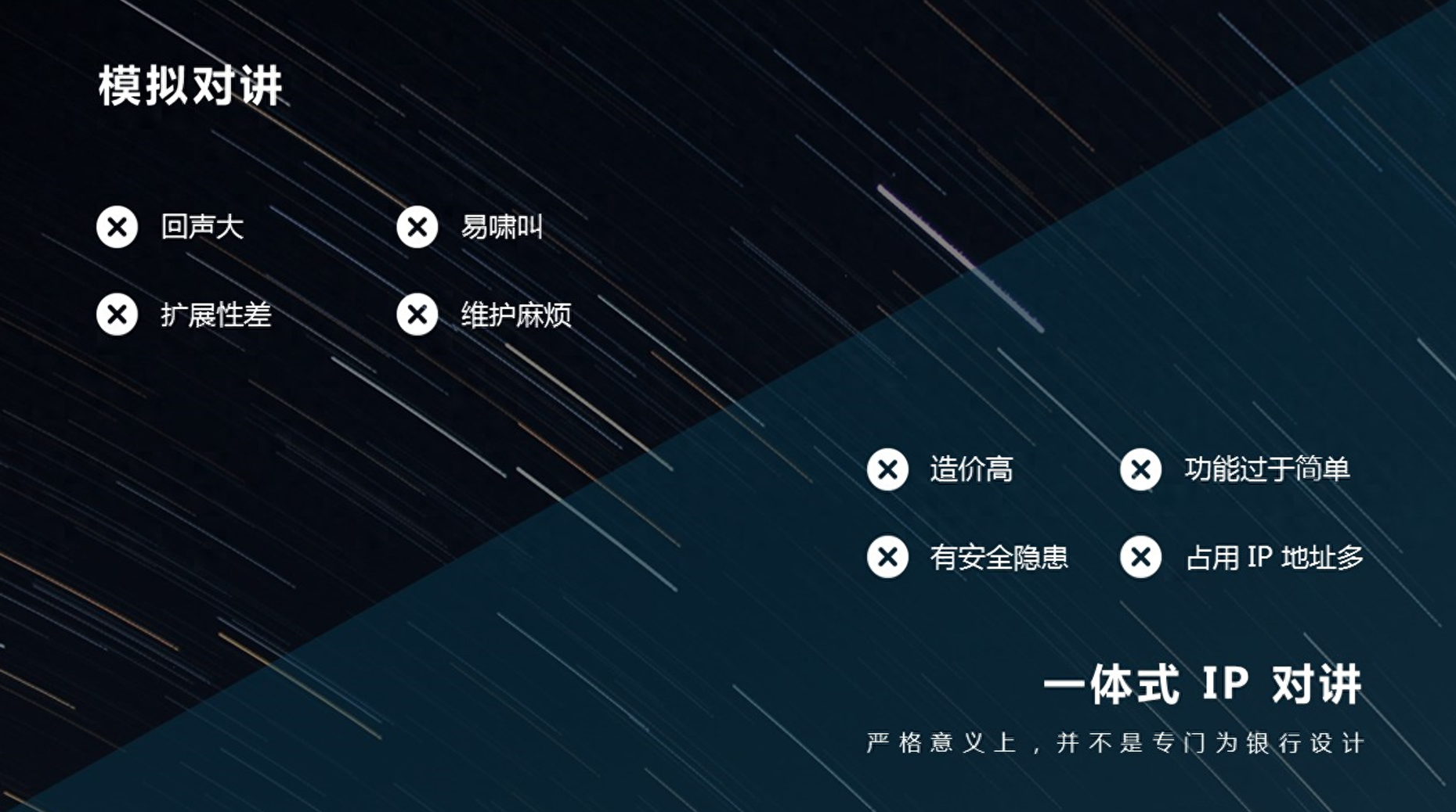
3. Comparison principle
Simply put, when comparing two or more things, make the key points stand out.
To highlight the key points, you must first define the key points and distinguish what is important content and what is non-important content, such as text content. You must remove colloquial text, refine the text and extract the key points, and then highlight these key points.
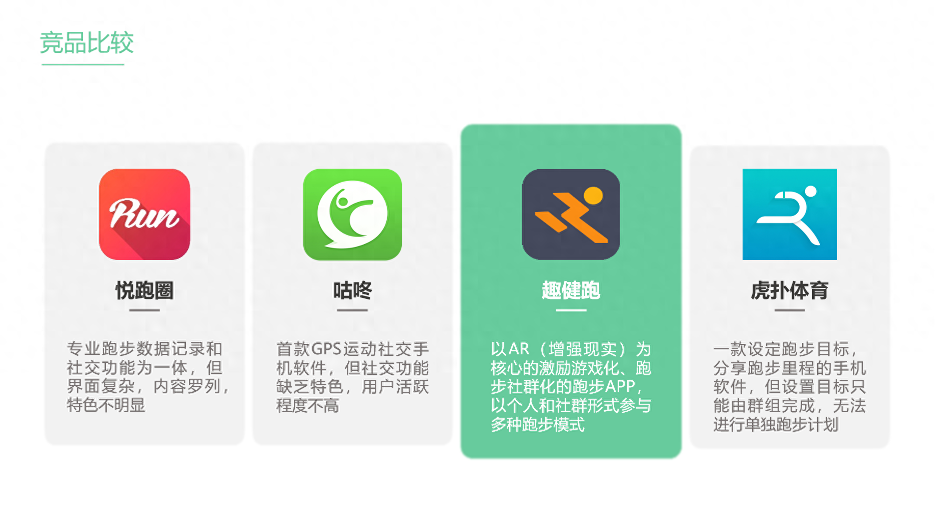
While highlighting the key points, you should also weaken the non-key content. However, it is important to note that the characteristics of the non-key content should be consistent, such as size, color, etc. Otherwise, the audience will pay too much attention and the key points will not be so important.
4. Alignment principle
The purpose is to make the arrangement of page elements more regular.
When using it, please note that one page of PPT must maintain one alignment, such as using center alignment or left alignment alone, rather than using both alignments together on the same page. This will make the audience feel that the elements are arranged Very messy and unorganized.
Adding frequently used buttons to the Quick Access Toolbar can improve efficiency, especially when aligning.
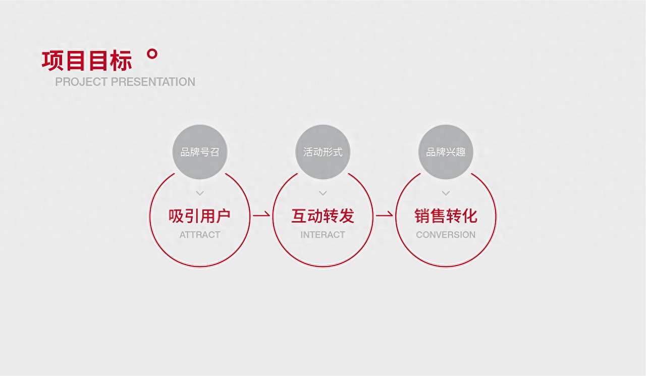
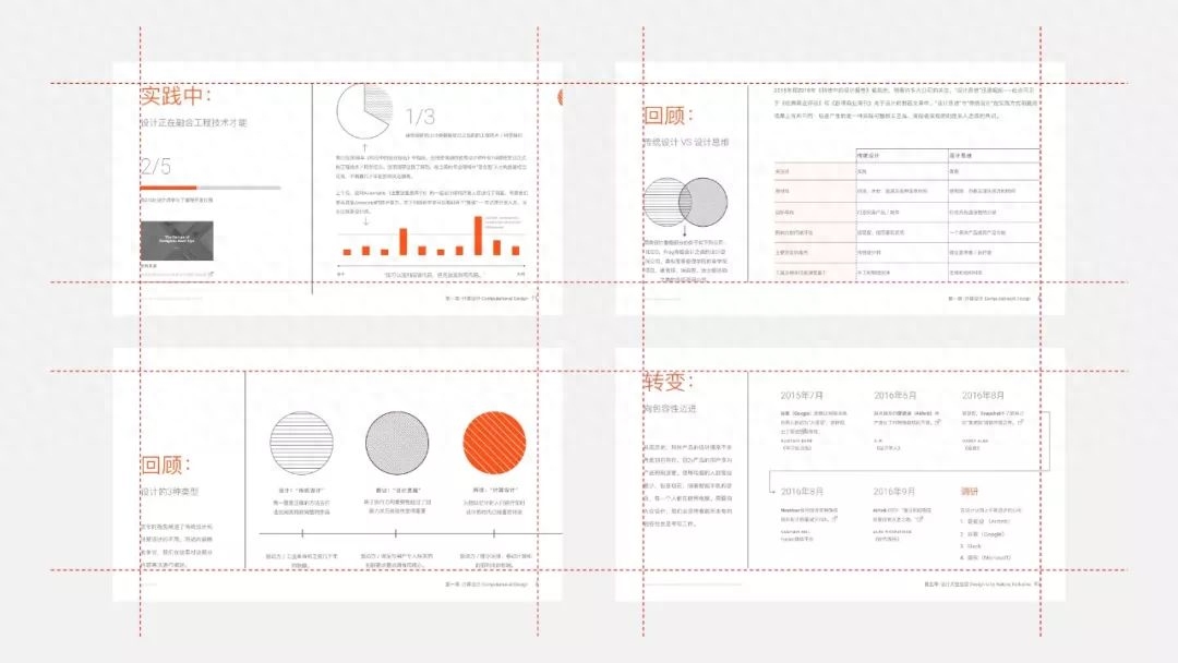
5. Repeat principle
The purpose is to establish a unified visual style, play a role in visual continuity in the entire set of PPT, and make the whole unified, but avoid duplication that lacks correlation.
Repetition can be divided into element repetition and layout repetition.
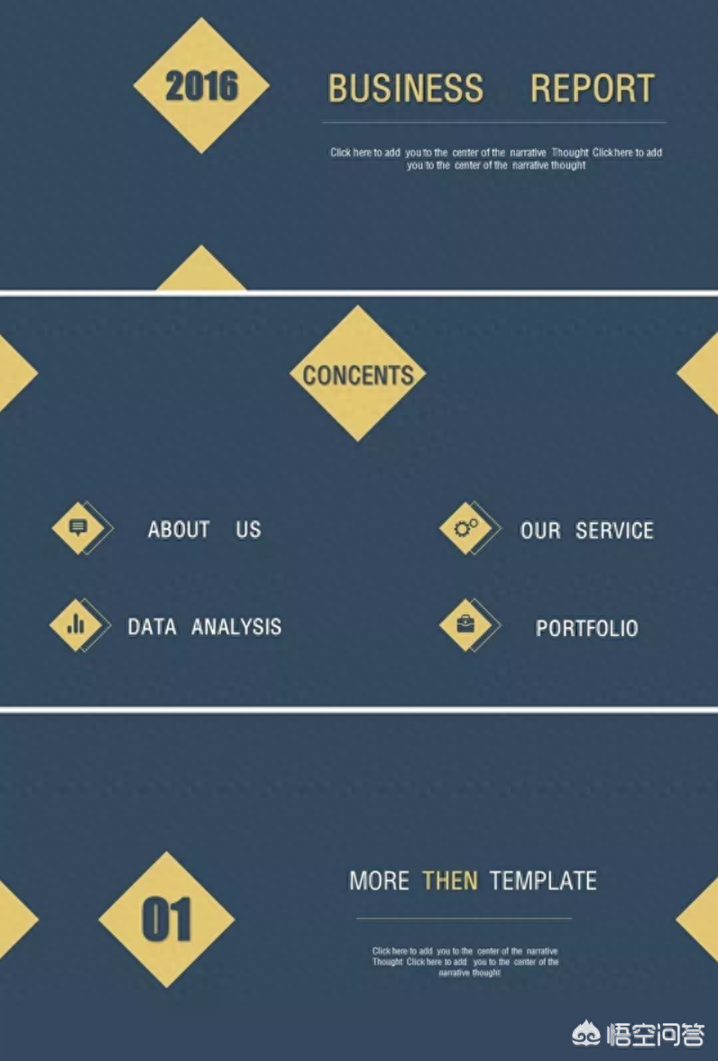
You can see diamond-shaped elements throughout the entire PPT page.
Allow visual elements to be repeated throughout the piece to achieve stylistic unity.
6. Sight guidance

Use the line of sight of the characters in the picture to attract the viewer's attention. The page will also look very creative.
When there is an image of a character on the page, you can use the character’s line of sight to guide you.
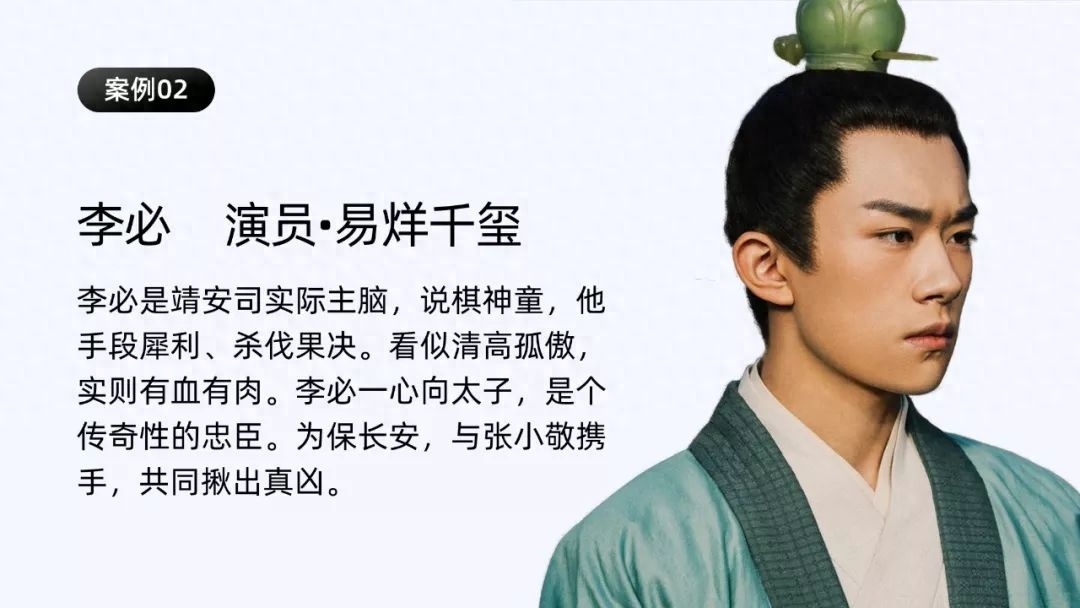
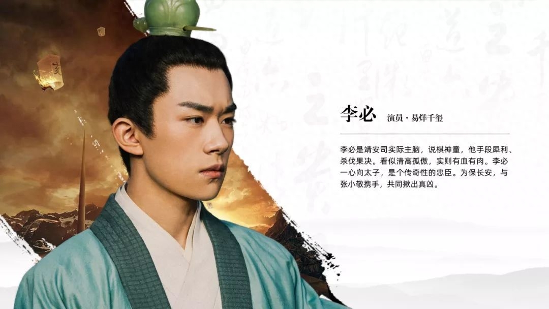
Comparing these two pictures, is it obvious that the second one is much better?
Likewise, there is this:

7. Leave blank
The layout retains a large amount of white space, but the text and characters form a symmetrical layout to ensure a balanced picture.
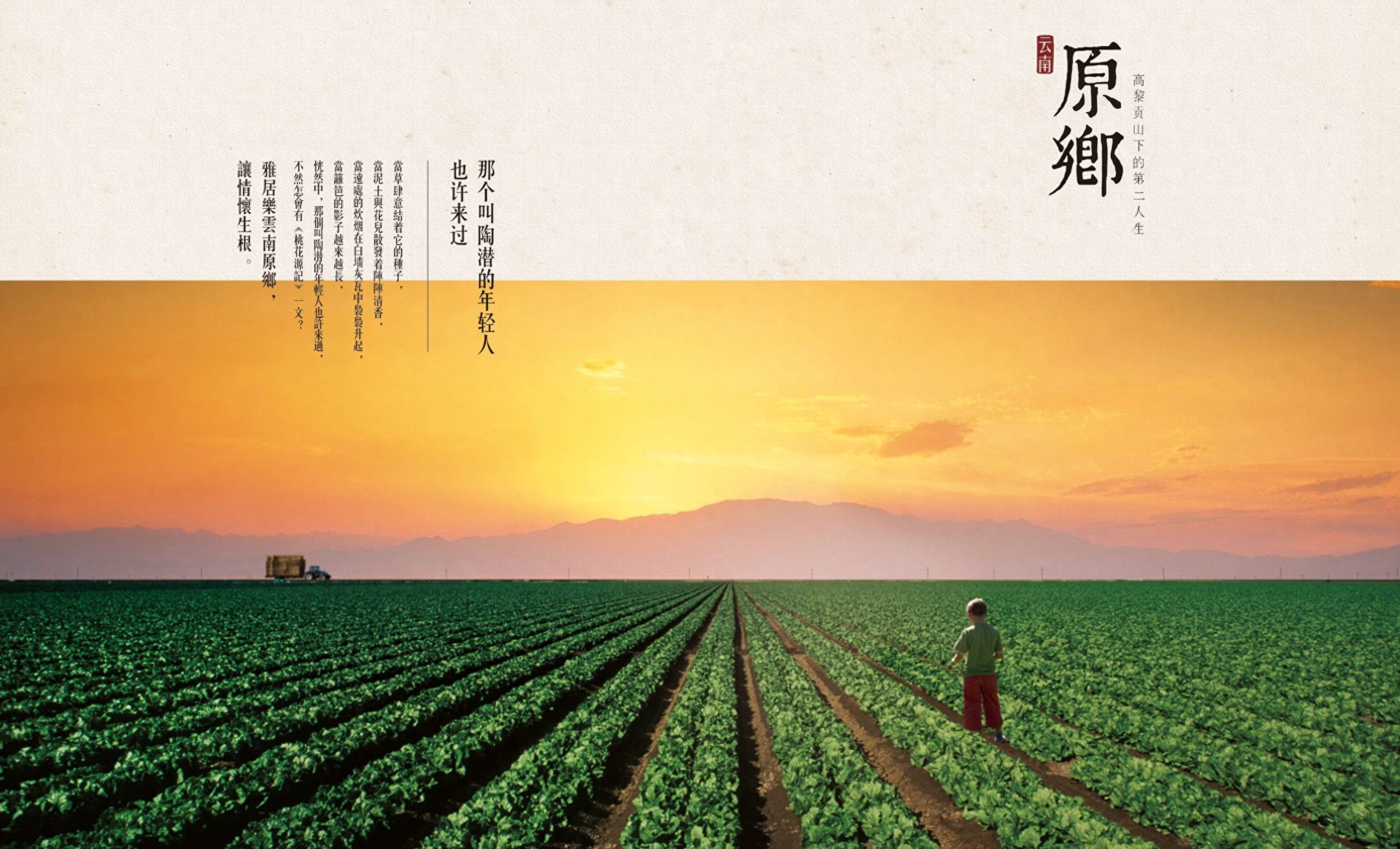
Appropriate white space on the page will make the page more artistic, avoid a large amount of text information, and make the page more breathable.
The above are some typography tips, I hope they are useful to you!
Finally, if you need a PPT template, you can reply to the keyword [PPT template] by private message, and you can receive my massive collection of PPT templates!
Articles are uploaded by users and are for non-commercial browsing only. Posted by: Lomu, please indicate the source: https://www.daogebangong.com/en/articles/detail/PPT-ye-mian-bu-hui-pai-ban-xue-hui-zhei-xie-xiao-ji-qiao-ye-mian-shun-jian-ti-gao-yi-ge-dang-ci.html
 支付宝扫一扫
评论列表(196条)
测试