
Let me ask you a question first: When will we use PPT?
Do you generally use PPT for work reports, project discussions, academic defenses, business road shows, etc.? The production of these topics will inevitably encounter flow charts.

Do you know how to create a high-quality flowchart page? Won't? Fortunately, this article may give you some inspiration.
There is a surprise at the end of the article, don’t forget to claim it!
Case 1:
This is a training PPT from Shandong Enma Group We modify and optimize the original flowchart page:

Through the company's logo, we can get the color and font, two key visual characteristics.
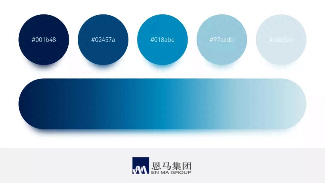
For example, if the logo graphic is dark blue, we can use it as Main color,Here I add some light blue to avoid a single color:
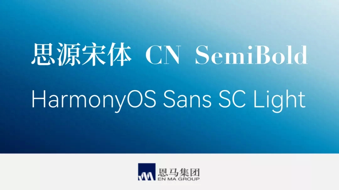
Also,The font in the logo is a serif font,Then, for the title of the slide, you can use Siyuan Song font, while the main text uses Hongmeng font to ensure readability:
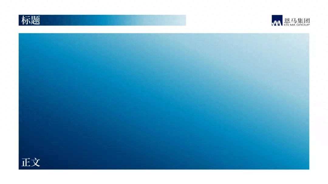
Then, determine the position of the title, logo, and the area of the text:< /span>
After determining the design specifications, we then proceed to modify the flow chart. Take another look at the original manuscript:
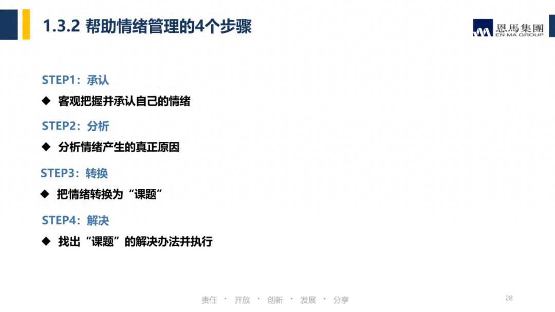
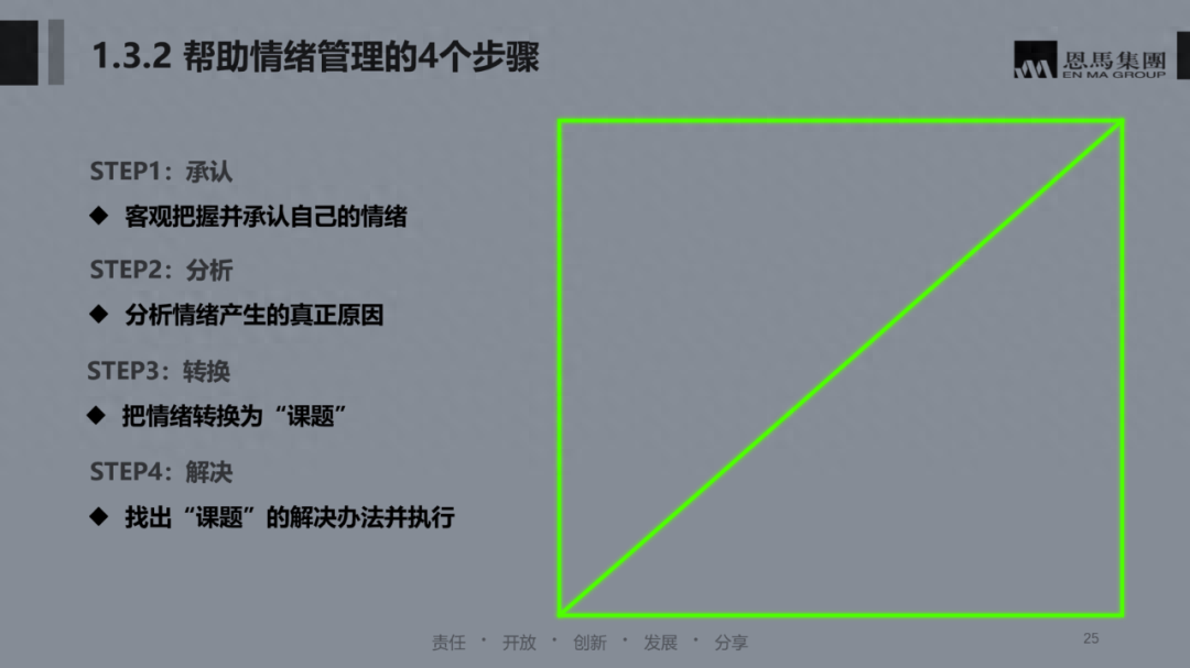
The problem with this page is obvious,The layout is unbalanced, leaving a large area of blank space on the right side:
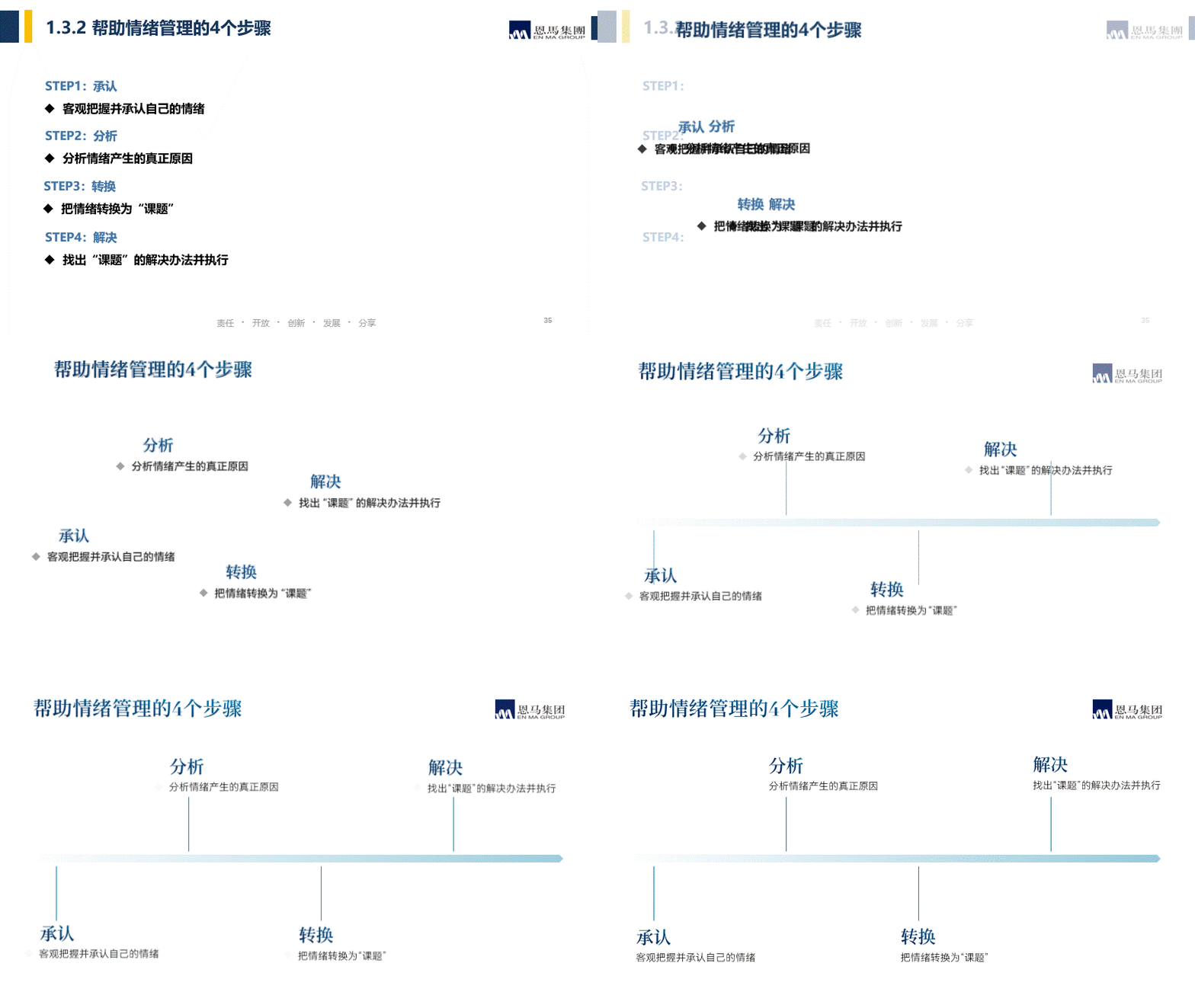
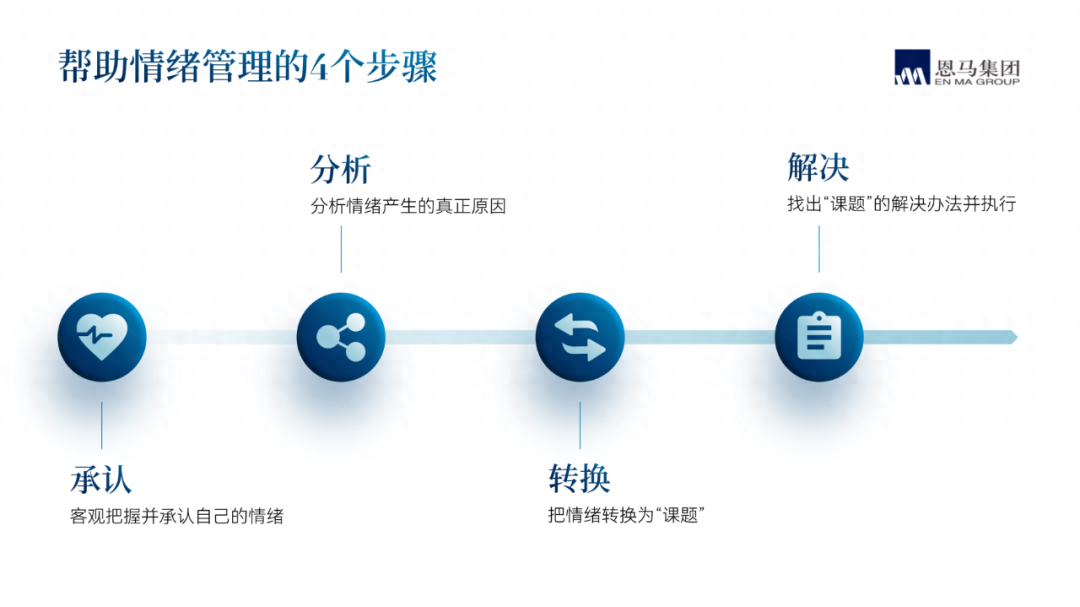
It is also very simple to solve this problem. Arrange the content horizontally and use gradient lines Guide the line of sight:
You can also match related icons based on keywords:
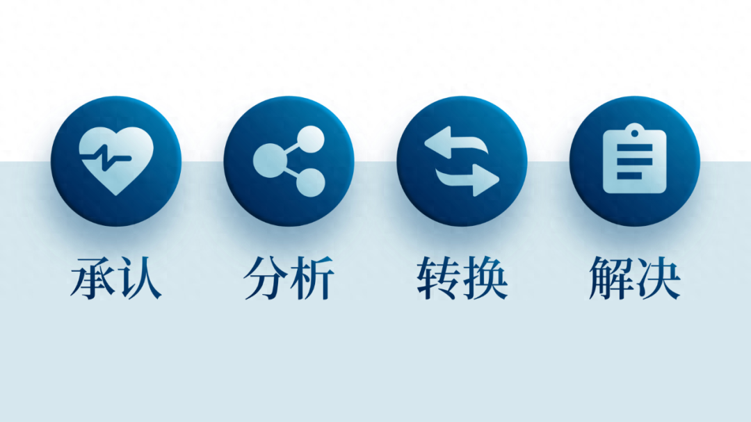
The circle carrying the icon here is formed by adding light and dark parts. A micro-three-dimensional effect:
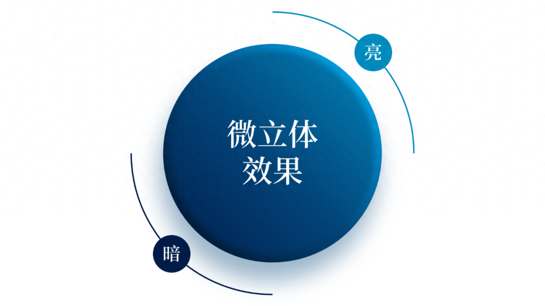
Put the icon into the page and see the effect:
Maybe you think this page is too simple, so use animations Come make amends!

Case 2
This is a PPT from a smart company. I selected one of The process page comes out:

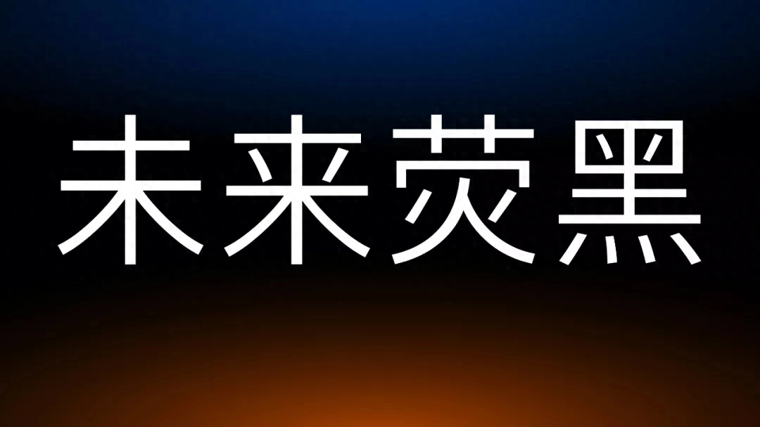
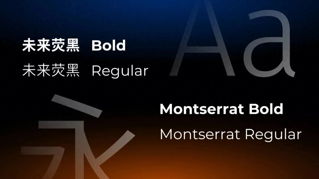
Let’s talk about the design specifications first. Here I chose the font Future Yinghei, which is more modern:
Can be paired with Spanish Montserrat, used for PPT page text content:
As for color matching, because the original manuscript introduces a product with the keyword "Linghu", we can easily think of foxes. Combined with the logo color, you can choose a gradient color:
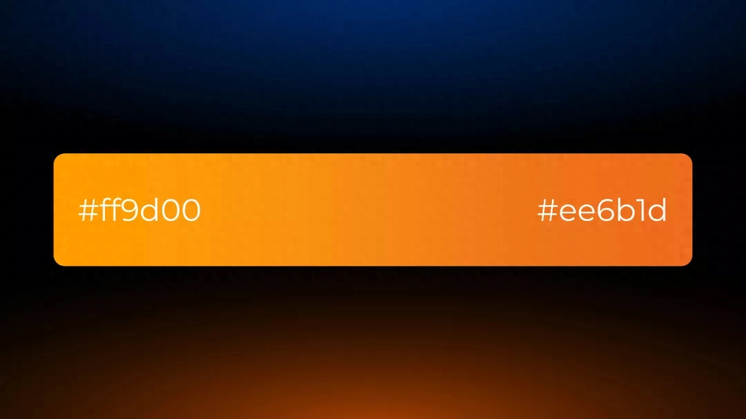
At the same time, it is paired with a gradient color of blue and black as the background:
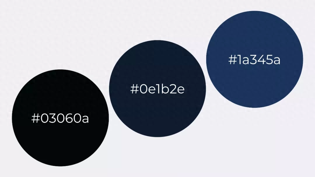
This page looks like It will also be more textured:

The manuscript page I chose is a kind of flow chart,The problem is that the icon styles are different and the text layout is not conducive to user reception:
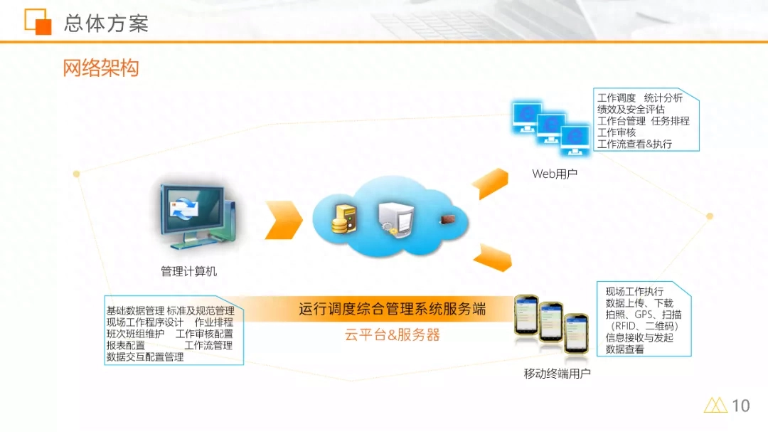
We are carrying out a creative design here, using 2.5D style to beautify it.
In the first step, based on the information on the page, you can find that the content is mainly divided into four sections. We can use three-dimensional rotation to make 4 equidistant platforms:
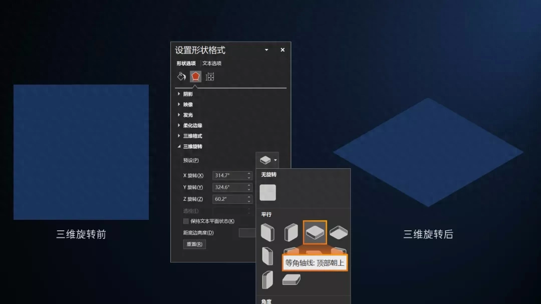
Determine the placement based on the page information:
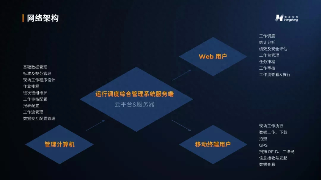
In the second step, we use gradient colors and gradient lines to decorate the platform:

Through the icon website, we found the 2.5D style icon and edited it to modify the icon color:

Carry out a simple combing of the text part of the page:
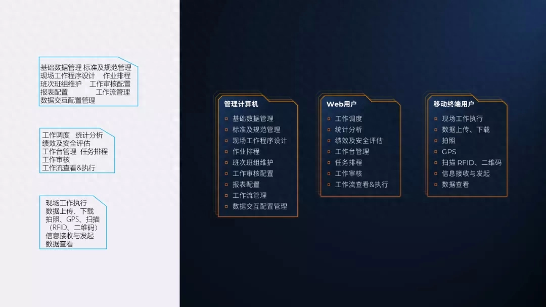
Finally, you only need to combine the platform, icons, and text into one, and a more creative flow chart is ready:

In addition to 2.5D style, the flow chart is also a timeline in a certain sense. We can also use the commonly used processing methods on the timeline page, take advantage of the picture trend!
For example, find a background image:

Using masks and shapes, we process:

Draw a timeline according to the trend of the mountains, and then add text:
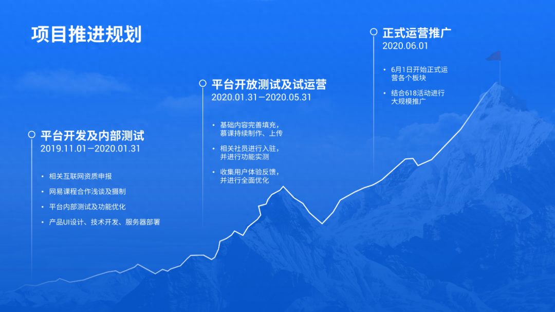
If we add PPT animation, does the effect look good?

Today’s content ends here!
Finally, in order to save everyone’s time in making PPT and improve work efficiency, I have organized a lot of timeline pages. Just follow me + send the keyword [Timeline]!
Articles are uploaded by users and are for non-commercial browsing only. Posted by: Lomu, please indicate the source: https://www.daogebangong.com/en/articles/detail/PPT-liu-cheng-tu-hai-neng-zhe-me-yang-qi-san-ge-an-li-jiao-ni-1-fen-zhong-zuo-chu-du-ju-yi-ge-de-ye-mian.html

 支付宝扫一扫
评论列表(196条)
测试