
Two days ago, a fan asked, how to deal with some PPT pages with structural indication relationship diagrams?
This type of PPT is often encountered when we design, and we often still design according to this traditional method.
It can be seen that the above design effect not only does not reduce the viewing cost of the audience, but is also more complicated.
In fact, it is not necessary. Just sort out the main logical relationship and then design it using a simple method.
Okay, so I also found a good case regarding this kind of theme content, and then I will share with you some ideas on how to deal with it.
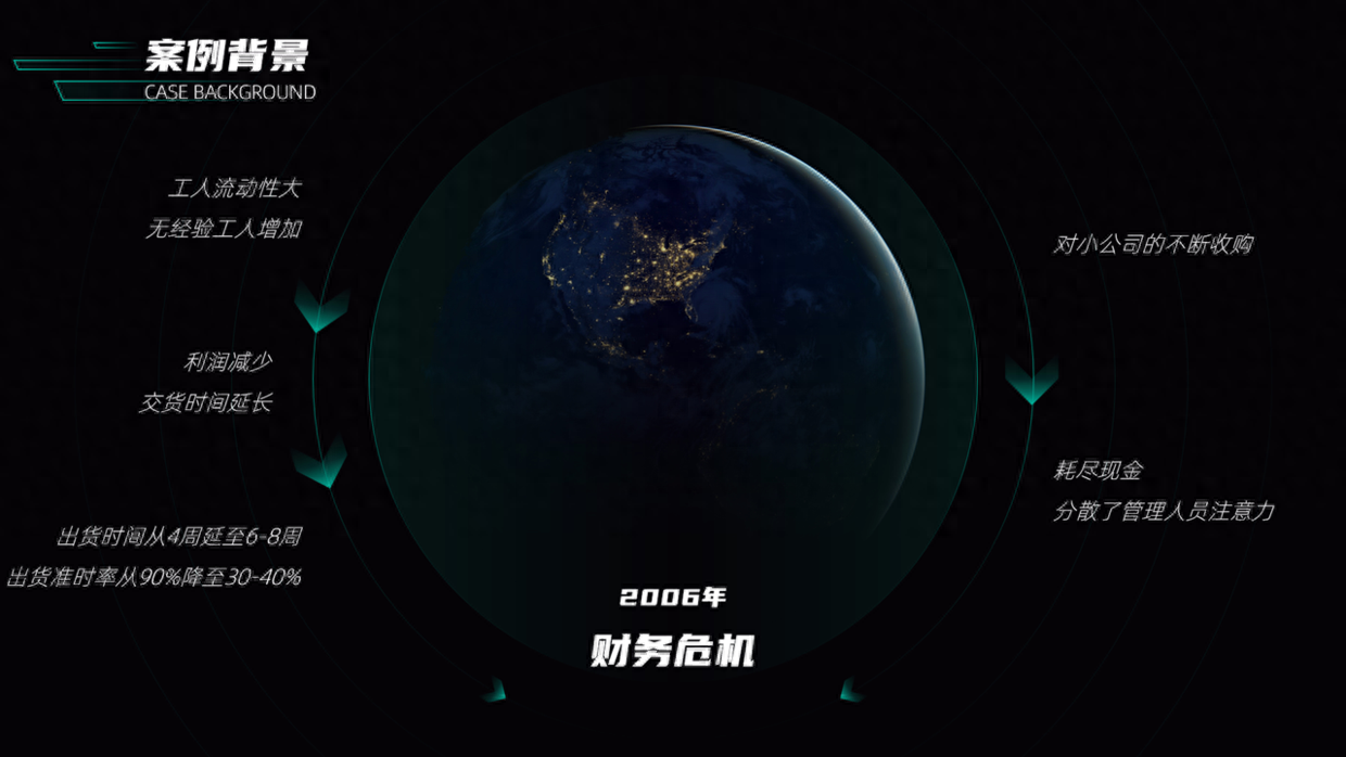
Case 1
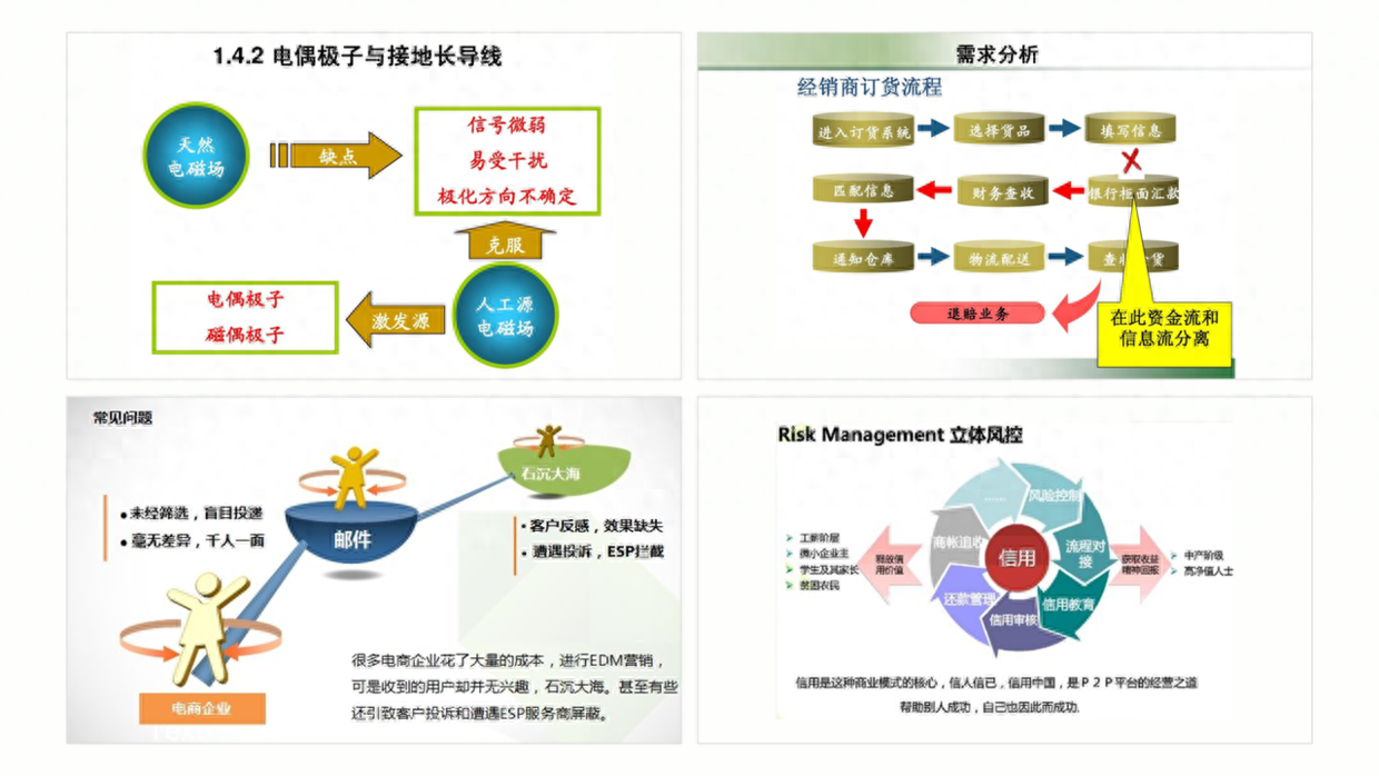
Let’s first look at how to optimize the flow chart in this case background. This is a two-way instruction relationship.
First, extract and process all the page content and retain the original information.
Do you still remember how to use pictures such as planets shared in the last issue?
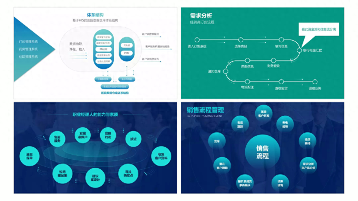
In the same way, this type of material optimization can also be used here, and then the indicative relationship is made with the content.
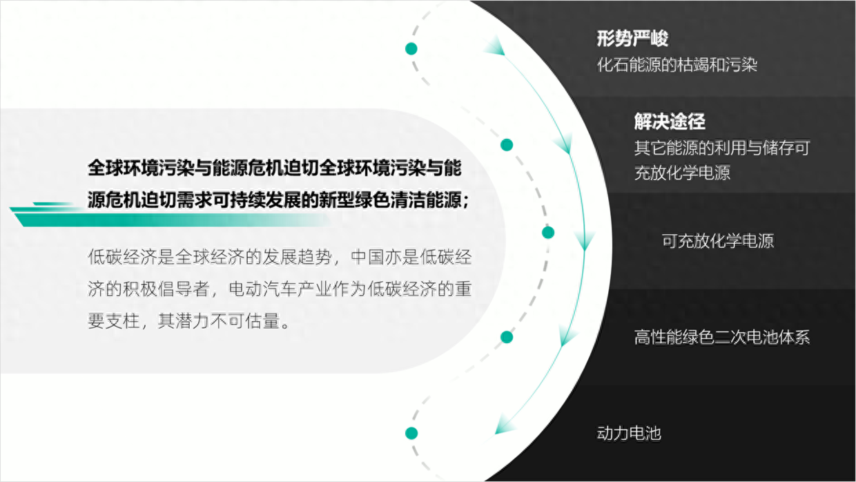
Case 2
The content of this page is also quite special. In addition to the structure diagram, there is also a large section of content. Obviously, there is still room for optimization in this PPT page.
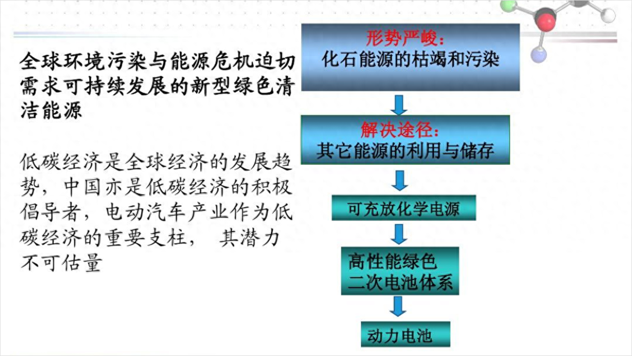
The curved arc effect design can be used here. The advantage is that it can organize the content in the flow chart and make the page more tidy.
Case 3
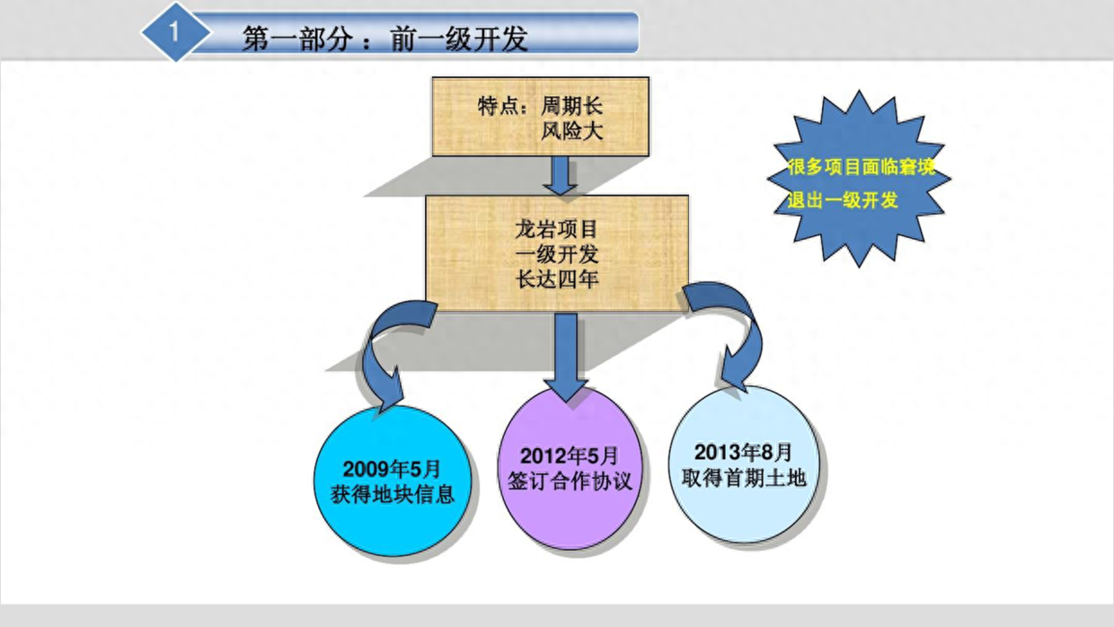
In addition, there are also structural diagrams with relatively little content, which seem to have less content, but are actually more troublesome to design.
For example, the following effect is designed using special shape effects in order to make the page have more elements, but it still has no sense of design.
In fact, we can put ourselves in someone else's shoes and express it in the simplest way, which is also a good way, such as using this arrow to indicate the design.

Case 4
For some types of structure diagrams, there will also be some special content included, such as a timeline.
The following page is typical content, take a look.
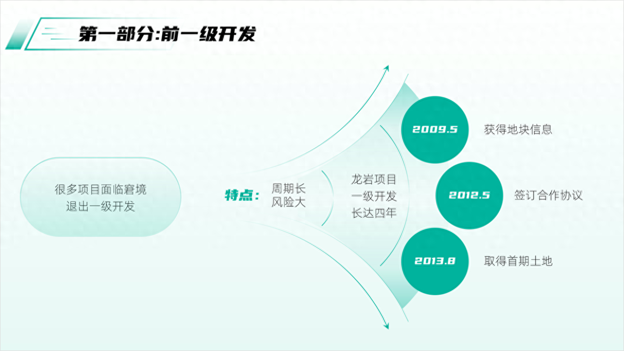
Okay, in order to make this kind of PPT page more design-friendly, first reorganize the logical content.
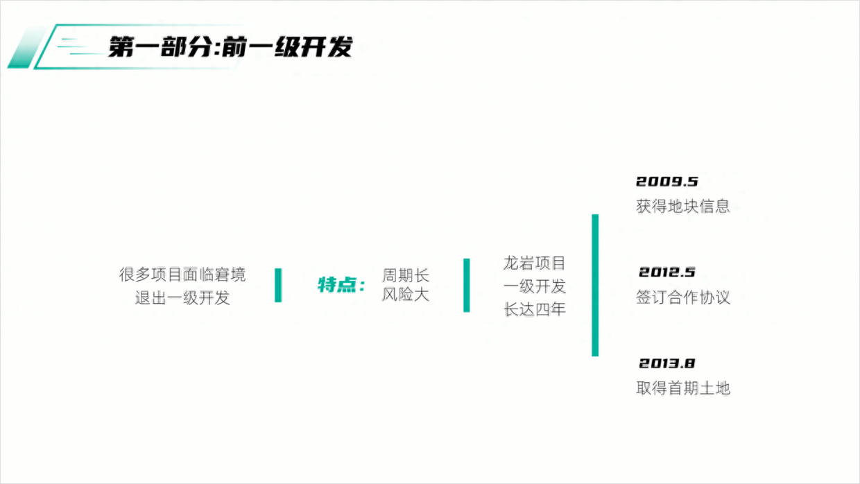
Next, you can design it according to the style of the structure diagram and display it with the following relationship diagram, and the page will be very clear.
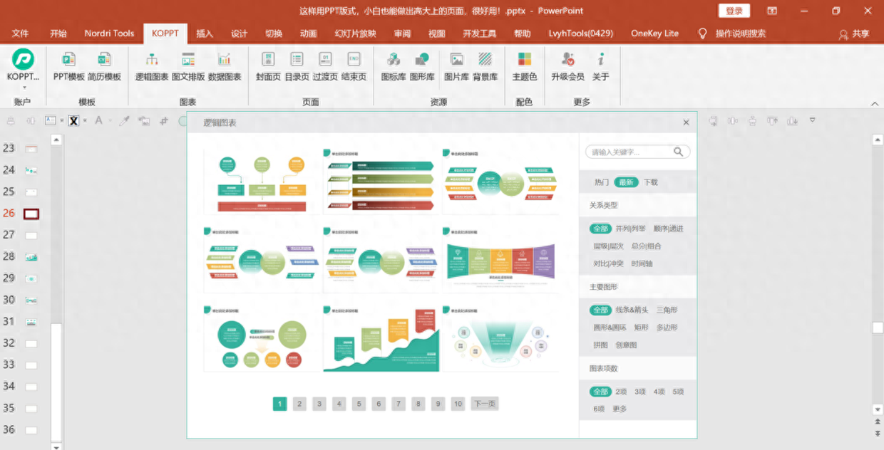
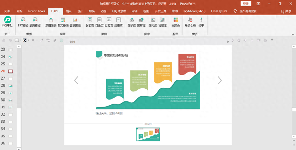
In addition, you can also find the creative structure diagram in the [KOPPT] plug-in library, click on the latest to download and use it.
The plug-in material comes from the KOPPT website
The plug-in material comes from the KOPPT website
Click [KOPPT] - [Logic Chart] - [Latest] to view the designed layout.
The plug-in material comes from the KOPPT website
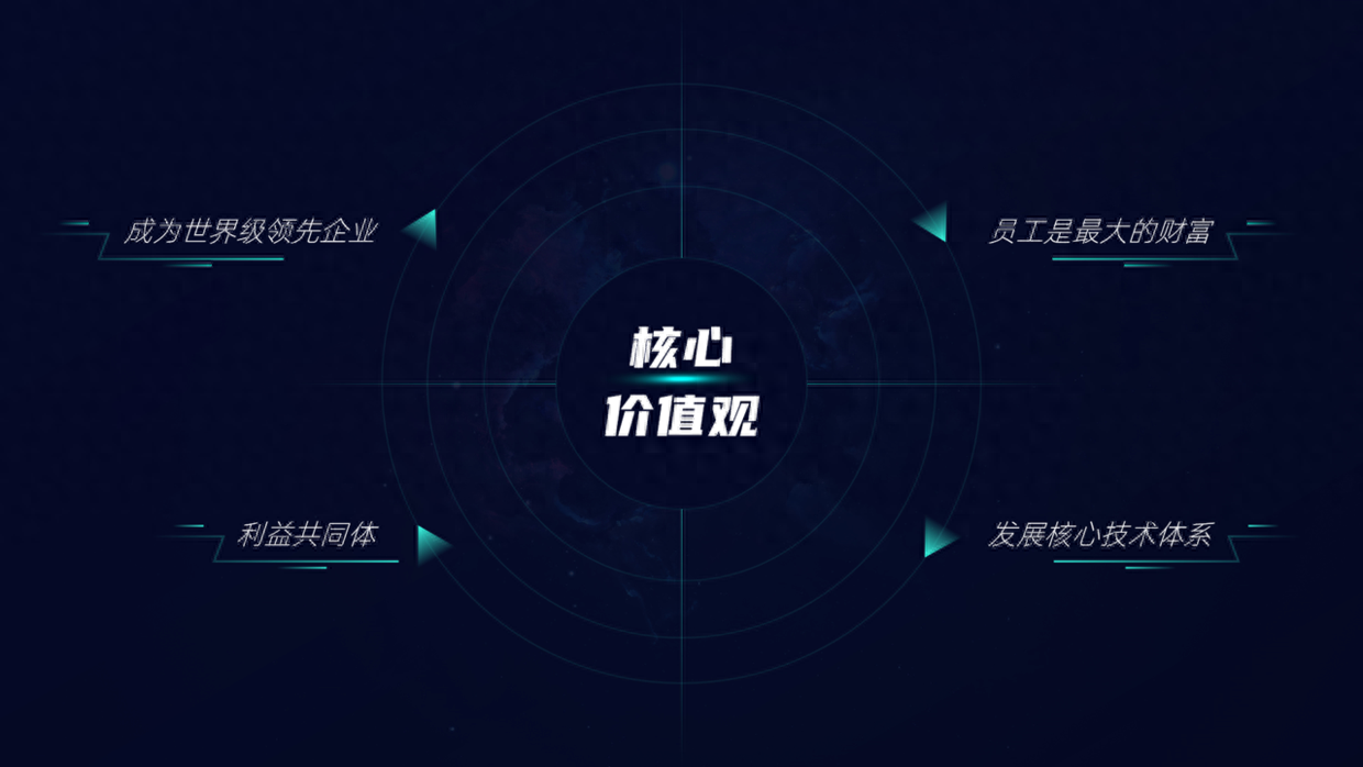
Case 5
Finally, there is a typical arc-shaped structure diagram, which is also a cycle diagram effect. Take a look.

This type of structural diagram is obviously relatively simple. At this time, use this crisscross effect design to increase the design sense of the page.
The above picture and case materials are all from Internet sharing and have not been invaded or deleted.
That’s all I’ll share about this topic, I hope it’s helpful to you.
See you next time!
Articles are uploaded by users and are for non-commercial browsing only. Posted by: Lomu, please indicate the source: https://www.daogebangong.com/en/articles/detail/PPT-jie-gou-liu-cheng-tu-zhe-yang-she-ji-hao-kan-you-you-she-ji-gan-kan-yi-xia.html
 支付宝扫一扫
评论列表(196条)
测试