The following article comes from Black and White Design, author Lao Hei

Starting from PPT, design becomes simple.
Scan the QR code on WeChat to watch the full set of Excel, Word, and PPT videos


老黑 Black and White Design (ID: HbjDesign)
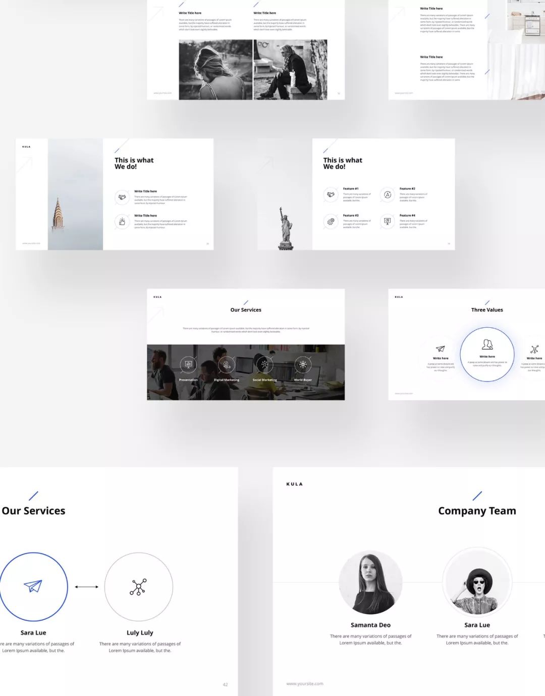
Sometimes when we look for PPT templates on the Internet, we will find some templates that look very cool. These templates are usually in English, with very small characters, and look like this.

After downloading it with great joy and replacing it with our own content, we suddenly found that it was a bit acclimatized. The originally beautiful template could not be read clearly after adding specific content.
Once we made the characters larger, we found that there was a mismatch between the original layout and the large characters.
01 Anyone who cannot see clearly is a hooligan
This is a common dilemma when applying PPT templates. So should we keep the original small text, or give up the layout in the template and enlarge the text?
I think the first principle is that if you want to give a PPT, then all the text in the PPT should be visible to all audiences. If you say you can't see it, you're being a hooligan.
Many advertisements have such a design, you can buy something for a certain amount of money, but there is a very small word "start" in the lower right corner of the amount.

The designer didn't want you to see this word at first glance, but it had to be put up, so it was made into this very small word.
When we give text sizes, we actually give them categories of importance.
Prominent text = important content;
Regular text = normal content;
Just enough to see the text = unimportant content;
The text that cannot be seen clearly = the content that you want to hide quietly.
When talking about PPT, of course you don’t want to leave a deceptive impression on others, so you must ensure that all text can be read clearly.
02 Only small things lead to big things
So why are some small text added to many designs? This also makes sense.
One day, you finally took off your job and went to the mountains for a swim.
Articles are uploaded by users and are for non-commercial browsing only. Posted by: Lomu, please indicate the source: https://www.daogebangong.com/en/articles/detail/PPT-ji-qiao-fen-xiang-zi-ti-da-xiao-yu-yan-shi-xiao-guo-zhi-jian-de-guan-xi.html
 支付宝扫一扫


评论列表(196条)
测试