Pictures and text are the most classic PPT format.
However, even if it is the simplest piece of text or a picture, many professionals still cannot do it well. Why?
There could be many reasons and everyone is different.
However, one thing that is certain is that we can learn from the methods of PPT masters in handling graphic and text layout.
So what are the specific ways?
After reading hundreds of excellent works, I summarized 9 commonly used graphic and text layout methods to create high-looking PPT, which will be effective immediately!
01 Full screen
Enlarge the picture to fill the entire page, maximizing the appeal of the picture.
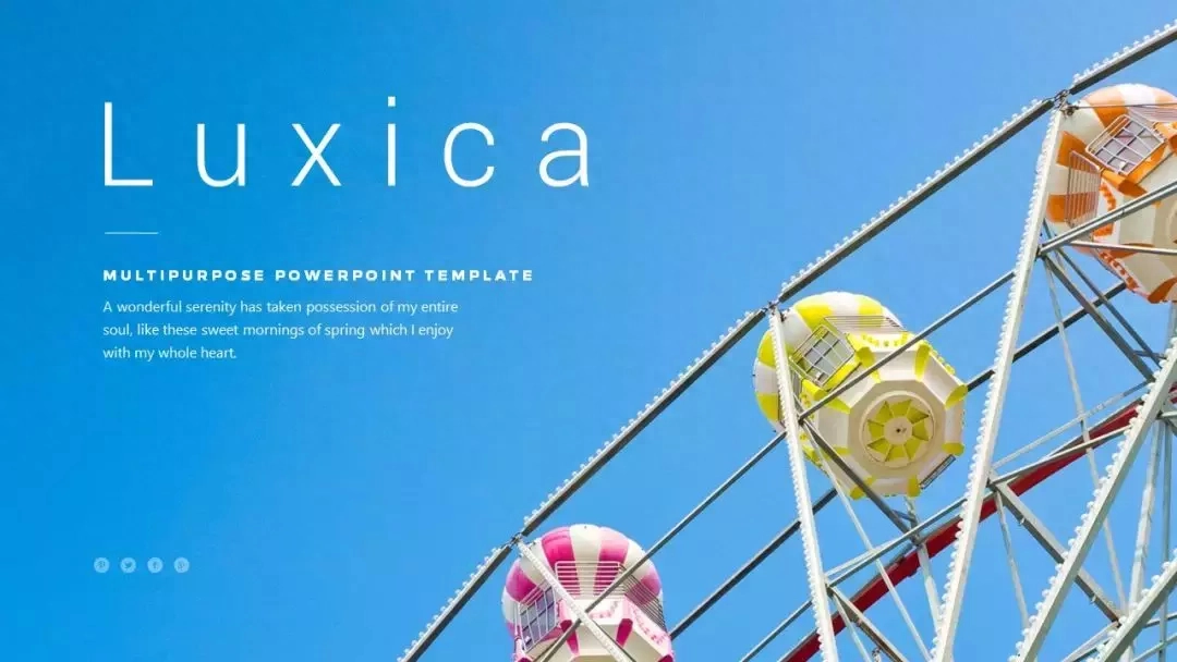
When choosing a picture, try to choose a high-definition picture with a large area of white space, so that you can add text directly in the white space.
If the image is too complex, you can consider adding a mask or reducing the brightness of the image.
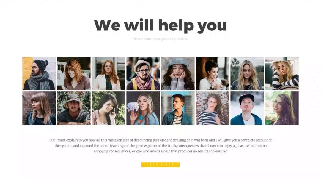
02 Uniform size
When formatting multiple images, unify the size of each image to help create a neat slideshow.
This trick is very useful when creating a team introduction page.
03 From big to small
If the size of each picture represents the degree of importance, you can also try to arrange the pictures from large to small.
Large pictures highlight a visual focus, small pictures enhance the atmosphere.

04 Geometric Shapes
Filling pictures in geometric shapes can give pictures a more distinctive display form.
Usually the shape of pictures is rectangular, so breaking people's stereotypes of pictures will give them a sense of freshness.
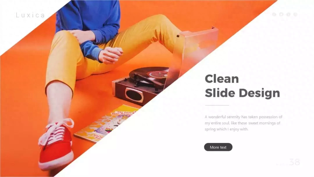
Of course, there is more than one way to change the shape of a picture, and there are the following.
05 Text Mask
Filling the text with pictures does not affect the reading of the text, but also brings the ultimate visual experience.

Of course, choosing different fonts will have different effects. It is recommended to use fonts with thick strokes.
06 Ink Shape
The ink material has a more flexible outline, and the filled pictures are freer and more dynamic.

Ink materials are generally obtained from PS brushes, but some enthusiastic netizens have extracted them and shared them in the resource square of PPT Beautification Master. You can directly insert them into PPT for use.
07 Irregular outline
Compared with geometric shapes, irregular contours have more changeable outlines and soft edges, which give people a sense of intimacy.
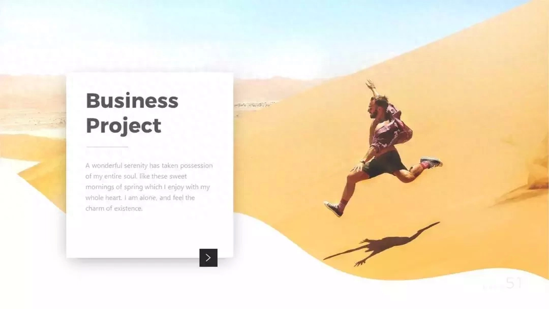
As for the production method, we generally need to change the way of thinking. Instead of touching the picture, we draw a soft-edged shape color block and cover it on the picture to block part of the picture.
08 Polaroid
Polaroid, a picture style with a memory mark.
Add white borders and shadows to pictures, staggered stacks, cluttered but not messy.

Because the production method is simple and the appearance is good, it can be said that it is very cost-effective.
09 Remove background color
Remove the complex background of the picture and fully display the touching details of the product.

Remove the background of the picture, you can have more design methods. For example, match it with color blocks to create a "crossing" effect.
Finally, to briefly summarize, this article provides 9 different ideas for PPT graphic and text layout:
❶ Fill the entire screen
❷ Uniform size
❸ From big to small
❹ Geometry
❺ Text mask
❻ Ink shape
❼ Irregular contours
❽ Polaroid
❾ fade away background color
Master these 9 methods and I believe your PPT will become beautiful in no time!
Articles are uploaded by users and are for non-commercial browsing only. Posted by: Lomu, please indicate the source: https://www.daogebangong.com/en/articles/detail/PPT-gao-shou-jin-jie-bi-ji-tu-wen-pai-ban-de-9-ge-tao-lu.html
 支付宝扫一扫
评论列表(196条)
测试