Text | Ming Ge, former McKinsey strategy consultant, Accenture Management Consultant, a veteran who likes to use mind maps to structure PPT, workplace skills, break them down and talk about them Listen to you, welcome to follow usLet’s make progress together, Become a professional elite.
Half a year has passed, yourMid-year reviewDid you do it? Today we are going to talk about the crazy things in PPTchart production< /strong>.
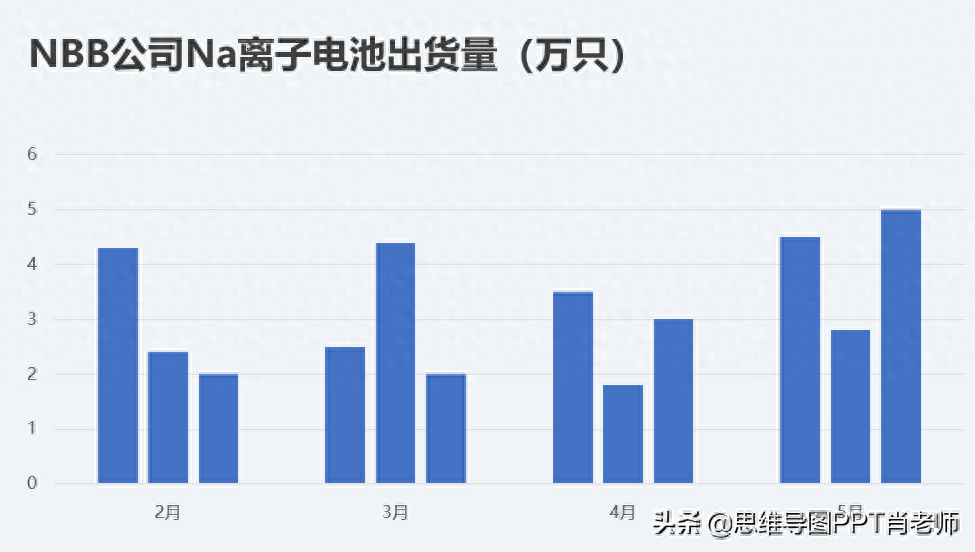
When it comes to charts, many people are helpless. After all, we are not professional PPT designers. Teacher, we are more concerned aboutcontent expression instead of Formal expression, So some people often use PPTDefault chart effect, such as the following, but < span style="color: #00ABAB; --tt-darkmode-color: #00ABAB;">The form is too simple and unattractive.
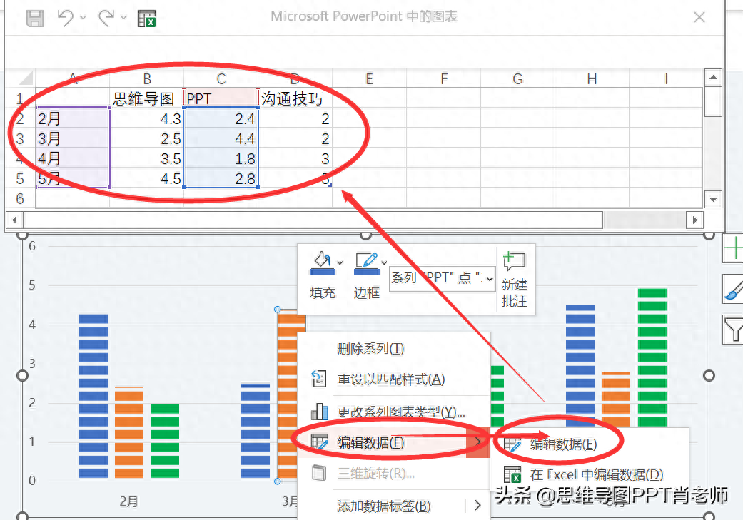
For those who often make PPT, we often collect a lot of effect templates ,No need to spend time designing, nor do you need to know many PPT skills, simply apply the template< /span> can make a high-end PPT. For example, in the example just now, we only need Find the right template, select "Edit data".
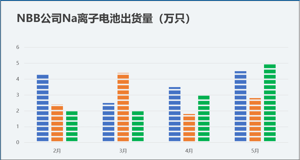
After modifying the data, the effect is as shown in the picture below, right< strong>Effortless and elegant.
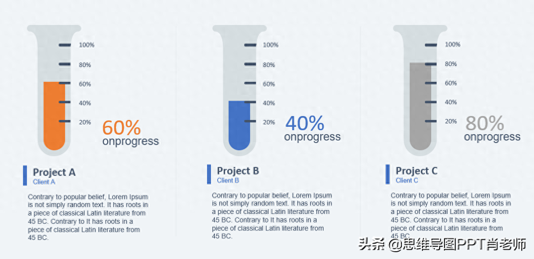
For another example, we divide the summarized data into 3 groups and use the following expressed by a scale diagram.
You can also apply the following effects:

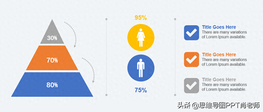
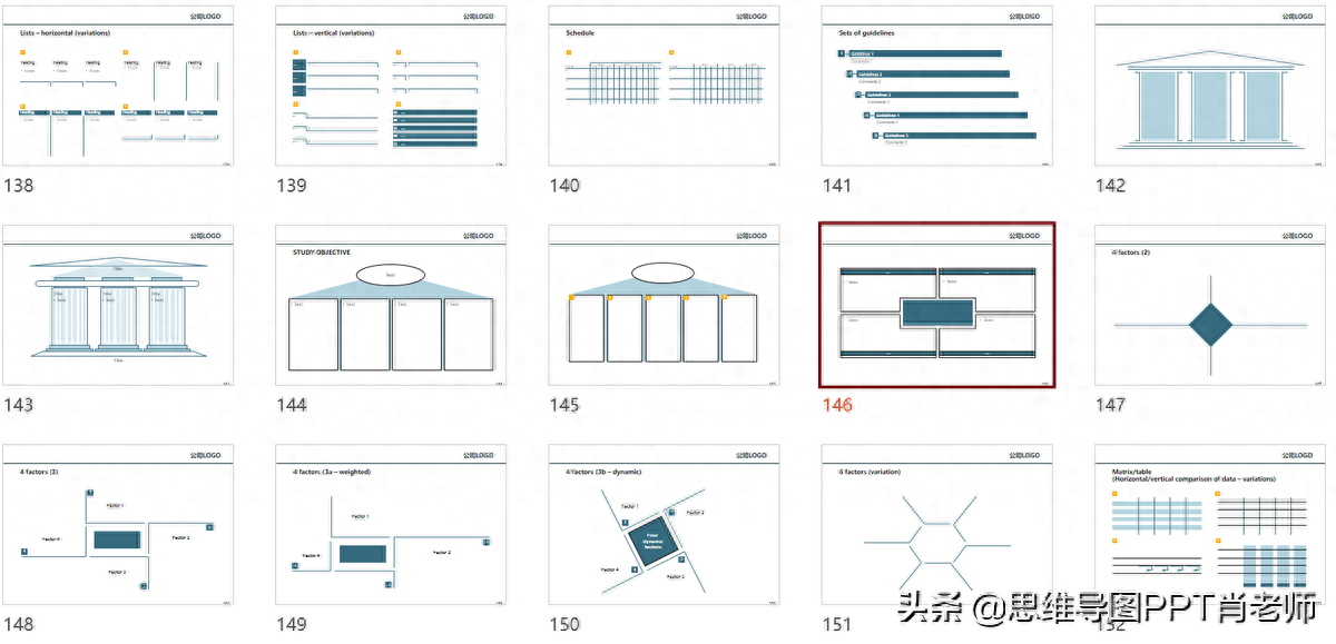
If you wantExpress hierarchical structure, We can use the followingpyramid structure, onion diagram, etc., just modify the data.
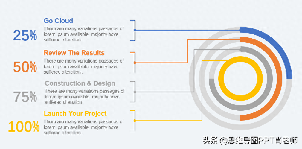
If you want to show the overall progress of multiple topics, you can use the following figure to express the advantages. It is possible to provide text descriptions for each topic, to avoid the default column chart in office. Disadvantages of text description of the theme.
Isn’t it very3 simple steps, justCompleted a high-end PPT, ^_^
(1) Find suitable materials.
(2) Edit the data and update the actual data.
(3) Modify the text appropriately and adjust the color matching according to the overall style, OK. .
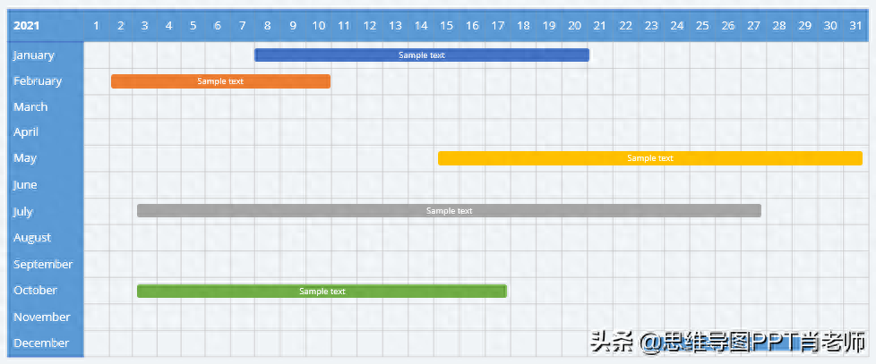
The above form is mainly to describe the trend and analysis of the data. If we want to draw Gan Tetu, what should we do?
For example, we can create the following Gantt chart in Excel, but similarly, This effect is quite satisfactory, without many bright spots, and we need to beautify it appropriately.
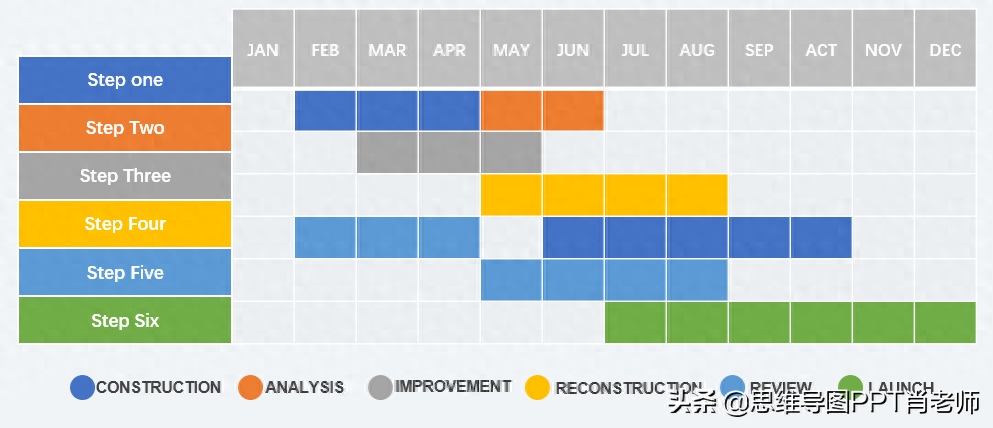
According to the previous ideas, we need to find some more attractive templates, such as Like this:
Also:
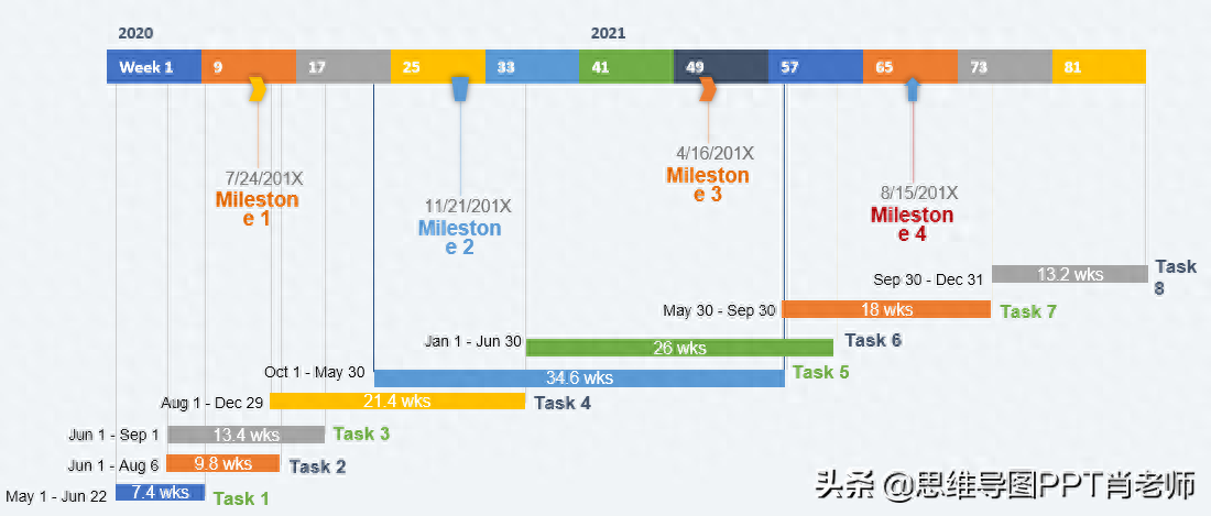
In short, just choose the template and modify the specific data.
Tips:
In fact, every consulting company will have its own commonly used chart templates. It is convenient for employees to apply and canmaintain the consistency of PPT style , but alsoSignificantly improve the efficiency of PPT, the same is true for us personally, and we will be intentional An unintentional collection of various excellent templates and chart elements.
As the knowledge sharing officer of Toutiao, today I will share a set of templates that I have selected and organized. Including some better expressions from Accenture and Roland Berger.
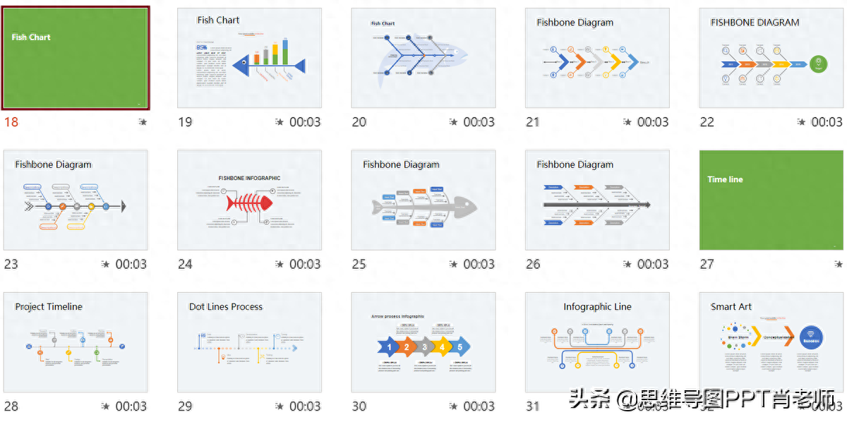
Includes fishbone diagram and timeline:
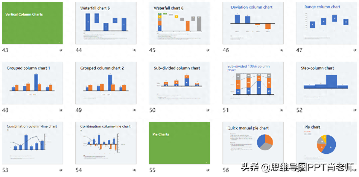
Various data charts, such as trend charts, pie charts, etc.
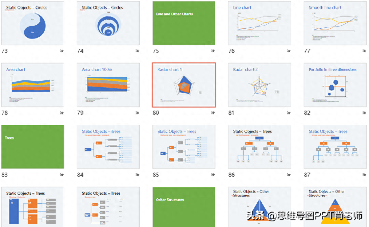
There are also onion charts, radar charts, scatter charts, pyramid structures, etc.
Finally, the overall color scheme of Roland Berger’s template is also very good:< /span>
Old rules,Like + forward + send a private message to 2718 You can get it, ^_^
Of course, templates only solve the problem of PPT. We must continue to improve and achieve promotion in the workplace. To get a salary increase, I recommend you subscribe to my "Toolkit for Highly Effective Professionals", which contains the methodologies of the famous McKinsey and Accenture, including the pyramid principle, the McKinsey method, etc.Methodology, underlying thinking, demonstration and reporting, efficiency improvement and other aspects of skills.
I will share it here today. If you like it, please give it a thumbs up and sympathize with my hard work. Please give a tip below the article. I like it as much as I like, ^_^

Articles are uploaded by users and are for non-commercial browsing only. Posted by: Lomu, please indicate the source: https://www.daogebangong.com/en/articles/detail/PPT-de-mo-ren-tu-biao-chou-si-le-an-zhao-zhe-3-bu-zou-fen-fen-zhong-bian-gao-da-shang.html
 支付宝扫一扫
评论列表(196条)
测试