PPT generally has "three elements", text, pictures and tables.
An entry-level PPT player can arrange the text in an orderly manner. An advanced player can process both text and pictures neatly and beautifully.

Tables are different from text and pictures. They carry a larger amount of information and are in a single form. The dense data makes it more difficult to beautify by several levels every minute.
I believe that when faced with forms, many people keep the same in response to changes and just fill in the data directly. It doesn’t look good anyway.
But it’s not that difficult! Now let’s talk about several ways to beautify tables in PPT.
1
Color matching
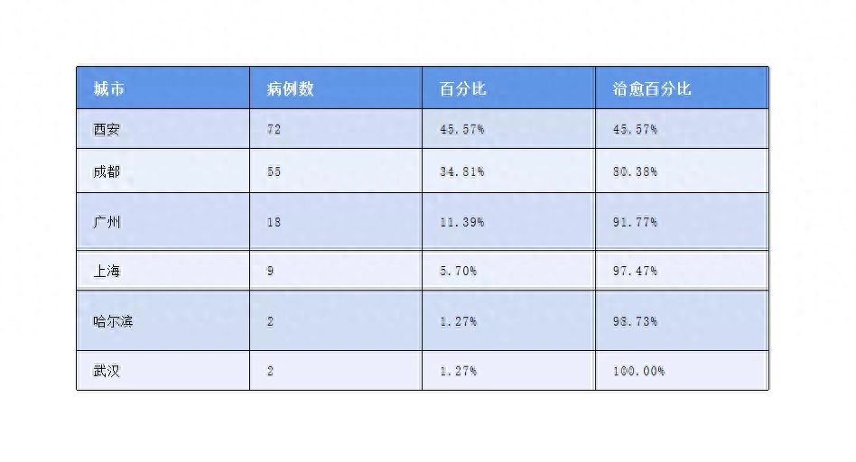
The first is color. Many people don’t have the awareness to adjust the color when making tables, and use blue by default:
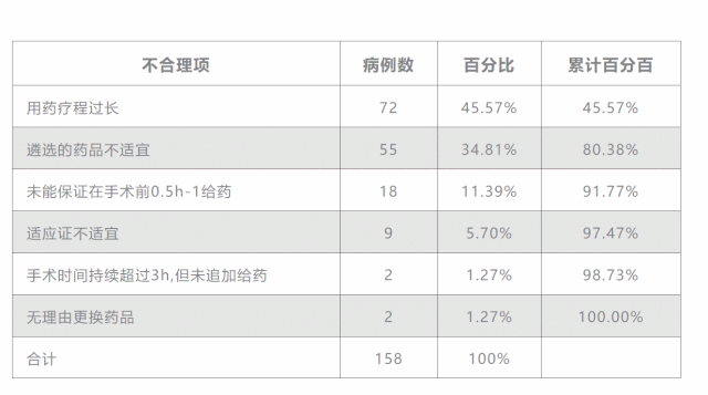
In fact, this color may appear quite abrupt when paired with many colors. If it is a pure white background, using lighter colors for the table will make it less likely to stand out, like this:

The effect is better, right?
A more careful friend may find that the modified form not only changes the color, but also removes many lines.
But even if these lines are removed, will it not affect the overall look and feel of the table? This brings me to my second point.
2
Clean lines
The function of lines is to separate different data for easy reading, but because the distance between these data is already wide enough, appropriately removing the lines will not only not affect reading, but also make the table look more concise.
On a dark background, we feel that a table with fewer lines will look more beautiful.

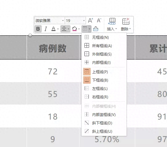
The operation method is very simple. You only need to select the part you want to add/remove lines, right-click and you can operate the lines in the pop-up edit box.
I’m worried you didn’t see it clearly, here’s another close-up:
3
Highlight the key points
What do you usually do when highlighting the key points in a table? Could it be that the font is marked red and bold?
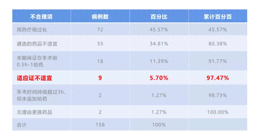
It’s time to add some new tricks. If you want to highlight the key points more beautifully, you can try Enlarge the entire row to highlight the key points.
This can create a very strong contrast with the content of other rows.
You can also use this method for vertical emphasis:

How to do it?
Reinsert a table row that is slightly wider than the original one, adjust the font size and color and place it there.

You see, doesn’t it require any complicated operations to make the form much more refined than before?
4
Smart Forms
If you are still confused about color matching and layout, then I highly recommend you to use smart tables in WPS presentations:
One-click typesetting, fonts and colors are in place in one step
In the WPS presentation, click anywhere on the table, the function bar of the smart table will appear in the lower right corner. Click "Typesetting" to beautify the table with one click.

You can also choose to click "Beautify" to open the smart sidebar and select table styles, there are many options! Various colors can be matched with various backgrounds. Hurry up and choose a style to try with your background image.

The highlighted key points of the table we mentioned earlier can also be achieved with one click here——

If there are too many tables in PPT and you don’t want to deal with them yourself, smart tables can definitely save you a lot of trouble.
Finally, let’s summarize some key points for table beautification:
1. The color of the table should match the background as much as possible. If the tone is consistent, it will look much more harmonious;
2. Reduce lines and focus on simplicity to make the table look more refined;
3. Use the method of reinserting a table to highlight the key points, and refuse to mark red × if you disagree;
4. Use smart tables to quickly layout and beautify tables.
Articles are uploaded by users and are for non-commercial browsing only. Posted by: Lomu, please indicate the source: https://www.daogebangong.com/en/articles/detail/PPT-de-biao-ge-zong-shi-chou-chu-tian-ji-yuan-yin-zai-zhe.html
 支付宝扫一扫
评论列表(196条)
测试