

Hello, everyone! I'm brother Lee!
Some of the case revisions I shared before are cases where the text has been sorted out, but in actual situations you may see that many PPTs are It is a large area of text.
For example, like this, there are a lot of dense text without focus, which makes it difficult for people to understand. Do you understand it?
I think PPT is mainly for people to read, not for reading like WORD. The content must be focused and prioritized to capture the attention of the audience.
If you encounter this kind of page in the future, how should you solve this problem?
Let me share my method, which is mainly divided into four steps:
1. Read the copy and sort out the logic
2. Highlight points of view, copywriting grouping
3. Optimize layout and beautify design
4. Logic visualization
Here I will talk about it in the form of practical cases.
Case 1:
Read Copywriting, combing logic
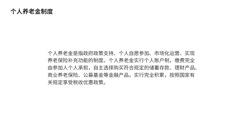
First read the content through to understand what this paragraph is about.
highlight Opinion, copywriting grouping
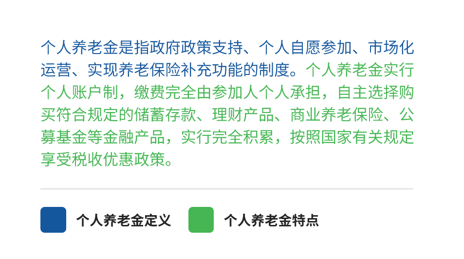
After clarifying the logic, it will be easy to handle. You can distinguish the primary and secondary relationship of content through font size and thickness , the first sentence is the key point, we can bold and enlarge it, or add supplementary information.
optimize Layout, beautification design
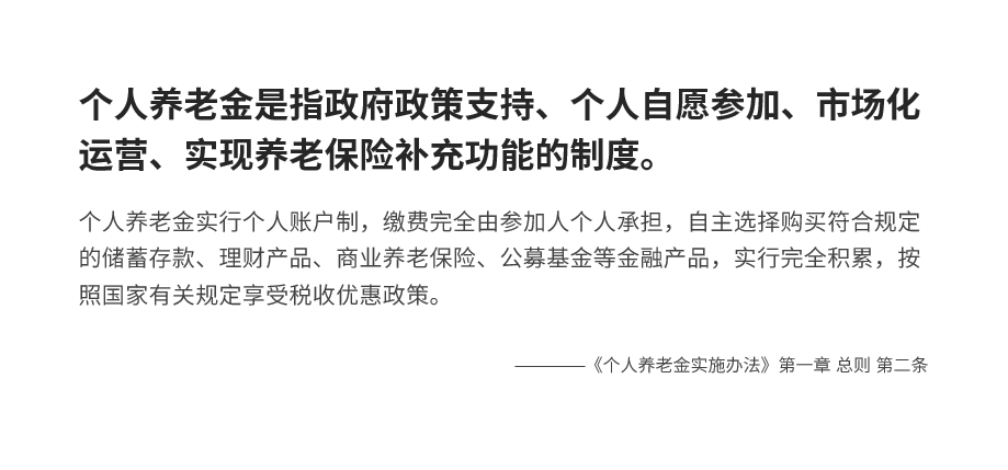
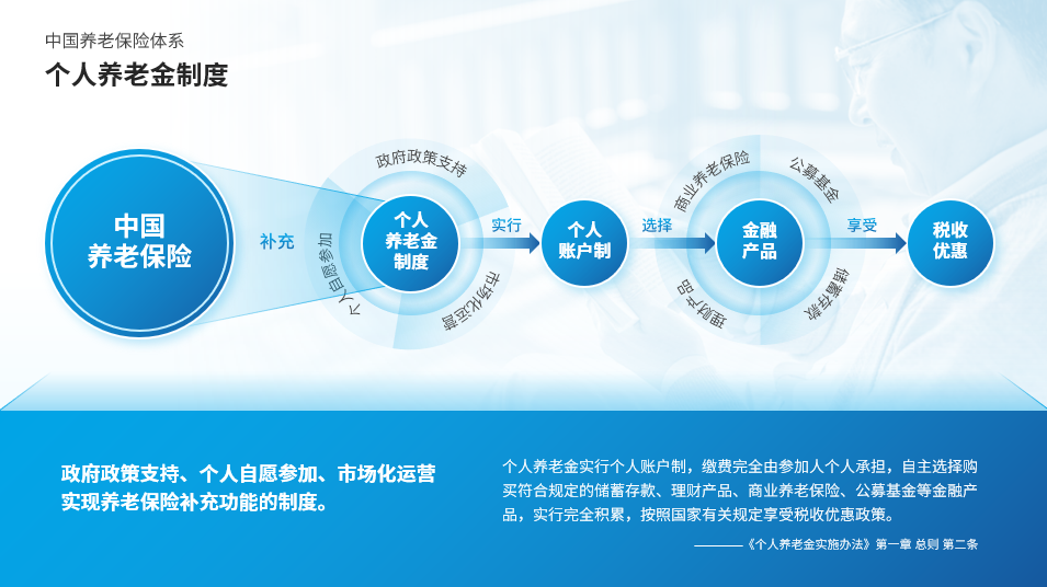
After sorting out the copy, it is typesetting. You can add color blocks in the form of a dialog box to make a page of PPT .

Adding color blocks just makes the page less monotonous, we can change the picture related to pension, This is more visual.

Logic Visualization
Simple typesetting only makes the key points stand out, but the logical relationship of the content is not reflected. If the content has obvious logic If there is a relationship, we can present the content in the form of a logic diagram.
Let’s look at the first paragraph first. The first 3 keywords are his characteristics, which can be made into total score strong> form.

Then look at the verbs and nouns, you will know that personal pension is a supplement to pension insurance, you can use radiation The trapezoid reflects the logical relationship.
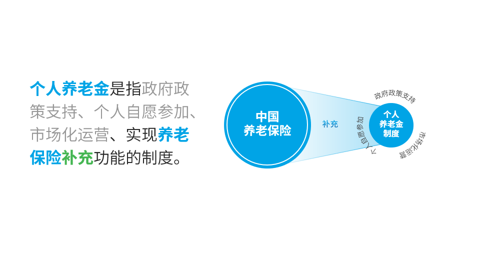
The last sentence is the same method.
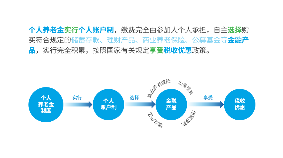
Then put them together, add text and pictures to complete, is it clear at a glance?
Case 2:
Read Copywriting, combing logic
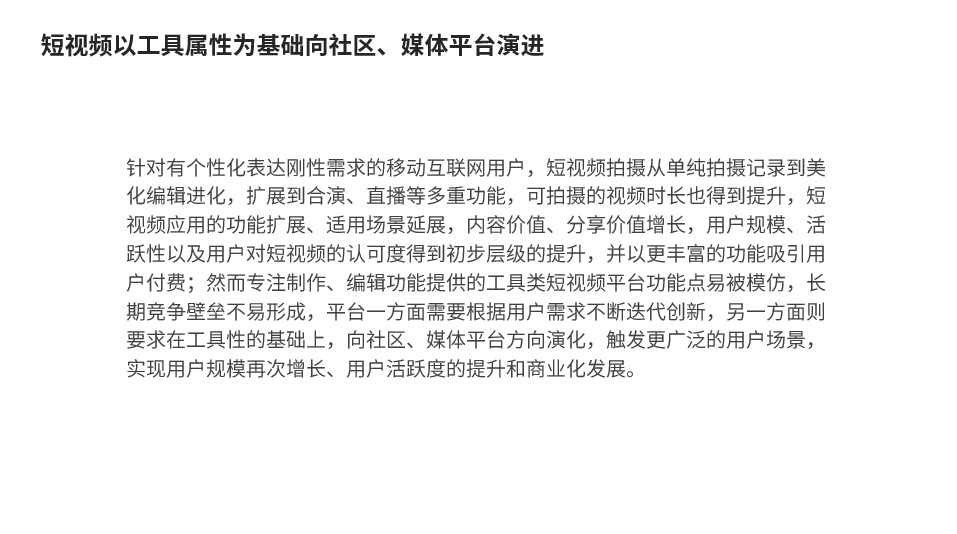
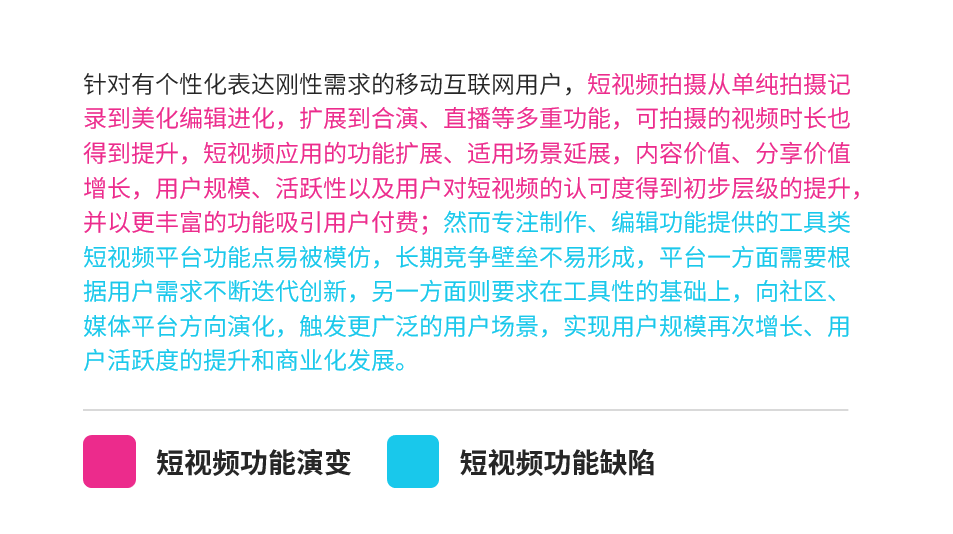
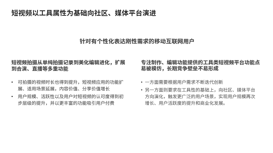
It’s still the same, first understand the following text, this time the text seems to be more than last time, but in fact it only talked about two paragraphs,< strong>The evolution of short video functions and the shortcomings of short video function creation.
highlight Opinion, copywriting grouping
Highlight the key points, and the two paragraphs can be typeset left and right.
optimize Layout, beautification design
Add darker color blocks to important content, and lighter color blocks to secondary content. Color blocks can make the content look Regular and clear.
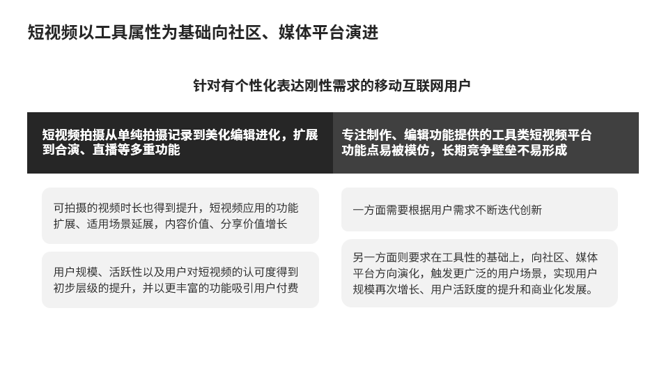
After that, optimize the details, add nice colors and enrich the background.

You can also change to another layout, layout up and down. Different content is distinguished by color, and you can enlarge and highlight it according to the content you want to emphasize.

Logic Visual Design
There is no special logical relationship in this case, let's have another case.
Case Three:
Read Copywriting, combing logic
After reading, you can see that it is about what needs to be done in each time plan.
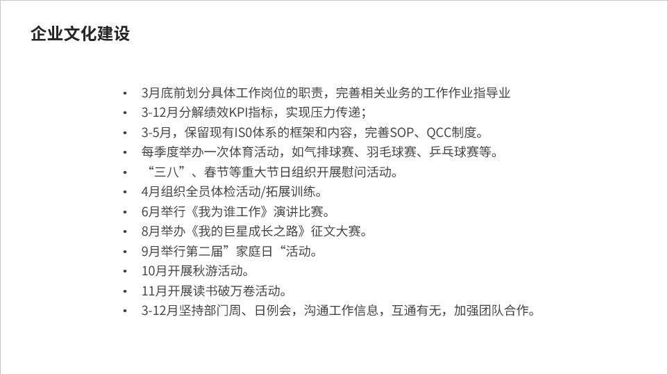
It looks like a simple list of things, but it actually talks about two things: Improve industrial affairs and organize events strong>.
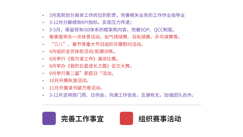
highlight Opinion, copywriting grouping
Then highlight the subtitles, divide the content levels, and replace the time information and events with two lines to make the structure clearer.
If you still want to be clearer, you can highlight the time with a thicker font, and then use lines to divide time and things Just open.
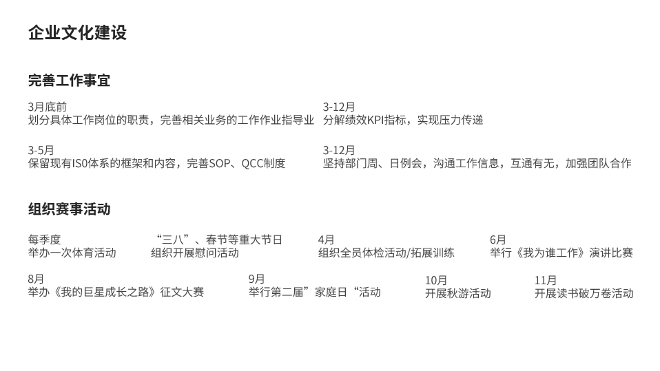
optimize Layout, beautification design
The two paragraphs of content can be columned, as before, add color blocks to make the information structure More clarity, isn't it pretty good.
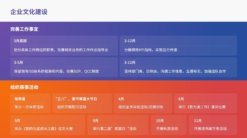
Of course, it is also possible to change the layout, layout left and right, and the main points spread out from the center.
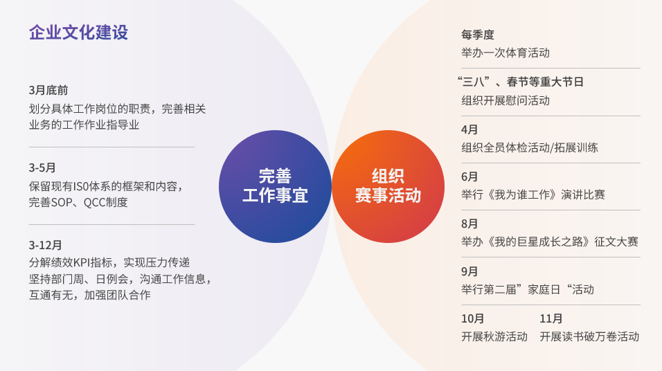
Logic Visual Design
We have gone one step further on the basis of the previous content,starting from the time dimension and making them in chronological order and progress In the form of a Gantt chart.
How to do it?
Conceive the content you want to place first, and then divide the layout with color blocks.
Then put the time and things on it.

Finally, just put the notes and other content on it.
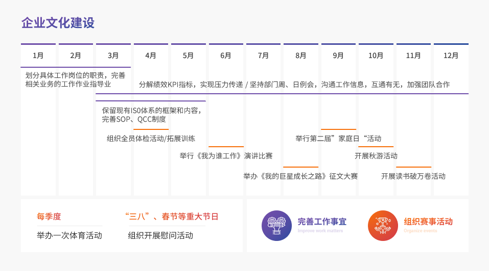
It’s okay, the logic becomes much clearer.
The methods and ideas have been taught to everyone, and then everyone needs to practice by themselves.
End of this article.
PS: I am Lixiong, a PPT designer who has been working for 9 years.
If you also want to make a good-looking PPT, you can learn from Brother Li. There are a total of 40 video lessons in the column , very systematic and of super high quality.
There is also a Q&A community, and 5G PPT materials are also given away
In addition, I will give you some benefits, the way to get them is as follows:

Articles are uploaded by users and are for non-commercial browsing only. Posted by: Lomu, please indicate the source: https://www.daogebangong.com/en/articles/detail/PPT%20with%20too%20many%20texts%20how%20to%20make%20it%20clearer.html
 支付宝扫一扫
评论列表(196条)
测试