I always dream of flying over the meridian above the clouds, I can’t tell whether it’s night or day, and I rush here with unbearable expectations...

Hello everyone, I am the editor: Eagle; today is the day before going home, and I am still extremely excited. Today I bring you a section that is very easily overlooked in PPT: the transition page
The first time I heard the term PPT transition page was in the school-enterprise class at that time. When I saw the transition page, I felt redundant at first because it existed for a short time. Later, I experienced other scenes such as speeches. Only through the use of the website can we know the importance of the transition page.
In fact, the role of the transition page is very large. It is like the lubricating oil in the PPT switching, which is to make the various parts of the PPT coherent, so that the content of each part can play a smooth and natural connection, making the switching less abrupt. !
What are the methods and techniques for making transition pages?
First of all, it is necessary to clarify the general design of the transition page:
Bright theme; bold colors; strong contrast
In fact, the design of the general cover is similar, so the design of the transition page can also refer to the cover design properly!
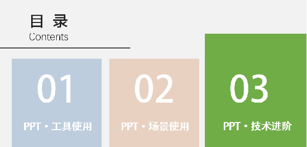
Method 1: Directory method
It's very simple and you don't need to consider the style, layout, color matching, pictures, embellishments and other designs, and you can't go wrong. It's really a good product, you deserve it!
Method: Copy the catalog page directly, and darken all the text and embellishments outside the theme (set through transparency)


You can also use zoom and other functions to highlight the theme more emphatically!
Method Two: Full Graphics
This is similar to our cover design, using graphics for auxiliary presentation
very versatile

This is like emotional transfer, using pictures and short text to instantly shorten the distance to the audience


The full graphics transition page seems simple, but it also has a lot of skills to design
1. Selection of pictures (according to the scene)
2. Text editing (priority)
3. Appropriate embellishment (increasing the sense of design)
4. Page color matching (emphasis)
For transition pages, just do it, fancy or not!
Method 3: Pure background type
A solid color background or a relatively monotonous background is a test of design ability, so besides the above catalog type, can you refer to it, are there other layouts?
There must be. In PPT, there is a very good thing: shape icons. Using this thing, you can create many different things.
example:


Reasonable use of shapes or icons for embellishment makes our page look simple but not simple!

Articles are uploaded by users and are for non-commercial browsing only. Posted by: Lomu, please indicate the source: https://www.daogebangong.com/en/articles/detail/PPT%20typesetting%20%20the%20neglected%20transition%20page%20in%20PPT%20is%20so%20important.html

 支付宝扫一扫
评论列表(196条)
测试