

Hello, everyone, I am Brother Li!
I did two corporate PPT trainings last week, one was Rockwell, a Fortune 500 company, and the other was Baoye Group, a well-known Zhejiang company.
How about a picture! (It feels so formal)
Through communicating with the students, I found that most of the students who came to the training did not have a good foundation.
Their requirement for PPT is to be refreshing, generous, concise and clear. It doesn't have to be fancy.
especially It is a PPT with a lot of text and a lot of pictures. I don’t know how to solve it?
We will also talk about this issue today. Let's look at a case first.
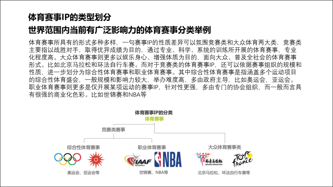
When you get such a PPT page, you have to understand, what is this PPT about? Can it be simplified.
If possible, of course, we need to simplify the text.
Let's analyze the content. Among them, the classification and special text are the most, and they are piled together, like word, which is not intuitive and difficult to read. On the contrary, the following examples are easy to understand.
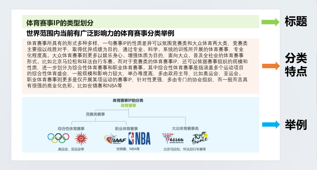
If possible, the middle paragraph can be deleted, because no one really reads it.
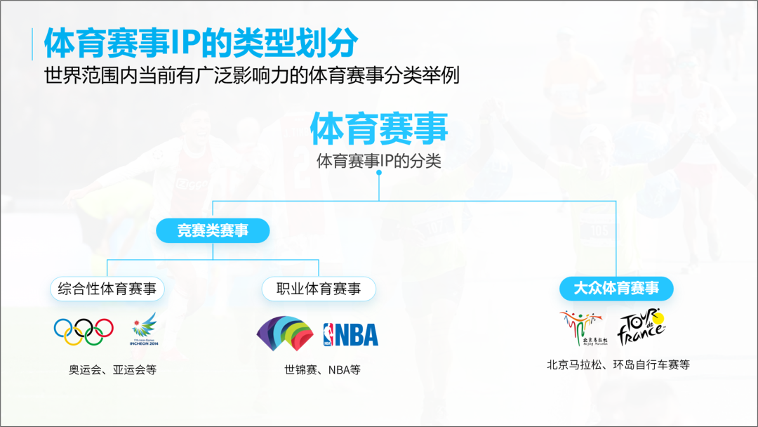
There must be someone here who will say that this division exists, but the characteristics are gone, so a large piece of text introduces various Features of sporting events.
This has to be kept. In fact, there are mainly three types. A comprehensive sports event, a professional sports event, and a mass sports event.
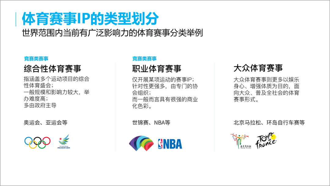
Multiple sports events and professional sports events are both competitive events. Is it possible to turn this into this sentence and put it under the title.
If it can be divided in this way, then we can add pictures, so that the whole will be more vivid.
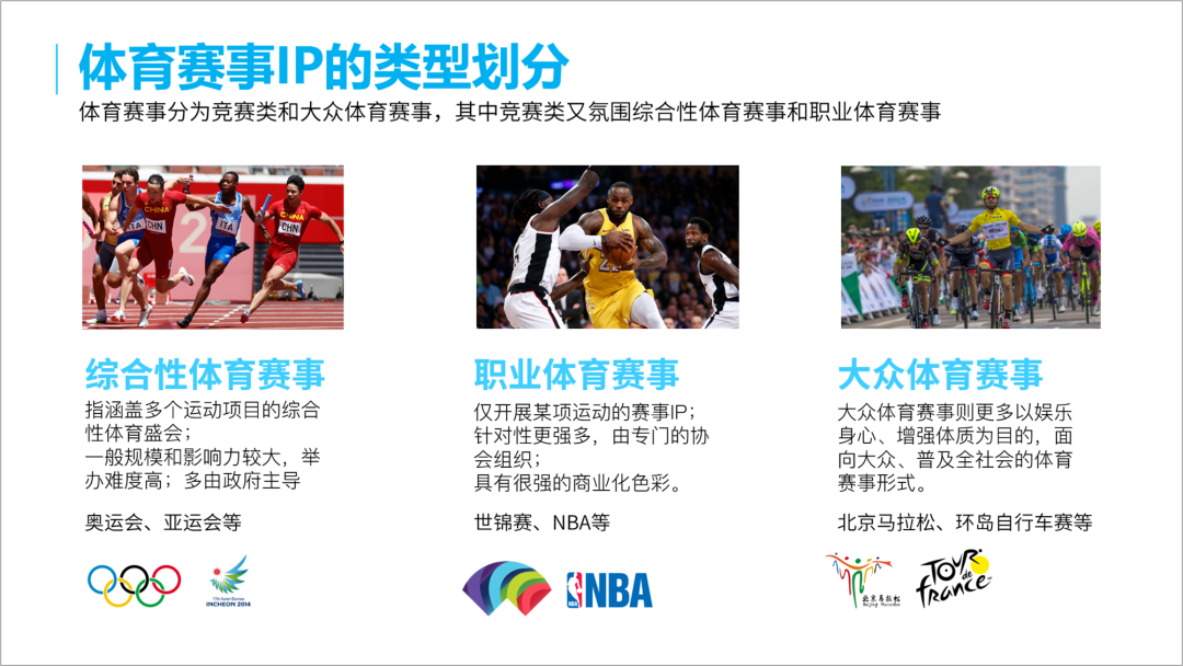
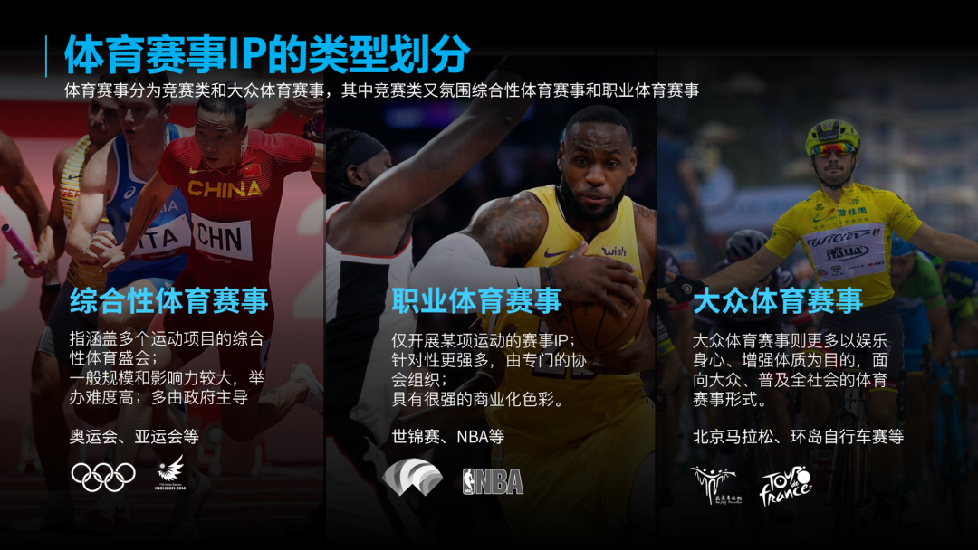
If you use a dark background, is the full image better?
If you say, this doesn't work, the structure is affected a little.
We can also divide the event into two parts, and then divide it in the competition, so that the logic is clear and the content clear.
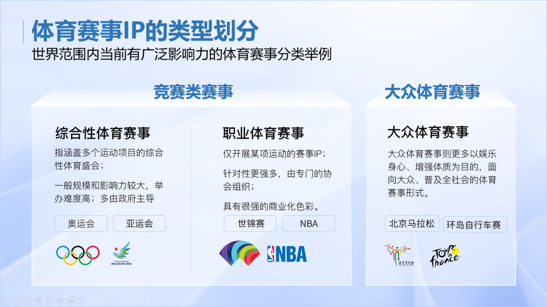
If you have to use the architecture diagram, you can only typeset like this.
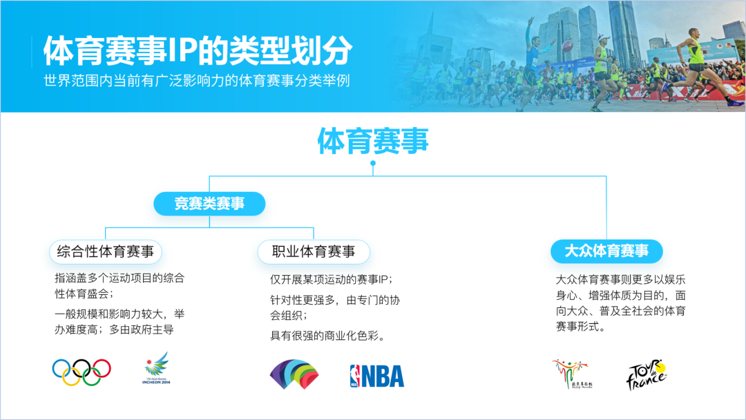
If it is that kind of clear, it will be simpler.
Let's look at Case 2 again. Like this page of PPT, it can be typesetting according to certain methods and routines.
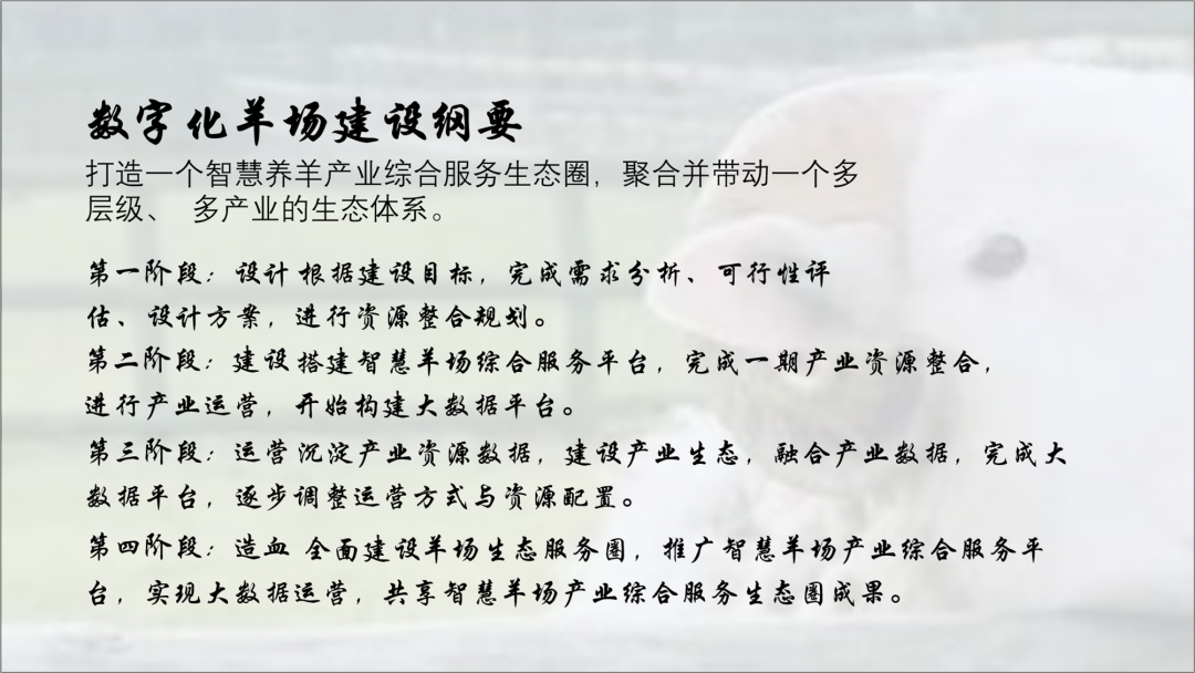
There are a lot of text, if it is a reading-oriented PPT, it must be highlighted.
Let's sort out the copywriting and highlight the key points.
Refine the subtitle, enlarge it and make it bold.

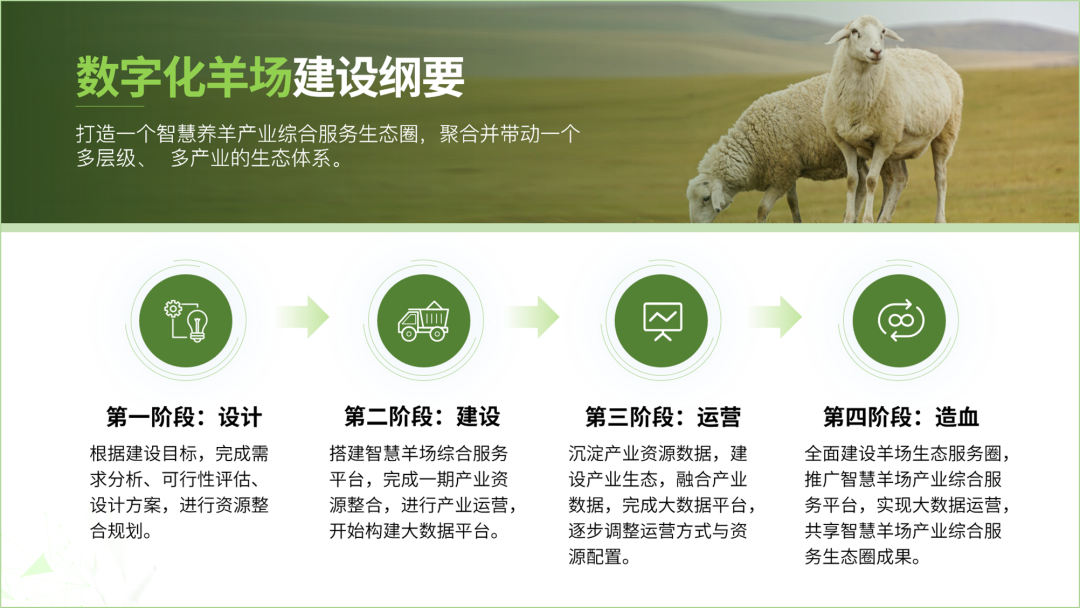
In terms of relationship, there is a progressive relationship, step by step, so we change the typesetting, typesetting horizontally, and then Add arrows.
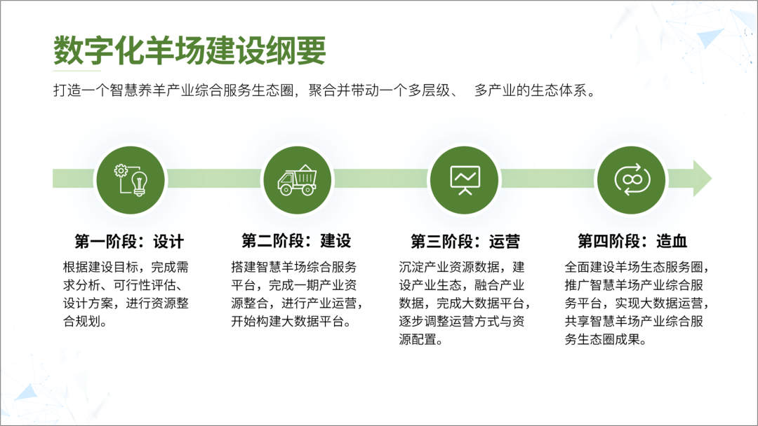
If you feel that it is almost lacking a picture, you can add a picture.
For example, a full graphic.
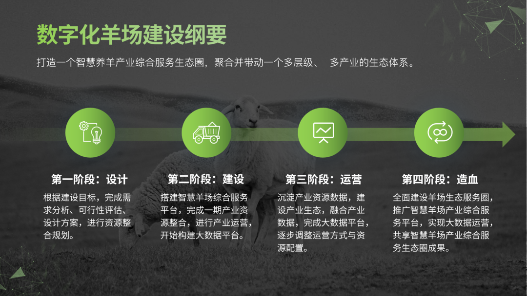
It feels a bit dark, but if you don’t add a mask, the text can’t be seen clearly.
We changed to a top and bottom split screen, and the effect is also good.
If the text can be integrated into the picture, will the effect be better? At this time, the ability to find and process pictures will be tested.

Let's cut out the sheep field below first, and put text on it to get such an effect.
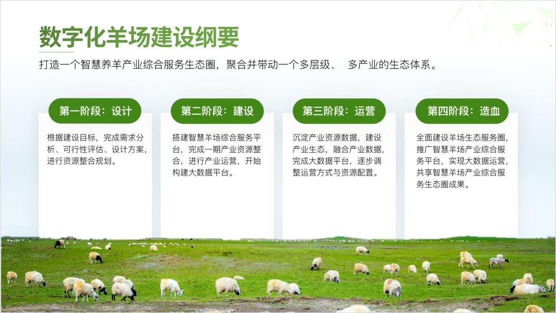
Finally, we made one more, let’s take a look at the effect.
This is wraparound.
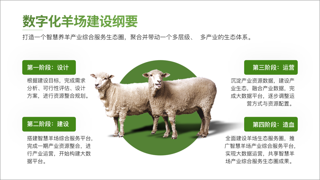
This is really not difficult, I think everyone can learn it.
In fact, PPT is really not that difficult, as long as you master the correct typesetting methods and skills, you can do well.
So hurry up and learn.
If you also want to make a good-looking PPT, you can learn from Brother Li. There are a total of 40 video lessons in the column , very systematic and of super high quality.
There is also a question-and-answer community, and 5G PPT materials are also given away
Articles are uploaded by users and are for non-commercial browsing only. Posted by: Lomu, please indicate the source: https://www.daogebangong.com/en/articles/detail/PPT%20has%20too%20many%20texts%20how%20to%20make%20it%20look%20good.html

 支付宝扫一扫
评论列表(196条)
测试