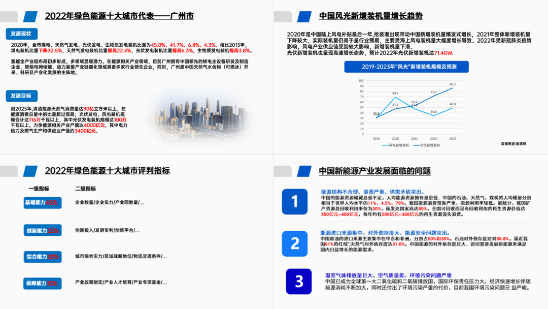
If you often need to typeset a bunch of data in PPT, like the following:
Then today's article I suggest youReverse! complex! Watch! look!
As long as you can understand the followingThe idea of data typesetting, in the future, when you see the data, you will no longer only mark it in red!
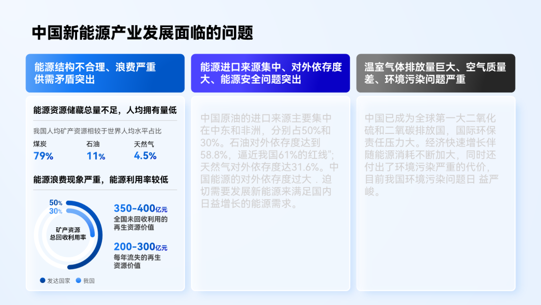
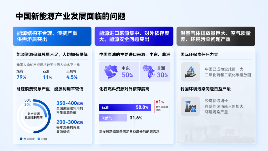
▎Three-paragraph content page

In the face of such a situation with a lot of text, what I thought of at the first time If the text is too long, it is easy to read the visual fatigue.
So my first step is to shorten the length of the text to get the following layout:< /span>
Next, to solve the problem of too much text, we have to help readers The information is sorted out.
Specifically, it is "Let long texts become short sentences".
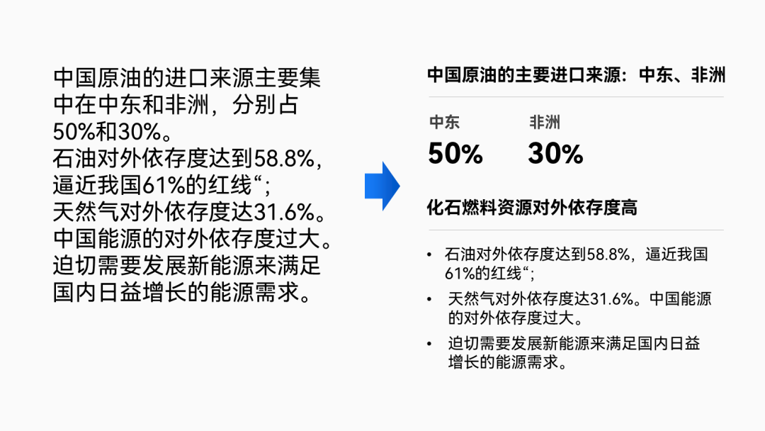
For example, read the first paragraph carefully, and you can extract the following points from it :
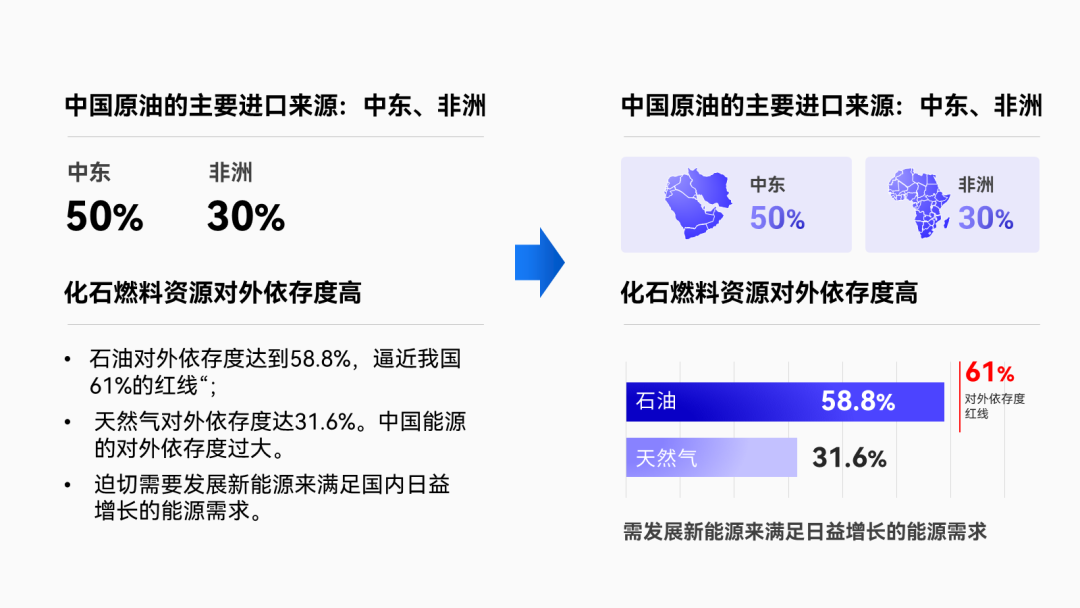
After extracting these key points, we'd better do some research on the data Some graphical processing.
For exampleEnlarge and color the key numbers, or use Suitable chart instead of boring numbers:
Put the first graphically edited copy back into the manuscript and you You can get the following effect:
Compared with the original large paragraph of text, is it now focused and more beautiful up?
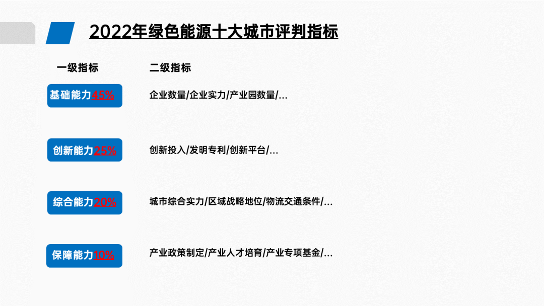
Look at the second paragraph of copy again, and sort out the key points first:
Do graphic processing on key data(add icons, change to charts, etc.):
Similarly, refine the key points for the third paragraph and add a Icon decoration:
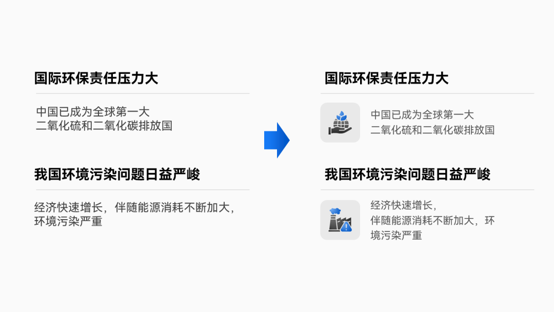
Finally, we can modify the PPT that was originally full of text as follows Effect:
From the above cases, you can easily conclude the following points: Key data can be extracted Come out, typeset separately, or present it with a diagram.
In the following few cases, you will find that I will always use the above Skill.
▎Two content pages
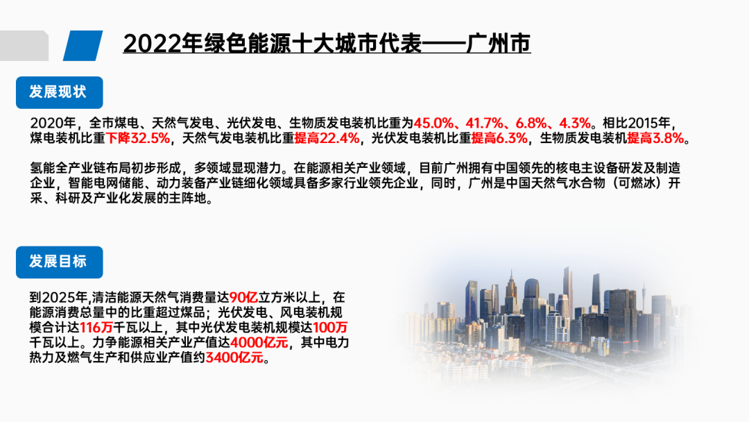
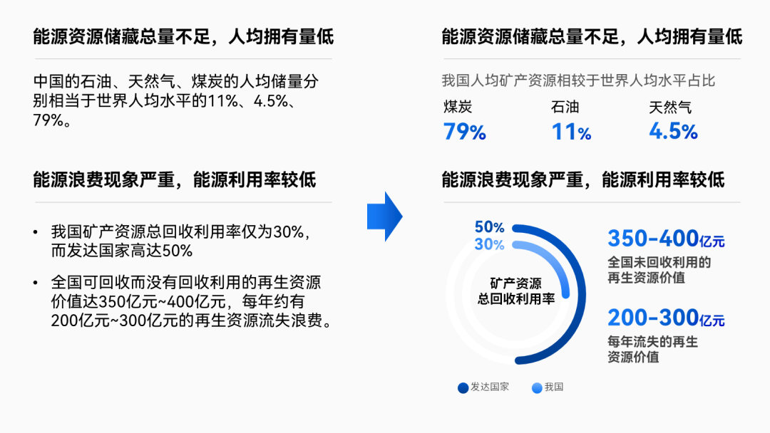
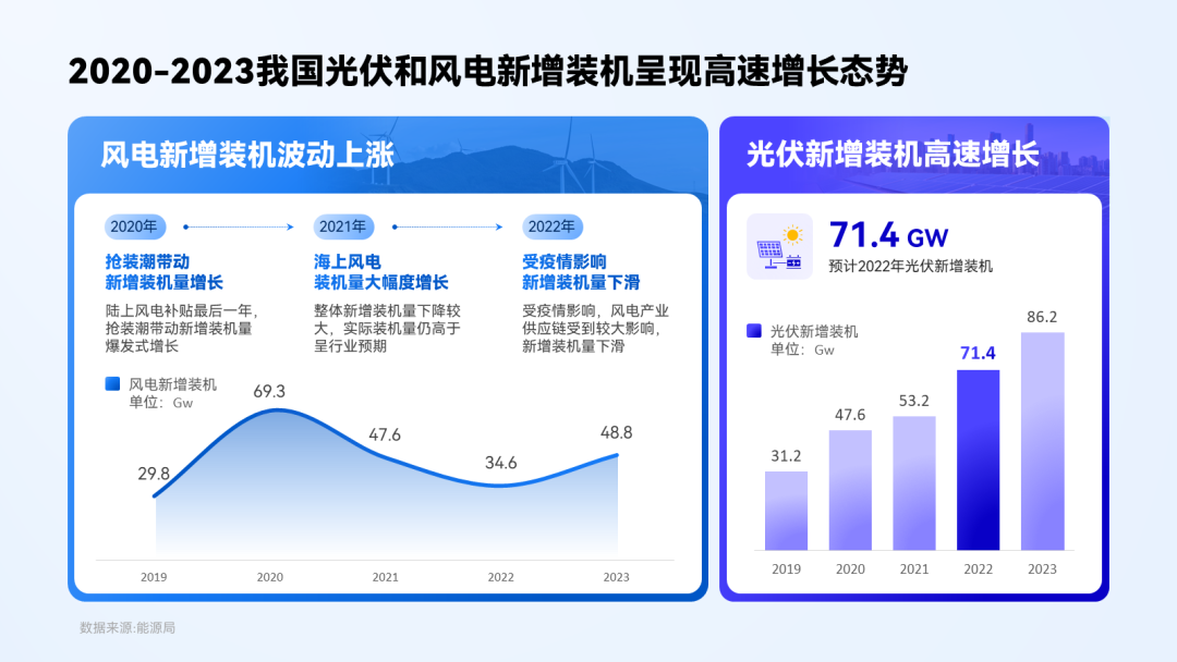
Read the first paragraph of copy, you will find that it contains a set of Data and a set of content:
Look at the data part first:
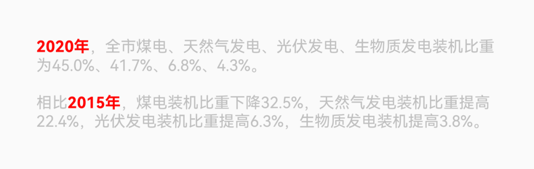
It is not difficult to see that it is mainly in Compare each Data change in different years :
For such contrasting content, use table is actually the best way to present:
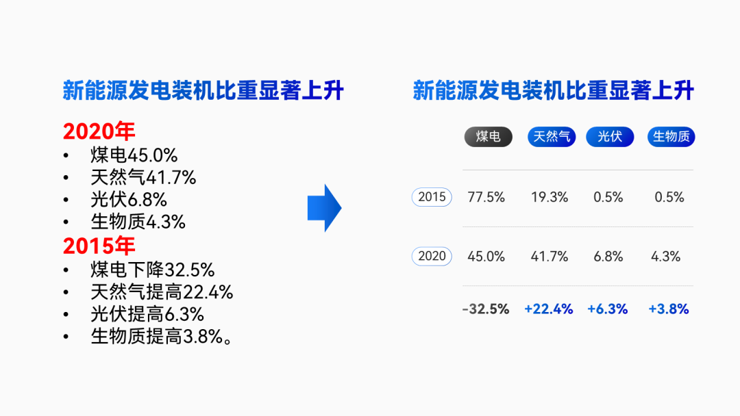
▲Pay attention to extract subtitles for copywriting
Compared with the original pile of data, the table looks much clearer, right?
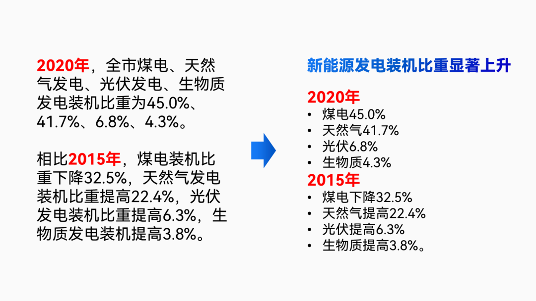
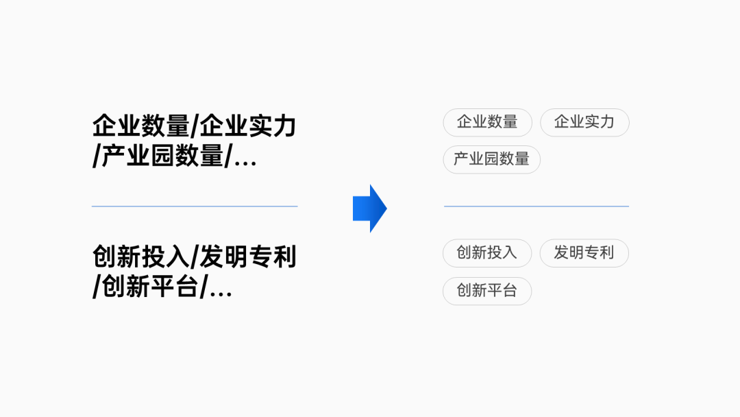
As for another set of plain text content, we can actually use In the form of refining the main points, two paragraphs of content are obtained:

Do some graphic processing on the text, such as using rounded rectangles for each key point Load it up:
Finally, we put the processed content together, compared to the original Large paragraphs of text, the focus is now more prominent and more beautiful:
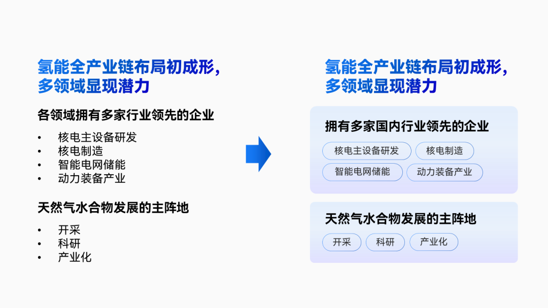
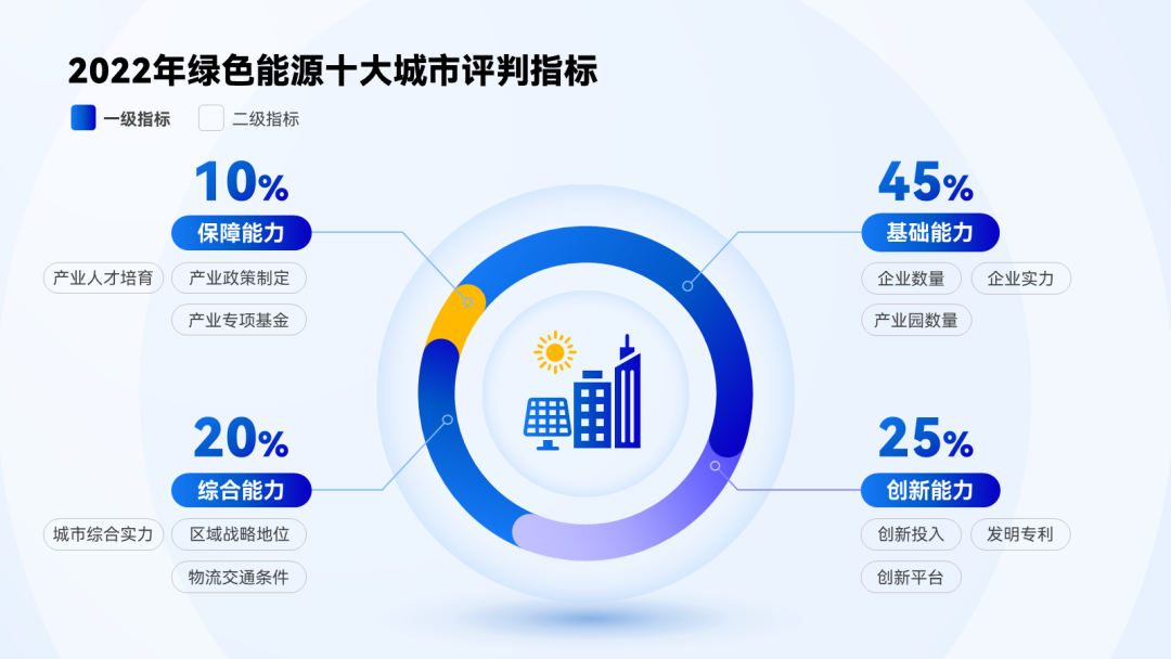
Then look at the second paragraph:
You will find that some data have a relationship between inclusion and inclusion, like At this time, we can actually with the help of lines to visualize the scattered data Integration:

▲Pay attention to the details of font color and font size
Through such a combing, multiple data that were originally scattered are arranged by us into three combinations:
Finally, we will use the "card type" layout to place all the processed content Putting it all together:
In order to make the boundary between two paragraphs clearer, we can also go to Add two color blocks at the bottom of the "card" to separate the upper and lower paragraphs:
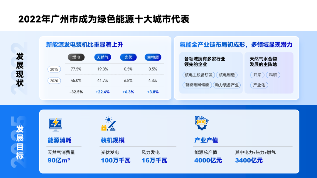
If you like a simple style, you can also choose to only fill the title module with color:< /span>

▎Graph layout page< /span>
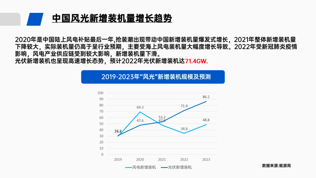
This combination chart has an obvious problem, that is, some data are relatively close , causing the data labels to overlap each other, making it difficult to see the data:
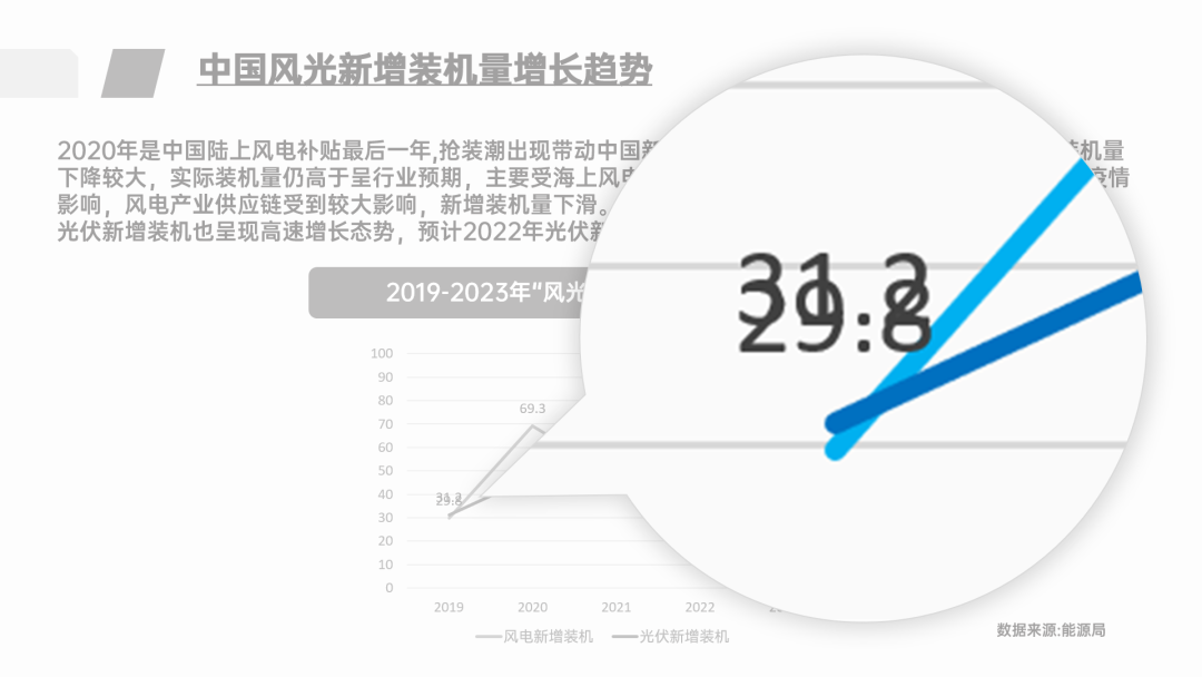
At times like this, If it is not necessary to compare these two sets of data, then we can make the two charts Separate typesetting
so that there will be no overlapping numbers:
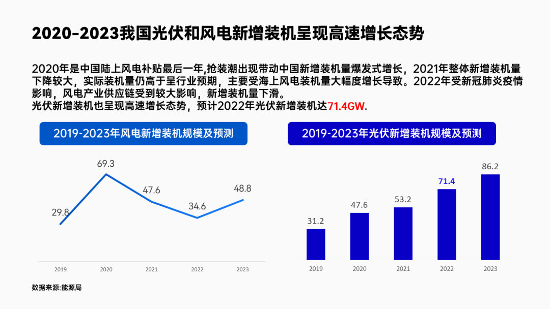
▲ is divided into line chart and histogram
Next, the two paragraphs in the manuscript correspond to the two chart, so we can put text into a chart:
Make a graphical processing, for example, the time relationship is made into a time axis:
The key data is extracted and typeset separately, and an icon is added for decoration:
Finally, load both charts with two shapes :
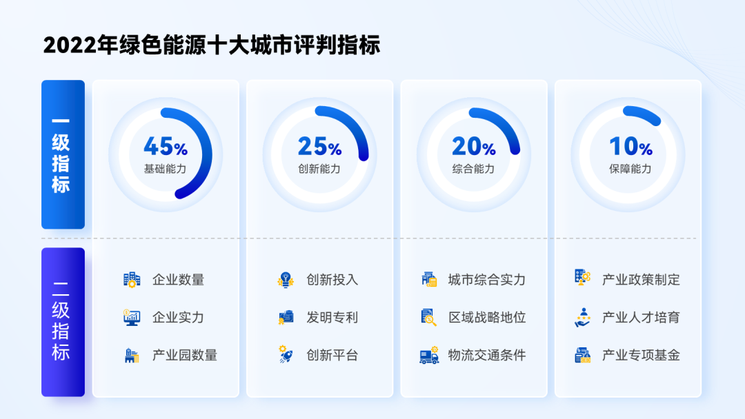
▎Four paragraphs of content page
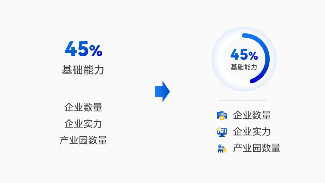
Percentage data in this page PPT, if you need to emphasizedata integrity, then we can use a complete pie chart to present the data:

▲ Pay attention to zoom in on key data
Next, do some Graphic processing:
Add some decoration around the pie chart and see the final effect:
If there is no need to emphasize the integrity of the data, we can also do it like the original , first format each group of data by group:
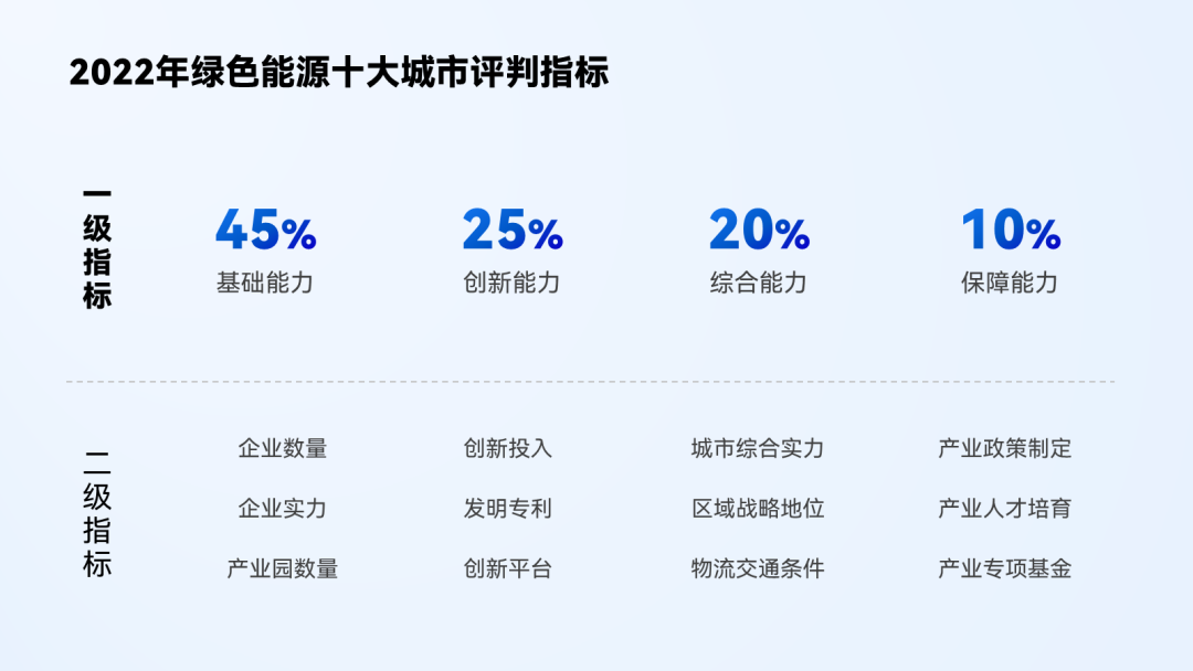
In terms of data, we can continue to present it in the form of a pie chart, each key point It can also be decorated with icons:
Look at the effect after graphical processing of data and text:< /span>

Finally, continue to use the card layout, put Correspondence between the content of each paragraph
Clear presentation, done:

In summary, be sure to use the right typography for your layout based on what you want to emphasize .
This requires you to accumulate more different design layouts, such as more Look at the cases in the official account, you can never go wrong.
▎Summary
Now let's take a look at the overall effect of the modified PPT:


From the modification of the above case, it is not difficult for us to summarize the following data typesetting skills :
- Don't let a bunch of data squeeze together, try to group;
- When the data can be converted into a chart, resolutely convert it;
- When the chart is too complex, try to divide it into multiple charts;
OK, that’s all for this issue, see you next time~
Articles are uploaded by users and are for non-commercial browsing only. Posted by: Lomu, please indicate the source: https://www.daogebangong.com/en/articles/detail/PPT%20full%20of%20data%20dont%20just%20mark%20it%20red%20anymore.html
 支付宝扫一扫
评论列表(196条)
测试