 Job Yoyo (ID: gh_b446c26b24f8)
Uncle Ha (released for record)

"If you don't do well in PPT, you will lose your job"
Director Liu from Baidu told us that if the PPT is not done well, you may lose your job.
Although not everyone has the opportunity to make large-scale speeches, everyone who is in the workplace will have a few turns.
Let’s talk about the little thing of doing PPT today.
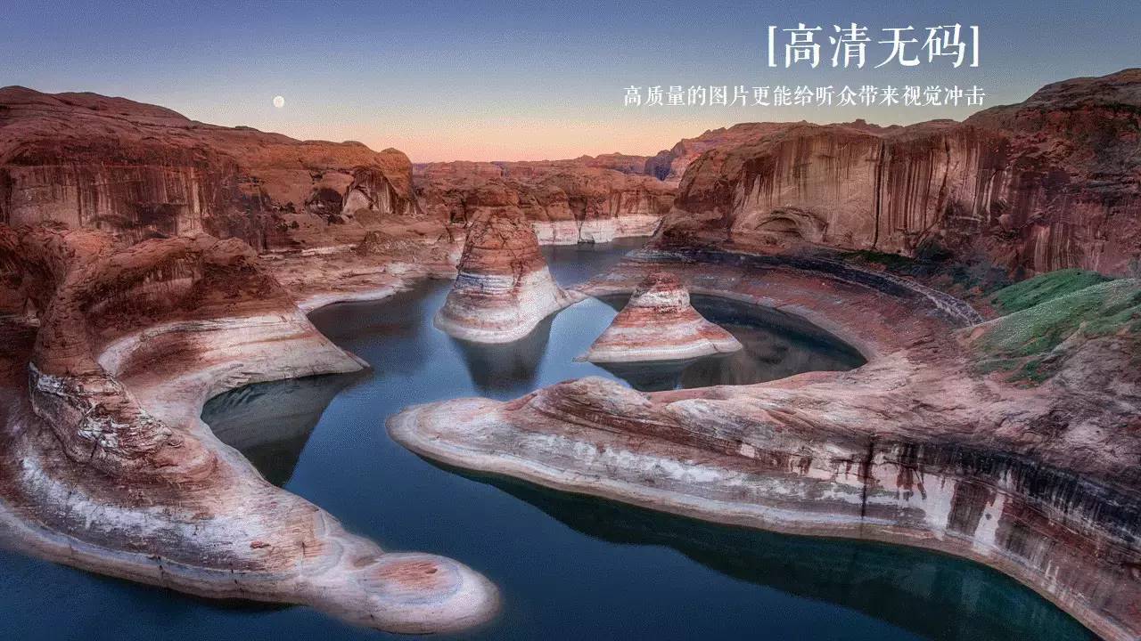
(Tip: Click on the animation icon, the picture quality will be significantly higher)
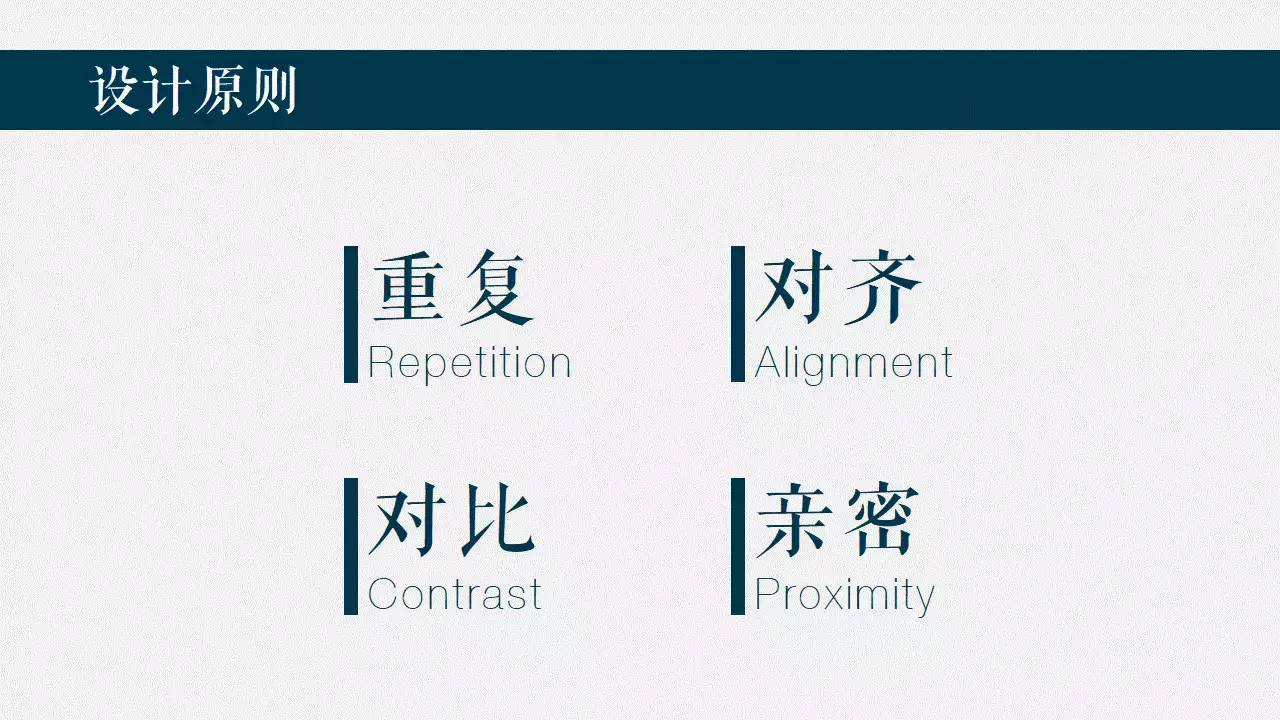
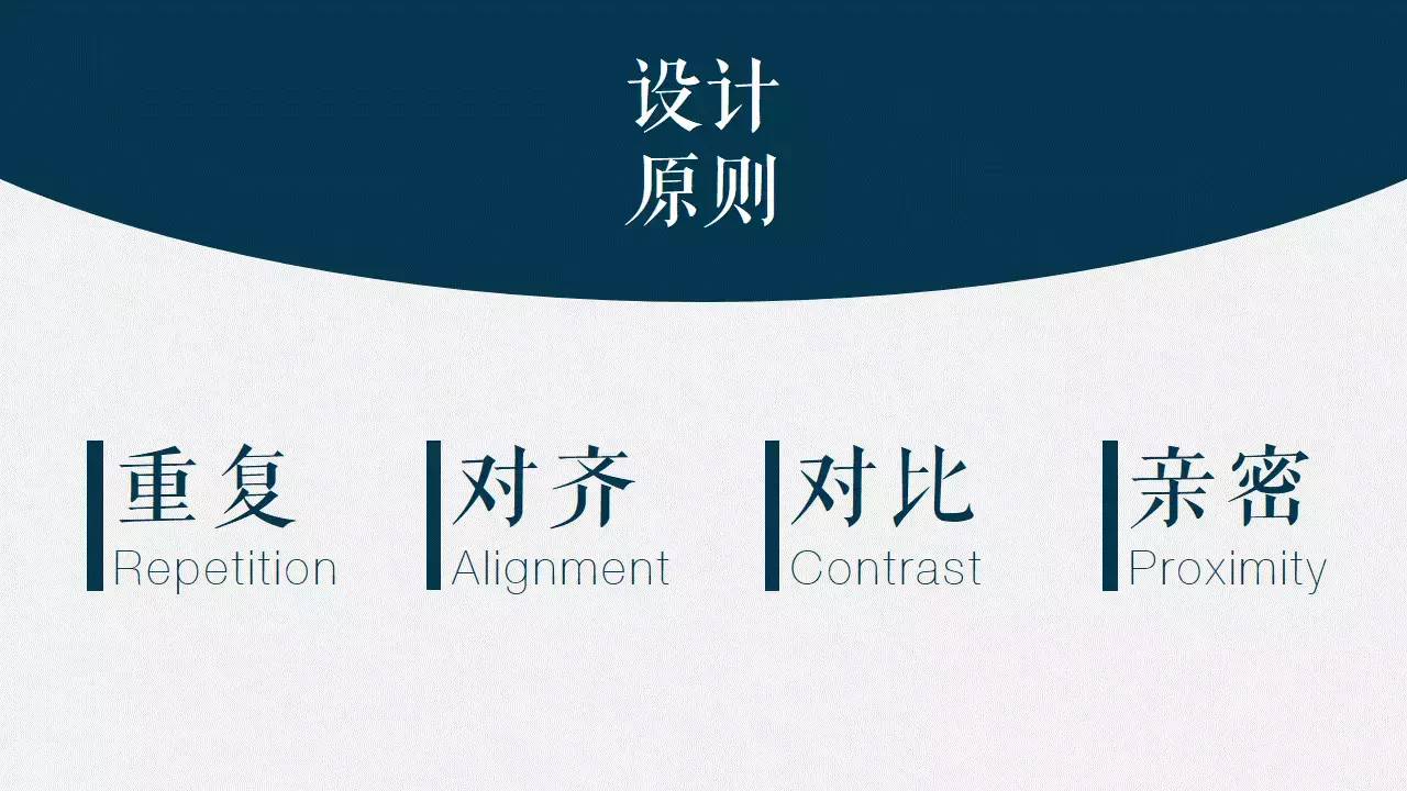
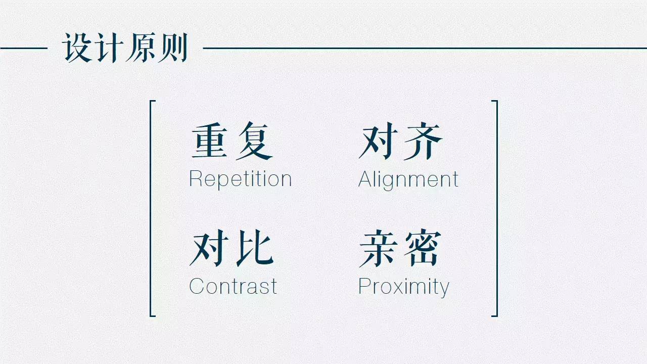
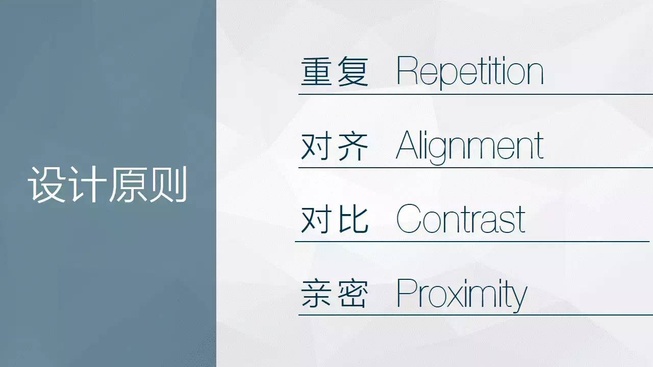
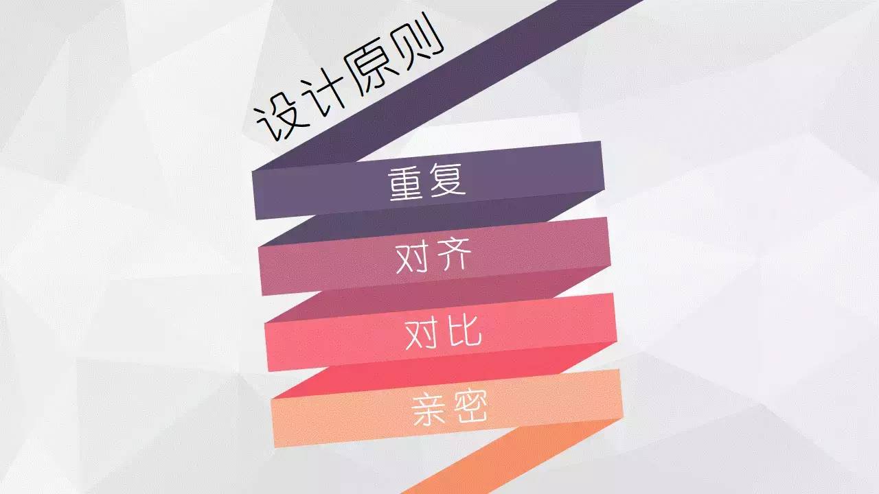
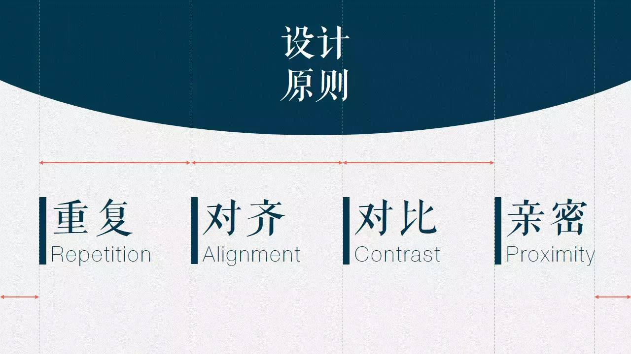
Design Principles
 No matter how innovative PPT is, it is inseparable from the most basic design principles:Repetition, alignment, contrast, intimacy .
These four principles come from the popular science book "Design Book for Everyone" written by American designer Robin Williams, but the Chinese version of People's Post and Telecommunications is of average quality, so I don't recommend you to buy it.
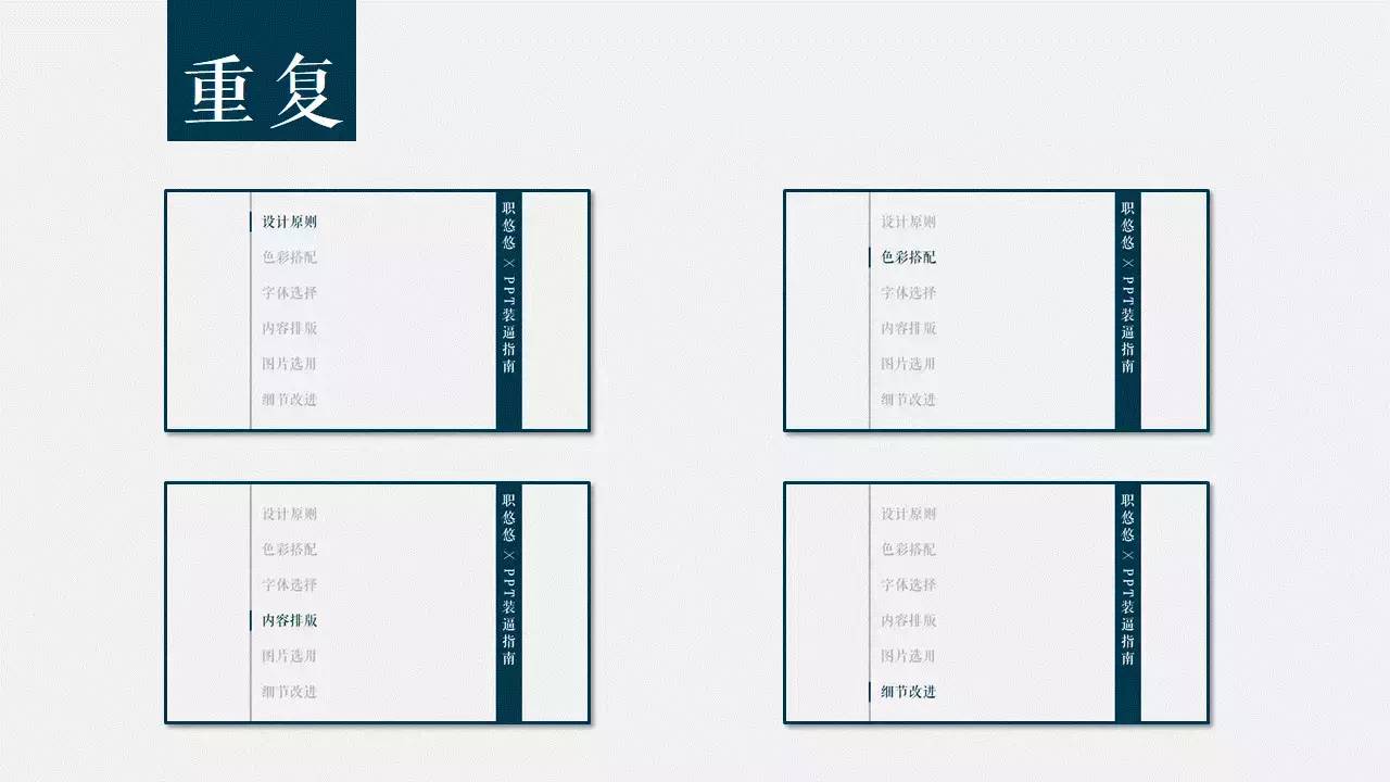
 Repetition means that in the entire PPT, you canrepeatthe same color, shape, font, etc. Design elements to increase the overall order and unity.
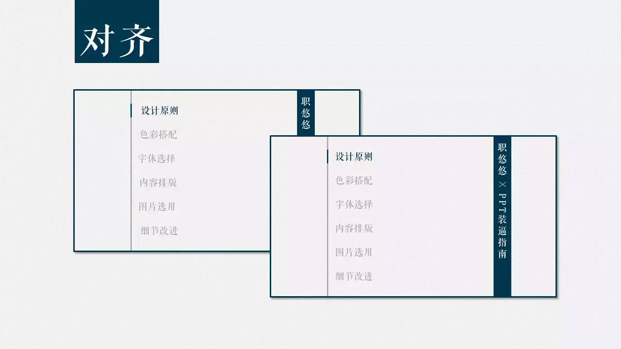
 How can misaligned PPT survive in the world.
Alignment means that all elements on the page should have some kind of visual connection, rather than placed randomly.
This creates a clearer and more aesthetically pleasing visual.
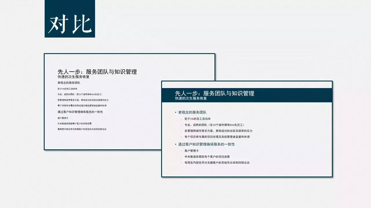
 Contrast means that the elements on the page should not be too similar, so that the audience can quickly discover the logical relationship between the content of the page and Find what you are interested in.
Intimacy means combiningsimilar elements together to form a visual unit.
This reduces clutter and provides a clear logical structure to the viewer.
At the same timeSeparate irrelevant content, so that the audience can quickly filter information.
Of course, the most important thing to do in PPT is innovation!
You can.
This way.
This way.
And so on.
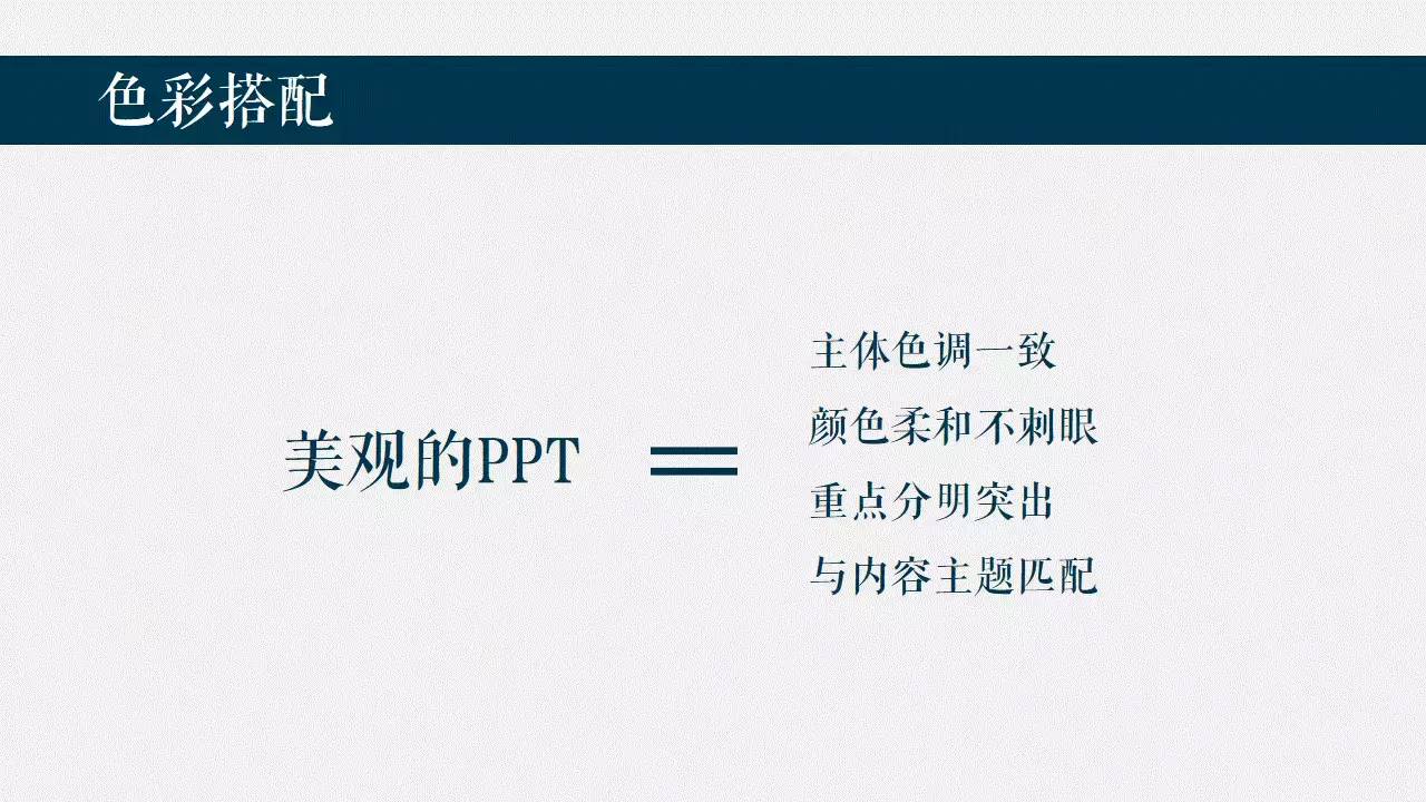
Color Match
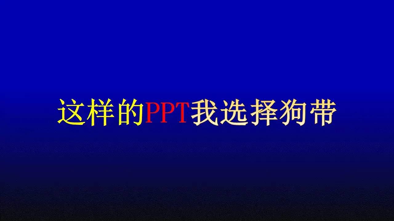
Meet thisPPT, I choose the dog leash.
Although I don't know why, it is popular in all major college classrooms.
A beautifulPPT should be selectedSoft and not dazzling colors< /span>As the main color of the same chapter or even the entire PPT.
At the same time, the color matching shouldhave a certain contrast to distinguish and identify.
In addition,The color should match the theme of the content, such as yourPPTThe content is about the food delivery platform of Ele.me, but it uses Baidu Waimai Red and Meituan Waimai Huang...
Do you think this is appropriate?
Is it right for you to ask?
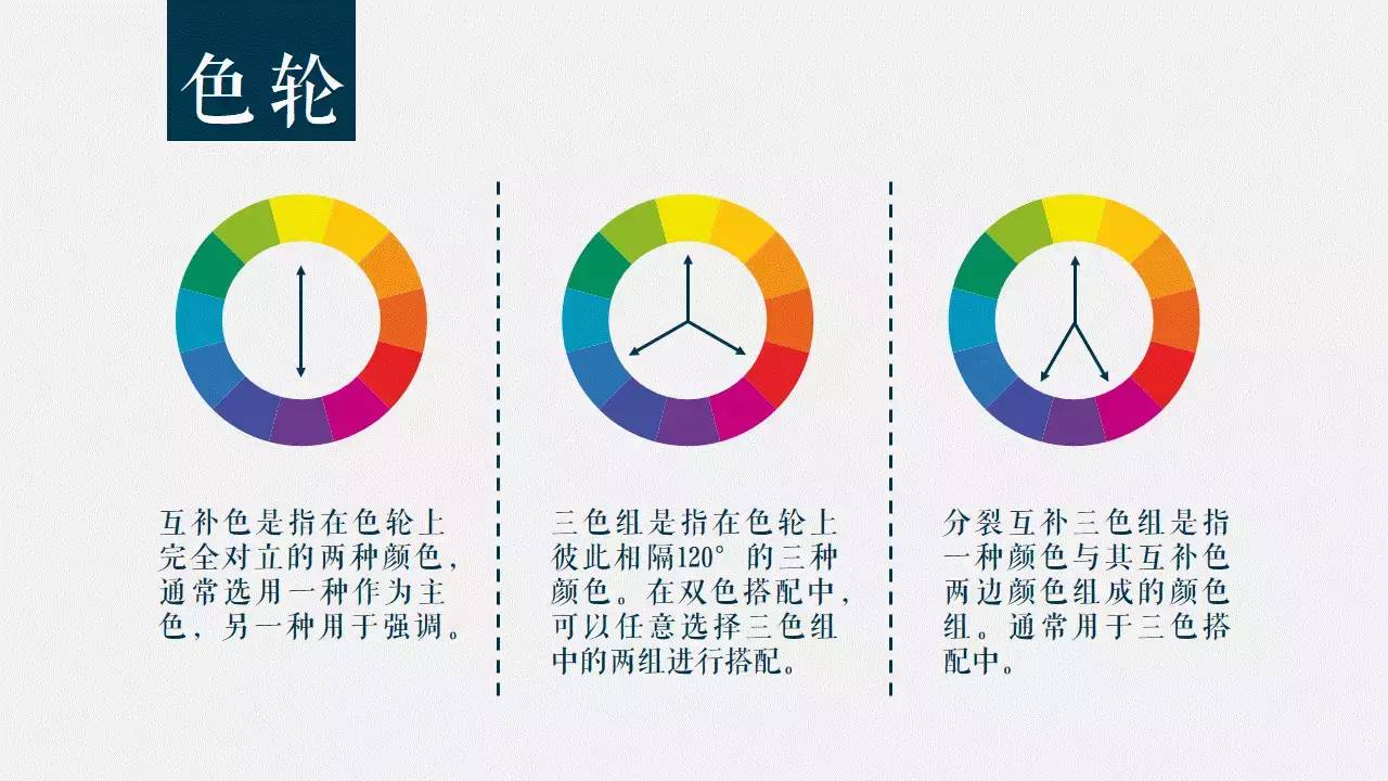
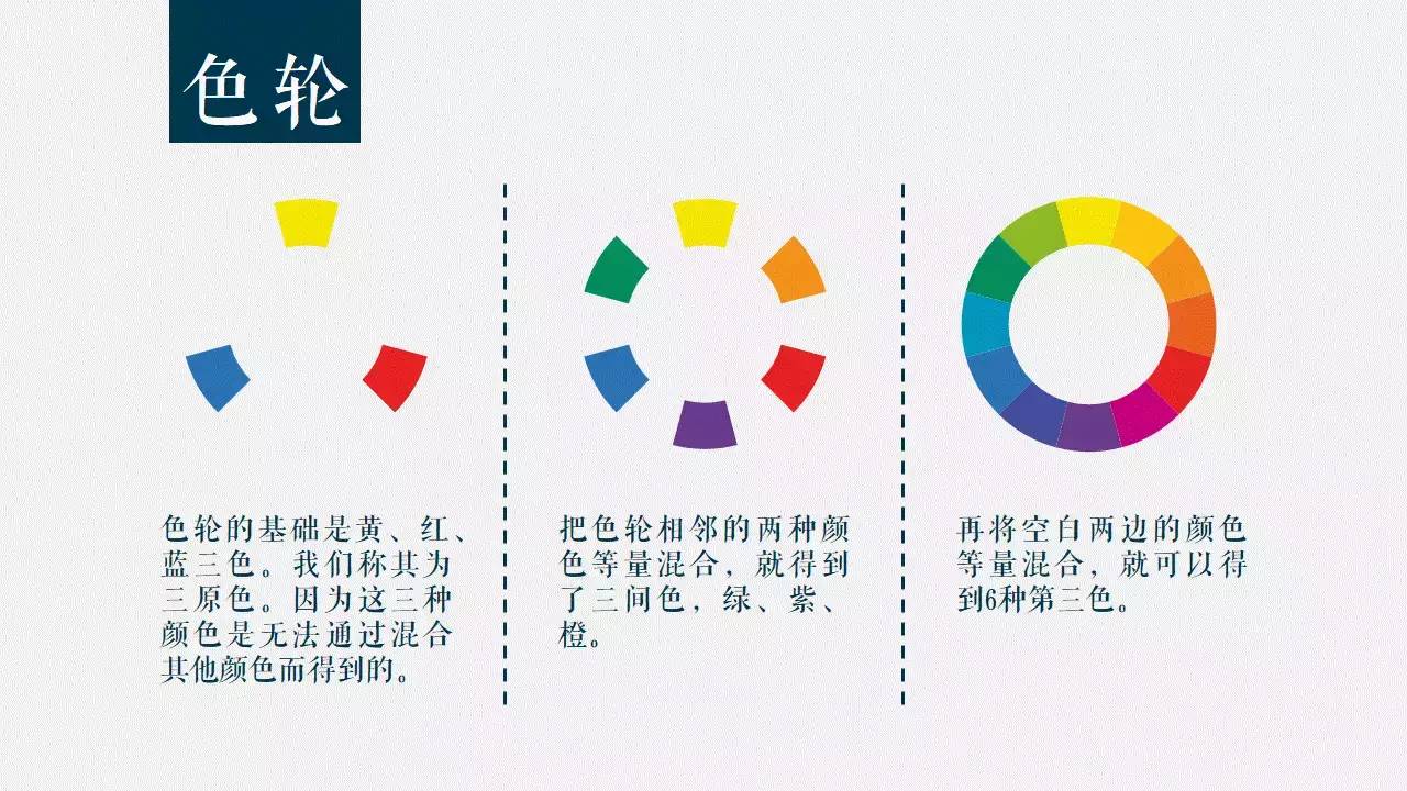
When it comes to color matching, it is inseparable from the color wheel theory.
The basis of the color wheel is yellow, red, and blue, which we call primary colors.
Because these three colors cannot be obtained by mixing other colors.
By mixing equal amounts of two adjacent colors on the color wheel, we get three secondary colors, green, purple, orange .
Then mix the colors on both sides of the remaining blank spaces in equal amounts to get 6 tertiary colors.
With a color wheel, how do we use it?
Simply put, use complementary colors for emphasis, three-color groups for two-color combinations, and split complementary three-color groups for three-color combinations.
Complementary colors are two colors that are completely opposite on the color wheel There are two colors, usually choose one as the main color and the other as an accent.
Triple color group means that the color wheel is 120° apart from each other The three colors of the three colors, in the two-color matching, you can choose two groups of the three-color group for matching.
Split Complementary Triad refers to a color group consisting of one color and its complementary colors , usually used in three-color collocation.
The theoretical knowledge is supplemented.
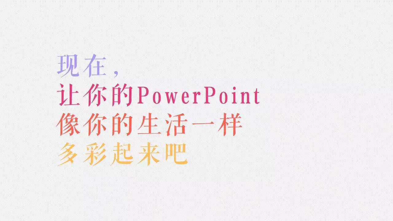
Remember to try more colors next time to make your PPT as colorful as your life.

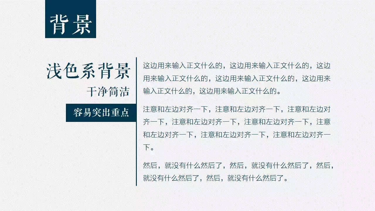
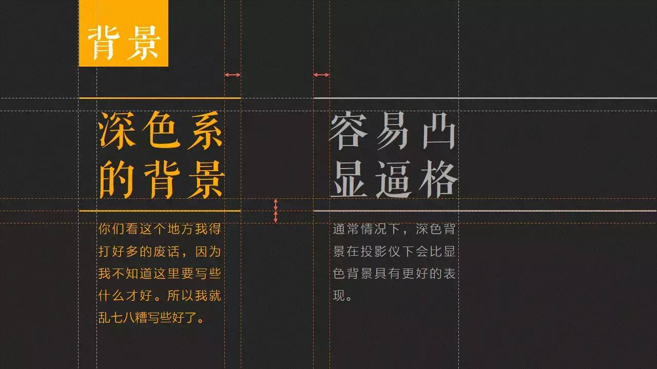
In addition to the theme color of PPT, the background color is also very important.
Light-color background, the overall look is very clean and simple, easy to emphasize.
Dark backgroundHigher style, and subject to the performance of the projector, usually dark background< span>Better performance when projectedthan a light background .
In addition, when making PPT, you also need to pay attention to the chromatic aberration problem of the projector.
When projected, the colors in PPT are usually not as vivid as they appear on the display.
For example, the yellow that Uncle Ha chose in this PPT may turn into a shit color when projected.
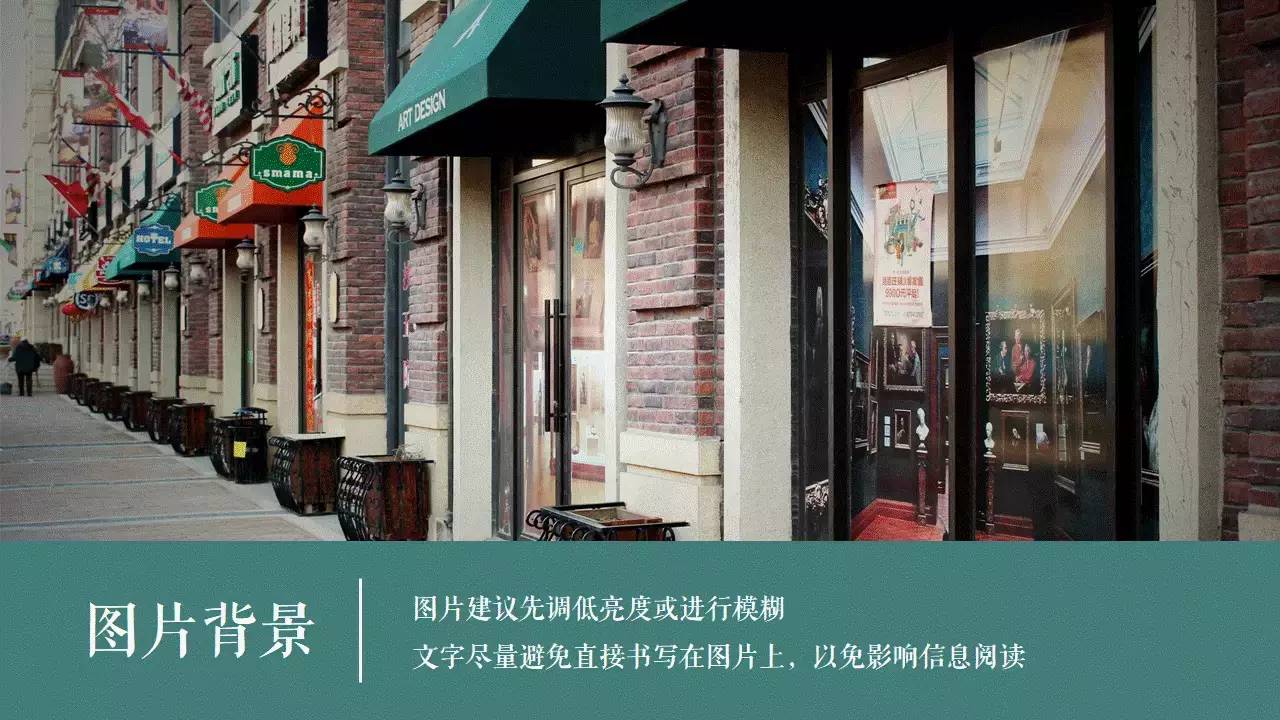
When choosing an image as the background, it is recommended to lower the brightness or blur the image first, so as not to steal the limelight from the content.
At the same time, try to avoid writing the text directly on the picture, so as not to affect the reading of the information.
In addition, you can use the color picker function to makeunify the color of the entire PPT.
Font Selection

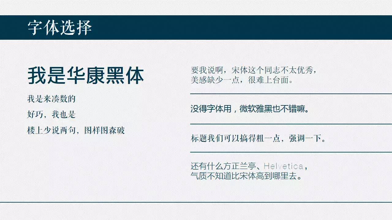
A good font can quickly improve the style of PPT. If there is no font to use, using Microsoft Yahei is definitely better than Song Ti.
Generally speakingSans-serif fonts (without strokes, such as Yahei and Heibody) are more < span>Flat, Bright, and span>serif fonts (with strokes, such as the font used in "font selection") are more conservative and quaint Some.
In addition, if the PPT uses fonts purchased and downloaded by yourself, you must embed the fonts, otherwise, if you switch to a computer that does not have this font, the font in PPT will be replaced with Song.
Content layout
PPTNeed toBoldly leave blank space Of course, blank space does not mean not to design, It's about making people feel more comfortable while looking like there's very little content.
At the same time, blank space can force you to streamlinePPT page content.
You know,PPT is not for you to read to you while giving a speech.
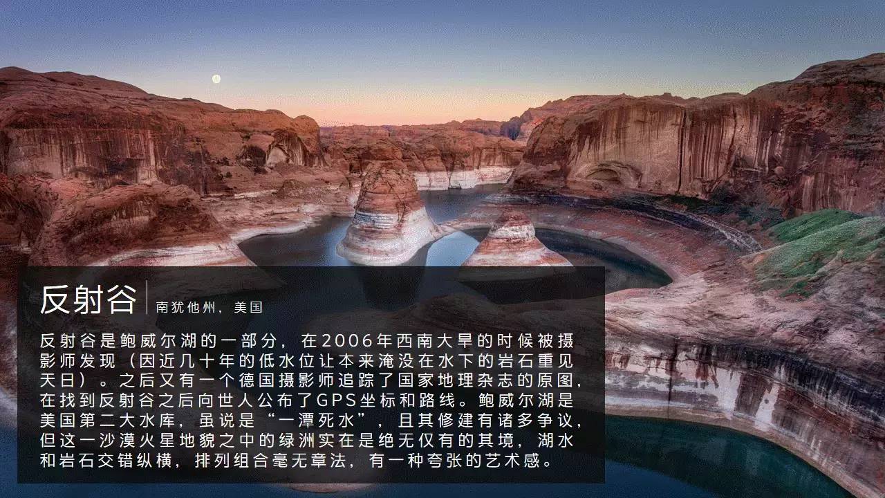
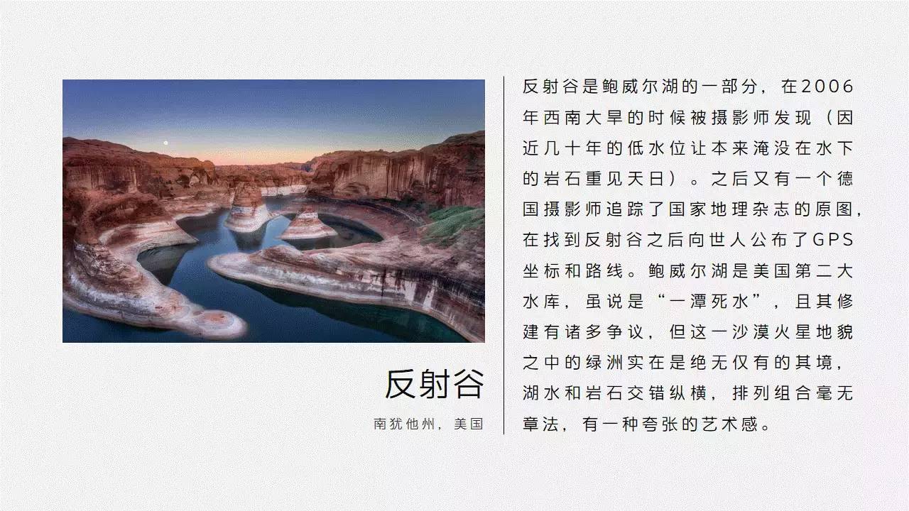
The most basic mix of pictures and texts, of course, pictures are pictures and texts are texts, but don’t you always feel that there is less impact?
If the picture is used as the background of the entire PPT, the effect of writing text on the translucent color block will be different immediately, is there any?
A final emphasis on alignment and spacing.
The gray line segment is the marked alignment guide, and the orange line segment is the marked spacing guide.
uniform spacing, alignment of elements, can instantly enhance the advanced sense of PPT.
Of course, it is not for you to manually align foolishly, you must make good use of PowerPoint's arrangement function.
For example, Center alignment not only allows a single element to be in the middle of the page, but also allows several elements to be automatically aligned on the same horizontal line (vertical line ) on.
And horizontal distribution/vertical distribution allows several elements equal spacing in the horizontal/vertical Arrange on top.
In addition, in addition to the left-right (up-down) symmetrical PPT, in addition to paying attention to the spacing between elements,Pay attention to the margins between elements and pages.
Image Selection
The picture must be high-definition and uncensored.
The picture must be high-definition and uncensored.
The picture must be high-definition and uncensored.
There are a lot of pictures in the PPT, and the logo of Nitu.com is hung on the bottom right, so I ask you whether it is embarrassing to look at.
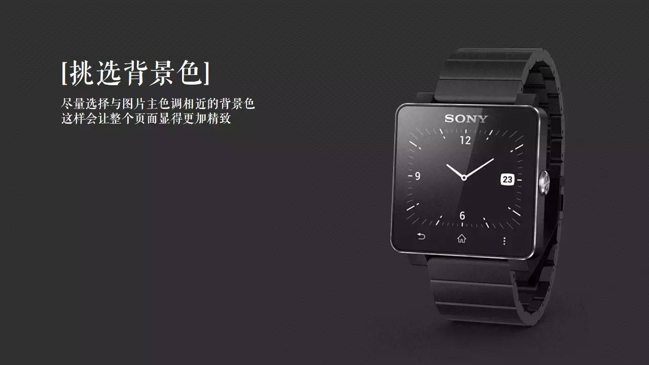
At the same time, you can also try to select the corresponding background color according to the main color of the picture.
The main color can be picked by PowerPoint's Color Picker.
In addition, PPT before version 13 does not have the color picker function.
Is the sense of force and refinement higher?
Similar to pictures of people, products, etc., you can use the delete background function of PPT to delete the background (after version 10), and then only Put the picture theme into the PPT.
Yes, you heard it right, PPT has its own cutout function.
Are you getting taller again?
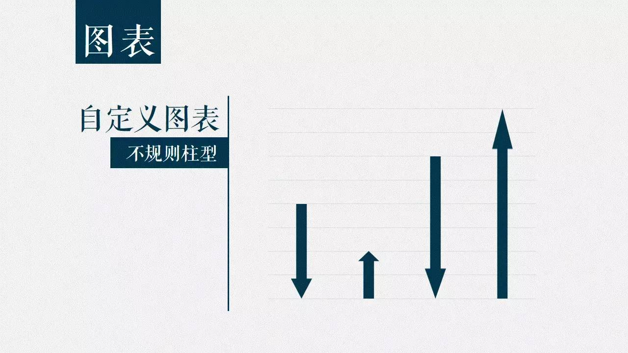
Detailed improvements
makes the histogram into an irregular column.
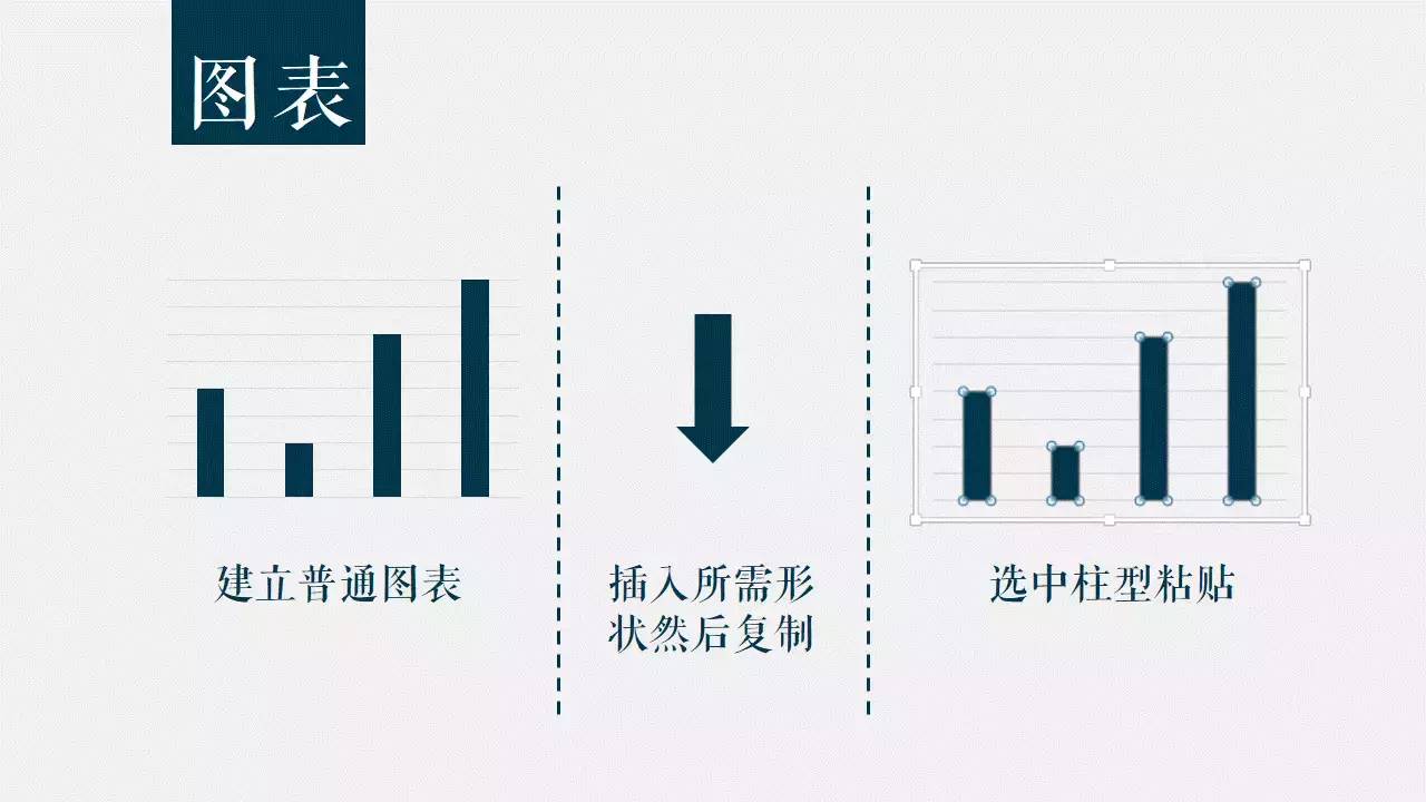
Creates a normal chart.
Insert the desired shape and copy it.
Check Cylinder Paste.
Done.
Yes, it's that simple.
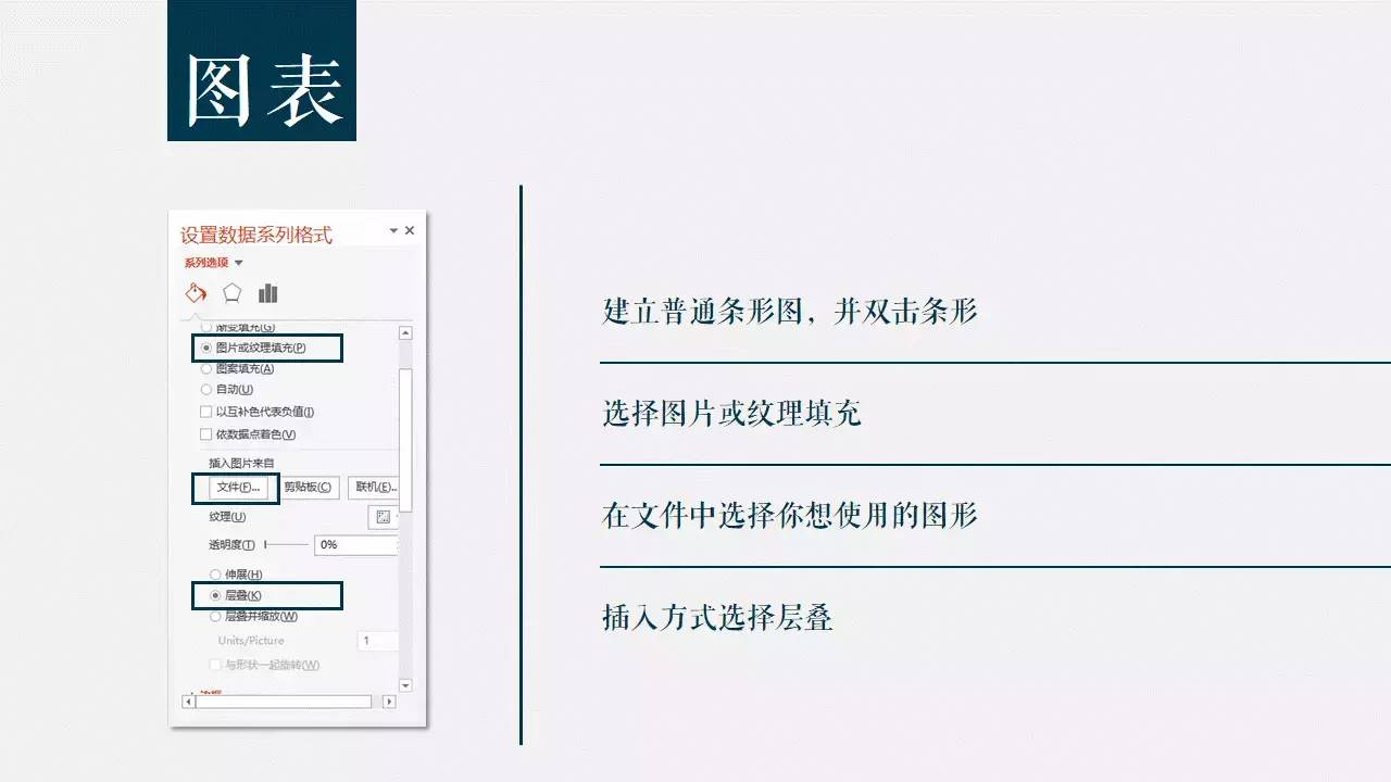
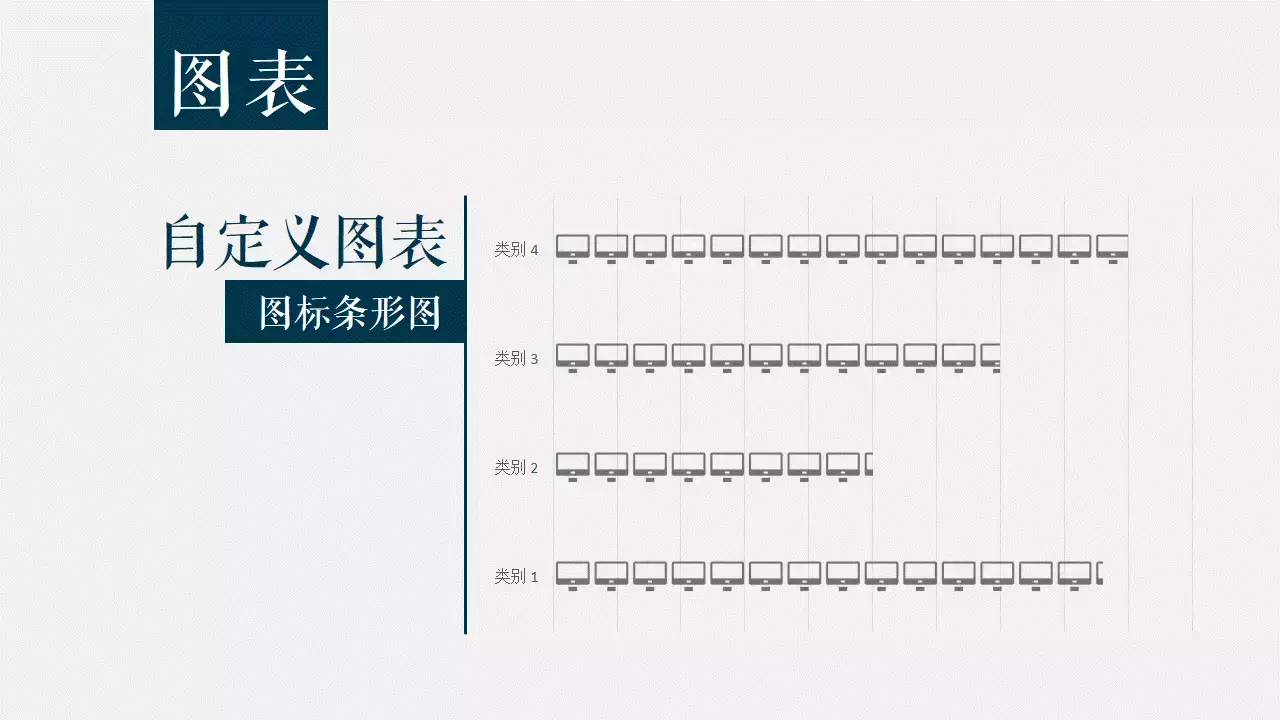
Use personalized icons instead of bars.
After creating a normal chart, and double-click the column, a menu will pop up on the right.
In the Fill options, select Image or Texture fill, and choose the icon you want to use.
Finally, Choose Cascading for the insertion method, otherwise, you will see that your icon is stretched and distorted into the icon.
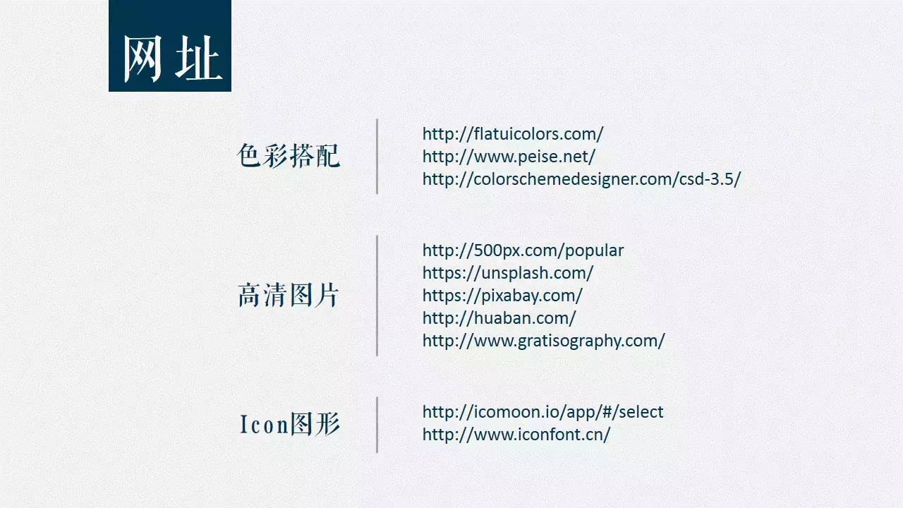
Finally, there are some commonly used websites, friends who need them can pick them up by themselves.

Thank You.
Every night at 10:00, don't miss your appointment!
-To make a better logo, find a LOGO master! -
WeChat: logodashi100/QQ:1198617798
[Part of the case links: Hirun, >Sanlishi, > Le Island, three peppers, and wood,Nolanka ,Lu Zhisheng, Lanyu Jingshe,Shu Chong, Panda Rabbit,Erhai Minor>,More works reply to "case"]
Articles are uploaded by users and are for non-commercial browsing only. Posted by: Lomu, please indicate the source: https://www.daogebangong.com/en/articles/detail/PPT%20design%20loading%20guide%20with%20tutorial.html
 支付宝扫一扫
评论列表(196条)
测试