The cover is the key to whether a PPT can catch people's attention and express the theme.
The opportunity to write this article is that a few weeks ago, a friend was going to make a PPT of Baidu Maps user experience report. She made the cover of the first version and wanted me to give some opinions. Let's use its cover as a case to briefly explain.
Her original cover looks like this:

This friend of mine has a lot of experience in doing PPT, and as far as the above PPT is concerned, it is already above the average level.
Let me talk about the merits of this cover first
① The theme is clearly expressed
At a glance, the message that the cover wants to convey is very clear, it is about the user experience report of Baidu Maps, and it will not make people think of it as anything else.
The reason is that the selection of pictures is very suitable for the theme, and a logo of Baidu Map APP is selected as decoration and pictures related to map elements are used as background.
② The typesetting is reasonable
This is a full graphic PPT. First fill the page with a whole picture as the background, and then insert a rectangle that fills the page (fill it with white, set the transparency to about 40%, and set the border to no outline).
The purpose of this is to weaken the messy lines and colors of the background image, better display the content of the text, and not completely lose the content conveyed by the image. Contrast and balance are used.
Simple text centered typesetting, the left LOGO is aligned with the top and bottom lines of the text. Embodies the beauty of symmetry.
The text adopts the format of main and subtitles, the font size of the main title is increased, and the font size of the subtitle is smaller. The short line in the middle acts as a visual division and weakens the heavy feeling of the text.
The font adopts the basic and versatile Microsoft Yahei, which reduces the chance of error.
But isn't there something missing?
The big problem is that it's not beautiful, not attractive enough, just average.
She ignored three points when making this PPT:
① The impact of text
Although Microsoft Yahei is versatile (many people have found out that Microsoft Yahei can be used in many occasions), but it is more suitable as a font for text, especially as an auxiliary font. At this time, another more impactful font is needed as a font. The main font is used in titles etc.
The cover requires appeal, so using Microsoft Yahei alone is not so bright.
A more rhyming font could be used.
② The abstraction of the picture
The picture on the original cover is too realistic, and the idea is not broad enough. I am limited to making a map-related PPT and use the map as the background picture. As a result, the picture selection surface is too narrow.
The lines and colors of the background image are also too messy, which increases the visual burden of the audience, but it is actually not so suitable.
It's better to change your mind.
Maps can be derived into things like roads, directions, globes, etc.
User experience can evolve into different emotions and actions of people.
The theme of the PPT can be derived from the use of mobile APP.
③ Color coordination
Legibility usually means that a PPT has less text and clearer focus.
In fact, highly coordinated colors and simplicity can also reduce the burden on the audience and improve legibility.
The cover has more than 5 LOGO and background colors, which is easy to cause dazzling.
And the color matching is very low, especially the combination of green and red is very sad.
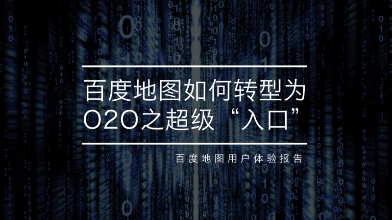
Here is my edited cover:
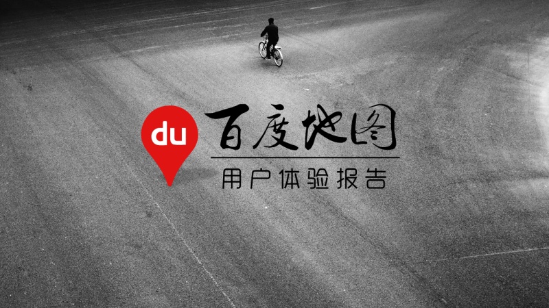
Layout 1
The color of the picture is more generous and elegant, and the background picture uses images of people, roads, and directions. People and directions represent the user's choice, that is, the experience; the parts of the road and the map coincide.
In terms of LOGO, the messy part is removed, and only the core red part is kept (as for how to remove it, you only need to learn AI briefly, and I will make a tutorial when I have time~嘤嘤嘤~). The red color of the LOGO matches the background color very well.
Pay attention to a detail: the LOGO part also adds a shadow to the right perspective, which feels like standing on the road, increasing the layering of the picture. (Click LOGO, select Format-Shape Effect-Shadow-Perspective in the menu toolbar)
The font used for the main title is the simplified 2012 version of Ye Genyou's brush running script, which is serif and stable.
The font used for the subtitle is Yuehei, a sans-serif font, and thin arc lines are used for balance.
(Friends who need fonts can go to the Internet to search, download and install)
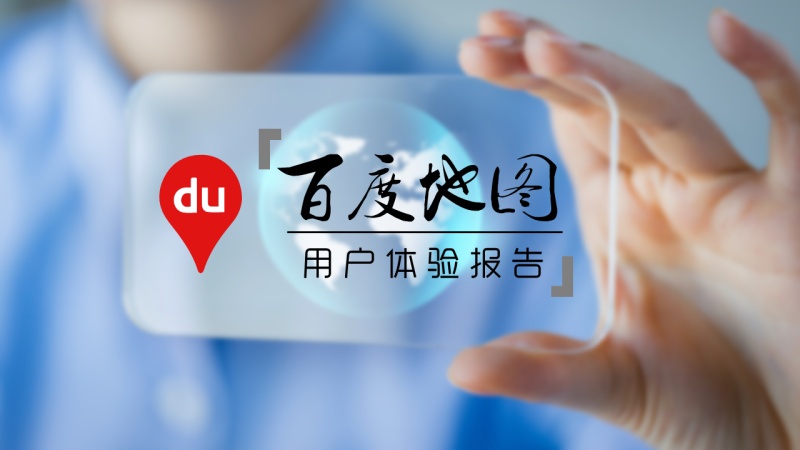
Layout 2
The theme expression of this version is much more specific than that of the first version. A person is holding a transparent mobile phone with a globe in the middle of the mobile phone. Human mobile phones are equivalent to the use of APPs, and the representative research object of the earth is Baidu Maps.
Of course, the color is still based on the principle of simplicity, with a high degree of coordination.
Two additional shape enrichment details were added.
The following is another modification similar to the PPT cover case:
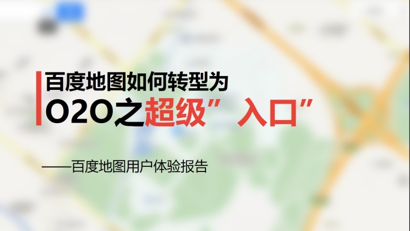
Before modification
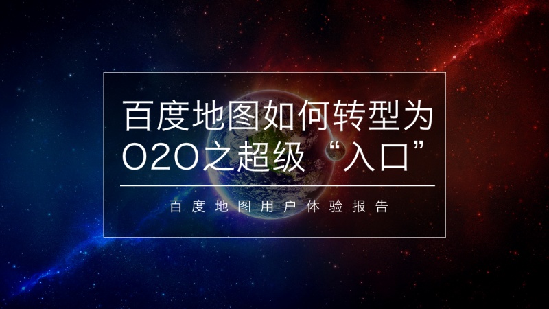
After modification, layout 1
After modification, layout 2
The above is the first PPT experience sharing, I hope it will be helpful to you.
Articles are uploaded by users and are for non-commercial browsing only. Posted by: Lomu, please indicate the source: https://www.daogebangong.com/en/articles/detail/PPT%20cover%20beautification%20tutorial%20.html

 支付宝扫一扫
评论列表(196条)
测试