
hello, everyone, I'm Brother Li~
Some time ago, I opened a new column called Error Correction Notes, which is to find out the PPT problems of some readers of Knowledge Planet and modify them.
Only when we understand our own problems can we solve them.
When PPT Xiaobai is doing PPT, he often makes three mistakes, or three difficulties. I will find out for you.
01
Inconsistency between long and short sentences will not be processed
When doing PPT, we often encounter a situation that several pieces of content are juxtaposed, and the length of the text is inconsistent. When doing typesetting, some content will have several lines, resulting in a lack of regularity in the whole.
Just like the picture below:

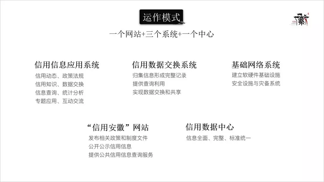
Why does this happen? Because of height inconsistency.
Therefore, the height of the center of gravity of each paragraph of text is different, not on the same horizontal line.
In this case, in order to organize the content, I usually deal with it like this:
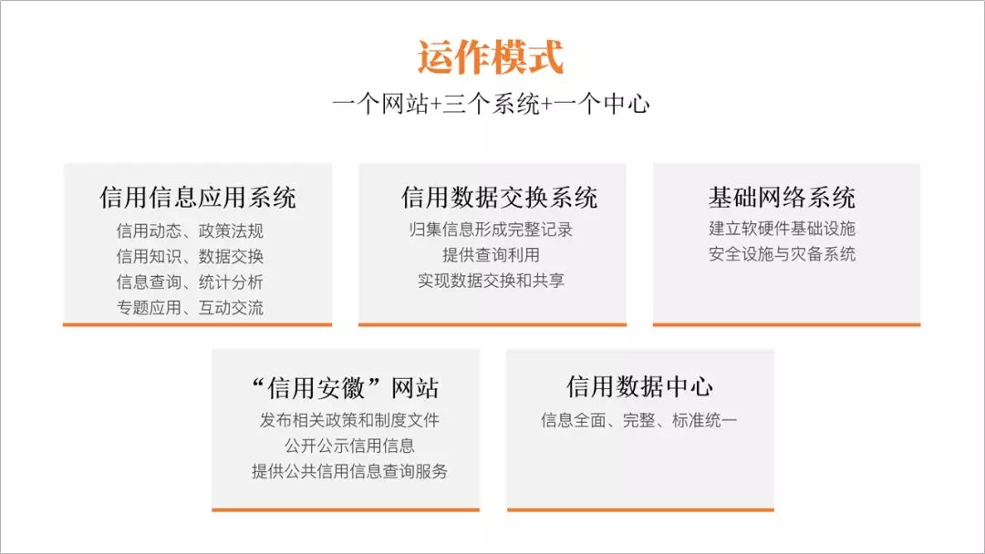
The first step is to add a color block first, and put the content into the color block so that the width is uniform.

However, the inconsistency in height is still very obvious visually, and there are still some shifts in the center of gravity.
In the second step, we uniformly add a line segment at the bottom of the text, preferably with color.
Due to the effect of the line segment, the center of gravity of our entire text returns to the same horizontal line.


In this way, we can solve the problem of the offset of the paragraph's center of gravity.
There is another case, as long as we add color blocks and line segments, the whole looks regular and coordinated.
02
Ignore white space
For a piece of text, if readers want to read it comfortably, there must be white space. The white space here includes line spacing and paragraph spacing. Of course, the margins are most likely to be ignored by everyone.
Blank 1: Line spacing and paragraph spacing
PPT Xiaobai usually uses the default line spacing of 1.0, which makes the text appear crowded and not clear.

The line spacing used by PPT masters is usually 1.3 times, and pay attention to the refinement and overview of the text.


Blank Two: Margins
When PPT Xiaobai is doing PPT, a mistake he often makes is to type against the edge of the page and lack page margins.
The margin on the left side of the image below is too small.

Images can bleed, but text must leave margins.
Before doing PPT, masters always pull out the surrounding reference lines to determine the center and margins of the version.

How wide is the margin for this page? There is no clear statement about this, it just looks comfortable.
Blank three: color block margin
In addition to page margins, when we add color blocks to text, we must also pay attention to the white space in the color blocks, and we must also leave a certain margin.
When Xiaobai adds a text color block, instead of inserting a shape, he directly adds a shading color to the text box.

In this way, the margin in the color block is very small. Under normal circumstances, at least 2 characters of margin should be left in the color block, so that it looks refreshing.

03
Unsteady center of gravity
Generally speaking, for a PPT, our center of gravity should be concentrated in the middle of the layout. But when many PPT noobs are doing PPT, the center of gravity will deviate seriously.
For example, the PPT below.

For the person whose center of gravity is in the middle of the picture, the text on the left is aligned to the left, so the overall center of gravity is biased to the left.
The correct way is to move the center of gravity of the picture to the right, so that the left and right are balanced.

If you use color blocks instead of text or pictures, you can clearly find that the final overall center of gravity is in the middle of the picture.

This is a common left and right structure layout to achieve a balanced layout, and we can also achieve a balanced effect with a top and bottom structure layout.


The above is what I want to share with you today, I hope you like it.
This article is over.

Articles are uploaded by users and are for non-commercial browsing only. Posted by: Lomu, please indicate the source: https://www.daogebangong.com/en/articles/detail/PPT%20Xiaobai%20three%20common%20mistakes.html
 支付宝扫一扫
评论列表(196条)
测试