

Learning math and drawing are two very different processes. Learning mathematics, 1+1=2, if you know it, you will know it, if you don’t know it, you won’t. Both students have learned 1+1=2, and their performance in answering this question is basically the same.
But painting is different. The same is to draw an egg, and both students can draw it, but the appearance and quality of the drawing will be very different.
In this world, some knowledge has standard answers, and some things have no standard answers. We call the former "hard knowledge" and the latter "soft knowledge".
The learning methods and focus of hard knowledge and soft knowledge are very different. Generally speaking, hard knowledge can be quickly improved through rote memorization and a lot of practice. And soft knowledge is very particular about the so-called talent and inspiration.
Doing a good job in PPT is actually equivalent to a kind of soft knowledge. Most people do not learn well because learning soft knowledge in the same way as learning hard knowledge will definitely get twice the result with half the effort.
The correct approach we should take: We do not necessarily become PPT experts, but we can also make professional-level PPTs through an integrated approach.
Second, what are the main differences between ordinary-level PPT and professional-level PPT?
The main difference between the PPT made by ordinary people and the professional PPT made by experts lies in five aspects, as follows:
1. Logical thinking 2. Color matching and font 3. Graphical expression 4. (Icons, etc.) detail processing 5, page design
In other words, as long as we find a way to solve these five problems, we can also make very beautiful PPT works.
Below, we will explain each of these 5 points in detail and give a quick solution.
1. Logical thinking
The essence of PPT is to express ideas, opinions, and knowledge. So first of all, we must be very clear about what we want to express, and be able to organize it into a well-organized, concise and clear tree structure.
If the meaning you want to express is vague, confusing, and unclear, then no matter how beautifully designed the PPT is, it will be meaningless. It is like the soul of PPT, which essentially determines the height of a PPT.
Sorting out the logical order of the expression content is the core work in PPT production, but it is also the only work that is difficult to improve by "integrating" methods. The solution to this aspect, we put it at the end to solve it.
Many times, a PPT gives us a very low feeling, mainly because its color matching and fonts are not used well. The reason for this is that most people's understanding of color is very unprofessional, and what is a good color match and what is a bad color match basically stays at the stage of "feeling".
Except for related majors, the school education in our country seems to basically not involve the education of color knowledge. So everyone stays at a very low level, the difference is mainly in talent.
What is "amateur" color matching? Let's look at an example:
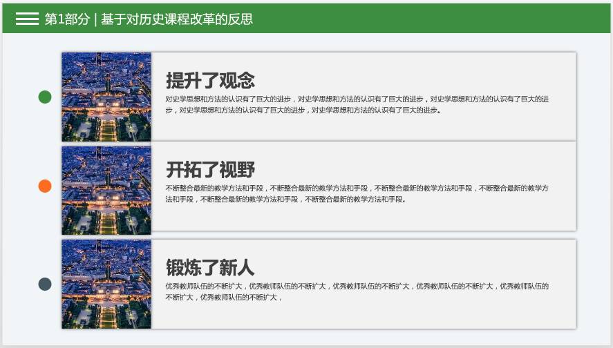
We have seen this kind of PPT in many state-owned enterprises and public institutions. The bright and vulgar color scheme suddenly lowered the overall grade of PPT.
Of course, the reason why the above PPT is not good-looking is not limited to color matching, its difference is all-round, which we will talk about later.
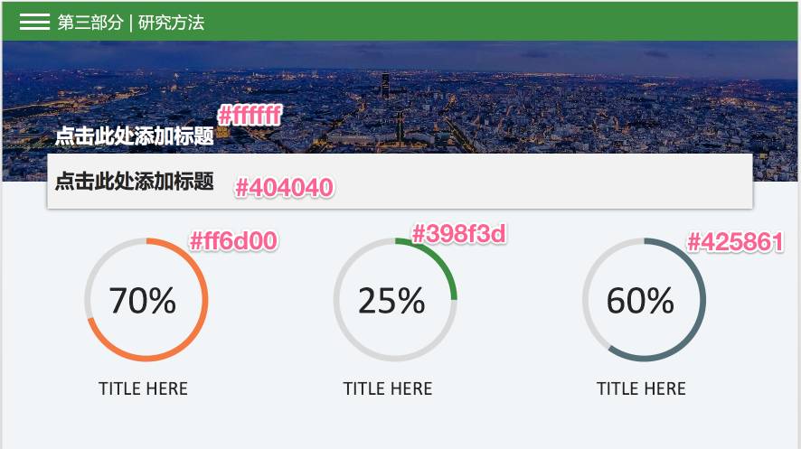
Basically the same content, if we slightly adjust the color matching and structure, you will find that the effect is completely different:
How can ordinary people improve their PPT color matching level? The fastest solution will be given below, let’s talk about taboos first:
Don't use colors with too high purity, don't use colors with too strong contrast, don't use too many colors in a PPT!
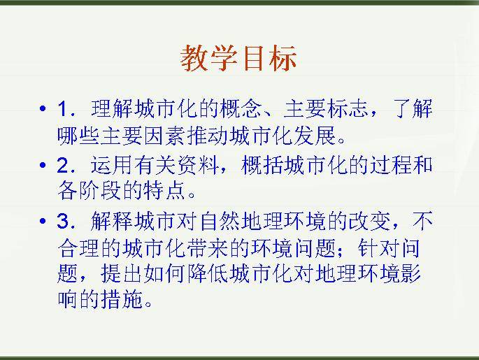
Let's talk about fonts again. Many people like to use Song typeface, official script, regular script and other fonts in PPT. It is very difficult to use these fonts well, and the effect most people use is terrible, as shown in the picture below:
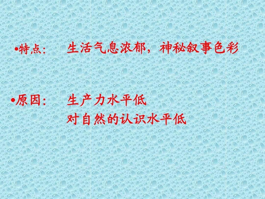
In fact, as long as people with normal aesthetics will know that such a PPT is "unattractive", it is likely that the person who made it is also very ashamed. The problem is that I have no energy and want to make it more beautiful, but I really don't know how to use force.
We want to be able to make a professional PPT in a short period of time. If we learn color collocation, font collocation, or even font design from scratch, we may not be able to learn it well after a long time. What's more, color matching and fonts are only a small part of ppt.
We don't need to be experts in color matching and font matching, through the method of integration, we only need to use the mature results honed by others!
Let’s talk about fonts first: The most conservative and safe choice, all use Microsoft Yahei. >
Tools: a Word document (or directly a PPT document), a Photoshop software.
Let me demonstrate to you:

Tool 1: http://www.peise.net/tools/web/ Tool 2: http:/ /www.peise.net/palette/ Tool 3: https://color.adobe.com/zh/create/color-wheel/
You can copy the URL to your computer and open it. Many classic color combinations are directly given above, which can be used according to your own needs.
These tools are designed by professionals who are very sensitive to color, such as Adobe, a company that is particularly strong in the field of image processing and design. The color combinations made by tools may not be the most suitable for you, but it should be no problem to throw yourself a blind color matching 10,000 streets.
Let's look at an example first:
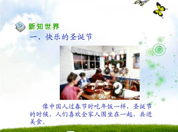
If there are more pictures of this quality in your PPT, will the style and grade be instantly improved?
And if you study carefully, you will find that it is not complicated to make such an effect in PPT: a sufficiently convincing and clear large picture, and some explanatory texts are placed moderately.
Let's look at the failed example again:
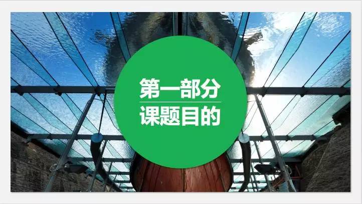
Don't laugh, most of us have done this level of PPT once. Many people's peak level may stay in this gear.
How to use pictures well to make our PPT look awesome? Very cold?
1. The picture must be clear 2. The picture is the most It is better not to have too many fancy elements, but to have a large clean area, which is suitable for us to put text, title and other information 3. The combination of pictures and text should be coordinated and beautiful
How to make the combination of pictures and text look harmonious and beautiful?
Method A: Let the text stack on the clean area of the picture, such as the example given above.
Method B: You can add some color blocks to the picture, and then add text on the color blocks:
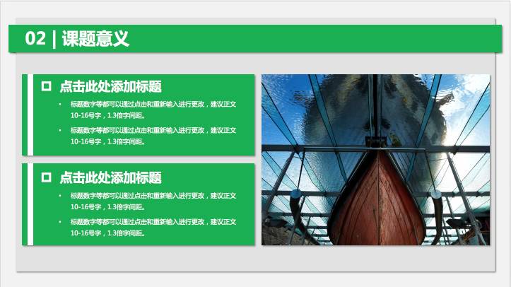
Method C: You can also organically combine pictures, color blocks, and text
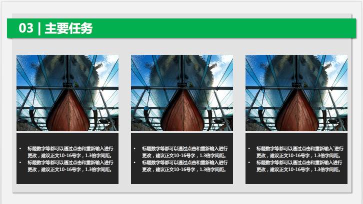
How to quickly improve their ability in this area?
Find 30 high-end PPT templates, and then record 15-30 different combinations of pictures and text. If you want to use it in the future, just choose it from your library!
In the future, no matter on the Internet or anywhere, if you see a combination of classic text and pictures, record it immediately and continuously enrich your record library.
For example, it can also be like this:
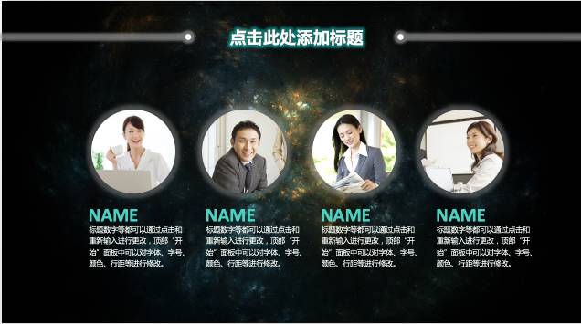
Like this:
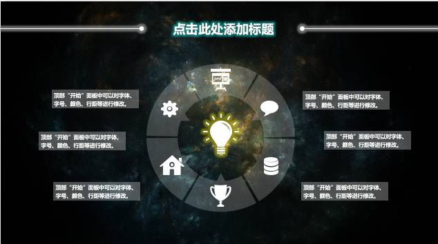
Now that we know how to display pictures and text content, we have to solve a big problem: where to find high-quality pictures?
It can be said that as long as there is a blurry picture in your PPT, the force will drop by more than 10 grades. The degree of decline is almost equivalent to when you are playing the game and you are about to clear the level, but suddenly the power goes out and there is no save, and everything starts from scratch.
Here is a good resource website for you:
1. Qiantu.com www.58pic.com 2. Panorama www.quanjing.com 3. Nietu www.nipic.com 4, 123RF http://www.123rf.com.cn/ 5, Eput http://eput.com/editors 6, Forwallpaperhttp://cn.forwallpaper.com 7, Yitu http://www.1tu.com/ 8, Pixabay https:/ /pixabay.com/zh/photos/?order=latest
For example: a whole consists of 6 small parts. To express this matter, we can express it in plain text, or in the following form:
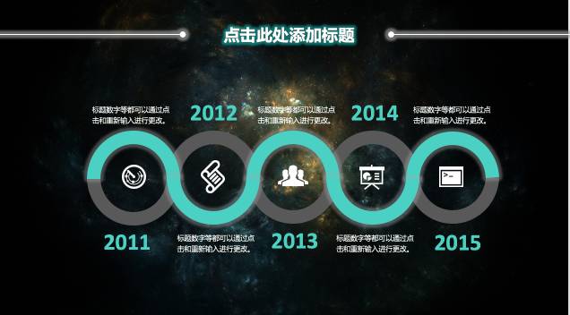
For example, as time progresses and things develop, we can use the following form:

Reasonable use of icons can make your PPT look professional. Let's look at a comparison case:
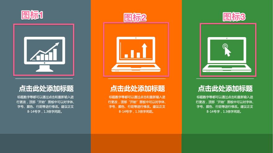
Let's look at a positive case:

The same is to express the three major points of information 1, 2, and 3. If the icon is used, will the grade go up all at once?
How do I find the right icon? Ah He vomited blood for 3 liters, and found the following method for you:
1. http://www.iconfont.cn/ Alibaba's website, tens of thousands of beautiful vector icons 2. Easyicon http://www.easyicon.net/ There are also a lot of icons here 3, Baidu 4, design or secondary editing icons with Photoshop, Ai and other software

A good page structure must meet the following elements:
a. Clear primary and secondary (title, text, pictures, subtitles should be clear at a glance, so that people can see the key points at first glance) b. Concise (don’t have big blocks Block text stacking. If you really want to stack, you need to reduce the font size, reduce the fear of too many word stacking, and reduce text interference). At the same time, if you can use pictures and icons to express, try not to use words; c, comfortable color matching d, reasonable space structure (the alignment should be aligned, and the font should be large Big, small when it should be small)
The three aspects of color matching, icons, and pictures have been mentioned above. The following will focus on the spatial structure and the distinction between primary and secondary issues. The unreasonable handling of the spatial structure and the unremarkable distinction between primary and secondary are the important reasons why most people's PPT looks unprofessional.
The main method to solve the problem of primary and secondary: put as little text as possible, especially large paragraphs of text; the title should be enlarged and highlighted; parallel content should be displayed separately in blocks.
How to make the spatial structure better? Also use the idea of integration: Read a lot of classic structural arrangements made by others, record them, and form your own library. When you use it, you can choose it directly from the library!
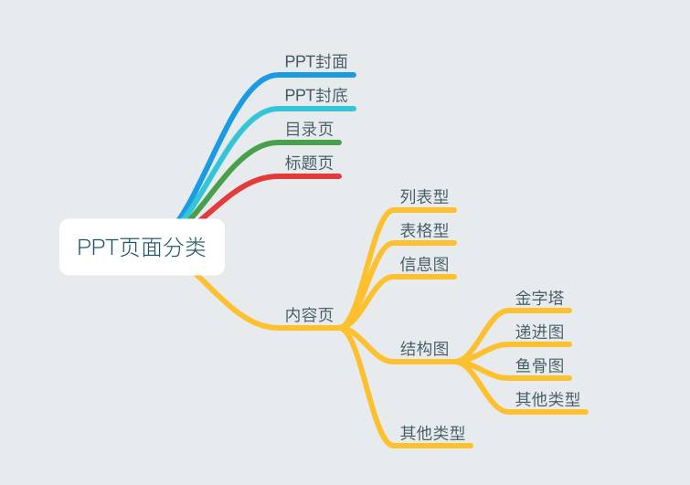
Let's take a look first. The overall classification of PPT pages is actually limited. I will roughly divide them into the following categories:
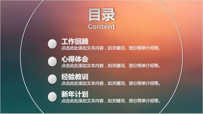
Let's take a brief look at each of them one by one, not mentioning the front and back covers. Example catalog page:
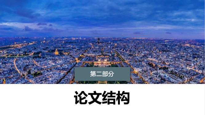
Title page:
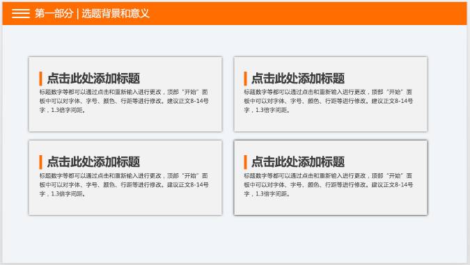
List type:
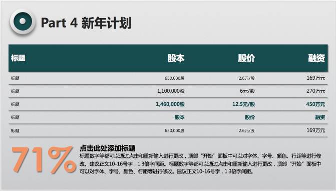
Form type:
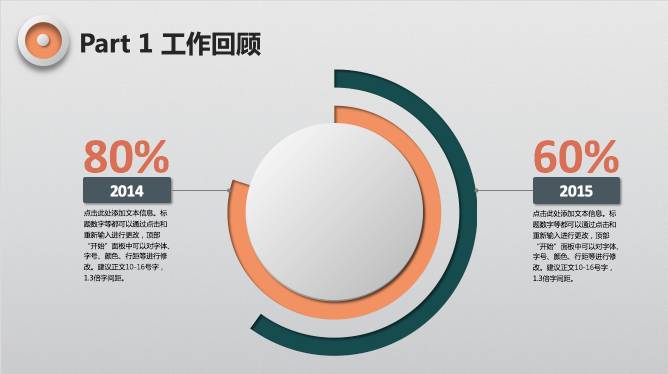
Infographic:
1. Show World Network (www.yanj.cn) 2. PPTSTORE(www.pptstore.net/) 3, Rice Husk (http://www.docer.com) 4, OfficePlus(http://office.msn .com.cn/List.shtml?cat=PPT) 5. Powerful PPT (http://www.tretars.com/)
6. Pooban.com (http://www.pooban.com/ppt/)
7. PPTMind (http://www.pptmind.com/)
8. Youpin PPT (http://www.ypppt.com/)
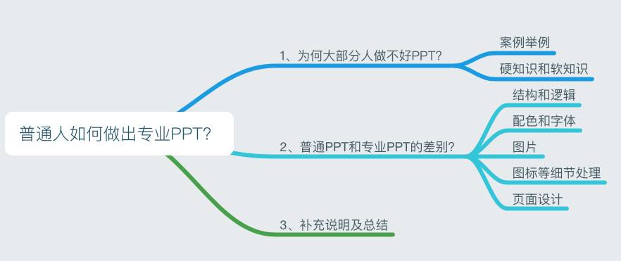
For example, when I write this article today, my whole idea is as follows:

With such a framework, I can write articles much faster. Similarly, when you make a PPT, you should first make the framework, get all the key points of information, and then improve the details.
Instead of writing, thinking, and adjusting your thinking.
Some additional notes:
1. To learn PPT, you can gradually improve your level according to the following stages:
a. Apply templates directly b. Combine different templates and modify styles c. Modify other people’s templates d. Directly Make your own original template
3. You must improve your aesthetic ability, otherwise you will not even have the ability to distinguish between beauty and ugliness, which is the most terrible thing. The more you look at the good design, the more you look at it, the more you will be able to distinguish between beauty and ugliness. Domestically, there are good design works on petal.com and UI China. At the same time, watching more PPT works by talented people is also a quick way to improve.
4. Pay more attention to our official account "Workplace Power Bank", and I will continue to write articles in this regard in the future. At the same time, lectures are given from time to time.
Remarks:
1. The PPT screenshots in this article are basically from the screenshots downloaded from the official website of Microsoft PPT templates, and a small part are from the Internet.
2. Reply "ppt" in the background of the official account of the workplace power bank to download the template we provide you
Articles are uploaded by users and are for non-commercial browsing only. Posted by: Lomu, please indicate the source: https://www.daogebangong.com/en/articles/detail/PPT%20Xiaobai%20becomes%20a%20master%20this%20tutorial%20has%20done%20it%20More%20than%20100000%20popular%20PPT%20course%20graphic%20summary.html

 支付宝扫一扫
评论列表(196条)
测试