
PPT custom design can be viewed on the personal homepage, or search on WeChat: Chenxi Design House. Follow the official account and get in touch.
Hello, I am Chen Xi.
Today we will explain two elements that are often used in PPT, pictures and shapes.
Making full use of the two elements of good pictures and shapes will also make great PPT works.
Taking Chenxi Design House as an example, we made a short brand promotion PPT work. The two elements of pictures and shapes are mainly used.
For everyone to broaden their minds, take a look at the advanced interaction of pictures and shapes. The overall design is classic, easy to apply, and has bright spots!
▣01
First, let's take a look at the prototype display effect of the overall design.
As shown below:
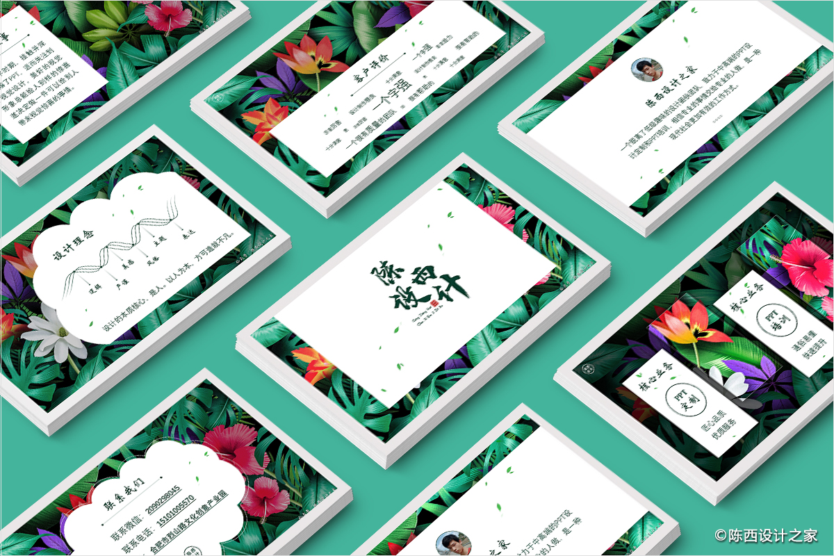
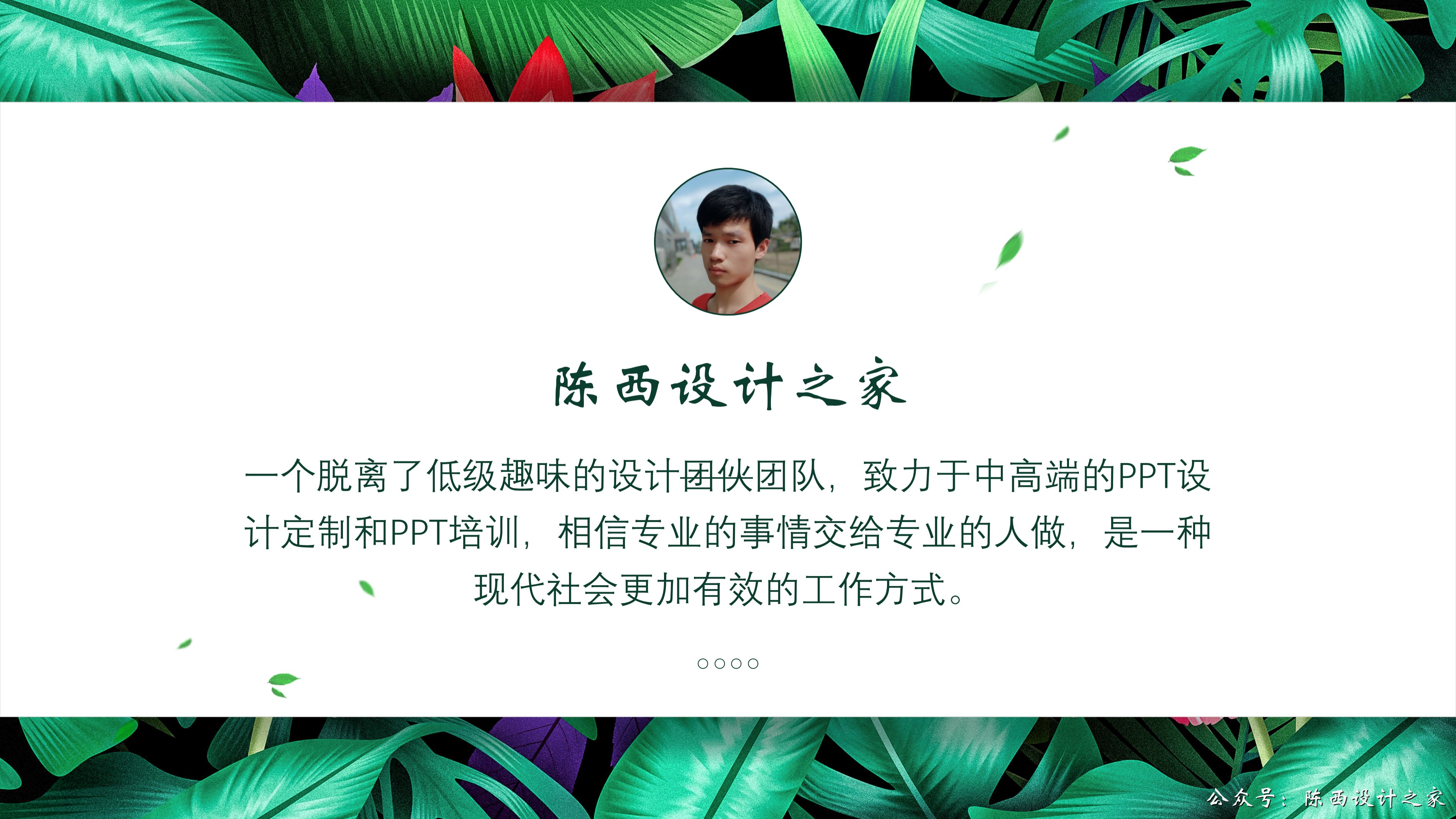
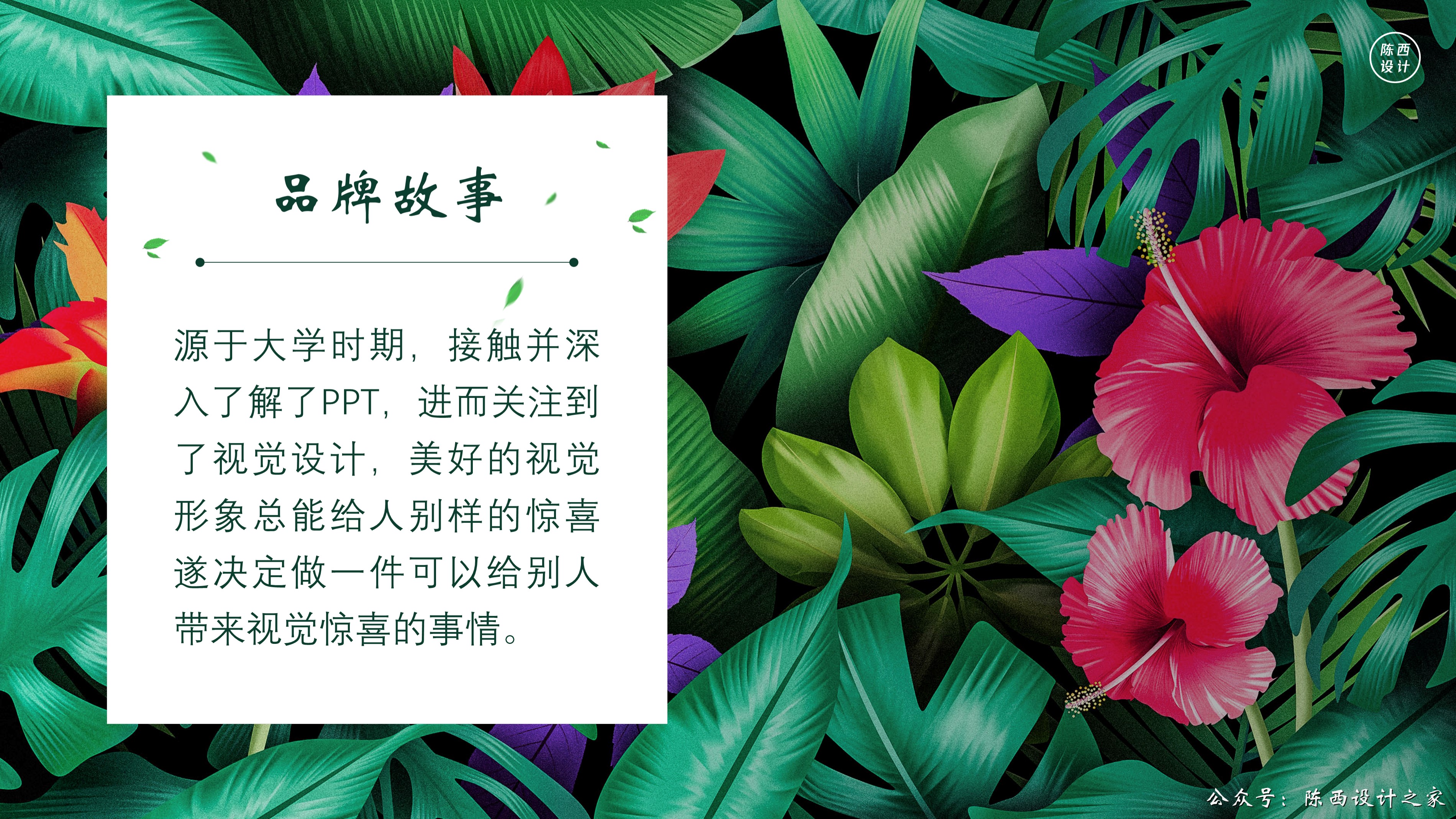
The theme is about the brand promotion of Chenxi Design House. Here is a short PPT case based on the content.
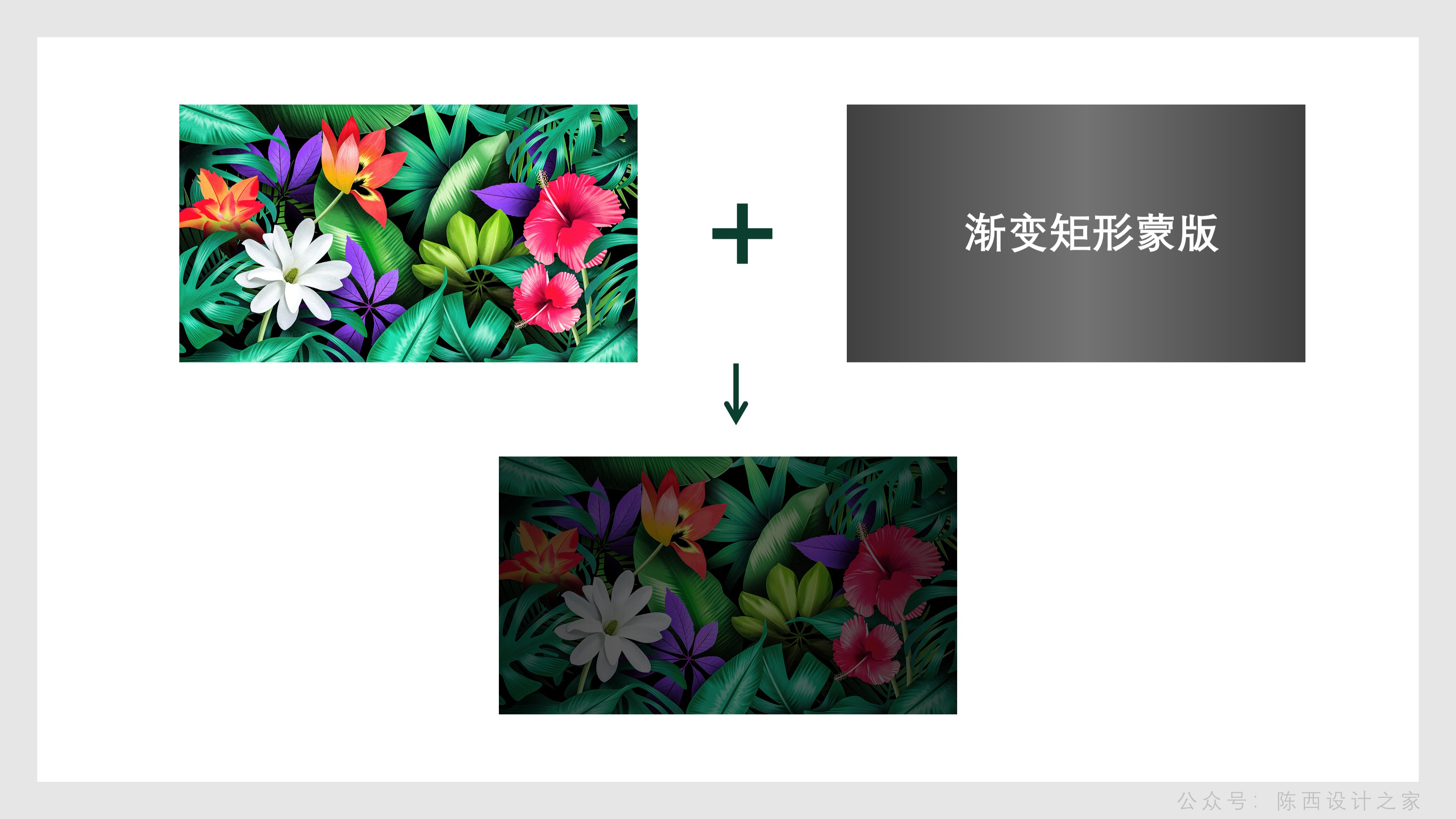
Let’s analyze first, why did you choose this picture of tropical plants and flowers here?
Because Chenxi Design House is mainly engaged in PPT design, pursuing exquisiteness, beauty and quality.
Plants and flowers can reflect these emotions, symbolizing good intentions such as beauty, enthusiasm, and delicacy. These emotions carried by tropical plants and flowers are stronger, bright enough and full of passion.
Of course, some personal preferences are also included here, but it is also possible to use other pictures that can express such emotions.
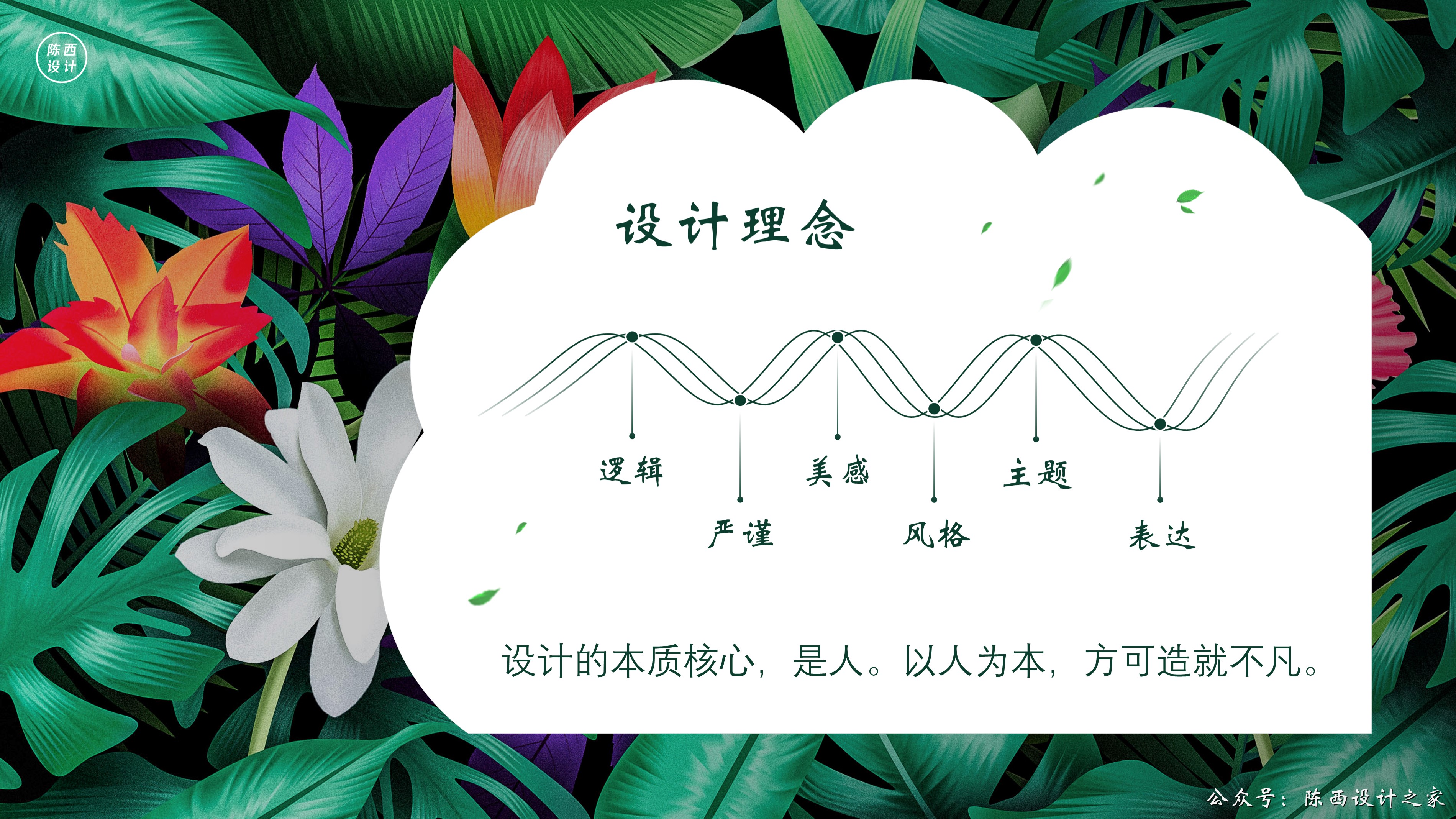
If you are in the medical industry, you can choose background images such as cells and DNA, and you can choose high-rise buildings in the construction industry.
For some situations where you don't know what picture to use, you can use some neutral pictures or abstract pictures.
For example: great rivers and mountains, cosmic starry sky, abstract particle lines, illustrations and so on.
▣02
Let's look at the specific production ideas analysis and operation steps.
▊First page:
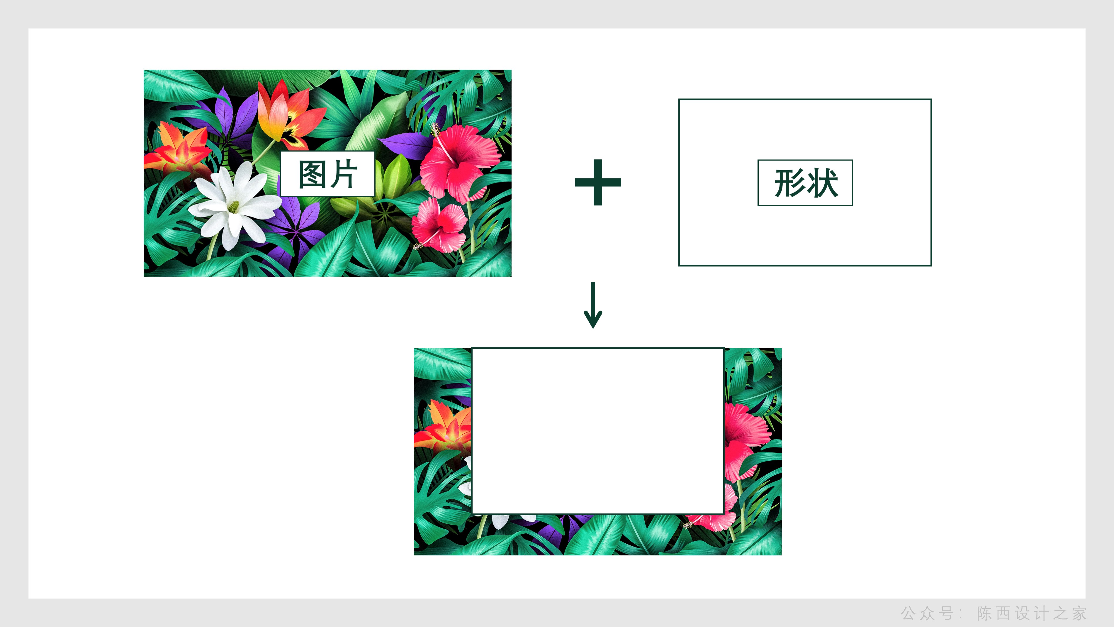
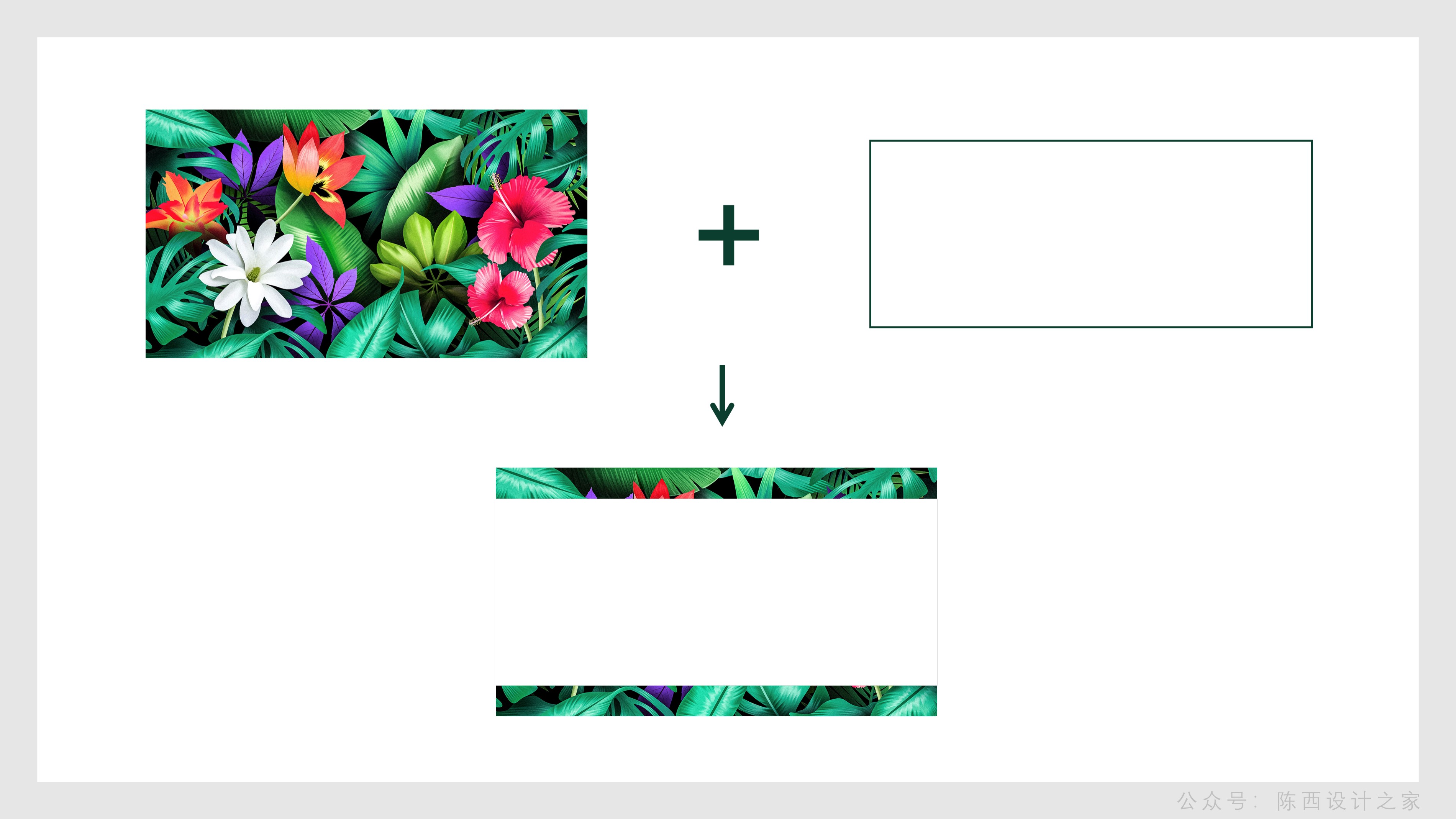
The background is relatively simple, it is a combination of shapes and pictures, and it is also the theme we are going to talk about today.
This background setting is an advanced typesetting interaction of pictures and shapes. You can remember this layout.
The specific operation is as shown in the figure below:
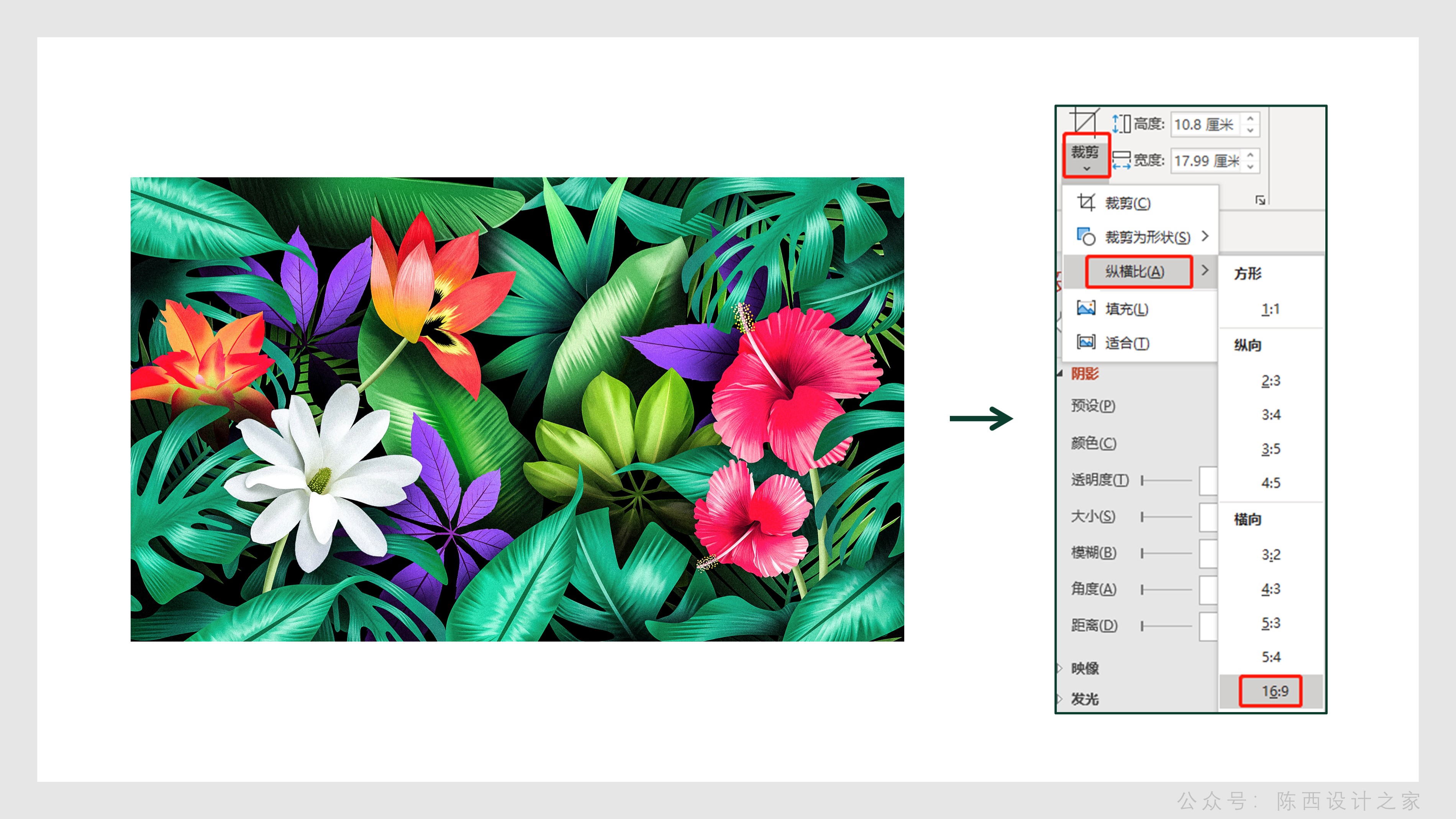
First go through our previous analysis and prepare relevant picture materials.
The size ratio of the picture material can be adjusted to the same size ratio as the slideshow by cropping. In this case, the ratio is 16:9.
After the proportions are adjusted, we add shapes for typography.
As shown below:
The picture plus a rectangular shape, the shape is above the picture, and the top is aligned.
This makes it easy to create a background effect.
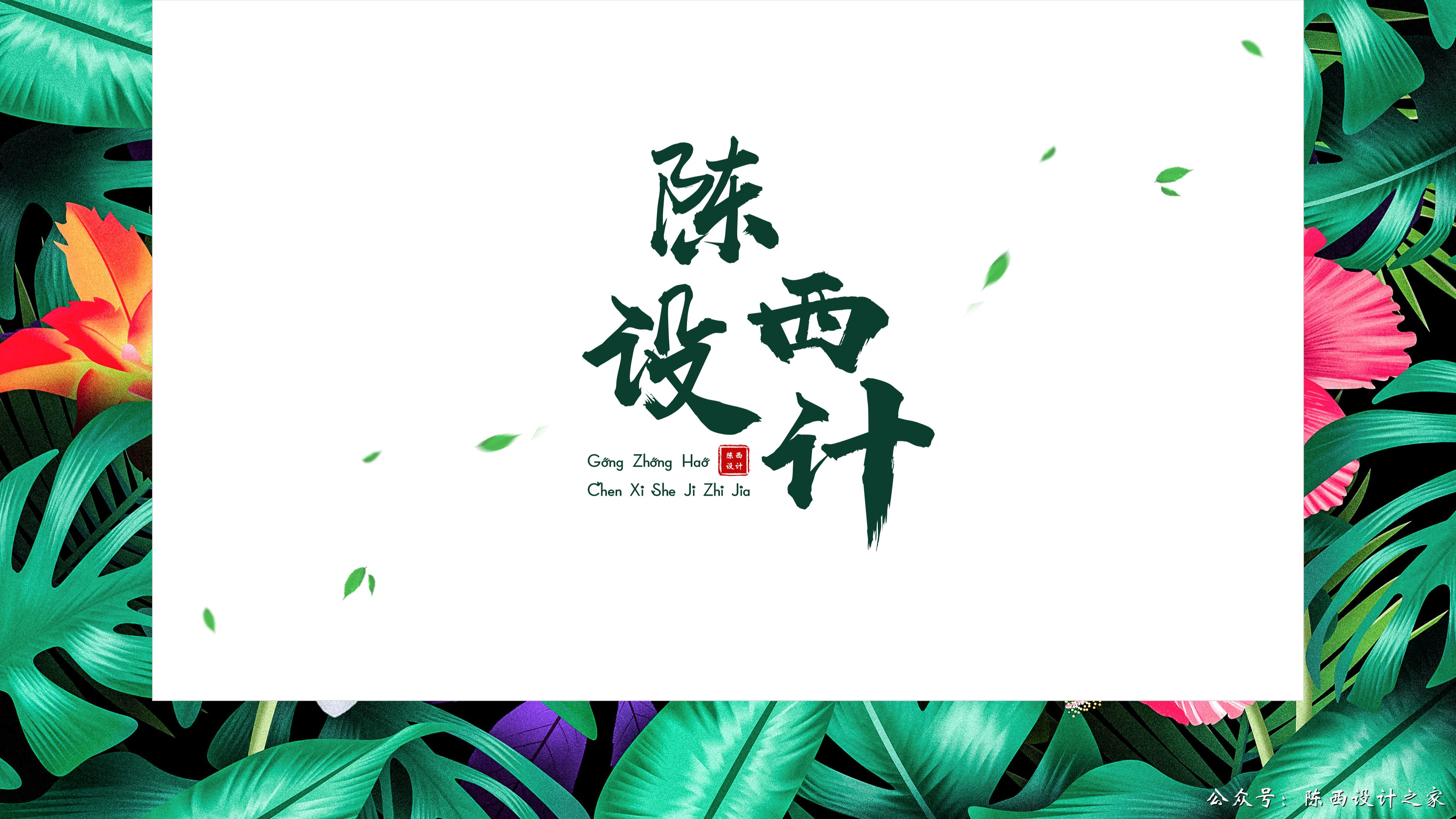
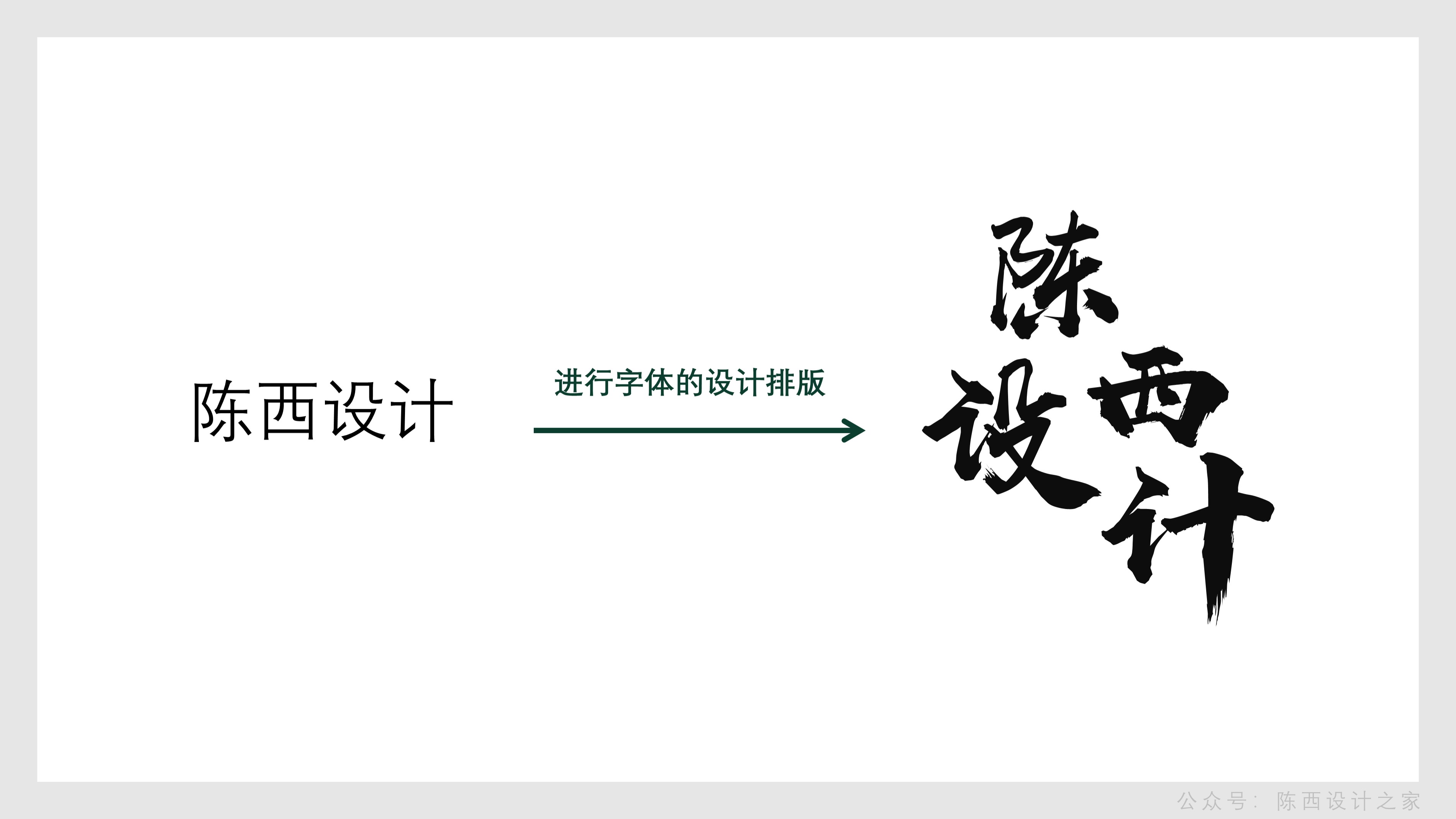
After the background is done, it is time to design the theme font.
As shown below:
Type in the theme text, then disassemble it separately, adjust different font sizes, and choose a brush type font, here is the Hanyi Shangwei handwriting font.
Then, according to the amount of text, it is necessary to carry out misplaced typesetting design. You can refer to the typesetting processing in the above picture.
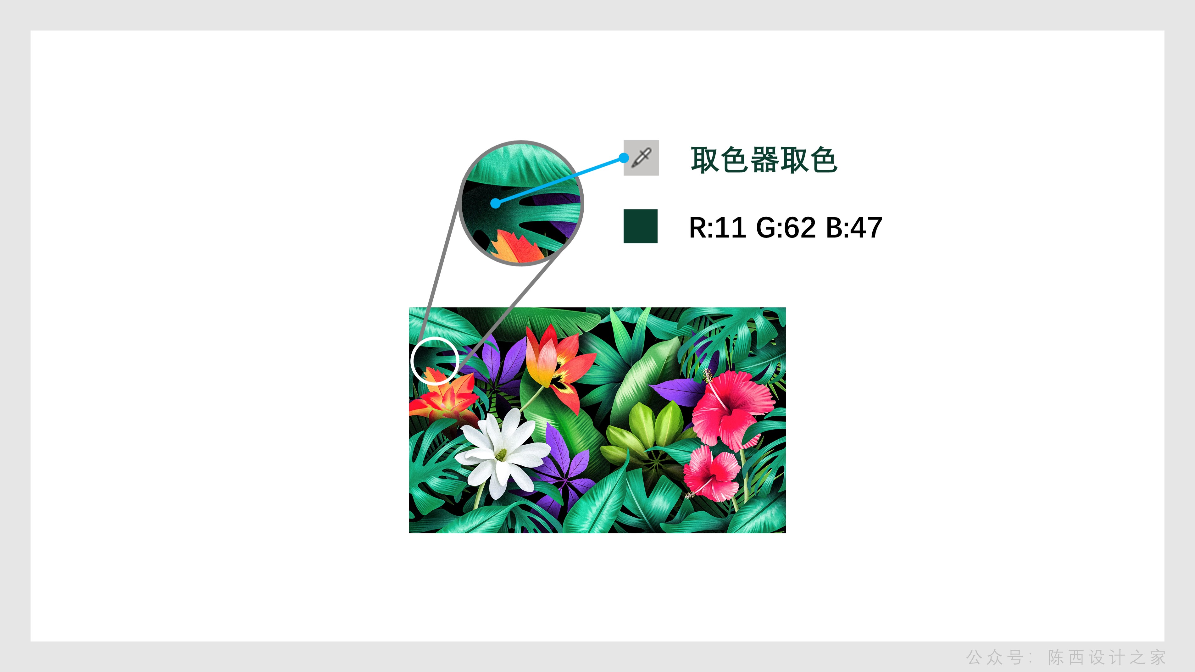
After finishing the typesetting, you need to determine the color.
As shown below:
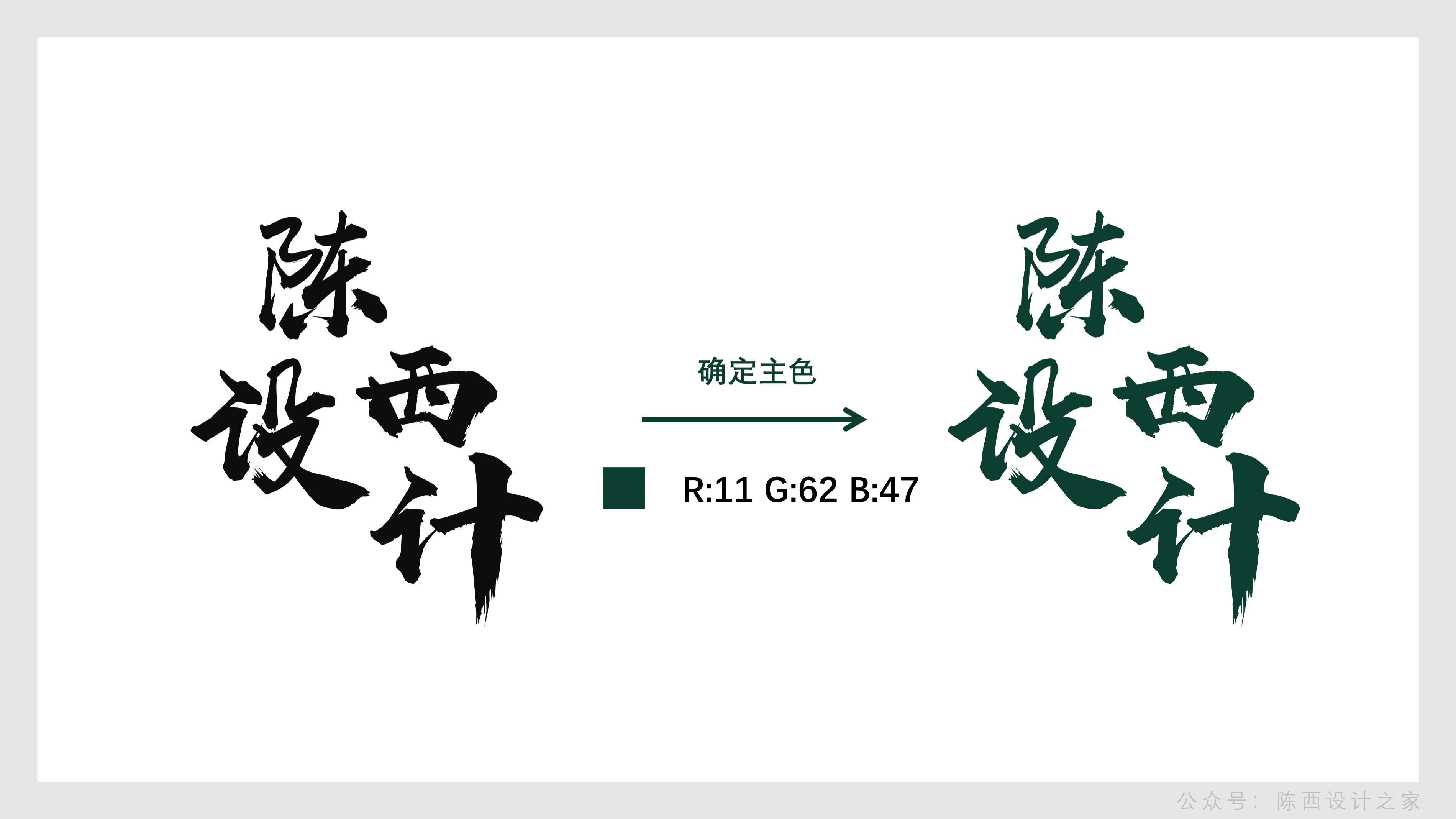
You can use the color picker to pick the color from the selected picture. This can quickly determine the theme color.
After the color is set, adjust the font color.
As shown below:
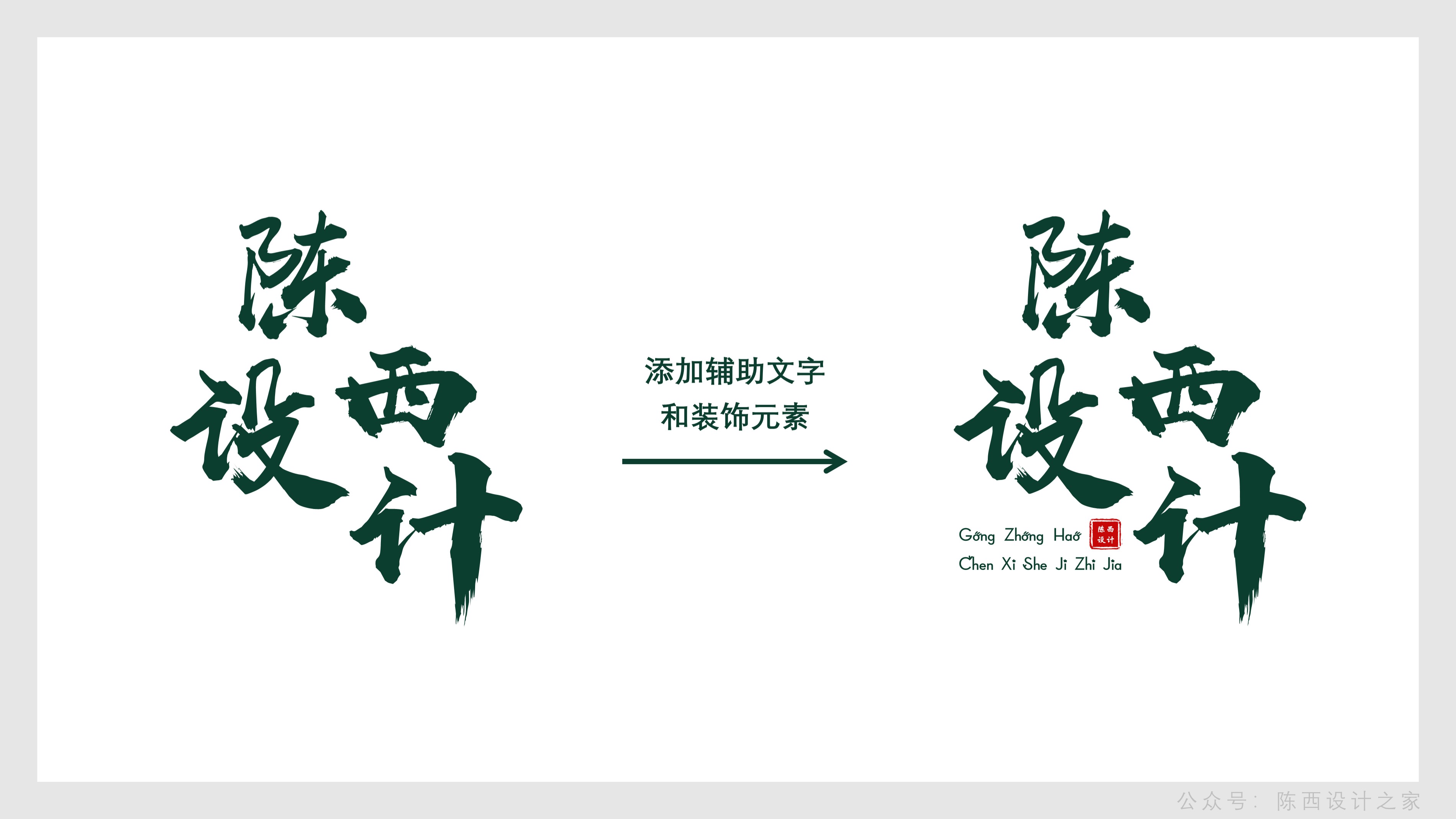
After adjusting the font of the main body, you will find that there is a lot of white space in the lower left corner of the main font, which is relatively empty and the structure is unstable.
Then you can consider adding some other elements.
As shown below:
Auxiliary text can be added, coupled with some exquisite decorative elements, the decorative elements here are seals. Then the overall structure of the font is very stable.
Put the designed main font on the background page, and you will find that the overall page is relatively empty.
Similarly we can add decorative auxiliary elements to improve the page design.
As shown below:

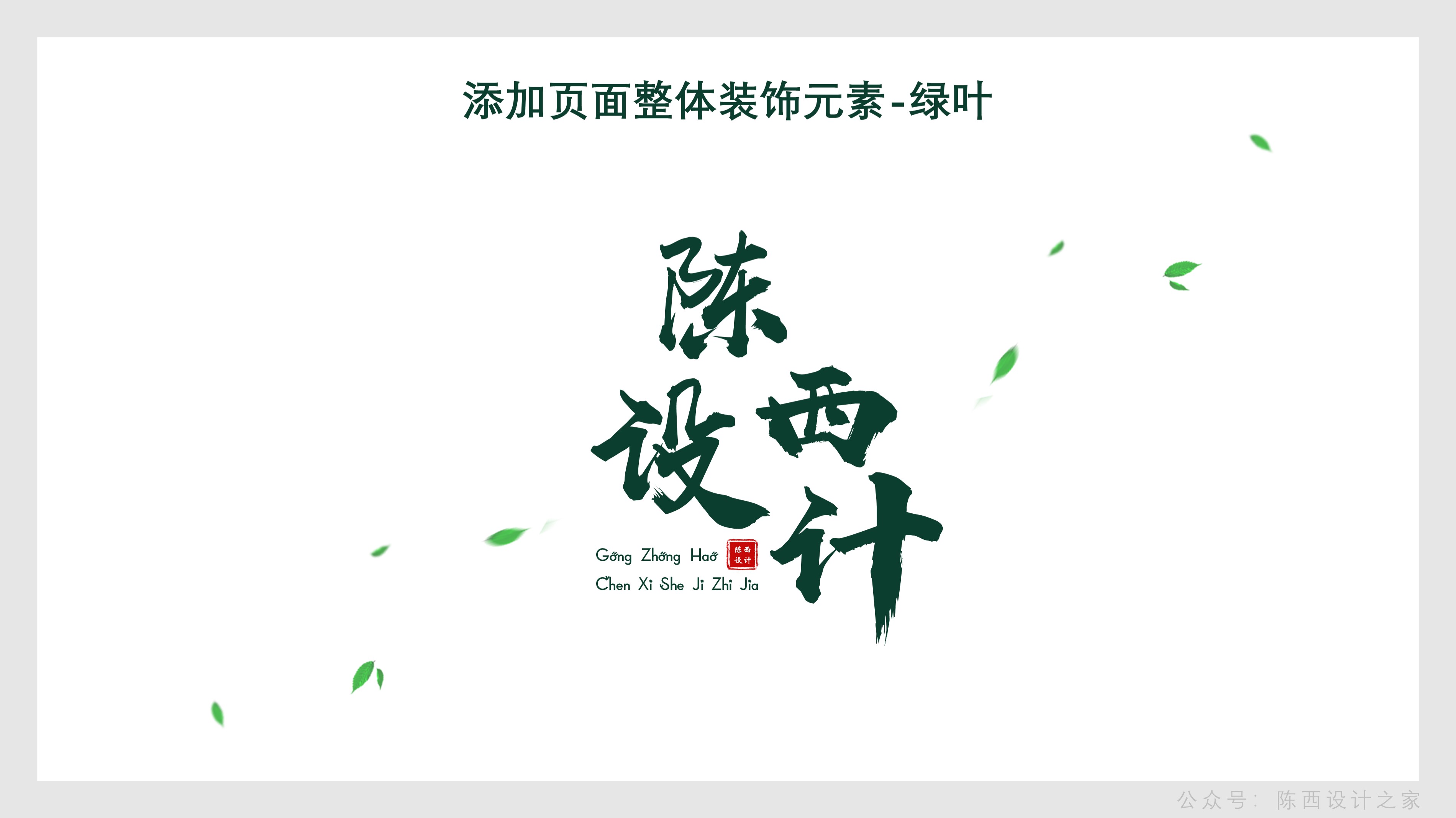
The overall page decoration elements are flying green leaves, which match the background pictures of plants and flowers.
The green leaf decorative elements here will also run through the design of all pages as a whole, as the decorative elements of all pages.
It fully embodies the principle of repetition in the four principles of design, that is, to ensure the consistency of the finishing page design, thus creating a high-end presentation effect.
After finishing these, combined with our background effect, the design of the cover of the first page is completed.
As shown below:
The design and typesetting of this format and font are very classic, and everyone can remember it. You can also download the source files to practice.
▊Second page:
This page is also an interactive design of pictures and shapes that I really like.
I have also used this type of design in some high-quality PPT template works I made before, because it is really easy to use.
Especially when there is only one main title and a paragraph of text introduction, it is especially suitable for this design pattern.
For example, introducing a single character, or displaying famous quotes from famous people, etc.
The design of the background here is also a combination of pictures and shapes.
As shown below:
Depending on the picture, the shape here can decide whether to add some shadow effects.
The content layout of this page is also very particular, it is best to use this mode. We can analyze it.
As shown below:
This typical centered typesetting method is defined here in more detail for everyone.
If you don't have a good design foundation, you can directly use the ones marked here for typesetting design, and just apply it directly.
It is easy to make the effect.
As shown below:

After the typesetting of the copy is completed, add the decorative elements of green leaves, and this page can be completed quickly.
As shown below:
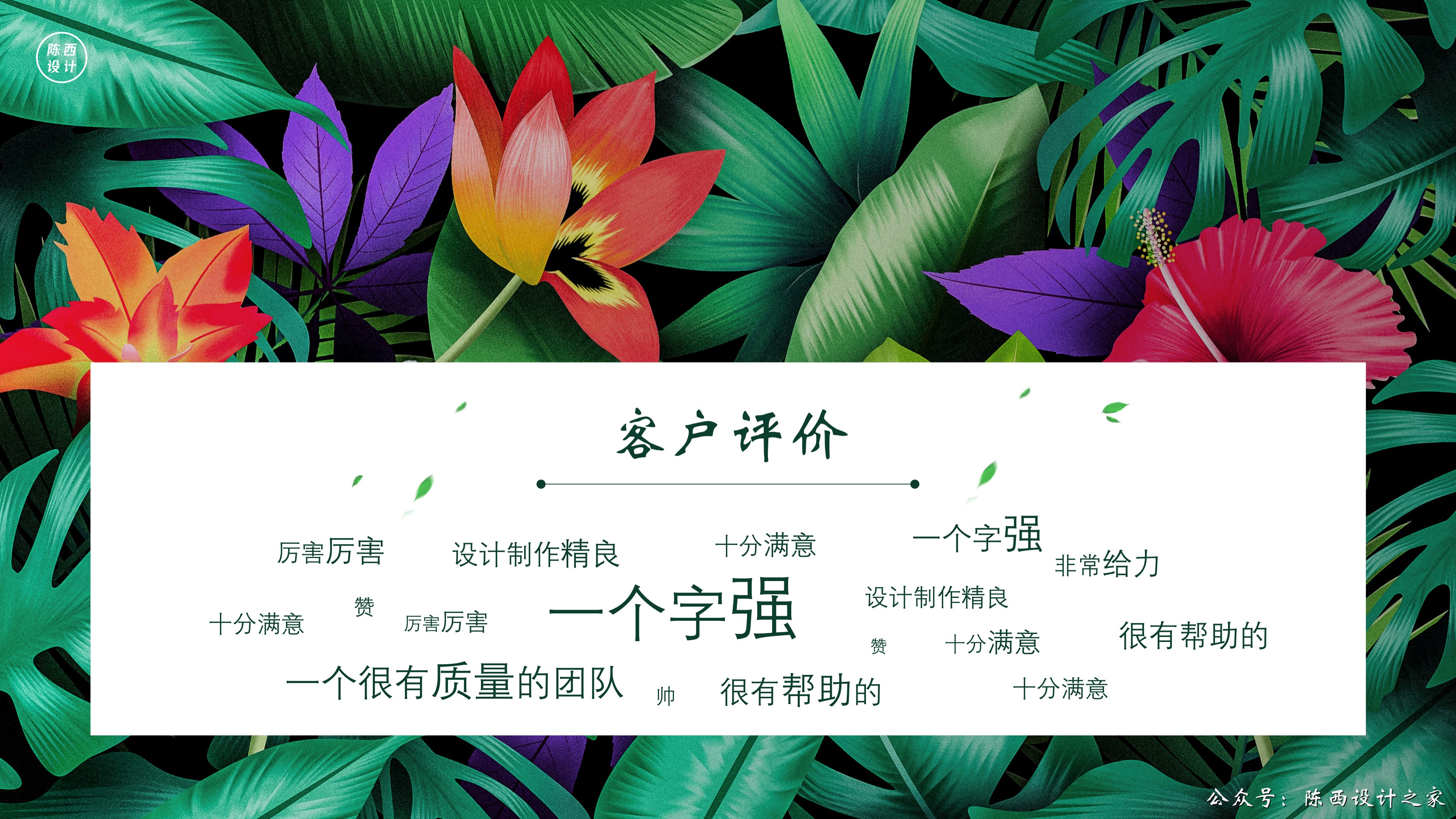
▊Third page:
There isn't much to explain on this page.
The background is also a picture plus shape design, changing the typesetting method of the shape. A rectangle with a black gradient is added above the image.
It should be noted that the alignment of the text here can be aligned with the help of guide lines or grids.
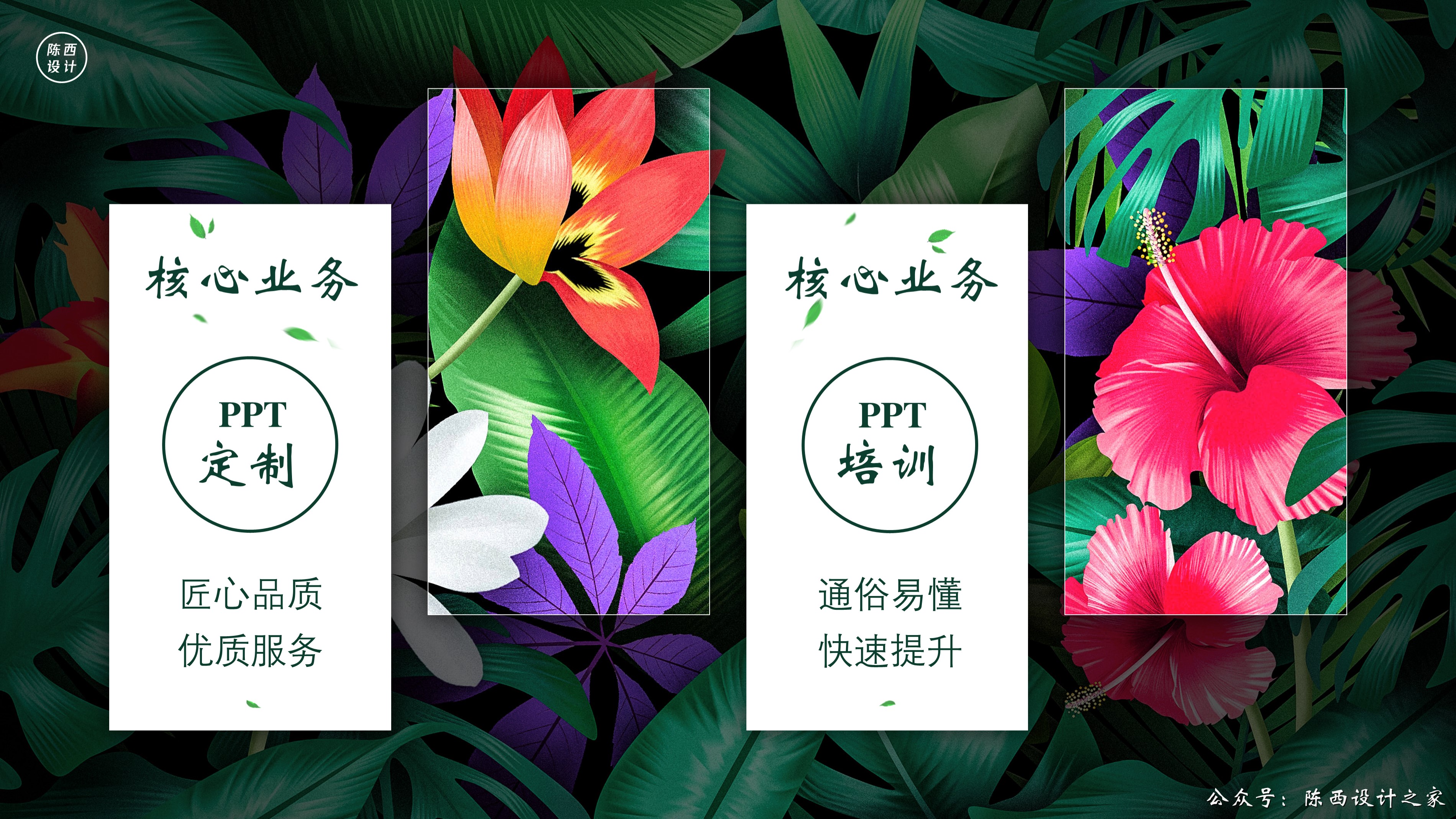
▊Page 4:
The underlying logic remains unchanged, advanced interactive typesetting processing of pictures plus shapes.
What needs to be grasped on this page is how to design and produce such shapes.
Here are a few ideas for your reference.
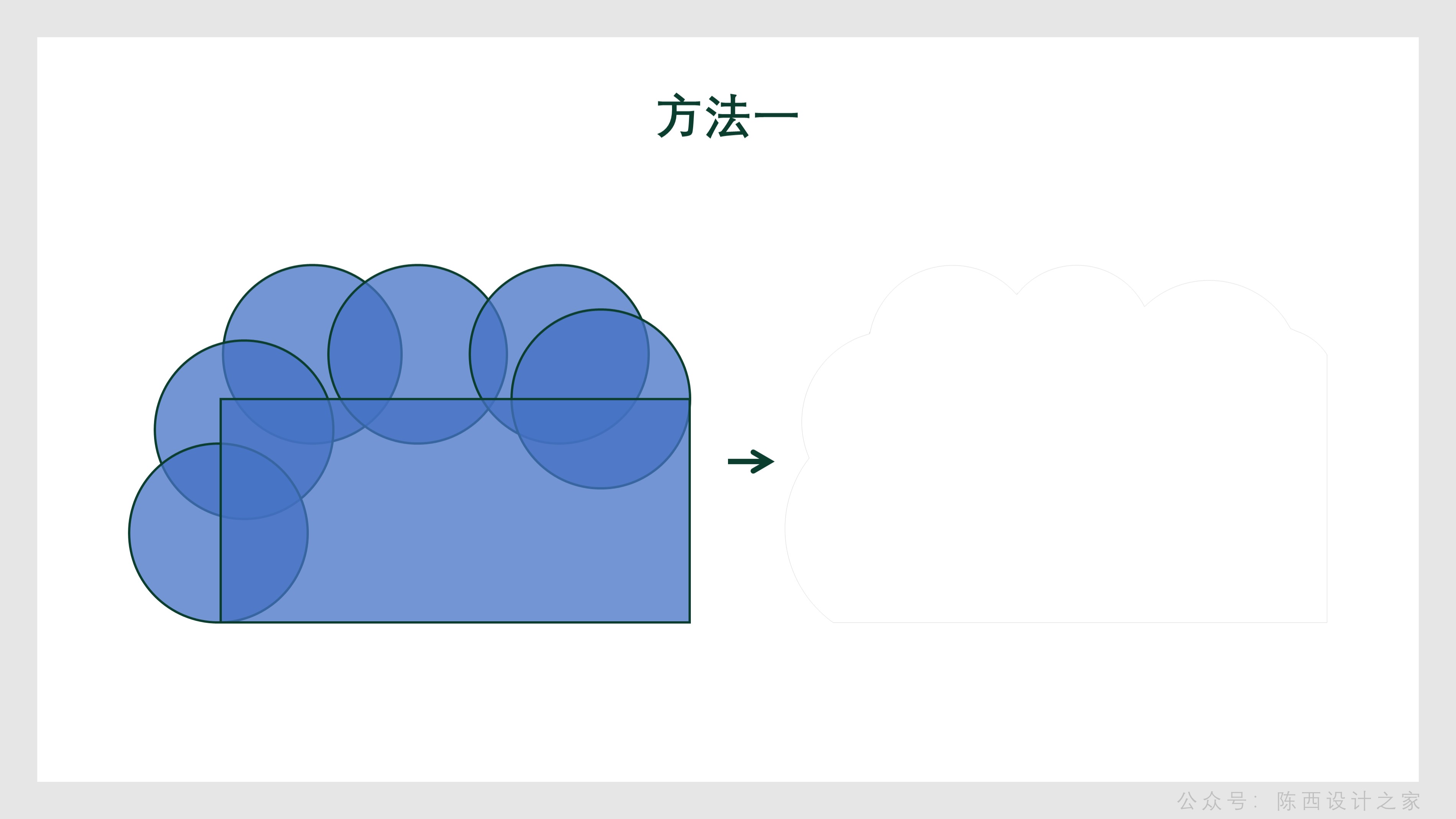
the first method:
Use some basic shapes for stitching, and then combine them in the merged shape.
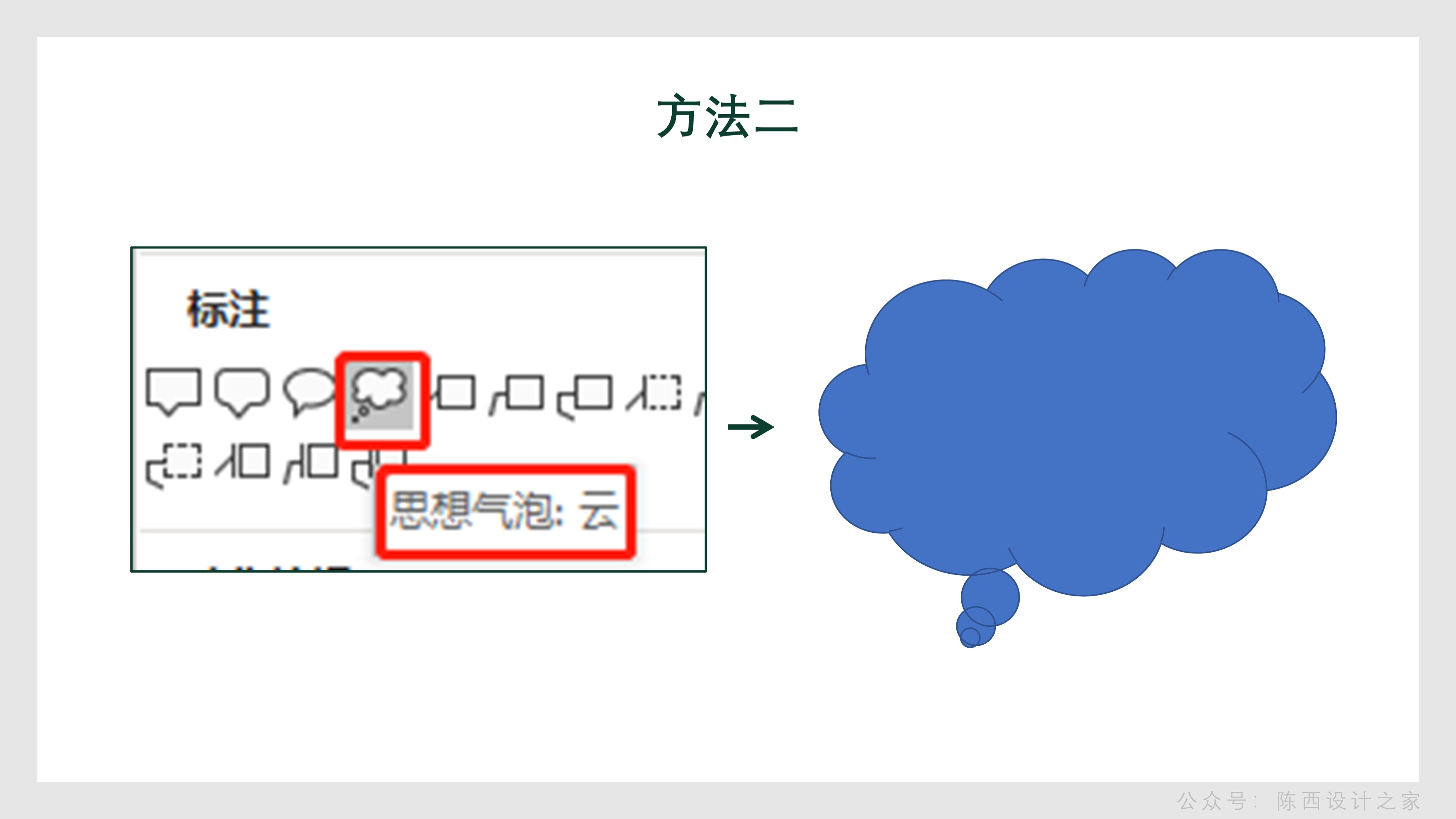
The second method:
Find this thought bubble inside Shapes: Cloud, and draw a cloud-like shape.
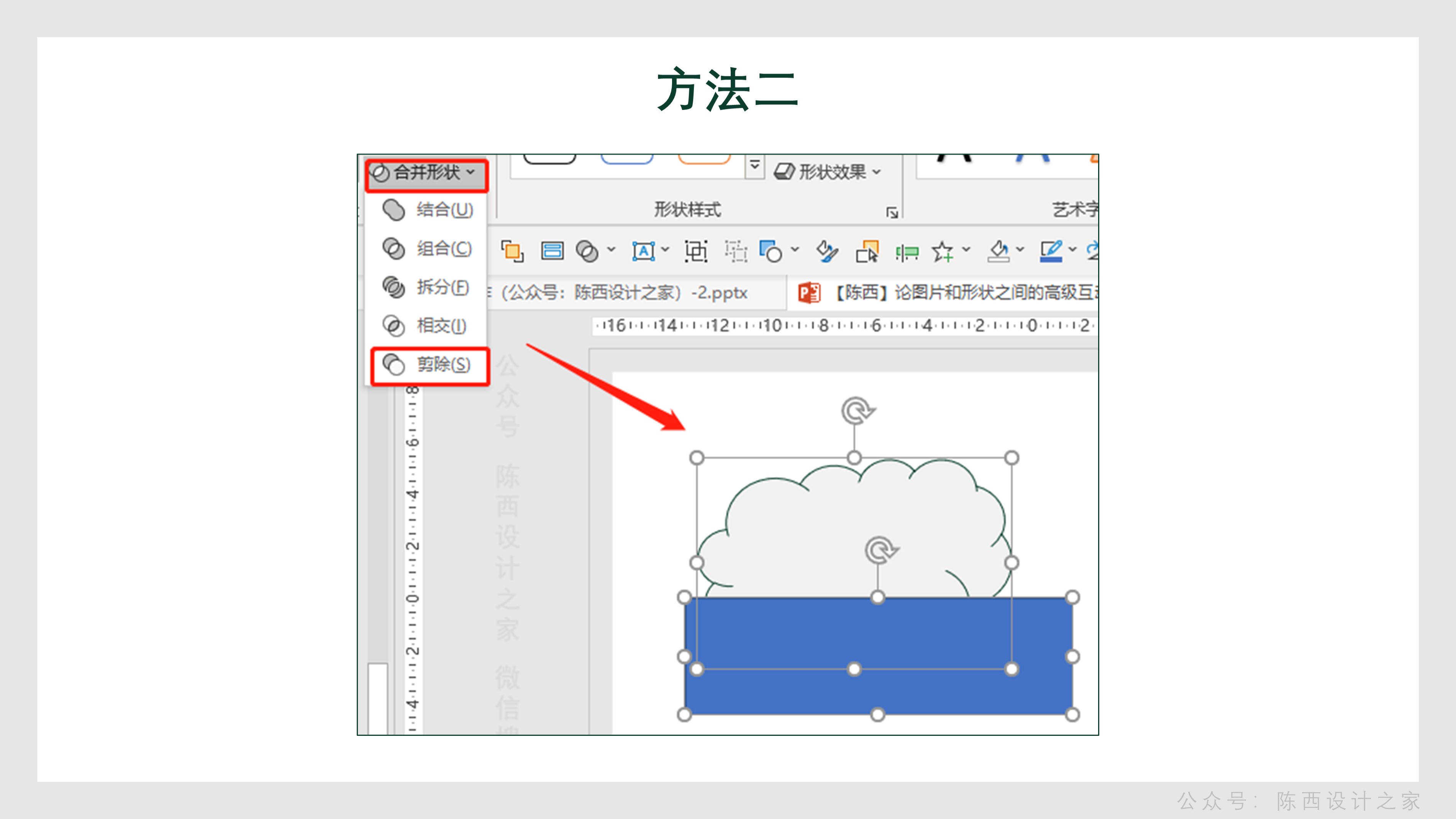
Then proceed to the next step:
Use the rectangle below to perform the subtraction in the merged shape. Similarly, the part on the right side can also be subtracted. This is how you get this shape effect.
The third method:It can be made by using arbitrary polygons or curves combined with editing vertices.
Finally, add text and decorative elements, as well as billions of details.
As shown below:

Combined with the background effect, you can get the final effect.
As shown below:

▊The fifth page:
This page needs some explaining.
First is the background. As shown below:
The background is the image plus a black gradient rectangle mask.
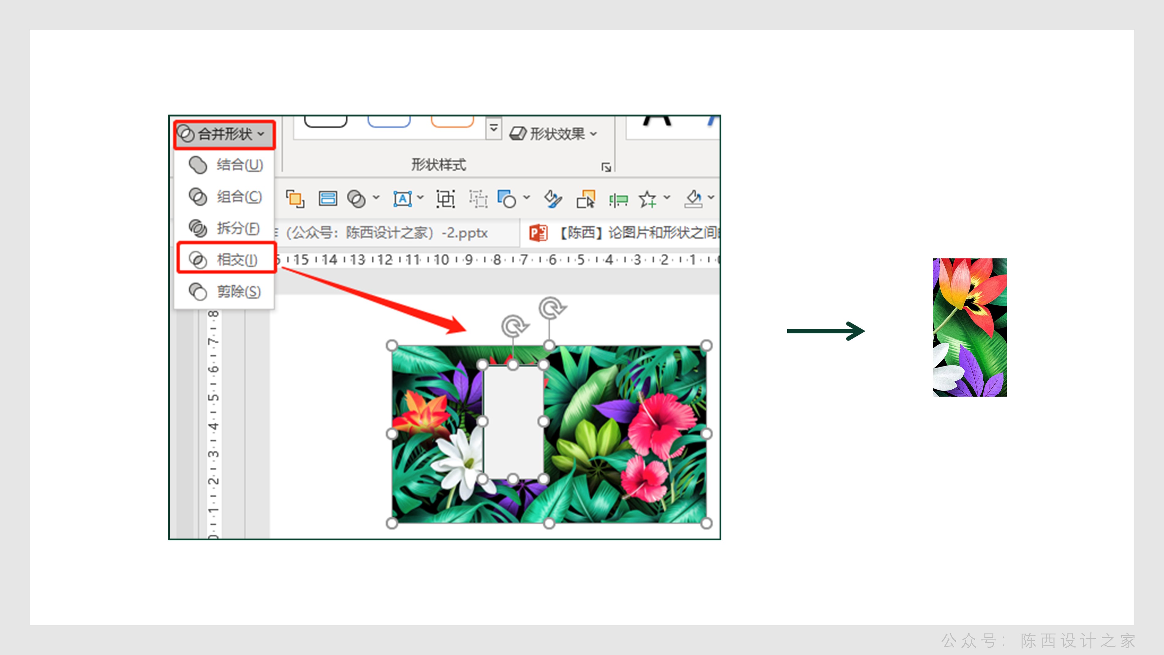
Continue to the next step:
Copy one more background picture, draw a rectangle, select the picture first and then select the shape, and use merge shapes to intersect to get a part of the picture.
Continue to the next step:
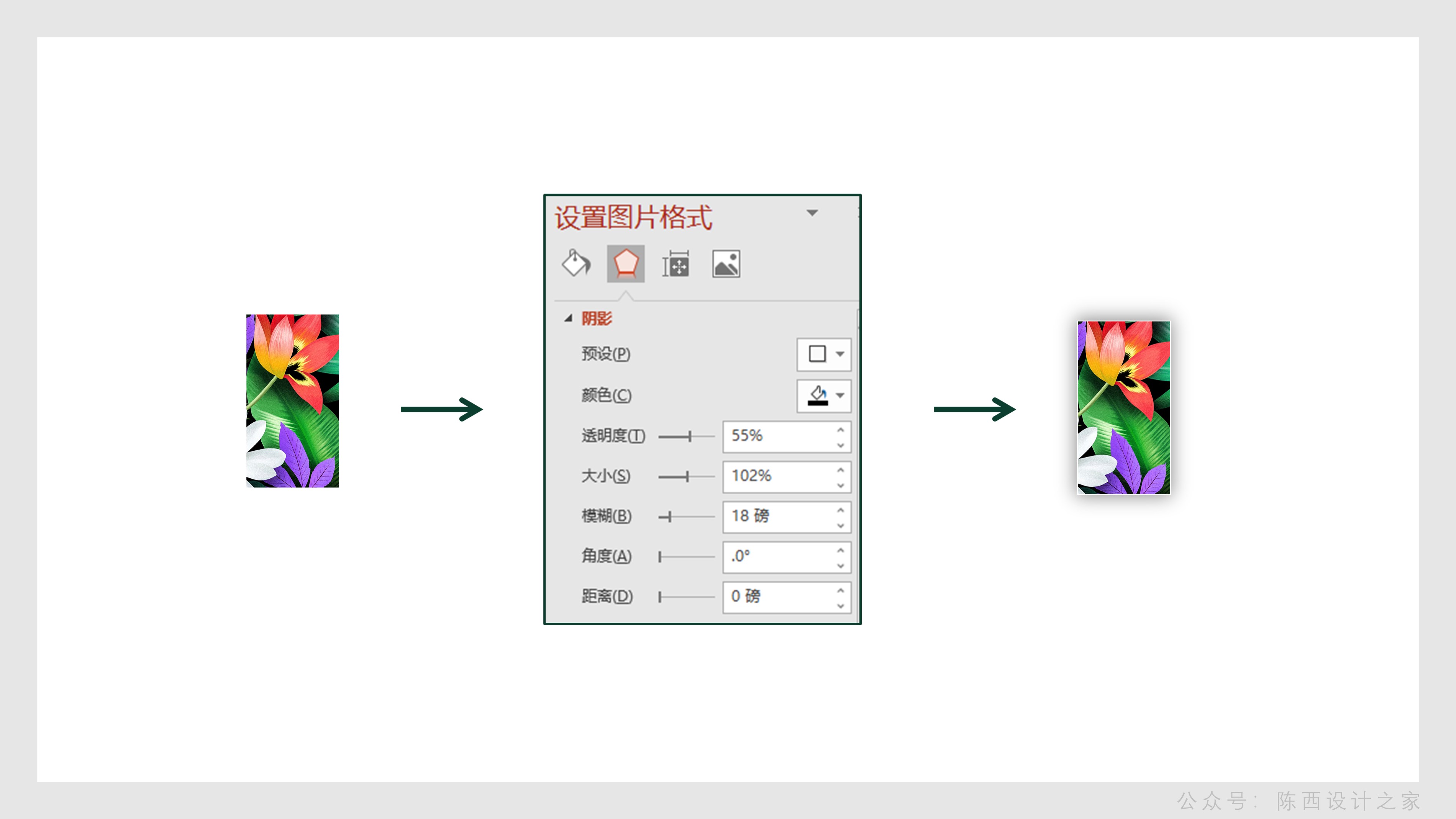
Add a white border and shadow effect to this part of the picture. You can refer to the parameters.
Continue to the next step:
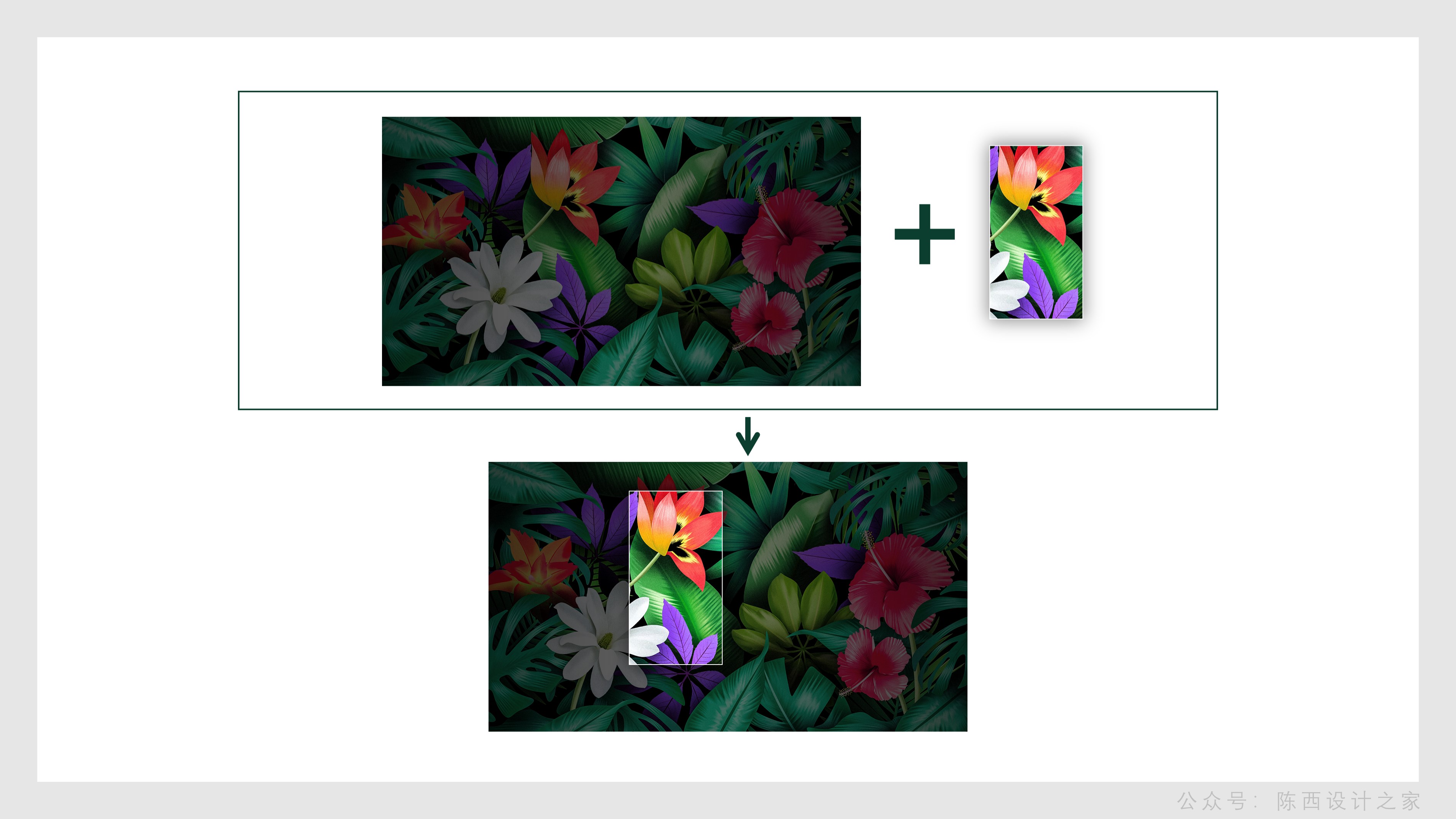
Move this part of the picture to the same position on the background picture, then the effect will come out.
The effect here can also be done with slide background fill, which is faster.
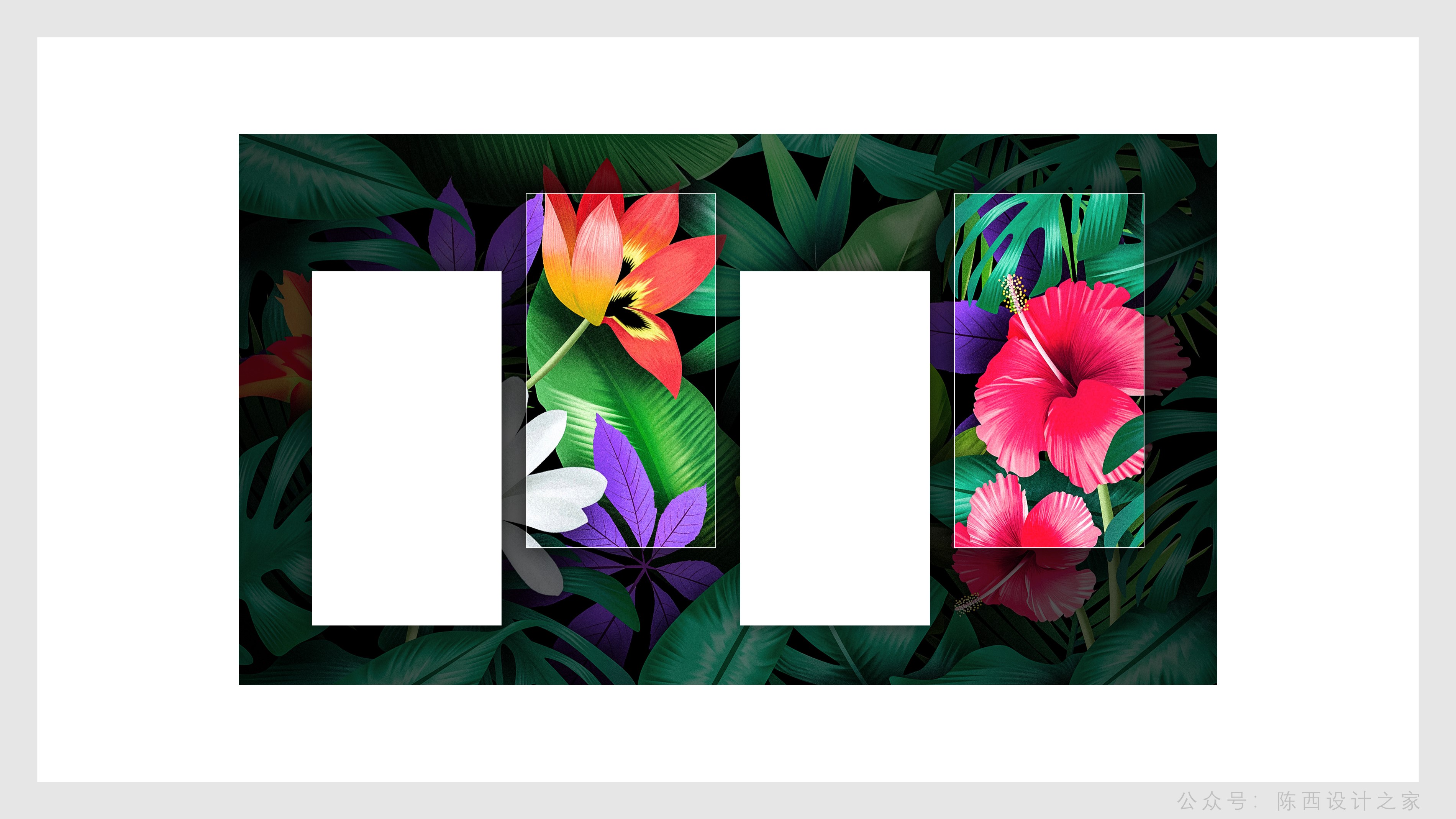
The other parts are also operated in this way, so that the effect can be obtained as shown in the figure below:
The last thing is to add the copywriting and details. That's it.
As shown below:
▊Page 6:
This page uses a simple text barrage effect. Of course, it may be better to cooperate with animation.
It should be noted that the size of the text is different, and the arrangement can be staggered.
In terms of the overall design, the interactive typesetting of pictures and shapes runs throughout, and the overall design is unique in creativity, which is worth learning and reference.
If you have brand promotion PPT production, you can refer to the design ideas here. I hope you all gain something.
above.
◎Source file: Wechat search: Chenxi Design House. Reply in the background dialogue box of the official account: Creativity 53 and you can download the PPT source file. Don't make a typo, you can copy it directly.
Articles are uploaded by users and are for non-commercial browsing only. Posted by: Lomu, please indicate the source: https://www.daogebangong.com/en/articles/detail/PPT%20Tutorial%20The%20advanced%20interaction%20between%20pictures%20and%20shapes%20in%20the%20brand%20promotion%20PPT%20has%20highlights.html
 支付宝扫一扫
评论列表(196条)
测试