The following article comes from the ppt excellent tutorial, author P Xiaobai

Share PPT graphic tutorials, video tutorials and other efficient office software tutorials every day.
WeChat scan code to watch a full set of Excel, Word, PPT videos
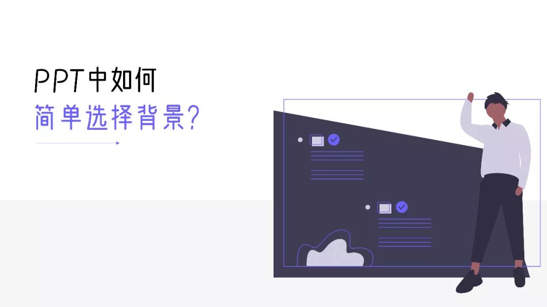
When doing PPT, choosing the background of the slide is a very tricky thing, and the background of the slide has a great impact on the visual effect of the PPT. How to choose a slideshow background? Let's take a look below!
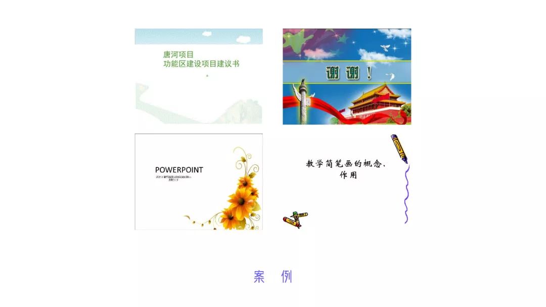
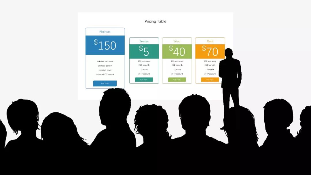
Speaking of the background, many people may have the following impression.

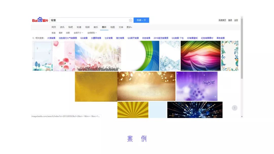
There is no eye-catching place, and it lacks creativity, as if it was carved on a mold. If the text is placed alone, it feels too thin, and the background search on Baidu is the same, which is very unsightly.
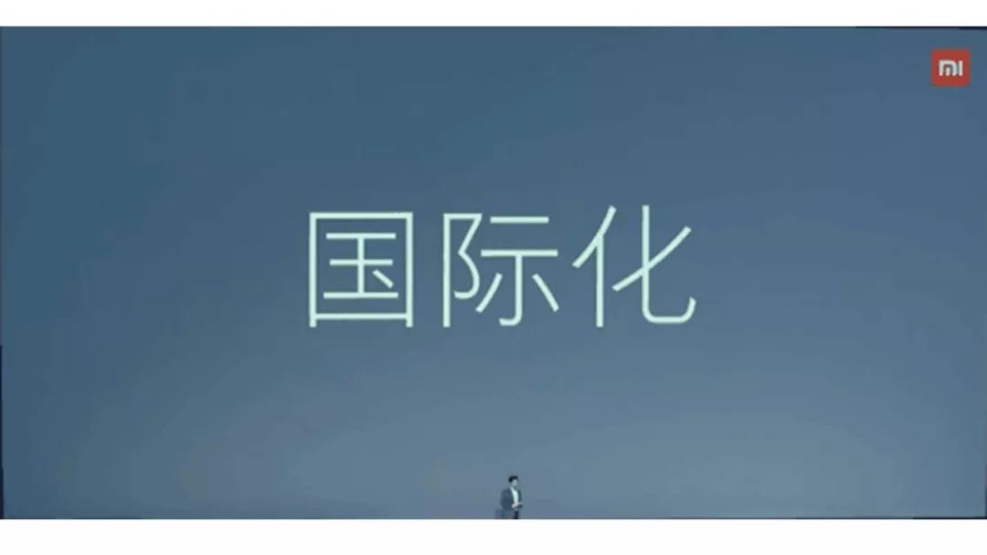
In fact, there are many cases worth learning about the PPT background, such as the press conferences of various mobile phone manufacturers.
We will find that the PPT pages of many press conferences are relatively simple and clear. In fact, this kind of thinking is particularly important in making PPTs. Everything in PPT is for speech, it is best to keep it elegant and high-contrast, such as black background and white text or white background and black text, there is a 100% difference between the two.
Xiaobai summed up 4 methods about the PPT background, namely: Consider the projection environment, reduce background color saturation, background gradient filling, light texture.
01
Consider the screening environment
Before doing PPT, think about the occasion of the speech. The background colors chosen for different occasions are completely different.
When speaking in brighter places, generally use a light background. The advantage of this background is that it can make the page blend with the surrounding background, avoiding the "loss" of screen color.
Similarly, dark backgrounds are often used in darker presentation situations.
If you use the wrong background style, it will have a very bad effect. For example, in a bright room, a dark screen is prone to "bleedout", while using a white screen in a dark room can be harsh, like a light shining on the eyes.
To summarize:
(1) Use a light background for a bright room, and a dark background for a dark room;
(2) It is necessary to consider the occasion of the speech before making the PPT.
02
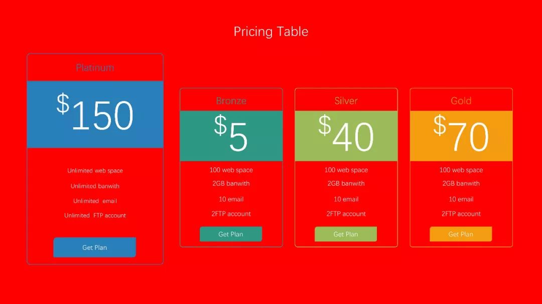
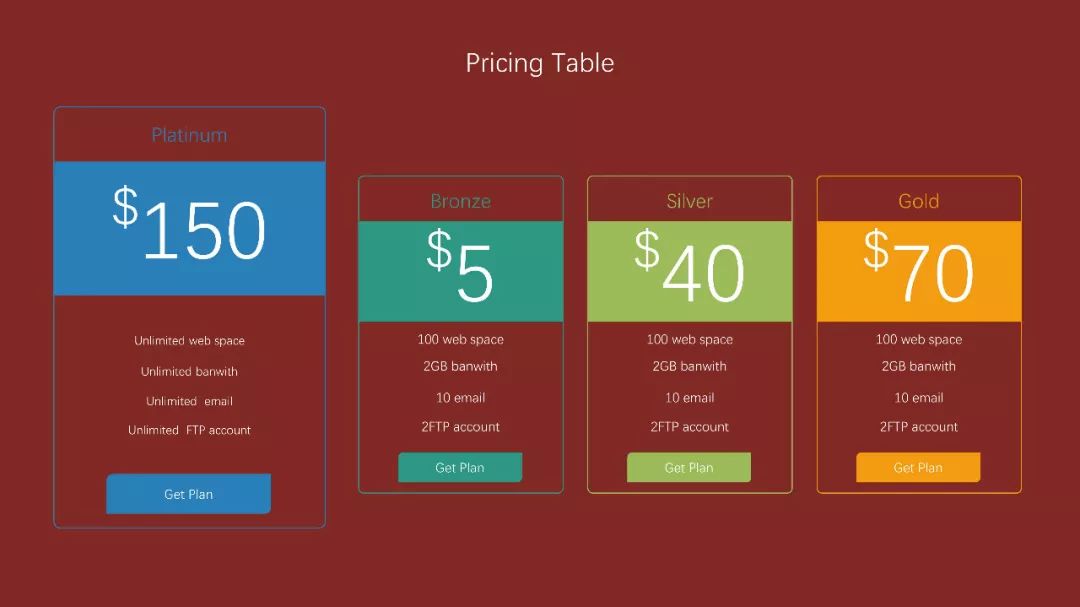
Desaturate background color
Accustomed to the default white background, many friends like to make a solid color background, but when making a solid color background, you need to pay attention to the page color.
Using the system default red as the background, due to the high saturation, it is more eye-catching.
After appropriately reducing the saturation, the background color is more friendly and easier to be accepted by the audience.
To summarize:
(1) Try not to use the colors that come with PPT, generally they have higher saturation;
(2) It is best not to have more than 3 colors in a set of PPT. Breaking this constraint requires higher design skills.
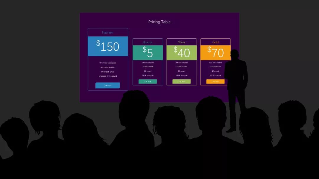
03
Background Gradient Fill
It is common practice for press conferences to use gradients for background filling. The principle is thatone end uses the background color, and the other end uses the same color a little lighter.

Too many single-color backgrounds are easy to cause aesthetic fatigue, and the use of gradient backgrounds can well alleviate this problem.

The 90° gradient, from top to bottom, is different from the solid color background, and the page is more attractive.
The same principle, no more details.
To summarize:
(1) When there are too many pages with a solid color background, it is easy to cause visual fatigue. You can consider using a gradient background to alleviate this problem;
(2) The commonly used gradient is a 90° gradient, and the transparency of the gradient fill is relatively low (there is a demonstration in the case).
04
Light texture
What about a single solid-color background that is tiring, and multiple over-the-top elements and cumbersome texture or pattern fills? It is better to use the texture pictures that have been prepared on the Internet.
By cutting, choose a picture or texture fill in the background option, cut the board, set it and then tile it to complete the texture background. But in general it is necessary to change the texture opacity so as not to affect the highlighted text.

This approach can also be applied to the Memphis style.
To summarize:
(1) In order to avoid the monotony of the page background, you can use the texture website picture on the Internet as the page background;
(2) Commonly used texture websites include: https://www.toptal.com, http://www.heropatterns.com, etc.
Having said so much, let's do the actual operation of the case~
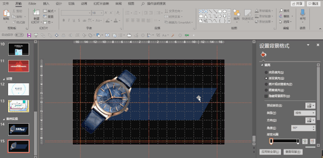
Step 1: Right-click the blank area, click "Set background format", and set " Set "Fill" to "Gradient Fill," drag the left mouse button upwards to delete the redundant gradient apertures and only keep two. At the same time, set the gradient aperture at both ends, the color of both is pure black, the transparency of one end is 0%, the transparency of the other end is 10%, and the "gradient angle" is 90°.
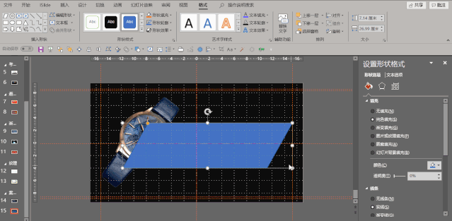
Step 2:In the "Insert" tab, select "Picture" to insert the downloaded picture. Click on the picture, rotate clockwise at a certain angle, move to the left for a certain distance, then select "Shape" in the "Insert" tab, insert a "parallelogram", and adjust the "yellow handle" of the quadrilateral to a suitable position.
Step 3:First, in the "Format Shape" property bar, set "Line" to "No Line" (When "Format Shape" does not appear, you can right-click the parallelogram to call it out), "Fill" is set to "Solid Color Fill", and the fill color is picked from the wristband of the picture using the color picker, and then, in the "Format" tab Move the color block down one layer.

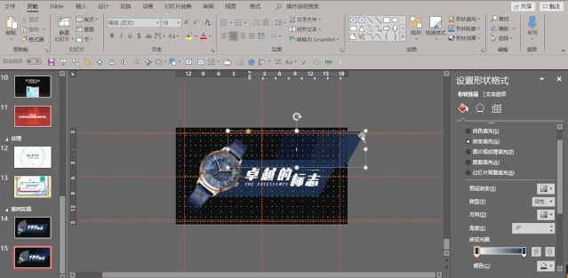
Step 4: Add text on top of the color block (simple but takes more time to operate), copy the color block, Also in the property bar of "Format Shape", set the "Fill" to "Gradient Fill", the angle to 0°, the color to the color from the color picker before, and the "Transparency" at one end to 100%, and the "Transparency" at the other end. Set to 0%.

Step 5: Reduce the copied parallelogram in step 4, copy multiple layers with Ctrl + left mouse button, and place it in the The surrounding area of the large parallelogram is used as a decoration, and the overall fine-tuning improves the sense of design and trend of the page.
Finally, the entire page is finished~ Let's see the final effect.
Okay, this is the end of this tutorial, see you next time~
PPT tutorial article recommendation
Shocked, only add a wireframe to the PPT, the force of the PPT The grid instantly increased by N times!
How to make the long flowchart in PPT clear and beautiful? Teach you a few tricks, the effect is good and you can see the explosion!
PPT tutorial: Urgent! urgent! urgent! Wait online! How to make a flash PPT with Douyin explosion?
Kneel down, the built-in [Merge Shapes] function of PPT is so powerful, it’s a pity that it won’t be used!
Click "Read the original text" for more information!
Articles are uploaded by users and are for non-commercial browsing only. Posted by: Lomu, please indicate the source: https://www.daogebangong.com/en/articles/detail/PPT%20Tutorial%20Most%20people%20who%20have%20done%20PPT%20have%20been%20stumped%20by%20this%20question%20N1%20times.html
 支付宝扫一扫
评论列表(196条)
测试