The following article comes from Black and White Room Design, author Lao Hei

Starting from PPT, the design becomes simple.
WeChat scan code to watch a full set of Excel, Word, PPT videos


Old BlackBlack and White Room Design (ID: HbjDesign)
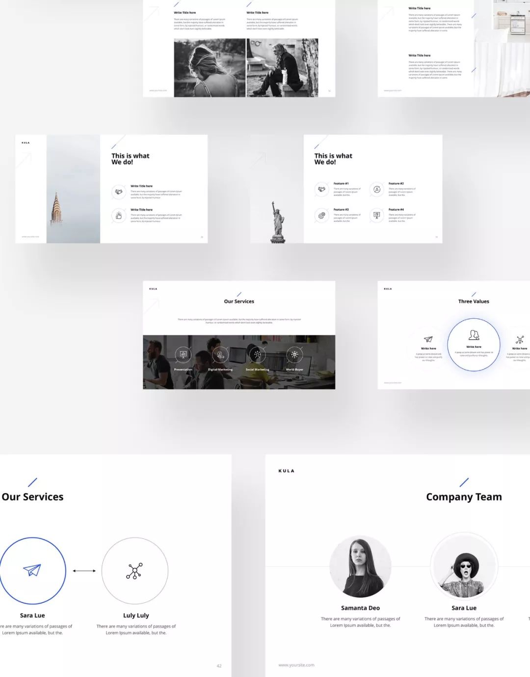
Sometimes when we look for PPT templates on the Internet, we will find some templates that look very compelling. This kind of template is usually in English, with very small characters, and it looks like this.

After downloading it with great joy, we replaced it with our own content, and suddenly found that there was a little bit of acclimatization, and the original very beautiful template could not be read clearly after adding specific content.
Once we increased the size of the characters, we found that the temperament between the original format and the characters did not match.
01 Those who can't see clearly are hooligans
This is a common dilemma when setting up PPT templates. So should we keep the original small text, or abandon the layout in the template and enlarge the text?
I think the first principle is that if you want to give a PPT, all the text in the PPT should be able to be seen by all audiences. If you say you can't see it, you are playing hooligans.
There is such a design in many advertisements, you can buy something for as much as you want, but there is a very small word "starting" at the bottom right of the amount.

The designer didn't want you to see this word at a glance at all, but it had to be placed, so this kind of very small text was made.
When we assign text sizes, we actually assign them importance categories.
Prominent text = important content;
normal size text = normal content;
Just enough to see the text = unimportant content;
Words that cannot be read anyway = content that I want to hide quietly.
Speaking of PPT, of course, I don’t want to leave a deceptive impression on others, so it is necessary to ensure that all the text can be read clearly.
02 There is only a small size
Then why do you add some small text in many designs? This also makes sense.
One day, you finally quit your job and went surfing the mountains, wanting to take a photo as a souvenir. One way is to make a traditional V-sign gesture, occupy most of the screen, and take a picture.

Another way is to set up the camera, go to a far away place by yourself, and then take pictures of the whole mountain and your own small figure. The following photos are the works of MaxRive.


If I were to choose, I would think the selfie in the back would be cooler.
This is the biggest use of small text:Use small text to define the smallest element in the page, and then the smallest element is compared with other elements, Create an atmospheric atmosphere.
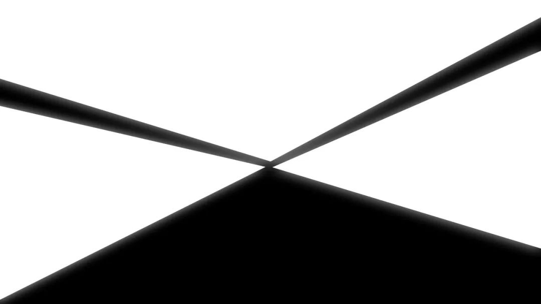
The size of the page is fixed, I drew a few shapes, tell you, these shapes are very big! You sure don't think so.
But I add an airplane, and the airplane exists as a small element. These shapes become very large.
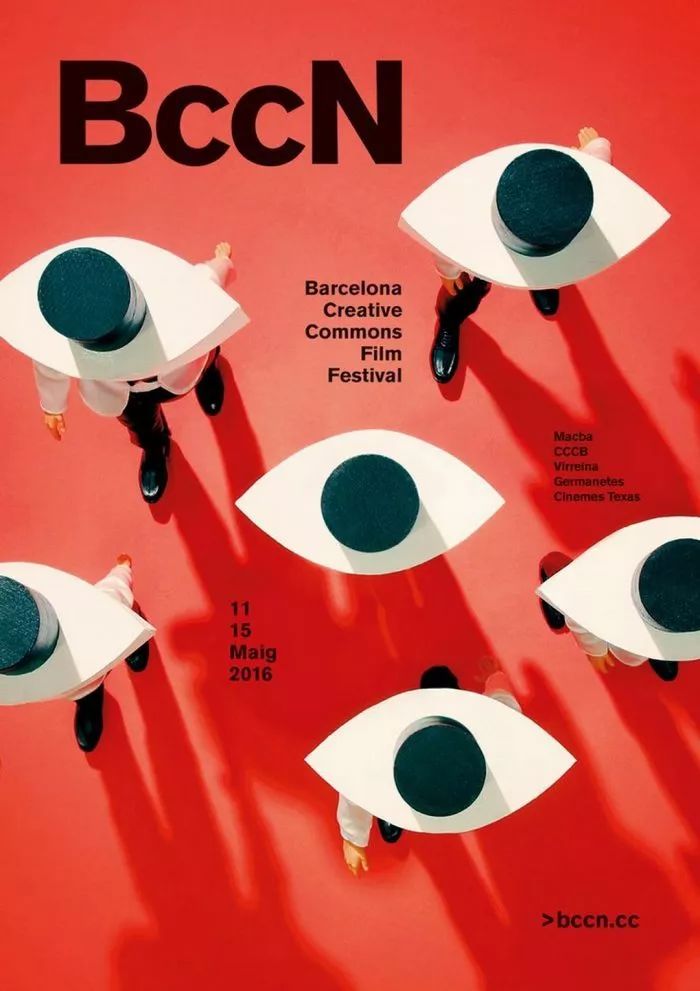
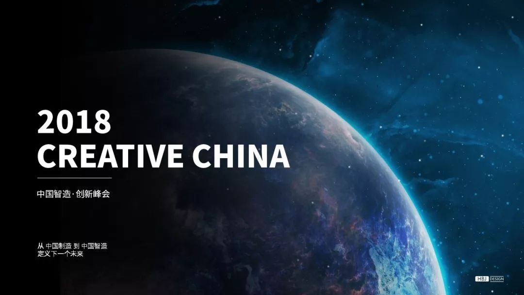
This also explains why tall PPTs are often accompanied by earth maps and starry sky maps? Because writing words on such pictures may be bigger than a country!
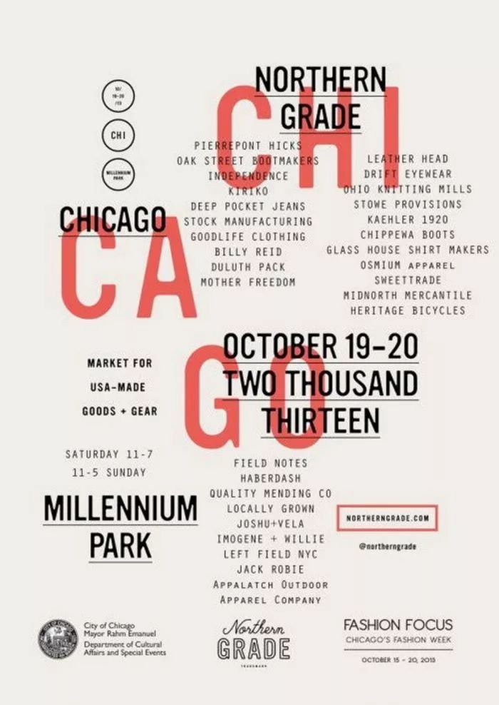
In short, if there are small characters, there are relatively large characters. Let’s look at a few more examples of excellent design with strong text contrast.


03 Blank space is also an element
In Chinese landscape paintings, you can often see a lot of blank space. The picture below is Qi Baishi's "Borrowing the Mountain Map: Dongting Junshan". The mountain is outlined with a few strokes, and the blank space becomes water with a small boat.

The process of arranging the text size is actually the process of arranging elements, white space and relationships. If you make the characters bigger, the natural space will decrease, and if you make the characters smaller, the natural space will become larger. Whether a large margin is required depends on the positioning of the design.
It is critical to consider white space as an important design element. Rather than having it be a by-product of arranging other elements. Hu Xiaoshi said: "Where there are words is ink, and where there are no words is white. Ink is words, and white is also words...where there are words and where there are no words, they are equally important." It is also an important part of the layout. Once this concept is established, there will be no such sayings as words are too small to waste space.
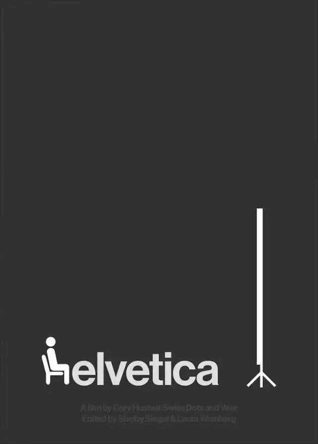
Large white space can sometimes make the content clearer. For example, to place a LOGO on the page, it is not necessary to fill the screen.
Given sufficient blank space, we will naturally notice the existence of the LOGO.
That is to say, design elements are not simply bigger and more eye-catching. Many times, there are a lot of content on a page, and they are all very large. If they are crowded together, they cannot be seen very clearly, as shown in the picture below.
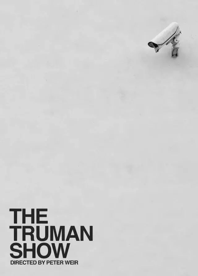
Let's look at a few cases of deliberately not increasing the font size to create white space.
04>
Taken together, the use of small print in the design makes sense. But it must be on the basis of ensuring that everyone can see clearly.
According to experience, if the PPT used for printing is printed on A4 paper, the reading will not be affected if the words are above 10.
So for the PPT to be used for speeches, how big should the characters be to read clearly? It is the most accurate method to go to the scene to check, because factors such as font stroke thickness, font type, venue length, projection screen size and other factors will affect the visual effect.
If you can't go to the scene. We can test this mathematically.
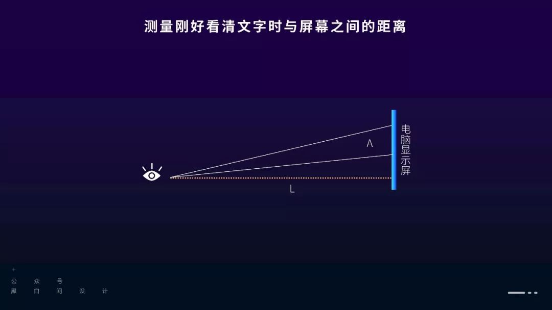
First, play the PPT on the computer screen, then walk away slowly, look up at the screen slightly, and stop at the position where you can read the characters clearly. At this time, our eyes and the upper and lower edges of the characters form a triangle, which is defined as A. Measure the distance between you and the screen, defined as L.

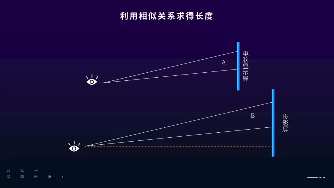
When we actually played the PPT in the venue, the eyes of the audience in the last row and the upper and lower edges of the projected text formed a triangle, which was defined as B. Triangle B and triangle A are probably similar, so you can measure how far away the audience with your vision can see the text clearly by the ratio of the width (height) of the projection screen to the width (height) of the computer display screen.
If the calculated distance of is greater than the length of the venue, then there is no problem; if the distance is smaller than the length of the venue, then the font size needs to be increased.
Specifically choose width or height as the basis for calculating the ratio, according to the principle of full screen. For example, a 16:9 PPT fills the width and height of the computer display, but when projected onto a 4:3 screen, it can only fill the width, leaving a part of the upper and lower sides. At this time, choose the width as the The basis for calculating the ratio.
For example, if your computer screen is 15 inches, then the width is 32.3cm. Suppose you set the font size and stand 2m away, you can see the text on the screen clearly. The on-site projection screen is a 150-inch 4:3 projection screen, so the width is 231cm. The width of the projection screen is calculated to be 7.15 times the width of the computer screen, then 7.15×2=14.3m, and the text you designed can be seen clearly in the venue within the length of 14.3m.
If you are too lazy to calculate, zoom the normal view of the PPT to about 60%, and if you can see the text clearly, the general problem will not be too big.
The above is the sharing of this issue~
PPT tutorial article recommendation
How to design the title of PPT to be brilliant? It is enough to master 4 skills
PPT design is always monotonous? How about trying to change the dynamic background, super exciting! (PPT Tutorial)
With this [opening] manual, you can make your PPT speech zero mistakes! (PPT Tutorial)
Don’t delete the unsightly material, put it on the prototype, and still make a good-looking PPT!
Click "Read the original text" for more information!
Articles are uploaded by users and are for non-commercial browsing only. Posted by: Lomu, please indicate the source: https://www.daogebangong.com/en/articles/detail/PPT%20Tutorial%20Make%20the%20words%20in%20the%20PPT%20smaller%20will%20the%20PPT%20be%20more%20compelling.html

 支付宝扫一扫
评论列表(196条)
测试