Hello! As a language model, I'd love to help you and answer your questions, but is there anything specific that I can help you with? Do you need me to give you a brief overview and summary of this PPT tutorial?
The following article comes from the ppt excellent tutorial, author P Xiaobai
Excellent ppt tutorialShare PPT graphic tutorials, video tutorials and other efficient office software tutorials every day.

I believe that some friends have encountered problems such as the size of the PPT does not match the projection screen, the speech venue is too large, the audience in the back row cannot see the PPT clearly, or the style of the PPT does not match the audience group. How to avoid these problems? Let's learn together! 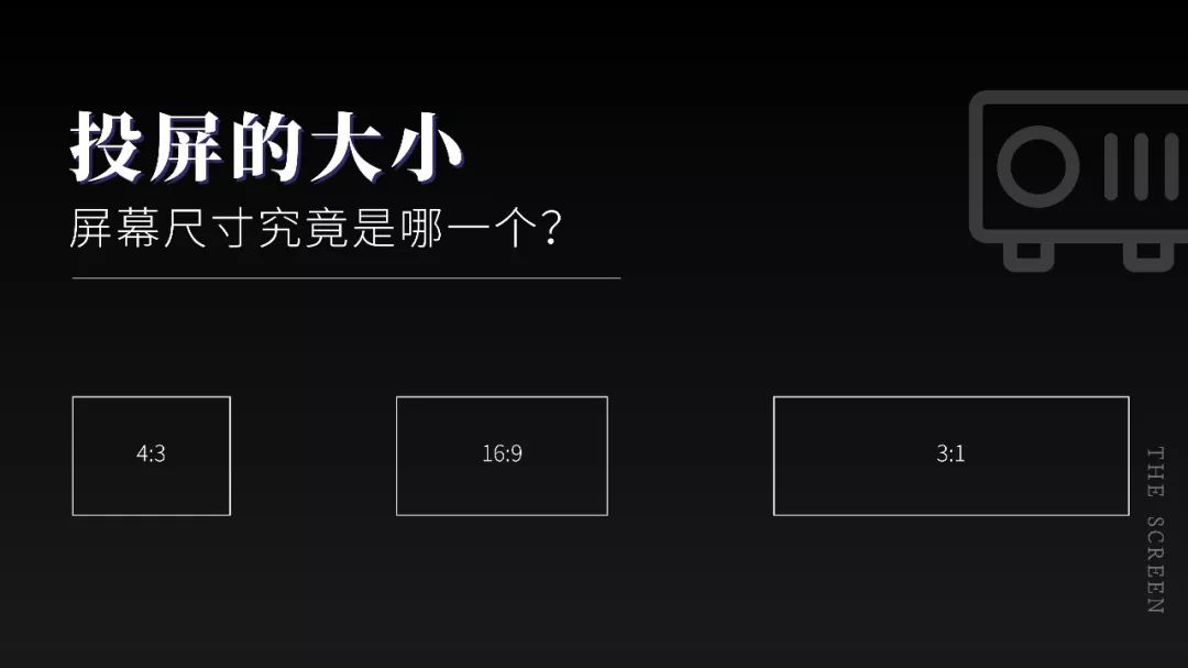
When it comes to speeches, many people are afraid to avoid them, and they are very nervous when they think about it. Actually, we don’t have to be nervous during the speech process. In today’s society, it’s very rare to express our own ideas, because Weibo, Douyin, WeChat, etc. are very popular , it's amazing to have someone willing to sit down and listen to you, even for a short while. It's a privilege to be heard, even if it's routine or called out under compulsion. 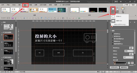
If you want to be excellent, you need to make full use of opportunities and let everyone listen to your heart. Actually, from the perspective of the audience, the most important thing is not the slides, but to see you, listen to your voice, and learn from you , So as long as you make enough preparations in the early stage and keep encouraging yourself in your heart, you can impress most of the audience present during your speech. Xiaobai spent half a day sorting out a PPT speech that needs to be paid attention to, and analyzed the things that should be paid attention to in the speech from two aspects, namely:Precautions before making PPT and Precautions after making PPT. Today we will talk about the first half: Precautions before making PPT. There are a lot of preparatory work that needs to be done before the production of PPT, such as what is the purpose of the speech? Who is the audience for the speech? How long is the speech, etc., here Xiaobai will analyze it one by one. Part 1:Size of the screen
The size of the projection screen is very particular. Generally, the ratio of projectors in university classrooms is 4:3, while the ratio of commonly used projectors in work and life is 16:9. Of course, at the press conference The ratio of the projector used is 2:1 or 3:1. If the size of the projection screen is ignored when making PPT, black borders will appear on the screen during the speech, which will affect the projection effect and speech effect. 
Set the size In the "Design" tab, set the "Slide Size" to change the screen size. Determine the size of the projection screen It is better to proceed to the next step to avoid PPT display problems and affect the projection effect. Part Two:Speaking Occasions
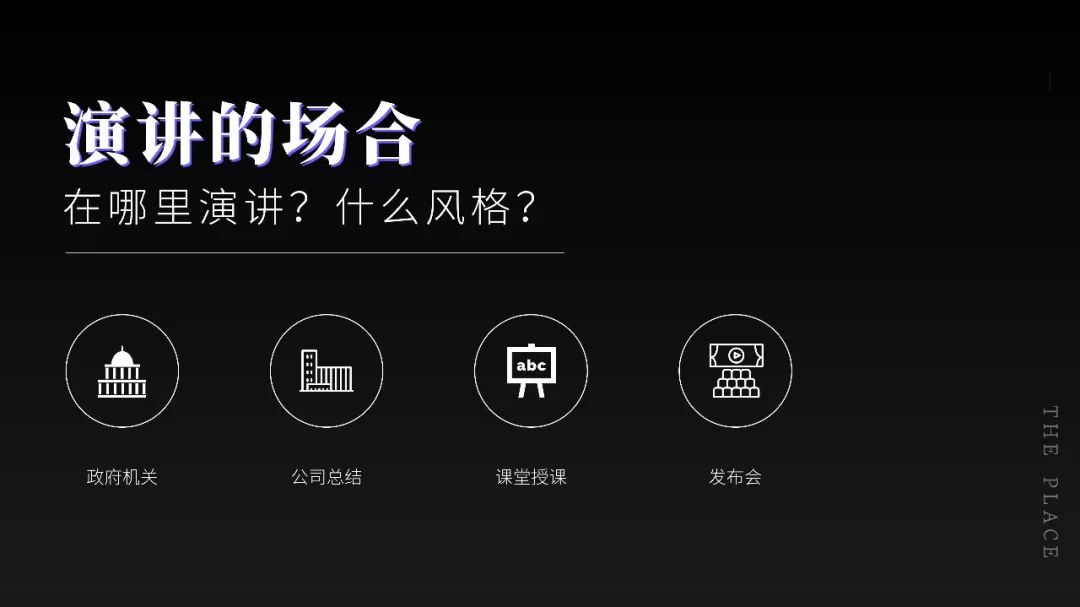
After determining the size of the projection screen, you also need to determine the occasion of the speech. Is it a party and government speech by a government agency? Or the company's internal summary or annual meeting? Or school classroom teaching? Or a press conference roadshow? These occasion factors are very important, it directly determines the style of PPT, for example, the party and government are easy to think of "tomato color", while the work summary is easy to think of "business blue" wait. Using the wrong PPT style will make people feel like eating flies, such as using pink for business style. Part Three: Audience Determination
Once the occasion is determined, the rest is the audience. Some people may say that the audience has something to be sure about, so just listen to me? In fact, it is not the case. For example, if there are more than 100 people in an audience, and the speech is in a crowded space, how do you let the audience in the back row see you clearly? PPT? Similarly, the tone of speech and body movements are often different for different audiences. Therefore, it is necessary to determine the number of audience and the relationship. (1)The style, characteristics and usage of slides are different in different occasions;(2)No matter what the occasion, the speaker can treat the speech as a kind of communication, not You are on stage and the audience is performing off stage. This is the end of the Precautions before making PPT, are you right in the article? Are you more interested in the last picture? Here Xiaobai also simply teaches you how to make such a simple page, don't blink~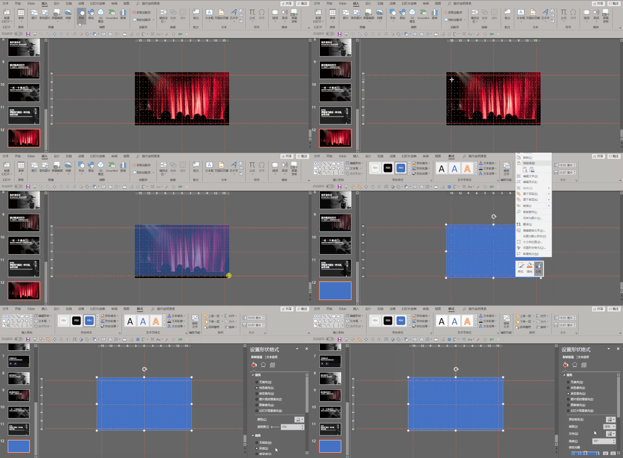
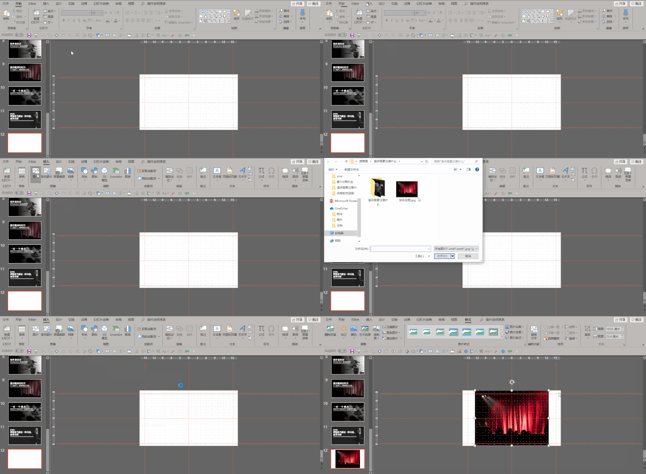
Step 1: Find a suitable picture (pexels or unsplash, skip the process of finding a picture), select "Picture" in the "Insert" tab, and insert the picture you just found. 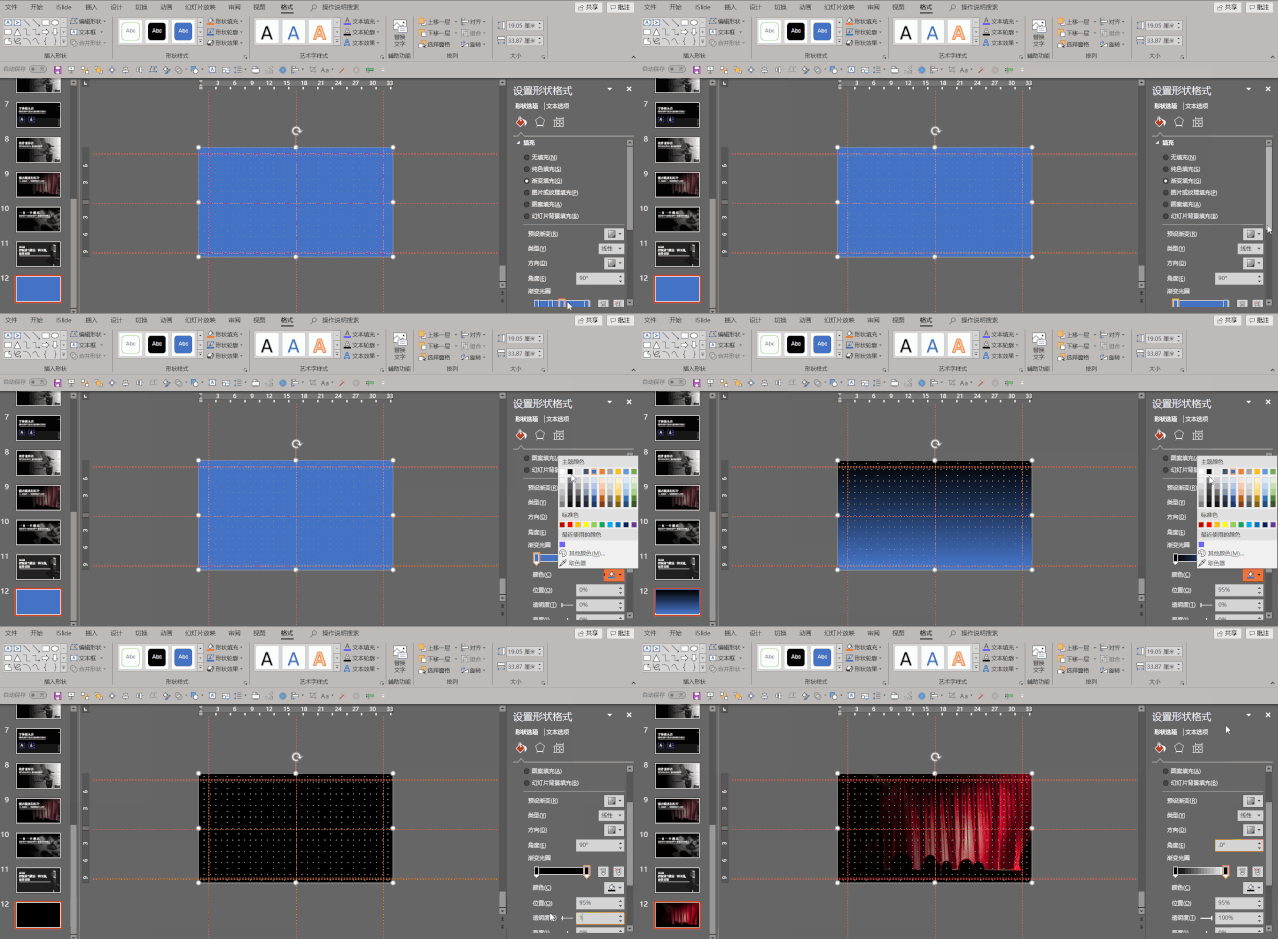
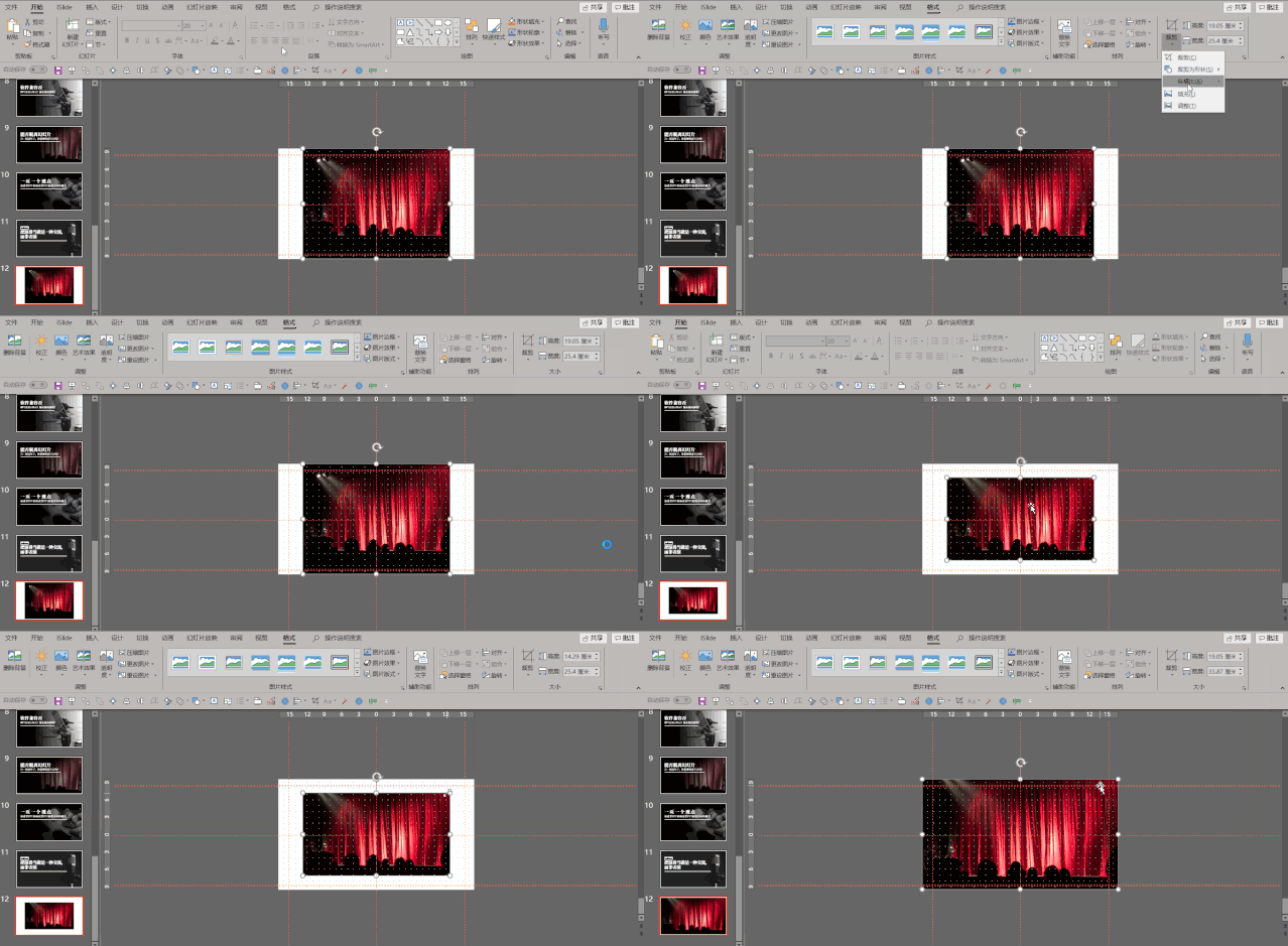
Step 2: Select "Crop" in the "Format" tab, change the cropping ratio to "16:9", and hold down Ctrl+shift to enlarge the picture proportionally until it fills the entire slide slice page. 
Step 3: Select "Shape" in the "Insert" tab, insert "Rectangle", drag the rectangle down along the upper left corner until it fills the entire slide page, right-click "Set Shape" Format", set Line to No Line, and Fill to Gradient Fill. 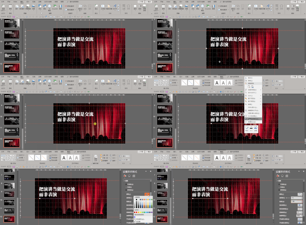
Step 4: Drag the gradient aperture upwards with the left mouse button, delete the redundant gradient aperture, and change the color of the gradient aperture at both ends, both are black, and one of the "transparency" is 100%. "Fade Angle" is set to 0. 
Step 5: Insert the "Text Box" in the "Insert" tab, enter the text, press Ctrl+A to select all the text, change the "Text Type" to "Siyuan Song Type", and change the "Font Size" of the text ” is set to 60, and the “Text Color” is changed to “White”. 
Step 6: fine-tune the position of the text box, select "Line" in the "Insert" tab, hold down the shift key to insert a straight line, right-click "Format Shape", and change the "Color" to "White" and "Pound Size" are changed to 2 points, and the whole page is completed~Let's take a look at the final rendering:< section>
Okay, this tutorial is over here, see you next time~PPT tutorial article recommendationA new colleague actually used PPT to "make up" the text, and instantly compared me!
The fancy way of playing PPT table makes your page design no longer boring!
In addition to displaying data, the PPT table also has such a powerful gameplay!
It was ugly at the beginning, but after using it, the PPT efficiency artifact that is really fragrant: iSlide[Function Analysis]
The most dazzling animation in PPT, 2 minutes to learn super cool smear animation, sensational audience! (PPT tutorial)
Click "Read the original text" to get more exciting content!
Articles are uploaded by users and are for non-commercial browsing only. Posted by: Lomu, please indicate the source: https://www.daogebangong.com/en/articles/detail/PPT%20Tutorial%20Issues%20that%20must%20be%20paid%20attention%20to%20when%20speaking%20on%20PPT%20dont%20lose%20the%20chain%20at%20the%20last%20step.html


 支付宝扫一扫
评论列表(196条)
测试