Director Liu of a certain degree told us that if the PPT is not done well, you may lose your job.
Although not everyone has the opportunity to make large-scale speeches, everyone will have a few turns in the workplace Presentation.
Let’s talk about the little thing of doing PPT today.
Design Principles
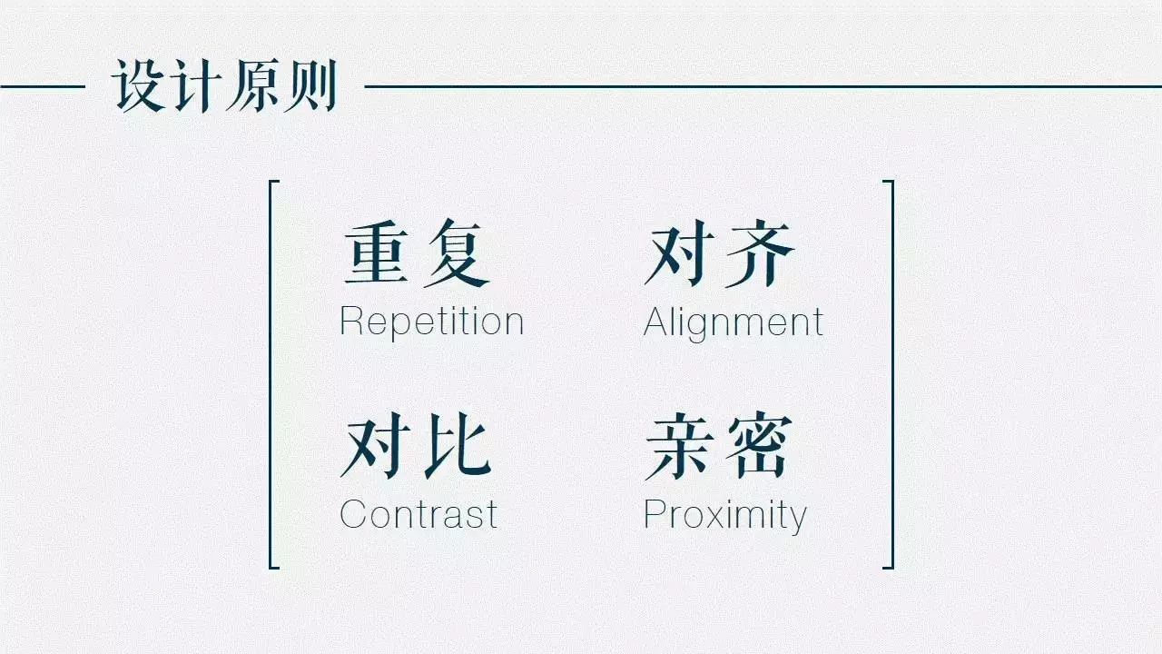
No matter how innovative PPT is, it is inseparable from the most basic design principles: repetition, alignment, contrast, and intimacy.

These four principles come from American designer Robin>
Repetition means that the same color, shape, font and other design elements can be used repeatedly in the entire PPT to increase the overall order and unity.

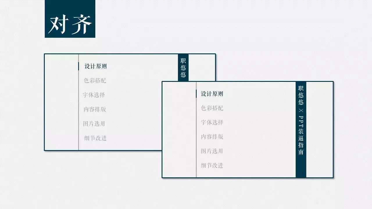
How can misaligned PPT survive in the world.
Alignment means that all elements on the page should have some kind of visual connection, rather than being randomly placed. Only in this way can a clearer and more beautiful visual effect be established.
Contrast means that the elements on the page should not be too similar, so that the audience can quickly discover the logical relationship between the content of the page and find the content they are interested in.

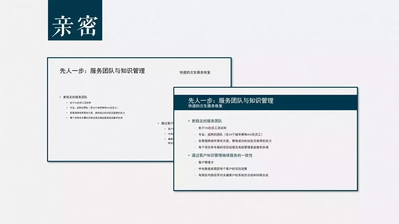
Intimacy means combining similar elements together to form a visual unit. This reduces clutter and provides a clear logical structure to the viewer.
At the same time, irrelevant content is separated to facilitate the audience to quickly filter information.
Of course, the most important thing to do in PPT is innovation!
You can do this
This

so

And this

Color Match
When encountering such a PPT, I choose a dog leash.

Although I don't know why, it is popular in classrooms of major colleges and universities.

For a beautiful PPT, soft and non-glare colors should be selected as the main color of the same chapter or even the entire PPT.
At the same time, the color matching must have a certain contrast in order to distinguish and identify.
In addition, the color should match the theme of the content. For example, the content of your PPT is about the food delivery platform Ele.me, but you use Baidu Waimai Red and Meituan Waimai Yellow...
Do you think it fits?
Just ask if you are suitable?
When it comes to color matching, it is inseparable from the color wheel theory.
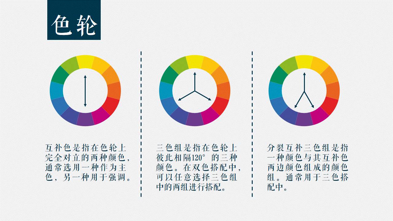
The basis of the color wheel is the three colors of yellow, red and blue, which we call the three primary colors. Because these three colors cannot be obtained by mixing other colors.
By mixing equal amounts of two adjacent colors on the color wheel, we get three secondary colors, green, purple, and orange. Then mix the colors on both sides of the remaining blank grid in equal amounts to get 6 third colors.

Now that we have a color wheel, how do we use it?
Simply put, complementary colors are used for emphasis, three-color groups are used for two-color collocations, and split complementary three-color groups are used for three-color collocations.
Complementary colors are two colors that are completely opposite on the color wheel, usually one is chosen as the main color and the other is used as an accent.
The three-color group refers to three colors separated by 120° from each other on the color wheel. In the two-color matching, two groups of the three-color group can be selected for matching.
A split complementary triad refers to a color set consisting of one color and the colors on either side of its complementary color, and is usually used in triadic matching.

The theoretical knowledge is supplemented.
Remember to try more colors next time to make your PPT as colorful as your life.
In addition to the theme color of PPT, the background color is also very important.

The light-colored background looks very clean and simple as a whole, and it is easy to highlight the key points.
Dark backgrounds are more compelling, and are limited by the performance of the projector. Usually, dark backgrounds perform better than light backgrounds when projected.
In addition, when making PPT, you also need to pay attention to the color difference of the projector. When projected, PPT colors are usually not as vibrant as they appear on a display.
For example, the yellow used in the PPT above may become a shit color when projected.

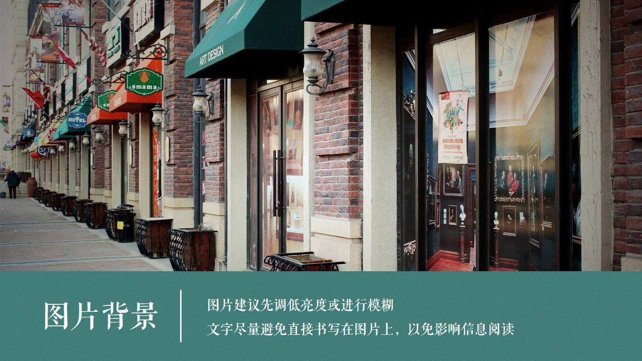
When choosing a picture as the background, it is recommended to lower the brightness of the picture or blur it first, so as not to steal the limelight of the content.
At the same time, try to avoid writing the text directly on the picture, so as not to affect the reading of the information. In addition, you can use the color picker function to make the entire PPT color uniform.
Font Selection
A good font can quickly improve the style of PPT. If there is no font, using Microsoft Yahei is definitely better than Arial.

Generally speaking, sans-serif fonts (without strokes, such as Yahei and Heiti) are flatter and lighter in style, while serif fonts (with strokes, such as the fonts used in "Font Selection") are more conservative and elegant.
In addition, if you use a font purchased and downloaded by yourself in the PPT, you must embed the font when saving the PPT, otherwise, if you switch to a computer that does not have such a font, the font in the PPT will be replaced with Arial.
Content layout
PPT should be bold and blank. Of course, blank space does not mean not to design, but to make people feel more comfortable while looking like there is little content.

At the same time, blank space can force you to simplify the content of the PPT page.
You know, PPT is not for you to read aloud when you are giving a speech.
The most basic mix of pictures and texts, of course, pictures are pictures and texts are texts, but don’t you always feel that there is less impact?

If the picture is used as the background of the entire PPT, the effect of writing text on the translucent color block will be different immediately, is there any?

A final emphasis on alignment and spacing.
The gray line segment is the marked alignment guide, and the orange line segment is the marked spacing guide.
The spacing is uniform and the elements are aligned, which can instantly enhance the high-level sense of PPT.
Of course, instead of asking you to manually align silly, you must make good use of the arrangement function of PowerPoint.
For example, center alignment not only allows a single element to be in the middle of the page, but also allows several elements to automatically align on the same horizontal line (vertical line).
The horizontal distribution/vertical distribution allows several elements to be arranged horizontally/vertically at equal intervals.

In addition, the left-right (up-down) symmetrical PPT not only pays attention to the spacing between elements, but also pays attention to the margins between the elements and the page.
Image Selection
The picture must be high-resolution and uncensored.
The picture must be high-resolution and uncensored.
The picture must be high-resolution and uncensored.
Many pictures in the PPT, hang a logo of Nitu.com at the bottom right, and ask you if you look embarrassed or not.
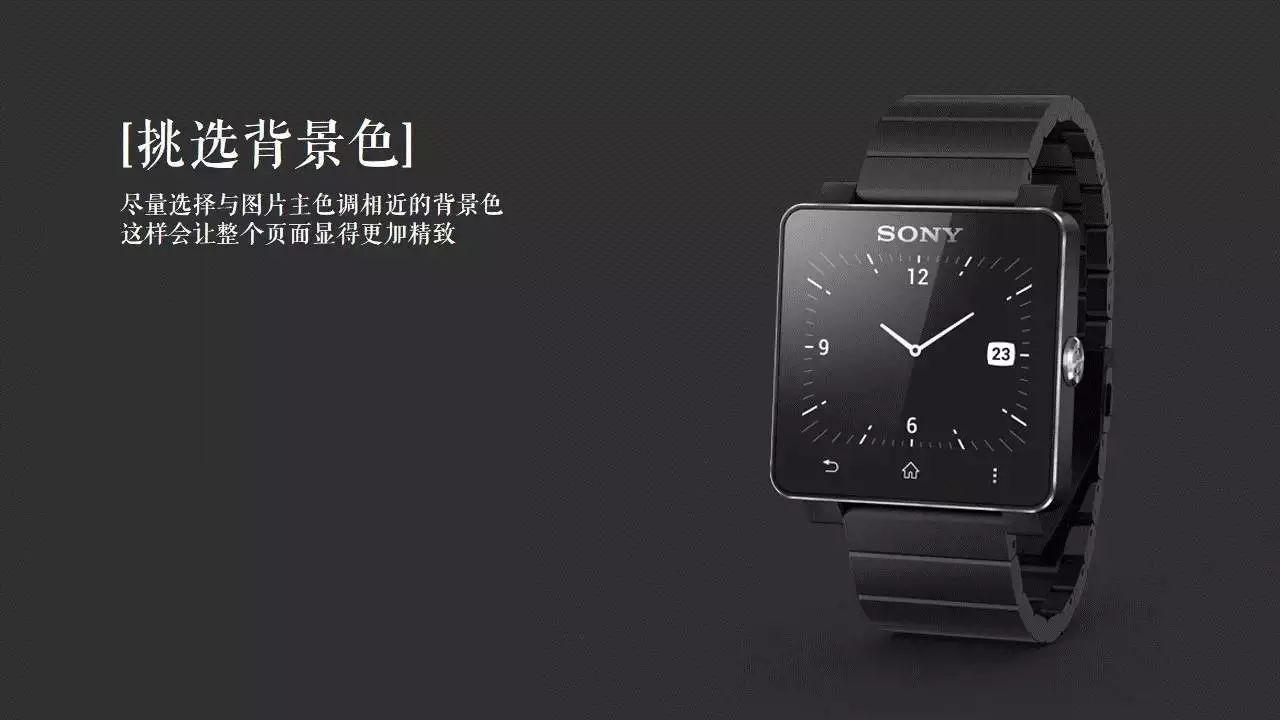
At the same time, you can also try to choose the corresponding background color according to the main color of the picture.
The main color can be selected through the color picker of PowerPoint. In addition, the PPT before version 13 does not have the color picker function.
Is the sense of force and refinement higher?

Similar to pictures of people, products, etc., you can delete the background (after version 10) through the delete background function of PPT, and then only put the subject of the picture into the PPT.
Yes, you heard it right, PPT has its own cutout function.
Is it a little taller?
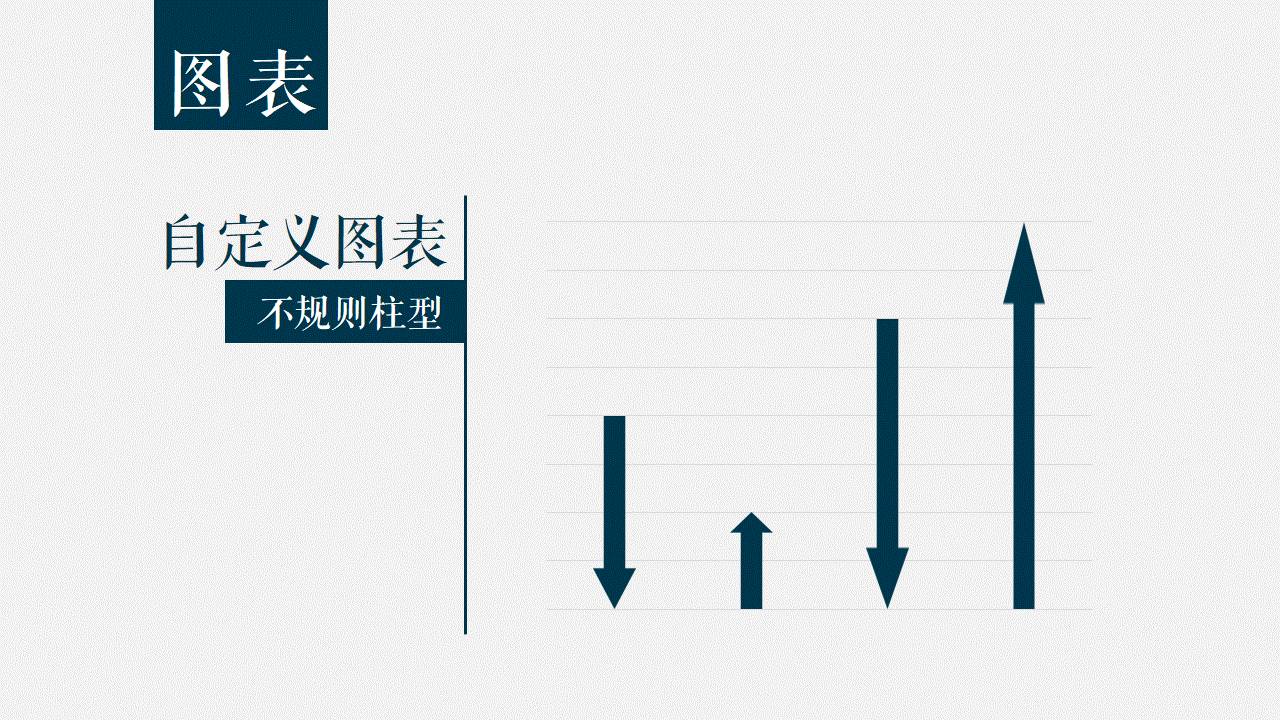
Detail Improvement
Make the histogram into an irregular column.

Create common graphs.
Insert the desired shape and copy it.
Check Column Paste.

Done.
Yes, it is that simple.

Use personalized icons instead of columns.
After creating a normal chart, and double-clicking on the column, a menu will pop up on the right.
In the Fill options, select Image or Texture fill, and choose the icon you want to use.
Finally, select Cascading as the insertion method, otherwise, you will see that your icon is stretched and distorted into the icon.

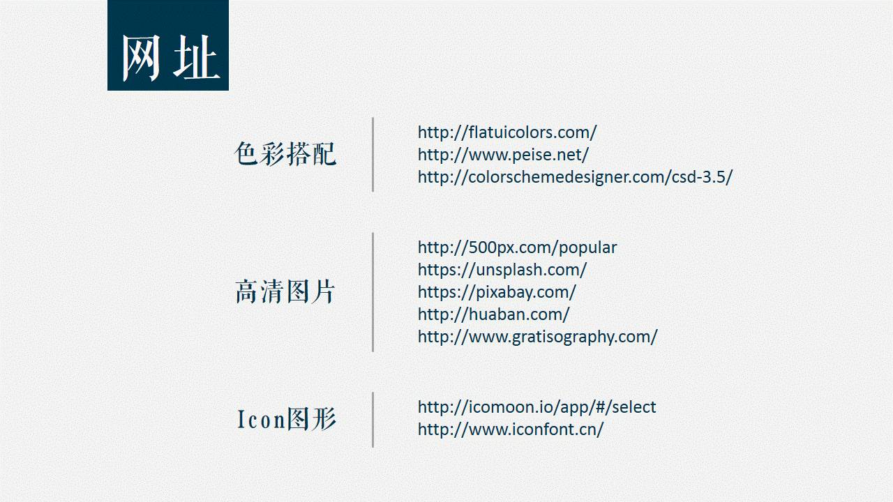
Finally, there are some commonly used websites, and friends who need them can pick them up by themselves.

The PPT pretense guide is over.

Uncle Ha of the article, long press the picture to follow.

When you come to Hangzhou, you can stay at Brother B’s home
After resigning from Ali, I earn a million a year
Ali Poor Life Guide
Ali Monthly Salary 20,000 Consumption Guide
Tencent Monthly Salary 20,000 Living Guide
Posting male tickets in the circle of friends means that you were fucked by this man
This is called a girlfriend who can cook, yours is at best a play house
A scumbag with no art skills actually works as a designer in Tencent Ali
ReplyAliView "Tell the truth! Never come to Ali to work"
ReplySalaryView the full version of "This may be the company with the best salary and benefits in the northern hemisphere: Tencent"
Reply to Tencent View "One Minute to Understand Tencent's Most Powerful Group: Designers"
Reply to A pictureView "A picture to understand the difference between working in Tencent and Ali full version"
Replyanother pictureView "Understand Tencent and Ali's corporate culture with one picture"
Articles are uploaded by users and are for non-commercial browsing only. Posted by: Lomu, please indicate the source: https://www.daogebangong.com/en/articles/detail/PPT%20Pretending%20Guide.html
 支付宝扫一扫
评论列表(196条)
测试