
Breakthrough - bondage
Mixcloud’s original LOGO seems to be the same as most brands, with the word “Cloud” in the name, so the LOGO must have the symbol “☁️”.
Although as a music platform, the combination of "☁️" + "sound wave/signal" is also in line with the situation expressed by the brand. However, when the same type of LOGOs began to flood the market, the brand couldn't help but start to reflect on whether it can make a breakthrough?
The brand upgrade of Mixcloud was carried out by Output Design Studio, which is headquartered in London, England. It set out to transform Mixcloud's new business strategy into a concrete brand image, and at the same time help the brand's development in the next ten years.
Connection - Concept
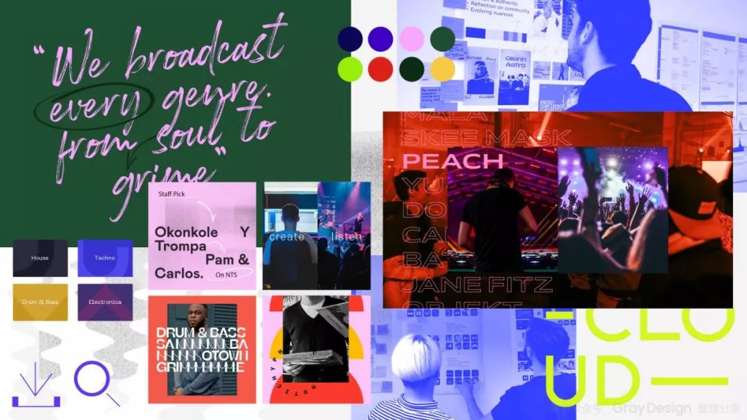
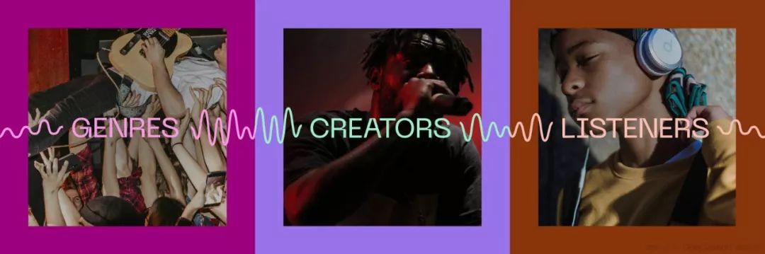
According to the introduction of Output Studio: Through the exploration and discussion of the team, we found the entry point of the design - Mixcloud as a platform to establish an emotional connection between creators and listeners.

This brings us to the creative concept of "connectors", which connect different music genres and user groups around the world, whose size and rhythm are completely determined by emotions, sometimes calm, sometimes crazy, always on the move And full of energy.
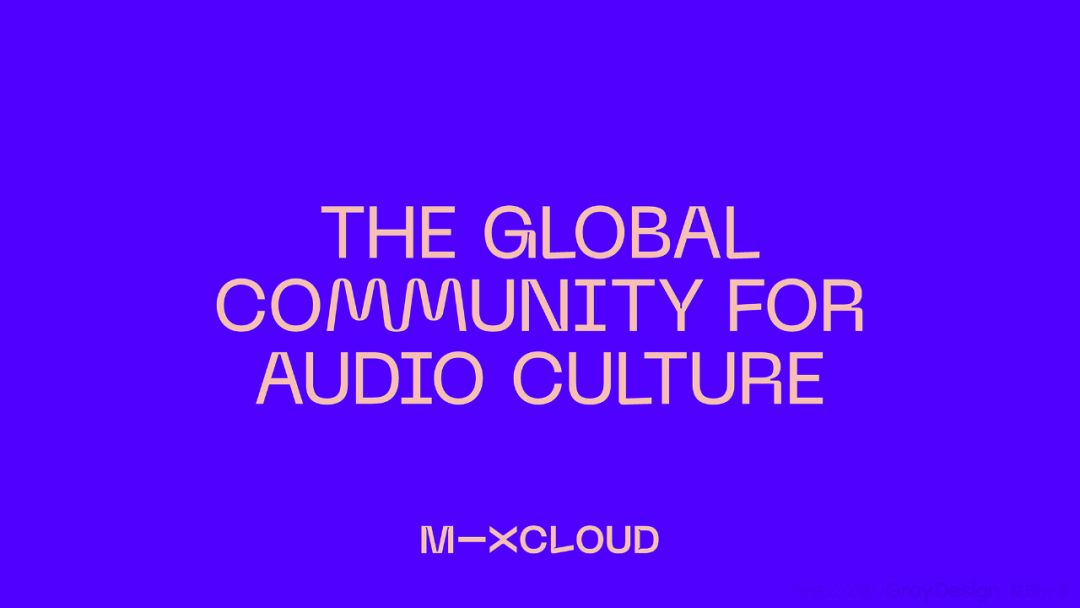
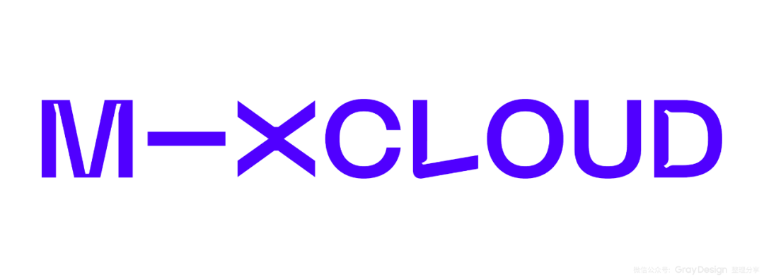
Connection——Font
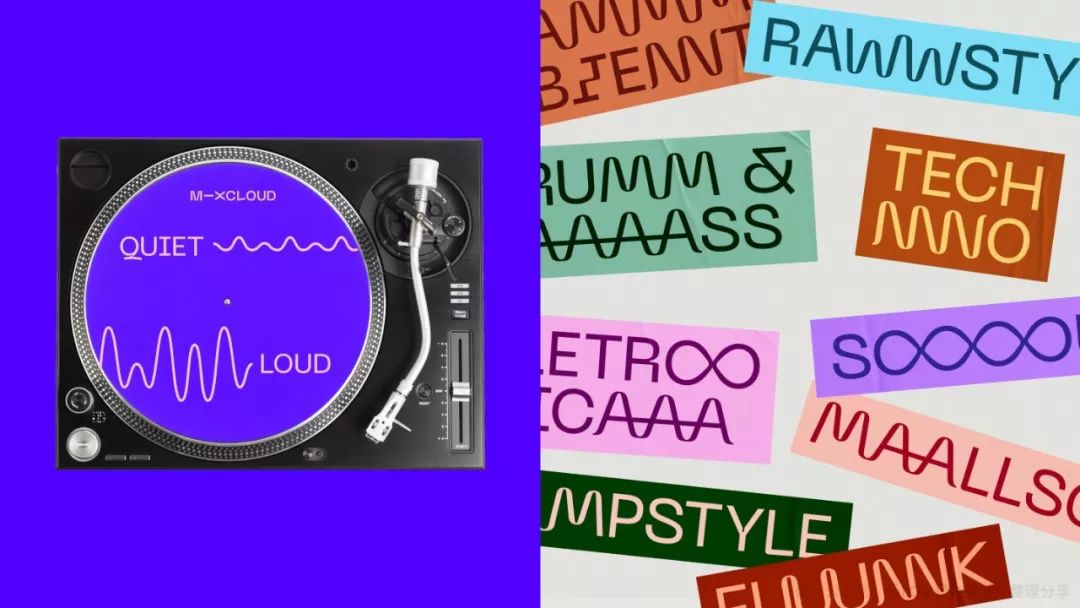
Combined with the concept of "connector", PangramPangram's custom-designed font is used as the main visual element of the Mixcloud brand. Bringing all brand content and emotion together with a wealth of user-generated imagery and this set of customizable fonts.
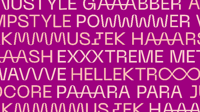
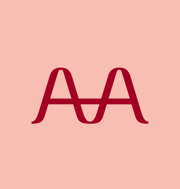
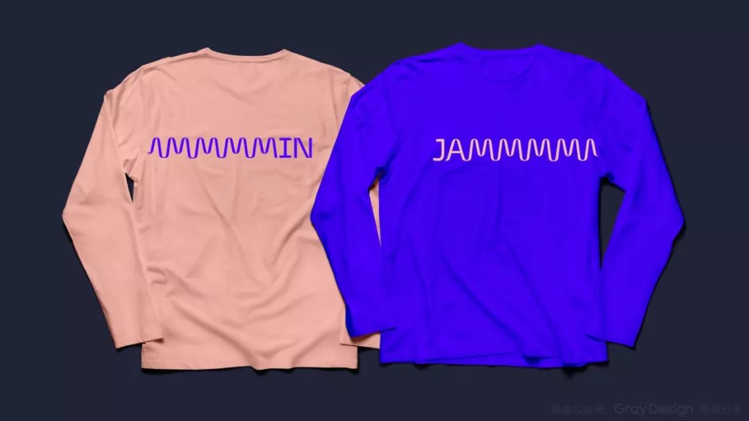
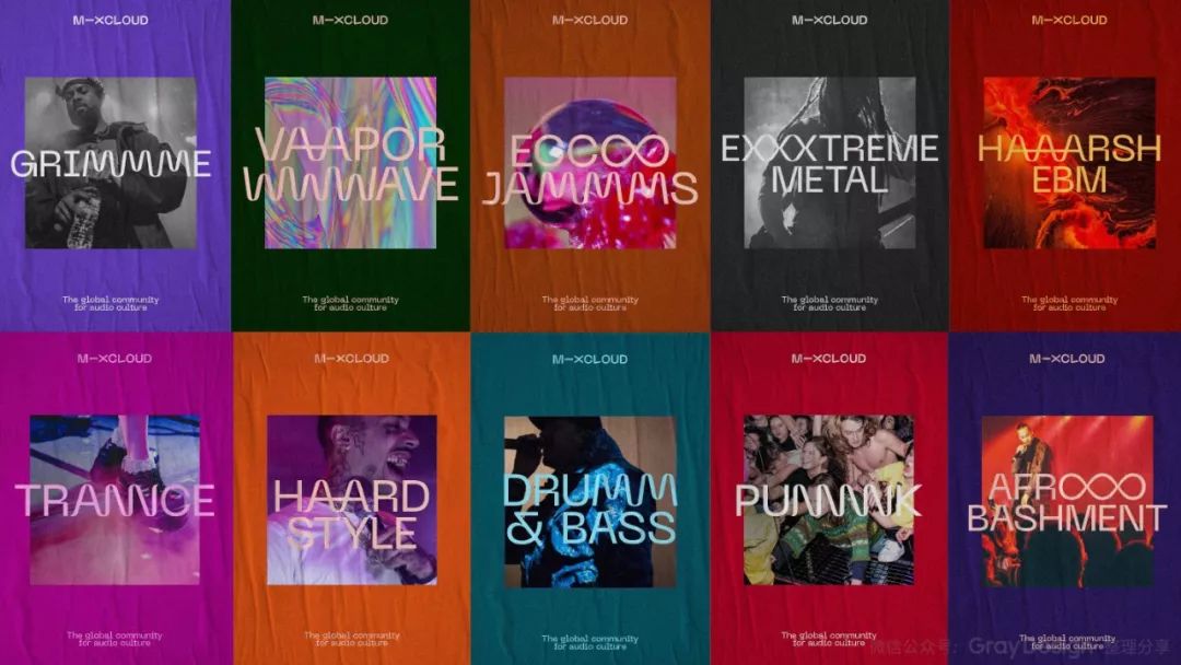
This font can also "connect" multiple letters into one character, making the whole more lively and interesting, and at the same time showing the rich expansion of the brand.
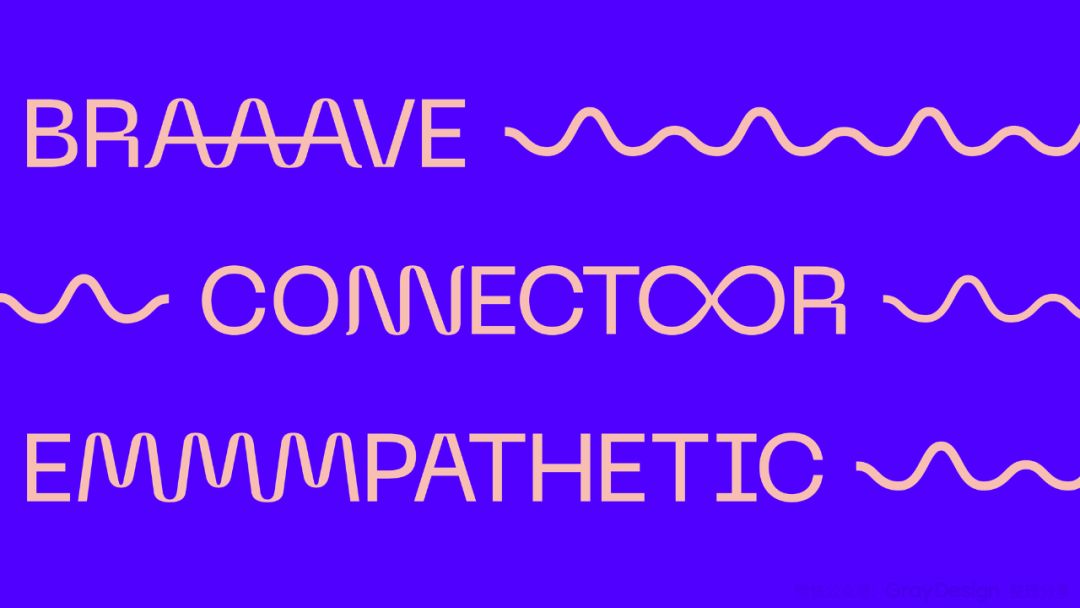
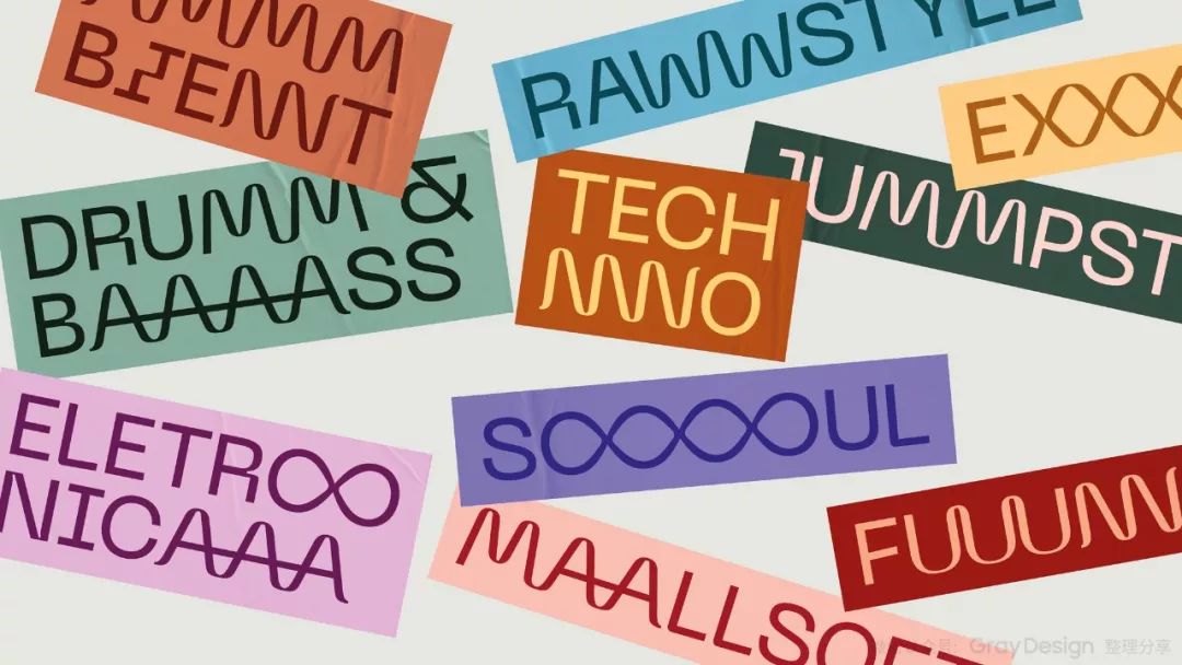
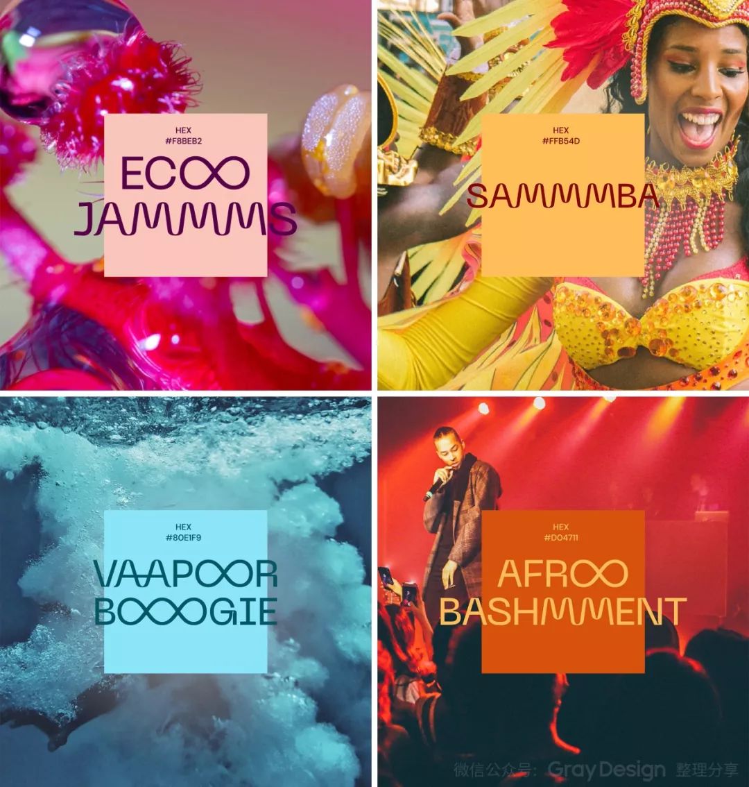
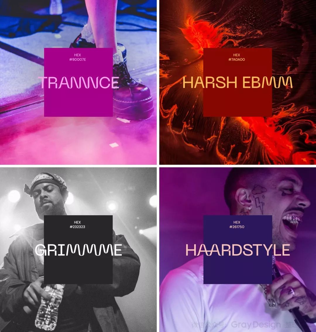
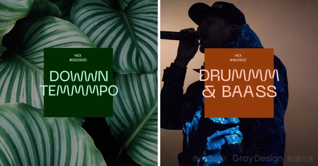
The concept of "connection" in this fancy font can not only connect two different letters, but also superimpose "connection" to generate some interesting phrases, such as: BAAAASS, POWWWWWER, etc.
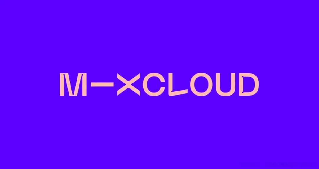
Connection - Color
With Mixcloud blue as the main brand color, and a series of auxiliary colors around it, these rich colors represent different communities, cultures and voices, as well as various genres and moods.
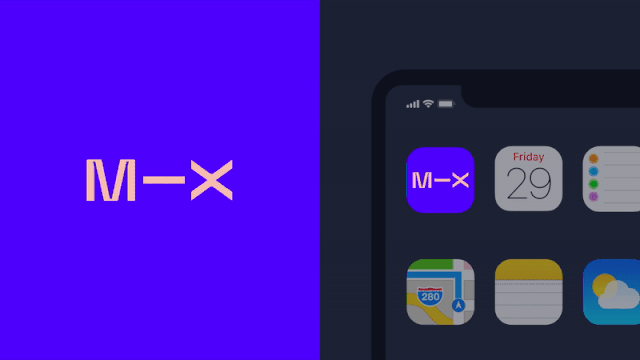
Connection - Products
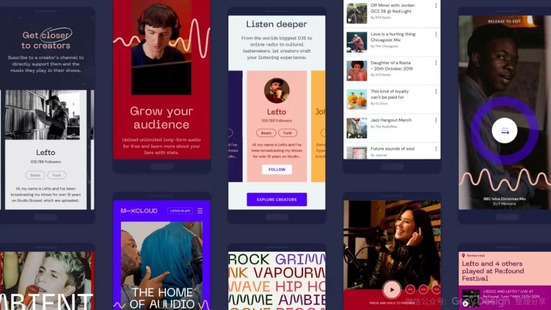
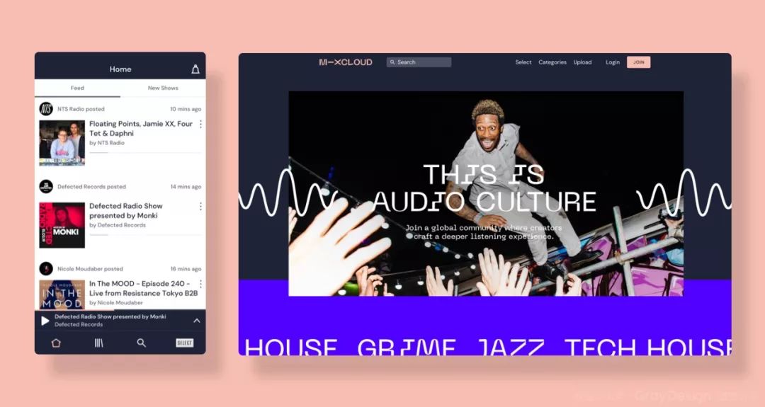
In order to truly test this brand identity and demonstrate its potential, we explored various ways to apply "connectors" to the core of the product. We studied the application from the simple appearance of the product to the "connector" running through the player of Mixcloud, and found that the process of tools and websites guiding the user experience may make it go further.
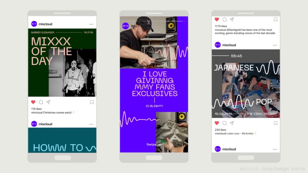
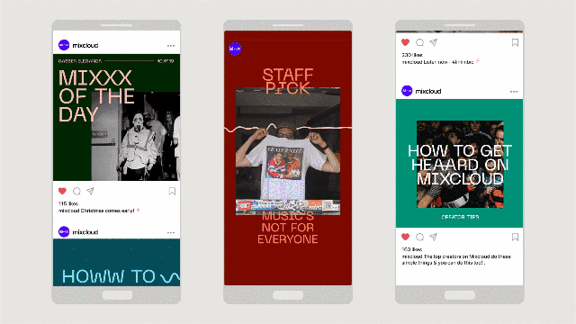
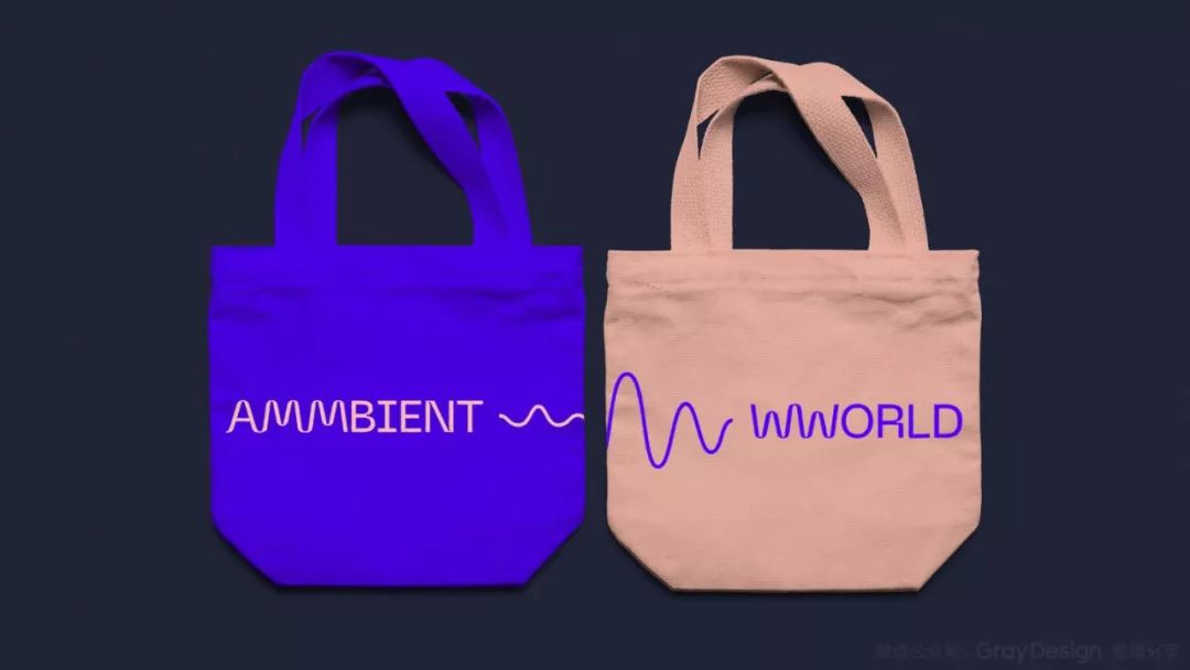
Connection - Brand
Bringing the brand image alive on social media around the world through a range of products, apparel and stickers. Through the application of iconic typography, you don’t even need to rely too much on the brand logo.
Attachment: Mixcloud Brand Image Upgrading Promotional Video
·TheEnd·
Articles are uploaded by users and are for non-commercial browsing only. Posted by: Lomu, please indicate the source: https://www.daogebangong.com/en/articles/detail/Only%20use%20fonts%20to%20fully%20interpret%20connect.html
 支付宝扫一扫
评论列表(196条)
测试