Editor: Scallion Author: Liu Baikun
Everyone is very familiar with the text in the form of blocks. What should I do if I want to make some styles? Let me share an article written by my good friend Fan Junyuan, simple and practical, I believe it will inspire you~
Rectangular character creation is the most commonly used method in font design, commonly known as the square splicing method. It is to use the "rectangle tool" in Illustrator to draw each stroke, and achieve the design sense of the font by connecting strokes, breaking strokes, and adding some small ideas. Compared with "pen-made characters", the width of the horizontal and vertical strokes of "rectangle-made characters" has changed greatly, so the adjustment of the negative space of the font is very important.
There are many "means" to deal with rectangular characters. Today I will briefly talk about the method of creating characters, in order to make it easier for us to learn an article about rectangular characters. Let's see how to use it in detail!
* Some of the following case pictures are quoted from the Internet
The application of font design is really very extensive. It exists in all aspects of our lives. Except for sleeping time, it is difficult for us to not see it at other times. Fonts can be seen in various forms in brand logos, book bindings, promotional posters, e-commerce networks... especially in recent years. Font design is playing an increasingly important role in the field of graphic design and has a position that cannot be ignored.
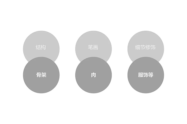
If we only change the font details and decorations, how can we make it change one font and become another style? The structure of fonts is like human bones. The overall structure cannot be changed after tomorrow, but you can change it at any time through clothing, just like human bones, meat and clothing, and one-to-one correspondence can convey the temperament of fonts .
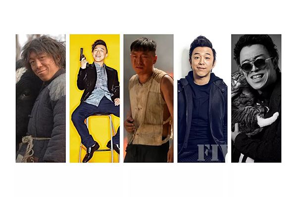
Let's make a simple image comparison and feel it, as shown in the figure below. The same person only changes the dressing style of external elements such as clothing, hair style, etc. These external images definitely affect a person's temperament/character to a certain extent. Similarly, changes in the structure, strokes, and details of fonts can also reflect the temperament/character of a character.
From the picture above, we can see that changes in clothing will improve a person's temperament by n+1 levels. What is a rectangular character? In fact, through the skeleton of the basic glyphs, the strokes and details are constantly changed to create a font with various forms, thus bringing people different visual feelings. An excellent font design can accurately convey font emotions to users in the fastest time, which is the greatest charm of font design.
1. How to quickly build the structure of rectangular characters?
We know that rectangular characters are basic fonts, so how can we make rectangular characters as quickly as possible, and how can we change them? First of all, let me talk about how I understand how to quickly build a text structure. It may not be the best method, but it is certainly not a wrong method (not limited to this method). If there is a better method, we can learn better , don't get bogged down by my method. (Only as an introduction, not an introduction...)

Adjustment of font shape, structure and center of gravity
Changes in the structure of rectangular characters have the most direct impact on the overall temperament of the font. Let's make some adjustments on the basic font first. The reference font is "Founder's Thick Tan Black". This font is very close to the rectangular font we made. It is a good choice on the banner or on the poster.
First adjust the font shape of Fangzheng Thick Tan Hei. The most typical feature of this font is that the center of gravity is on the top, the top is tight and the bottom is loose, and the strokes are thick and thin. Therefore, it is more appropriate to use this glyph as a prototype, and build a new glyph with reference to Thick Tan Black. The horizontal structure is adjusted, and the center of gravity of the rough tan bold font is on the top, and the top is tight and the bottom is loose, giving a sense of compactness. Adjust the upper and lower structure and the center of gravity of the word "雷" to make it smooth and visually balanced, making the font look more concise and tidy.
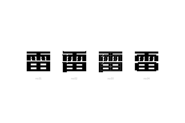
No.01 is a newly built font, and no.02-04 is a slight change, with oblique cuts and some small cut corner decorations to make the characters more powerful. Corner cutting is not random cutting. Generally, corner cutting is done at two intersecting strokes. Appropriately adding some corner cutting can enhance the overall three-dimensional effect of the font, and the structural space of the font will become more breathable. There are more levels and changes in the relationship between characters.
Well, I won’t say much about the basic rectangular characters. If you don’t understand, read the previous article. Today’s focus is on the back. (Knock on the blackboard, everyone, look down)
2. How to quickly extract strokes
Stroke is the most basic unit in fonts. The setting of strokes is also important for the expression of the temperament of the whole font. The decoration of strokes creates a variety of fonts. The visual impact brought by different strokes is also completely different. . How to extract strokes when we first came into contact with fonts? do it yourself? Don't make too much trouble. Opening Zhanku\Petal\be Kakaka is just a show operation. Find the most important brother dei first...
Let’s do a demonstration first. We want to make a font with the same style. It may be a little troublesome to make this kind of font directly. It is a process from simple to complex. Let's break it down step by step, treat it as a rectangular character, add strokes to decorate it, and then make overall adjustments to make this group of fonts more coordinated and unified.
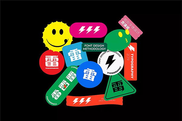
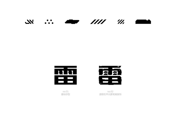
The red area is the representative strokes of this group of fonts, which we extract first.

The strokes use the extracted strokes, and the horizontal and vertical hooks are not sorted out. There are no fine details of the strokes, which mainly depends on the effect. Let's see that the font of no.01 is directly modified from rough Tanhei, and the font and stroke decoration we refer to is added later to make the font of no.02. The final step is beveling, which skews the glyphs. Slashes are more dynamic and powerful than straight lines, which is the visual sense brought by the lines, which further enhances the temperament of the font.
The strokes of this group of characters are relatively simple, and the detailed decorations are directly replaced without too much processing. Compared with the 01 font, it will appear more distinctive and less mediocre.
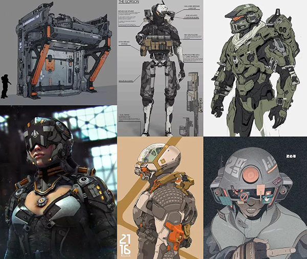
What is Mecha Wind? Everyone's understanding is different... I can think of keywords such as science fiction, hardcore, and cool.
Mecha, which means "mechanical power armor", generally appears in science fiction or surreal film and television, games and novels, and some people try to create this kind of technology in reality. The term mecha in the original meaning basically refers to a power suit similar to "Iron Man", but with the influence of Japanese ACG works, most people now have the impression of mecha as a large robot operated by humans. Defined as a weapon of war, such as the well-known Gundam.
After reading these, I searched for some more technical and hard-core mecha-style materials. Let’s take a look first (knocking on the blackboard and marking key points are all required to be tested)
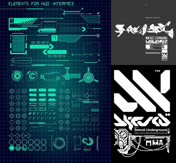
I found the material, and I also made the extractable elements. After completing this step, we will add details to it (no.01 font). As for which details to add? We need to integrate some of the extracted reference elements into the font, so that the font looks more design and mecha style.
In contrast, the font structure is still our original structure. We only change the decoration to change the temperament of the font while keeping the structure unchanged. The intuitive feeling brought to people is also different.
The change of font, font weight, and thickness of strokes is a crucial step in the process of adjusting font personalization and temperament deformation. For related content on font center of gravity adjustment, please read the next article (write it when you think about it...)
Learning points:
In the process of selecting prototype fonts, it is necessary to fully analyze the characteristics of the project background and select fonts close to the characteristics of the project as prototypes. It will be easier and faster to add decorations or deformations later. Secondly, the stroke thickness of the prototype font also plays a key role in the font style.
1. Straight line fonts look thicker, more stable, and solemn, and are suitable for regular font designs such as regular theme words and main kv.
2. Diagonal lines have a sense of strength and a sense of guidance for visual trends. The greater the inclination, the stronger the sense of visual guidance for movement. Reasonable oblique cutting of fonts can effectively strengthen the role of dynamic temperament of fonts.
3. Curves are very suitable for font designs with feminine themes.
Reasonable use of the design of these three glyphs, flexible changes according to the theme, reasonable changes in glyph strokes, and the integration of straight lines, slashes and curved elements can make the font more design.
The method has been told to you, hurry up and practice it! ~
Articles are uploaded by users and are for non-commercial browsing only. Posted by: Lomu, please indicate the source: https://www.daogebangong.com/en/articles/detail/One%20trick%20to%20debunk%20the%20routine%20of%20rectangular%20characters%20beautiful%20and%20fun.html
 支付宝扫一扫
评论列表(196条)
测试