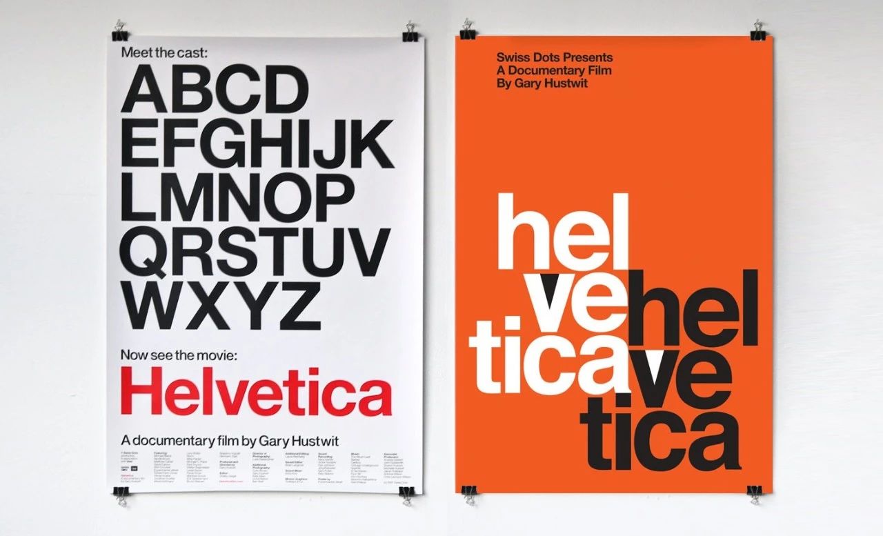
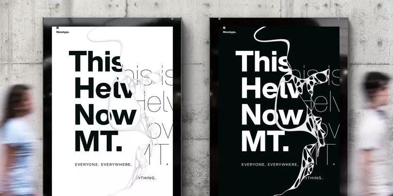
"If you don't know what font to use, use Helvetica."This sentence is in the graphic design industry The widely circulated words seem to be jokes, but they also fully reflect the status and wide applicability of Helvetica in society.
As early as the early 19th century, sans-serif fonts appeared, but at that time, sans-serif fonts were not favored. It wasn't until a century later that the wave of "Bauhausism" originated in Germany swept across Europe and then affected the United States. Sans-serif fonts that emphasize "clear purpose and can effectively convey information" really began to exert social influence. After World War II, the European design style began to emphasize cleanliness, objectivity, and easy-to-read. This simple and clear design style with precise communication functions quickly became popular all over the world.
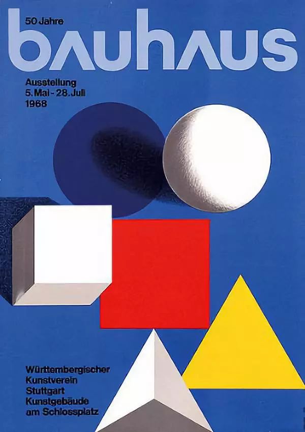
"Bauhaus" style design
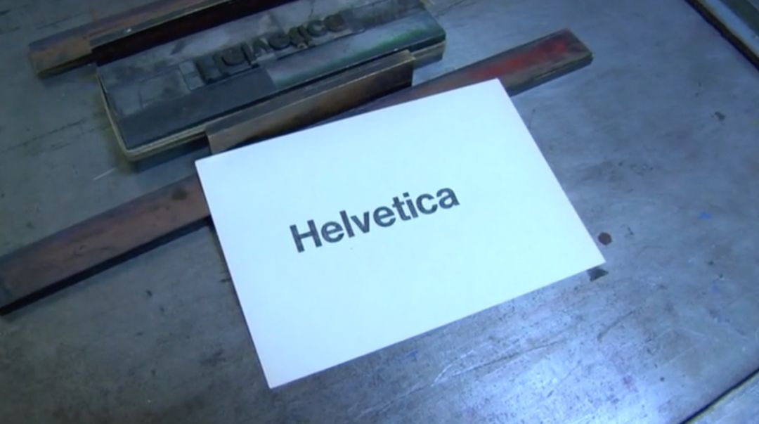
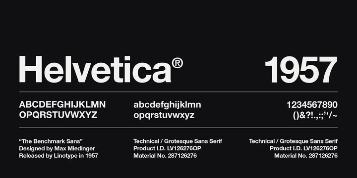
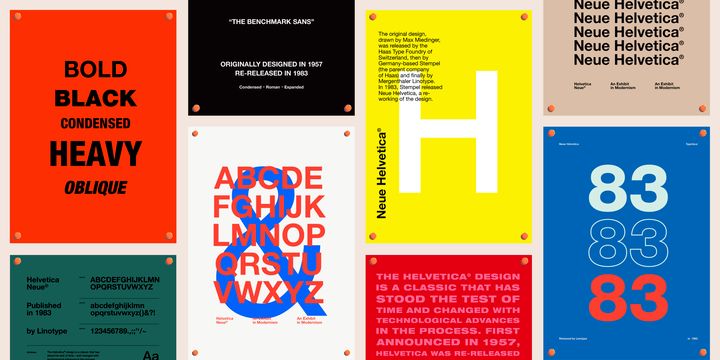
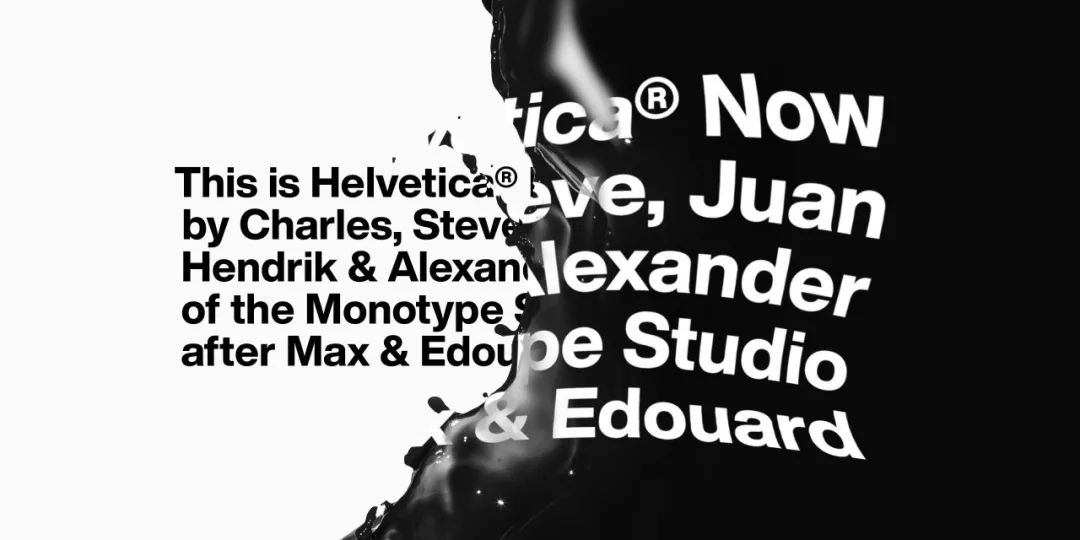
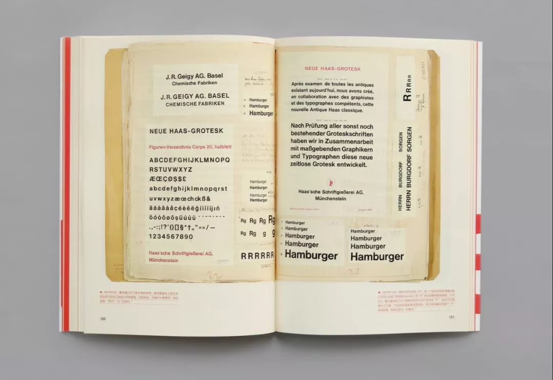
In June 1957, Helvetica (originally known as New Haas Grotesk) was officially launched at the "Plane 57" fair in Lucerne. It was born in response to modern design's need for a more neutral sans-serif typeface, and is a typical product of the Internationalist style. Believable, safe, practical, approachable, extremely organized... Helvetica represents a sense of the ordinary, but also implies a metaphor for the everyday.
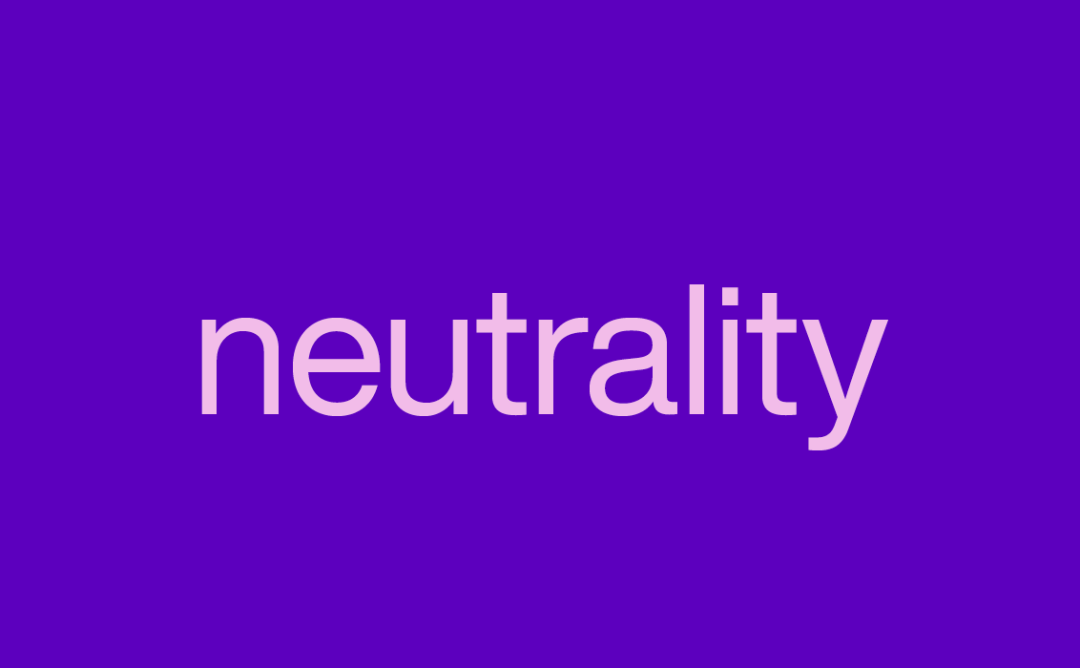
The word Helvetica carries a sense of poetic integrity: it serves the rich as well as the poor; Accurately conveys the core concept of the Swiss spirit - neutrality.
Helvetica caught up with the golden age of Swiss typography, and was born in Europe, which has just undergone political reform and entered a period of rapid economic development. There is a saying that, The success of Helvetica was rooted in this pragmatism of the time.
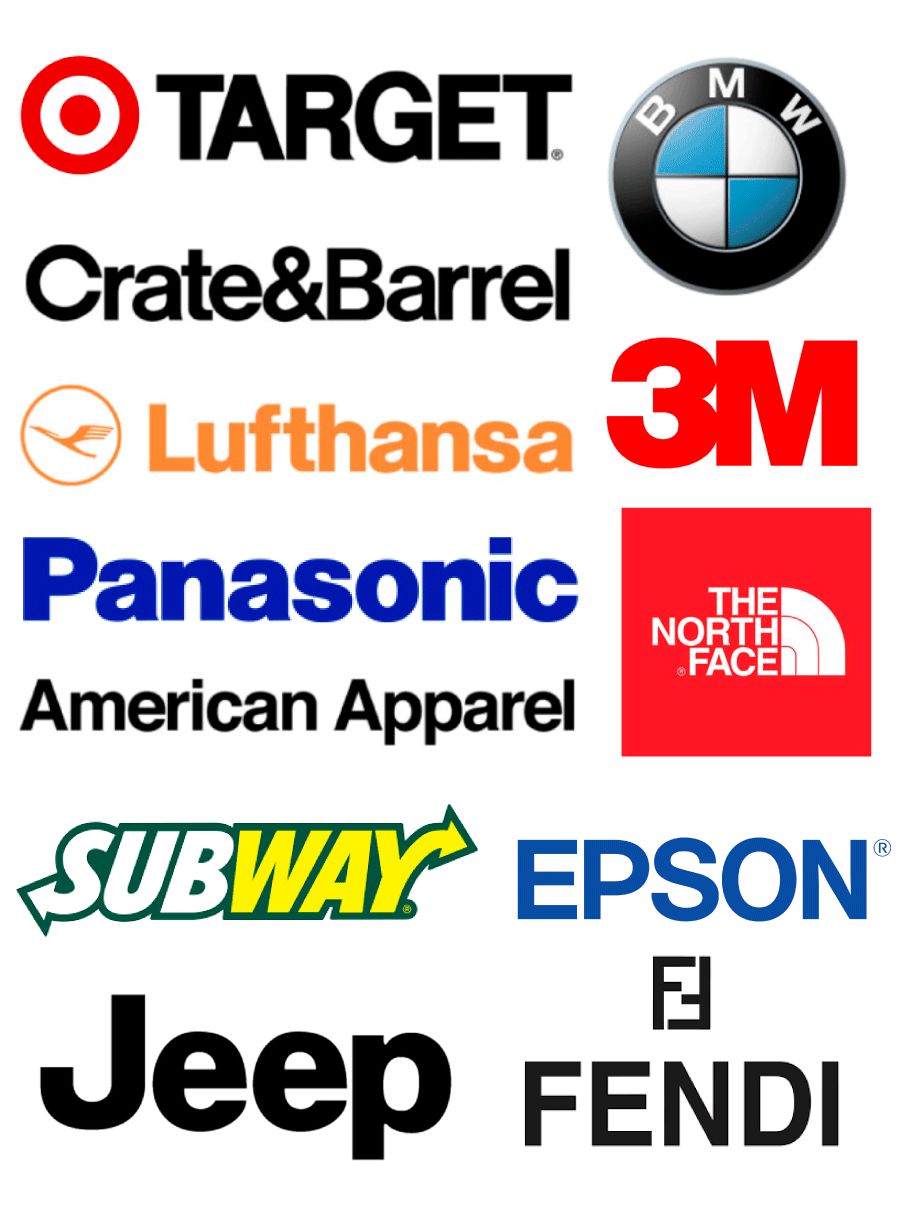
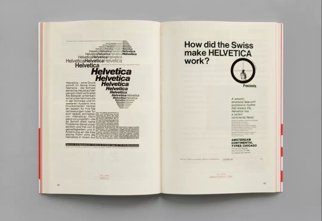
Helvetica has been around for more than 60 years and represents an aesthetic timelessness whose clear, neutral character has always been Much loved. It would be an understatement to say that it is the most widely used modern typeface. Panasonic, Lufthansa, JEEP, BMW, Nestle, Lufthansa... Countless well-known brands have chosen Helvetica.
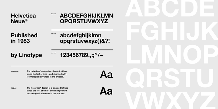
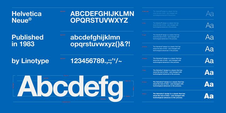
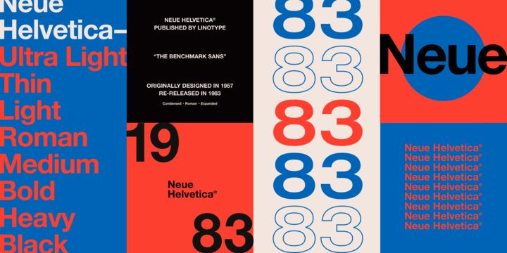
Neue Helvetica
The revolution in printing also affected type design, as typefaces had to be adapted to completely different typography techniques, and the electronic revolution naturally affected Helvetica as well.
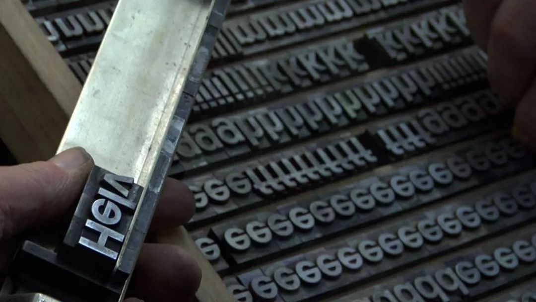
Helvetica came out at the end of the era of metal movable type. Perhaps because Helvetica won a high reputation, it immediately adapted to the new trend in the technological revolution of the printing industry, and fortunately survived after the emergence of phototypesetting technology.
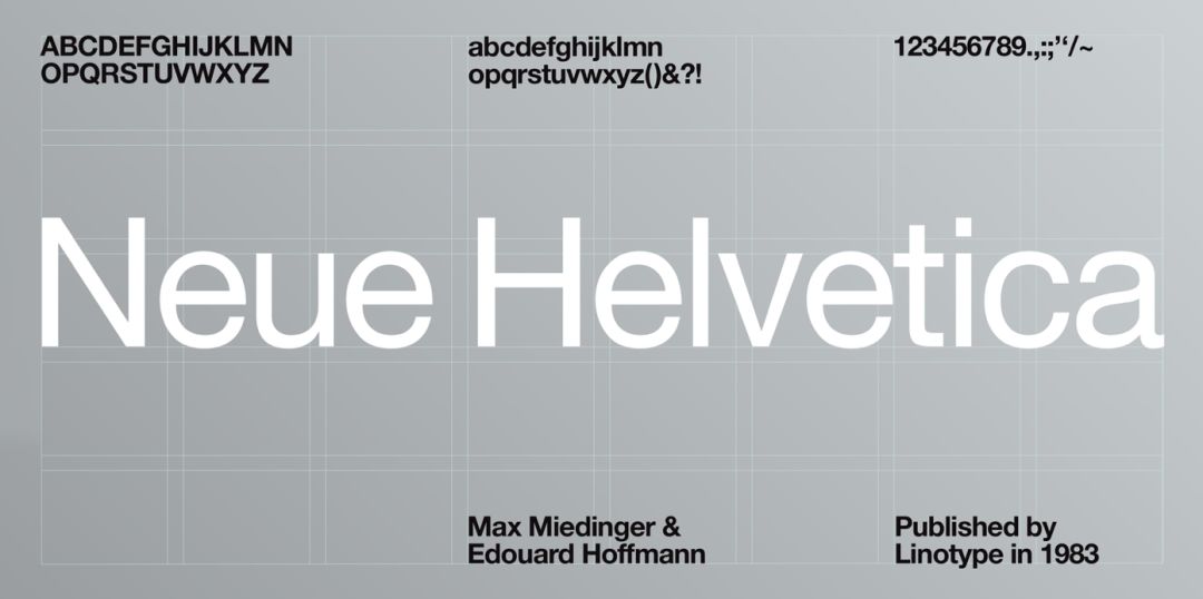
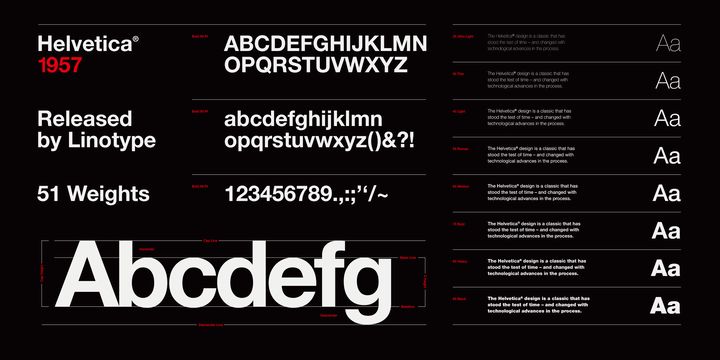
In 1983, the optimized version of Neue Helvetica was released, and Helvetica officially entered a new era. Neue Helvetica can be described as a synthesis of aesthetic and technical improvements and modifications, resulting in improved appearance, readability and usability.
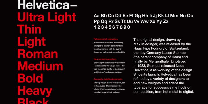
Neue Helvetica has refined many of the characters from the original to make them more consistent with the overall design and improve readability.

The width of certain characters (e.g. capital M) has been extended to improve balance and aesthetics
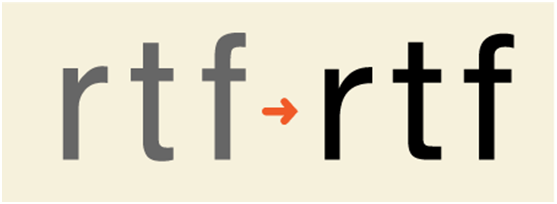
The widened bars on the lowercase f and t increase character recognition in the text

Rounded characters have softer curves to better align with the rest of the design
After a series of optimizations, all the characters of Helvetica have been unified and arranged, and the chaos caused by the sprawling growth of the Helvetica family over the years has also been replaced by a uniform appearance.
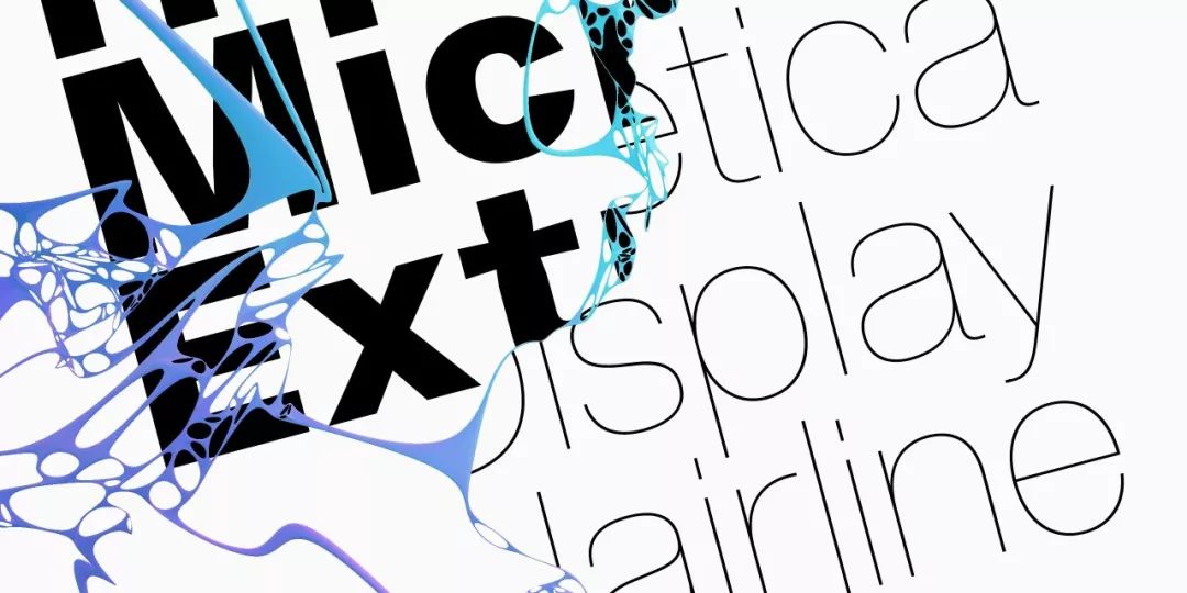
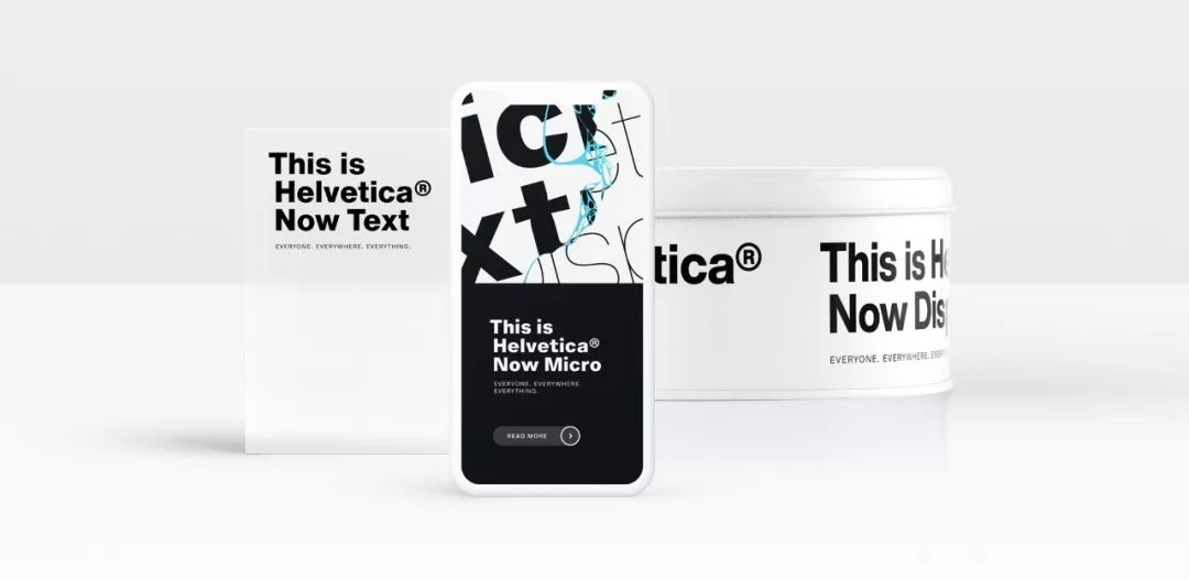
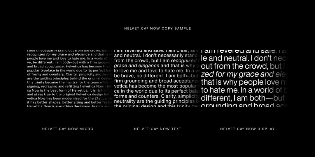
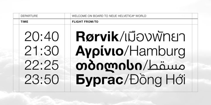
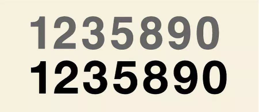
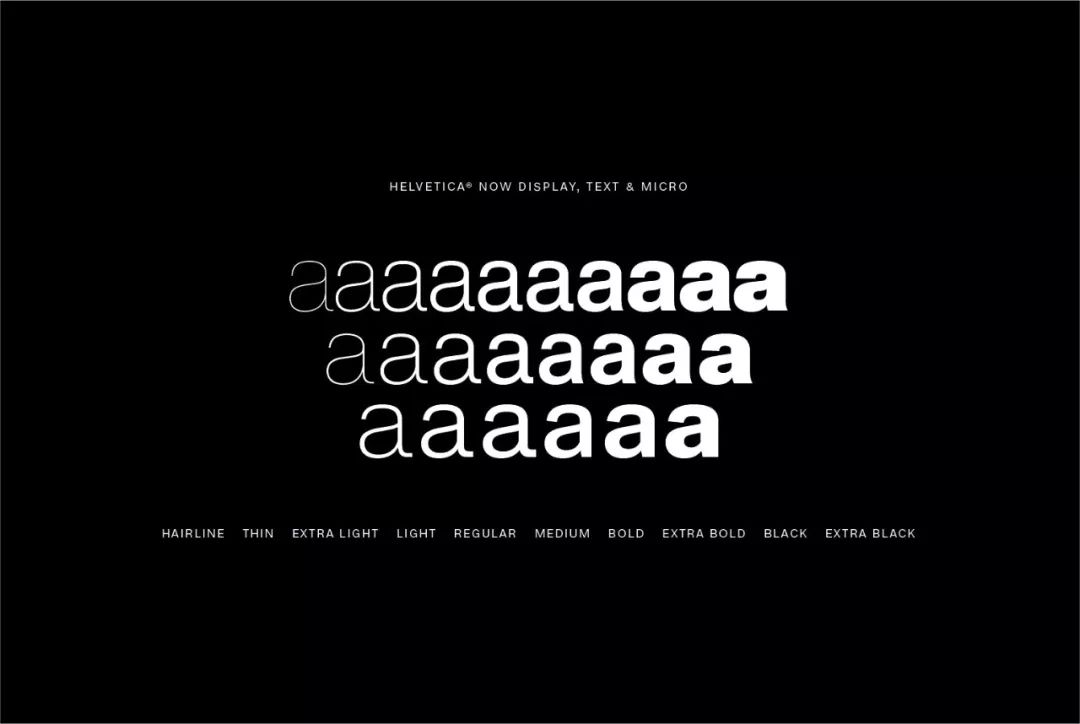
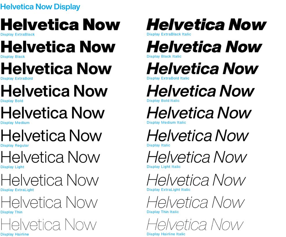
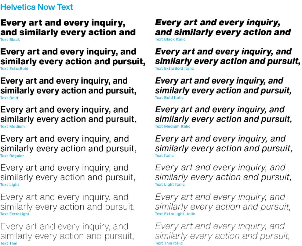
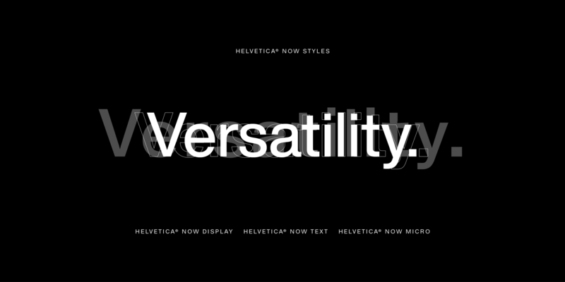
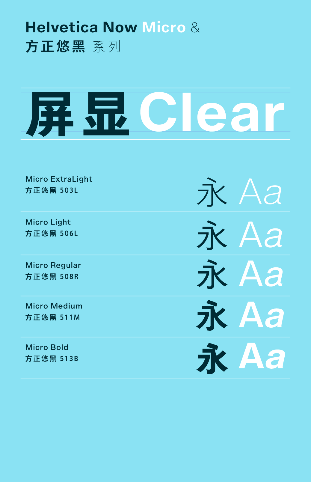
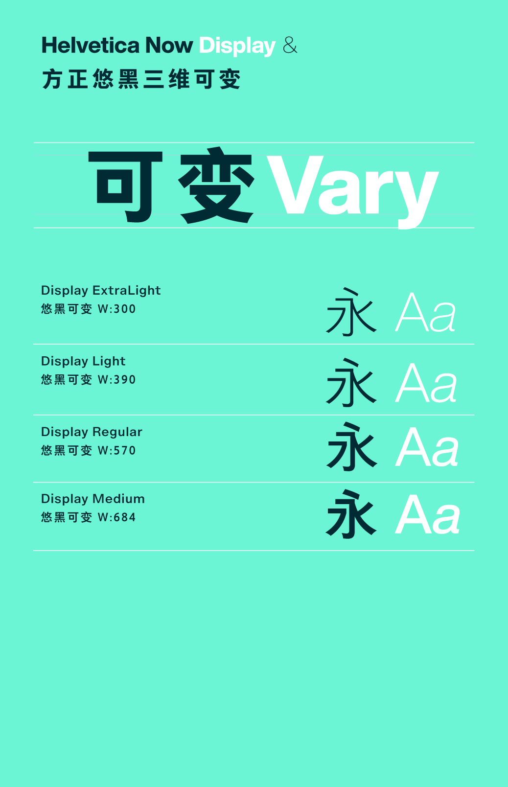
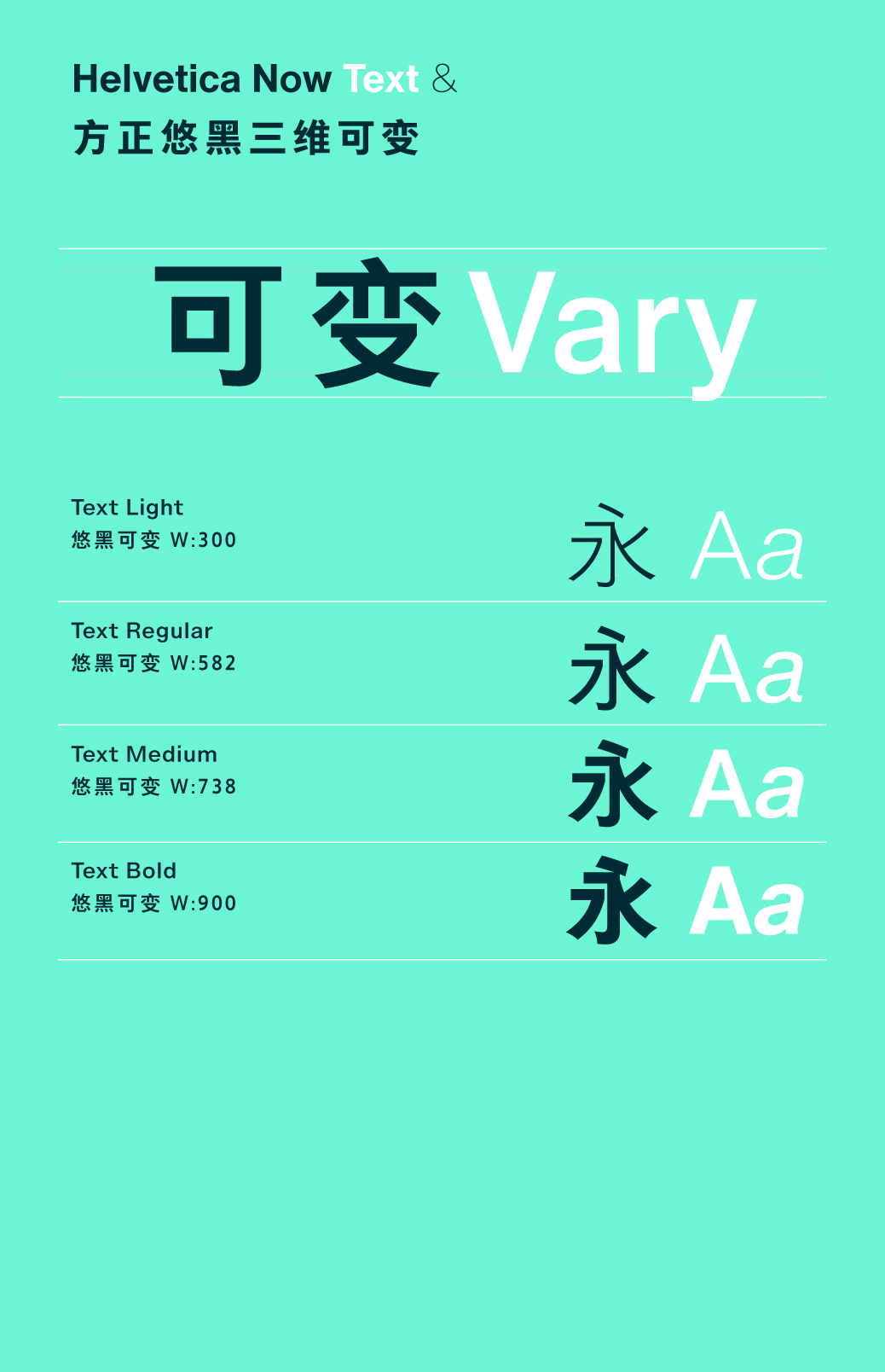
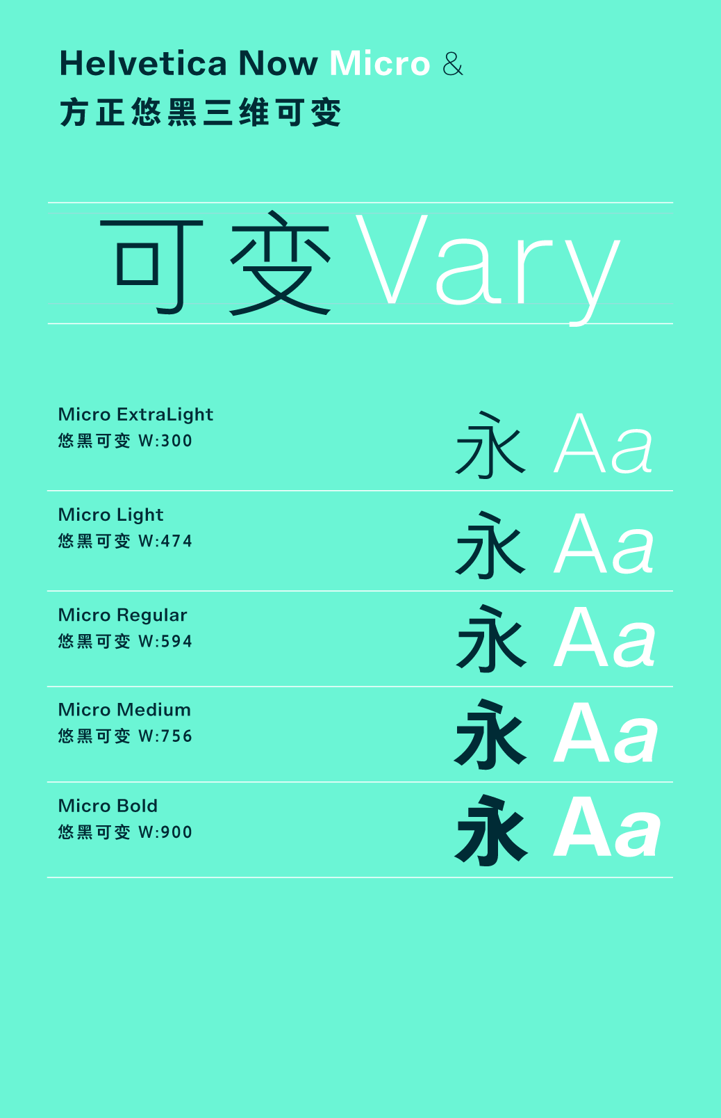
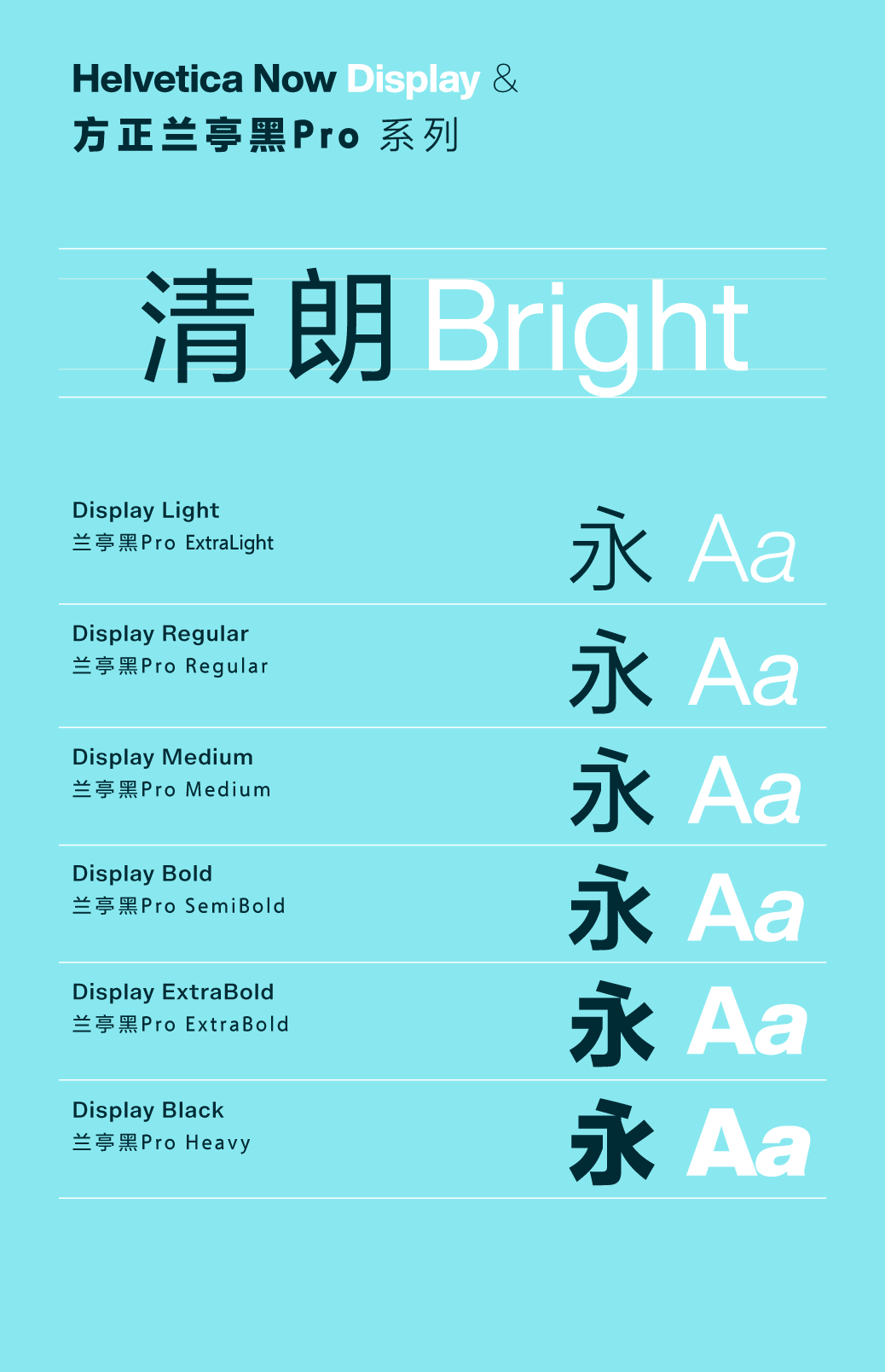
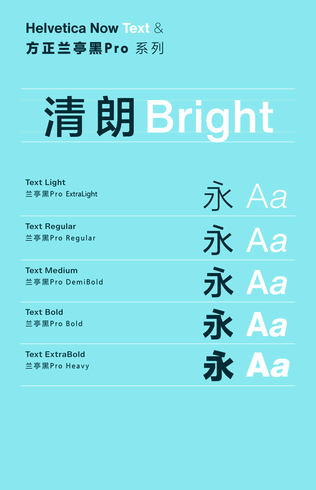
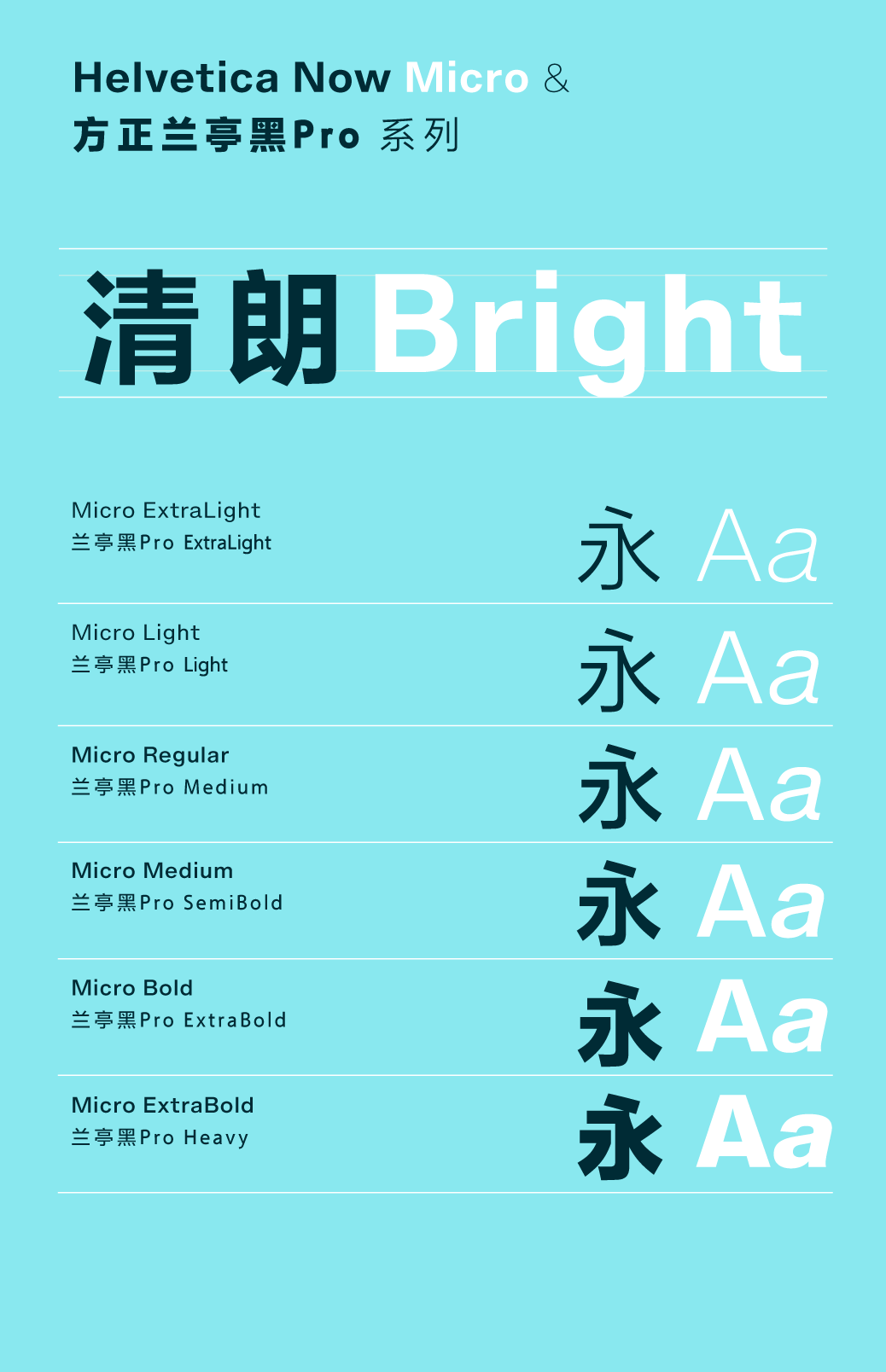
Poster designers will find that the large font spacing used to showcase the environment accentuates the clear style of Helvetica. Problem with poor performance. When Neue Helvetica is used to display small characters on the screen of devices such as tablets and smart watches, the effect is not satisfactory. The miniature font size of Helvetica Now is specially simplified and highlighted for such environments, not only retaining the style of Helvetica in the small print environment, It also provides generous spacing, micro text and low-resolution environments without compromising the readability of the text. Helvetica Now is equipped with three font sizes: miniature, text, and display, and each font size is suitable for a specific application environment. The font and spacing of Neue Helvetica are only applicable to the text environment. Three font sizes, corresponding to specific use environments, finely adjusted according to specific needs. That is to say, designers can directly use Helvetica Now fonts without relying on additional skills such as manually adjusting word spacing like in the Neue Helvetica era.
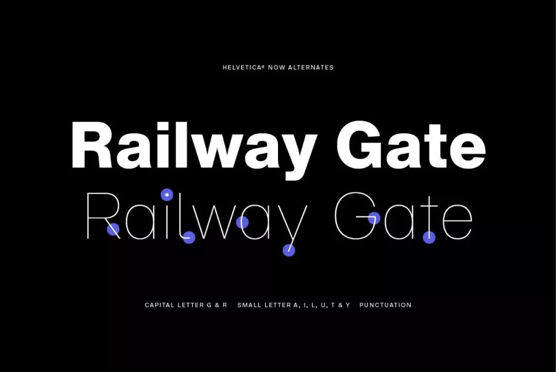
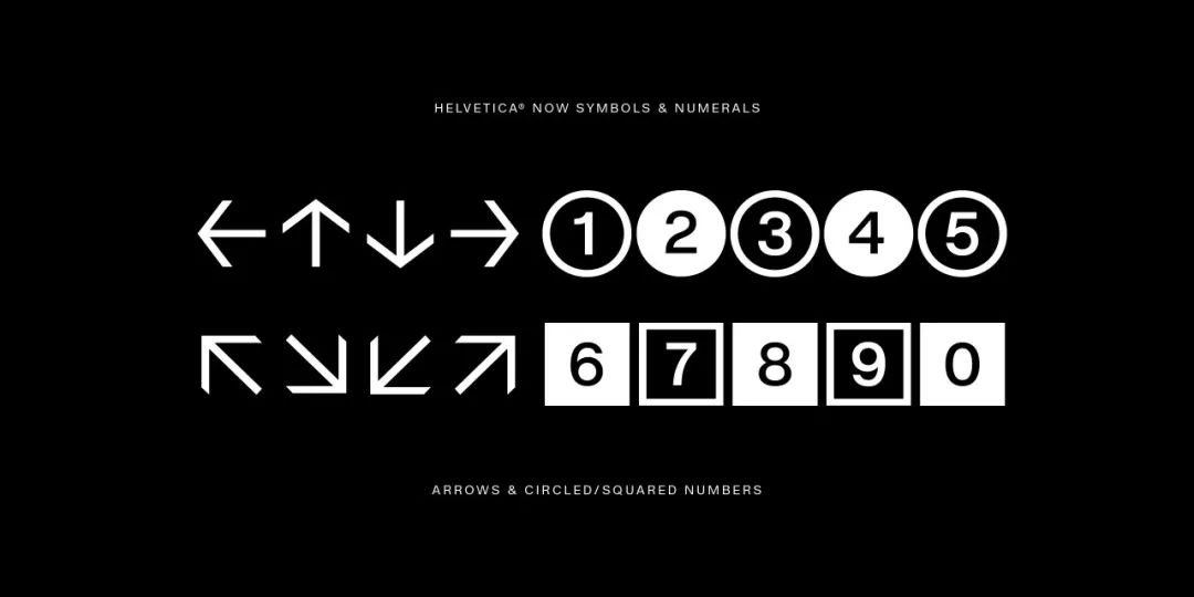
Accessory symbols Helvetica Now pursues completeness and expands as much as possible The expressiveness of fonts. The font provides a full set of alternate fonts, allowing users to add subtle personalities as needed while maintaining clear features. The entire font family is provided with alternatives, such as the single-layer lowercase letter a < span >In the past, designers could only borrow characteristic symbols from other fonts, or draw them themselves. Helvetica Now provides special symbols such as encircled numbers and Helvetica characteristic arrows, and these symbols are suitable for all fonts and font weights of the entire Helvetica Now family, and are also easily used in scenarios such as infographics and signboards. Details
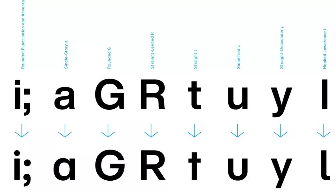
Helvetica Now is much more than an update or upgrade. Monotype's team of designers went back to the origins of Helvetica's design and painstakingly redrawn each symbol, using the various modifications that users have made to the typeface over the years. A series of common problems have also been resolved, such as using a curved lowercase l to avoid confusion between an uppercase L and a lowercase l to improve readability at small sizes. Other new changes include a redesigned @ symbol, rounded punctuation, rounded uppercase G, straight uppercase R, single-layered lowercase a, sans-serif lowercase u, and more.
Small changes to improve readability at small font sizes
Carefully drawn symbols
Monotype's team of designers has adopted the various modifications that users have made to the font over the years. Close to the original style. Monotype's designer team strictly adheres to the design concept, making each letter closer to Helvetica's three principles of "clearness, simplicity, and neutrality".
"Helvetica Now returns to the original design concept, readability is better than before, and the mystery is more in the word spacing than the characters themselves," Monotype font design Director Charles Nix said, "The key is to delve into the gaps between characters, summarize the blanking methods of earlier versions, find out why Helvetica is easy to read, and then return to the original and further improve."
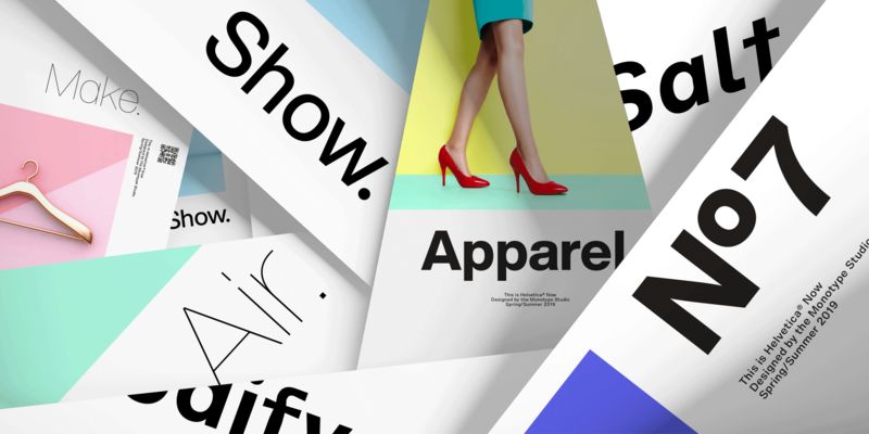
Seeing this, designers who are familiar with Neue Helvetica may find Helvetica Now refreshing, such as larger text, stronger expressive force, and more room for development. Moreover, Helvetica's acclaimed neutral style is still there, and now designers have greater freedom to find and explore new design languages.
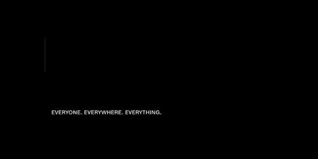
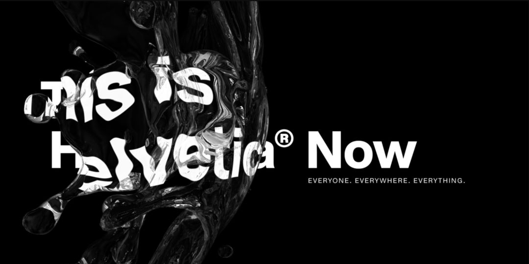
I see our work as adding a whole new chapter to the canon of Helvetica, creating a piece for 21st century designers. A unique tool. We have carefully extended Helvetica's rigorous heritage, avoiding the constraints that have limited its evolution." As the slogan of Helvetica Now says: If you want to download and try Helvetica Now for free, please click read the original text. ▶ AboutHelvetica NowChinese and Western adaptation >
As the most famous typeface in font history, Helvetica stirs strong emotions among designers and end users alike. Helvetica Now's mission is to challenge our stereotypes. It inherits the soul of Helvetica's original design, while turning a new page in the typeface's history.
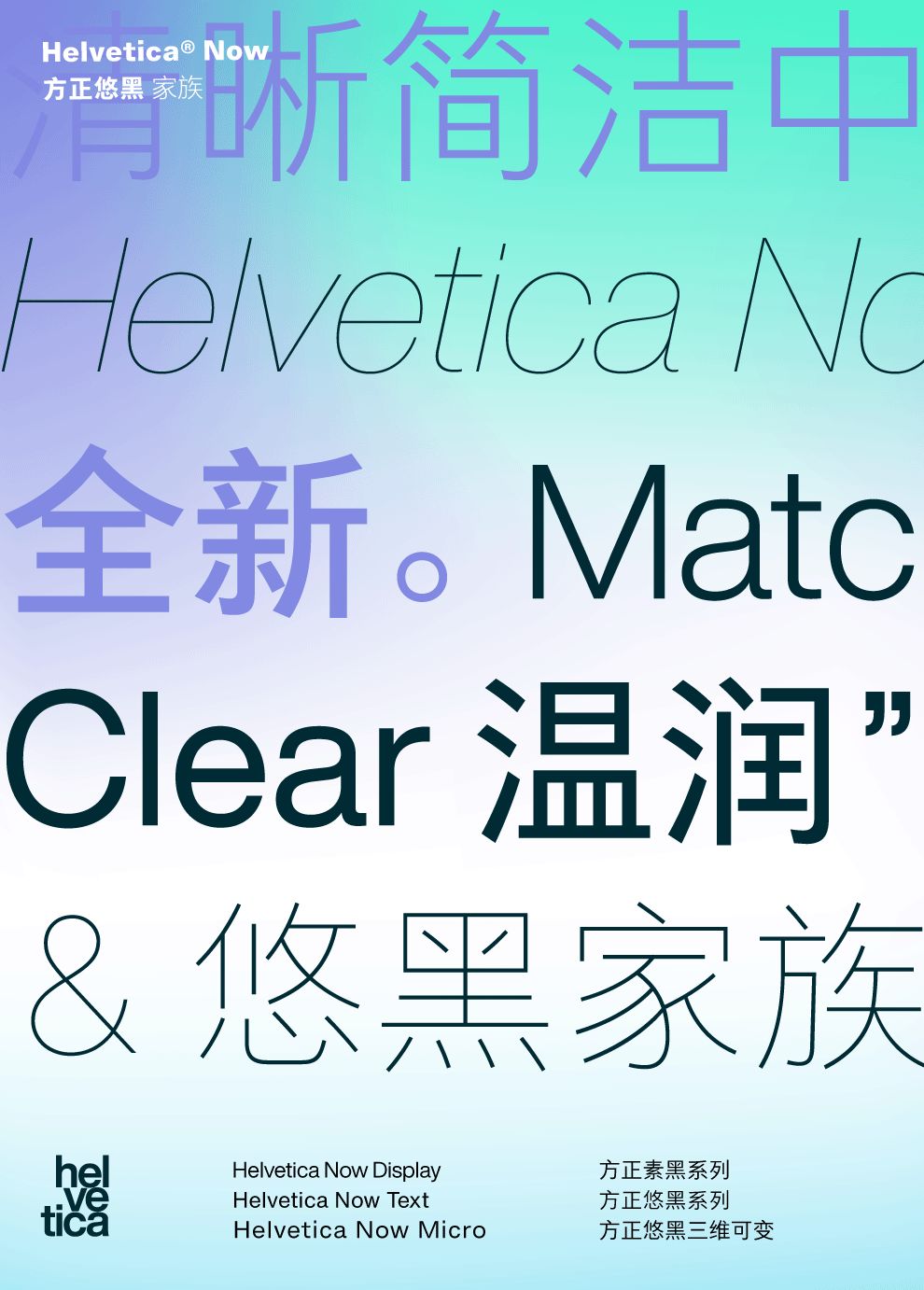
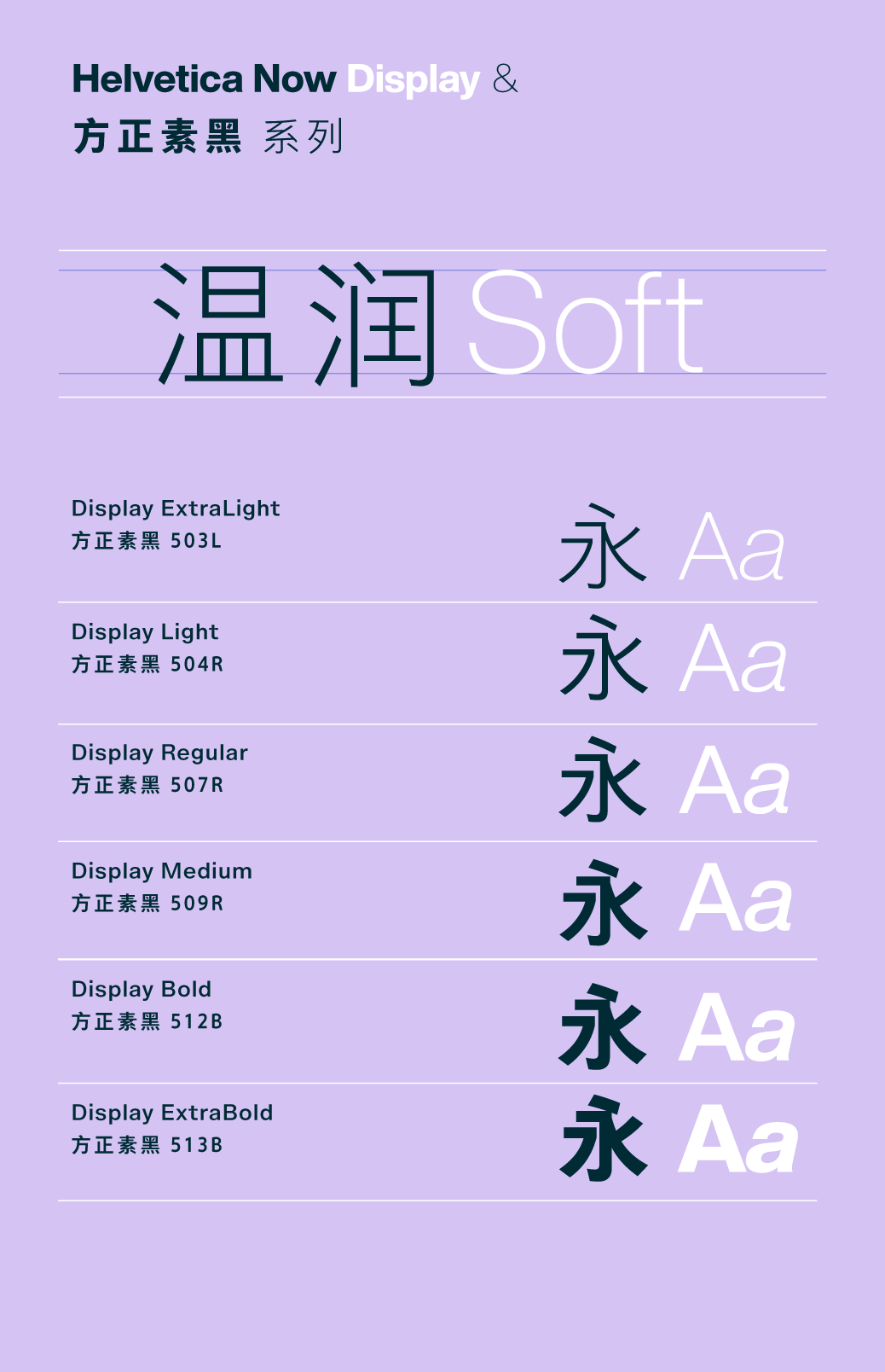
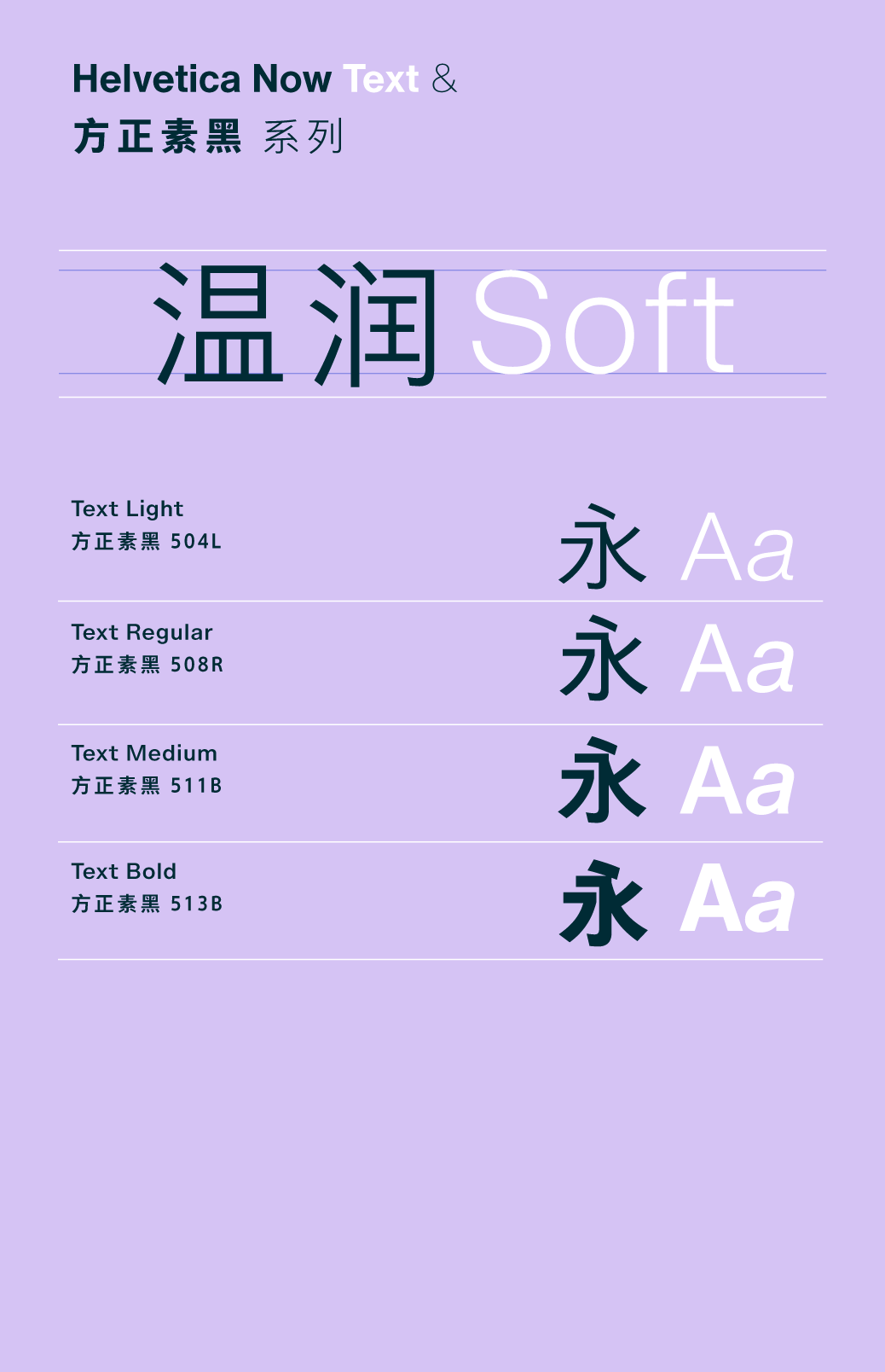
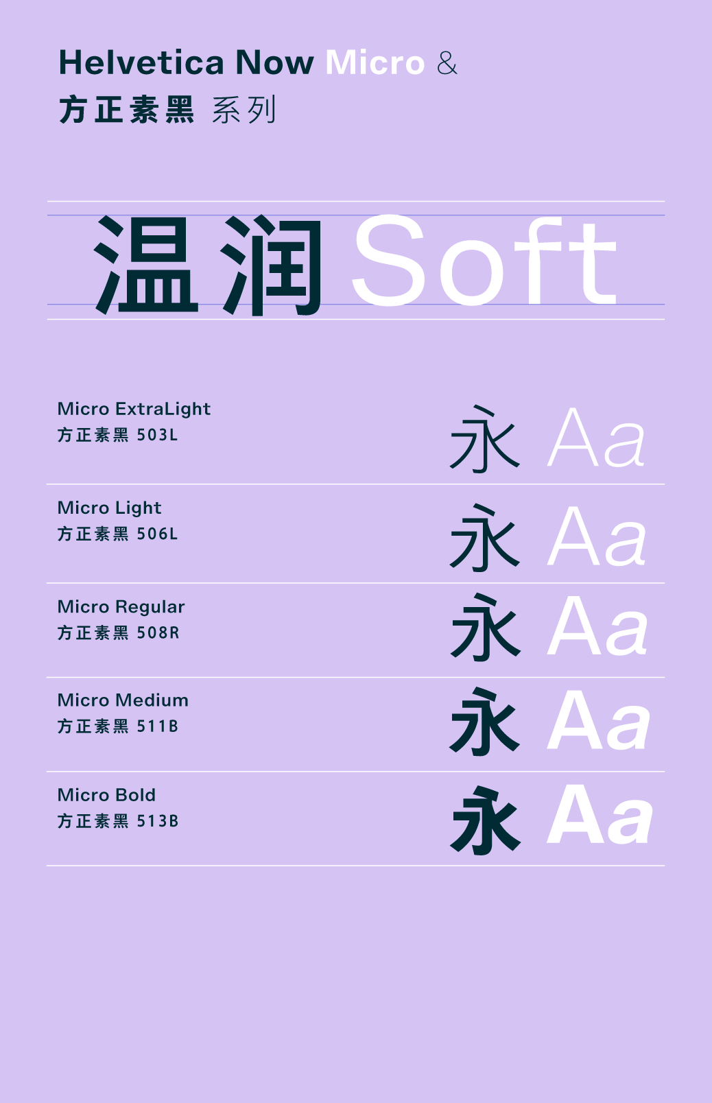
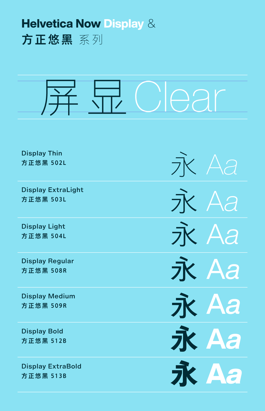
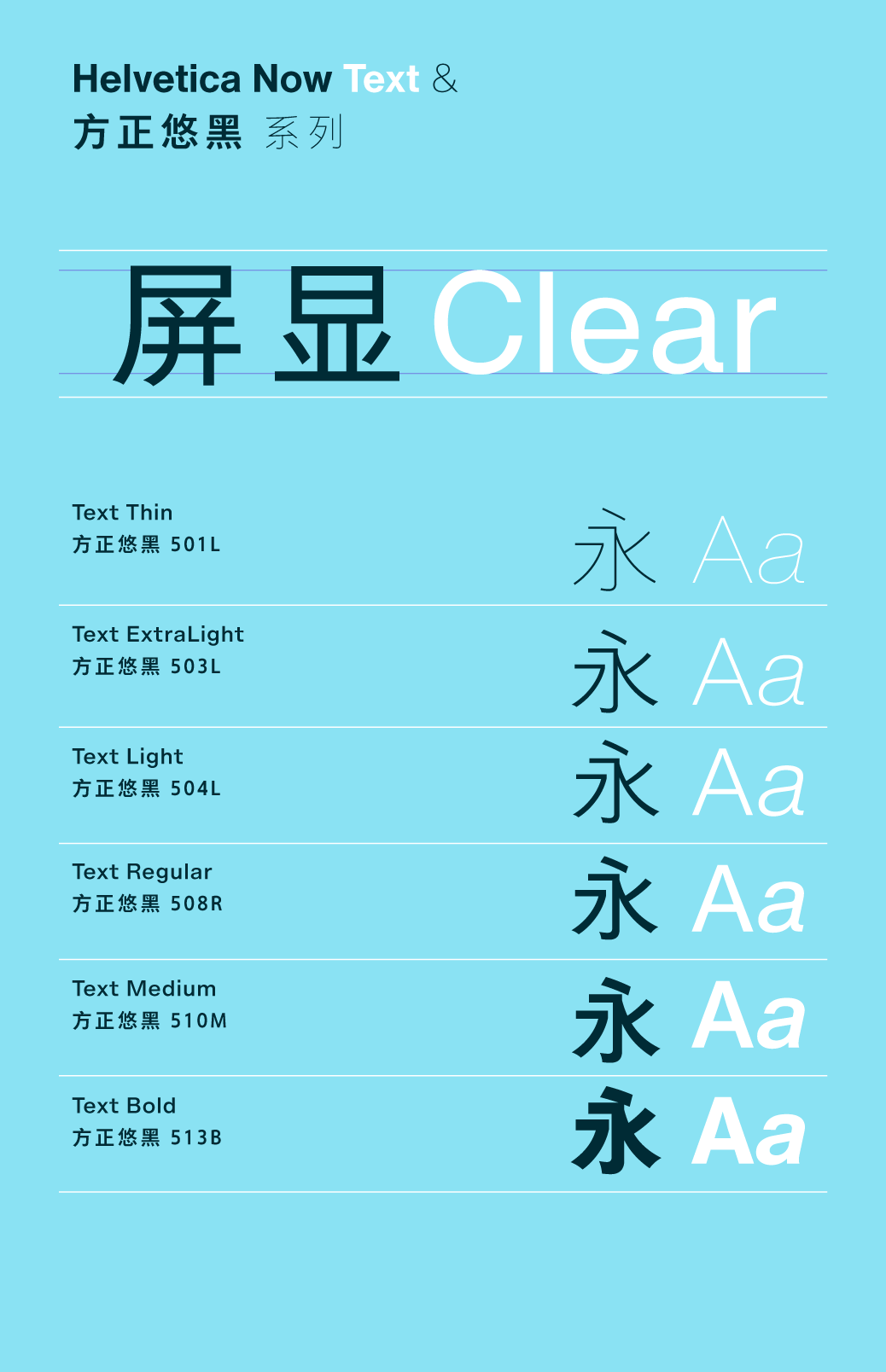
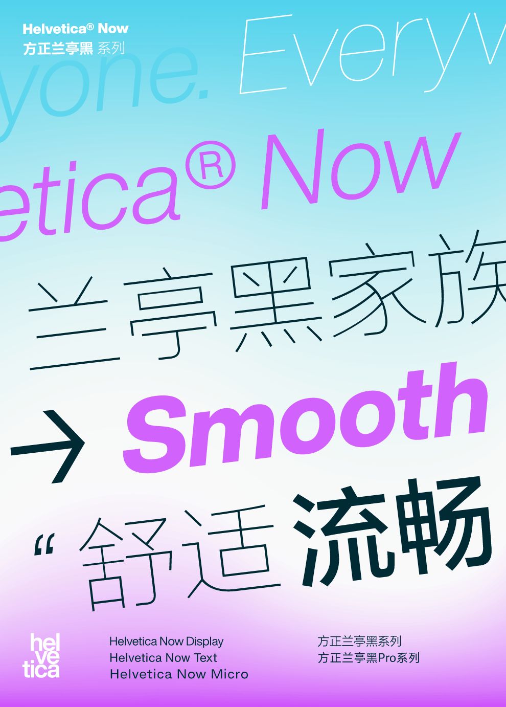
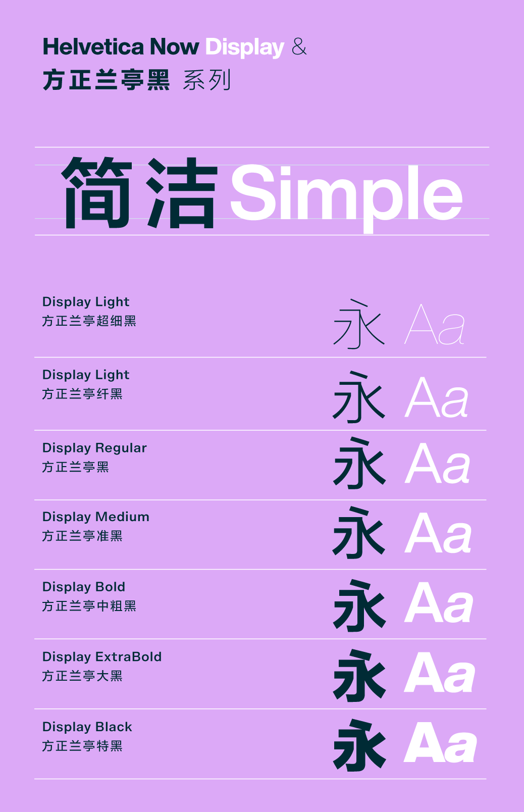
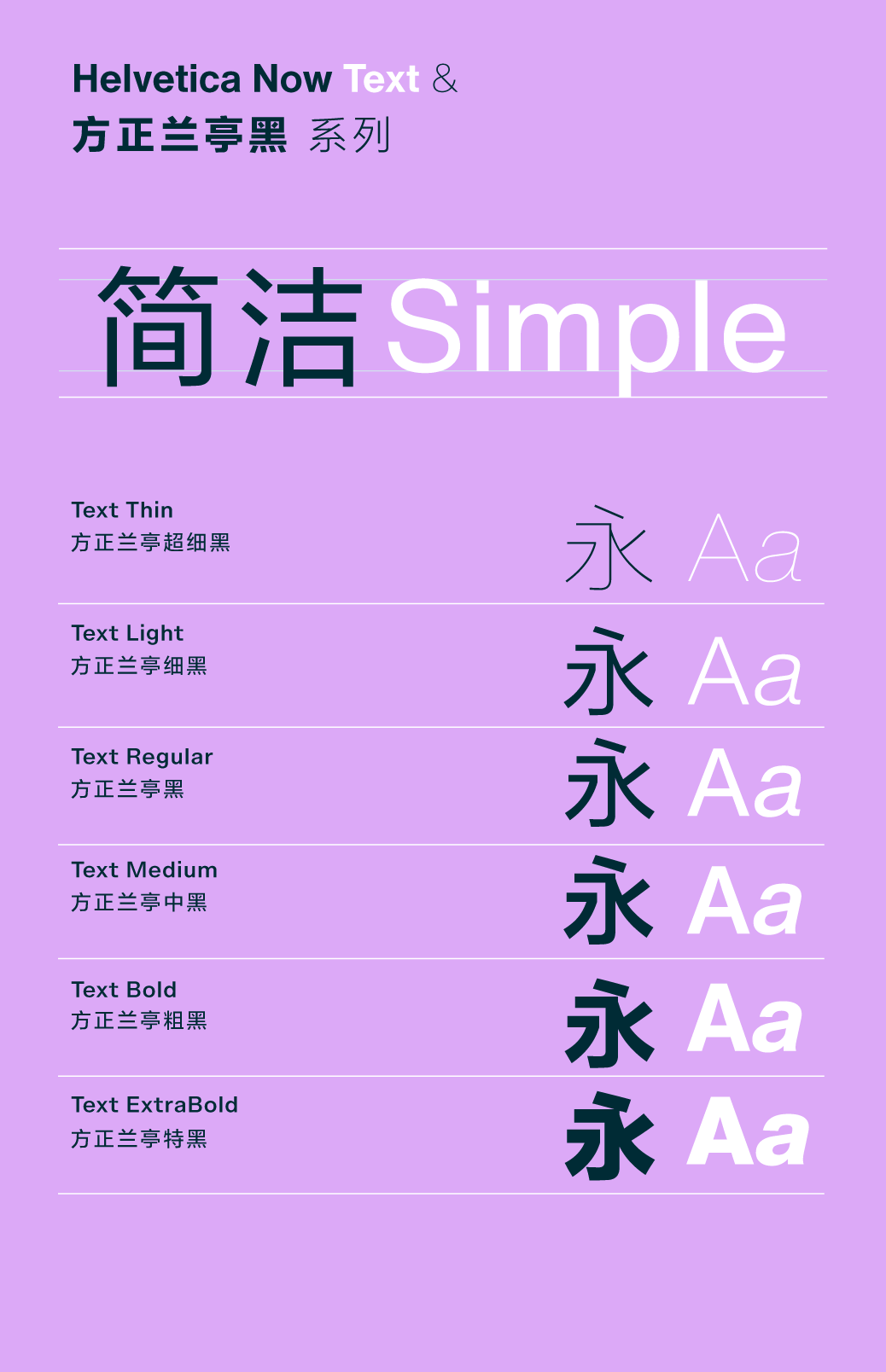
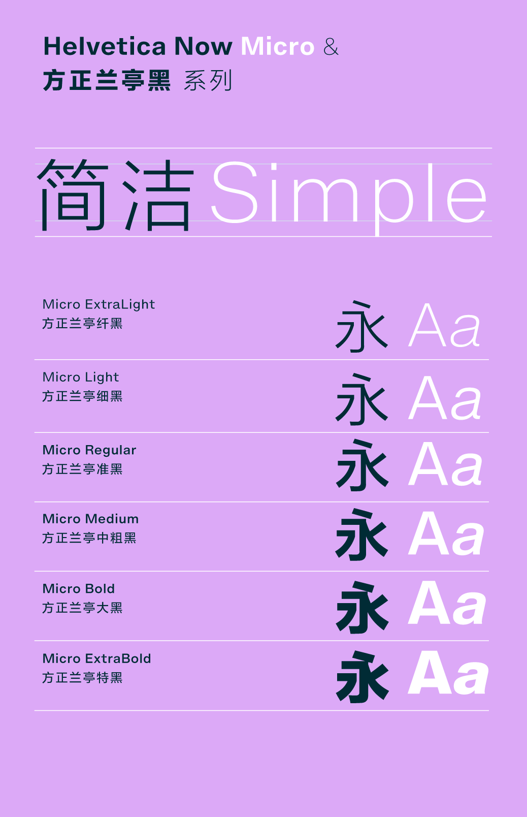
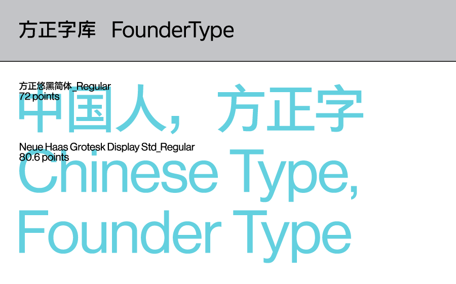
For Chinese designers, the mixed arrangement of Chinese and Western fonts is something that makes many people scratch their heads. How to make Helvetica Now look more comfortable and reasonable when Chinese and Western characters are mixed, it is necessary to find a Chinese font with a high degree of compatibility. As the Chinese strategic partner of Mona Font, the professional designers of Founder Font recommend several fonts that are highly compatible with Helvetica Now—— Helvetica® Now & Fangzheng Youhei Family
The first recommendation is the matching of Helvetica Now with Founder Black series, Founder Plain Black series, and Founder Black series. < Swipe to see more matching schemes> Helvetica® Now & Fangzheng Lanting Hei Family
In addition to Yuhei, Fangzheng Lanting Black series and Founder Lanting Black Pro series also have a high degree of matching with Helvetica Now.
< Swipe to see more matching schemes> The above Chinese and Western characters match The scheme is hoped to bring convenience or inspiration to the designers. Start your creative journey now with the brand new Helvetica Now!
In addition, not only Helvetica Now, Helvetica and Neue Helvetica are also available in Download and try for free on the official website of Founder Typeface, allowing you to experience the infinite charm of this classic font.
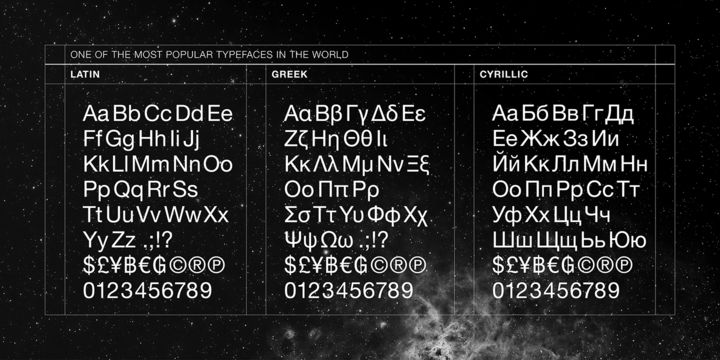
About Monar ▼ Monotype, headquartered in Woburn, Massachusetts, USA, is the world's leading provider of font design, font technical support and related consulting services, with more than 10,000 fonts< /strong>'s font library and the world's best designers provide global customers with multilingual font solutions for various devices and applications. The Mona Corporation Type Library is home to some of the most popular typefaces in the world today, such as Helvetica®, and a hub for new trends in type design. Founder & Mona ▼ June 2018 On March 13, Founder Information Industry Group of Peking University (referred to as "Founder Information Industry") and Monotype held a grand strategic cooperation signing ceremony in Shanghai. In the Chinese enterprise market and personal market, we cooperate fully with Mona, and act as an agent to sell Mona's Western font products. The cooperation between the two parties will bring more font choices to Chinese designers, provide great convenience for their creativity, and expand their international horizons. Enterprises and users in China can use the most complete wording solutions jointly provided by Founder and Mona to develop and serve overseas markets. How to get fonts
▲ Log in to the official website of Founder Font, download and install the "Zijia" client, one-click access, free for personal non-commercial use.Commercial use: Call 4006-516763.
Interactive Benefits
Author
[Norway] Lars Müller et al
Translator
Li Degeng
Chinese Version Planning
Yang Linqing
Li Degeng
Frame Design
Yang Linqing
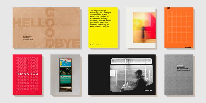
"Font Legend - Helvetica Influencing the World" is a brief history of Western sans serif fonts with rich pictures and texts. The author uses a large number of precious never-published The information presents the social, cultural and even inter-epochal evolution of the font Helvetica from a broad perspective, and also popularizes popular knowledge about fonts, as well as the characteristics of fonts that are widely circulated around the world. "Font Legend" is not only a must-read for professional designers, but also readable for general readers. Leave a message about your feelings or suggestions about using Helvetica font , Three people with the most likes will each receive a copy of "Font Legend - Helvetica Influencing the World".
-END-
▲"Heartbeat font" service mode: Users can purchase font licenses according to a single design and a single character scene, starting at 99 yuan, mostly as low as 499 yuan, and can be used permanently. For details, please search "Founder Type" official website: https://pattern.foundertype.com/. 『Past Review』Click on the blue below Text
Typesetting font Ash Black / You Song / Ruizheng Round / Fang Junhei / Lanting Black Pro Global / Retro rough song / Xinhei / Juzhen new imitation / Germany Saihei / Hei Li / Lanting Black Pro / < span >Sharp positive black / Small Milan Pavilion / Leap forward body / Youhei / Re-engraved font / Yu Bingnan font / Lanting Circle / Imitation of Song Dynasty / Yan Song / Bangshu / Zhenghei / Lanting Black / Boya Song
Creative font Douhei/ Essence and spirit/ Not alone/ Super important /< /span> Su Xin Poetry Cuan Style / Silk Road < /span>/ Floating Body / Fairy Array / Interesting Round / Aisha style / Interesting black / Ruishuiyun / Color source body and profit body / Black change / Xu Bingxin English style / Su Xinshi pebble style / Yazhu style span> / Extraordinary body / Shuiyun / Dali body / Yun Ke body / Pure body / Emperor Empress Style / Su Xin Poetry Art Standard / There are cats in / / span>DUANG body
Writing font Duobao Pagoda Yanti and Qinli Monument Yanti / Chivalrous guest body / Zhou Mi Xingkai/ < /span>New Handbook/ Keshu Huangbang/ Xu Jinglei Running Script / Guan Jun regular script / Qing Kai / Huangling Wild Crane TourBook / Long Kaisheng Running Script / Shang Wei Xingkai / Teng Zhanmin Bamboo Carved Style / Wang Left Middle Right Style / Baiguan hand-painted / Young body and sea body regular script / Imitation Yan body and imitation European body / Xiangji pure steel plate characters / Famous calligrapher re-engraved font / Zhao Andi / Dongli style / Liu Xin standard style / Zeng Baiqiu font< /span> / Zhang Nairen Xingkai / Lu Xun style / writing font / Ink eight-year-old style
Other collections Poetry Handwriting/ Female western font/ Yan Zhenqing style font / Graduation season font / Father's Day font / Children's Day font / Valentine's Day writing / female font / male font / Western font / Signboard font / "Beauty" font


Articles are uploaded by users and are for non-commercial browsing only. Posted by: Lomu, please indicate the source: https://www.daogebangong.com/en/articles/detail/New%20word%20download%20%20From%201957%20to%202019%20the%20new%20look%20of%20Helvetica.html
 支付宝扫一扫
评论列表(196条)
测试