Today, Founder Type released a new typeface——Founder Yashihei.
Founder Yashihei family fontsThere are six weights, which can fully meet the typesetting of text and titles.Is the deputy director of Founder font library design Wang Wen is another masterpiece after Bangshuxing.

-1-
Design Flow
The design of Yashihei began in 2012. After six years of polishing and three revisions of its draft, it was finally finalized and formed a font library in 2018.
The inspiration of Yashihei comes from the classic Latin font Optima. This font with uppercase and lowercase letters has a classical temperament, giving people a beautiful Roman font feeling. It has been published for more than 50 years. , is still often used in the fashion industry to express slenderness and elegance.
In Chinese fonts, is it possible to combine the elegance of serif fonts with the simplicity of sans serif fonts? Is it possible to perfectly combine the advantages of Song typeface and Hei typeface? It is with this kind of thinking that Wang Wen designed this stylized black body with both retro and fashion, and elegant temperament.
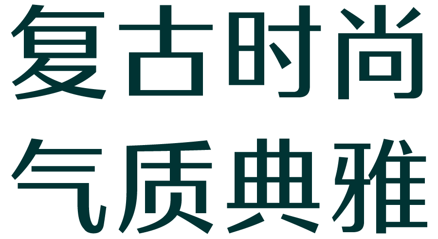
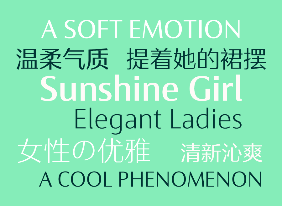
-2-
Temperament Characteristics
Fangzheng Yashihei not only has the toughness of the geometric lines of the black body, but also has the thickness variation and graceful arc of the strokes of the Song Dynasty, achieving the combination of rigidity and softness, elegant and generous.

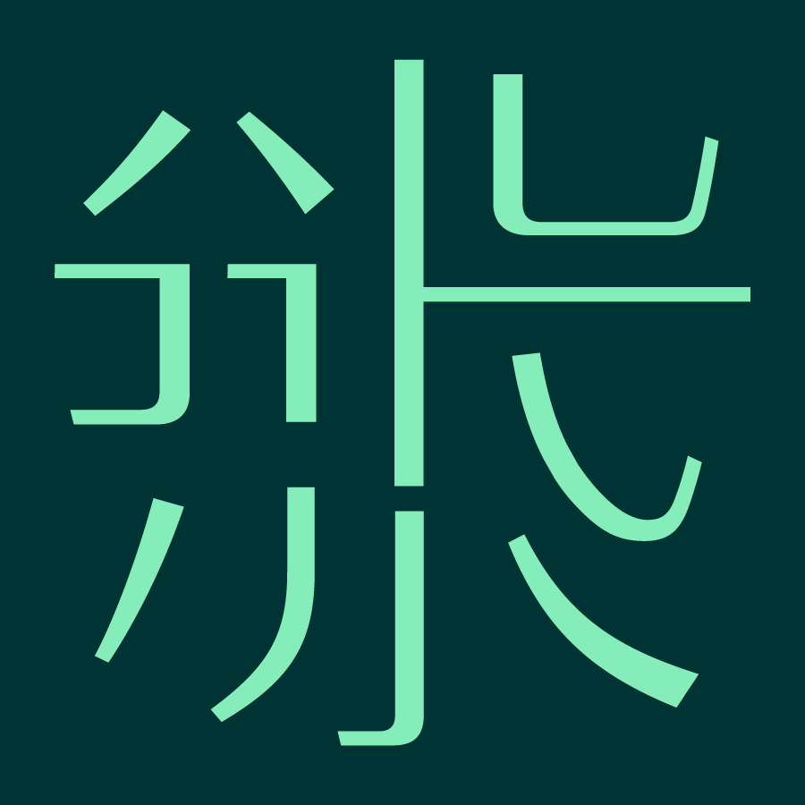
The picture above shows the stroke style of Yashihei,The Yashihei family contains 6 weights, which can fully meet the different application requirements of text and title.
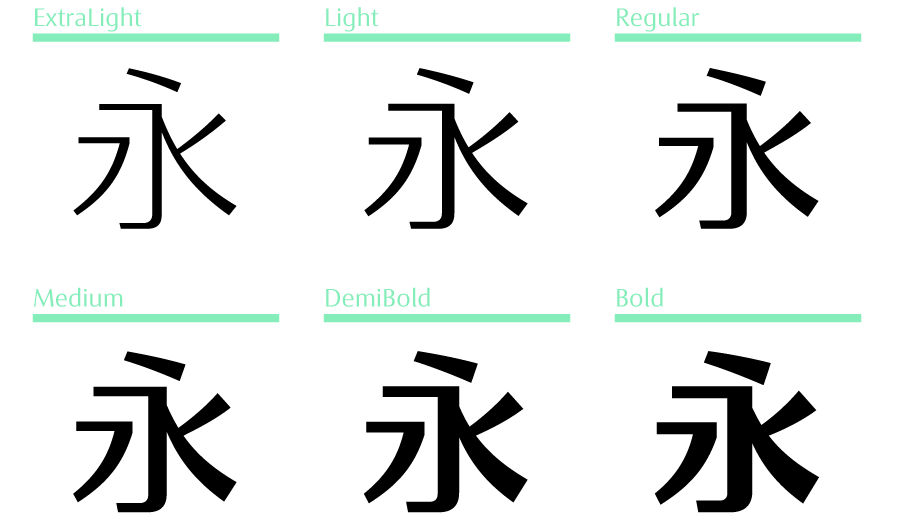
The entire set of fonts not only has an innovative fashion look, but also has the stability and dignity of classic fonts. When used as a typesetting font, it can also make the reading experience more comfortable, exuding the aesthetic charm of China between the lines.

-3-
Add English and Japanese characters
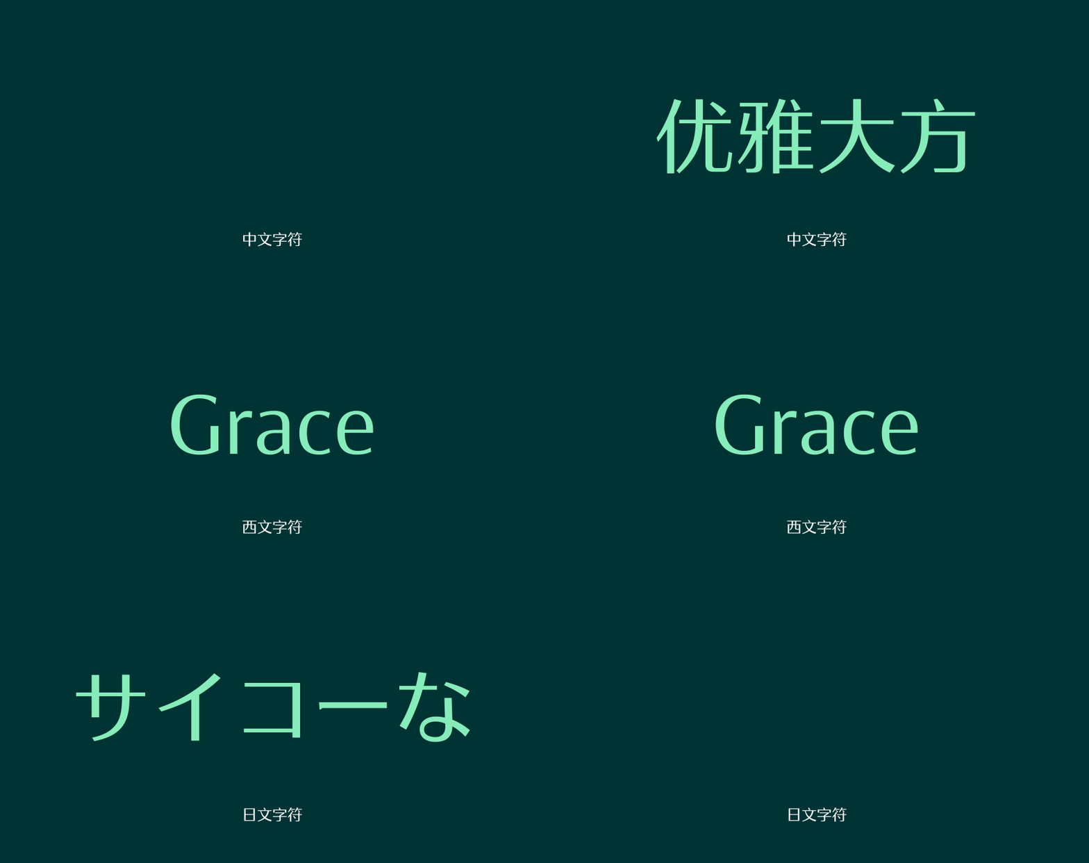

In addition, another major feature of Yashihei is that, in addition to Chinese characters, it also designs matching Latin characters and Japanese characters, which is convenient for users to use together.

Latin characters absorb the characteristics of Optima font, adjust the font width, more modern and concise.
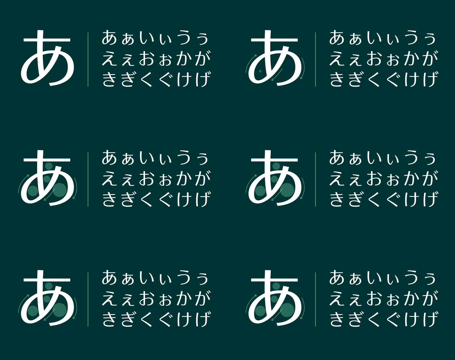
Japanese characters are rigorous in shape, slightly wider in the central palace, simple and elegant.
-4-
Application Example
Fangzheng Yashihei FamilyHas the characteristics of HeiTi and SongTi, and its applicable scenarios are relatively broad: from mobile terminals such as mobile phones, computer screens, paper printing, to outdoor advertisements, etc. All mediums performed well.

When the flowers splash tears, hate the birds and startle

Flowers do not bloom together with hundreds of flowers, independent hedges are endless

The head trees in the inkstone pool in my house, all of them bloom with light ink marks
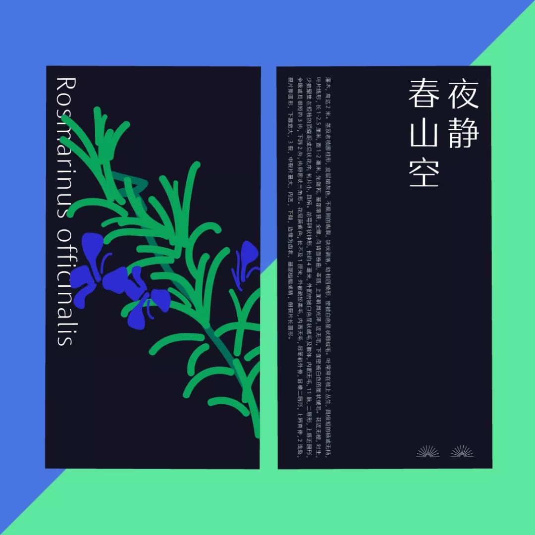
Osmanthus fragrans fall, the night is quiet and the mountains are empty

Flowers drift away and water flows by itself
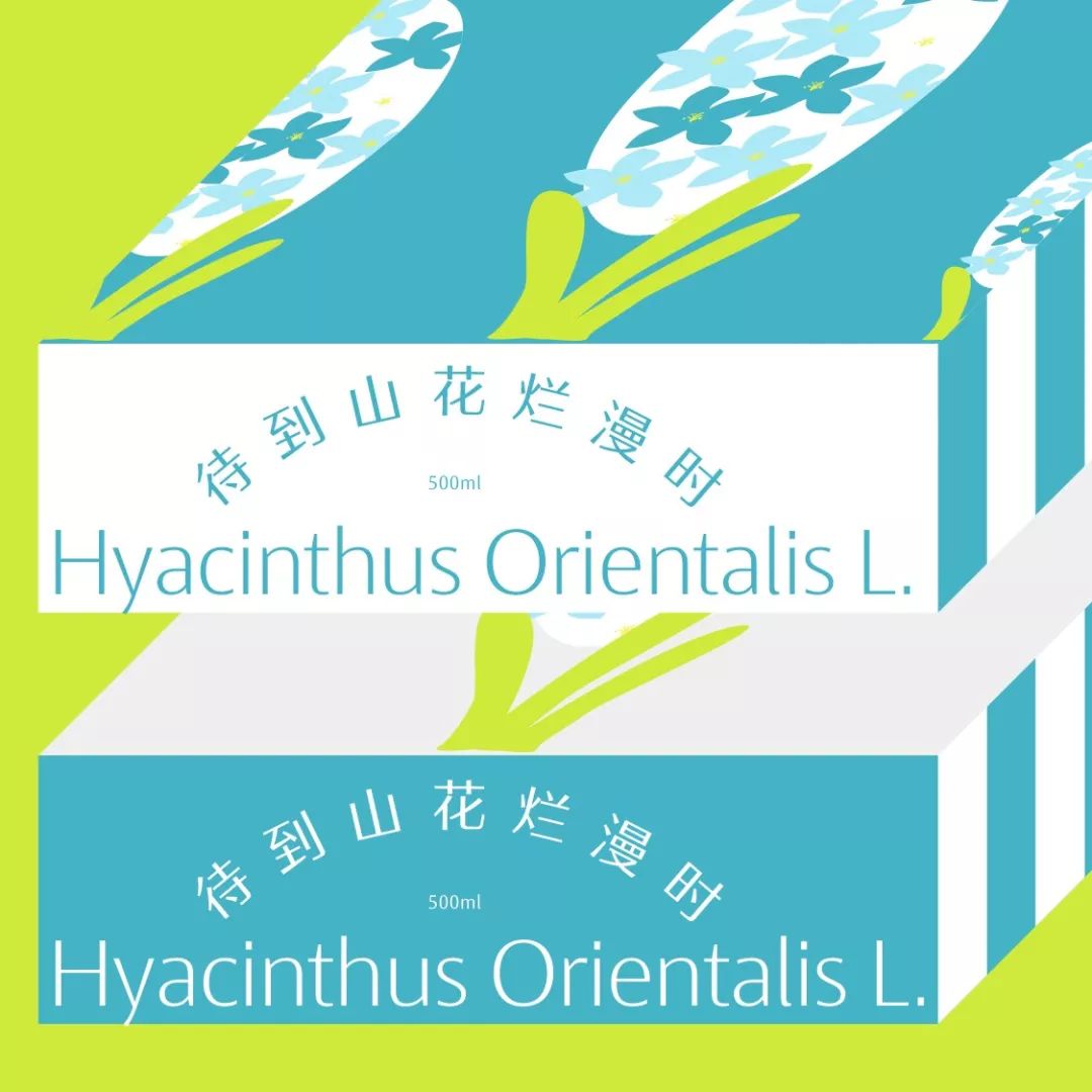
When the mountain flowers are in full bloom

There are still flowers and branches

English Application Demonstration
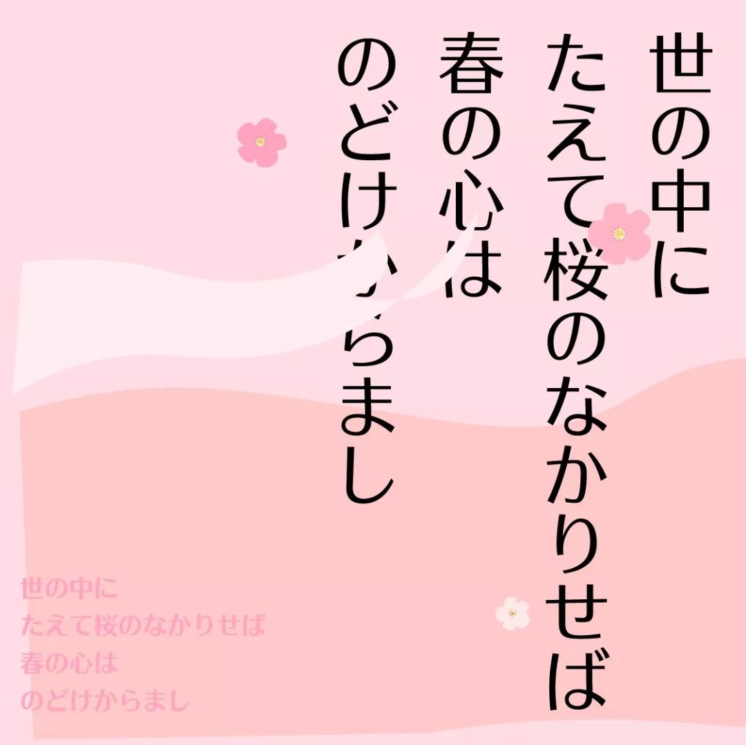
Japanese Application Demonstration

Chinese and English style comparison
-
Welcome to followMostDesign

Past pushArticle
Uber’s 2018 data review special illustration
Little Swan is suspected of plagiarizing the Hong Kong Ballet poster
Geely’s new LOGO, are you satisfied now?
If you want to talk about the design of the dirt, there is no one but it...
The movie poster of "The Wandering Earth" is more than a little bit lazy
Apple's Chinese New Year design is definitely not inferior to Chinese brands!
Petals are back! What kind of design do petal users like?
Articles are uploaded by users and are for non-commercial browsing only. Posted by: Lomu, please indicate the source: https://www.daogebangong.com/en/articles/detail/New%20Font%20of%20Founder%20Type%20Founder%20Yashi%20Black.html

 支付宝扫一扫
评论列表(196条)
测试